It's software update week and this time we've rolled out 3 small improvements to our suite of WordPress plugins.
Two of them are with Thrive Architect, the backbone of many of our plugins, and the other is a new custom fields integration. To find these changes on your website, make sure you've updated to Thrive Architect version 2.4.8.
This is just a small release but we're cooking up a few bigger changes around the corner.
Want to know what's changed? Read on for the latest.
More...
But first...
1. Completely Rebuilt Toggle Element
You've seen it in the Thrive Architect elements panel before. But not like it is now.
Now that's a good looking toggle!
Those of you that have been using our products for years will know that the Toggle has been around since before Thrive Architect, back when it used to be known as Thrive Content Builder.
It's been a staple in our products for years. But we decided it was time for a complete overhaul.
Don't worry: it's backwards compatible. If you update Thrive Architect, the toggles on your website will remain the same until you want to use the new ones.
Right out of the box, the Toggle element comes with 16 beautifully designed templates and a default design if you want to build your own from scratch.
Two column Toggle layout? Easy!
Make no mistake... These aren't just new templates. This is a completely rebuilt element.
Here's what's new:
Smart Color Technology:
In the main settings area of the Toggle, you'll see a color picker. Depending on which template you load, you may even see more than one color picker.
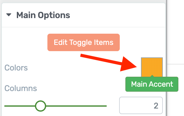
Look for the new Main Accent color picker.
This allows you to change the overall color palette of your toggle in a single click.
By setting the accent color, your toggle's font colors, background sections, borders and hover colors will intelligently change to match the accent.
What makes smart colors really smart is that it will apply different shades derived from the same accent color.
Look at this example:
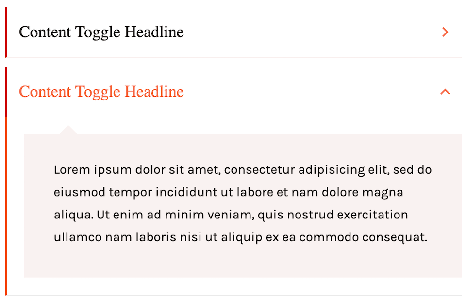
Our smart color algorithm will figure out what shades to use.
Although the pale red content box is a different shade to the red Toggle title font, both will intelligently update when you set a new accent color.
Want something different? You can manually override any of these colors by entering the new Edit Mode and setting the colors for the expanded, collapsed or hover states of your toggles.
Toggle Animation & Auto-Collapse:
How do you want your Toggle to open? Do you want it to happen instantly, or would you prefer a slow animation?
With these new options, it's just a couple of clicks to set your chosen animation.
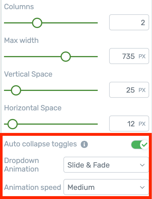
Auto collapse and animation settings
Tucked away in the Architect sidebar, you'll also find a switch to enable Auto-Collapse. This is sometimes known as the accordion effect, and the result looks like this:
See how the first toggle closes when the second is opened? That's auto collapse.
With auto-collapse enabled, clicking a new toggle will immediately collapse the last one left open. This way, you can force only one toggle open at a time.
Set Your Toggle Defaults:
The Main Options panel for the Toggle now offers lots of granular control.
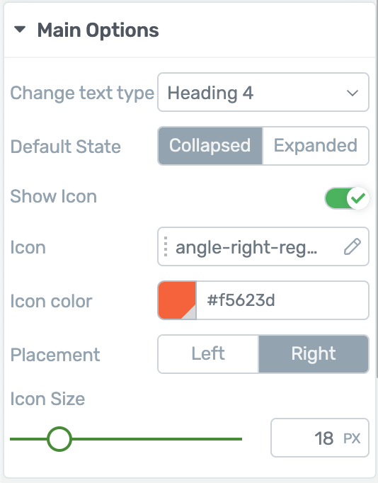
New options available for the Toggle
Toggle titles are wrapped in H4 tags by default. For SEO reasons, you may want to change that to a different heading tag or just to paragraph. Now you can with two clicks.
You can also choose the default state of the toggle when your visitors first load a page. Do you want it expanded or collapsed? Set it at the toggle level.
Want an icon on your toggle? Enable it, choose which one, and set its color, size or placement.
Using Edit Mode & States:
Remember when you used to click a toggle to edit it, but you would accidentally open it?
We've made it easier to manage by enabling an Edit Mode.
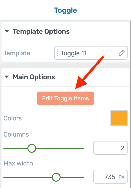
Click here to enter Edit Mode
When you enter Edit Mode, you can easily select the toggle you want to style without opening it.
After you've made your general style changes and you're ready to change the Expanded or Hover states, you can switch to them by clicking the dropdown in the top left of Thrive Architect:
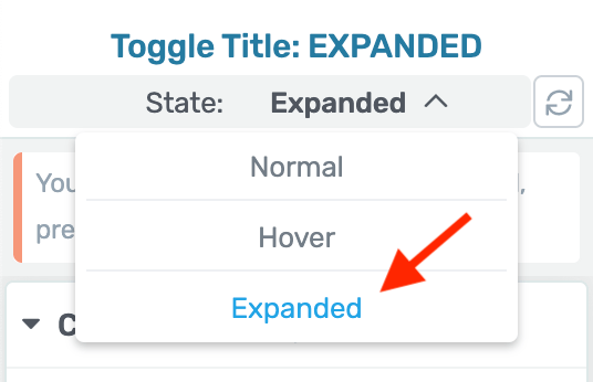
This is the easiest way to make style changes to different element states
Any styling changes you make will only apply to that state.
To quickly swap to the expanded state, duplicate a toggle or add a new one, you'll find a few options just one mouse click away:

Move, duplicate, trash and add options are all nearby when in edit mode.
Bonus Tip: When you have the Expanded state selected, you can also choose to rotate the Toggle icon. That means you can turn a triangle 90 degrees to simulate a drop down, or spin a plus icon until it makes a cross. It's up to you.
2. Different Aspect Ratios For Video
They say that over 50% of internet traffic is now browsing on a mobile device.
Marketers are starting to leverage that by creating videos at different aspect ratios suited to the devices people are using.
That means vertical videos and square videos.
So, we've added support for different Video Aspect Ratios:
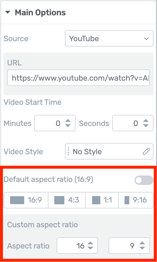
Want to display vertical video? Easy.
Here is an example vertical video courtesy of Billie Eilish using the standard YouTube embed. The first image is using the default video aspect ratio, and the second is using 9:16 vertical video aspect ratio.
The black bars disappear and more of your background section will display. Have a look at what a difference it can make:
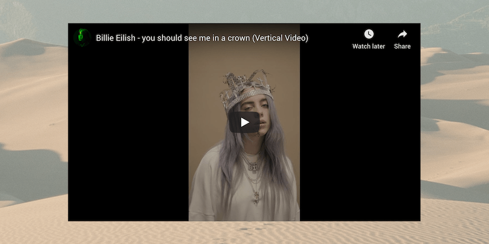
Without Vertical Video Aspect Ratio

...with Vertical Video Aspect Ratio.
Filmmakers often use ultra widescreen video too, with aspect ratios like 2.35:1, known as cinemascope.
In these cases, you probably don't want to show the black bars above and below your video. So we've given you a custom aspect ratio option which supports all kinds of uncommon video formats.
Simply type the numbers into the fields and the Video element will comply with your desired aspect ratio.
3. ConvertKit Now Compatible with Custom Fields
A few months ago, we rolled out support for Custom Fields with our Lead Generation element — initially with 4 email autoresponders, and soon after we added a 5th.
In this update, the popular email tool ConvertKit gets added to that list.
This now means you can pass custom field values to the following autoresponders:
What is a Custom Field and why would I use it?
Inside your mailing list, you'll always collect a subscriber's email address and perhaps their name. By creating a Custom Field, you are able to collect and store more information that suits your business needs.
Perhaps you want to collect a subscriber's country of origin, fitness goal, favorite TV show, or business website URL... whatever you want.
You begin by creating this custom field inside of your mailing list, and then use a lead generation plugin like Thrive Leads to collect that information on an opt-in form and write it to your custom field.
Once you have that custom field information, you can customize the emails that you send to your subscribers, or filter them by their interests.
(Still confused? Watch this example in action)
Like these improvements?
We know this is only a small round of improvements, but we are cooking up a few big things around the corner.
Do you like the new Toggle element? Will you use the new Aspect Ratio feature?
Drop a comment below and let us know.


Great! Especially the new toggle element!
We knew you’d like it 🙂
Great news 🙂 The only thing I’m still missing “desperately” 😉 is Thrive Themes to integrate many more Autoresponders (Email-Marketing-Automation- oder CRM-platforms) via WP-Fusion …
Can you explain that a little more? We have integrations with 30+ tools, most of which are autoresponders. So I’m unsure what you’re looking for.
Hi Bradley, great improvements thank you for sharing. Do you know if Moosend ( email marketing software and marketing automation platform) is on the roadmap for integration?
It isn’t at the moment, no. We’ve been collecting requests for it though, which are coming in more frequently. I’ll count your vote
“This is sometimes known as the accordian effect” <- shouldn't that be "accordiOn"? 😛
Oops. Good find. If I need to hire a personal proof reader, I know who to call!
❤︎
What happens with SEO and a toggle? Do search engines alway grab what is hidden?
Do those who surf to a page easily find the hidden content?
Search engines pay close attention to heading tags, from H1s to H6s, and basically award “importance-points” to the lower H-tags. H1s get the most points. The titles used in Toggles are wrapped in H4s by default. For SEO purposes, you may want to draw more attention to those titles by changing them to H2s or less attention by changing them to H6s (or even paragraph).
With the new toggle element, you can change which heading tag wraps your toggle titles. It’s safe to leave it as H4s, but you have the option to do as you please now.
Hope that helps!
To add to Bradley’s answer, yes what’s “inside” the toggle is “seen” by search engines. It’s part of the code so it will get picked up. Don’t try to outsmart Google though… No use of hiding a ton of weird keywords in there 😉
Great, I like all the updates. I wanted to ask if we can display different dimensions of video on different platforms, or this will accommodate different dimensions of videos as they come originally.
Eather way, it’s nice that I can share IGTV videos as well. Maybe you can create different templates that accommodate for that. For instance, the video that’s square or portrait can be placed on the left or the right side in a column instead of the center…Just a thought
Hi Dalila,
Do you have an example in mind?
You can already put the video in a column, no problem (just drag it next to whatever you want to have on the other side).
Each video that you add to the page, you can set the dimensions.
Much needed overhaul. TT is slowing becoming a beast. At the annual price for all of these tools – it’s a total steal!!!
Do I dare ask anything about the Thrive Theme builder?
Or would that beat beating a dead ????????
Amit, There’s going to be an announcement about this very soon.
Exact text copied from the post above:-
If you read the comments section on our blog posts or YouTube videos, you’ll see that there are always questions about this mysterious thing called ‘Thrive Theme Builder’.
“What is it? What does it do? Any updates? When are you releasing it?”
We’re going to have some official company news about it this month. When we do, we’ll be ready to answer all of your questions and explain what it does. Until then, enjoy the latest round of updates.
It’s official now… 2nd of March is the official launch exclusively for Thrive Themes members.
Different Aspect Ratios For Video is Great.I Love this Feature.
Happy to hear Ali
Hi Bradley,
Well Explained. I was waiting for any such changes. Good Work. Kuddos 🙂
Thanks Ravi
Can you support Campaign Monitor for custom email fields please?
We’ll count your vote.
I am ALWAYS excited to see these update posts. Thrive… You never fail to impress. All three of these updates are going to be put to immediate use. Thank you!
Happy to hear Sandra!
Weirdly amazing timing as I was stuck with trying to somehow show 12 benefits of my product, each that have multiple paragraphs of explanation, but I wanted the user to have control over seeing the detailed explanation or just seeing the title of the benefit. These new accordion features will be MUCH better than the current “Tabs” solution my particular need. Especially because Tabs on 12 items does not translate well to mobile view. Thanks again Team Thrive!
Hi Tom,
You’re right the toggle (accordeon) element is a much more elegant and mobile friendly solution.
That’s an amazing update. Thrive Themes is one of the most powerful products in WordPress space and I believe more such amazing features on their tools & plugins.
Thanks!
Does the new toggle allow to put into it (like the old one does)?
Hi Guido,
You can put any element in the toggle element, you can have a column layout, have images in there,… It’s really up to you 🙂
great, thanks Hanne
Fantastic job on the toggle element! I was one of those who requested these kinds of updates a while ago, and I must say the way it has been rebuilt exceeds my expectations.
OT suggestion: You already have an incredible tool in Thrive Leads, and it always seemed odd to me that it lacks a seemingly elementary function, i.e., the ability to track CLICKS on a link as well as subscriptions.
Arguably the greatest strength of the plugin is the ability to run A/B tests for different forms; wouldn’t it be awesome if we could do the same, just for call-to-action type boxes, pop-ups etc? I’ve often had to use TL forms to invite people to visit a page or something like that, that means no subscription, i.e. no tracking, so no A/B test. But I REALLY would like to have that ability on call to action forms. Well, panels, whatever, you know what I mean.
Case in point, each one of my posts on this site has an instant screen filler TL form with a testimonial and a call to action button that leads to my sales page.
https://www.declutteringefficace.com/quindi-il-decluttering-puo-aiutarmi-a-dimagrire/
Since I’ve implemented the screen-filler, I’ve seen a clear up tick in sales, so I know it’s working, but I’m asking myself whether it could work even better.
It would be awesome to use TL test capabilities to find out what works best:
– instant activation or after 30% scroll
– different testimonials
– different PSPs
– and so on
See what I mean?
I’ve run into this problem again and again, and I always end up having to go with my best guess and hope for the best, which is really annoying when you work with such a powerful tool. So: could you pretty please with a cherry on top add click tracking capability to TL? 🙂
Happy to hear you like the toggle element, Lorenzo!
For the click tracking, it’s been something we’ve been going back and forth about in the company but it’s not on the road map in the near future.
While this is not a perfect solution (because it’s not in Thrive Leads ;-)) you can still use the A/B testing advantages of Thrive Leads AND know which one won…
Here we go:
The idea is to have a specific URL that you can track. There are a couple of ways to do this.
1. install Pretty Link (free plugin) on your site and simply create pretty links as the link to your sales page (eg. yoursite.com/salespage becomes yoursite.com/30scroll). This will allow you to see the number of clicks still from your WP dashboard.
2. Use URL parameters and track in Google Analytics (https://ga-dev-tools.appspot.com/campaign-url-builder/) And track in GA which “campaign” is doing better.
Hope that at least that allows you to take the guessing out of it 🙂
“For the click tracking, it’s been something we’ve been going back and forth about in the company but it’s not on the road map in the near future.”
I’ll have to quote Dumb & Dumber here: “So you’re telling me there’s a chance…YEAH!” 😀
Jokes aside, I hope you keep it in mind at least for the not-so-near future…and thank you very much for the workaround, that should work!
Love it all! Great improvements and well explained.
Thanks Barney
Great upgrades! Thanks! I LOVE Thrive architect.
If I had ONE request that would make a world of difference in the editor it would be to make the scroll button on the left side of the page that scrolls through the options (main, Background, layout etc) WIDER.
I spend so much time trying to pick it up and drag it with my mouse and clicking on the wrong thing because it is so thin–drives me nuts and makes what would otherwise be THE MOST awesome site builder an exercise in frustration…
But other than that I LOVE LOVE LOVE this platform and am recommending it to anyone who will listen. 😉
Hey Kathrine, that is actually a deliberate choice. Let me explain:
Years ago, thick scroll bars were common. Nowadays virtually every mouse comes with a scroll wheel or every laptop trackpad comes with a two-finger scroll gesture. So internet standards have shifted. For example, if you use Google Chrome (arguably the most popular browser) you’ll see the scroll bar is tiny by default.
If you aren’t using a mouse with a scroll wheel, I’d encourage you to get one. They’re like $10 – $15 now and it’ll make everything you do online a million times easier. Hope that helps!
Thank you! I like them all, especially the ones dealing with the different video aspect ratios and the custom fields for ConvertKit.
You’re welcome, Luis. I’m pleased to hear that quite a small feature release is still valuable to you
Think you’ll ever consider the following:
1. Radio buttons/checkboxes in contact forms
2. Multi-step contract forms
Thank you and AWESOME new updates! Love them
1. More than just considering it, we’re already working on it.
2. Contract… or contact forms? If you mean the latter, then we’ve got a few things to release before we’re capable of splitting forms into multi-steps. But it’s something we’d like to consider, yes.
Glad to hear you like the updates, Andrew
I hope there is an option to have a large plus/minus on the toggles. much more intuative than a chevron. I have a rather old demographic that uses my site and when I watch the screen recordings they always seem to click in the wrong areas, l literally had to put text above the toggle that said click on the gray box to see more details. I see a small plus above, but hope there is a large plus/minus as well.
You can choose any toggle icon you like, set it to the left or the right of the toggle area, and resize it. Make it at large as you want! You can choose how far to rotate the icon on open as well, such as 45 degrees, 90 degrees or more. However, for technical reasons, you can’t change the icon to a new one on open. But for your purposes, it’s easy to communicate to your demographic how it works.
This is why I will continue to be part of the Thrive Army. Though one thing I might suggest: An official Facebook group and perhaps Twitter and Instagram account). Flex baby flex!
And it’s great to have you in our army, Erik!
Facebook groups are tricky. Every group I’ve ever seen with over 5000 people has turned into a disaster, and users with good intentions get overshadowed by the loud (and often aggressive) minority. Groups just seem to work better in smaller numbers.
However, I did see it work well with a big group only once and that was with very heavy moderation. So… maybe if we can figure out how to keep it civil.
Hi Bradley,
I’m the Admin of a Facebook group with 9280 members today, steadily growing. I have 4 people to help, but I do the majority and find it to be a quite relaxed task. I normally check in a couple of times a day, but that’s more than needed.
I’ve set rules about which topics are wanted and which are not, about friendly and polite tone and I’ve described the intentions of the group clearly. This does the job for me. In cases where rules are challenged, other members normally will report it quickly, so I don’t need to scan everything.
A group for Thrive Themes would be very specific, with a sorted user group. Politics, sports, environment, etc are the issues triggering emotions. None of those topics are relevant here. The discussion topics would never be controversial. I think such a group would need minimal effort.
Thanks for sharing. It probably could be done, but I’m not confident we know how. Super clear rules make a different but I’ve also seen Facebook groups for software companies set clear rules and user still just vent their support requests, no matter how clearly they are told “go to the support forum”.
Great work, team!
Suggestion: As I’m commenting right now, I always wonder why Thrive Comments doesn’t include the date. Is that on purpose? Is it an option to include it? If not, I think that’s the one thing that makes me leery of using it.
Yes, you can. You can choose to show the date, or the relative date (such as: “2 days ago”), or hide the date entirely.
No update available here…
If you don’t see an update available, click the ‘check for updates’ button in your plugins area next to Thrive Architect.
The new toggle seems to have a lot of trouble loading a video. You have to click in the empty space before it appears. Please see what you can do about this.
I’m very happy to get the different aspect ratios for video. I use 1:1 and I had to go through hoops to get them to display properly, particularly for the mobile.
Hey Dermod, I ran a test and wasn’t able to replicate your issue, so it’s quite possible it’s caused by something else on your website.
Whenever you find an issue like your toggle video one, make sure you open a support ticket and provide the necessary details. That way our technical team can look into it.
I’m excited to hear that you’re working on multi step contact forms, radio buttons & check boxes as well as the new Thrive Theme Builder of course which sounds very promising- I’d almost given up on that one. Also very encouraging is custom field integration expansion. How far down the list is ‘Send In Blue’ for that?
Hold on, Adrian – I want the clear the air: we are not working on multi-step contact forms, but we would like to consider it in the future after some other updates first. I’ve just got to make sure there isn’t an expectation there that could lead to disappointment. Regarding ‘Send In Blue’ custom fields, it’s not on the roadmap yet but we’ll add your vote to the feature request for it.
Oh, ok – thanks for the clarification Brad – those radio buttons & check boxes are a welcome start.
On the subject of contact forms – does Thrive enable a way for potential subscribers to opt in to your form by simply clicking a button using their preferred social network button such as facebook, Google, twitter, amazon, linkedIn etc., rather than filling out their name and email address? I see some organisations doing this. I’m not sure but I imagine that there could be some additional side benefits to something like this other than the ability of the subscriber to join with just one click
We don’t have that functionality, no. But it’s on our radar. Since the goal of lead generation is to get their email address, Social Sign-In only makes sense with social accounts that can pass the email address over, such as Facebook and Google. I don’t think the others allow this.
Hey Brad, I just want to say that I also would love to see a multi-step contact form. Anyway, keep up the great work!
We’ll count your vote, Oliver
Really Amazing job have done by Thrive team . I’ve been using Thrive Architect on my website. We have been waiting for more upcoming updates. Thank you ” ThriveThemes”
Cool!! I like all three updates. Thanks for sharing the info about latest changes.
Amazing Update. But there’s one big problem that comes with this update, I can’t drag and drop things from the outside of the Toggle Element. It’s a real pain. Please fix it.
Hi Puneet,
Make sure you are in “edit mode” that way you can drag elements in the Toggle element.
If you are in edit mode (the big orange button in the main options) and you still can’t drag things in there, there is most likely a conflict with something else on your site. In that case, please contact our support team so they can have a look at your site and help you out.
Thanks for your quick reply, Hanne.
What I’m saying is, I can’t able to drag things that are already on the page but outside the main toggle element.
When I’m in edit mode all the elements outside the toggle get locked to select.
Yes that’s unfortunatly a limitation of the toggle element edit mode. If you have a lot of content (and you don’t want to create it again) I would suggest saving it as a template. You’ll be able to drag that template in the toggle element.
Or you can copy paste if it’s text.
Yes, that’s what I’m doing, and thank god, there’s an option template after that.
Anyways, I love the update 🙂
Hi there!
Any plans of updating the Architect Countdown element? It is a bit rigid and outdated. Ultimatum has much more features and flexibility than the drag and drop Architect element.
Hi Attila,
You kinda answered your own question there 😉 At the moment, if you want more flexibility, Thrive Ultimatum is the way to go.
Can you also re-do the tabs? It’s outdated
One new tab element coming right up 😉 The new element will be in the next release.
Where do I find the 16 templates?
How can I update an exiting toggle to the new version? Is this possible or do I need to basically cut and past to a new version?
Although it might feel similar, from a code perspective – a lot has changed in the toggle. Too much to make it automatically updatable. If you want to move content into a toggle, yes, cutting and pasting content is your best bet.
Thank you.
Hey Brad, I like the new toggle element but what is the reasoning for having the default state (expanded or closed) be default across all screen sizes? Shouldn’t you be able to decide what you want the default state to be on desktop in comparison to mobile?
Hey Robert, you are the first person I’ve come across that has asked for this. Our reasoning is because we haven’t seen a valid use case yet that justifies adding more complexity to the controls. Can you tell me more about what you want to achieve and why? Do you simply want all toggles closed by default on mobile, or do you want to set a different toggle to expanded than you have on desktop?
If you set the toggle to exapanded on desktop because you wanted to have it expanded on desktop it could take up a lot of space on mobile no? So for a good mobile experience the ability to adjust if it is expanded or closed would be very important. I just found it odd that every other control on the left hand pannel can be adjusted at different screen sizes except for the toggle.
I have a specific use case that I need it for that I have talked to support and they say there is no way that thrive themes can do it, except of course if you were to add the functionality for setting the default state fo the toggle for different screen sizes.
Right now you can’t have more than one Table of contents on a page because the second one will break the first one. That is a limitation of Thrive Architect that i discovered when trying to build a page for my client that had a scrolling table of contents in the left hand column that allowed you to navigate the page keeping the table of contents on the page as you scroll.
For mobile though the Table of Contents element is too lager to scroll with the page so you either have to place it in a toggle that can be expanded by default on desktop and closed by default on mobile or you have to make it invisible altogether and provide no navigation with jumplinks because any navigation with jumplinks added will break the Table of Contents element (another limitation of Thrive Architect I discovered when talking to support).
I was under the impression from multiple videos by shane and or hannah that anything in the left hand column could be adjusted on multiple screen sizes but in this case it is the only thing I am aware of in thrive architect that can not be adjusted on multiple screen sizes.
You can correct me if I am incorrect.
As you can see I have a very specific use case for having the ability to adjust it on mobile different from desktop and probably will have more in the future.
To limit the ability to adjust for multiple screen sizes feels more like an oversight than the intended way of using it since no one has given me a reason why it is different than any other thing in thrive architect and why it would be better to limit that functionality rather than have it.
Why is is different from every other element in the left hand panel?
That was on purpose?
Hey Robert, there is a little more to how the Architect sidebar works. The majority of the styling you setup in the sidebar will be configured per screen size, yes. Main Options are not always set individually. For example, the form fields you set in a Lead Generation element cannot be removed from different screen sizes and the hyperlink on a button cannot be changed for mobile. Think of it as core behaviors vs styling. Setting the default toggle is a behavior rather than style. I understand your example, though, so we’ll mark this down as a feature request.
Your reasoning in regards to what is best for your customers and your business is obviously more wise and pragmatic than mine.
I’m sure you are all stressed out because of the pandemic, and so am I.
I don’t want to add to that stress so I look forward to the future feature update that includes the ability to adjust the toggle on mobile.
Thanks for your time.
We’re in some very bizarre and unnerving times, for sure. No problem, Robert. Hope you’re staying safe 🙂
Cool!! All these three updates are wonderful & helpful. Thanks for sharing about latest changes.