Have you ever wondered why your website gets traffic but still struggles to capture leads?
The reality is that 96% of visitors aren’t ready to make a purchase the first time they land on your site. Most of them are simply browsing, comparing options, or gathering information. Without a clear path forward, they slip away — and with them, potential revenue.
That’s why capturing leads is so powerful. By offering a simple first step, you can start building a relationship with those visitors and move them closer to becoming customers. And it’s worth the effort: email marketing delivers an average ROI of up to 4,400%, making it one of the most profitable channels in digital marketing.
In this definitive guide, I’ll walk you through both the strategy behind a high-converting lead funnel and the step-by-step execution of building one with Thrive Architect. My goal is to make sure you not only understand how to set up the funnel technically, but also why each piece matters — so you end up with a system that actually works for your business.
What are the Important Elements of a Lead Generation Funnel?
Every high-converting funnel is built on the same foundation. Think of these elements as the “moving parts” that work together to turn casual visitors into subscribers:
👉 When each element plays its role, your funnel feels seamless — guiding visitors from curiosity to commitment without friction.
How to Set Up a Lead Generation Funnel (Step-By-Step)
Now that you know the strategy behind a successful funnel, it’s time to put the pieces together. In this section, I’ll take you through the exact steps to set up a simple but powerful lead generation funnel — from creating your offer to building the pages and connecting your email service.
Each step is designed to keep things practical and doable, so by the end, you’ll have a fully functioning funnel that captures leads and starts building relationships on autopilot.
Step 1: Download & Install Thrive Architect
For your lead magnet funnel, you’re going to need a landing page that catches the eye and keeps your audience engaged.
That’s where Thrive Architect comes in.
Here’s why you should consider Thrive Architect:
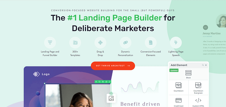
1. Easy Building: Thrive Architect’s drag-and-drop editor makes the landing page creation process much easier — and more enjoyable! You can easily move around whole sections, or small design elements without compromising the rest of your page.
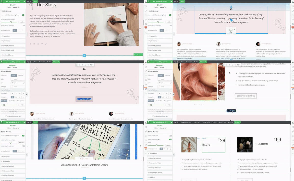
Thrive Architect in action
2. Tailored Page Templates: Starting from scratch can be intimidating. That's why Thrive Architect offers a variety of templates designed to make your life much easier. Whether you're creating a landing page for a digital product, physical product, service, or even a membership site, you'll find templates that fit your needs. Using these templates can save you a ton of time. Instead of starting from scratch, you can pick a template that's close to what you want and then tweak it to fit your needs.
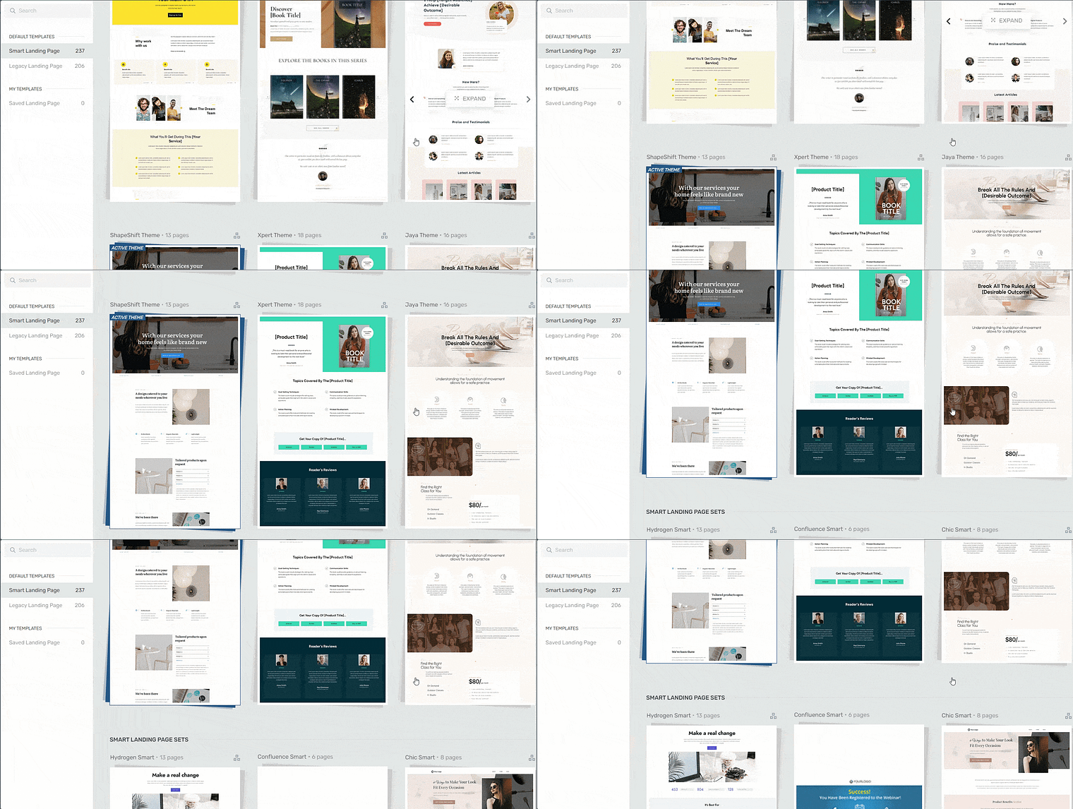
Landing page template sets in Thrive Architect
3. Conversion Focus: Thrive Architect is full of features to help your funnel work better. Want to grab your visitors' attention and keep them reading? Thrive Architect lets you add eye-catching buttons and colorful content boxes that stand out. Need to create a sense of urgency? You can add countdown timers with just a few clicks.
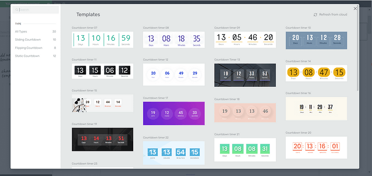
Countdown Timers in Thrive Architect
And since so many people use phones to browse these days, you'll be glad to know that Thrive Architect makes sure your funnel looks great and works well on all devices.
In short, Thrive Architect takes the headache out of building a high-converting lead magnet funnel. It lets you focus on what really matters - creating an offer your audience can't resist.
Step 2: Create Your Lead Magnet
🎯 Define Your Audience
Before you even think about designing a page or picking a lead magnet, take a moment to get clear on who you’re building this funnel for. A funnel that tries to speak to everyone usually ends up converting no one.
Before you create your lead magnet, ask:
- Who am I trying to reach?
- What problem keeps them stuck?
- What quick win would feel valuable right now?
👉 Even the best-designed page won’t convert if the offer isn’t aimed at the right audience.
The content and messaging in your lead gen funnel is focused on getting your potential leads to opt in and get you lead magnet.
If you haven’t got an offer to promote, you’ll need to create one first. Your lead magnet should target a specific stage of your overarching sales funnel.
Sales Funnel Stage Breakdown
Your sales funnel is split into three main stages — awareness, consideration, and conversion.
These stages of the funnel are also known as top of the funnel (TOFU), middle of the funnel (MOFU), and bottom of the funnel (BOFU).
- Brand Awareness stage (TOFU): Your audience has just discovered your business (through a social media post, ad or search engine results page) and wants to learn more. Ideal lead magnets for this first stage include: eBooks, checklists, industry reports, and high-quality blog posts.
- Consideration stage (MOFU): Your audience is aware of their problem or need, and are still trying to work out if you can help them. Use a lead magnet here to nurture their interest and build credibility. Suggested lead magnets include webinars, case studies, free trials, or templates.
- Conversion stage (BOFU): At this stage, your qualified leads are ready to buy and need a push in that direction. Good lead magnets (or incentives) for this stage are discounts, product demos, and free consultations.
For an effective lead generation strategy, you must create your offers and funnels with a specific funnel stage in mind. This will also help form a successful sales process, because you’re targeting the right people.
Thrive Tip: We recommend creating a customer journey map to make it easier to create a streamlined funnel and lead generation process.
Step 3: Create and Customize Your Landing Page
In the WordPress dashboard, click “Add New” and select “Page”.
Name your page and click the green “Launch Thrive Architect” button.

Thrive Architect will provide you with four options:
1. Normal Page
2. Blank Page with Header and Footer
3. Completely Blank Page
4. Pre-built Landing Pages
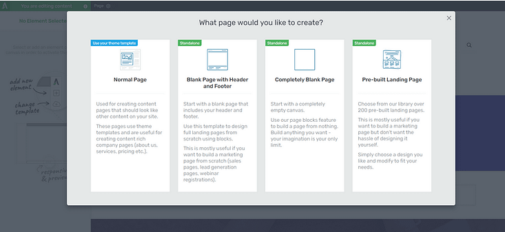
We recommend choosing the "Pre-built Landing Page" option.
In the Landing Page Library, browse through our template sets and select the one you like most.
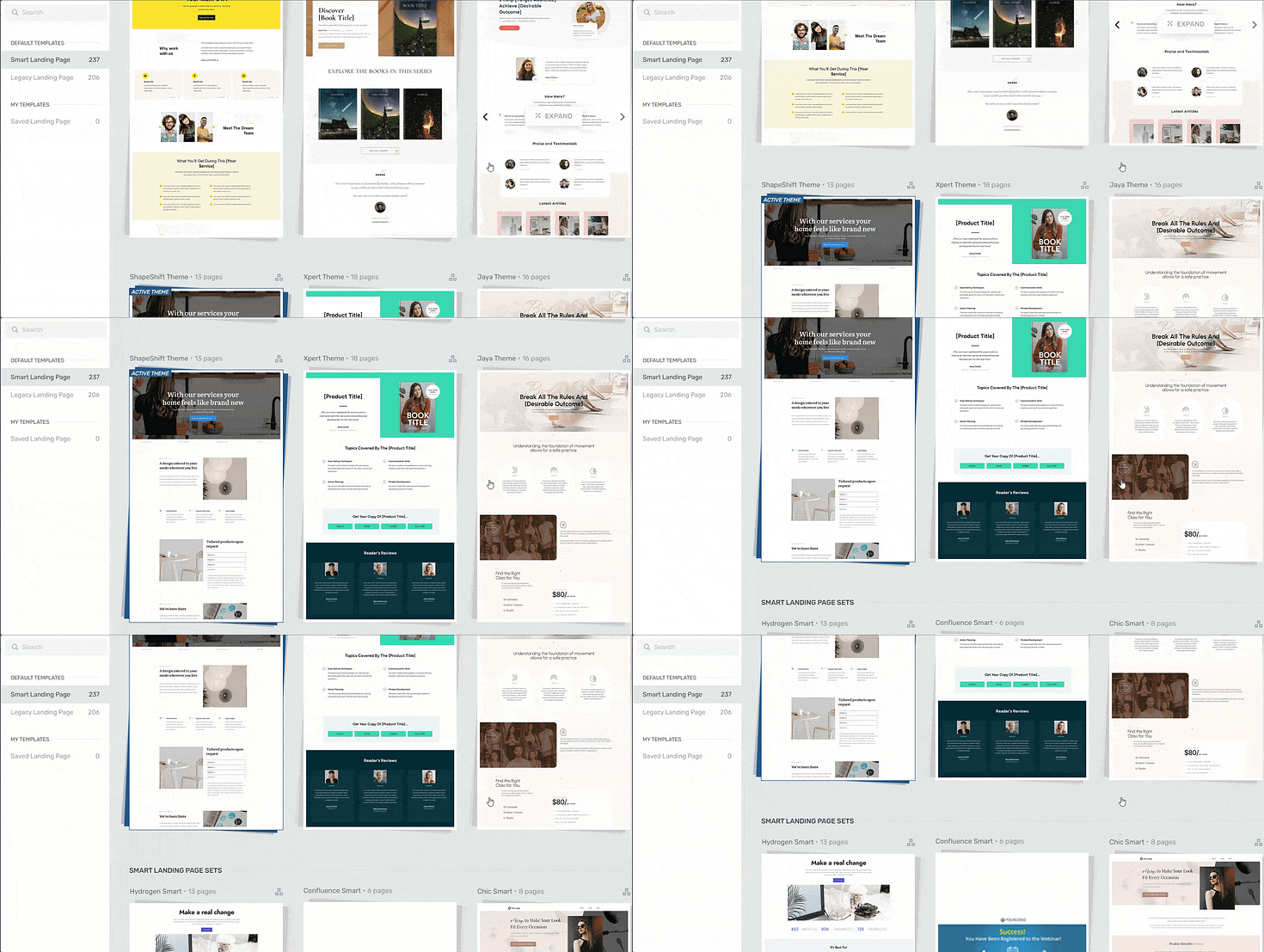
Landing page template sets in Thrive Architect
Each set comes with page templates that serve specific purposes. In the left sidebar, click “Lead Generation” and load the template.

You’ll see that our lead generation landing page has everything you need to effectively promote your lead magnet:
An attention-grabbing headline and space to add supporting, persuasive copy.

Hero Section
A social proof section to add testimonials from people who love your products and services.

Social proof section
A well-crafted “Benefits” section to give your audience an idea of what to expect from your lead magnet.
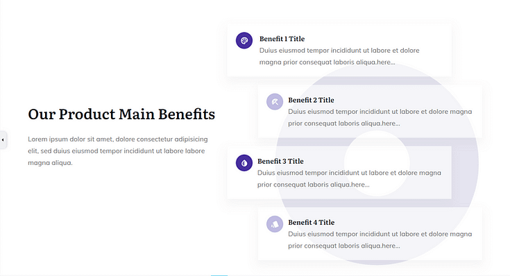
"Benefits" section in a Landing Page Template
An eye-catching opt-in form for your site visitors to submit their contact information.
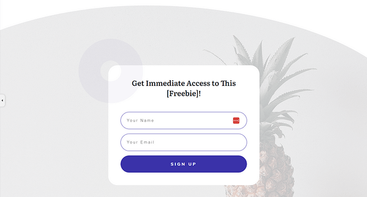
Lead Capture Form on a Landing Page Template
Every template comes with helper text, to show you where to add copy and the message it should convey.
So, go through your template and replace the placeholder text and images with your own content.
Don’t forget to save your landing page design.
Step 4: Create a Confirmation Page
Next, create another page in the WordPress dashboard and Launch Thrive Architect.
Select “Pre-Built Landing Page”.
For consistency, we recommend using page templates from the same set.
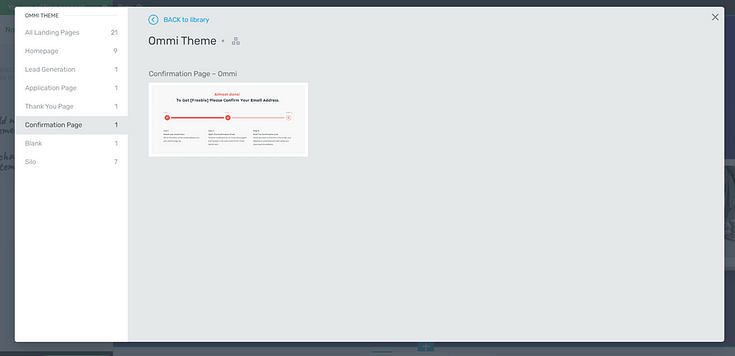
Confirmation Page Template from Ommi Landing Page Set
Search for the “Confirmation Page” template and select it.
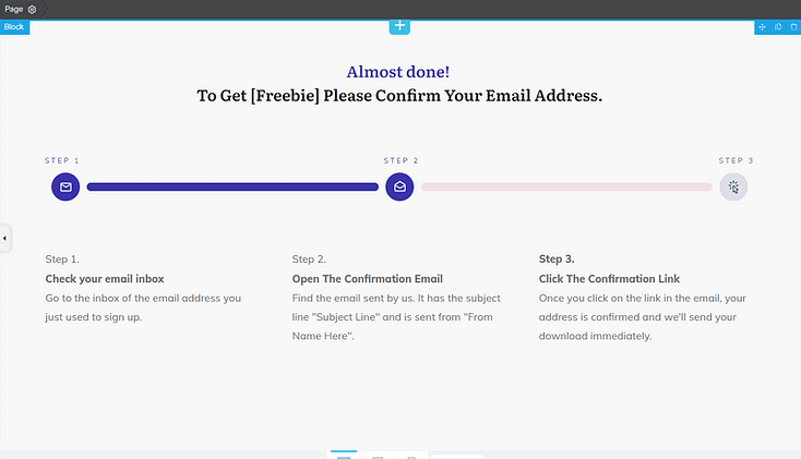
Loaded Confirmation Page template in Thrive Architect
As you can see, the purpose of this page is to let your visitors know that their submission was successful and they need to confirm their email addresses.
The confirmation email is configured in your email marketing service of choice, so be sure to follow the instructions the platform provides.
Step 5: Create a Thank You/Download Page
Your “Download” page template is also known as a “Thank You” page.
Create another page in WordPress, launch Thrive Architect, and select the “Thank You” page template from your landing page set of choice.
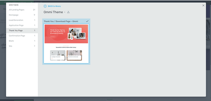
Use Thrive Architect to customize the placeholder text and images. Once you’re happy with your changes, save your page.
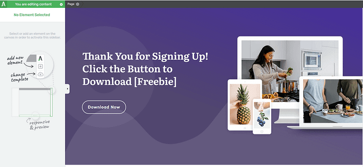
Thank You Page template in Thrive Architect
Now you have all the pages you need in the funnel, time to set everything up.
Thrive Tip: Add a random string of numbers to your “Download” page’s URL, to make it hard to guess. This stops people from trying to by pass your opt-in form to access your content.
Step 6: Configure Your Email Provider
You'll need to configure your email provider so that a confirmation email is sent and when clicking on the link in the email your subscribers are redirected to the download page.
This is different for every email provider, but a quick Google search should help you out.
Example: “How to create a confirmation email in ActiveCampaign”
Be sure to create a follow-up email sequence to engage your new leads and build a relationship with them. This strategy is a key part of the lead nurturing process.
Step 7: Connect Your Email Marketing Service to Your Landing Page
Connect your email service through API. You will only need to do this once for the first opt-in form you set up.
You can find tutorials for all major email providers here.
Go to your Lead Generation landing page and click on the opt-in form. In the sidebar, click on "Connect form with service" follow the set up wizard.
You'll be able to configure the fields you want to show (yes or no first name field) and you will also select the action after opt-in.
This action will be redirect to the URL of your confirmation page.
That's it, your whole funnel is set up and working!
Thrive Tip: When publishing your “Confirmation” and “Download” pages, use your SEO plugin to prevent the page from showing up in search results. Each setting is different, but for a plugin like AIOSEO, all you need to do is toggle the “Show in Search Results” option.
Bonus: Segment Your Leads with a Quiz Lead Magnet
If you’re looking for a creative way to engage your audience and get a deeper look into their interests, you should consider using a quiz as a lead magnet.
Quizzes help you gain personalized insights from your audience, allowing you to categorize your leads into different segments.
For example, quiz results might segment leads into “Vegan”, “Keto”, “Gluten-Free”, and “Balanced Diet”.
These insights can help you tailor your email marketing content and offers, increasing the effectiveness of your campaigns and, eventually, leading to more conversions.
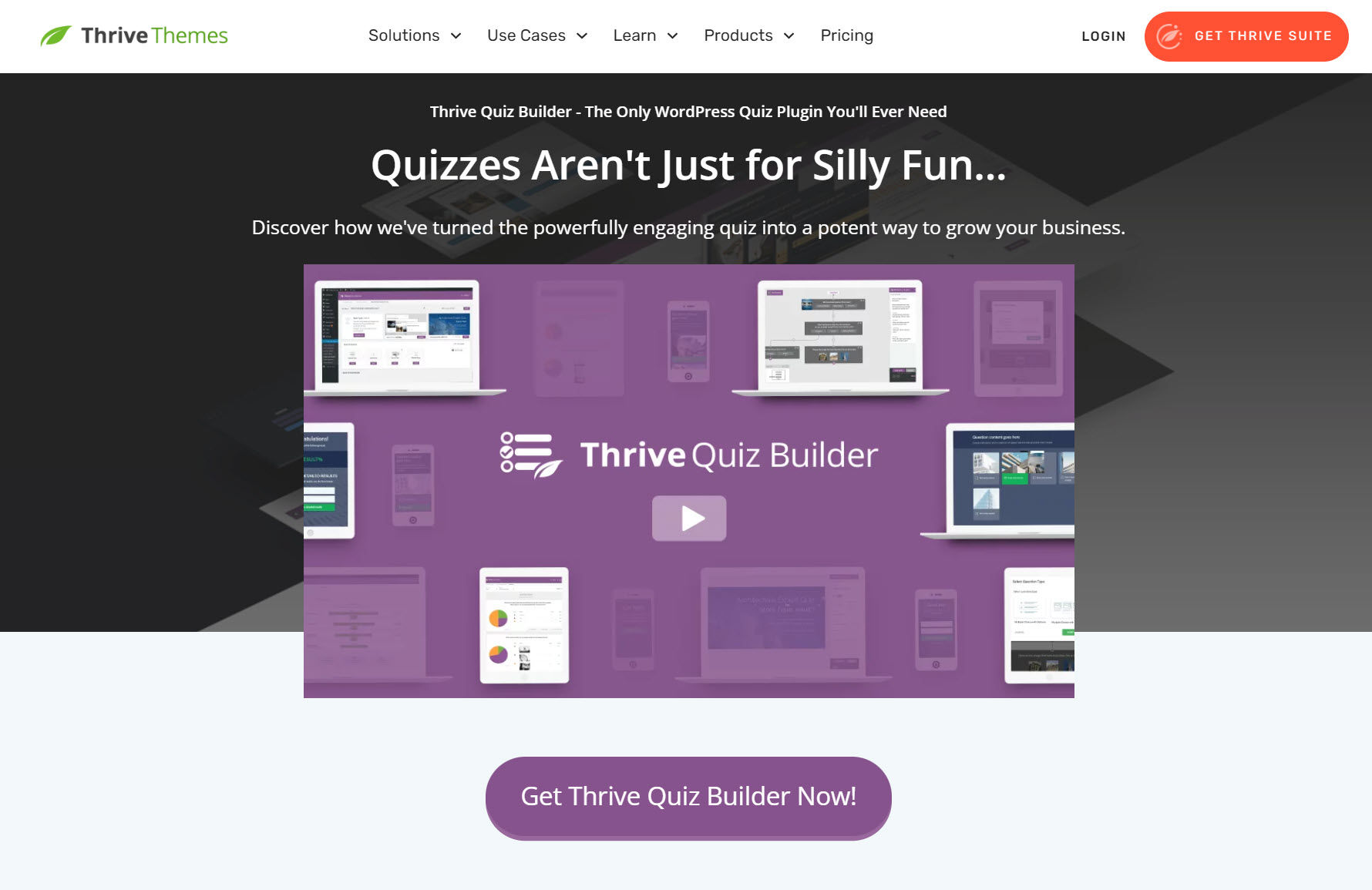
Thrive Quiz Builder is an excellent choice for creating online quizzes to engage your audience and boost your lead generation efforts.
With this plugin, you can create different types of quizzes, such as multiple-choice, true or false, and image-based questions.
You also get access to a variety of quiz templates and a drag-and-drop editor to customize them.
Thrive Quiz Builder is available as a standalone plugin, or as a part of Thrive Suite.
Next Steps: Start Driving Traffic to Your Landing Page
Once you’ve set up your lead generation funnel it’s time to get it in front of the right eyes.
As you share your landing page on social media, through email, and even via SEO, you need to make sure you’re targeting the right people (i.e. your ideal customer).
Here are 4 free resources/tutorials to help you drive the right traffic to your website:
Frequently Asked Questions: Building a Lead Generation Funnel
Before you start building (or fixing) your funnel, here are quick, no-fluff answers to the questions I’m asked most. Think of this as a skim-friendly checklist you can reference while you set up a simple two-step funnel (squeeze page → thank-you/download page), with notes on when to layer in more.
Yes. A lead gen funnel is a simple, structured path that moves someone from visitor → subscriber → customer. Even the most basic two-step version (squeeze page → thank-you/download page) gives curious visitors a clear first step and turns anonymous traffic into relationships you can nurture.
Create a 3-line mini-persona:
Who are they? (role/segment)
What’s the urgent problem? (one sentence)
What’s the quick win they want? (checklist, template, demo, discount)
If your offer matches those three lines, your funnel will feel relevant and convert better.
Pick the format that delivers a fast, specific win:
TOFU: checklists, templates, short guides
MOFU: webinars, case studies, calculators/demos
BOFU: trials, consultations, discount codes
Make sure the magnet is both a filter (attracts the right people) and a ramp (naturally leads to your core product).
Single goal (one CTA)
Clear, benefit-driven headline (+ concise bullets)
Relevant visual (hero image or short video)
Social proof (logos, testimonials, numbers)
Message match (headline mirrors ad/search promise)
Minimal fields (email, maybe first name)
Mobile speed (<3s load)
Keep the form visible, copy action-oriented (“Get the checklist”), and remove distractions.
Use a blended approach:
SEO/content for steady, high-intent organic traffic
Paid search for BOFU “ready now” intent
Paid social for TOFU/MOFU awareness and list growth
Retargeting to bring non-converters back
Whatever the channel, keep message match tight between the click source and the landing page.
A simple 3-email welcome sequence:
Immediately: deliver the magnet, set expectations, invite replies
+2–3 days: more value (related post/case study/tip), soft trust-builder
+5–7 days: next step (webinar, demo, trial, or relevant product page)
Segment by magnet/topic so follow-ups stay contextually relevant.
Track by stage and fix the biggest leak first:
TOFU: traffic, CTR
MOFU: landing page conversion rate (visitor → lead)
BOFU: MQL→SQL, close rate, CPA, sales cycle
Use analytics + heatmaps to spot friction, then A/B test one variable at a time (headline, CTA, form length, layout). Improve the weakest stage, re-measure, repeat.
Start Generating Leads Today
And there you have it!
With this tutorial, you can easily build an engaging lead generation funnel to grow your email list and, eventually, generate sales. And you can do it all by yourself — no need for an expert sales team or marketing team.
Thrive Architect is a powerful funnel-building tool and provides you with everything you need to create stunning landing pages.
So, if you need a solid funnel builder, you know what to do.


