Looking for content marketing hacks to help create a thriving content marketing strategy that generates leads and sales?
Maybe you're struggling with your current content marketing strategy and you need a few pointers to help you course correct?
This guide is for you.
Keep reading to learn 9 tried and tested content marketing hacks that can help turn your content into valuable resources your site visitors will love.
Let's dive in.
What is Content Marketing & Why Is It Important For Your Business Growth?
Content marketing focuses on using written, visual, and audio content to attract and engage an audience – often with the goal of getting the audience to convert into leads or customers.
The goal of your content marketing should be to provide valuable content that educates audiences, solves one of their problems, or simply keeps them engaged.
The most common types of content used in a content marketing strategy include blog posts, social media content, videos, webinars, eBooks, podcasts, and so much more. But as a new business owner, or one who’s trying to rework their content marketing strategy, you should focus on quality over quantity.
Limit yourself to 2 to 3 content formats, provide consistent value through them, and only add other types of content to your strategy once you’ve started generating consistent results.
And, in case you’re still asking, “Why is content marketing so important for my business?” here are a few reasons.
A solid content marketing strategy:
Builds trust in with your audience and establishes yourself as a go-to authority in your industry
Boosts your business’ visibility through SEO and consistently sharing content on discoverable platforms like social media
Helps you create content that interests your audience and encourages them to opt-in for more – resulting in more leads for your business
Increases the chances of converting your potential customers into paying customers
Helps retain your current customers as they feel they’re receiving consistent value from the content you share
…and so much more
You don’t have to be a super marketing whiz to create a content marketing strategy that boosts your audiences and drives your conversions.
In fact, we’ve made the process easier for you by combining our years of marketing experience to show you 9 simple content marketing hacks that can lead to consistent results.
9 Content Marketing Hacks to Help Grow Your Audience, Generate Leads, and Land More Sales
With content marketing, simple is always better. Simple strategies are easy to implement, track, and replicate.
Let’s take a look at what some of these strategies look like and how you can implement them:
1. Deepen Your Audience Research to Make Sure You Target the Right People
If your current content marketing efforts aren't helping attract the right audience – or isn’t bringing in your desired amount of traffic then it’s time to go back to the basics.
No content marketing tip or trick, no matter how good, will help you attract more traffic or generate leads if you aren’t focusing on the right audience. Perhaps you did do some audience research before you started creating content, but it’s possible you missed a few crucial details.
For example, let’s say you’re a business coach who wants to help women build six-figure businesses. In all your research, you’ve said, “I want to help women build six-figure businesses and create the life of their dreams.”
It sounds great – you have a target audience! But that audience is still too broad.
What is the age range of the women you want to help? Are they women who already have 9 - 5 jobs, or are they freelancers?
Do these women live in a specific region? Does the niche of the business they want to create matter?
Each of these questions helps you get closer to identifying your specific, target audience. The answers to these questions can also guide you in creating more personalized, targeted content that immediately catches your potential customers’ attention.
Let's say you're a new business owner with no marketing experience, look at the two headlines below:
A.
Content Marketing Hacks to Help You Grow Your Business
B.
Content Marketing Hacks for Beginners: How to Attract the Right Audience For Your New Online Business
Which one resonates with you more?
The second one, right? It’s more specific and tells you exactly what you’re going to learn from the article.
One of the best ways to create engaging content and attention-grabbing headlines is to understand your audience as much as possible. Go beyond scratching the surface and really get to know them.
You can do this in a few actionable ways:
If you already have an online community (e.g. a Facebook group), send a survey to your audience with questions related to their pain points and goals they want to achieve
Head to your competitors’ social media pages and other platforms to view what’s working with their audience, the questions their customers are asking, and potential gaps you can fill with your products or services
Search social media and forums related to your niche, to find reviews, questions, and comments to learn what your potential customers are looking for
Read more resources on how to create in-depth audience or buyer personas to create targeted content that will grab their attention
2. Prioritize Keyword Research for Your Content Strategy
When creating content, your target audience should come first, but that doesn't mean you should forget about the search engines.
Keyword research plays a vital role in helping you generate SEO-friendly content. If you want your target audience to find your articles, blog posts, or videos when they search for topics related to your business, you must use the right keywords in your content.
That might sound like a lot of pressure, but it isn’t. There are a number of great keyword research tools for SEO you can use to make sure your content marketing strategy is on the right path.
Keyword research also gives you a better understanding of your target audience’s search behavior.
With the right tools, you can see the specific terms people use when searching for content and products related to what you offer. This knowledge can help you proactively create blog posts, videos, podcasts, etc. to address your target audience’s needs and challenges.
That way, you can also find an unlimited number of topics to use to create engaging content that’s relevant to what your audience is searching for.
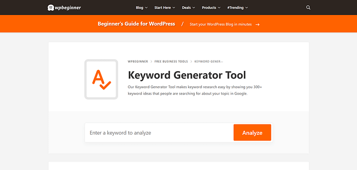
Start your SEO journey with this free Keyword Generator Tool that’s designed to help you find the right keywords for your content strategy.
And if you’re looking for a reliable SEO plugin to help you manage a successful, stress-free SEO strategy, then All In One SEO could be the right tool for you.
Don't forget about content hubs either! This can be a perfect way to help your audience find the content they're looking for and grow your organic traffic.
3. Collaborate with Like-Minded Business Owners & Creators
Collaboration is a great way to get your content in front of new audiences. And when you work with similar business owners who are on the same mission as you...you can generate amazing results.
Most business owners think they need to reach out to high-level influencers or brands to get their businesses in front of new audiences.
And while this can be a helpful strategy, it's also expensive. If you're building your business on a budget, you can't afford to spend thousands of dollars on influencer marketing. Not yet.
What you can do is reach out to other new and growing business owners who, just like you, are looking for ways to expand their audiences and get more people to see what their businesses are about.
A good place to find interested collaborators is to look at businesses that are adjacent to your niche. For example, if you’re a fitness coach, you can reach out to nutritionists, gyms run by small business owners, or wellness practitioners.
These are businesses that share common ground with your industry but aren’t your direct competitors. So, when you cross-promote each other, you don’t have to worry about losing your audience to the competition.
Focus on businesses that are a similar size to yours, or slightly bigger. It’s easier to reach out to them and they’re less likely to charge you an exorbitant price for a collaboration.
Tip: Collaborations with other business are also a great way to build backlinks, and this will help your SEO.
4. Leverage Analytics to Create a Data-Driven Content Strategy that Generates Results
Your site’s analytics are the map you need to identify what is and isn’t working in your content strategy. This data also plays a key role in helping you understand your audience’s behavior as they interact with your site’s content.
For example, site analytics can highlight your most popular posts and pages, the amount of time your visitors spend on your website, and the links they click.
And this information alone is enough to help you rework your content marketing strategy, so you’re constantly providing the right kind of content to your audience.
Another benefit? By looking at the data, you can save hours of time by discarding content or strategies that aren’t bringing in results.
Now, when most tech newbies hear the word “Analytics” their minds go to complicated graphs and data that’s hard to understand. But with the right analytics tools, making data-driven decisions is a breeze.
And if you have a WordPress website and you’re still looking for a WordPress analytics plugin that makes understanding your site’s data super simple…you should take a look at MonsterInsights.
MonsterInsights is the best Google Analytics plugin for your WordPress website.
If you struggle to understand Google Analytics reports, this is the plugin for you. MonsterInsights has a user-friendly dashboard that helps you track your site data (e.g. pageviews, conversions, sessions) with ease.
This plugin also boasts a simple 1-click install and a variety of in-depth features to help you make data-driven content marketing decisions that lead to conversions.
5. Use Online Quizzes to Boost Engagement, Generate Leads, and Segment Your Audience
If you’re looking for a creative way to generate leads and get your audience to stay on your website for longer, that’s so simple you’ll wonder why you didn’t try it out before…
You need to start using quizzes.
Quizzes are a fun way to get your audience to interact with your website and gather important information to create personalized marketing content.
For example, let’s say you have three different lead magnets and want to offer the most relevant one to your site visitors. You can create a quiz that has three different outcomes that are based on the answers someone selects throughout the quiz.
Each outcome should be based on one of your three lead magnets and must include an opt-in form; encouraging your visitor to submit their contact information in exchange for the lead magnet.
Because the outcome is based on information they submitted during the quiz, your visitor is more likely to opt-in because your offer is relevant to their wants or needs.
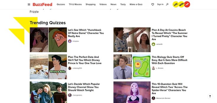
Alternatively, you can use online quizzes for the fun of it. Think Buzzfeed and their “Which [TV Series] Character Are You?” era.
We weren’t the only ones obsessed with those, right?

Interactive quizzes like this can be a game-changer for your social media strategy. People love quizzes and are more likely to click a link that directs them to one.
If you put out good quizzes on a regular basis, you can build an engaged community of quiz takers who love the ones you create and will return to your website regularly to see if you’ve published any new ones.
That in itself is a great opportunity to turn your hub of quizzes into a space to generate leads and promote new offers.
Your options are endless when it comes to using online quizzes in your content marketing strategy.
And with the right no-code quiz-building tool and templates, you can create as many quizzes as you need to – without getting stuck in complex code or design.
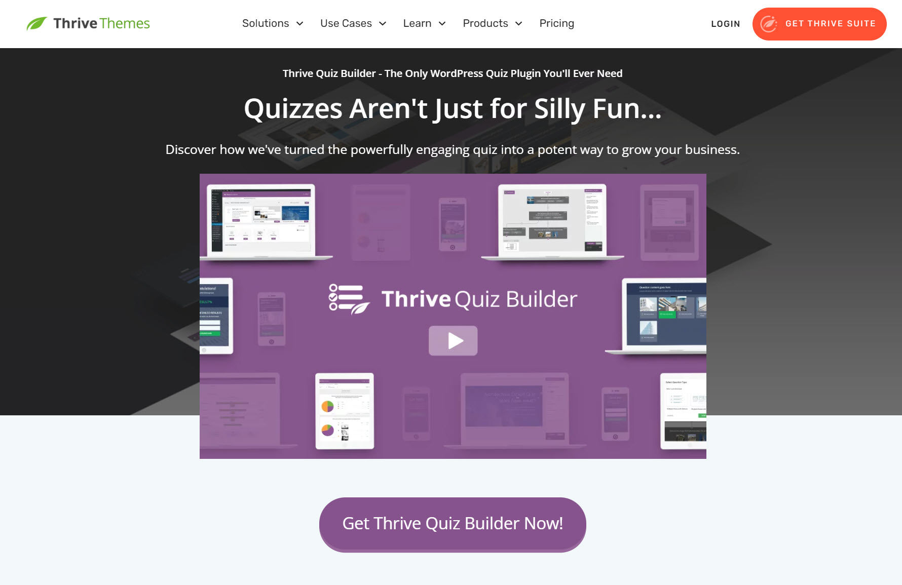
Thrive Quiz Builder is an excellent choice for creating online quizzes that not only engage your audience but also help with lead generation
This plugin boasts a user-friendly interface, a variety of engaging quiz types, and integrations that allow for seamless lead generation and segmentation.
You’ll also have access to in-depth analytics to study how your users engage with your quizzes, as well as the quizzes that resonate best with your audience.
Click here to learn more about Thrive Quiz Builder.
6. Use a Free Product to Sell One of Your Premium Products
As a new business owner, you might struggle to get your target audience to purchase one of your products.
You’re new to the industry and they’re still getting to know you. Sure, you’ve impressed them with your clean, conversion-focused website but they’re still not sure if they can commit to actually paying for one of your products.
This is the perfect opportunity to use a free offer or simplified version of your premium products to totally win them over.
For example, if you’re an online course creator who’s just launched a premium online course, you could benefit from this strategy.
Create a free ultimate PDF guide on a specific topic, or a free version of your premium course, and offer it as a teaser to your audience. After they’ve opted in for your free offer, send them timely emails that include your premium course as an upsell.
Your free offer could be access to one module in your course, resources related to your premium course, etc.
If your visitors are impressed with what they gain from your free offer, they’re likely to return to our premium offer and purchase it.
Watch this video to learn more about this game-changing technique:
7. Turn ChatGPT into Your Brainstorming Buddy for Better Content
This wouldn’t be a relevant guide if we didn’t include anything on AI.
ChatGPT is a powerful tool – you know that. But one question we hear regularly is, “How do I actually use it to grow my business?”
The good news: you don’t need to be an AI prompt engineering whiz to get the most out of ChatGPT and other AI tools. In fact, we’ve learned a simple strategy that’s helped us find ideal topics that resonate with our audience.
And now we want to show you how to do it.
1. Tell ChatGPT About Your Business & Your Customers
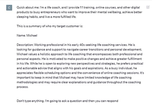
Introduce ChatGPT to one of your target customers. Give it a summarized overview of who you are and share your customer profile like this:

2. Use any of These Simple Prompts to Dive Deeper into Your Customers Needs
Before you dive in, remember: these prompts are just templates. If you want to switch them up a bit, go right ahead.
We’ve used the name “Michael” here because that’s the name of the example’s customer profile, but you can replace that name with a different one.
The prompts are:
- Is there anything about Michael I could've missed?
- Are there any other goals Michael could have?
- Tips to highlight the value of my 1:1 sessions to Michael?
- What kind of blog posts would Michael want to read on my website?
- *Pick a blog post topic you like from the list* “Why would Michael click on this link? What would he like to learn?”
- And how can I use this blog post to get Michael to opt-in for one of my lead magnets?
- Examples of useful, actionable advice I can put in my newsletter for my customers? Who are like Michael.
- What type of tips would Michael want to learn in a newsletter?
- What are some of Michael’s worries that my services can solve?
These prompts are to help you create deeper brainstorming sessions but you should take ChatGPT’s responses with a pinch of salt.
Remember, it’s a language model that’s still learning and it’s known to make mistakes.
If ChatGPT generates a response that doesn’t match your expectations, you can tell it to regenerate the response. Alternatively, you can provide ChatGPT with more context, to help it give you more accurate results.
The point of this exercise is to get insights you struggle to find when you do a Google search.
Just one of ChatGPT’s responses could spark a new idea you can try out – which could lead to more leads and sales.
ChatGPT is a powerful tool and you don’t need to be a tech whiz to tap into its power.
So, give a couple of these prompts a try and document your results.
And read this tutorial to find 54 more ChatGPT prompts to use in your blog, marketing, or social media strategies.
8. Repurpose Your Content to Reach More People
Fun fact: the information from the previous point came from our weekly newsletter.
And now, we’ve added this content to our blog post as a relevant tip for you to use in your content marketing strategy. That’s an example of repurposing your content.
Content repurposing is a tried and tested content marketing hack that saves you time and makes it easier to reach out to different audiences.
Let’s say you’ve created an awesome guide and published it in your blog post. Some of your audience members might prefer to watch a video, listen to a podcast episode, or look at an infographic, and, as a result, miss out on the key information you’ve shared in your blog post.
Depending on the resources you have, you can turn that blog post into a podcast episode, or a script for a 5 to ten-minute YouTube video – or do both!
That way, you can use one piece of content to reach out to three different audiences. Simple, time-saving, and convenient!
9. Be Action Driven
Too often with digital marketing, people become obsessed with traffic.
Yes, traffic is great, but it doesn't mean anything unless you turn it into something more. You have to have a clear goal in mind with all your content creation - what action do you want the reader to take next?
That might be getting someone to fill out a lead form, sign up for your email marketing, check out your social media platforms, or something else, but whatever you do, make sure you have a goal in mind. Effective content marketing isn't just about getting people to your site, it's about turning that traffic into something valuable.
It all starts with quality content, but once you've grabbed someone's attention, you've got to turn that into action. Really focus on your calls to actions (CTAs) and make sure you're making it obvious what steps you want people to take next.
Ultimately, this is what takes it from blogging to deliberate content marketing.
Final Thoughts: Is Your Website Helping or Hurting Your Content Marketing Strategy?
Now that you have the key tips you need to create an engaging, conversion-generating content marketing strategy, it’s time to focus on other parts of your business that could be stopping you from growing business and generating more sales.
Your website is the front door to your business and if that front door doesn’t look good or is hard to open or use, you’re going to lose a lot of potential customers.
Great content brings amazing results when it’s published on a clean website that looks great and is easy to navigate.
Are there buggy parts of your website you’ve turned a blind eye to? When you load your site do you ever think, “This could look so much better but I’ll fix it later…”
If you’ve been nodding along as you read this, then you need to take a look at your business website and determine whether it’s helping or hurting your business growth.
Here are four free resources to show you what a good business website should look like:
And if you feel like it’s time to make a change to your website, so you can finally reach your business goals, you should consider buying Thrive Suite.
Thrive Suite is an all-in-one toolkit that contains plugins, landing page templates, opt-in form templates, quiz templates and more; designed to help you create amazing content and make money from it.
If you've been thinking about building your own independent business and want to use high-quality tools for a crazy reasonable price - Thrive Suite could be for you.


This is brilliant and I like the number 6 and 7 part of the article