TL;DR: Hero Section Examples That Actually Convert
If you only have a minute, here’s what this guide covers:
Real-world inspiration, not gallery fluff. We’ll break down seven hero section examples from brands that balance clarity, emotion, and performance — across SaaS, e-commerce, coaching, and more.
Frameworks that scale. You’ll learn the anatomy of a high-performing hero section — headline, subhead, CTA, and visuals — and why message hierarchy matters more than trends.
Behind-the-scenes strategy. We’ll go beyond “good design” to explore performance optimization, accessibility, testing, and how to tailor your hero for your business type.
Out-of-the-box ideas. From interactive elements to personalization and storytelling, you’ll see fresh ways to turn your hero section into a true conversion driver.
Pro tools for creators. I’ll show you how I design and test every hero section visually using Thrive Architect inside Thrive Suite — no code, just data-driven design that converts.
By the end, you’ll know exactly how to build a hero section that earns attention, builds trust fast, and gets people to take action.
Have you ever opened a website and felt… nothing? No pull, no sense that it’s speaking to you?
I have—and almost every time, the problem starts at the top.
The hero section might be small, but it decides everything. It tells visitors if they’re in the right place, if they should trust you, if you understand what they need. Most of the time, it doesn’t.
I’ve spent years looking at why some hero sections make people stay while others quietly lose them. This isn’t about fancy gradients or clever animations. It’s about clarity, message, and emotional connection. In this guide, I’ll walk you through examples and frameworks that show how to build a hero section people actually respond to.
Before diving in, make sure you understand the optimal landing page structure — it’s the foundation that helps every hero section perform its best.
The 10 Questions Everyone Asks About Hero Sections
Before we overthink color palettes and headlines, let’s get the fundamentals right. These are the questions I get asked most often—and the ones that quietly decide whether your hero section earns attention or loses it.
It’s the first thing people see when they land on your website—the space above the fold that sets the tone for everything else.
I like to think of it as your first five seconds of trust. It’s not just decoration; it’s your message, identity, and invitation all rolled into one. If it’s confusing or forgettable, most visitors won’t even make it to your offer.
Every effective hero section includes four essentials:
- A clear headline that says what you do and why it matters.
- A supportive sub-headline that gives a touch more context or emotion.
- A call-to-action that invites the next step (not “Learn More,” but something specific and useful).
- A visual element that reinforces the message—image, video, or illustration.
Everything else is optional. If these four aren’t working together, no amount of extra design will save it.
It depends on what tells your story best—and how fast it loads. A still image works beautifully when it’s strong, relevant, and well-lit.
A short, muted background video can show a product or mood in seconds, but it must be optimized for speed and accessibility.
Illustrations add personality and flexibility, especially for brands selling ideas rather than tangible items. The key is purpose: your visual should clarify, not distract.
Speak to a person, not a crowd. Clarity beats cleverness every time. I aim for a single, outcome-driven sentence that answers the silent question: What’s in it for me? For example:
- “Build your website faster with tools that actually make sense.”
- “Find furniture that fits your life, not just your space.”
Write it as if you’re talking to one friend who’s slightly skeptical—and you only have one line to earn their trust.
It’s visible, specific, and emotionally aligned with what comes before it.
Instead of neutral labels like “Submit” or “Learn More,” I use copy that mirrors intent: “Start your free trial,” “See how it works,” “Book your spot.” The button should look clickable, feel relevant, and appear at a natural point in the reading flow—not buried under visual clutter.
A full-width image around 1920 × 1080 pixels works for desktops, but size is less about dimensions and more about weight.
I keep hero images under 200 KB—ideally closer to 100 KB—using modern formats like WebP. Responsive image tags ensure smaller devices don’t load the desktop version. Fast loading isn’t a technical luxury; it’s part of user experience and even search ranking.
Indirectly but powerfully.
A clear headline that matches user intent helps search engines understand your page. Visitors who quickly grasp your value stay longer and engage more—signals Google reads as quality.
Use a proper <h1> tag for your main headline, compress visuals, and make sure the page loads fast. The better the experience, the stronger the SEO feedback loop.
To go deeper, check out our guide on how to create SEO-friendly blog posts that win both readers and search engines.
- Unclear messaging — people shouldn’t have to decode what you do.
- Generic visuals — if it looks like a stock template, trust drops instantly.
- Too much text — you’re not writing an essay; you’re earning attention.
- Weak CTAs — invisible buttons or multiple competing actions confuse users.
- Ignoring mobile — a gorgeous desktop hero means nothing if it breaks on a phone.
Each of these mistakes comes from designing for ourselves instead of our visitors.
Design for thumbs and short attention spans.
Use larger font sizes, high contrast, and plenty of breathing space. Swap wide background images for cropped or vertical versions that load quickly.
Keep CTAs large enough to tap without zooming. I always test by opening the site on my phone and scrolling with one hand—if it’s not effortless, it’s not ready.
Start with your analytics: bounce rate, time on page, and clicks on your main CTA.
Then go deeper—run A/B tests on headlines, buttons, or visuals. Use heatmaps to see where people pause or scroll. Even a simple change in wording (“See plans” vs. “Get started”) can reveal what motivates your audience.
Data doesn’t replace intuition, but it keeps you honest about what’s actually working.
Hero Section Mistakes: Don’t Fall for “Copy-Paste” Inspiration
I used to treat design inspiration like a checklist. I’d open a dozen tabs, scroll through Dribbble, bookmark a few layouts from Landingfolio, and convince myself that I was being strategic. But when I looked closer, most of what I’d saved was surface-level—beautiful, yes, but disconnected from purpose.
Here’s what I’ve learned since:
- Industry showcases are great for context but rarely explain why a design works.
- Design galleries reflect what designers like, not what customers act on.
- Case studies often dig deep into SaaS examples that don’t translate across industries.
- Tutorials teach structure, not substance.
Each of these has value, but together they can trap you in imitation. You end up recreating what looks impressive instead of asking the harder question: what message does my audience need to feel right now?
A strong hero section doesn’t begin with aesthetics. It begins with understanding—what your visitor cares about, what they want to solve, and how you can meet that moment with clarity. That kind of insight can’t be copied. It’s built through empathy and intent.
If you’re looking for fresh, modern ideas that actually convert, browse our web design trends for 2025.
Why Ignoring This Costs You Conversions
I’ve built sites that looked sharp—but under the hood, they leaked visitors. Traffic arrived, paused, then disappeared. Analytics told me the same story: visits without engagement, eyes that never made it past the first scroll.
When the hero section doesn’t connect, people don’t linger. They don’t feel understood. They go elsewhere. And that’s not just lost opportunity—it’s lost momentum for your entire funnel.
Here’s what the data shows about how quickly that happens:
- 53% of mobile visitors leave if a page takes more than three seconds to load.
- Pages that load under three seconds see bounce rates as low as 8%, but that number jumps to 24% at four seconds and 38% at five.
- Every extra 100 KB in hero media increases bounce rate by roughly 1.8% — something we confirmed in our own tests.
- A one-second delay in page load time can reduce conversions by about 7%.
These aren’t abstract warnings. They’re real consequences. The moment someone lands on your site and your hero section doesn’t deliver clarity fast enough, you risk losing them before you’ve even made your case.
👉 Ready to plug the leaks? Follow our landing page checklist to make sure every section — starting with your hero — earns its keep.
When I look back on projects that underperformed, I almost always see the same pattern: the layout looked polished, but the emotional cue—why this matters to that person, right now—was missing or muffled. The headline was vague. The CTA was passive. The load speed was slow.
I never want you to lose a visitor because the top of your page felt heavy or hollow. In the next section, I’ll break down how to build the anatomy of a hero section that earns attention—and keeps it.
What Is The Structure of a High-Performing Hero Section?
Every great hero section follows a simple structure—but the magic lies in how those elements work together. Four parts, one purpose: to help a visitor understand, feel, and act.
You’ll see these same four elements in nearly every high-converting landing page example we’ve analyzed.
1. Headline: The Moment of Clarity
The headline carries the heaviest load. It’s the first thing someone reads, the anchor that decides if they’ll stay. A strong headline speaks directly to what the visitor wants—not what you sell.
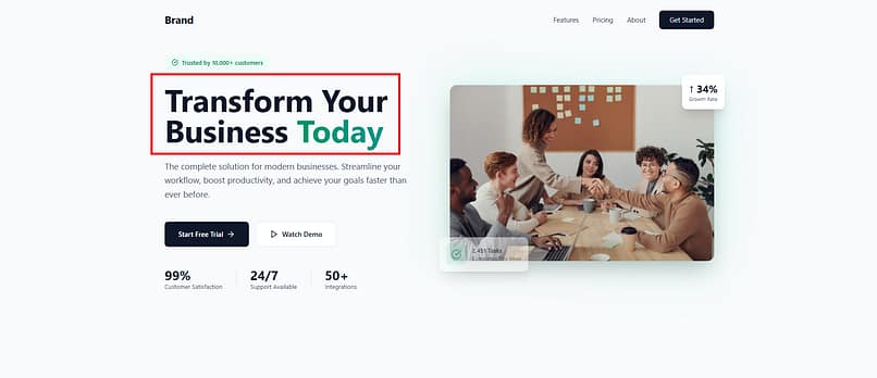
It should be unmistakably clear, outcome-driven, and written in natural language. If someone can’t explain your offer back to you in one sentence after reading it, it’s not ready.
Think:
“Plan smarter projects without endless meetings.”
“Create and launch your website in hours, not weeks.”
Short. Active. Human.
2. Sub-Headline: The Gentle Nudge
If the headline earns attention, the sub-headline earns belief. It’s where you give context or emotion—the “how” behind your promise.
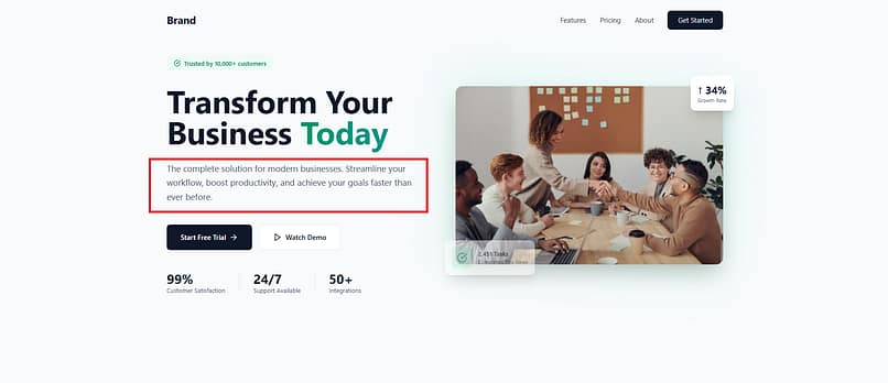
This line deepens the conversation: it explains who the offer is for, what problem it solves, or what transformation it creates. It’s not a repeat of the headline; it’s a layer beneath it.
Example:
“Built for creators who want design freedom without the overwhelm.”
3. Visual: The Emotional Shortcut
Once the words land, the eyes look for proof. That’s where your visual steps in. It translates your message into something people can feel.
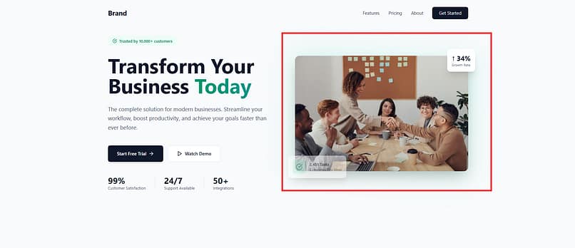
A crisp product shot, a looping interface demo, a photograph that mirrors your audience’s reality—whatever you choose, it must reinforce the story the copy already started. The wrong image can dilute trust as fast as the right one can build it.
Keep it fast, responsive, and intentional. If it doesn’t add clarity or emotion, it doesn’t belong there.
4. Call to Action: The Invitation
After clarity and emotion comes direction. The call to action turns interest into motion.
A good CTA feels like a continuation of the conversation, not a command. It uses active, benefit-focused language that matches the mindset your visitor is already in:
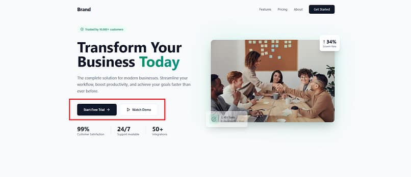
“Start your free trial”
“See how it works”
“Book a session”
The button should be visually distinct and positioned where the eye naturally lands after reading.
Why Order Matters
Our eyes follow a natural rhythm: headline → sub-headline → visual → CTA. Each step builds on the last. First, we understand the offer. Then, we believe it. Then, we feel it. Then, we act.
Design should serve that sequence. Too many pages flip it—putting visuals before meaning, or CTAs before clarity. But the message dictates structure, not the other way around. When the story flows in the right order, you don’t need gimmicks or tricks; the page quietly does its job.
💡 This same principle applies across your entire site — see how it impacts results in our 15 easy conversion rate hacks.
How I Build and Refine My Own Hero Sections
When I’m building hero sections, I rely on Thrive Architect — it’s the visual page builder inside Thrive Suite that’s built specifically for marketers and creators who care about conversions.
I like it because I can design directly on the page — drag, drop, resize, and rewrite in real time until the section feels right. No code, no waiting on developers, no guessing how it’ll look once it’s live. That freedom lets you focus on what matters most: crafting a clear message, testing different layouts, and seeing how each piece fits into the bigger conversion story.
💡 Want to see the whole process in action? Follow our step-by-step tutorial on how to create a hero section in WordPress that stops the scroll — complete with visuals, layout tips, and performance tweaks.
Or if you’re planning a full funnel, learn how to build a complete lead generation funnel using Thrive Suite.
Hero Section Examples That Actually Work (With Lessons You Can Steal)
It’s one thing to understand the anatomy. It’s another to see it in motion. I’ve studied hundreds of websites across industries—tech, e-commerce, education, and creative services—and the same truth always surfaces: design trends come and go, but clarity and empathy never miss.
The following examples stand out not because they’re flashy, but because every element works in service of a single, deliberate message. Each one shows how to translate principle into practice, and how subtle choices—tone, layout, pacing—can change the way someone experiences your brand.
Let’s break down what these sites do right, and what you can borrow for your own.
Don't Have Time to Read Through?
🧭 Type: SaaS Platform 🎯 Offer: Real-Time Financial Planning & Forecasting for Growth Teams
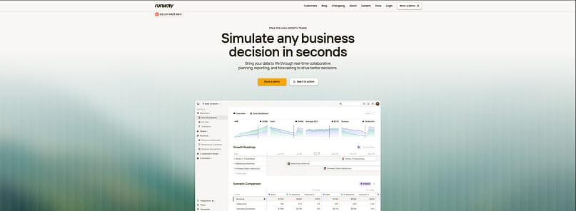
TL;DR: What Runway’s Hero Section Gets Right
Runway’s hero section is a great example of how clarity outperforms cleverness. The headline — “Simulate any business decision in seconds.” — doesn’t dance around what the product does. It says it straight, and I love that. There’s power in plain language when the offer is strong.
A few things I noticed:
- The headline grabs attention by promising speed and control — two words every growth team cares about.
- The sub-headline goes deeper: “Bring your data to life through real-time collaborative planning, reporting, and forecasting…” It’s clear, active, and ties every word to a real business outcome.
- The visual shows the dashboard immediately. Take a look at that choice — no abstract illustrations, just a real interface that makes the value tangible.
- The CTAs are smartly split: “Book a demo” for people who are ready, and “See it in action” for those who want a preview. It’s subtle but strategic.
This hero doesn’t try to impress through trend or flair. It earns attention by being direct, relevant, and believable — exactly what a SaaS page should do.
Why It Works
What I like most is how the structure respects how people actually read online. The eye moves from headline to proof to action, naturally. The gradient background fades away, giving space for the product to shine.
Runway’s page speaks to a specific kind of person — someone who makes decisions, not guesses. The tone matches that mindset: confident, unhurried, focused. And when a page feels that aligned with its audience, conversion becomes a byproduct of understanding.
🔑 Key Takeaways from Runway’s Hero Section
- Lead with a result. The best headlines tell visitors exactly what outcome to expect.
- Show the product early. Seeing is believing, especially in SaaS.
- Offer two paths. Give both the curious and the committed a clear next step.
- Keep hierarchy clean. Headline first, visual proof second, CTA last — in that order, every time.
🧭 Type: Fitness & Wellness Platform 🎯 Offer: Online Fitness Programs, Recipes & Coaching
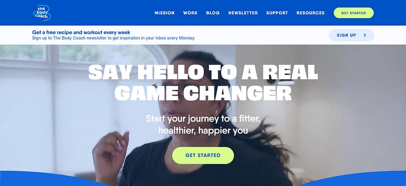
TL;DR: What The Body Coach’s Hero Section Gets Right
The Body Coach hero is full of movement and energy—exactly what the brand is known for. The headline, “Say hello to a real game changer,” sets an immediate tone of momentum. It feels like a personal challenge rather than a generic pitch, which fits the brand’s motivational identity.
A few things I noticed:
- The headline sounds human and confident, using everyday language that feels spoken, not scripted.
- The sub-headline adds warmth and direction: “Start your journey to a fitter, healthier, happier you.” It tells the reader what to do and why it matters—all in one line.
- The visual shows real motion: someone mid-workout, caught in that authentic, sweaty moment. That’s a cue of credibility—real results from real effort.
- The CTA, “Get Started,” is right where it should be—clear, visible, and repeated in the navigation. Every path leads to action.
The overall design mirrors the energy of the offer: bright colors, large typography, and a sense of rhythm that keeps you engaged. It feels like you’ve stepped into a workout, not just a website.
Why It Works
I like how this hero expresses vitality through design. The motion background adds life without overwhelming the message, and the copy matches that tempo with short, active lines. Everything on the screen reinforces a single idea—forward movement.
The Body Coach hero works because the brand knows who it’s speaking to: people seeking motivation and practical momentum. Every design and copy choice meets that emotional state.
🔑 Key Takeaways from The Body Coach Hero Section
- Match the page’s rhythm to the brand’s personality. Energy and optimism flow through every element.
- Use real motion and real people. Authenticity carries more weight than polished stock footage.
- Guide the visitor with a single, steady CTA. Consistency builds confidence.
- Lean into color and movement with intent. Vibrant design can communicate purpose when it supports the core message.
🧭 Type: Personal Brand / Online Coaching 🎯 Offer: Confidence Coaching and Online Courses

TL;DR: What Susie Moore’s Hero Section Gets Right
This hero speaks in a voice that feels both warm and certain — exactly what you want from a confidence coach. The headline, “Become the most confident person you know,” lands as both a promise and an invitation. It doesn’t overreach; it empowers.
Here’s what stands out to me:
- The headline leads with transformation, not tactics. It captures a desire that’s deeply human — and immediately personal.
- The supporting text reads like a gentle pep talk: “Your life belongs to you. And it’s happening now…” That phrasing gives momentum while keeping the tone nurturing.
- The visual works beautifully — Susie herself, relaxed, thoughtful, facing light. It signals trust and calm authority.
- The CTA, “Start Now,” sits right beside the message. The color choice — bright yellow — matches her brand’s optimistic tone and draws attention without shouting.
The composition feels natural. You see the person behind the offer and sense the clarity of her message. It’s a hero built for connection, not complexity.
Why It Works
I like how personal this hero feels. You can sense that Susie understands her audience — ambitious people who crave confidence but want compassion too. The mix of assertive language and approachable design balances empowerment with safety.
Every detail aligns with her positioning: soft background, open posture, simple typography. It’s the kind of design that says, “You’re in good hands.” And for a coaching brand, that emotional cue carries more weight than any visual flourish ever could.
🔑 Key Takeaways from Susie Moore’s Hero Section
- Lead with the emotional outcome. The headline centers on transformation the reader can envision.
- Use tone as strategy. Warm, confident language builds trust faster than claims of expertise.
- Show the person behind the brand. Visibility builds credibility in service-based work.
- Keep the CTA close to the promise. Placement and color reinforce immediacy and focus.
🧭 Type: EdTech / Online Learning 🎯 Offer: Interactive Coding & Career Development Courses
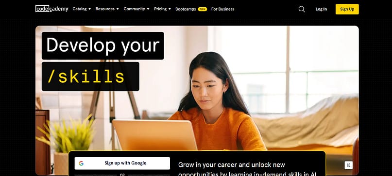
TL;DR: What Codecademy’s Hero Section Gets Right
Codecademy’s hero section shows how to turn simplicity into impact. The headline — “Develop your /career” — is short, confident, and perfectly on-brand. I like that it borrows from coding syntax (“/career”) because it instantly connects with the audience it serves. One glance, and you know this space is for people who build things.
A few details worth noting:
- The headline uses design as meaning — not decoration. The green “/career” command format ties back to the product’s core identity.
- The supporting text below focuses on outcomes: “Grow in your career and unlock new opportunities by learning in-demand skills in AI, data, and web development.” It’s all benefit, no jargon.
- The visual features a real person mid-laugh, framed in warm light. That choice humanizes what could easily feel like a tech-driven experience.
- The CTA — “Sign up with Google” or “Sign up” — keeps friction low. It’s positioned right where attention falls after reading the headline.
What makes this hero strong is its rhythm. It blends the precision of tech with the humanity of learning. Every element serves a purpose: clarity, accessibility, and trust.
Why It Works
I like how Codecademy manages to feel bold without being loud. The dark background and green highlights echo the look of a command line, while the smiling visual softens the tone. That tension — structured yet friendly — mirrors how people actually feel when they start learning something new: cautious, curious, hopeful.
The messaging also understands motivation. It doesn’t sell “courses.” It sells progress — a better career, new skills, upward motion. That’s the real value learners sign up for.
🔑 Key Takeaways from Codecademy’s Hero Section
- Use brand language intentionally. The “/career” syntax is more than clever—it’s identity shorthand.
- Lead with benefits, not features. People care about outcomes, not modules.
- Pair confidence with warmth. Real faces and natural light make digital products feel human.
- Design for immediate action. Clear, low-friction CTAs remove hesitation at the top of the page.
🧭 Type: E-commerce / Consumer Brand 🎯 Offer: High-Caffeine, Small-Batch Coffee
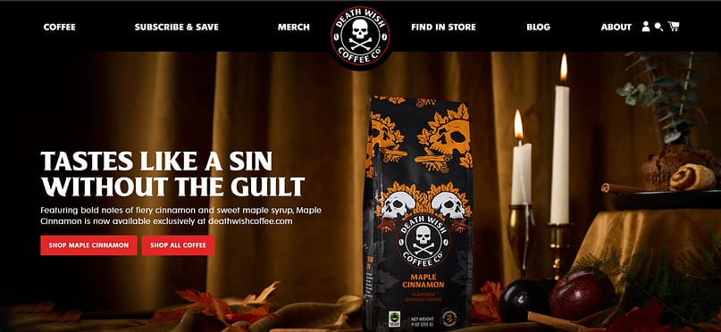
TL;DR: What Death Wish Coffee’s Hero Section Gets Right
This hero section wastes no time trying to please everyone — and that’s exactly why it works. The headline, “Tastes like a sin without the guilt,” lands like a punchline and a promise rolled into one. It’s bold, self-aware, and instantly defines who this coffee is for.
Here’s what I like:
- The headline carries the brand’s attitude — cheeky, unapologetic, and memorable. It doesn’t blend in with every other coffee brand trying to sound “premium.”
- The supporting copy brings flavor to life: “Featuring bold notes of fiery cinnamon and sweet maple syrup…” It’s sensory, direct, and tied to the product itself.
- The visual leans fully into the aesthetic — candles, skull motifs, deep tones. You can almost smell the spice and rebellion.
- The CTAs — “Shop Maple Cinnamon” and “Shop All Coffee” — give clear paths for both the curious and the decisive.
This hero feels like a scene. It builds atmosphere before it sells, and that’s rare. The confidence to lead with identity instead of mass appeal is what makes it stick.
Why It Works
I like how this page makes a statement without explanation. The tone, colors, and imagery form a world you either want to enter or scroll away from — and that clarity is a strength. When a brand owns its voice this completely, it becomes magnetic to the right people.
The visuals are rich and theatrical, but the copy keeps everything grounded in product benefit. You’re drawn in by personality, then convinced by flavor and exclusivity.
Death Wish Coffee shows that clarity isn’t always polite. Sometimes, it’s loud, dark, and exactly what the right customer wants.
🔑 Key Takeaways from Death Wish Coffee’s Hero Section
- Lead with voice, not volume. A strong point of view attracts more loyalty than generic charm.
- Use sensory language. Descriptive copy invites the audience to imagine the experience.
- Build atmosphere through design. Lighting, tone, and texture can tell a story before a word is read.
- Be unapologetically specific. Speaking directly to a niche builds stronger emotional resonance.
🧭 Type: SaaS / Productivity Platform 🎯 Offer: AI-Powered Workspace for Teams and Collaboration
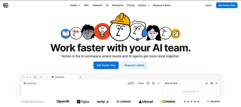
TL;DR: What Notion’s Hero Section Gets Right
Notion’s hero section reframes productivity through collaboration. The focus is simple: humans and AI working together to get more done. The headline — “Work faster with your AI team” — distills that idea in one line. It’s confident without being flashy and sets the tone for the rest of the page.
Here’s what I like about this design:
- The headline gives a clear benefit — speed — while positioning AI as something that works with you, not for you.
- The sub-headline adds context: “Notion is the AI workspace where teams and AI agents get more done together.” That phrasing bridges the gap between familiar teamwork and emerging technology.
- The visuals are thoughtful — illustrated faces representing collaboration between people and AI. They make the concept more human and easier to relate to.
- The product preview beneath the hero reinforces credibility with a live interface view and recognizable partner logos (OpenAI, Figma, NVIDIA). That’s proof and social validation rolled into one.
- The CTAs, “Get Notion free” and “Request a demo,” make sense for their mixed audience — one caters to individual users, the other to enterprise teams.
Why It Works
I like how Notion positions AI as a collaborator instead of a replacement. That subtle shift changes how the page feels — approachable rather than futuristic or abstract. The design mirrors that balance. Light backgrounds, calm typography, and clean spacing create an open, welcoming impression.
I’ve noticed that even with its global presence, Notion still manages to feel personal. The copy is plainspoken, the tone is steady, and there’s no sense of corporate distance. I think that’s what keeps it relatable. For freelancers or small teams, the dual CTA says, “You belong here too.” For larger organizations, the design signals scale without shouting about it.
Everything in this hero builds quiet confidence. The message is clear, the visuals are friendly, and the pacing gives space to absorb the idea before acting.
🔑 Key Takeaways from Notion’s Hero Section
- Lead with clarity, not cleverness. Simple phrasing builds faster understanding.
- Show collaboration visually. The illustrated team faces make a complex idea feel human.
- Use proof early. Combining partner logos with the interface establishes trust quickly.
- Design for inclusivity. Dual CTAs and an open layout create room for both individual and enterprise users.
🧭 Type: E-commerce / Skincare Brand 🎯 Offer: Custom-formulated skincare with ongoing expert consultations
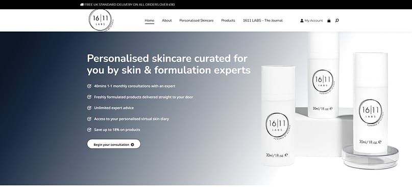
TL;DR: What 16|11 Labs’ Hero Section Gets Right
The 16|11 Labs hero section is clean, composed, and confident. The copy speaks directly to a single person — not an audience segment or demographic, but you. The headline, “Personalised skincare curated for you by skin & formulation experts,” feels like the start of a one-on-one conversation rather than a sales pitch.
A few things I really like:
- The headline establishes trust immediately through expertise (“formulation experts”) while keeping the tone warm and conversational.
- The supporting bullets act as micro-proof points — consultations, fresh formulations, ongoing advice — all practical benefits that add credibility without clutter.
- The CTA — “Begin your consultation” — reframes conversion in a smart way. It’s not asking for a purchase, it’s offering help. That small shift makes it approachable for first-time visitors and subtly builds authority.
- The design balances professionalism and calm. White packaging against a muted gradient background creates a sense of science-backed care rather than vanity marketing.
Why It Works
What stands out to me here is restraint. The page doesn’t push urgency, it earns attention through precision. Every line serves a purpose. Instead of glamor or hype, the design speaks the quiet language of trust — clinical visuals, clear structure, and consistent spacing.
I also like how the hero gives visitors agency. The CTA feels like a step forward with the brand, not into it. By calling the quiz a consultation, they elevate the perceived value of the first interaction. It’s no longer just a “form” — it’s the beginning of a relationship.
This hero section reminds me that minimalism isn’t about fewer elements; it’s about fewer distractions. When every word and visual aligns with the brand’s core promise, you don’t need anything extra.
🔑 Key Takeaways from 16|11 Labs’ Hero Section
- Lead with credibility, not claims. “Formulation experts” signals authority more effectively than adjectives ever could.
- Turn your CTA into an invitation. Framing the quiz as a consultation shifts the emotional tone from selling to guiding.
- Use structure as design. Spacing, bullet points, and soft gradients communicate calm professionalism.
- Make minimalism strategic. Focus and clarity can feel luxurious when done with intention.
Section 6: What These Hero Sections Teach Us About Clarity, Connection & Conversion
Across industries, the best hero sections do three things well:
1. State value fast – in plain language.
2. Show proof early – through visuals, social cues, or structure.
3. Guide action clearly – with CTAs that feel natural, not forced.
Below is a quick-view summary of what each example teaches:
Quick Lessons from 7 Hero Sections
- Runway: Clarity meets proof — show what you offer and how it works.
- The Body Coach: Use movement and emotion to reflect your audience’s energy.
- Susie Moore: Write like you’re talking to one person; empathy drives trust.
- Codecademy: Keep it modern and forward-moving; let design echo progress.
- Death Wish Coffee: Bold identity wins. Speak directly to your true audience.
- Notion: Simplicity scales. Clear messaging makes complexity approachable.
- 16|11 Labs: Focus and restraint communicate authority; calm sells confidence.
Comparison Table
Hero Section Example Comparison
Brand / Type | Visual Style | Copy Focus | CTA Style | Key Lesson |
|---|---|---|---|---|
Runway – SaaS | Product-driven, live demo imagery | Benefit + proof | “Try Runway Free” – immediate | Pair visuals with results for instant credibility |
The Body Coach – Fitness | Dynamic video + bright color | Motivation + emotion | “Get Started” – action oriented | Energy and tone are design tools |
Susie Moore – Coaching | Warm portrait + soft light | Personal empowerment | “Start Now” – friendly invitation | Connection > credentials |
Codecademy – Education | Bold black & green contrast | Transformation through learning | “Sign Up / Log In” – straightforward | Modern clarity drives engagement |
Death Wish Coffee – E-commerce | Dark, high-contrast visuals | Cheeky confidence | “Shop Now” – direct sale | Strong voice attracts right buyers |
Notion – Productivity | Clean white space + illustrations | Collaboration with AI | “Get Notion Free / Request a Demo” | Simplicity bridges audiences |
16 | 11 Labs – Skincare | Minimal, gradient background | Expertise + personalisation | “Begin Your Consultation” |
Main Takeaway
Every high-performing hero section balances message, proof, and motion. When visitors land on your page, they’re asking three silent questions:
1. What do you do?
2. Why should I care?
3. What should I do next?
Answer those clearly — with visuals that reinforce your words — and your hero section will do the one job it’s meant to do: keep people on the page long enough to say yes.
⚡ Quick Break — Build It the Smart Way
If you’ve been nodding along thinking, “I need to fix my hero section” — this is the part where I remind you that you already have the tools to do it right.
With Thrive Suite, you get everything you need to design, test, and refine high-converting pages — from the first headline to the final CTA.
I use Thrive Architect to design every hero section visually (no code, no stress) and Thrive Optimize to A/B test different versions directly inside the same editor. It’s the easiest way to go from idea to data-backed improvement — without juggling plugins or analytics dashboards.
If you’re serious about conversions, it’s worth building with tools that speak the same language.
Section 6: Beyond the Basics — What the “Best of” Lists Don’t Tell You
Most “best hero section” roundups stop at aesthetics — clean layouts, catchy headlines, great photography. But the difference between a good hero section and a high-performing one comes down to what happens behind the scenes.
Here’s what those top-10 lists rarely explain:
Performance as Design
A beautiful hero section that takes six seconds to load isn’t a hero — it’s a barrier. Performance isn’t an afterthought; it is part of the design.
Keep hero images under 200KB, and export them in WebP or AVIF format to retain quality while cutting file size. Use responsive image sizes (srcset) so mobile users aren’t forced to download large desktop assets.
These small technical details directly affect bounce rate, engagement, and SEO. Faster pages convert better because they respect your visitor’s time — and that’s good design in action.
Accessibility Is Strategy
Accessibility isn’t decoration — it’s communication. When users can’t read your text, navigate your structure, or control animations, you lose them before they even see your message.
These practices don’t just meet compliance. They build trust by signaling professionalism and care — qualities every visitor feels, even subconsciously.
Testing, Not Guessing
No amount of theory can replace data. What you think will perform isn’t always what your audience responds to.
Start simple:
A headline that you love may underperform next to a clearer one. The lesson isn’t about guessing better — it’s about building a system that tells you why something works.
Context Is King
What makes a hero section effective changes depending on your audience and offer. The visual hierarchy, tone, and CTA should all mirror what your visitor expects when they land.
Hero Section Context
Type | What Matters Most | Common Pitfall | What Works Better |
|---|---|---|---|
SaaS / Tech | Product clarity, demo visuals, social proof | Overloading with jargon or feature lists | Pair a single benefit headline with a short explainer video or animation |
E-commerce | Emotional imagery, trust signals, instant clarity | Focusing on looks over load speed | Lead with lifestyle context and quick-add CTAs |
Local Services | Credibility, human connection | Generic stock imagery | Use real team photos and one strong local proof element (e.g., Google rating) |
Creative Portfolios | Visual identity, personality | Too much minimalism or ambiguity | Combine strong visuals with a line that defines your craft clearly |
Context turns best practices into strategy. When you know what your visitors care about, you can make design decisions that meet them where they are — not where design trends say they should be.
Want to put everything you’ve learned into practice? Use our website optimization checklist to fine-tune your hero section and beyond.
Section 8: FAQs — Hero Sections Explained
A hero section is the main, above-the-fold area of your homepage or landing page. It introduces your brand, communicates your value, and guides visitors to act — usually with a headline, subhead, and CTA. A banner, on the other hand, is usually smaller and used for temporary messages (like sales or announcements). The hero is part of your site’s foundation; a banner is more like an update that comes and goes.
Technically yes — but I don’t recommend it. A second “hero-style” block further down the page can work as a reinforcement section (especially for multi-offer sites), but there should only be one true hero at the top. If everything is shouting for attention, nothing feels important. Keep your main hero focused and consistent.
It depends on your traffic source and intent.
- If visitors already know who you are (organic or returning traffic), linking directly to your sales page works best.
- If they’re new and still learning about your brand, a lead magnet or free consultation CTA usually converts higher.
I often test both versions — “Start Free Trial” vs. “See How It Works” — to learn which intent my audience responds to more.
They work for everyone. Big brands often have more visuals and polish, but small businesses have an advantage: authenticity. A well-crafted headline, a real team photo, and a clear promise often outperform corporate polish. People don’t care about your size — they care about whether you can solve their problem quickly and clearly.
Vertical hierarchy always wins on mobile. Stack your headline, sub-headline, image, and CTA in a clear, scroll-friendly order. Use larger text (at least 18–20px), reduce padding so content feels cohesive, and ensure buttons are tap-friendly. Avoid side-by-side columns; most mobile users skim, so vertical alignment helps them stay oriented.
You can — but use them wisely. Generic stock photos can break trust because people recognize them instantly. If you use stock, customize it: crop, color-correct, or overlay text to make it feel branded. Whenever possible, use authentic visuals — real products, real teams, real spaces. Even an iPhone photo with good lighting feels more believable than a staged image of “happy coworkers.”
Aim for 6–10 words. Long enough to make a promise, short enough to read at a glance. The goal is comprehension in under three seconds. If your headline takes longer to process, trim filler words or split supporting details into a subhead. I always test shorter variants first — concise usually outperforms clever.
There’s no universal “best” color — only the one that stands out in your design system. If your brand palette is mostly cool (blues or greys), try a warm CTA (orange or coral). If your palette is warm, use a contrasting cool tone (blue or teal). The rule is simple: contrast = visibility. Always ensure sufficient color contrast for accessibility.
If your brand serves clients or companies, absolutely. Logos act as social proof — they transfer credibility in seconds. Just make sure they don’t crowd your headline. A small, grayscale row beneath the hero (or just below the fold) works beautifully. For B2C brands, consider replacing logos with trust signals like star ratings or testimonials.
When your analytics or intuition tell you people aren’t connecting. Watch for:
- High bounce rates from your homepage.
- Declining click-throughs on your main CTA.
- Visitors spending less time on page.
- A brand shift that your current hero no longer reflects.
If your business evolves, your hero should too. Redesign isn’t just cosmetic — it’s a reflection of growth.
Conclusion: Hero Section Examples
When I look at every high-performing website I’ve built or studied, one pattern always stands out — clarity wins. A great hero section doesn’t rely on trends or tricks; it earns attention through intention.
For me, that means thinking beyond the pixels. The message has to land fast. The page has to load even faster. And every design choice — headline, image, button, spacing — should make it easier for someone to say yes.
That’s what separates something that just looks good from something that actually works. I’ve seen the difference in analytics, in leads, and in the way visitors move through a page when everything feels intuitive. It’s the kind of detail you can’t fake.
So don’t aim for “pretty.” Aim for purpose. Build hero sections that tell your story clearly, respect your user’s time, and adapt as you learn more about what converts.
If you want to design and test those pages without wrestling code or guesswork, Thrive Architect and Thrive Suite make it effortless to build, experiment, and optimize until your hero section truly earns its name.
Because when your message, design, and performance finally align — that’s when your site stops whispering and starts working.


Wow, so detailed and helpful