WordPress themes have come a long way, haven’t they? Back in the day, you couldn’t choose your theme color or your font — you were stuck with what the theme developer gave you.
Today, Thrive Theme Builder allows you to choose any color you want for any element on your entire website.
It’s jaw-droppingly customizable.
But with great customizability can come great confusion. What’s a global color? Why didn’t this update like I thought it would?
In a past article, we covered how to use the Outside-In Principle to customize your website’s typography. In this article, we'll explore how using this exact same principle will allow you to take complete control over your website's colors and create gorgeous pages more quickly than ever.
Once you start using this method, you’ll wonder what you ever did without it.
More...
But before we get into the Outside-In Principle, it would be helpful to understand the basic color tool in the Thrive visual editor: the color picker.
The Color Picker
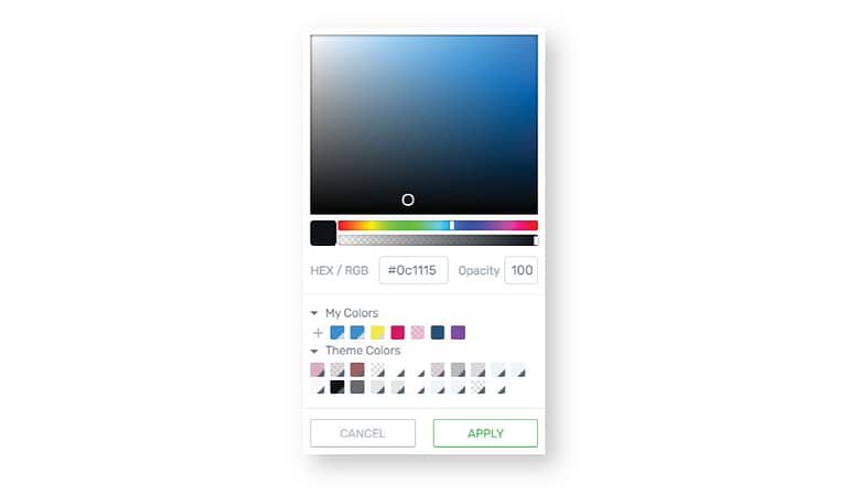
The Thrive visual editor color picker
The color picker appears whenever you click on a color swatch within Thrive Theme Builder or Thrive Architect. There are several elements that can be assigned a specific color, so you’ll find color swatches in a variety of places.
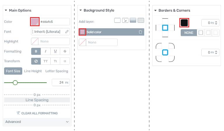
Some of the options within the Thrive visual editor that allow you to choose a color.
Assigning a Color
The simplest way to assign a color to an element is to simply select the element and choose a color from the color picker. Start by selecting the element that you wish to customize, then:
1. Use the rainbow slider to select a general color.
2. Drag your mouse over the color field to select the right shade.
3. Use the opacity slider or field to select the transparency of the color.
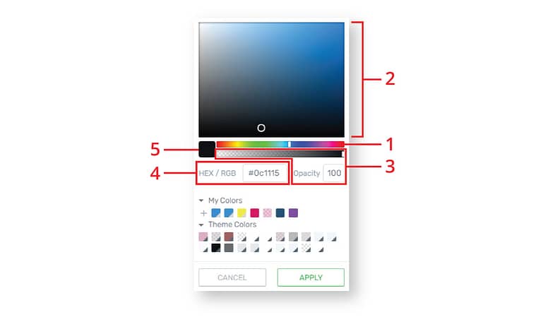
Alternatively, if you already know the hex code for a specific color that you would like to use, you can enter it in the HEX/RGB field. (4)
To clear your color selection, simply hover over the main color swatch and click on the “X”. (5)
After making your selections, you'll notice that the element you've selected in the editor has updated to reflect your choices. Click “Apply” and close the window.
That was pretty easy, right?
But... what if you want to use the exact same color on multiple elements? Should you go through this entire process again?
No need! You can save colors for easy access later. These saved colors are called...
Favorite Colors
If there's a color that you would like to use for multiple elements on your site, saving it as a favorite color will spare you the hassle of trying to pick the exact same color, or typing in exact hex codes.
To save a favorite color, use the rainbow slider and color field to make your color selection, and make sure that the color you want to save is shown in the main color swatch.
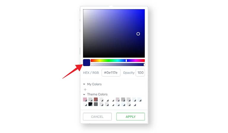
The color picker with the main color swatch called out.
Then, click on the plus sign under My Colors, and choose “Favorite”. You'll see that a new swatch has been added to your My Colors list.
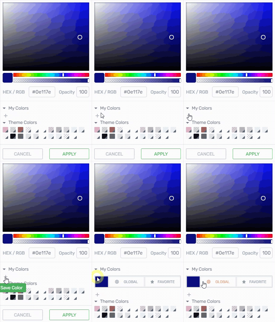
How to save a favorite color.
To rename or delete a favorite color, click on the swatch for the particular color. When the name of the swatch appears, click on the color's three dot menu and follow the prompts.
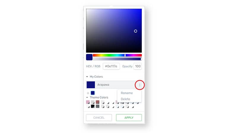
The color picker with the three dot menu circled.
Favorite colors are handy because they're easy to access, and using the same ones over and over will keep the colors consistent throughout your website.
But... what if you want to easily change your brand's colors? What if you decide to change everything from blue to purple?
Should you spend hours and hours assigning new colors to all of the elements on your website? Should you tear your hair out in frustration?
No need! You can assign colors in such a way that simply updating your saved swatch will automatically update all of the elements that use the swatch. These colors are called...
Global Colors
Global colors are like favorite colors in that they're easy to access in the color picker, and using them will keep the colors on your website consistent.
However, global colors have an added feature: when you assign an element a global color, this links the element to color. If you then edit the specified global color, every element to which the color was assigned will automatically change as well.
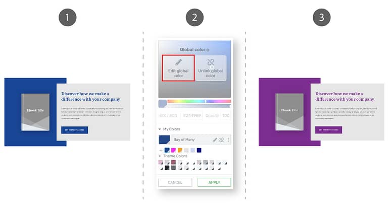
How global colors work: 1. Assign a global color (blue) to various elements. 2. Edit the global color (change blue to purple) . 3. All elements that use the global color will automatically update.
To save a global color, use the color picker and rainbow slider to make your color selection, and make sure that the color you want to save is shown in the main swatch.
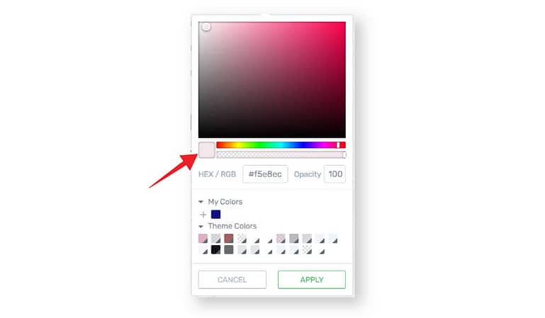
The color picker with the main swatch called out.
Then, click on the plus sign under My Colors, and choose “Global”. A new global color swatch will be added to your My Colors list.
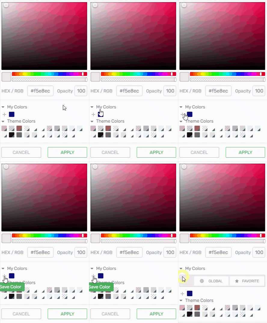
How to save a global color.
Global colors are denoted with a small grey triangle in the lower right corner of the swatch.
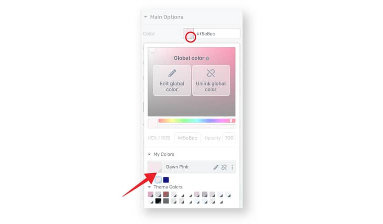
A saved global color with the grey triangle called out.
If you're new to global colors, think about them like pro sports teams. Every team has their own team color. If our team color is pink, everyone must wear pink jerseys. Whenever someone new joins the team, he or she gets assigned a pink jersey to match the rest of the team.
So when you assign an element a global color, it’s almost like adding that element to the sports team. Then, if the owner of the team decides to change the team color from pink to blue, every player on the team will be automatically issued a new blue jersey.
Back in Thrive Themes land, if you edit the global color and change it from pink to blue, all of the elements that were once assigned the pink global color will automatically update to blue.
And that brings us to...
Editing Global Colors
To edit a global color, first select an element that uses the color you would like to change, and click the appropriate color swatch to open the color picker. When the color picker appears, simply click the “Edit global color” button or the pencil icon next to the swatch name.
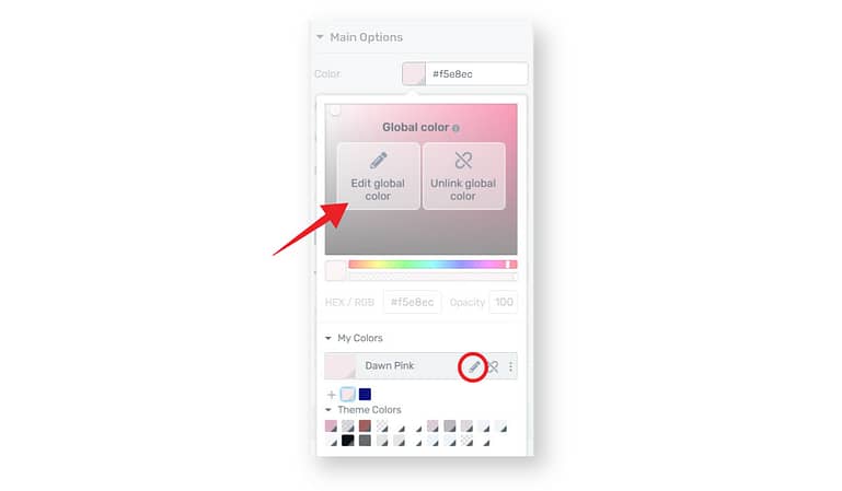
The color picker with the "Edit global color" button called out.
Choose a new color, then click the check mark to confirm your changes.
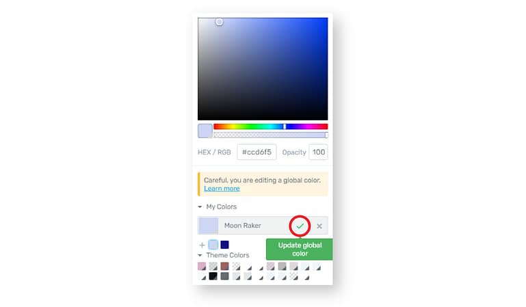
The color picker with the option to update a global color called out.
Voilà! All of the elements throughout your entire website that were once pink are now blue — if they were originally assigned the pink global color.
If you update a global color and find that an element did not update as you expected it to, it is most likely because the element was assigned a regular or favorite color instead of a global color.
Watch out for this mistake!
There’s one “gotcha” to watch out for as you edit global colors.
Selecting a new color swatch is not the same as editing a global color, and will not result in global changes. Going back to our analogy, this would be like removing a player from the team. While this is not necessarily a bad thing (maybe the player is joining a new, better team!), it is important to be aware of the difference.
Unlinking Global Colors
Sometimes, a player just isn't happy on a team. Let’s say a player decides that they don’t like the jersey color, and they decide to quit the team. This is like unlinking an element from a global color.
To unlink an element from a global color, select the element, then click the “Unlink global color” button or the unlink icon next to the swatch name. This will not immediately change the color choice, but will unlink the element from the global color. You can then choose a new color.
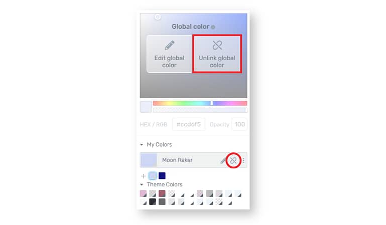
The color picker with the option to "Unlink global color" highlighted.
If you are switching from a global color to any other swatch listed in My Colors or Theme Colors, you do not need to unlink the element from the color; simply click on the new color swatch that you would like to assign to the element.
Theme Colors
You might have noticed a curious array of global colors at the bottom of your color picker.
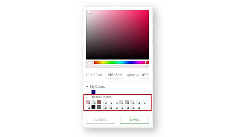
The color picker with Theme Colors highlighted.
“Did I choose these? Where did these come from?” you might wonder.
When you set up your website using the Thrive Theme Builder Site Wizard, it will automatically generate coordinating global Theme Colors and assign them to various elements throughout your website. As you customize your website, you may pick from these Theme Colors in addition to any new favorite or global colors that you might save.
Now that you’re familiar with the color picker, let’s explore the Outside-In Principle.
What is the Outside-In Principle?
We mentioned the Outside-In Principle in a previous article related to font customization, but just the same, let's go ahead and recap:
When applying the same styling to multiple elements, apply the styling to the parent container of those elements, starting from the biggest container, working your way inwards to the smallest container.
In general, smaller containers override larger ones.
The idea is that instead of applying the exact same color specifications over and over to individual elements, you can save precious time and energy by simply applying the specification to the container around the elements – once – and everything inside the container will take on that specification.
The container levels for pages and posts that use a theme template versus standalone pages are slightly different, and are as follows:
For pages and posts that use a theme template, you would start making customizations at the theme level, then move on to the theme template level, proceed to the section level, and lastly, address individual elements.
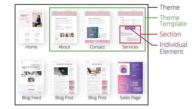
Diagram showing container levels for posts and pages that use a theme template.
Standalone pages, such as a sales page, do not use a theme template, so they have a slightly different container structure. Your customizations would start at the theme level, then you’d move on to the standalone page level, proceed to the section level, and wrap up with individual elements.
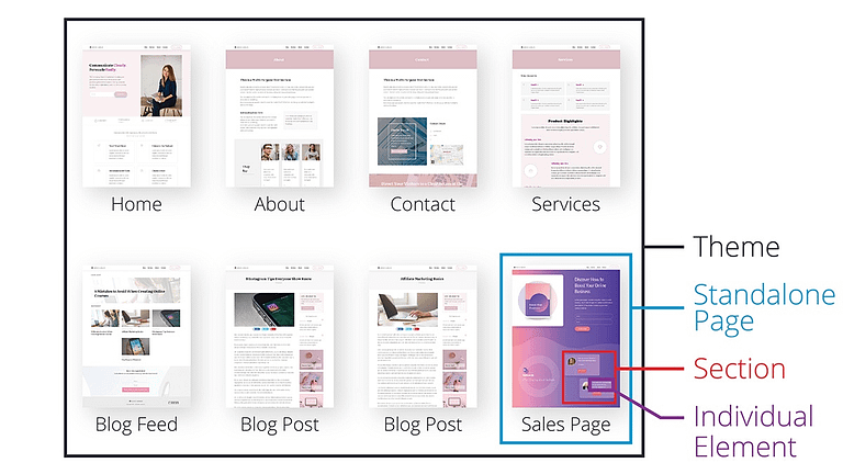
Diagram showing container levels for standalone pages.
To use the Outside-In Principle to make customizations to your website, we recommend starting with the largest container, the theme level, and working your way through the smaller containers.
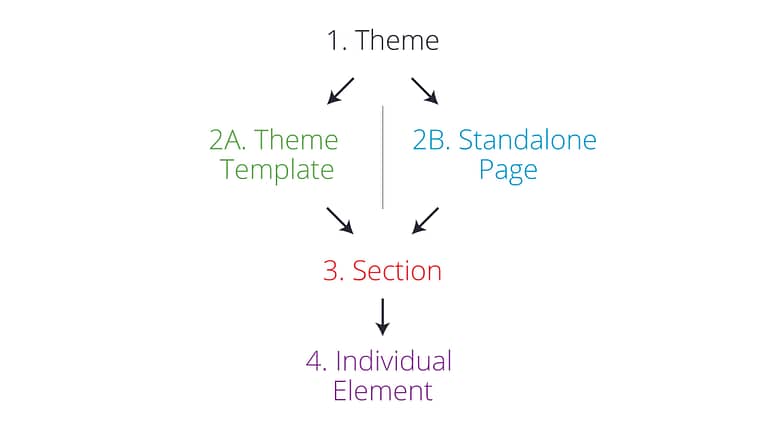
Flow chart showing container levels for the Outside-In Principle.
Using this method, you can avoid the tedious task of making the exact same customization to multiple elements, while at the same time guaranteeing that the styles on your website remain consistent.
So, are you ready to start building? Then let's begin customizing colors!
The Theme Level
When you go through the Thrive Theme Builder Site Wizard, one of the first customizations you'll make is choosing your website's main brand color.
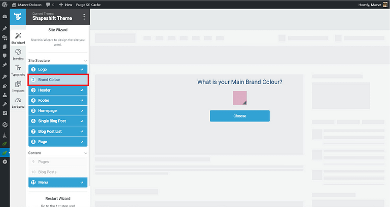
Thrive Theme Builder with the Brand Colour tab highlighted.
Using this color, Thrive Theme Builder will automatically create coordinating Theme Colors for use in background sections, buttons, icons, and more. Theme Colors are global, and they will be added to your Theme Colors palette automatically. You can read more about Theme Colors here.

The color picker the Theme Colors highlighted.
Here's the magic of Thrive Theme Builder: if you only have one brand color, your color customizations could be considered done — even if you haven't yet built any pages, or customized anything else on your site. From here on out, Thrive Theme Builder will take care of color-coordinating any new blocks or elements that you add to your pages and posts.
How's that for easy?
“But what if I have more than one brand color?” you ask.
In that case, choose your main brand color here at the theme level, and then you can introduce your other brand colors as you make customizations at subsequent container levels.
The Theme Template Level
Theme templates are generally used to ensure that groups of pages and posts have the same structure. For example, a theme template would be handy if you wanted to make sure that your About and Contact pages have the same header, footer, and display their page titles the same way.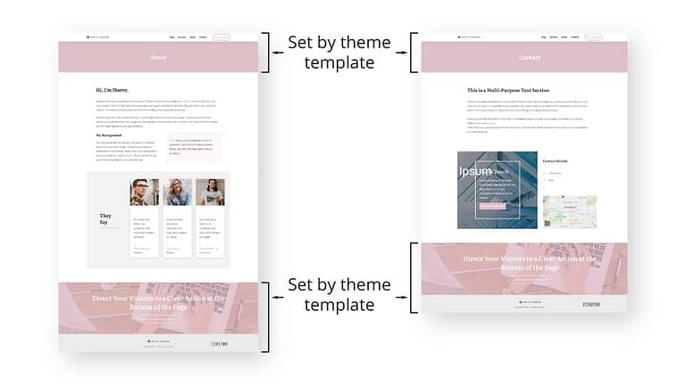
An About page and a Contact page that use the same theme template.
However, when it comes to color customization using the Outside-In Principle, the main application at the theme template level is likely going to be the background style or color for the entire page.
For example, we could add a light grey background color to our About and Contact pages by opening our default page template in Thrive Theme Builder…
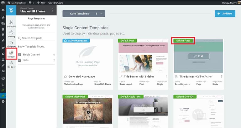
Thrive Theme Builder with the Templates tab and the Default Page highlighted.
…and then navigate to the theme template settings, open the Background Style tab, and apply a light grey color layer. We recommend using global colors whenever possible so that if you decide to change your brand colors later, you can easily update all of the elements that use a particular global color in just a few clicks.

How to apply a background color and save it as a global color.
Any pages that use this template will now have a light grey background.
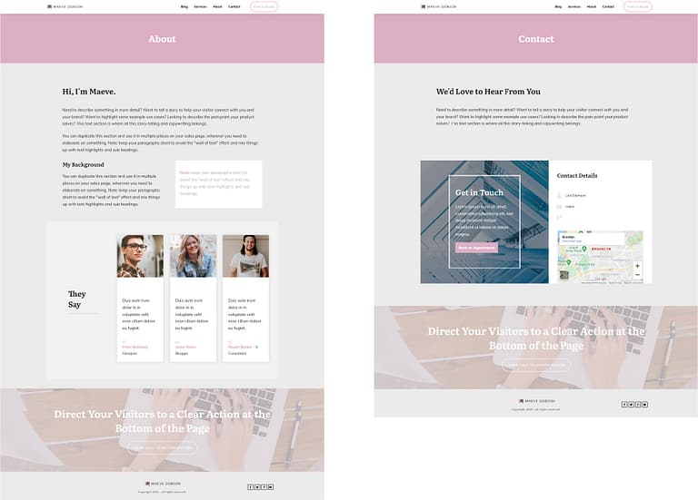
The resulting About and Contact pages.
But wait, shouldn’t this change the background color for the entire page? How come some sections still display other background colors?
The Outside-In Principle is already at work here, so smaller containers have overridden larger ones. Our designers have specified background styles for specific sections to aid you in designing beautiful pages. If the backgrounds for these sections had no particular specification, they would be grey as well.
The Standalone Page Level
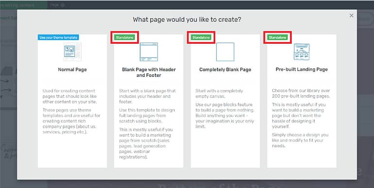
The introductory screen when creating a new page. Standalone page options are highlighted.
Standalone pages are generally used for pages that are structurally or stylistically different from the rest of the pages on your website. For example, you might use a standalone page for a sales page if you want the page to display a different header or footer from the rest of your website. Since this page is the only one on your site with this format, it is appropriate to use a standalone page.
Like the theme template level, the Outside-In Principle is useful at the standalone page level when customizing the background style for an entire page.
This is especially helpful for pages like long form sales pages. Long form sales pages typically have many sections, and a common way to delineate sections is switching background colors. At the standalone page level, you can specify a background color or style for the page. Then, you can create visual separation by specifying different background styles for particular sections.
Let’s take a look at how to accomplish this. Here we have a sales page that could use some background color customizations.

A basic long form sales page.
To specify a background style for the entire page, use the breadcrumbs to select Page Settings, then open the Background Style tab.
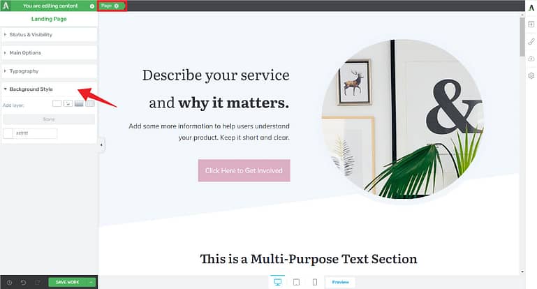
The Thrive visual editor with the Page Settings and Background Style tabs highlighted.
Using the Background Style tab, you can add a solid color background, an image, a gradient, or a pattern. In this example, we’ll click on the solid white button and add a light grey background color.
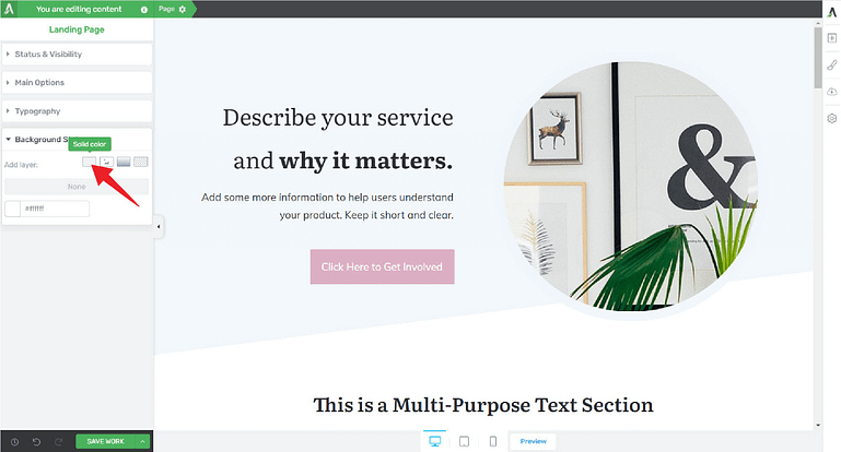
The Thrive visual editor with the Solid color button highlighted.
The resulting color change gives us:

A basic long form sales page with the added background color.
Then, we can make further background color customizations at the section level.
The Section Level
At the section level, you can customize colors for containers that might contain multiple elements. For example, you can customize blocks, background sections, columns, content boxes, and the like.
Continuing with our example, we’ll select a background color for the Product Highlights block to distinguish that section from the rest of the page.
Using the breadcrumbs, we’ll select the Block element, and then open the Background Style tab.
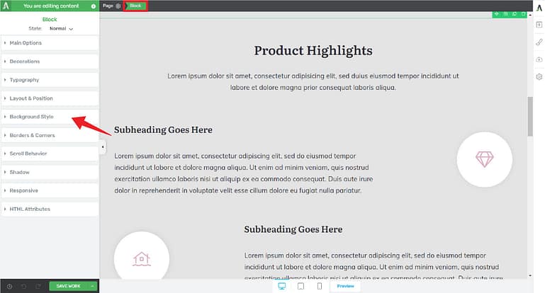
The Thrive visual editor with a block section and the Background Style tab highlighted.
Then, click on the solid white button and add a blue color layer.
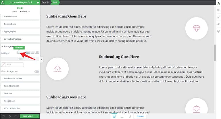
The Thrive visual editor with the Solid color button highlighted.
While we’re at it, we might as well save the color as a global color. This way, if we want to use this color on another element, it will be readily available. And, if we ever decide to change our color scheme, all elements to which this color is assigned will be easy to update. To save the color as a global color, click the plus sign under My Colors...
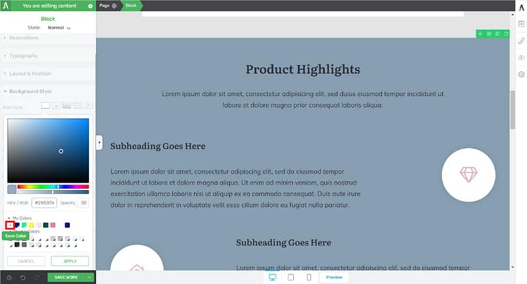
The Thrive visual editor color picker with the plus sign highlighted.
… and select “Global”.
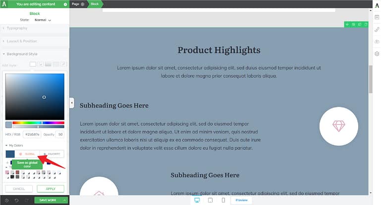
The Thrive visual editor color picker with the Global color button highlighted.
A new global color swatch will be added to your list of colors.
Lighter text would be easier to read on a dark background, so we can customize the font at the section level as well. Making sure that the correct Block is selected in breadcrumbs, we can navigate to the Typography tab and choose a new color.
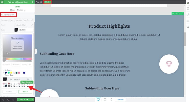
The Thrive visual editor with the Typography tab and a new color highlighted.
After making all of our section level changes, here is the resulting page.

Much better than before, right?
At this point, you might be wondering: Why did we bother with customizing the background at the standalone page level if we could simply make all of our background specifications at the section level?
There’s certainly no harm in making all specifications at the section level, however, using the Outside-In Principle can save you precious time. If the majority of your background sections are going to be assigned a particular color, you can simply assign the color to the entire page once, versus assigning the color multiple times to multiple background sections. After making your page-wide specification, you can then cherry pick sections that require color customizations as needed.
The Individual Element Level
Finally, the background color of any individual container can be changed by selecting the container and choosing a new color. This is helpful when you want to call attention to a particular piece of information, or add a bit of visual interest.
For example, in a three column layout, you can call attention to a particular piece of information by changing the background color of just one column. In the example below, let’s add a white layer to the background of the middle column. Let’s also reduce the opacity of the white solid layer to let the blue background show through.

How to add a background color to a single column in a three-column section.
Then, don’t forget to save the color as a new global color. Click plus sign under My Colors, and select “Global”.

How to save a global color.
Although saving global colors is an extra step in the design process, it’s well worth it to take the time to set up global colors properly. Not only does having a saved swatch make assigning colors easier and faster, but if you ever want to change your branding colors later, it couldn’t be simpler!
Changing Your Theme Colors
Now that we’ve gone through all of the levels, let’s explore how to change your theme colors.
The Central Style Panel
As you work on your site, at some point, you might decide to change your main brand color or some of the theme colors used on various elements. On theme templates and standalone pages only, you can access the Central Style Panel (which will then open the Style Editor) and do just that.
The Central Style Panel lets you make theme level changes from a theme template or standalone page. Note that the Central Style Panel takes on a slightly different role for non-ShapeShift pre-built landing pages, which we will explore in a moment.
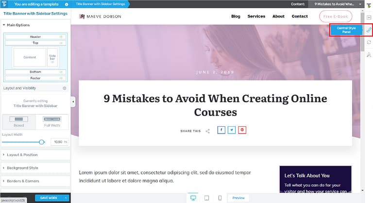
A theme template with the Central Style Panel button highlighted.
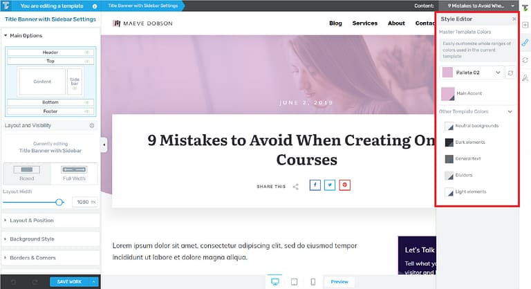
A theme template with the the Style Editor open.
When you open the Style Editor, you’ll see your website’s Master Template Colors as well as Other Template Colors.
The Main Accent color is linked to the Main Accent color in the Branding tab inside of Thrive Theme Builder, as well as the Main Brand Color in the Site Wizard, so changing one will change all three.
The Other Template Colors are automatically selected by Thrive Theme Builder, and these colors, along with the Main Accent color, are the basis for the Theme Colors listed in the color picker. To change global Theme Colors for things like backgrounds and dividers, use the colors listed here.
All of the swatches listed in the Style Editor are global colors, so changes made here will reflect throughout your site.
The Central Style Panel is for editing colors only. You cannot assign colors to elements using this panel. To assign colors, use the color picker on the left side of the page.
The Branding Tab
You can also make color changes by navigating to Thrive Theme Builder and accessing the Branding tab. Then, select the Theme Colors dropdown.
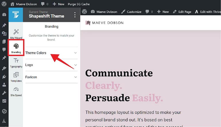
Thrive Theme Builder with the Branding tab highlighted.
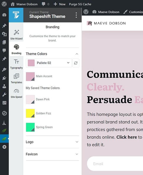
The Branding tab with the Theme Colors dropdown open.
In the Theme Colors dropdown, you can edit your Main Accent color as well as your Saved Theme Colors.
- The Main Accent color is the same as the Main Accent color in the Central Style Panel on Theme Templates, and the Main Brand Color in the Site Wizard.
- Your Saved Theme Colors will list any colors that you’ve saved as a global color and used on at least one element on a theme template. If a particular global color has been used only on a standalone page, or only within the content section of a page or post, it will not appear in the Branding tab Theme Colors list.
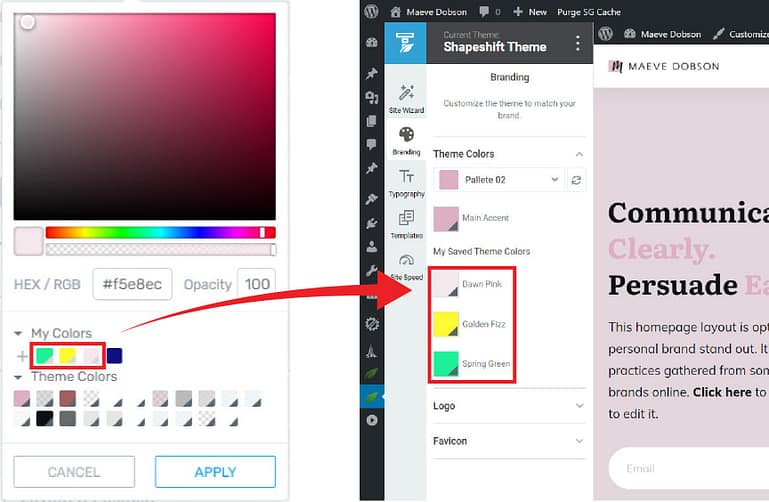
My Saved Theme Colors in the Branding tab come from global colors used on theme templates.
To edit any of the colors listed in the Theme Colors section of the Branding tab, simply click on the swatch and use the color picker.
Finally, non-ShapeShift pre-built landing pages are somewhat of an exception to the Outside-In Principle because they have been carefully designed by our designers, and come with their own set of colors and fonts.
Non-ShapeShift Pre-built Landing Pages
Pre-built Landing Pages are standalone pages that have been designed as a part of a landing page set. Non-ShapeShift Pre-built Landing Pages, such as those indicated below, have their own template colors that are completely separate from the theme colors in Thrive Theme Builder.
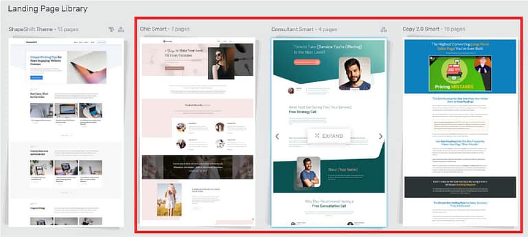
Sets of non-ShapeShift pre-built landing pages.
What’s unique — and almost magical! — about non-ShapeShift pre-built landing pages is that the color scheme for each page is both completely done for you and customizable. Let’s take a look.
The overall color scheme for non-ShapeShift pre-built landing pages is determined by the Master Template Colors shown in the Style Editor.
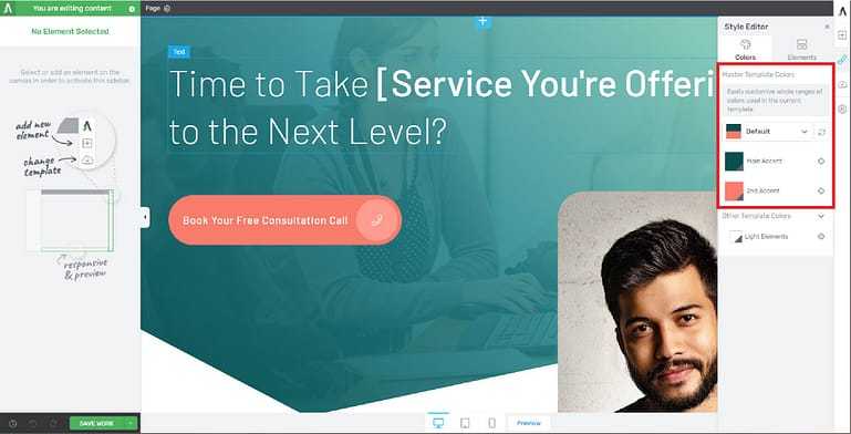
A non-ShapeShift pre-built landing page with the Master Template Colors highlighted.
Here’s what the default colors look like on a landing page (abbreviated for length) from the Consultant Smart set :
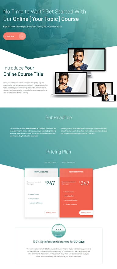
Notice the Template Colors that are now available in the color picker when an element on this page is selected. These colors are based on the Master Template Colors, and are automatically generated for you. You may use these colors as you customize elements on the page such as buttons, dividers, and background sections.
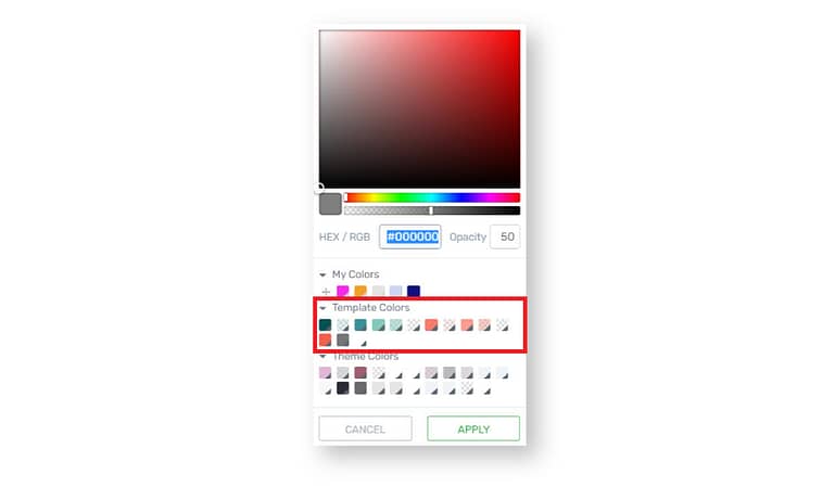
The Template Colors available on a non-ShapeShift pre-built landing page.
If you would like to change the overall color scheme to match your brand, you can do so by accessing the Central Style Panel and choosing different colors for the Main Accent and 2nd Accent colors.

How to change the Master Template Colors on a non-ShapeShift pre-built landing page.
Voilà! After those two simple color changes, here is the updated page.
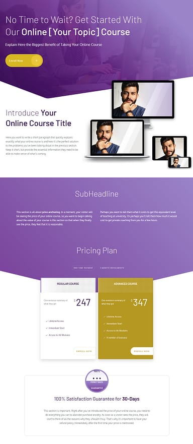
And, you’ll see that the template colors in the color picker have updated as well.
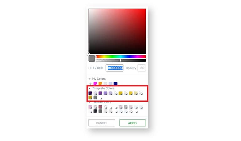
Pretty cool, right?
A Note Regarding “Global” Template Colors on Non-ShapeShift Pre-Built Landing Pages
Although the color swatches listed in the Style Editor have the small grey triangle indicating that the color is a global color, with non-shapeshift pre-built landing pages, “global” refers to this landing page only. These color swatches will not appear in the Branding tab or in the color picker when editing pages outside of this one.
Now, what if you would like to edit the template colors, but aren’t sure which combinations look nice together?
Simply click the dropdown menu and choose from one of our pre-built color combinations. It couldn’t be simpler!
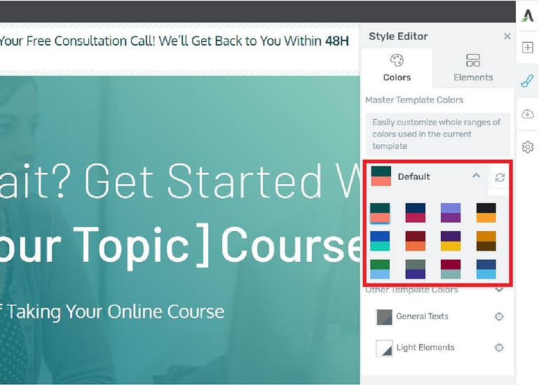
The pre-built color combinations on a non-ShapeShift pre-built landing page.
After setting up your main colors for the page using the Central Style Panel, you can then use the Outside-In Principle to customize colors for sections and individual elements like normal.
Your Turn to Use the Outside-In Principle
So, that’s how you can use the Outside-In Principle to customize the colors on your website. Hopefully you can see how using global colors in conjunction with various container levels will help you create gorgeous websites faster.
And not just that — in a year or two, if you decide to change your main brand color, you’ll be able to do it in just a few minutes, with as few clicks as possible.
Of course, you’ll only be able to do this if you have Thrive Theme Builder, so if you don’t have it yet, why not give it a try?
If you have any thoughts or questions about how to use the Outside-In Principle, leave us a comment below!



Thanks Christine… terrific tutorial!! Your instructions were very clear and easy to understand. Thank you 😉
I’m glad you like it 🙂 Thanks for tuning in and for the compliment.
Your blog is very nice, thanks to upload this.
Thanks Akshita! You’re welcome, I’m glad you like it.
Great video Christine – I hope you do more of them
Thanks Catherine! I will be doing more 🙂
Thank you Christine, this video came just at the right time, as I am finishing a new website, and it’s time to set all the colors. 🙂
Excellent! Let me know if you have any questions.
Thanks Christine. Very clear, good pace.
Thanks Sue, glad you like it 🙂
Very clear ….saving time and mental health. Thanks Christine.
Thanks Duric!