TL;DR: How to Show Off Your Products So People Actually Buy Them
I know you're busy, so here's the quick rundown. Your potential customers are looking at multiple options, and they don't have time for guesswork. This article dives into the best ways to present your products or services so people can quickly understand the differences and make a confident choice.
Three Key Takeaways for Skimmers:
- Clarity is King: Ditch the walls of text. Your comparisons need to be scannable and easy to understand at a glance.
- Visuals Drive Decisions: People process images faster than words. Use charts, cards, and infographics to highlight what makes your offers unique.
- Meet Them Where They Are: Different comparison formats work best at different stages of the buyer's journey. Mix and match to guide people from curiosity to purchase.
Ready to stop losing sales to confusion? Dive into the details below.
I've asked myself this question countless times when I’m brainstorming how to present our offers: what makes someone choose your product over the five other tabs they've open right now?
The truth is, people don’t have the patience to decode walls of text or guess which plan is right for them. They want clarity. They want shortcuts. And if we don't give it to them, they'll find someone who will.
Over the years, I've learned that a great product comparison isn't just a feature list; it’s a decision-making tool. When you lay out the differences with intention, you're not only guiding someone through your offer, you're building trust.
You're saying, "I get what you need, and I've thought this through for you." That's why I pulled together the formats in this guide, the ones that actually help visitors make a choice instead of clicking away. Some are quick and visual, others more detailed, but they all work because they respect your customer's time.
Understanding the Buyer's Journey: Why Product Comparisons Matter
When I think about why we even bother with product comparison ideas, it always comes back to the person on the other side of the screen.
They're on a journey, often a confusing one, trying to figure out if what you offer is the right fit for them. Your job, and mine, is to make that journey as smooth and clear as possible.
Think about your own shopping habits. When you're trying to decide between a few options, what do you do? You probably open a bunch of tabs, skim, and look for something that quickly tells you the differences that matter. Your potential customers do the exact same thing. They're busy people, and they're likely checking out your competitors too.
So, when someone lands on your page, you need to show your product's value quickly and clearly. This is about helping customers make confident decisions. The best product comparison ideas don't just inform; they guide. They meet your audience where they are in their buyer's journey, whether they're just starting to evaluate options or are ready to make a purchase decision. Different comparison formats cater to different stages, helping move people along.
💡Sometimes, a great way to guide them is by letting them discover what they need through a product recommendation quiz.
Understanding how your customers move through their journey is super important, and we've got a whole guide on what the buyer's journey really means.
The Psychology Behind Product Comparisons That Work
Our brains are wired for comparison. It’s how we make sense of the world. But there's a fine line between helpful comparison and overwhelming information.
- Cognitive Load: Too much information at once, especially in dense text, creates cognitive overload. Your brain has to work harder to process it, which often leads to decision fatigue. Visuals, on the other hand, reduce this load. My brain processes an image much faster than a paragraph. (If you want to really see how people are processing (or not processing!) your pages, website heatmaps can give you some amazing insights.)
- Decision Fatigue: When people are faced with too many choices or too much complex information, they get tired and often default to doing nothing at all. A well-structured comparison simplifies the decision, making it easier for them to pick something.
- Trust and Transparency: When you openly compare your product, even acknowledging potential drawbacks, you build credibility. It shows you're confident in your offering and not trying to hide anything. This transparency often tips the scales in your favor.
Product Comparison Ideas: Promote Your Offers Better, Visually
I've seen a lot of businesses hide their product's true value behind walls of text, expecting their visitors to do all the heavy lifting.
But the thing is: people are visual creatures. We process images far faster than words, and when it comes to making a buying decision, a clear visual comparison can be the difference between a sale and a lost opportunity.
If you're wondering how to get those awesome images for your site, we've got some tips on creating images for your blog or website.
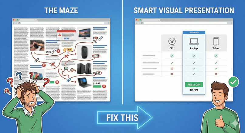
Have you ever landed on a site where the product descriptions felt like a maze? Blocks of text, scattered features, and prices hidden behind three clicks. Your visitors hate that too. But here's the good news: you can fix this with smart visual presentation. (Making sure your site is easy to navigate and understand is one of those must-have website features that really makes a difference.)
Visual comparisons tap into how our brains naturally process information. We make buying decisions faster when we can see differences clearly laid out. Just look at how major brands handle this, they rarely expect you to read through endless paragraphs to understand their product lineup.
When you organize your comparisons thoughtfully, you show respect for your visitors' time and demonstrate confidence in your offering. You're not hiding anything behind complicated navigation or vague descriptions.
Thoughtful organization also applies to your overall site, and we've got some fantastic website layout ideas to inspire you.
Best Practices for Designing Visual Comparisons
The key to creating effective visual comparisons is to make sure they're useful.
- Consistency is Key: Use the same icons, colors, and layout for similar features across all products or plans. This makes it easy for the eye to track and compare.
- Highlight Key Differences: Don't make your visitors hunt. Use bold text, different colors, or even a "Recommended" banner to draw attention to the most important distinctions or your preferred option.
- Scannability Above All: Break up information into bite-sized chunks. Use plenty of white space. People should be able to glance at your comparison and grasp the main points within seconds.
- Focus on Benefits, Not Just Features: Instead of just saying "50GB SSD Storage," explain what that means for the user: "Faster loading times for a smoother user experience."
- Mobile-First Mindset: Many people will view your comparisons on their phones. Make sure your tables and charts are responsive and easy to read on smaller screens. Vertical tabs, which I'll get to later, are great for this (Making sure your tables look good on any device is super important, and we've shared some great ways to create mobile responsive tables in WordPress.)
Tools for Creating Visual Comparisons
You don't need to be a design wizard to create compelling visual comparisons. Several tools can help:
- Thrive Architect: My personal favorite. It's a WordPress page builder that lets you easily create pricing tables, comparison charts, and even interactive elements like vertical tabs with a drag-and-drop interface. You get templates, and you can customize everything without touching code.
- Canva: Great for infographics or static comparison images. It has a ton of templates you can adapt, making it easy to create something professional-looking even if you're not a designer.
- Spreadsheets (Google Sheets/Excel): For data-heavy comparisons, you can organize your information here first, then export it or use it as a basis for a more visual tool.
- Dedicated Comparison Table Plugins: If you're on WordPress, there are plugins specifically designed to build comparison tables, often with features like sorting and filtering.
Seriously, you can create some stunning visuals without being a pro, especially with these free tools for visual content.
7 Best Product Comparison Ideas You Can Easily set up Today
I often hear people say they don't have the technical skills or the budget for fancy comparison tools. But you don't need to be a coding genius to present your products clearly. There are plenty of accessible product comparison ideas you can set up today, no matter your technical comfort level.
You don't need advanced tech skills to create helpful product comparisons.
Start with whichever method feels most comfortable for your current setup. Maybe that's a simple chart, or perhaps you're ready to try something more interactive. You can mix and match these ideas to find what clicks with your audience. to the options.
1. The Good Ol’ Static Comparison Chart
Sometimes, the simplest approach is the most effective.
A static comparison chart might seem a bit old-school, but it works: it presents information in a digestible, scannable format that helps visitors quickly grasp the core differences between your offerings.
A static comparison chart might sound a little basic, but it remains one of the best ways to showcase your product's value.
These charts work because they give visitors exactly what they want, a clear, scannable overview of features and benefits without requiring extra clicks or interaction. They're especially good for users in the consideration phase of their buyer's journey, helping them quickly evaluate options.
You can use static comparison charts in two main ways:
Brand vs. Competitor Comparison
Look at how ClickUp structures their comparison with Asana.
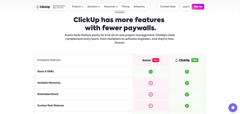
They've laid out key features side-by-side, making it easy for potential customers to spot the differences. The key isn't to disparage your competition, but to highlight where your product shines. ClickUp demonstrates this by focusing on specific features their target audience values. This helps users make a more informed purchase decision.
Product Tier Comparison
You can also use a static comparison chart for your own products. Take a page out of Thrive Themes’ book:
This chart, from our Thrive Architect sales page, shows how to showcase different pricing tiers effectively.
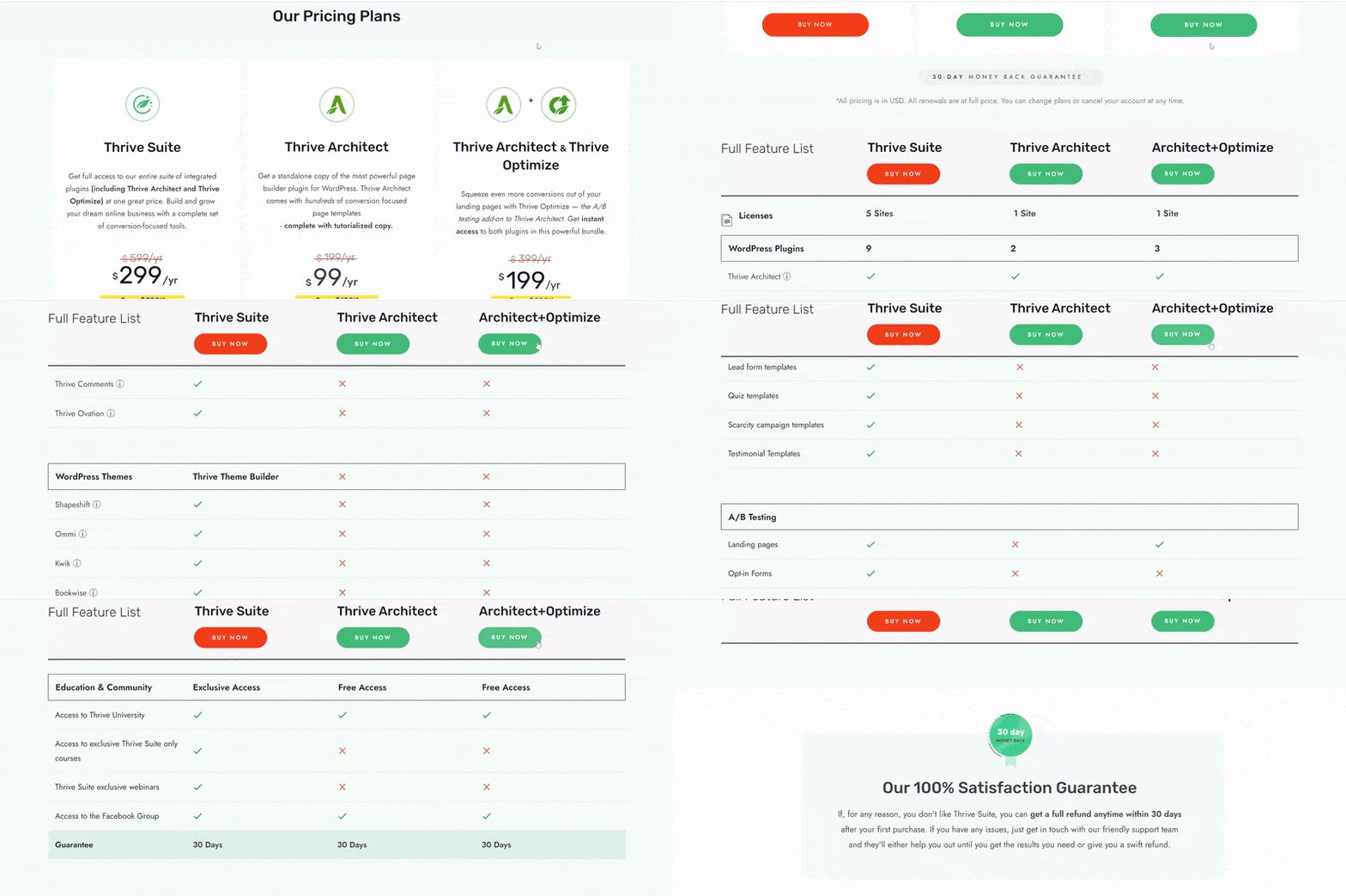
This is a smart way to help your visitors understand the added value they get by choosing a higher-tier plan. Notice how we highlight our recommended option, it guides users while still letting them make their own choice. It's a direct way to help them with their purchase decision.
You can easily set up a pricing or comparison table like this in Thrive Architect, the best landing page builder for WordPress. You get a variety of templates to choose from and a drag-and-drop editor for super straightforward building. If you want to give your landing pages a premium touch, this is the tool for you.
By the way, if you're curious about all the ins and outs of my go-to tool, you can check out our full Thrive Architect review.
2. Interactive Comparison Chart
If you've got a lot of products or a highly engaged audience, an interactive comparison chart can make a big difference. It puts the power in your visitor's hands, letting them choose exactly what they want to compare, which often leads to a much deeper level of engagement and understanding.
Interactive comparison charts are great for eCommerce stores or review platforms that cover a lot of products. So, if you’re an affiliate or an online business that deals with a variety of products (say, from drop-shipping, perhaps), you can use this product comparison idea to keep your audience on your site for longer. This format is excellent for users deep in the consideration stage, actively trying to evaluate options.
The example below is from a skincare review platform, Skinsort. You’re given a choice to select two products from a dropdown list and compare them.
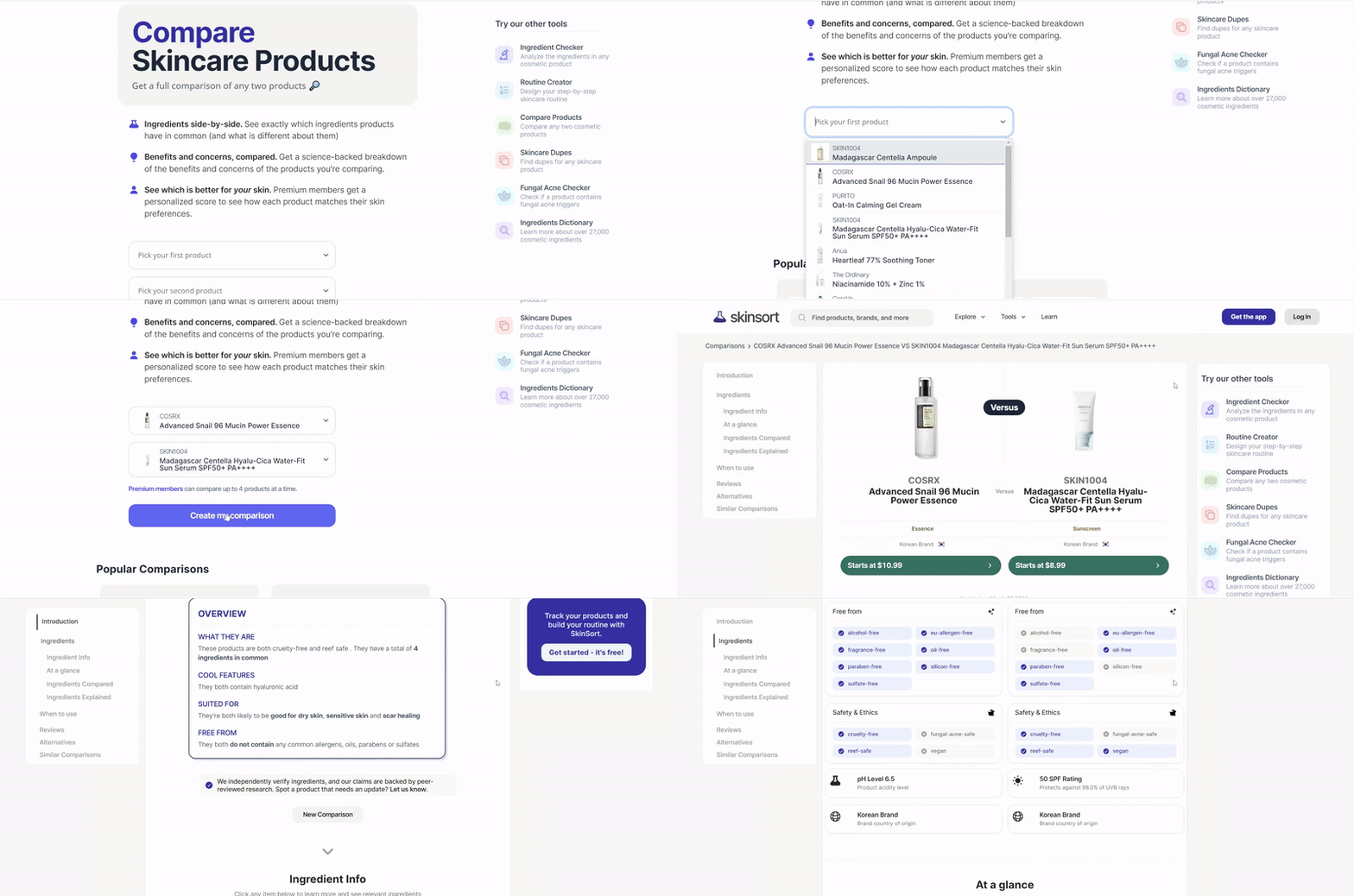
Think about it: when you let people pick exactly what they want to compare, they become active participants in their buying journey instead of passive readers.
They work for different types of potential customers. Someone just looking for basic features can keep things simple, while your tech-savvy visitors can dig into detailed feature comparisons. You're basically giving each visitor their own personal shopping assistant.
Pro tip: Don't worry if this sounds technically challenging for your website. You can start small, try adding expandable sections to your product pages, clickable tabs that reveal different comparison points, or simple show/hide buttons in your blog posts. These little interactive touches can make a big difference in how people engage with your comparisons and move closer to a purchase decision.
💡If you're thinking about building a site focused on reviews, we've got a comprehensive guide on how to create a product review website.
💡And if you're just getting started with selling online, you might find our guide on how to start an ecommerce store really helpful.
3. Pros and Cons List
I've noticed that when people are making a decision, they don't just want to hear the good stuff. They want a balanced view. That's where a solid pros and cons list comes in, offering a transparent and trustworthy way to help your audience weigh their options.
If you create review content or promote affiliate products, a well-structured pros and cons list can be your secret weapon. It's perfect when you want to show your audience why you genuinely recommend one product over another, especially if you've tested multiple options in your niche. This format is particularly useful for those in the later stages of the buyer's journey, helping them weigh the final factors before a purchase decision.
This kind of transparency also works wonders in quiz funnels, helping people get personalized recommendations based on their needs.
Take a page from Macworld’s book. They added a pros and cons table to each of their product reviews to help their audience get a quick overview of each product.
The last time you read a review, did you scroll straight to the pros and cons? There's a high chance your audience will. They trust this format because it shows you're not just highlighting the good stuff. By acknowledging potential drawbacks alongside benefits, you build credibility with your readers.
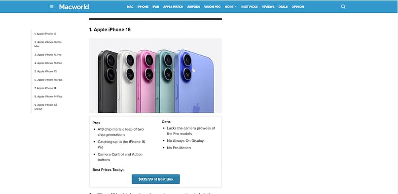
For review posts, structure your pros and cons to match what your audience cares about most. Let's say you're comparing email marketing tools. Start with the standout features that solve common problems for your readers: "Pro: Creates beautiful email templates in minutes without design skills." Then balance it with real limitations: "Con: Advanced automation features only available in higher-priced tiers."
4. Side-by-Side Card Comparisons
When you need to give a bit more detail than a simple chart allows, but still want that clear, visual distinction, side-by-side card comparisons are a fantastic solution. They let you tell a richer story for each product without overwhelming the reader.
Think of side-by-side card comparisons as the detailed storytellers of the comparison world. While static charts give you quick feature checkmarks, cards let you paint a fuller picture with proper explanations and context. This is great for users who are digging deeper to evaluate options before their purchase decision.
I like what NerdWallet has done with their side-by-side (literal) card comparisons:
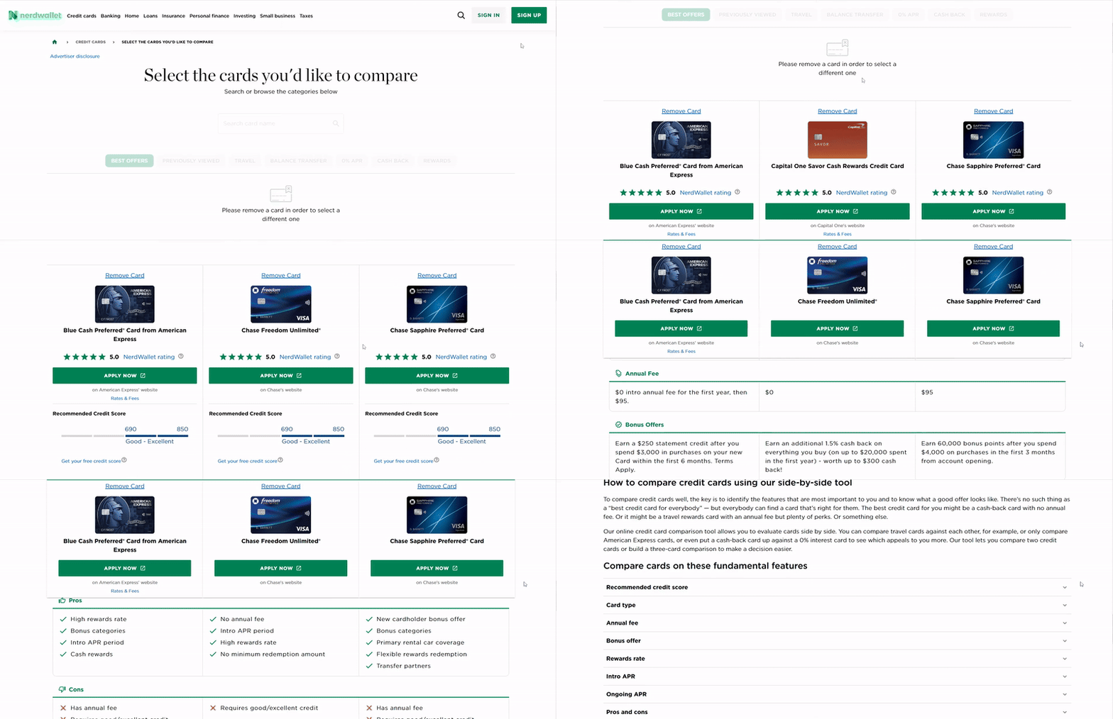
Each card becomes a mini showcase for a product or service. You get space to explain the 'how' and 'why' behind each feature, not just list them. For credit cards, which are an important long-term purchase for most people, a detailed overview of each available option is key here.
And once they've made their choice, you can even use order bump ideas to increase the value of their purchase without being pushy.
This type of product comparison idea works really well when you need to break down complex features or services. Take web hosting plans, for example. Instead of just listing "SSD Storage: 50GB", your card can explain what that means for site speed and user experience. Or if you're comparing course packages, you can detail exactly what students learn in each module.
You'll often spot these on SaaS pricing pages, where companies display their packages in cards with detailed breakdowns of what's included. But don't limit yourself, this format adapts well to physical products, online courses, or service packages where the differences need more explanation than a simple yes/no.
5. Video Product Comparisons
I've noticed that people often want to see a product in action before they commit. Video comparisons are perfect for this, bringing your offerings to life and giving your audience a dynamic, engaging way to understand the differences.
Video comparisons tap into what people love most about YouTube, seeing products in action before they buy. These usually follow a versus format ("Product A vs Product B") which hooks viewers looking for honest insights about products they're considering. Videos are fantastic for the awareness and consideration stages of the buyer's journey, helping people visualize and evaluate options.
Thrive Themes has a great, in-depth example you can take a look at:
You can create these videos for your own product line or compare your offering with competitors. Post them on your YouTube channel to catch people during their research phase, then embed the same videos in your blog posts or landing pages where they're already closer to making a decision.
The beauty of video comparisons? You get to show, not just tell. If your software saves time, record a quick screen capture of both tools in action. Selling physical products? Film how they actually perform in real-world conditions. Your audience sees exactly what they're getting.
Keep the format straightforward, start with a quick intro of what you're comparing, dive into the key differences, and wrap up with clear recommendations for different types of users. Most viewers want to know "which one is better for me?" not just "which one is better?"
The comment sections on these videos often turn into goldmines of questions and feedback. Pay attention to what viewers ask, it tells you exactly what points to cover in your next comparison.
6. In-Depth Blog Post or Article
While quick visuals are great for initial impressions, sometimes your audience needs to roll up their sleeves and dig into the nitty-gritty. That's where an in-depth blog post or article comparison shines, allowing you to provide all the context and detail someone needs to make a truly informed decision.
If you don’t have the resources to create product comparison videos, then blog post comparisons are the perfect alternative for you. These are particularly potent for users deep in the consideration phase, who are ready to evaluate options thoroughly before making a purchase decision.
Here, you've the room to tell the whole story. While charts and videos work great for quick comparisons, sometimes your audience needs deeper insights before making their choice.
Take this review, for example: Thrive Architect vs Divi.
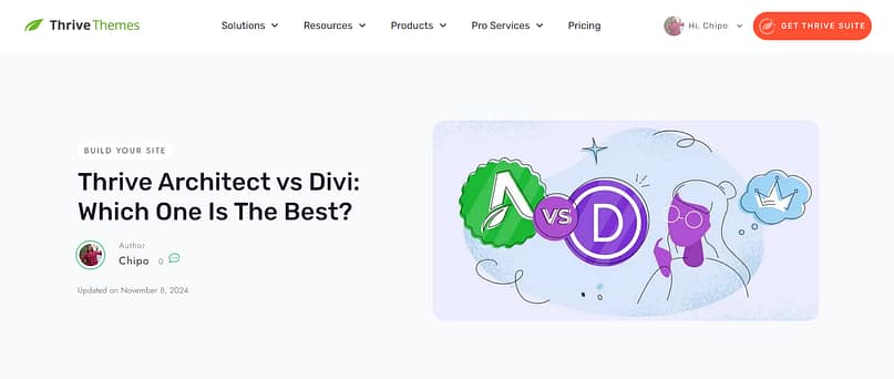
These posts work especially well for two groups: people who love to research thoroughly before buying, and those searching Google for "[Product A] vs [Product B]" comparisons. Each section can tackle a different aspect, pricing structure, feature sets, user experience, customer support, while weaving in your hands-on experience.
Don't just fill your post with walls of text though. Mix in those comparison charts or embedded videos we talked about earlier. Break up detailed explanations with screenshots, examples, or user testimonials. Think of it as your ultimate comparison resource that pulls together all the comparison types that make sense for your products.
SEO Tip: These comparison posts often rank well for terms like "alternatives to [competitor]" or "[your product] vs [competitor]." But remember to write for humans first, clear, helpful comparisons tend to rank better than keyword-stuffed content anyway. And for more SEO tips, check out this handy guide.
You can repurpose sections of these posts into social media content, email sequences, or sales page material. One well-written comparison post becomes a content goldmine.
7. Visual Infographics for Quick Comparisons
I've found that infographics are fantastic for cutting through the noise and delivering key comparison points in a visually appealing, shareable format. They're perfect for those moments when you need to make a strong, quick impression.
Infographics take your comparison data and turn it into eye-catching visual content that people love to share. Unlike dense charts or lengthy blog posts, a well-designed infographic tells your comparison story at a glance. This is fantastic for users in the early awareness stage of their buyer's journey or those who need a quick summary to evaluate options.
I’m a fan of this example from Dermatologist’s Choice. This infographic was added to their product comparison blog post to convince readers that their preferred pick is the best way to go.
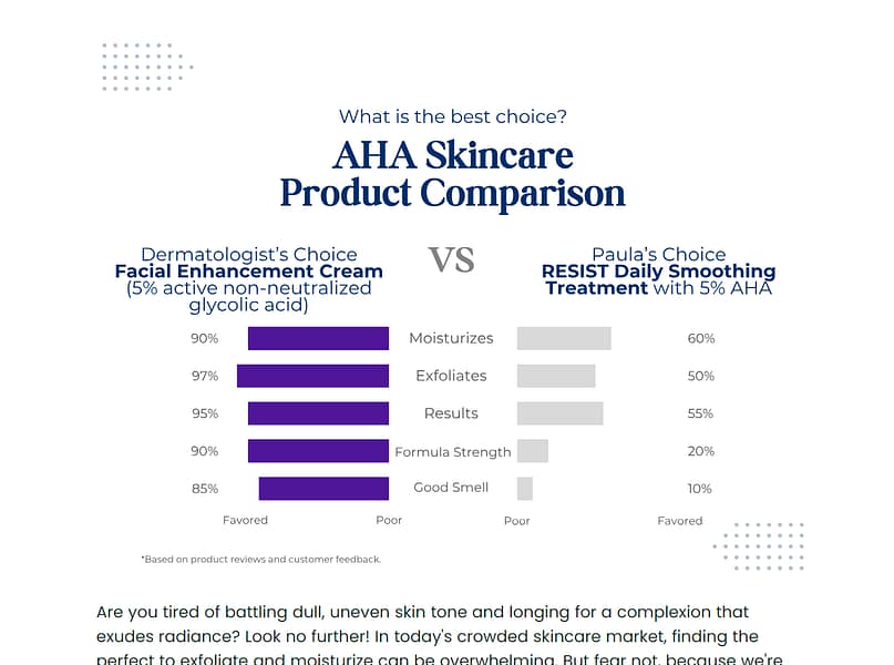
Sometimes, people aren’t up for reading an entire post of text. But they'll definitely take a look at the visuals.
The trick to great comparison infographics? Focus on the key points your audience cares about most. Skip the tiny details and zero in on the standout differences. Use consistent icons, clear headers, and a color scheme that matches your brand. Think of it as designing a roadmap that guides viewers to understand why your product stands out.
You don't need advanced design skills either. Tools like Canva offer templates specifically for product comparisons. Pick a template, plug in your data, adjust your brand colors, and you're ready to share across your marketing channels.
Beyond Visuals: Other Powerful Product Comparison Formats
While visuals are incredibly effective at grabbing attention and conveying information quickly, I've learned that sometimes you need to go deeper or approach comparisons from a different angle. Not every decision is made with a quick glance, and some buyers need more nuanced information to feel truly confident.
While visuals are incredibly effective, sometimes you need to go deeper or approach comparisons from a different angle. Here are a few more product comparison ideas that offer variety and cater to different user needs, especially as they progress through their buyer's journey to a final purchase decision.
8. Use-Case Based Comparisons
I often see businesses focusing solely on features, but what people really want to know is, "How does this actually help me?" Use-case based comparisons shift the focus from what your product *does* to what it *solves* for specific situations, making it incredibly relatable.
Instead of just comparing features, compare how different products solve specific problems or fit into particular workflows. This is incredibly powerful because it helps users visualize themselves using the product. It helps them evaluate options based on their specific context.
Let's say you offer different project management tools. Instead of just listing "Gantt Charts: Yes/No," you could've sections like:
- "Best for Agile Teams:" Highlight features like sprint planning, stand-up meeting templates, and integration with development tools.
- "Best for Client Projects:" Focus on client portals, easy reporting, and invoicing features.
- "Best for Solopreneurs:" Emphasize simplicity, low cost, and minimal setup.
This approach helps people quickly identify which solution aligns with their specific situation, cutting through the noise of features they might not even need.
9. Customer Testimonial / Review Comparisons
I've always believed that social proof is one of the most powerful tools in your arsenal. When potential customers hear directly from others who've made a similar choice, it builds a level of trust that your own marketing can't always achieve.
Sometimes the most persuasive comparison isn't one you create yourself, but one that comes from your customers. Gather testimonials or pull snippets from reviews that directly compare your product to a competitor or highlight how it solved a problem another product couldn't. This builds trust and provides social proof, helping users with their purchase decision.
You could create a dedicated page or section that features quotes like:
- "I switched from [Competitor A] because [Your Product] finally let me do X without the headaches."
- "The support from [Your Product] is night and day compared to what I got with [Competitor B]."
This adds a layer of social proof and authenticity that's hard to beat. Just be sure to get permission if you're quoting directly, and always keep it ethical and honest.
10. Detailed Feature Matrices
For those highly technical products or services where the details truly matter, a simple checkmark table just won't cut it. A detailed feature matrix allows you to dive deep, providing granular information that technical buyers need to confidently evaluate options.
Detailed Feature Matrix Example
Feature Name | Your Product (Pro Plan) | Competitor A (Premium) | Competitor B (Enterprise) |
|---|---|---|---|
User Roles | 5 customizable roles (Admin, Editor, Contributor, Viewer, Guest) | 3 fixed roles (Admin, Editor, Viewer) | Unlimited custom roles with advanced permissions |
API Access | Full REST API, webhooks, 1000 calls/min | Limited API, no webhooks, 100 calls/min | Full GraphQL + REST API, webhooks, unlimited calls/min |
Data Encryption | AES-256 at rest, TLS 1.2 in transit | AES-128 at rest, TLS 1.0 in transit | AES-256 at rest & in transit, FIPS 140-2 compliant |
Integrations | Salesforce, HubSpot, Zapier, Slack, Mailchimp | Zapier, Slack | All of the above + custom integrations via professional services |
Custom Branding | Logo, colors, custom domain | Logo only | Full white-labeling, custom CSS/JS |
This format is particularly useful for B2B software or complex services where buyers need to verify specific technical requirements. It allows them to quickly scan for deal-breakers or must-have features.
11. Interactive Comparison Quizzes
I love the idea of turning what could be a passive experience into an active one. Interactive comparison quizzes do just that, guiding users through a personalized decision-making process that feels less like marketing and more like helpful advice.
Imagine a short quiz that asks a few questions about a user's needs, budget, and priorities. Based on their answers, the quiz then recommends the best product or plan for them. This actively guides users through their buyer's journey and helps them with their purchase decision.
This is a fantastic way to personalize the comparison experience and reduce decision fatigue. Instead of presenting a wall of options, you're acting as a helpful guide, narrowing down the choices based on *their* input. Tools like Typeform or even some WordPress quiz plugins can help you build these (and if you're looking for more WordPress quiz plugin options, this guide can help).
This kind of engagement is exactly what we aim for with our proven interactive content strategy for lead generation.
Measuring the Impact of Your Product Comparisons
Creating compelling comparison content is only half the battle. If you're putting in the effort, you need to know if it's actually moving the needle for your business. I always say, if you're not tracking, you're just guessing, and that's not a strategy I endorse.
Creating great comparison content is one thing; knowing if it's actually working is another. I always tell people that if you're not measuring, you're just guessing. So, let's talk about how you can tell if your product comparison ideas are hitting the mark and effectively influencing the purchase decision.
Key Metrics to Track
- Conversion Rate: This is the big one. Are people who view your comparison content more likely to buy or sign up? Track conversions directly from pages featuring your comparisons. If you see a bump, you're on the right track.
- Time on Page/Engagement: Are visitors spending more time on pages with comparisons? Longer time on page often means they're engaged and carefully considering their options. For interactive comparisons, look at clicks on tabs, dropdowns, or quiz completions. This indicates they're actively trying to evaluate options.
- Bounce Rate: A lower bounce rate on comparison pages suggests that the content is relevant and holds visitors' attention. If people are landing on your comparison and quickly leaving, it might be too confusing or not what they expected.
- A/B Testing Results: This is how you really fine-tune things. Try different layouts, headlines, or calls to action on your comparison content. See which version leads to better conversions or engagement. Small tweaks can sometimes make a huge difference.
- Comparison Tool Usage (for interactive elements): If you've built an interactive comparison tool or quiz, track how many people use it and which options they select. This gives you direct insight into what features or products they're most interested in, informing their purchase decision.
Optimizing Based on Data
Once you have some data, you can start making smart adjustments.
- If conversion rates are low: Maybe your comparisons aren't clear enough, or you're not highlighting the right benefits. Try simplifying the language, adding stronger calls to action, or emphasizing your unique selling points more.
- If time on page is short: Your content might be overwhelming, or not visually appealing. Break up text with more visuals, use bullet points, or try a different comparison format altogether.
- If interactive tool usage is low: Is the tool easy to find? Is the prompt to use it compelling? You might need to make it more prominent or explain its value better.
The goal here is continuous improvement. Think of your comparison content as a living thing. It needs regular check-ups and adjustments to stay healthy and effective.
FAQs about Product Comparison Ideas
Visual product comparison ideas are important because our brains process images much faster than text. They reduce cognitive load, making it easier for visitors to quickly grasp differences and make decisions. This helps prevent decision fatigue and guides them more smoothly toward a purchase decision.
Next Steps: Experiment with Vertical Tabs on Your Landing Pages
I often find that small design tweaks can make a huge difference in how people engage with your content, especially on mobile. If you're looking for a simple, yet powerful way to present structured information without overwhelming your visitors, vertical tabs are a smart next step.
Want a simple way to level up your product comparisons without overhauling your entire site? Add vertical tabs to your posts or pages. They're perfect for organizing multiple comparison points without cluttering your layout or confusing your visitors, especially for those trying to evaluate options on mobile.

Unlike horizontal tabs that get squeezed on mobile screens, vertical tabs stack neatly as people scroll. Your visitors click one tab to see specific details, then easily switch to compare other features or products. It adds that interactive touch people love without getting complicated.
Thrive Architect has some great vertical tabs templates for you to try out, and you can get started with this tutorial right here.
Product Comparison Ideas: Wrapping Up
Listen, you don't need to tackle all these comparison styles at once. Maybe start with a simple chart or those vertical tabs we talked about. Keep an eye on how your visitors respond and grow from there. It's like having a conversation with your audience, just in a more organized way.
The real win? Making it super clear why different products fit different needs. No confusion, no overwhelm, just straightforward comparisons that help people choose. Focus on clarity over flashy features, and remember to highlight what your audience cares about most at each stage of their buyer's journey.
Want to create engaging product comparisons without wrestling with code? Thrive Architect's drag-and-drop editor makes it easy. Build comparison tables, add vertical tabs, and design beautiful product cards, all with a few clicks.


Useful article.