I’ll be honest with you — I’ve seen gorgeous sales pages flop. Slick design, fancy graphics, even a video front and center… and still, no one clicks “buy.” Why? Because a video sales page isn’t about the pixels or the polish. It’s about connection.
When I build a sales page with video, I’m not just embedding a clip — I’m giving my audience a reason to stop scrolling, lean in, and believe me. Done right, a sales video makes your offer clear, emotional, and impossible to forget. Done wrong, it’s just noise.
That’s why I put this guide together. I’ll walk you through the strategy behind a great video sales page, the types of videos that actually convert, and the exact steps I take to build one in Thrive Architect. By the end, you’ll know how to create a page that feels simple, powerful, and persuasive — the kind that turns viewers into customers.
Why I Say You Should Use Video Sales Pages
When I need to move the needle, I reach for video. Text and images are great, but a well-crafted sales video can do things a headline never will:
- It grabs attention. People stop scrolling when something moves and speaks. A video pulls them in before their brain can decide to click away.
- It makes your offer click. I can explain complex ideas faster on camera than in three paragraphs of copy — and with a lot more personality.
- It connects emotionally. My audience isn’t just hearing features; they’re seeing my tone, my confidence, my empathy. That’s how trust is built.
- It makes you memorable. A story told on video sticks. Think explainer clips, short demos, or a customer testimonial that makes people say, “That’s me.”
💡And the data backs it up: landing pages with video can boost conversions by up to 80%, and and viewers retain about 65–83% more information when learning via video instead of text. Numbers like that are hard to ignore — and they’re exactly why video is no longer optional in a sales funnel.
If you’ve been putting video off because it feels intimidating, I get it. But ignoring it is costing you sales. A strong video sales page isn’t a “nice-to-have” anymore — it’s one of the fastest ways to turn curious visitors into paying customers.
My Go-To Video Sales Page Checklist
Before I touch a single design element, I run through this list. It saves me from messy do-overs and makes sure my video actually sells instead of just sitting there looking pretty.
- Lead with a hook. If I don’t grab attention in the first 5–10 seconds, I’ve already lost the viewer. I use the simple flow: Hook → Story → Offer. Works every time.
- Keep it tight. I aim for 60–90 seconds. Long enough to land the message, short enough to leave them wanting more.
- Audio first. Blurry video is forgivable. Bad sound? Deal-breaker. I’d rather invest in a good mic than a fancy camera.
- Front and center. My video always goes above the fold. If someone has to scroll to find it, I’ve buried my best salesperson.
- Say the next step out loud. I never assume people “just know” what to do. I tell them. Then I back it up with a bold CTA button.
- Respect the scroll. I never autoplay with sound. Instead, I use a thumbnail that makes people want to click.
- Keep it fast. A slow page kills conversions. I compress my video files and host them somewhere reliable.
How to Create a Conversion-Focused Video Sales Page
This tutorial includes a step-by-step guide on how to build a video sales page that converts.
Let’s dive in.
1. Download & Install Thrive Architect
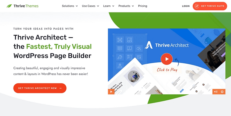
Thrive Architect is the best landing page builder for WordPress websites.
If you’re looking for the right tool to build landing pages that convince your target audience to convert – this is the plugin for you.
Thrive Architect makes page design easy – really easy. Saving you time in learning so you can focus on generating leads and sales for your business.
This plugin gives you access to hundreds of customizable templates to create stunning webpages that leave your audience going “Wow. I want to buy from this business”.
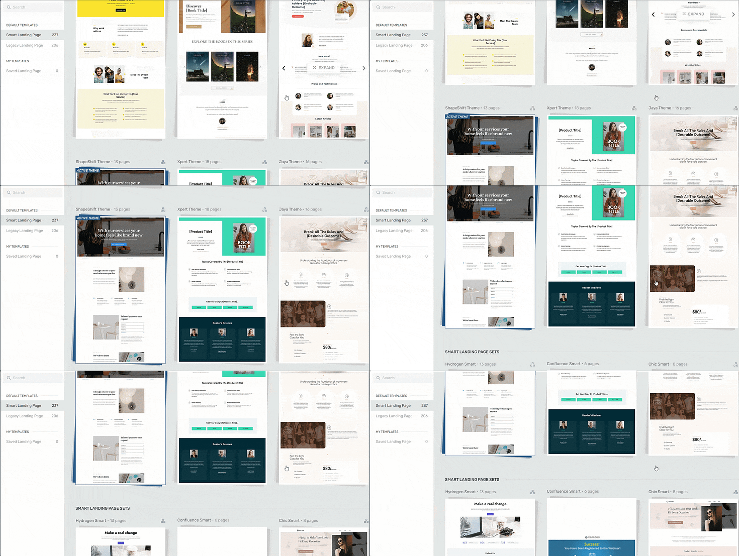
Landing page template sets in Thrive Architect
Every page template was built with conversion generation in mind, so you’ll find all the crucial elements you need to guide your site visitors to buy or sign up.
Want to make changes to a template or build a page from scratch? No problem.
Ideal for WordPress beginners, the Thrive Architect editor comes drag-and-drop functionality and a large selection of block templates and design elements you can easily add to your pages to create a custom design.

Like we said – easy building.
In terms of integrations, this plugin works seamlessly with most Google analytics plugins and the best SEO tools to help you track your metrics and optimize your content for search engines.
You can also connect your pages to your CRM (e.g. HubSpot), eCommerce, and automation tools in a few clicks.
When you buy Thrive Architect, you also get a 30-day money-back guarantee — allowing you to give this tool a try, risk-free.
Think of it as a free landing page builder trial.
2. Create a New Page & Launch Thrive Architect
In the WordPress Dashboard, select the "+ New" button at the top of the page and select "Page".
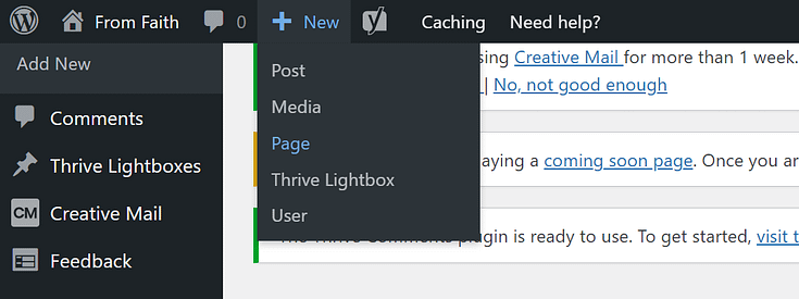
When taken to the next screen, name your page and select the bright green "Launch Thrive Architect" button.
3. Choose a Landing Page Template (Optional)
After you launch Thrive Architect, a menu will pop up with four options:
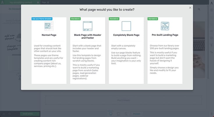
1. Normal Page
2. Blank Page with Header and Footer
3. Completely Blank Page
4. Pre-built Landing Pages
We recommend choosing the "Pre-built Landing Page" option.
In the Landing Page Library, browse through our template sets and select the one you like most.
4. Add a Video to Your Page
Now comes the most important part: adding your sales video to your landing page. To do this in Thrive Architect, click on the plus sign from the right sidebar.
This is where you can add a new element:

Look for the “Video” element or search for it in the search bar. Drag and drop it on your page wherever you desire:
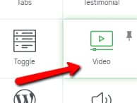
You will now notice that you have all the available options that you can apply to the video on the left sidebar:
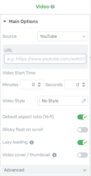
Under the "Main Options" section of the left sidebar, you will be able to find some ways to quickly customize your "Video" element.
Once you insert the "Video" element to your editor, you will see that, under the "Main Options" section, the first thing that you can change is the "Source" of the video.

There are a few available video platforms that you can choose from when using the "Source" option, or you can upload the video from your PC. To select a source, click on the field next to the "Source" option.
From the small drop-down menu that opens, simply click on the source that you want to use.
You can also choose to hide the video controls on your video, add a cover photo instead of a generic thumbnail appearing, and can even set your video to autoplay.
Sales Video Placement Best Practices
Since your video will be a core component of your landing page, you can’t place it somewhere obscure (e.g. as a background video).

If you take a look at any of our video landing page examples at Thrive, you can see that our videos are front and center — easy for any viewer to see when the page loads.
Here are some of the best practices for positioning on your video landing page template:
- Above the Fold: Placing your video "above the fold" (the part of the webpage visible without scrolling) is the best place. Visitors will see the video immediately upon landing on the page, increasing the likelihood that they'll watch it.
- Central Positioning: Position the video centrally on the page. A central placement naturally draws the eye and can make the video feel like the focal point of the landing page.
- Top of the Content Hierarchy: The video should be one of the first elements a visitor encounters. If it's meant to be the primary method of communication or sales pitch, it should take precedence over other content like text or images.
- Near the Call-to-Action (CTA): If the video is designed to persuade viewers to take a specific action (like signing up or making a purchase), you must place it near the CTA. This positioning can directly lead viewers from watching the video to taking the desired action
If the video is a testimonial or a product demo, place it alongside relevant product information or user reviews. This placement can help reinforce the message in the video.
The effectiveness of video placement can vary depending on your specific audience and the purpose of the landing page. Therefore, it's important to A/B test different placements to see what works best for your particular case.
How to Choose the Right Video for Your Goal
Not every sales page needs the same kind of video. The format I choose always depends on what I’m trying to achieve:
The Explainer Video
When my offer feels complex or abstract, I go straight to an explainer. This is where I simplify, break things down, and make the lightbulb go off. Think of how Slack’s explainer video turned a big, intimidating idea into a fun, clear story. That’s the power of a good explainer.The Product Demo Video
If I’m selling software or a tangible product, showing is always stronger than telling. A demo lets me walk people through exactly how it works — but I never stop at “look at this feature.” I tie every feature back to a real benefit: how it solves a problem or makes life easier.The Testimonial Video
Some of my most effective sales pages rely on other people’s voices, not mine. A happy customer, on camera, sharing their before-and-after story builds trust faster than anything I could script. That authenticity is gold — and it’s often the nudge a hesitant buyer needs.
5. Add Sales Copy and Headlines
Use the pre-designed headline and text sections on your landing page template to add persuasive copy and attention-grabbing headlines.
Be sure that your landing page copy complements the video and clearly explains the benefits of your product or service.
6. Include a Clear Call-to-Action
Place a clear CTA button near your video. This could be for making a purchase, signing up, or any other action you want your visitors to take.
Most of our landing page templates include pre-built call-to-action sections, so all you need to do is add the relevant copy and customize its design.
Use strong, action-oriented words to push your visitors to click through and take action.
7. Add a Countdown Timer to Increase Conversions
Countdown timers are a great way to boost your CTA click-through rate and land more conversions.
Thrive Architect does offer pre-built, customizable countdown timers you can add to your page…
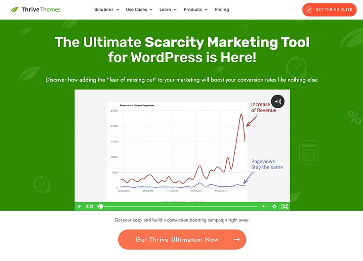
But if you really want to tap into the power of scarcity marketing, you should use Thrive Ultimatum – the ultimate FOMO plugin.
Thrive Ultimatum lets you take advantage of every aspect of scarcity marketing:
Program countdown timers to appear at a certain time (great for recurring sales promos)
Give your business a permanent conversion boost using an ultimate evergreen timer system (just like Udemy!)
Show your timers to the right audience at the right time using Ultimatum’s easy-to-set targeting
You can get Thrive Ultimatum and Thrive Architect together as a part of Thrive Suite – the best WordPress plugin bundle for busy business owners like you.
8. Add Testimonials or Reviews as Social Proof
Testimonials are a game-changer for generating more sales.
Most of our landing page templates include a testimonial section, but if you want to add more we recommend placing them in the following places:
Above the fold, right after your sales video
After the “Features/Benefits” section
Underneath the “About Us” section
Close to a call-to-action button
Thrive Tip
If you’re struggling to find the courage to ask for testimonials from your email list, in real life, or via social media, read this guide to learn 5 effortless ways to add testimonials to your WordPress website and sales pages.
And if you’re looking for a seamless way to collect and manage your testimonials – right from your WordPress dashboard – you should look at Thrive Ovation, our testimonial management plugin.
This plugin takes the stress – and awkwardness – out of collecting the testimonials you need to reinforce the value of your products and services.
When you purchase Thrive Suite, you also get Thrive Ovation – in addition to Thrive Architect, Thrive Ultimatum, and seven other premium plugins to improve your business and grow even more.
9. Optimize Your Page for Mobile
As you work on your sales video page, don’t forget to make it mobile-friendly.
A large chunk of your potential customers will use their phones or tablets to view your sales page. If they can’t read or interact with your page smoothly, they’ll drop off without interacting.
Thrive Architect comes with built-in mobile optimization features, making it super easy for you to create mobile-friendly landing pages.

If you struggle with tech and design, however, these features might not be as easy to use.
So, here’s a super useful tutorial on how to create mobile responsive pages for your WordPress website:
10. Optimize for SEO and Set Up Analytics (Recommended)
Optimize your page for search engines by adding meta descriptions, titles, and keywords.
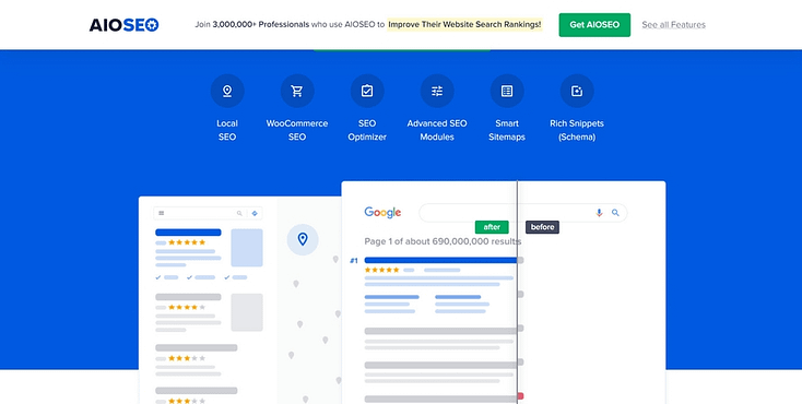
We recommend using a reliable SEO plugin like All in One SEO to help you optimize your pages the right way.
All in One SEO takes the stress out of search engine optimization and boosts your pages’ chances of ranking well and reaching your target audience.
For analytics, we recommend using MonsterInsights – the best analytics plugin for WordPress websites.
With this tool, you can keep track of all important metrics – key for helping you make data-driven marketing decisions.
Next Steps: Drive Traffic to Your New Sales Page
Building an effective landing page is one step. Getting it in front of the right eyes is the next.
Here are 4 free resources/tutorials to help you drive the right traffic to your website and increase your conversion rates:
Frequently Asked Questions
If you’ve ever wondered how long your video should be, where to put it, or if you really need fancy gear, you’re not alone. These are the most common questions I hear — and my no-fluff answers.
I aim for 60–90 seconds. That’s long enough to land the message but short enough to keep attention.
Not with sound. It’s jarring and pushes people away. If I use autoplay, I keep it muted and rely on a custom thumbnail to spark curiosity.
Audio, hands down. People will forgive slightly grainy video, but if they can’t hear me clearly, they’re gone.
Front and center — above the fold and close to my call-to-action. I don’t make people hunt for it.
No. I’ve created high-converting videos with just good lighting and a decent mic. Perfection isn’t the goal — clarity and connection are.
Yes, but I adjust the script and call-to-action so it fits the ad format. What works on a page doesn’t always translate to a scroll-stopping ad.
I always back my video up with strong copy. That way, even the “non-watchers” get the message — and nobody slips through the cracks.
Creating a Video Sales Page: It’s Your Turn Now
And there you have it!
With this tutorial, you can easily build thriving video sales pages to generate more sales from your products and services.
The best part? You can do it all by yourself — no need for an expert sales team, copywriter, or marketing team.
Thrive Architect is a powerful conversion-generating tool that is ideal for sales and lead-generation landing pages.
And if you want to turn the rest of your website into a results-generating online business, you should take a look at Thrive Suite.
If you’re looking for a set of tools that work seamlessly together to create a memorable user experience for your target audience – this is the bundle for you.


