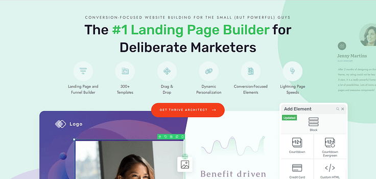
Looking to create an online course sales page that actually leads to enrollments?
You’ve come to the right tutorial.
A big dilemma creators face after braving the course creation process is trying to figure out how to successfully sell their new course.
You can’t just hop on social media or blast your email list with an alert like “Hey! I created a new course!” and have no where to direct them.
That’s where your sales page comes in. This is where your potential students comes in — to communicate the value of your course and convince potential students to sign up.
...and that’s where we come in.
We've developed a straightforward, step-by-step guide to show you how to create a sales page that not only looks good but also converts visitors into engaged students.
Ready? Let’s dive in.
You Don’t Just Need a Course Sales Page…
You need a sales page that converts.
The design of your sales page is not merely a checkbox on your course launch checklist; it's a make-or-break element that directly influences the sales you've worked tirelessly to achieve.
Your sales page needs to be:
Well-designed: Every element, from the layout to the sales copy, should be thoughtfully designed to capture and hold your reader’s attention
Engaging: Add interactive elements and compelling visuals to draw in your website visitors and keep them interested
Clear on Value: Spell out what makes your course different and why it’s the best choice for your audience
Relevant to Your Target Audience: Use language, images, and videos that speak directly to the specific needs, desires, and challenges of your prospective students.
Easy to Navigate: Your site visitors should find it easy to explore the page and find the information they need without confusion.
Rich with Persuasive Testimonials: Include real stories and endorsements from past students to build credibility and trust.
Clear on Its Call to Action: Make it easy and enticing for visitors to take the next step, which should be buying.
Now if you don’t have a lot of design or marketing experience, the thought of trying to create a sales page that meets all these requirements could be overwhelming.
But, you’re in luck. You don’t have to do this on your own. The next part of this tutorial will show you how to build a winning course sales page – and fast.
How to Create an Effective Sales Page for Your Course: Step-By-Step
These steps are going to make it easy for busy online course creators like you to create a successful online course sales page.
1. Download & Install Thrive Architect: The Best Landing Page Builder
Your sales page’s design and performance mainly depend on the tools you use to build it.
If you’re serious about seeing sales and want to deliver the best possible sales page for your online course – Thrive Architect is the page builder for you.
This plugin takes the headache out of web design and provides you with a straightforward path to creating sales funnel pages that look great and win your audience's attention.
Everything is drag-and-drop – which means no complex coding. If you want to build a sales page from scratch, you can set one up in minutes using Thrive Architect’s block templates.
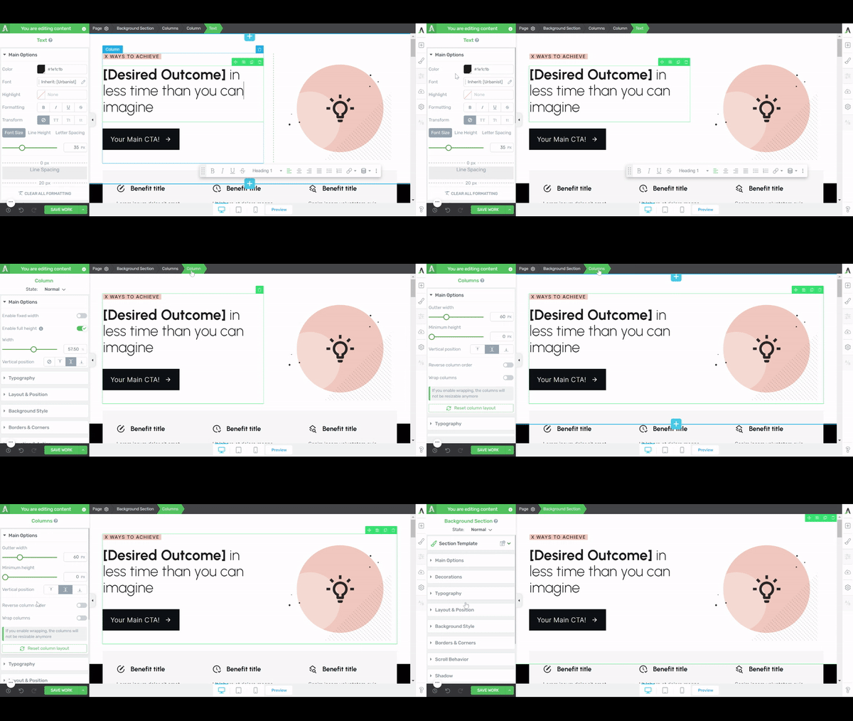
Thrive Architect editor
We’ve gone 10 steps ahead and compiled block templates that include the main elements each yours sales page will need – from pre-designed hero sections, to features & benefits templates, testimonial blocks, and many call-to-action (CTA) sections.
Think of these templates as your shortcut to a stunning website. No more staring at a blank page, wondering where to start.
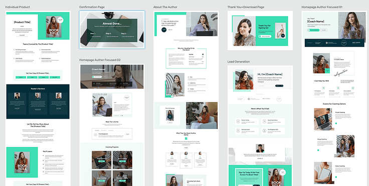
All you need to do is click the blue plus section on the page and access the Thrive Architect block library.
But it gets better.
If you want a faster way to build high-quality sales pages – and spend less time fretting over small design decisions – then hop into the landing page template library.
These one-click templates are more than just visually appealing; they're optimized based on proven conversion principles, meaning they're designed to get your audience to act — leading to more customers for your online business.
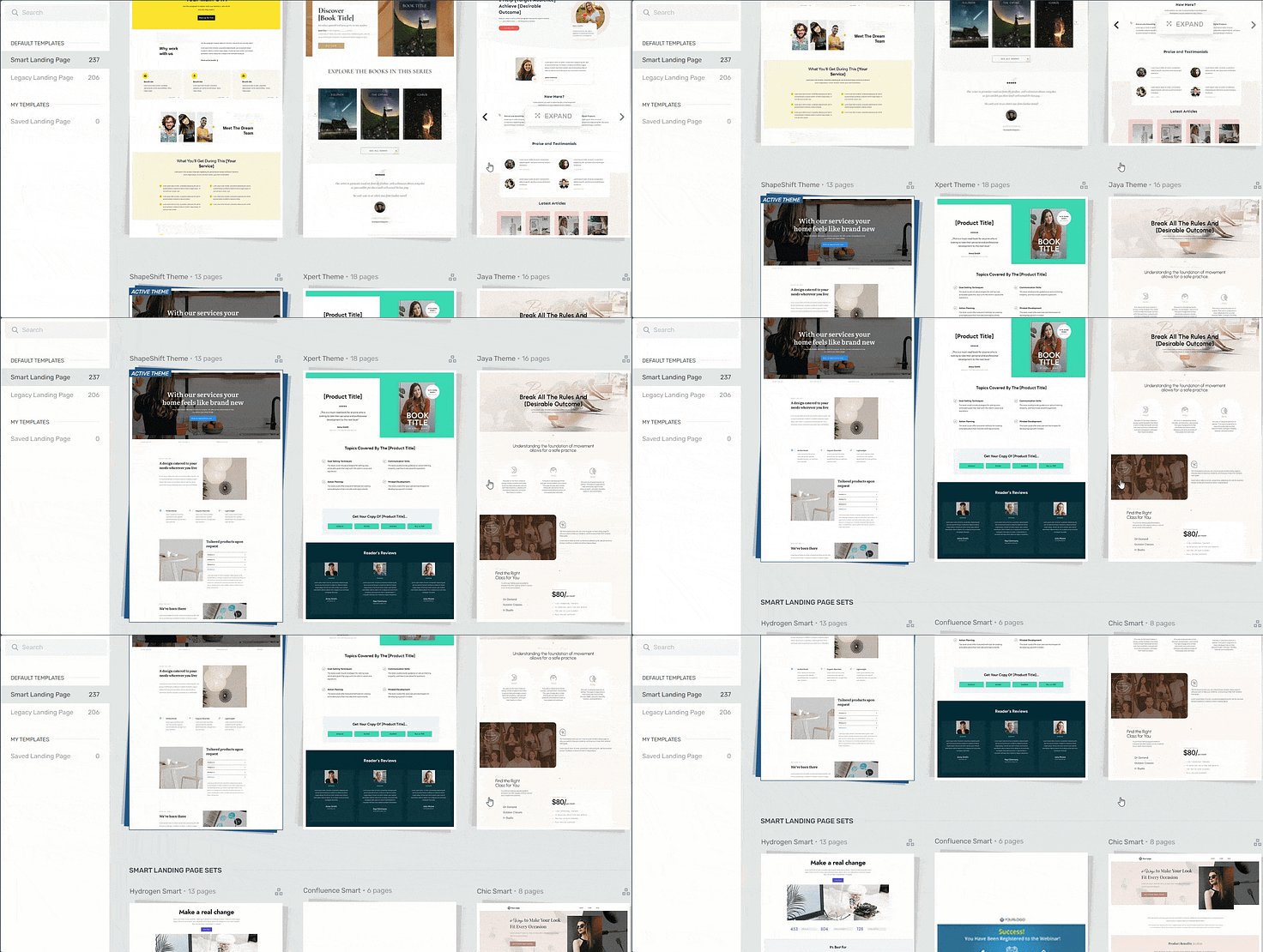
Landing page template sets in Thrive Architect
Thrive Architect is different because every template in our library follows key conversion optimization principles. All you need to do is choose your design, customize the color, add your copy, and get started.
In terms of integrations, this plugin works seamlessly with most Google analytics plugins and the best SEO tools to help you track your metrics and optimize your content for search engines.
You can also connect your pages to your email marketing, eCommerce, and automation tools in a few clicks.
Thrive Architect doesn’t have a free version, but this pro plugin offers a 30-day money-back guarantee — allowing you to give this tool a try, risk-free.
2. Create a New Page and Select a Landing Page Template
After you activate Thrive Architect, head back to your WordPress Dashboard.
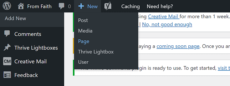
Next, select the "+ New" button at the top of the page and choose "Page".
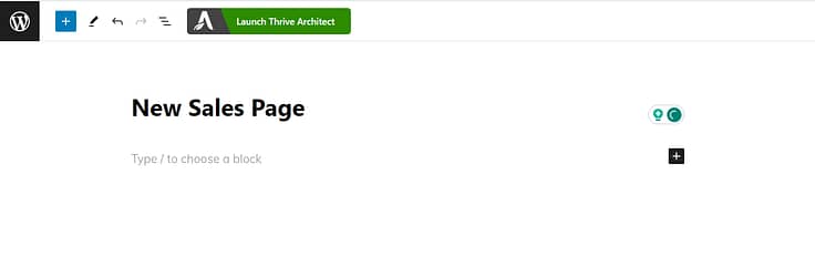
On the next screen, give your page a name and click the bright green "Launch Thrive Architect" button.
Thrive Architect will give you a few options to choose from:
1. Normal Page
2. Blank Page with Header and Footer
3. Completely Blank Page
4. Pre-built Landing Pages
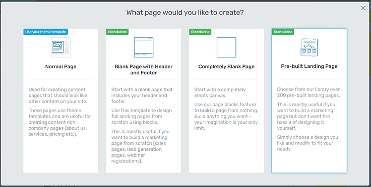
For this tutorial – and if you want to create an effective landing page without the hassle of building it from scratch – select Pre-built Landing Pages.
In the Landing Page Library, you can browse through 350+ conversion-focused landing page templates until you find the perfect one to promote your online course.
Focus on choosing a product-focused landing page design because we’ve incorporated all the key elements needed to boost your conversion rates.
And with our Smart Landing Pages, you can build the perfect landing page for your online course in minutes.
3. Customize Your Sales Page Template with Your Text, Images, and Style
After you've selected and loaded your template, it's time to get to work and start customizing your page.
Start With Your Hero Section
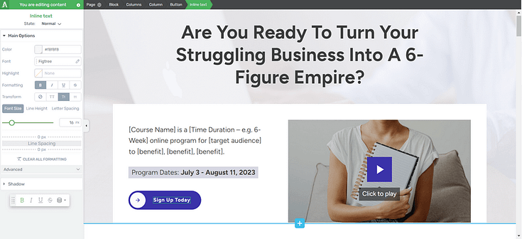
Your hero section is the first thing your potential customers will see. It sets the tone for how they’ll interact with the rest of your content.
Focus on using this section to grab your audience’s attention & connect with the inner goal they want to achieve.
Create a strong, compelling headline that grabs attention and support it with a high-quality hero image or video.
Outline Your Audience’s Pain Points to Connect with Them
After you’ve caught your audience’s attention, you need to form a connection with them. Show them you understand where they’re coming from.
Use the next section of your sales page to spell out your audience’s pain points. To successfully do this, you need to know the buyer persona for your course. This requires a few hours of focused research on who your audience is and what’s blocking them from achieving their goals.
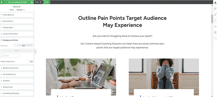
Once you’ve hacked this and pinpointed their challenges/pain points, you can add them to your sales page.
As you browse through the Thrive Architect Landing Page Library, you’ll notice that most of our sales pages include a dedicated section for outlining your audience’s pain points – making it easier for you to focus on what matters:
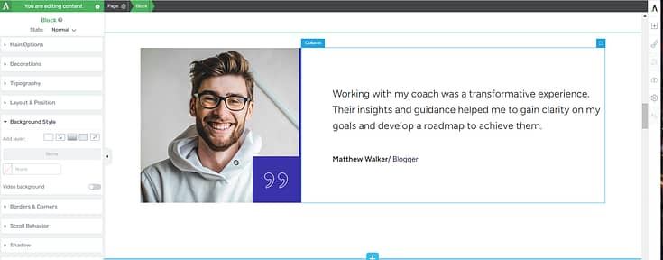
Creating compelling copy that truly reflects what your audience is going through.
And the great thing about Thrive Architect’s landing page templates is that they don’t just give you a random blank block to fill with text.
Each landing page allows you to display your copy in a creative way that engages with your audience and makes them want to keep reading.
Add Testimonials to Show Your Course is the Real Deal
Social proof is the ultimate hack for turning your audience’s curiosity into budding trust.
Adding glowing reviews from previous or current students — who’ve experienced your course material — is a great way to show your website visitors that they can trust your work.
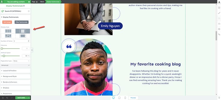
You should use a mix of written and video testimonials if they’re available. If you have student case studies, feel free to throw those in too.
We recommend placing your testimonials in the following places:
Close to the top of the sales page, after you’ve broken down your audience’s pain points.
After the “Benefits” section
Underneath the “About the Coach/Instructor” section
Right before or after your pricing table
At the end of the page
Close to a call-to-action button (CTA button)
If you don’t have testimonials to place on your online course landing page, but you’ve already created your course, consider offering free or heavily discounted access to a select group of your audience in exchange for their honest feedback
You can also launch your course as is, without the testimonials, and ask your students to leave feedback once they’ve completed the course.
Tip: Struggling to find the courage to ask for testimonials? Read this guide to learn 5 effortless ways to add testimonials to your WordPress website and sales pages.
Show Off the Benefits Your Potential Students Are About to Receive
Now to answer your target audience’s main question, “What’s in it for me?”
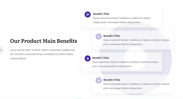
"Benefits" section in a Landing Page Template
Here's how you bring the benefits of your course to life, making it irresistibly personal:
Translate Features into Benefits: Instead of merely listing the features of your course (like video lectures, downloadable resources, etc.), explain how each feature benefits the student.
Focus on Outcomes: Your potential students are interested in the end results. Highlight the outcomes they can expect by taking your course, such as new skills, certifications, or career advancement opportunities. Make the connection between what you're offering and how it helps them achieve their goals.
Emphasize Transformation: Communicate the transformation that students will undergo as a result of your course. This could be a transition from novice to expert, the ability to take on new challenges, or personal growth. The promise of transformation is a powerful motivator for enrollment.
Make It Relatable: Ensure that the benefits you highlight resonate with your target audience's specific needs and aspirations. Understanding your audience allows you to tailor the benefits in a way that speaks directly to them.
Add Your Course Curriculum to Give a Sneak Preview
This is the best way to let your potential students know what to expect from the learning experience your course platform will provide.
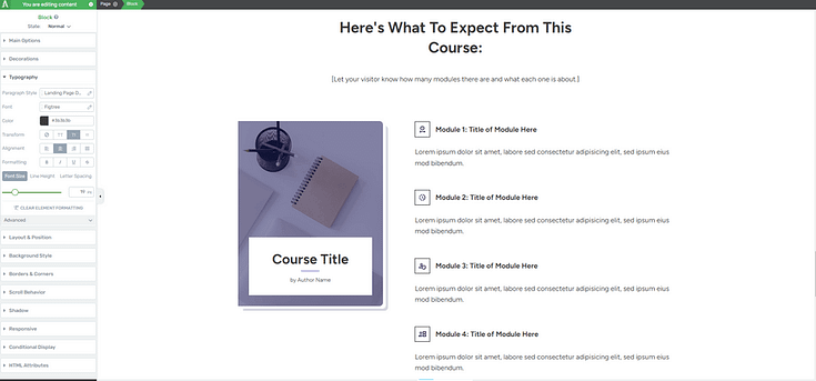
Adding a brief outline of your curriculum helps your audience understand the depth of your course topic and confirm if it aligns with their learning objectives.
Make sure your course description is clear and use bullet points to separate each module and lesson.
This transparency builds trust and can significantly increase enrollment rates by giving prospects a tangible sense of the value and structure of the course, empowering them to make an informed decision about their education journey.
Add Your Instructor Bio & Credentials
By the time one of your potential learners has reached this point, there’s a high chance they like what they’ve seen so far and now they want to know the person behind the course: you.
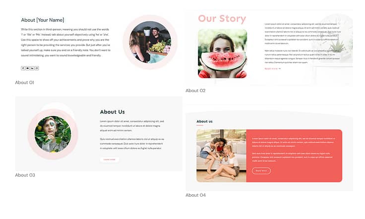
Examples of Thrive Architect Block Templates
Adding an “About the Coach/Instructor” to your course landing page helps your audience get to know you a little better. This is the place to mention who you are and why you created this course.
Include any details on your certifications, work experience, academic achievements, awards, or any other credentials that solidify why you’re the best instructor to learn from.
Don’t forget to add a high-quality photo of yourself to further build trust.
Include Your Course’s Pricing Information
This part is pretty straightforward. You need to let your audience know how much your course is going to cost and what the purchase comes with.
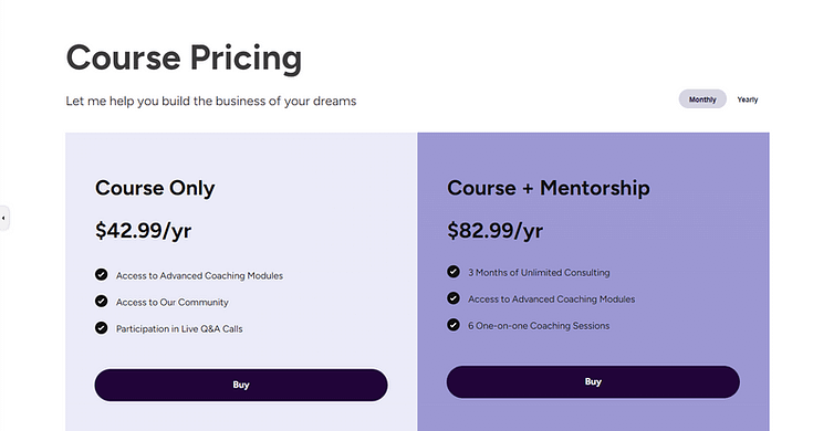
If you’re building your sales page in Thrive Architect, you can add a pricing table block template to your page with a couple of clicks.
Add a Proactive FAQs Section
Your site visitors are going to have questions about your online course that they’ll want to be answered before they decide to buy.

Get ahead of this by adding a FAQ (frequently asked questions) section to your sales page, that includes common questions & answers on your course content, pricing, and any other details that might not be clear.
In Thrive Architect, you can add this section to your sales page as a plain text box and simply put your questions and answers there.
But if you want to get a little creative, you can use the Toggle Element to create a stylish FAQ section. You can add icons to the section, change the FAQ section’s background color, and even add a background shadow to your text.
Make Your Call-to-Action (CTA) Sections Clear
Remember, the goal is to get your audience to buy your course. Call-to-action (CTA) sections push your potential customers to take action before leaving the page. Be sure to include 2 to 3 clear calls to action on your page: one near the top, one in the middle of your page, and one towards the end.
And if you need a checkout tool for your digital products (webinars, premium podcast episodes, etc.) , to process credit card, PayPal and other payments, we recommend using Easy Digital Downloads.
Next Steps: Start Driving Traffic to Your New Sales Page
Once you’ve saved and published your online course, it’s time to get it in front of the right eyes.
Here are 4 free tutorials to help you drive the right traffic to your website:
Ready to Create Your High-Converting Online Course Sales Page?
As you’ve seen, building landing pages for your WordPress site isn’t hard when you’re using the right tools.
Thrive Architect is your go-to for crafting a hassle-free pages that are designed to convert visitors into quality leads and customers – helping you grow your business.
This tool simplifies the technical side of things, freeing you up to concentrate on what you do best: connecting with your audience and delivering standout content that drives your business forward.
So if you’re ready to level up and create funnels that boost your conversion rates — and snag more potential customers — you know what to do.


