Most Travel Websites Look Great…and Still Underperform
We’ve all seen them. You have. I have. You know the travel homepages with cinematic drone shots, dreamy fonts, and enough wanderlust to make you pack a bag at 2 a.m.
But a big problem persists:: they look amazing… and still don’t convert.
Pretty doesn’t pay the bills. Especially in travel.
Your homepage isn’t just there to inspire people and make them go “oo, wow, pretty.”
It needs to make them think, “WOW! I want this experience and I want this business to help me make that happen.”
Simply put: your travel homepage design needs to guide, convince, and convert.
And the pressure’s real.
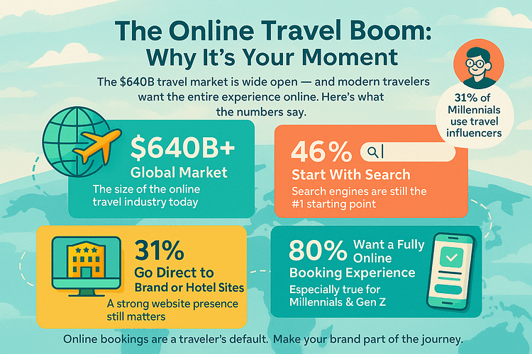
The online travel market surpassed $640B in 2024, with millions of people actively planning and booking online every single day. According to travelperk:
That’s the good news. Because it means your business is relevant and needed – for agencies and influencers alike.
But there is a catch.
Online travel agencies (OTAs) like Booking.com, Expedia, and Trip.com – along with more than 400 other official players – now control 40% of the global travel market. That includes hotels, flights, tours, and packages. And they’re not winning by accident. Their pages are sleek. Their funnels are airtight. Their ad budgets are massive.
Which means the remaining 60% is still up for grabs… if your homepage can make a strong first impression and close the gap.
You don’t get multiple chances. Your design needs to earn trust, build desire, and move people to act — all in a single scroll.
I’ve built the pages that get clicks but not customers. I’ve seen what doesn’t work.
So let’s fix it.
This guide will walk you through what your homepage actually needs to compete — from emotional impact and layout best practices to travel site UX, mobile responsiveness, and conversion-driven CTAs.
We’ll still make it beautiful. But this time, it’ll perform.
Solution: The Homepage Blueprint for Turning Travel Dreamers into Paying Customers
Before someone becomes a customer, they’re a browser. A dreamer. A maybe.
And when they land on your homepage, they’re not just admiring the view — they’re scanning for signals. Is this legit? Is it easy? Is it for me?
The faster and clearer your homepage answers those questions, the more likely that visitor turns into a lead, a booking, or a brand fan. The slower or more confusing the page? They’re gone.
And it happens fast: from my research, web design influences 94% of first impressions, and visitors form an opinion of your site in just 50 milliseconds. Even more telling — 75% of visitors say they judge a brand’s credibility based on website design. If your homepage doesn’t feel trustworthy and intuitive, they’ll click away before you’ve said a word.

So here’s your blueprint — built from real user behavior, practical conversion strategy, and way too many hours studying travel websites that almost worked. These 9 questions reflect what your visitors are silently asking. Your job is to make sure the answers are obvious — and irresistible.
Let’s break them down.
Key Questions about Your Travel Homepage Design
Use bold, high-quality travel imagery or background video that taps into emotion — not just location. Your homepage should evoke wanderlust and create a visual hook within seconds. A powerful first impression is key for destination marketing and user engagement.
Beautiful websites mean nothing if they’re slow. Optimize your page speed, compress images, and limit heavy design features that stall mobile performance. Fast-loading, visually rich sites improve bounce rates and support a smoother travel booking experience.
Your call-to-action buttons should be clear, action-driven, and conversion-focused. Include both primary CTAs like “Book Now” or “Check Availability,” and secondary actions like “Browse Destinations” or “Get Travel Deals.” Guide users through your sales funnel with intent.
Over half of travel searches happen on phones, so mobile responsiveness isn’t optional. Design for touch navigation, stack content vertically, and prioritize key booking actions like filtering trips or submitting inquiry forms. A seamless mobile user experience can make or break a sale.
Add a destination finder, trip filters, or visual categories to help users self-navigate. Whether they’re looking for family vacations, romantic getaways, or adventure trips, your homepage should direct them to relevant content with minimal effort.
Boost booking confidence by placing social proof, customer testimonials, and trust badges near your CTAs. Show refund policies, secure payment icons, and reviews early in the experience — not buried in the footer. Trust is a key factor in conversion optimization.
Forget jargon. Use benefit-focused copy that highlights the experience, not just the itinerary. Speak to what your customer wants: ease, connection, transformation. Strong copy improves user retention, increases click-through rate, and makes your brand feel human.
Use travel personalization to match content to the visitor’s intent. Tailor homepage sections by location, device, or interest. Suggest relevant destinations or experiences based on quiz responses or Browse history to improve user engagement and booking conversion.
Keep the homepage focused and goal-oriented. Use it to introduce your brand and direct users to landing pages for deals, destinations, or seasonal offers. A clutter-free layout improves usability and creates a better customer journey.
The Real Problem: Why Travel Websites Fail (Even the Polished Ones)
Here’s the part no one wants to admit: a lot of travel websites look incredible… and still don’t work.
Not because the brand isn’t trustworthy. Not because the trips aren’t amazing. But because the homepage — the one place designed to capture attention, build trust, and drive bookings — falls flat when it matters most.
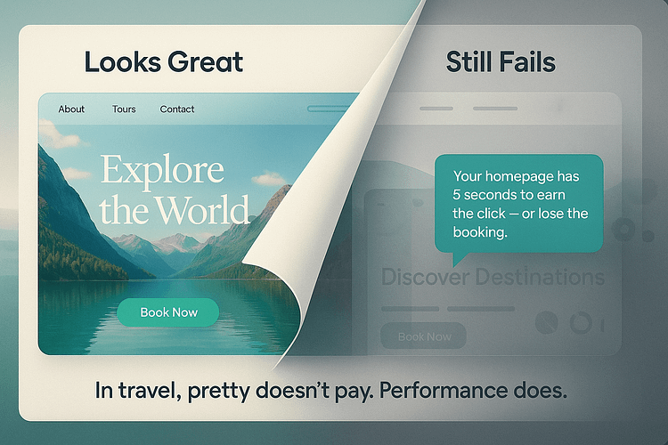
It’s not enough to be pretty. Not in a market this saturated, where attention spans are short and users are comparing five tabs at once.
The truth is, most homepage designs fail in the same predictable ways — and it’s costing travel brands bookings, trust, and thousands in wasted ad spend.
Let’s unpack the quiet killers of homepage performance. If you’re making even one of these mistakes, it’s time to fix it fast.
The Hidden Problem Most Designers (and Founders) Overlook
Imagine checking into a luxury resort. Marble floors. Ocean views. Everything looks perfect — until you realize there’s no front desk. No staff. No one to greet you, guide you, or tell you what to do next.
That’s what most travel homepages feel like. They look stunning — full-screen video, curated visuals, sleek menus — but they offer no direction. No clear CTA. No intuitive flow. No sense of where to go next.
And this is something to remember: users won’t stop and ask for help. They’ll just leave.
This is the core mistake: focusing on aesthetics without a strategy. Your homepage can’t just look good — it needs to work. It needs to lead. Guide. Convert.
If you’re not thinking like a UX strategist and a booking funnel architect, even the best-looking homepage won’t bring in results. It’s not a gallery — it’s a tool. And tools are built to do something.
What Happens When You Ignore Your Travel Homepage Design
It’s easy to brush off homepage performance issues. After all, it looks great, right? People compliment the design. You’re proud of how it feels.
But looking good isn’t the goal — getting booked is.
And when your homepage isn’t built to convert, the damage doesn’t scream. It leaks. Quietly. Relentlessly. In missed opportunities, dropped sessions, wasted ad clicks, and the slow, invisible erosion of trust.
Most travel websites don’t fail loudly.
They fail subtly — and by the time you realize it, you’ve already lost the lead.
So let’s talk about what’s really at stake when your homepage isn’t pulling its weight.
The Silent Killers of Conversion
These are the things that don’t show up in compliments or design reviews — but they quietly tank your results.
These issues are subtle, but they add up. And they don’t just hurt conversions — they quietly erode the confidence visitors have in your brand.
FAQ – High-Impact Homepage Questions Travel Brands Ask
You’ve got questions — and you’re not alone. These are the things travel brands, marketers, and founders ask when trying to figure out why their homepage looks great… but still underperforms.
Let’s clear it up.
Think of your homepage as your digital check-in desk — it’s the first impression and the starting point of the journey.
At minimum, you need:
- A bold, inspiring hero image or video that taps into emotion
- A strong call-to-action above the fold
- Fast, mobile-friendly layout
- Clear trust signals (SSL, reviews, refund policy)
- Simple navigation + smart segmentation (e.g. “Choose Your Trip Type”)
If it’s not guiding someone toward booking or exploration within seconds, it’s not doing its job.
Start with a mobile-first mindset, not a desktop design you try to shrink.
Here’s what helps:
- Stack content vertically for easy scrolling
- Use large, finger-friendly buttons
- Cut anything that clutters or slows down load speed
- Test on actual phones — not just browser previews
Bonus: fast, mobile-friendly pages not only convert better, they rank better too.
No one’s handing over credit card details unless they feel safe. Trust is the deal-breaker — especially in travel.
Build it by:
- Displaying real testimonials (with names + faces)
- Adding visible trust badges (SSL, secure payment, verified partnerships)
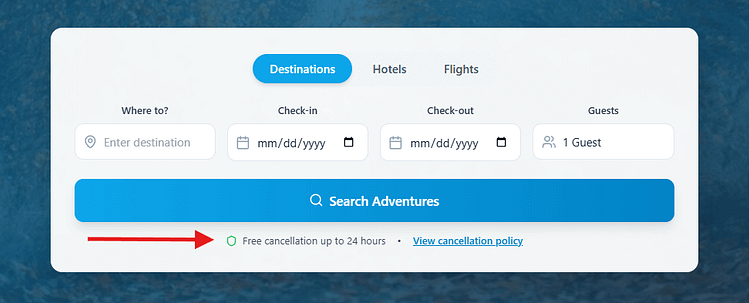
- Showing refund/cancellation policies right where decisions are made — not buried in your footer
A simple “Trust Strip” with key icons near your CTA can go a long way in boosting booking confidence.
Do not try to cram everything onto your homepage. That’s the fastest way to confuse and lose people.
Instead:
- Treat it like a gateway — clean, clear, and purpose-driven
- Link out to focused landing pages for top destinations, seasonal offers, or trip types
- Let users self-segment based on interest or travel style
If every click feels like progress, you’ve designed it right.
Strategy: How to Build a Homepage That Actually Converts
At this point, you know what your homepage needs — and what’s probably holding it back.
But here’s the thing: clarity without direction still leads to inaction.
What you need now is a strategy — a clear framework that turns insight into execution. Something you can use to structure your homepage with confidence, knowing every section, button, and visual choice is helping visitors move forward.
This next section breaks down a simple but powerful approach to building travel homepages that don’t just inspire clicks — they drive bookings.
My 5-Point Conversion Framework for Travel Websites
When I build (or audit) a homepage for a travel brand, I’m not just thinking about how it looks — I’m thinking about how it moves. Moves attention. Moves emotion. Moves people toward booking.
After years of trial, error, and quietly watching bounce rates betray “good design,” these are the five principles I now follow, every time.
But First: Here Are the Tools I Use to Build Travel Websites That Convert
When people ask how I build fast, beautiful travel homepages that actually perform, I don’t gatekeep.
I’ve tested dozens of WordPress tools over the years — page builders, form plugins, popup tools, analytics dashboards, you name it.
Some looked good on paper but fell apart in practice. Others required duct-taping five plugins just to get one page to load properly.
These days, I build with the Thrive Suite because it gives me everything I need to design high-converting pages without jumping between tools — and it’s built for marketers, not just designers.

Here’s what I use it for:
💡 Bonus: Thrive even has a travel-specific WordPress theme, optimized for destination-based content, mobile responsiveness, and clear booking paths. It’s a solid foundation to build on if you’re starting from scratch.
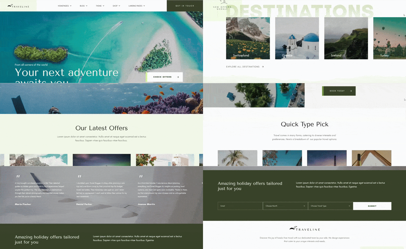
👉 If you’re ready to stop duct-taping your site together and start building with strategy, Thrive Suite is worth exploring. It’s what I trust to turn ideas into pages — and browsers into bookings.
1. Emotion First, Then Action
People don’t make travel decisions with spreadsheets — they follow a feeling.
That’s why I always start with something visual that feels like a real moment: a wide-open landscape, someone laughing mid-adventure, or a quiet, golden-hour view from a balcony. The kind of image that makes you think, “I want to be there.”
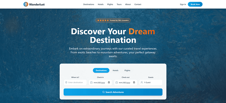
But emotion alone isn’t enough. Right below that moment, I place a bold call-to-action — something like “Start Planning” or “View Trips.” No hesitation. No guesswork. Just a clear next step that matches the mood.
🛠️ Want to get this part right?
Learn how to design a high-converting hero section — one that grabs attention, builds emotional momentum, and drives action.
2. Trust Is Earned Early
I’ve seen too many beautiful homepages with trust signals buried in the footer — or worse, missing entirely. In travel, where people are making big purchases and planning real-life experiences, trust has to come early.
That’s why I front-load it:
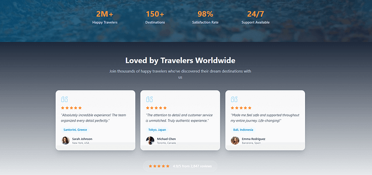
A few strong testimonials right under the hero
A refund or cancellation policy link near the first CTA
As well as visual cues like SSL icons or “secure checkout” graphics where it counts
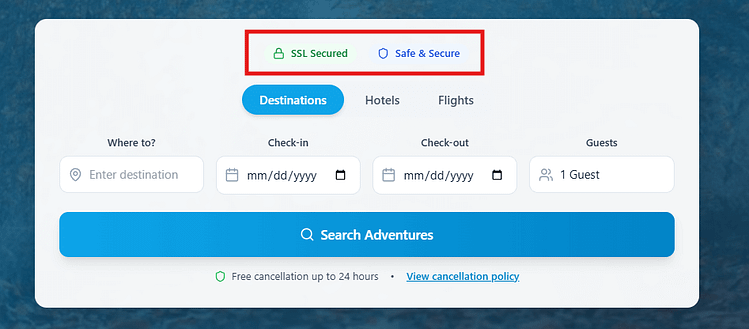
The point here is you don’t need to flood your page with icons and signals. You just need to use a few, strategically, to provide quiet reassurance in the right spots.
🔒 Worried your homepage doesn’t look secure enough?
Here’s how to make your website feel trustworthy — with subtle, conversion-focused trust signals your visitors actually notice.
3. Segment with Purpose
Most homepages try to talk to everyone at once — and end up saying nothing helpful to anyone.
Instead, I give users an easy way to self-sort. That could be a row of trip types (Adventure / Family / Romantic), a quiz prompt (“Not sure where to go? Take our 60-second trip matcher”), or even buttons like “Plan a Quick Getaway” vs. “Explore Long-Stay Travel.”
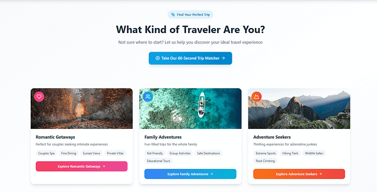
This kind of segmentation keeps people engaged because it gives them agency. They’re choosing their path — and that makes them far more likely to follow it.
4. Guide Without Overwhelm
Designing a homepage isn’t about showing everything. It’s about showing just enough — and doing it in the right order.
I break content into digestible pieces:
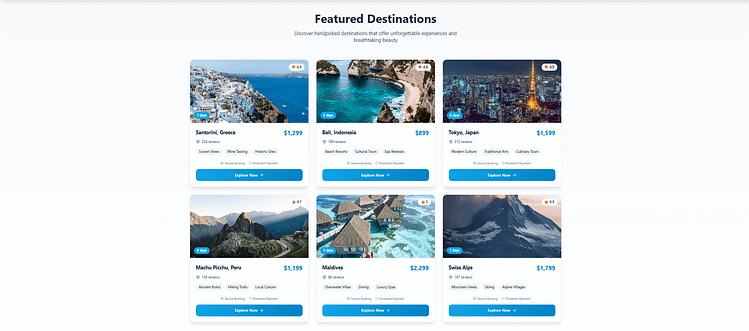
The goal is to reduce friction without hiding what matters. If someone’s interested, they’ll dig deeper — but they shouldn’t have to fight to stay interested.
5. Test Everything
No matter how good something looks in the editor, I’ve learned not to get too attached.
I test my headlines, CTA text, button colors, even which testimonial shows up first. And the results always surprise me — sometimes the phrasing I thought was too simple ends up winning by a mile.
Conversion isn’t a one-time event. It’s a process of listening, adjusting, and making better choices based on real user behavior — not personal preference.
🧪 Not sure what to test (or how to test it without guessing)?
This A/B testing guide breaks down exactly what to try first, how to set it up, and how to turn small homepage tweaks into big conversion wins.
Bonus – Smart Homepage Tactics Most Travel Brands Miss
Once your homepage hits the basics — fast load time, emotional imagery, clear CTAs — these quiet upgrades can tip the scale between interest and action.
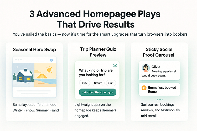
1. Switch your hero seasonally
Don’t redesign everything. Just swap the context. In winter? Show ski trips and cozy retreats. In summer? Beaches, road trips, and island escapes.
The layout stays the same, but the mood shifts to match what your visitors are craving right now.
Bonus: Seasonal relevance also makes returning visitors feel like your site is alive — and that limited-time offers matter.
2. Add a “Trip Planner” quiz preview
Not every visitor is ready to book — but many are open to dreaming. I like embedding a short, playful quiz right on the homepage with a prompt like:
It’s low-pressure, engaging, and doubles as a lead gen funnel. Best of all, it gives people something to do, not just scroll past.
3. Use a sticky social proof carousel
Instead of hiding testimonials at the bottom of your page, try this:
Add a small, scrollable carousel halfway down or in a sidebar. Show real reviews, short quotes, or even booking pings like “Laura just booked a 3-day Iceland tour.”
When visitors see proof that others are happy (and buying), they feel safer doing the same.
Your Travel Homepage Design Is a Business Tool. Treat It Like One.
If your travel homepage isn’t turning visitors into bookings, it’s not doing its job.
It’s not enough to look beautiful — it needs to sell. Guide. Reassure. Convert.
You don’t need a full redesign. But you do need to stop treating your homepage like a digital mood board and start treating it like the revenue-driving engine it’s meant to be.
Start now – not someday.
✅ Pick one thing from this guide to fix today: •
- Swap in a clearer CTA that sparks action
- Bring trust signals above the fold
- Add a quiz or destination filter to guide users
- Run a mobile test and fix slow-loading elements
Then…
Drag, drop, and launch a travel homepage that’s fast, focused, and built to convert — no dev team required.
You’ve got the strategy. The tools. The timing. Now you just need to build it.


