Looking for form conversion optimization strategies that actually work?
Then you've come to the right place.
Designing an opt-in form is simply "step one". But you'll need more than a basic form, with a few fields, to achieve a steady stream of sign-ups.
If you don't have a web designer or marketer's mind, however, you'll struggle to achieve your conversion goal.
Fortunately for you, you don't need to spend hours (or days) reading on conversion rate optimization to transform your forms.
We've done all that for you and simplified it into this post.
Our guide is straightforward, filled with actionable steps to tweak your forms for maximum efficiency and take you several steps closer to hitting your lead-generation goals.
Tired of Slow Opt-In Rates?
Not to be dramatic, but your email list is the lifeblood of your online business. It’s the easiest way to reach your target audience, build relationships with them, and turn them into loyal, consistent customers.
But, if your opt-in forms don’t bring in new leads regularly – you’ll end up leaving a lot of money on the table.
When faced with slow opt-in form conversion rates, most business owners rush to look at their digital marketing strategies. And while this is a good place to start, sometimes the answer is a lot closer to home.
Your forms could be behind your low sign-up rates. Maybe you have an exceedingly high number of form fields, or you’ve placed your form so far down your page that no one sees it.
Whatever the case, it's time to revamp your web forms – with the right guidelines.
With a few strategic tweaks, you can turn those slow forms into lead machines that generate higher conversion rates.
Just keep reading through this post.
Let’s Break Down These Simple Form Conversion Optimization Tips
Every tip we’ve listed out here is simple, straightforward, and easy to apply – we’ve also implemented most of them on our forms.
We’ve taken all conversion rate optimization (CRO) tips and made them actionable for you so you can start seeing results faster.
You can use these techniques on your contact forms, eCommerce forms, sign-up forms, webinar registration forms and more.
1. Cut the Clutter: Simplify Your Form Design
Let's be honest, nobody likes filling out long, tedious forms.
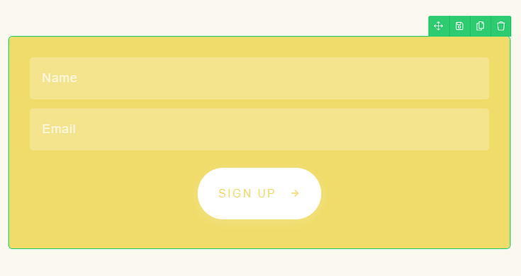
The more fields you ask for upfront, the higher your abandonment rates will be. So keep your forms as lean and straight forward as possible - only ask for absolutely essential information like name and email, (and maybe phone number) at first — and remove optional fields where you can.

That way, you’re creating a great user experience for your visitors.
You can always capture more details later through progressive profiling. Each additional form field can decrease conversions by up to 15%, so be ruthless in cutting the clutter.
What is Progressive Profiling?
Think of progressive profiling as getting to know someone gradually.
Instead of asking for everything about them at once, you start simple—maybe just a name and email.
Later on, when they interact with your site again, you can ask for a bit more, like their job title.
This way, your forms stay short and sweet at first, making people more likely to fill them out.
Over time, as they come back for more, you get the chance to learn a bit more about them, without scaring them off with a long form right away. It's a win-win: your shorter forms stay clutter-free, and you still collect the info you need.
2. Create a Smooth Mobile Experience
With over 50% of web traffic now coming from mobile devices, ignoring mobile form optimization is a surefire way to tank your conversions.
Make sure your forms are mobile-friendly with adequate spacing between fields and buttons sized for tapping, not clicking.
And don't forget to automatically adjust keyboards for different input types like email, numbers, etc.
A clunky mobile experience is a conversion killer.
3. Place Your Forms in Smart, High-Visibility Locations
You've optimized your forms to perfection, but are they even being seen?
Some of the best places to place online forms on your landing pages (or homepage) are:
Above the fold: think hero section or just beneath it
In the middle: After a couple of testimonials or your features/benefits section
At the end of a page: Right before your footer
We also recommend using exit-intent popups to grab abandoning visitors. You can easily set these up with the right form-building tool – like Thrive Leads.
But don't settle for one location - test different placements through A/B testing to see what works best.
4. Optimize Forms for Scanning, Not Reading
Hard truth: most visitors are skimmers, not readers. So format your forms accordingly.
Divide your form using clear, straightforward subheadings to help site visitors navigate with ease.
Space your form fields accordingly so your audience can spot each field without any trouble
Emphasize important parts of your forms with bold font, bright colors, and fitting icons.
Put the most important form fields first so they can’t be missed.
The easier your form is to scan and digest, the more likely people are to fill it in.
5. Guide Your Users With Smart Form Field Ordering
The order of your form fields matters more than you think.
Start Simple: Begin with just the basics like name and email. This gets the important info quickly and keeps the momentum of someone ready to fill out your form.
Group Things Together: Put similar fields, like contact details (name, email, phone number), next to each other. It makes the form easier to fill out because everything feels more organized.
Use Conditional Fields to Simplify: Don’t show all the questions at once. Start with a few, and then show more based on what someone has already filled out. This way, the form doesn't look too long at first glance, making people more likely to start it.
Product Recommendation: WPForms is a good choice for WordPress sites to make forms that adapt based on what someone picks or enters. It has features that let you hide or show more fields as someone fills out the form. This makes the form feel less overwhelming and more manageable, helping you get more completed forms.
6. Make the Next Step Obvious With Clear Call-to-Actions (CTAs)
Once you've captured their interest and smoothly led them through your form, the final step is to seal the deal with an irresistible CTA button.
Choose a high-contrast color for your submit button to make it stand out on the page, practically calling out for a click. The color should grab attention without clashing with your site's overall design, so it's both noticeable and aesthetically pleasing.

The words on your button matter just as much, too. Opt for copy that drives action while easing any last-minute hesitations. Instead of a generic "Submit," phrases like "Join Our Community" or "Get Started Today" suggest a positive outcome and an invitation to be part of something.
This subtle change in wording can significantly impact the user's perception and willingness to complete their form submission.
Together, these elements—the color, the action-inspiring copy, and the clear outline of benefits—work to land you more submissions.
7. Reduce Friction With Smart Default
When forms ask for a lot of typing, people often give up.
Make things easier by filling in some info automatically, like names or where they live, especially if they've visited before.
For things like phone numbers or dates, or other required fields, set up the form so it helps people type it the right way themselves. And adding little hints or examples right where they're filling in details can really help, too.
8. Leverage the Psychology of Progress
For multi-step forms, add a progress bar or breadcrumb trail to tap into our deep-rooted desire to complete unfinished tasks.
It's a psychological trigger that can increase form completions by over 10%. Plus, breaking one long form into steps makes the process feel more manageable. Simple psychology driving powerful results.

Multi-step forms, when designed thoughtfully, can significantly encourage user engagement and completion rates.
One of the best ways to do so is by adding a progress bar to your form page. This technique taps into a core aspect of human psychology: our inherent desire to finish what we've started.
Implementing a progress indicator can increase form completions by more than 10%. It’s a simple trick, but it leverages a deep-rooted psychological trigger to achieve powerful results.
Also, breaking down a lengthy form into smaller, digestible steps can make the whole process feel less intimidating. Each step completed gives your website visitor a sense of achievement and propels them to tackle the next, making it more likely they'll see the form through to the end.
9. Make Your Lead Forms Look Trustworthy and Credible
The way your website looks and feels can significantly impact how much trust your visitors place in you.
First impressions matter, and design plays a major role in signaling that trust — and reduces form abandonment. Here's how you can make your site not just a place that looks good, but also one that feels secure and trustworthy:
Display Security Icons: People are cautious when entering personal information online. Place visible security badges near your forms to show them data protection is a priority for your site.
Use Recognizable Accolades: If your site has been mentioned or endorsed by well-known platforms, highlight these accolades near your forms. This shows potential customers (and leads) that trusted sources vouch for your credibility.
Maintain Brand Consistency: Forms that match your site’s design and brand identity feel more legitimate. Keep the styling consistent to reinforce trust throughout the visitor’s journey.
Link to Your Privacy Policy: Demonstrating transparency about data usage builds trust. Include a clearly visible link to your privacy policy near your form, reassuring users about the safety of their data.
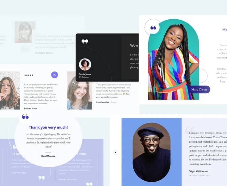
Add Testimonials to Reinforce Trust: Nothing screams “this is trustworthy” like positive reviews from current or previous customers. Place a couple of testimonials right above or below your form – where they’re easy to see.

10. Reinforce The Value Proposition on The Thank You Page
Don't just say "thanks" and leave it at that.
Your thank you page also plays an important part in engaging your new leads.
Use it to remind subscribers exactly what to expect and when. You can even upsell additional offers, products, or resources here to win a few more conversions.
If possible, add a personal touch by dynamically inserting their name. A well-designed thank you page can reinforce your subscriber’s decision to fill out their form and look forward to receiving your follow up messages.
11. Leverage Urgency and Scarcity
Humans are hard-wired to value things that are scarce or have a time limit attached.
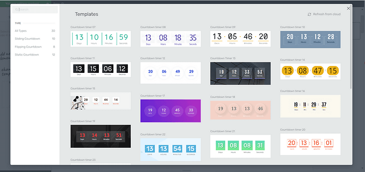
So capitalize on these psychological triggers. Use countdown timers for limited-time offers. Highlight limited spots or quantities available.
You can also display social proof like "xx people have signed up in the last week". A sense of urgency and scarcity is a great way to get hesitant visitors to take immediate action.

Countdown Timers in Thrive Architect
12. Always Test and Iterate
Even with all these tips applied, your forms will never be perfect on the first try.
In your analytics tool, analyze drop-off rates for each field to spot lingering friction points. Depending on the form builder you use for your pages, there should be an in-built reporting engine that provides these metrics.
If not, use a WordPress analytics plugin like MonsterInsights to get this data.
Alternatively, you can use heatmaps to see where people are getting stuck or losing interest – provided your form-builder has this feature. If not, just stick to good ol’ analytics.
And don’t forget to A/B test different variations of copy, design, and functionality to find the winning form. Remember, this should be a regular practice.
Next Steps: Build Your Next Lead Capture Form (The Right Way)
Now that you're armed with a dozen proven tips to boost form conversions, it's time to put them into action!
Whether you're creating a brand new opt-in form or revamping an underperforming one, make sure to apply these best practices.
Here are a few tutorials to get you started the right way:
And if your current form builder is letting you down, consider upgrading to a more conversion-focused tool like Thrive Leads.
You're going to love how user-friendly this tool is. With its drag-and-drop functionality, designing custom lead-generation forms is a breeze, even for beginner WordPress website owners. No need to try figure out HTML or CSS.
This tool is all about making things simple and efficient for you. And with a variety of templates (450+ to be exact) that are not just eye-catching but conversion-optimized, you're set to capture your audience's attention.
Form Conversion Optimization: It’s Your Turn Now
With these tips, you'll transform your forms in no time and start seeing the results you've been waiting for.
Don't let too much time pass you by before working on your opt-in forms -- the sooner you start, the sooner those leads may start coming in.
And as we've said earlier:
If your current form-building tool isn't helping you achieve your goals...


