Yep, it’s that time again.
It’s finally time to share another round-up post of new product updates for our Thrive Suite customers!
This week, we’re sharing 3 great new features....
and 2 helpful improvements...
Let us know your feedback and questions in the comments. We can’t wait to hear from you.
More...
1. A Shiny New Number Counter Element!
Adding an animated number counter is a highly requested feature, and we’re finally happy to add this little element to the Thrive Visual Editor.

Loyal Thrive users will remember that we had number counters way back in the day of Thrive Content Builder + our legacy themes. We figured it was about time we brought it back as a brand new visually editable element.
Want to see the new Number Counter element in action? Let’s give it a whirl...
Do you know how many times the Ommi theme has been downloaded?

Not only is the Number Counter ready to drop into your designs right now, but it’s also packed with powerful customization features:
Style it however you want!
Like all elements in Thrive Architect, we believe in code-free visual drag-and-drop page building. So don't let the default element fool you.
You can change the font, font size, font weight, color, line height, and spacing for the counting number, it's suffix and prefix, and the labels.

A splash of color and a different font. Looks good, doesn't it?
Start and end values
The Number Counter animation starts as soon as it enters the screen. (We've used gifs above to loop the animation for demonstration purposes.) If it’s placed above the fold, it will start as soon as the page is loaded. If it’s placed below the fold, it will start when your visitor scrolls to first view it.
For large numbers, it doesn’t always offer the best user experience to start counting from 0. The starting value lets you choose from where the animation begins.
Likewise, your Number Counter can count down to your final total. This is perfect for where a lower number is more impressive (e.g. weight loss, financial debt support).
The end value is much simpler... it’s the total figure of your final Number Counter.

Setting a decimal point
The new Number Counter comes with complete control over how decimal points are displayed – perfect for currencies and precise measurements.
Right now, you can choose between 0 to 3 decimals places using the handy slider.
What’s even more impressive is how the number is automatically rounded to match your choice!
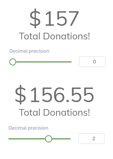
Decimals are automatically rounded.
Depending on your country’s numbering system, you can choose either a period (.) or a comma (,) as your decimal point character.

Choosing a thousands divider
When numbers get into the thousands, it can make sense to add a separating character to improve readability.
Some countries use a comma:

Some countries use a period (aka a point):

And some countries use a space:

It’s completely up to you.
Add a prefix or suffix
The new Number Counter lets you quickly add an optional prefix and suffix to either side of your total.

Prefixes and suffixes are perfect for currency symbols or short abbreviations:

You can combine prefixes and suffixes if required.
Label options
What’s that? You want more customization options?
No problem...
Now you can easily add visually-editable labels above or below your Number Counter – or above AND below if you choose!
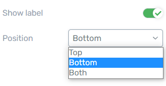
Setting up Number Counter labels in the Thrive Visual Editor.
Here’s some typical examples how how you might use a label on your Number Counter element:
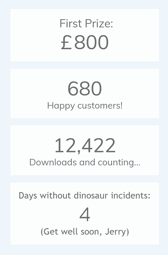
Animations
Finally, you can also customize the animation speed for your Number Counter.
Choose from 1 of 3 presets (slow, default or fast), or set your own custom speed in milliseconds.
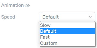
Setting the Number Counter animation speed in the Thrive Visual Editor.
It’s easy to preview the animation speed within the Visual Editor, simply by clicking the little eye icon shown above.
We love the new Number Counter element, and we hope you’ll use it in many interesting ways to enhance your content.
Want to see some more great examples of the new Number Counter?
Check out Hanne's video below, as she leads you through some best practices and practical use cases for this attention-grabbing design element.
2. New Dynamic Data Sources in Thrive Automator
What does that even mean?
It means more business insights, more cross-platform integrations, and ultimately more opportunities to sell your product or service!
Imagine if you could capture information about your visitors (or course students), and pass those values to other services... like setting tags in your email service provider.
Well now you can!
Head on over to Thrive Automator to find a new Dynamic Data button waiting in the action step...
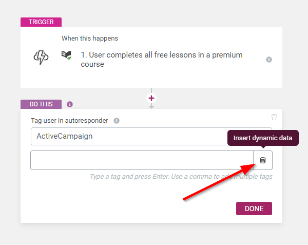
This little button supercharges Thrive Automator with Dynamic Data.
This small, unassuming button is insanely powerful. It lets you pull information about your visitors and whatever event has taken place and pass it along.
Take a look at this example below, where you can feed the WooCommerce product name into a tag that you add to a contact in ActiveCampaign. With just one automation, you'll be able to add custom tags per product every time a customer makes a purchase from your WooCommerce store!

Adding dynamic data will change the tag applied depending on the product purchased.
If you’re already familiar with the Dynamic Text feature inside the Thrive Visual editor, you’ll feel right at home with this new addition to Thrive Automator.
Here’s just some of the options available:
- WordPress username
- WordPress user email
- Course title
- Course topic
- Course difficulty
- Course author
- Percentage of course completed
- Order amount
- Payment processor
- Payment date
- Testimonial title
- Testimonial author name
- Testimonial author email
- Testimonial author website
- Quiz title
- Quiz type
- Campaign name
- Campaign type
- Campaign start date
- Campaign trigger type
- Name
- Phone
- User consent field
- Order number
- Customer ID
- Customer IP address
- Billing company
- Billing state, postcode, country etc.
- Billing first name, last name, email, phone etc.
- Shipping company
- Shipping state, postcode, country etc.
- Shipping first name, last name, email, phone etc.
- Payment method
- Currency
- Order status
- Product type or name
- Product SKU, description, status etc.
- Upsell IDs
Let the possibilities of this sink in for a second... you can now send this information to any integrated platform that supports incoming values.
It can be hard to wrap your head around the applications at first, so here’s some examples:
When a student has completed the free lessons in a Thrive Apprentice course, tag them with “Free Lessons Completed - %course_title%” in your email service provider, and trigger a pre-written autoresponder to convince them to purchase the course.
When a visitor subscribes to your email list with Thrive Leads, tag them with their %user_consent% choice in your email service provider, so you have a clear way to segment those who have consented to marketing communications.
When a customer buys a WooCommerce product, send the %product_sku% or %woo_product_name% to a webhook for some aftersales magic, or to your email service provider so they are tagged for future upsells.
I’m just scratching the surface here, and we will definitely explore more conversion-focused uses of this feature in future content. If you have any suggestions or questions, let us know in the comments below.
The more we think about the opportunities opened up by the new Dynamic Data feature, the more excited we get here at Thrive Themes. With a little careful planning, this new feature promises to be a game changer for your sales and marketing funnels!
3. Dynamic Text for Menu Items
We've made a few changes to the custom menu element recently, with the vision of supporting a more dynamic and customized experience for students and website members.
We've added:
- Logged in/ Logged Out menu items: the ability to hide a menu item depending on whether a user is logged in or out.
- New icon and image formats in menus — including support for dynamic images in menus: This allows you to create any combination of images, icons and text both above, below or on the sides of a navigation item and to display a logged-in user's profile image.
In the latest release, we now added support for dynamic text in custom menus. When you're directly editing a Navigation Item on the canvas, you'll see the dynamic text icon available in the typography bar:

Look for the 'dynamic text' icon when editing a Navigation Menu item.
Remember, 'dynamic text' means that the text will intelligently update based on a dynamic (changing) source.
We added this with a specific use case in mind: showing a logged-in user's image and first name as a customized menu option.
By loading User Data > WordPress user first name as your dynamic text, you can create menus just like this:

Now a logged-in user will see their own name in the menu!
Think about it.
What a beautifully customized website experience, for your users to log in and find all their necessary links inside a menu item with their name and profile image.
4. Give your Core Web Vitals a CLS Boost in Thrive Leads
Cumulative Layout Shift – or CLS – is one of the major factors that Google takes into account when it decides how fast your website loads as part of Core Web Vitals.
As a web page initially loads in the browser, Google carefully watches to see if new elements pop in and force the layout to shift around unexpectedly.
The more the page jumps around and flickers trying to load, the poorer the user experience and the higher the CLS score.

A lower CLS score is better.
In short: Reduce your CLS to score better in Google’s Core Web Vitals.
As part of our commitment to speed and website usability that has resulted in many code improvements and features dedicated to speed, our product team uncovered a another improvement...
We saw that Thrive Leads forms can affect CLS, so naturally, we found a solution. Before we explain how, let's first understand why.
To make a page load faster and play nicely with caching plugins, we've always recommended setting Thrive Leads forms to Lazy Loaded. By enabling this setting, your Thrive Leads forms will load after the main page loads, meaning it won't slow down the initial page rendering.
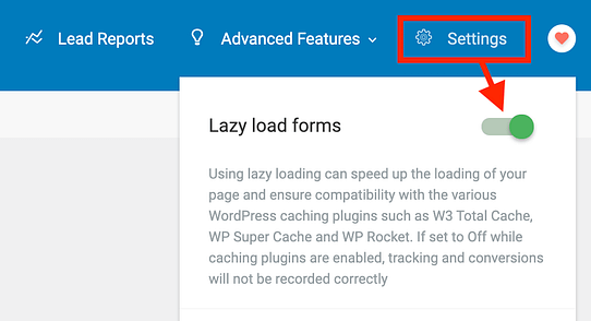
We've always recommended Lazy Loading for faster websites.
And although there are many benefits to enabling lazy loading, there's one disadvantage:
Lazy loading Thrive Leads forms can impact your CLS score by pushing the content of your page around after it's loaded. This was only noticeable when they were above the fold when the page loaded.
But we want the best of both worlds— lazy loading and minimal CLS... and we figured out how to achieve this by adding two new features to Thrive Leads.
Improvement 1: New Ribbon positions
A common Thrive Leads form is the ribbon, and it looks like this.

An example Thrive Leads ribbon.
Ribbons stick to the top or the bottom of a visitor's viewport as they navigate your website.
The problem was that a ribbon stuck to the top of the page and set to lazy load would 'push' the content of your page down a second after it had loaded. To combat this, we've added a 3rd Thrive Leads ribbon position: Top Over Content.
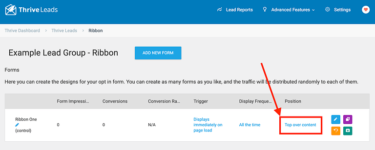
When editing your ribbon, you can now pick the new 3rd option: top over content.
If you select 'Top over content' as your Ribbon position, then when your ribbon has lazy-loaded, it will be placed over the top of your page content rather than pushing it down.
As far as Google's Core Web Vitals are concerned, it's perfectly ok to load content over the top of your page, so long as it doesn't move the rest of the page around.
How to use this feature:
If you are making use of the Thrive Leads ribbon on a webpage that you really want to rank in Google, we'd recommend switching it to 'Top over content' as your Ribbon position.
Improvement 2: Skeletons!
Have you even opened Google Drive, Facebook or YouTube and noticed a light grey placeholder that displays for a half-second before the page content renders? Something like this?
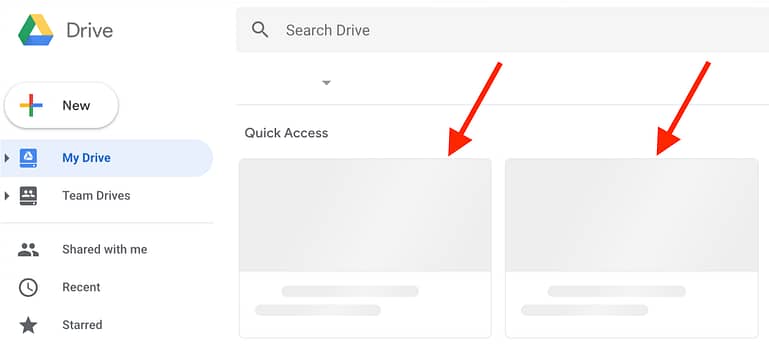
These light grey placeholders are known as 'skeletons'
That's called a 'skeleton', and they're not just good for showing users that page content is loading... it also reserves space on the page.
In Thrive Leads, there are a few lead form types that can impact your CLS scores: the widget form (that appears in a sidebar on your website) and the Lead Shortcode (that you can embed anywhere).
These forms, when lazy loaded, will push other content around the page once they've loaded.
So to fix this, we've added our own simple loading skeletons— a light grey placeholder that reserves space for the Thrive Leads form while the page content loads.
Here’s an example page a few milliseconds after loading a page with 2 Thrive Leads forms:

... and here’s the same page a second later, when the skeletons are replaced with the lazy-loaded content:
It’s a simple solution with a big payoff – The layout doesn’t change or flicker, so the CLS impact is greatly reduced!
This is a much more professional experience for the end user, and it helps you achieve a better Core Web Vitals CLS score, which can factor into better SEO performance.
How to enable Thrive Leads Skeletons:
All you need to do is update to the latest version of our plugins, and re-run Project Lightspeed. That means going to your Thrive Dashboard, clicking 'Project Lightspeed', and selecting 're-run asset optimization'.
Read our knowledgebase article on how to re-run Project Lightspeed.
But does it make a difference? YES!
We tested our Thrive Leads improvements many times to ensure that we'd see meaningful improvements to CLS, and we're proud to say that yes it made a difference.
Have a look at the score our test page was getting before enabling the latest changes in Thrive Leads:

Here our CLS score is in the red...
Our test page had a Thrive Leads ribbon, a widget form in the sidebar, and a lead shortcode embedded above the fold. Perhaps it was excessive, but we wanted to see the results on an exaggerated test.
Now, here are the results after re-running the Project Lightspeed asset optimization which adds the loading skeletons, and setting the ribbon to display 'Top Over Content':

CLS in the green!
Without any other optimizations, CLS dropped from 0.285 to 0.001. That's an outstanding score, just by running Project Lightspeed (a few clicks) and changing the Thrive Leads ribbon position.
5. Add Dark and Light Logo Variations in the Thrive Theme Builder and Thrive Apprentice Setup Wizards
The Thrive visual editor has supported both light and dark versions of your logo for a while now, letting you choose the best logo variation for the background color of your design.
A darker logo looks best on a lighter background, and vice versa.
However, this feature was hidden away deep within the setting pane of the Logo element.
Until now...
Now you can upload both light and dark logo variations from within the Setup Wizard of both Thrive Theme Builder and Thrive Apprentice.
And yes, your main Thrive Theme Builder website can have completely different logos than your Thrive Apprentice school. Both in light and dark flavors.
Simply head on over to the Setup Wizard of either product, upload your first logo, and you’ll see a light and dark preview that allows you to customize either variation...

The preview shows how both your logo variations look on contrasting backgrounds.
Your new logos will be available in 2 places...
1. The Logo element in the Visual Editor
When you drop a Logo element onto your canvas, you’ll see both the light and dark versions in the settings pane. While this feature has been available for a while, it’s now directly linked to logos you chose in the Setup Wizard.

You can add a logo anywhere and simply choose which one looks best depending on the background of its parent element.
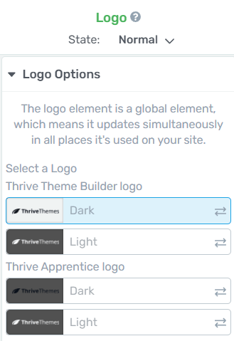
The Logo options pane in the Thrive Visual Editor.
2. Dark and light-designed templates
Thrive Theme Builder and Thrive Apprentice are packed with professionally designed templates that you can use right away on your website. Many of these templates feature logos, such as headers, footers, landing pages, school pages and more.
Some of them are built with a lighter design language, while others use a high-contrast darker design.
Whichever template you choose, if it contains your logo, you can now control the light and dark variations from within the Setup Wizard.

A light header template with a dark logo.

A dark header template with a light logo.
The main reason we wanted to make this change was so that our design team can create some stunning new dark header designs as part of Thrive Apprentice, which will come later in the year.
What’s Coming Next?
Oh boy, do we have some great surprises planned just around the corner...
In addition to the usual new features and updates that we’re famous for, we also have some super-secret, super-awesome improvements planned for Thrive Theme Builder and Thrive Apprentice.
That’s all we're going to say at the moment... but we're really looking forward to the day we can let more cats out of the bag.
You’ll definitely want to Watch. This. Space!


All of these updates are fantastic! I was designing a sales page recently and wanted to add the number animations and I was convinced they already existed, but I couldn’t figure out how to add them. This new update comes at the perfect time so I can go back and update that sales page with an extra fancy factor! 🙂
I appreciate the skeleton update too! That’s going to be SO helpful with Google’s new changes! Thank you, team! Keep up the good work!
You’re welcome, Lucia— glad to hear you can put the new number counter to use straight away!
Great Updates 🙂 Thank you all the team of Thrive Theme. You are keeping us proud of being part of this awesome company.
Thank you Taher!
Hey, Bradley, I’m just wondering about one feature that is missing for more than a few years now: Lead export in Thrive Leads.
Currently it shows that it’s unavailable to export leads because of GDPR changes and the update is in the works…
Soooo… You know… GDPR went into action like 3 years ago now. What’s up? 😀
P.S. But I love the new updates! <3
Yeah, I’m not sure about that one. GDPR really made things complex, and navigating different privacy standards set by different countries feels like jumping through flaming hoops at the circus.
I can’t give you a good answer, I’m afraid, because not too sure what exactly we can do about it.
If you give me a use case, that’s always helpful for us. So for example: why aren’t you passing lead data out via API connection when the lead is created? Why do you want to export lead data– for what purpose? These kinds of questions help us figure out the best way we can help you given the limitations we have.
Ah, thank you for the honest answer! <3
I have tried to use the export two times in the past when in two of my websites API failed and I was locked out of mailing platform. (Well, ok, once I accidentally deleted whole mailing list in the mailing service… Haha…) So I tried to use the export as a backup option.
But yeah, I guess just using API is enough 😉
Wow… So amazing. I’m so happy the countdown is back. I just implemented it immediately. This is so so cool… Thanks for the updates.
Meanwhile, I’m still looking forward to the course content dripping.
Course dripping is something we’re working on right now. But our version of it is going to be many times more powerful than all other options out there, so it is taking us some time to get it right.
Excellent features !! I have a question, specifically for Thrive Automator, is there a recommended autoresponder? What works best? I have worked with Mailchimp, Mailerlite, and ActiveCampaign. I mean that you can take advantage of all the functionalities that Thrive Automator offers. Thanks.
All email services have gotten pretty good these days. A few years ago, Shane, our co-founder, did a pretty extensive comparison and research article and saw that ActiveCampaign was the most fully-featured service at the time. That’s why we use it as a company, why we recommend it, and why most of our new features will integrate with ActiveCampaign before other services.
My god! You guys are the best!
Every time you drop a post I’m excited like a child 🙂
We love hearing that! Seriously— even for our team, it’s such a rewarding feeling to be able to give you updates like these and see that they are well received.
As always you are awesome team. I’m using your sprint updates as an example to other Saas teams. Proud to be Thrive Theme member.
Thanks Martin. We just keep up the sprints and it shows how software can grow and change if you remain consistent.
Wow, these are awesome updates! You guys keep getting better and better, at lightspeed!! (see what I did there? 😉 ).
So, for the TA variables… do they work only when an action is made on site (a form submission, a sale) or can they be triggered by visits only (via URL variables, e.g. from a previous page)?
Love a good pun! They’re common in our team and always welcomed.
Right now, Thrive Automator doesn’t have a ‘visits webpage’ trigger, but it’s something we’re looking to add, and in theory it shouldn’t be too difficult.
Have you got a specific use case in mind? It’s always helpful for us to understand how it would be used when we design the feature.
Thanks for the reply and confirming how the automations work. I guess I’m thinking it would be great to be able to use TA to do funnel analytics, as a replacement to building converison goals on GA for instance. Maybe this is completely off, but that’s what came to mind!
That’s a great idea, and yes it could be done with a GA integration on Automator actions. I’m curious though: is there any benefit to logging the conversion from your site with Automator versus installing Google scripts on your entire site and then telling Google Analytics what page-visits should be counted as conversions?
How would a user upload a profile picture using a thrive suite website?
By default, WordPress profile pictures are loaded from Gravatar, a free avatar synchronization service owned by WordPress.
It’s actually pretty great, because it can fetch a profile image based on an email address. That means that if your website members have ever used a service that synchronizes with Gravatar, then as soon as they log into your website, WordPress finds the profile image attributed to the wordpress email address and loads it for them on the WordPress site.
We intend to create our own user profile uploader, so Gravatar images can be overridden, but it’s not a high priority since gravatar does the job very nicely.
Thanks for the reply. That makes sense. I’m not currently using profile images, but since it was mentioned in this article, I thought maybe there was a feature I wasn’t aware of.
LOVE the updates guys.
Skeletons are a great tool and should be used everywhere they apply.
Like loading images. Lots of images of variable sizes can affect CLS too, depending on how they are done. When you have a symbol used on page, that’s a box with an image in it (only way to do dynamic images) I noticed it can affect CLS a bit, though not as dramatically as your Leads example 🙂
REALLY love anything added to Automator – would like to see more WP field data (like username for example) added to dynamic data & dynamic test.
The counter is a neat addition we used to use in TCB days. We use countdown timers already – not just for marketing, but on member pages as a countdown to when new content will post, when software updates will be added, or when new stuff being added. All of it marked as “Estimated” of course, but it actually reduced number of emails we get asking “when is…” questions! 🙂
Great job on all of it. 🙂
Joe C.
CTO
Thanks Joe! You might be surprised to know that…
Thrive Automator already supports dynamic user data for: username, user id, email, user role, last logged in, last updated, registration date, and number of comments left.
And Thrive Architect supports dynamic text for: username, email, user role, first name, last name, nickname, public name, website, bio, IP and browser.
For number counters, remember— the countdown timer and the number counter are slightly different. The countdown timer we added late last year is seriously world-class! Good to hear you’re getting great use out of it and I hope you do from the new Number Counter too.
I expect we will make good use of both counters.
I am curious if there is video/tutorial on creating the “members” menu with the User profile picture?
Would be useful to do that so it shoes only for logged in users
I don’t think we have it as a tutorial yet, but I’ll forward this request to our marketing team. They always love fresh ideas of new videos they can make.
Again great stuff!!
Now dynamic data is possible with WooC. does it mean it’s possible to build an abundant cart automation? With emailing cart content etc.?
Keep up the great work!
We did look to see if this would be possible. Unfortunately, we saw that most abandoned cart extensions for WooCommerce add functionality that isn’t in the native version of Woo. What that means is: out-of-the box, you can’t really create an effective Abandoned cart automation. But if a 3rd party extension integrates with Automator (and we’d love for them to!) then you could.
Once we move Automator out of the public beta, we’re looking to invite more 3rd parties to integrate, so perhaps we’ll see a solution come forward then.
Can Thrive Automator be used to change out page/personalise content based on answers to a quiz? Eg: what type of customer are you? Plumber, Electrician, Pool Cleaner….then content changes?
Thrive Quiz Builder has this built into it natively, so Thrive Automator isn’t required.
In Thrive Quiz Builder, you can do it 2 different ways. First, you can redirect a user to a custom results page based on their quiz result. That means that when they get ‘plumber’ as a result, you can immediately send them to a dedicated page for plumbers.
The second way is that you use one single result page and add the Quiz Dynamic Content element to the page. That way you can change a block of content based on what result they get.
Hope that helps!
Excellent Brad! I appreciate the insight you provide with the updates and improvements that just keep on coming! 🙂
You’re welcome, Peter! Thanks for stopping by to comment
Thanks for these updates. And I have a feature request.
I think it is time to update the Thrive Ovation display testimionials element in Thrive Architect. I am getting used to the fact that I can customize almost everything. But with Thrive Ovation I can just select from a list of templates and only change the colors. When I want to change something else I have to do that with css.
Any chance that I can modify the Thrive Ovation templates like the rest of the page soon?
We’ve had an update to Thrive Ovation sitting on our backlog for quite a while now. We’re definitely looking forward to building the update, but we have a lot of updates fighting for priority and it keeps getting kicked along. One day we will!
I hope my request kicks the update in the right direction… 😉