Strap yourselves in for a ride...
I'm going to take you on a journey through 9 kick-ass new features and improvements we've just released into Thrive Suite.
"9, you say?"
Yes. That's... a lot.
There's updates to Thrive Architect, WooCommerce, Thrive Ultimatum, Thrive Apprentice AND to Thrive Theme Builder.
Let's get stuck into it.
More...
1. World-Class Countdown Timers
Countdown timers are notoriously difficult to style.
What seems simple on the surface is, behind the scenes, a tight cluster of boxes, animations, numbers and text elements that all affect one another.
For this reason, most countdown timer plugins are rigid and inflexible, forcing you to pick from a few styles.
Not ours.
Our latest update to the countdown timer puts us leagues ahead of the standard for visually editable, customizable timer designs.
Watch this video below and you'll quickly see how flexible it really is.
Play the video above to see the new countdown timer in action.
This latest update applies to both the Countdown Timer and the Countdown Evergreen elements inside of Thrive Architect.
Try out either of these elements to see the new timers.
With the standard Countdown, you can select a date and time for it to expire.
With the Evergreen Countdown, you can select an amount of time after a visitor arrives before it will automatically expire, and how soon after its expiry you would like the countdown to restart.
When you add a new countdown timer to your page in Thrive Architect, you'll get to select from 6 core templates.
Among these 6, there are 3 different animation styles.
From there, you can begin to customize everything in the timer.
And we really do mean everything.
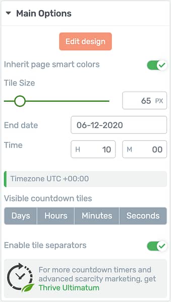
Improved countdown timer options.
With a few clicks, you can change the color of your timer to anything you want... or set it to inherit your landing page colors.
These timers are Smart Color enabled meaning you can change one color input and the whole design will intelligently generate a color palette with shades, tones and variations derived from your input color.
Resizing the countdown is ridiculously easily. Just drag the slider and the whole element will scale proportionally.
You can also disable visible tiles with a quick click here:

One click to hide/ show a countdown tile.
...hiding a few unwanted countdown tiles until it displays only minutes and seconds, perfect for short One-Time-Offer or tripwire discounts.

Only want minutes and seconds? Easy!
Or switch it around and hide all except the days tile to create an easy countdown to a date or special event.

Hide all except days? Also just so easy!

This day counter has hours, minute and seconds hidden.
With one click, you can enable or disable the tile separators too. That's the symbol that displays between countdown tiles.
Not only that, but from edit mode you can choose which character, typography and font you'd like to use for the separator!
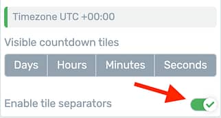
Enable or disable your tile separators
This setting even respects your screen size, meaning you can disable separators only for mobile view where screen real estate is limited.

Outlined in green are the tile separators that you can show, hide or edit.
Edit Mode:
After you've made a few high-level changes, you can enter 'Edit Mode' for extremely precise, granular control over... well... everything.
Expired State:
When your countdown timer ends, a content box will be displayed on the page with any unique content you wish to show.
To edit the expired state, enter Edit Mode and select it from the Edit Mode bar.

The edit mode bar has a dropdown for state switching built right in.
Yes, you can add anything from the elements panel to the expired state content box. Simply drag and drop it.
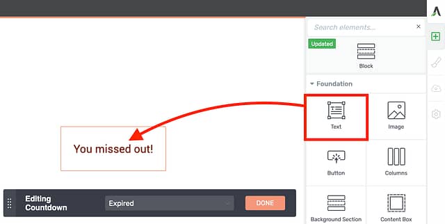
Drag and drop content into the Expired State content box.
Want to show the expired timer?
There's a toggle for that.

Find this toggle in the Main Options tab when editing the expired state.
With just one click you can choose to include the expired countdown above your expired state content box to show those dramatic zeroes.
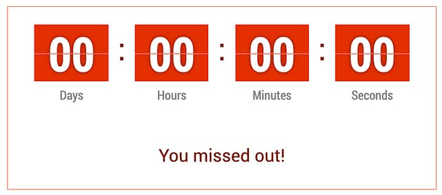
Display your expired countdown once it reaches zero.
This truly is a well-built piece of website technology.
I'm not kidding when I say that this is the most flexible countdown timer you'll ever have the joy of styling. Period.
But... wait until you see it in Thrive Ultimatum!
2. Even Better Countdown Timers in Thrive Ultimatum
In a true scarcity marketing campaign, the countdown timer itself is just the visible tip of the iceberg.
Much like an iceberg, what really makes a scarcity marketing campaign deadly is the part that remains unseen, including:
...and more.
This, my friends, is where Thrive Ultimatum shines.
To bring us all on to the same page, Thrive Ultimatum lets you choose from multiple campaign types that can work across multiple pages on your site.
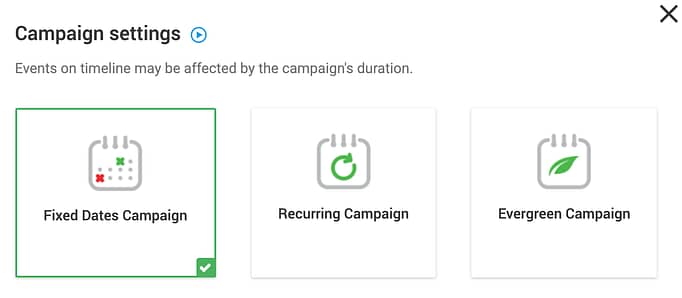
Thrive Ultimatum has 3 main campaign types.
Once you've selected your campaign type, you can set a countdown trigger, create a scarcity timeline, and a conversion goal.
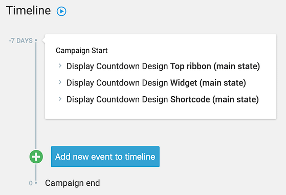
Thrive Ultimatum's timeline lets you define scarcity events.
Once your campaign is live, you'll see reports on the number of visitors who have seen your scarcity campaign pages, and what your conversion rate is for that campaign.
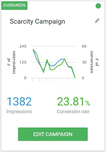
Thrive Ultimatum's scarcity campaign reporting
But how do your visitors know what special deal or launch offer is available on your site?
That's where we return to Countdown Timers.
Thrive Ultimatum takes the new countdown timer element from Thrive Architect... and super charges it.
Instead of just 6 new countdown timers, you'll find 30!
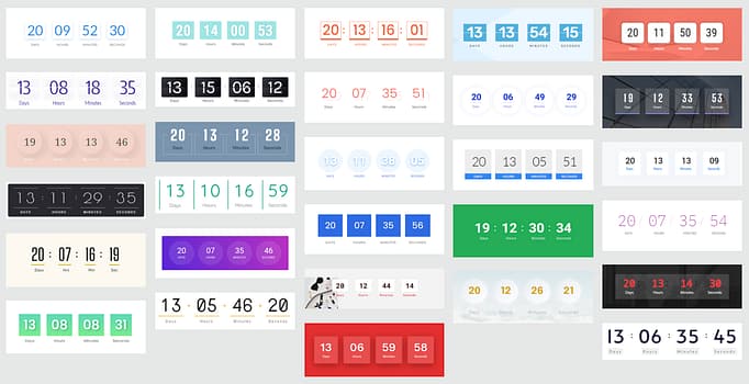
30 new Countdown Timer designs are available in Thrive Ultimatum
These timers are known in Thrive Ultimatum as 'Shortcode timers', and can be added in any content on your site, whether you have Thrive Architect or not.
A Thrive Ultimatum shortcode timer allows you to create a timer with any accompanying elements alongside it, and then embed the whole set together... even on multiple pages.

The Thrive Ultimatum content block can contain anything you want to hide on expiry.
Why? It means you can add pricing tables, text, buttons and more that will magically vanish from your sales pages when the timer ends.
Once you've built a countdown in Thrive Ultimatum, simply drop it into your Thrive Architect pages with the Ultimatum Countdown element.
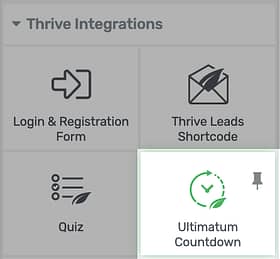
Add your Ultimatum timers from the element panel.
The result is a countdown timer just like the ones you'll find in Thrive Architect... but anchored to a site-wide scarcity timeline.
But is that all Thrive Ultimatum can do? Of course not.
New Site-Wide Ultimatum Templates
Although the Thrive Ultimatum Shortcode timer can replace your Thrive Architect countdowns on sales pages, they are only 1 of the 4 timer types available.
The others are the top ribbon, bottom ribbon and widget templates, designed to be used across your whole website to drive traffic to your all-important sales page.
Thrive Ultimatum users will now find 17 new Ribbon templates.
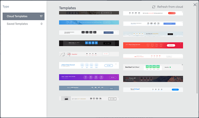
17 beautiful new scarcity ribbon templates.
Each designer-made ribbon template contains a countdown timer with some accompanying elements and a Call-To-Action, like this:

These ribbons could be up on your website in minutes.
We've also added a new selection of 8 widget template designs, made to show in the sidebar of your website to alert visitors to any active scarcity campaigns they haven't responded to.
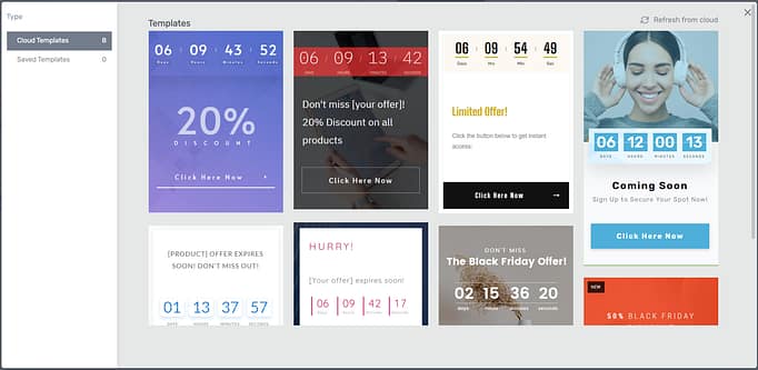
Style these widgets and add them to your sidebar effortlessly.

Don't you want this on your blog when you're promoting a product launch?
If you want to learn more about the difference between Thrive Architect timers and Thrive Ultimatum, and how it can super-charge your scarcity marketing campaigns, click here:
3. Edit Product Template in WooCommerce
Earlier this year, we released our WooCommerce integration for Thrive Theme Builder, allowing you to quickly load and customize WooCommerce templates.
Since then, our developers have been carefully improving core WooCommerce elements to give you granular control over everything.
It began with customizable headers, top & bottom sections, footers, and sidebars. Then we improved the Shop element, allowing you to embed and style it anywhere.
In this release, we've now released that same level of control on the Product element, used inside the WooCommerce product page template.
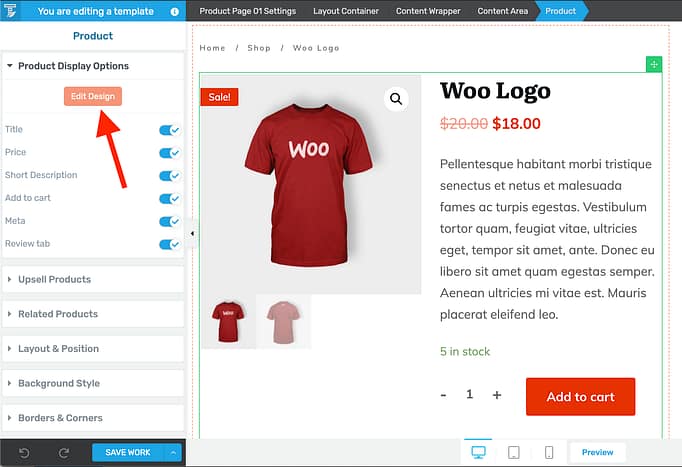
Click Edit Design to style your WooCommerce product pages.
This product page template is generated dynamically by WooCommerce for every product in your store.
Product content (such as product name, price, description, images, stock quantity, etc.) is created in the backend of WooCommerce itself and fed through to this element on your page.
Now when you edit the page template, you can select the Product, click 'edit mode' and apply styling to any of the sections contained within.
The arrangement will remain as per WooCommerce defaults, which means it supports extensions that add other content inside of the Product area too.
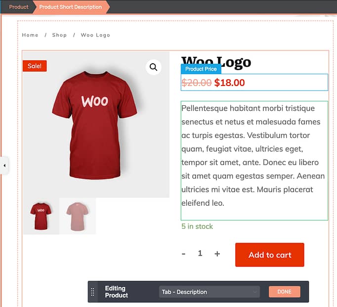
Inside of edit mode, select any sub-element and apply your styling.
That means fonts, font sizes, colors, paddings, borders, corners and more are all editable. Get as creative as you like and make your store look perfect for your brand.
Since these changes are at a template level, you won't be editing the content - only their style - and they will affect all products that use that template on your website.
You can even use the Edit Mode bar to switch between the WooCommerce Description and Reviews tabs to style what your users see in both.
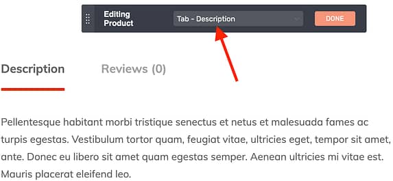
Select the tab you'd like to style
4. Thrive Apprentice gets a new User Interface (UI)
Behind the scenes, our team are working to improve Thrive Apprentice to make it more robust, flexible and user friendly, for both you as a course creator and for your students.
To do this, we need more space to deliver new options and features.
So we decided it was time to refresh the user interface to make it cleaner, sharper and leave more room for expandability.
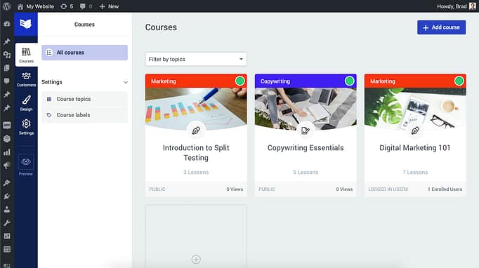
Doesn't that look nicer?
Has anything else changed?
This is a cosmetic change, though there is one temporary change to manual course removal which will continue to be improved in an upcoming release.
You can still remove access to a product in Thrive Apprentice, but for the moment you cannot manually remove access from an individual course that is not attached to a product.
This change is unlikely to affect your student management, and will soon be improved with more efficient student management.
5. Thrive Apprentice Login/Logout Menu
Are you using a plugin to change your WordPress menu options when students are logged in or logged out?
Well, you can now deactivate and delete it.
...Because we've just brought this feature natively into Thrive Apprentice.
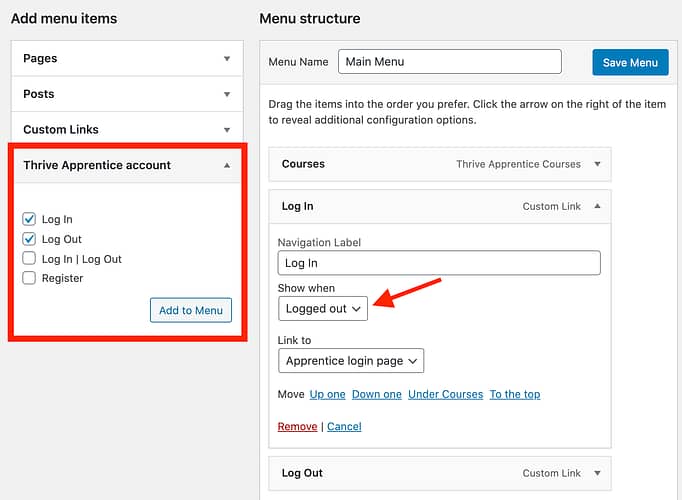
Easily set menu items to show only when logged in or logged out.
If you have Thrive Apprentice installed, you will be able to add WordPress menu items and apply a 'Show when' option.
Your choices are:
As the name suggests, these menu items will only show depending on your visitor's status.

An example Logged Out menu.

The same menu once a user has logged in.
There is also a Log In | Log Out option, which is automatically configured to switch.
The text to the left of the pipe symbol ( | ) is what a user sees if they are not logged in, and the text to the right of it shows when they are.
To display your new menu in your Thrive Theme Builder template, headers or in Thrive Architect, make sure you select to correct menu source.
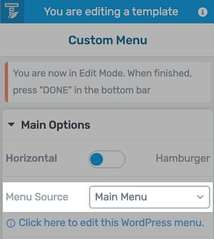
Set your menu source under Main Options.
Rather than manually setting your Log In & Log Out links, you can select the option 'Link to: Apprentice Login Page' and the link will be always be updated with the page you set universally inside of Thrive Apprentice.
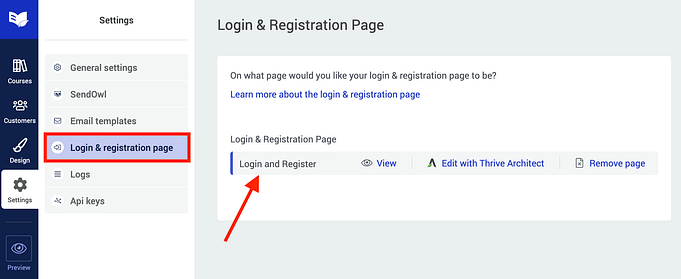
Your Login & Register page here will be substituted into your WordPress menus.
How to get the Apprentice Menu Options
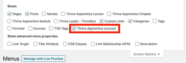
In WordPress, if you open Appearance >> Menus and you can't find the Apprentice options, you might find it hasn't been enabled under your screen options.
Click this button at the top of the screen:

This will show you different menu options that are hidden. You'll find one called 'Thrive Apprentice account'. Make sure it's checked and then you'll find the settings you are looking for.
6. Pre-Made Templates for the WordPress Login Screen
In our last release, we added WordPress Login Screen Branding, accessible from the Thrive Dashboard for Architect, Apprentice and Theme Builder users.
It was a hit.
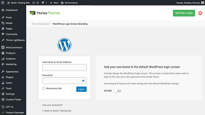
WordPress Login Screen Branding lets you add your own brand to the login screen.
With a few clicks, you could style that pesky default WordPress login screen to make it look just how you want.
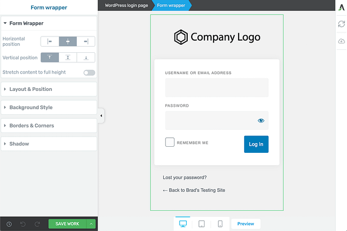
Style that form however you like!
But we know that you probably aren't a designer, and as much as you love the design freedom...
...you wish someone would do it for you.
No problem.
Now when you open the editor for the WordPress Login Screen Branding, you'll see a new cloud template icon on the right.
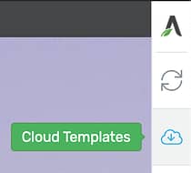
Click here to get started
Do you know what that means?
It means rather than starting from scratch, our design team have build 20 beautiful templates for you!
Pick the one that suits you and customize it to your heart's content.
7. New Logic Filter Added to the Dynamic Styled List
A dynamic element is one that auto-populates in more than 1 place on your website.
Thrive Architect edits a static page (only seen in 1 place), but Thrive Theme Builder customizes dynamic templates, meaning your changes are seen across multiple posts or pages.
One popular element in Thrive Theme Builder is the Dynamic Styled List.
Find it in your elements tray in Thrive Theme Builder.
With this element, you can add a list to your website's sidebars, footers, or anywhere you choose, knowing that it will automatically update when new content meets the display logic.
In the latest release, we've added Filter Logic, similar to what you know from the Post List.
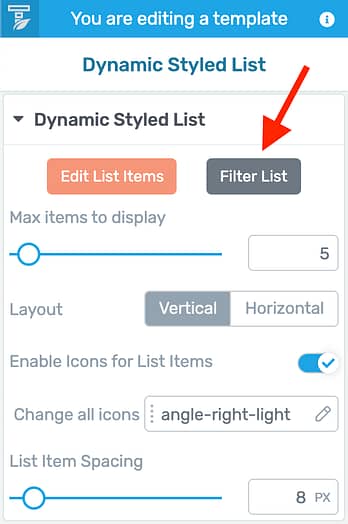
Click the new Filter List button.
When you click 'Filter List', you'll be able to set some display logic rules for your Dynamic List.
The key difference is that, unlike the Post List, you choose what to exclude from your list type, rather than what to include.
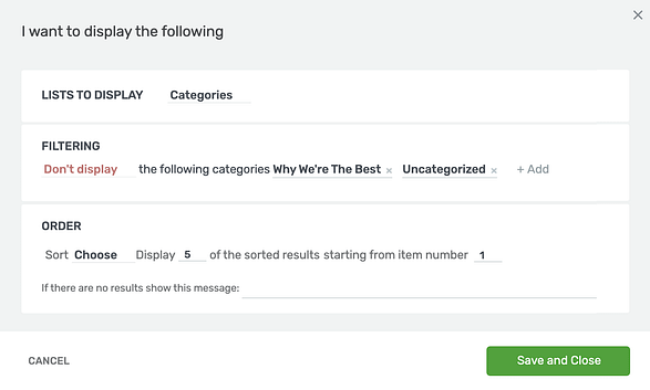
Build out your logic for your dynamic list.
In the above example, I've selected 'Categories'. If I add a new category to my website, these lists will update accordingly.
However, I can choose specific categories that I do not want included in the list. This filter makes the Dynamic List much more flexible.
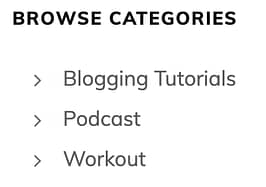
Don't forget that with Edit Mode you can quickly style those lists from something bland like this...
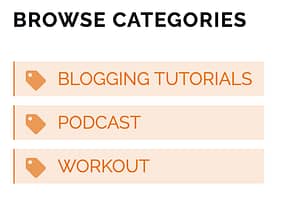
Into something with some design flair like this:
8. Smart Sticky Sidebar
What good is a website sidebar... if your visitors can't even see it?
When a visitor scrolls up and down a long blog post, your sidebar full of lead generation forms, links to other content, author boxes and more can quickly slide off screen and become ignored.
That's why sticky sidebars are popular. But the catch is that a sidebar may be shorter or longer than your browser height, potentially hiding content off screen.
Some smart sidebar sticky logic is required... and we've added that for you with one-click.
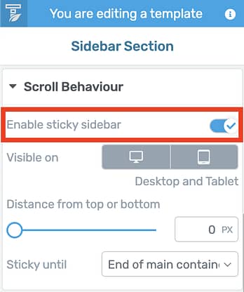
Enable sticky sidebar is now just one click!
In Thrive Theme Builder, simply select your sidebar and under Scroll Behaviour, enable the new Sticky Sidebar toggle.
If your sidebar is short, it'll remain visible up and down the page.
If it's long, it will naturally scroll like the rest of your page, sticking only when it arrives at the top or bottom of the sidebar. It's perfection!
Look at this quick preview below to see how it looks in action.
9. Easier-To-Find Section Template Gallery
Did you know that Thrive Theme Builder has over a hundred pre-made templates for your top section, bottom section, sidebar, header and footer?
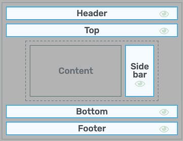
Each of these highlighted sections come with pre-made templates.
We've seen some walkthrough reviews online where users have completely missed this outstanding feature in Thrive Theme Builder, instead believing that they had to customize the defaults themselves.
Our designers hung their heads in shame.
In the latest release, we've made a small improvement to Thrive Theme Builder to highlight that there are ready-made designs waiting for you.
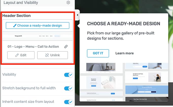
Follow the tooltip to find the section gallery!
It's a small change, but we hope this will show you that there are many templates to choose from, such as these sidebar templates made by our design team to inherit your chosen fonts and website colors.
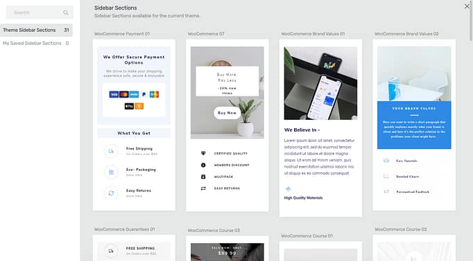
We make website building easy.
Do you have Thrive Suite yet?
In this release, we improved 4 premium WordPress plugins: Thrive Architect, Thrive Theme Builder, Thrive Apprentice and Thrive Ultimatum.
Did you know that you can get access to all of these tools (and more!) for a super-low price when you get Thrive Suite?
When you get Thrive Suite, you don't just invest in a better website...
You invest in a growing software development team that is dedicated to giving your online business an edge over your competition.
As always, we'd love to hear your feedback and requests in the comments below!


Great!!!
“The arrangement will remain as per WooCommerce defaults, which means it supports extensions that add other content inside of the Product area too.”
Will there ever be an option to move the items around? Like moving price to the bottom of description?
Now its quite easy to do with a custom plugin that rearranges this woocommerce display template. But… You know… It would be easier without it 😀
Well, we won’t say ‘Never’, but it’s much easier said than done. Although WooCommerce is customizable, it was never really built to work with visual editing. What kind of rearrangement are you trying to do?
I wanted to move the price to the bottom of description (and meta tags), for example. And in checkout page I wanted to move around the fields 😉
But I do understand that it’s not easy to do, when there is so much moving parts in the code side.
Yeah, our WooCommerce implementation works a bit differently to standard page content, just because of how WooCommerce is built. But your description is helpful. We’ll discuss it with the product team and see what’s possible
Hi, technically you can move elements around if you create a new template. There are some limitations to this tho.
For now, there’s a work around available, where you can turn off the price in the woocommerce product options inside Theme Builder.
Then add a text box back into the template in the area you want it your price to show, and set it as dynamic link to show the product price. Works great.
That… would work. I can’t guarantee it’ll work exactly how you imagine or want it to, but yes, WooCommerce data is available as dynamic text too.
Oh, yeah, that’s an idea! I will try it out, thanks 😀
wow, just another amazing update to my Thrive Membership 🙂
Love the new countdown timer featues!
We’re super proud of it too. It really is next level
Incredible!!
I would love to see Thrive Apprentice with WooCommerce!!
We would too! It’s on the cards, but no ETA yet.
As always… An excellent update! Appreciate it!
No problem, Eric. Thanks for your comment
I have already used the new style counters, and they’re awesome. Thank you for all of these 🙂
You’re welcome, Tibor
Would you be happy to share some links?
It’s very satisfying and helpful to see how people are using the new Countdown Timers on their websites.
Great improvements! Again. 🙂
Thanks Stef!
These new features blow me away. I can’t wait to play with them!
They’re lots of fun, I’m sure you’ll love them
Love that you all show up everyday and create more value for us users of the TT products…love that it gets better and easier every day…thanks!!!
Thanks Kyron! We try to be always evolving, and I’m glad to hear that it’s helpful
I would like to see some more practical sidebar templates. As a Product review blog Me and my Name is the absolute less important in this world. All your templates are too much personal branding focused. (included sidebar templates) and remove all the noise in them.
A sidebar should only contain these things from top to bottom: a simple and basic one coloured option form with email and a button. – 3 separate fields for a custom URL to place ads- Lates posts list (with links to the post of course).
This is everything a sidebar shall contain if you are product-oriented and not personal brand-oriented.
In thrive, theme builder, it should also be possible to have an option to skip/remove the front page/generated front page template since that is kind outdated.
Hi Aslak,
We have 4 sidebars for content specific sites (that do not include any personal branding) you can easily delete the sections you don’t need. We made the choice to add what we believe a content site would want or need and have it designed because it’s much easier to delete and element than design it from scratch.
For the front page/generated homepage, you can simply choose to use your blog page as the front page: https://share.getcloudapp.com/p9uwvn5Y
Really awesome updates Brad.
Weldone to be the team.✌️
Thanks for this long anticipated post, Brad! Keep ‘m coming. 😀
Question: related to update 7: New Logic Filter Added to the Dynamic Styled List. Is it possible to display the list as a Word Cloud?
We don’t have an option to display the list as a word cloud; to be honest, we don’t really have plans to implement that, but we can note this as a feature request and monitor demand for it.
Great updates Brad 🙂
Any word on an update that allows for a left sidebar on desktop without the sidebar elements on mobile being moved to the top of the post as a result?
We are currently working on that one 🙂 it’s scheduled for one of our upcoming releases, so if all goes well during testing, it should be available fairly soon.
Love these updates
The log in and log out features and just want WordPress needs.
Massive improvement for our sites.
Now that you have updated thrive apprentice does that mean drip lessons will be here soon?
And pay for courses with woocommerce?
Can not wait for these features.
Keep up the great work. You guys are amazing.
Thanks? Adam
Thanks Adam! Some huge improvements for sure.
Drip is coming, but not soon. Our goal right now is to improve the Student experience in Apprentice and make it seamless and enjoyable first. Once we are really happy that the foundation of Apprentice is close to perfect, then we’ll start adding other features like Drip.
Nice to see Thrive Ultimatum is improved.
Rather than cosmetic improvements and more timer templates, I really would like to see a functional improvement that I am desperately waiting for: start evergreen campaigns with an ActiveCampaign webhook. I asked for it before, and was told that it would come one day. Any ETA on this?
And it would be really awesome if I could use a Thrive Ultimatum countdown timer in emails too… 😉
Hi Wouter,
We needed the “cosmetic improvements” first 😉
The Active Campaign webhook is around the corner now.
Email timers are another beast though… If you have a fixed campaign, this might work: https://www.sendtric.com/
Good to hear that the Active Campaign webhook is around the corner!
And thanks for the link. But most of my campaigns are user specific. That’s why I need the Active Campaign webhook.
I do this now.
But i use integromat to trigger a https request. So webhook to Integromat then http request to my site with the Ultimatum link. Works perfectly although not as good as direct integration.
Smart 🙂 Hopefully soon all of this will become much more straightforward!
This exact feature is being released literally next Wednesday…25th November, 2020
Thanks a lot for the new features!!
Very nice.
You made me love to work on my websites!
Cheers!
You’re welcome, Christiaan
Great job, you guys, being a TT member gets better and better 😉
????????????????
Hopefully in December you’ll add support for horizontally scrollable navigation on mobile (like other modern websites)? ????????????
Can you give an example Ryan?
Great ideas and implementation again guys!
Any updates in the pipeline for the front end display settings on thrive ovation? They’re kind of rigid and sucky to work with.
Yeah, they’re not great and we know it. We’d definitely like to improve Ovation, but at the moment all of our developers are working on higher priority things for Architect, Theme Builder, Apprentice and Ultimatum. In 2021 once we’ve got some big changes down, we’ll schedule work on Ovation, Comments, etc.
Great update.
I am always waiting for more Woocommerce options 🙂
For example, adjusting the position and the look of the ratings would be great.
I would like to have the toggle for the ratings below each other for the instead of side by side.
Example now: FAQ – Rating
Better:
-FAQ
-Rating
Or create a description of the product with Thrive Architect between the “Product Element” and the “Rating Element”.
-Product
-Architect
-Rating
I am also happy about the WPML Update.
I am planing to translate several websites in the next months – starting December or January.
Best
Thank you for your feedback. Moving things around in WooCommerce is another level, so while it’s something we have in mind to implement, we can’t really make promises about it in the short term.
Better support for multilanguage sites is definitely something on our roadmap. At the moment I don’t have a precise ETA though, because that’s also quite a big task with many unforeseen challenges 🙂
Finally Ultimatum updates!!
Thank you ????
And there’s more coming too!
There is somthing that could be very useful and I don’t think it would be very difficult to implement and is the posibility of exporting headears and footers as well as landing page. At least the posibiliy to export a header or a footer separately.
We’ve had some more requests for this recently, so I’ll discuss it with the team. Thanks Juan
Thank you for these great updates,
Regarding the Sticky Sidebar feature, there is a bug related to the sidebars with the (right side) alignment; when I scroll down the sticky sidebar appears on the left side instead of the right one. Is this a common issue or I’m the only one who experienced it?
We don’t have any other tickets with that issue, so it might be isolated to your website. Would you mind opening a support ticket? We’ll get out team to take a look at what’s causing it.
Will there be feature to add “scroll to top” button in future updates?