TL;DR: The Buyer’s Journey
The buyer’s journey is your customer’s path from awareness (realizing they have a problem) → consideration (researching and comparing solutions) → decision (choosing the winner).
- B2B journeys: longer, with more decision-makers, budgets to justify, and a need for clear ROI.
- B2C journeys: faster, often emotional, driven by personal needs or instant gratification.
To map it well:
- Know your audience – build detailed personas with goals and pain points.
- Spot key touchpoints – from first ad to post-purchase follow-up.
- Match content to stage – educate in awareness, compare in consideration, reassure in decision.
- Measure and refine – track what moves people forward and fix friction points.
Do this right, and you’re not just selling — you’re guiding, building trust, and turning casual browsers into loyal customers.
Stop losing customers you could have won yesterday.
Every day you spend guessing how people go from “I think I need something” to “I’m buying now” is a day of missed revenue.
And if you’re just starting out right now in 2026, I can only imagine how much pressure you're feeling right now. But hey! Breathe. I'm here to help.
Having been in the marketing industry for years, I’ve seen platforms come and go, algorithms rise and fall, and trends explode overnight — only to fade just as quickly. But one thing has stayed relatively the same: the buyer’s journey.
No matter how much tech evolves, your customers will always need to be led through a path where they find you, learn about you, and decide to buy from you.
But the good thing is... you don’t have to figure it out the hard way.
In this guide, you’ll see exactly how to:
- Spot where customers are in their decision-making process
- Give them the right nudge at the right time
- Map out a path that turns casual clicks into loyal brand advocates
Think of it as your shortcut to clarity — no jargon, no guesswork, just a practical way to connect with your audience and guide them to “yes.”
Let’s dive in.
Buyer’s Journey FAQ
The buyer’s journey is the path customers take from recognizing a problem (awareness) to researching options (consideration) to making a purchase (decision).
It’s important because it flips the focus from how you want to sell to how your customers actually make decisions. Understanding it lets you create targeted content and experiences that meet customers’ needs at the right moment — increasing trust, conversions, and long-term loyalty.
The buyer’s journey is customer-centric, describing what buyers think, feel, and do as they move toward a purchase.
The sales funnel is company-centric, showing your process for converting prospects into customers.
The sales pipeline is seller-centric, mapping the internal steps your sales team takes to close a deal. The buyer’s journey provides the context for both, and aligning them creates a seamless experience for customers and better results for your business.
- Awareness stage: Educational, problem-focused content (how-to guides, blog posts, infographics, explainer videos).
- Consideration stage: Solution and comparison content (case studies, webinars, buying guides, live demos).
- Decision stage: Trust-building, conversion-focused content (testimonials, transparent pricing, free trials, guarantees).
Matching your content to the buyer’s stage ensures you give them the right information to move forward confidently.
You can identify a buyer’s stage by their behaviors:
- Reading a general “how-to” article or problem overview = Awareness.
- Downloading a comparison guide, attending a webinar, or researching product categories = Consideration.
- Viewing pricing pages, requesting quotes, or booking demos = Decision.
Tracking these actions — and scoring them — helps you send the right follow-up to guide them to the next step.
- Awareness: Website traffic, brand mentions, social shares, time on page.
- Consideration: Resource downloads, lead form completions, return visits, stage-to-stage conversion rates.
- Decision: Sales conversion rate, deal velocity, total revenue.
Using stage-specific KPIs gives a clear view of performance and prevents judging early-stage content by sales numbers alone.
Because the sale is the start of the customer journey, not the end. Post-purchase experiences — such as onboarding, helpful follow-ups, excellent support, and loyalty programs — keep customers happy, increase retention, and encourage referrals. It’s significantly more cost-effective to retain and grow existing customers than to acquire new ones, and satisfied customers often become your most effective advocates.
So, What is the Buyer’s Journey?
The buyer’s journey is the process your potential customers go through before making a purchase — from realizing they have a problem (awareness), to exploring and comparing possible solutions (consideration), to finally choosing the best option (decision).
It’s the roadmap for how strangers become paying customers, and understanding it is the key to creating marketing that meets people where they are and moves them toward “yes.”
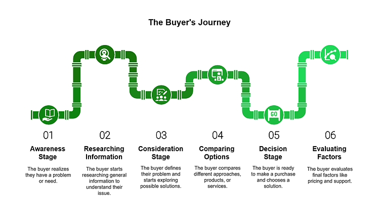
The Buyer's Journey Explained
Let’s bring it to life with an example.
Meet Ben. He's the energetic owner of a digital marketing agency. But he has a big problem – his team's productivity tool isn't cutting it anymore, and he knows it's time for a change. Ben's situation is the start of what we call the buyer's journey.

This journey matters because it’s how real people, whether it’s someone like Ben searching for the right tool, or your own audience looking for what you offer, make decisions.
When you understand where they are, you can meet them with exactly what they need:
- The right information at the right time
- A helpful resource that answers their questions
- An offer that feels relevant to their current priorities
For Ben, it all started with a simple realization: something isn’t working. The same goes for your customers. Your job is to spot those moments — the little signals that a need exists — and show up with a solution that feels made for them.
That’s where your marketing becomes more than just promotion. It’s guidance. It’s answering the questions they’re already asking, showing them what’s possible, and making it easy for them to see your product or service as the clear choice.
Ben’s journey, like every buyer’s journey, is full of forks in the road. When you show up at the right moments and help them take the next step, you’re not just making a sale — you’re building a relationship that can turn a one-time buyer into a loyal customer.
Buyer’s Journey Stages: A Breakdown
Let’s take a closer look at the different stages of the buyer’s journey, using Ben as our guide to illustrate how each phase plays out in real life.
Awareness Stage
TL;DR: Your buyer has just realized they have a problem or an opportunity but can’t yet define it clearly. Focus on helping them name and understand the issue with educational, problem-focused content — no hard selling.
The journey begins when a buyer realizes there’s a problem or an opportunity. They’re not ready to buy yet — they’re just figuring out what’s wrong.
As we mentioned earlier, Ben is juggling several projects when he notices his team’s productivity isn’t what it should be. Deadlines are creeping up faster than usual, and the stress levels are high.
This is the moment Ben becomes aware of a problem: their current project management tool isn't keeping up with the team's needs and they need a new one.

Awareness Stage in the Buyer's Journey
In the awareness stage, potential buyers like Ben realize they have a problem that needs solving but may not know the best way to solve it yet. It’s all about identifying the issue.
He starts searching for articles and resources to grasp his situation better – a quest for knowledge that marks the beginning of his buyer's journey.
Consideration Stage
TL;DR: Your buyer understands their problem and is actively researching solutions. Provide detailed, comparison-driven content that positions your offer as a strong contender while addressing their decision criteria.
Once Ben recognizes the problem, he moves into the consideration stage. He’s determined to find a solution that can streamline workflows, improve team collaboration, and ultimately, enhance their output.
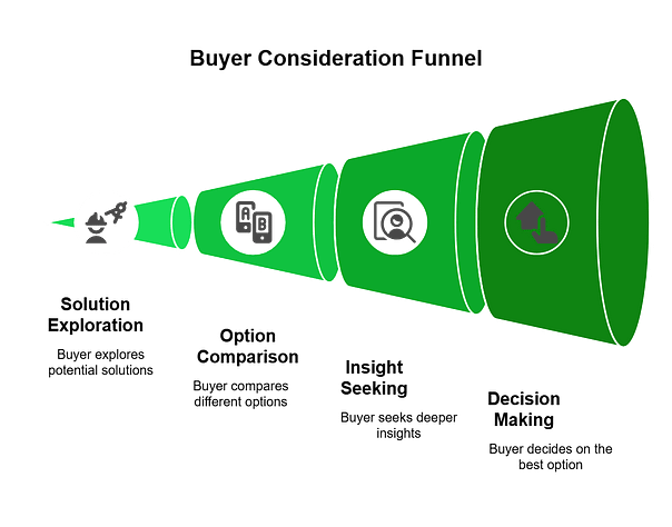
Consideration Stage in Buyer's Journey
Ben moves from research to actively looking into various project management tools, reads reviews, and even tries out a few demos.
This stage is marked by comparison and evaluation, as Ben is actively looking for the best options that fit his specific needs. Buyers in the consideration stage, like Ben, are gathering information, exploring solutions, and narrowing down their choices.
Decision Stage
TL;DR: Your buyer is ready to choose a solution and just needs final reassurance. Remove friction with trust-building assets like testimonials, transparent pricing, guarantees, and an easy buying process.
TL;DR: Your buyer is ready to choose a solution and just needs final reassurance. Remove friction with trust-building assets like testimonials, transparent pricing, guarantees, and an easy buying process.
After a thorough investigation, Ben reaches the decision stage.
He’s weighed the pros and cons of each option, considered the pricing, features, and user feedback, and now he’s ready to choose the project management tool that he believes will best address his team’s challenges.
The stage of the buyer’s journey is where a consumer makes their final decision based on the information gathered during the consideration stage. For Ben, this means selecting a tool that not only meets today’s needs but also has the potential to grow with his agency.

Decision Stage in Buyer's Journey
Through Ben's journey, we see the buyer's journey come to life. Starting with an awareness of a problem, moving through careful consideration of the options, and finally making a purchase decision, Ben’s experience highlights the importance of each stage.
Buyer’s Journey vs. Customer Journey
Think of the buyer’s journey as everything that happens before the money changes hands — awareness, consideration, and decision. It’s the path someone takes to go from “I have a problem” to “This is the solution I’m going with.”
The customer journey picks up right after that first purchase. It’s about what happens next: onboarding, product use, customer support, loyalty, and advocacy. This is where you turn buyers into repeat customers — and repeat customers into brand champions.
When you understand both, you’re not just focused on winning the sale — you’re also setting yourself up to keep that customer, delight them, and have them coming back (and referring you) for years to come.
B2B vs B2C: What Does the Buyer’s Journey Look Like?
B2B Journey: A Complex Process
For Ben, choosing a new project management system for his agency involves a thorough, often lengthy decision-making process.
It’s not just about personal preference but about meeting the needs of his entire team and ensuring compatibility with existing workflows. This journey is characterized by in-depth research, consultations with vendors, and collective decision-making, highlighting the analytical nature of B2B purchases.
B2C Journey: Quick and Personal
When Ben shops for a new laptop for personal use, his decision is much faster, driven by individual needs and desires.
Brand loyalty and the product's look and feel can significantly influence his choice, reflecting the more emotional and straightforward nature of B2C transactions.
Key Differences
When it comes to decision-making, B2B and B2C buyers follow distinct paths. While businesses prioritize logic, strategy, and return on investment, consumers often make choices based on personal needs and emotions. Here’s a breakdown of how these two buying processes differ:
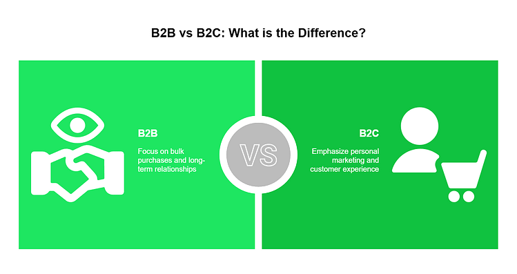
So, if You’re a B2B Business, This Means…
Your content needs to dive deep, really highlighting how your product or service can tackle the big, industry-specific challenges. It's not just about listing features; it's about showing real, tangible benefits and the kind of return on investment businesses care about.
The sales process won’t be as fast as direct-to-consumer sales and that’s because B2B buying isn’t a solo decision but more of a team effort. These decisions aren’t made overnight, so focus on building solid relationships through every interaction.
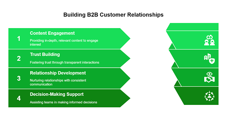
Think about your marketing as if you're constructing a sturdy bridge to your potential customers. This bridge needs to carry all the important details and proof that what you’re offering isn’t just good on paper but works in real life too.
This could mean getting into the nitty-gritty during webinars, having honest discussions in consultations, offering deep dives in infographics, case studies, whitepapers, and other educational content — and always, always focusing on building trust.
After all, trust is the foundation of any strong relationship, especially in B2B, where the stakes (and rewards) are high, and getting everyone on board takes a bit of time.
And if You’re a B2C Business…
Mapping content out for B2C businesses looks a little different.
Your marketing should really speak to the heart, capturing the emotions and immediate needs of your audience. It’s all about showing how your product or service can make their life better, right here, right now. Make every touchpoint with your brand—from your website to your store—an absolute breeze and a pleasure.

Use testimonials, promotional pieces of content on social media and in email, and even influencer collaborations to build credibility and weave your product into the fabric of your consumers' lifestyle.
In the B2C world, buying decisions happen fast, often sparked by how deeply your message resonates with someone’s personal story or how it makes them feel in the moment.
So, your mission is clear: connect fast, hit the emotional notes with the right content, showcase the instant rewards of choosing your product, and smooth out any wrinkles in the buying process.
Lean into SEO
Whether B2B or B2C, you’ll need to optimize your content for SEO, so your target audience can find you during their awareness stage.
Your potential customers should be able to find all types of content, from your business, through search engines — video and written, alike.
To make this happen, you’ll need a solid SEO plugin like AIOSEO or Yoast to optimize your pages and posts so they can be found by the right people.
And if you need more guidance on writing SEO-friendly pages and posts, then this is the guide for you.
How to Map Out Your Customer’s Journey to Get Results (Practical Tips)
1. Customer Research: Get to Know Your Audience
Start by gathering as much data as you can about your customers. Surveys, interviews, and analyzing behavior on your website can provide insights into who your customers are and what they need.
You’ll need a solid analytics plugin to find this information. MonsterInsights is our top recommendation for WordPress websites.
MonsterInsights
This tool takes the confusion out of Google Analytics and gives you all important site data in an easy-to-understand format. No need to spend hours poring over tutorials to figure out your website visitors’ behavior.
And after you’ve done your research, compile your findings into buyer personas that represent your typical customers. Include demographic information, goals, pain points, and buying behavior to make these personas as detailed as possible.
That way, you’ll know how to use your content marketing strategy to offer potential solutions at every stage of your target audience’s journey.
Ready to dive into your website data? Setting up analytics is the first step! Follow our easy guide on How to Set Up Analytics on Your WordPress Website to start tracking visitor behavior and making smarter marketing decisions. 🚀
2. Identify Key Touchpoints
These are all the points at which a customer interacts with your brand, from seeing an ad for the first time to contacting customer service after a purchase. Mark these touchpoints to understand where you need to engage with your customers.
Let’s say you run an online clothing store. A key touchpoint could be the moment a potential customer sees a sponsored post on Instagram featuring one of your best-selling items.
This visual, engaging introduction sparks interest and guides them to visit your website – where you can present them with a coupon code or pop-up with an irresistible offer to drive a quick sale.
Other touchpoints might include the checkout process on your website, the email confirmation they receive after purchasing, and the follow-up email asking for feedback once they’ve received their order.
3. Understand Customer Goals and Pain Points at Each Stage
At each stage of the buyer’s journey (awareness, consideration, decision), your customer has different goals. Understanding these goals helps you create content and interactions that resonate.
Similarly, identify the challenges or obstacles your customers face at each stage. Addressing these pain points is key to moving them further along in their journey.
4. Map the Journey
Create a visual representation of your customer's journey, including buyer personas, touchpoints, goals, and pain points.

Customer journey map is shown using a text
This map should reflect the path from initial awareness to post-purchase. It’ll serve as a guide for planning your sales strategies & marketing efforts.
You can start simply with a whiteboard or spreadsheet. The format isn’t as important as the clarity it brings to understanding your customer’s path.
Once you’ve mapped it out, start working on relevant content and marketing materials for each point – landing pages, opt-in forms, sales funnel pages, demo requests, chatbots, etc.
The goal is to provide an answer to every question your potential buyer has as they learn more about your offer and how it can solve their problem.
We also recommend identifying key performance indicators (KPIs) for each stage of the journey. These might include conversion rates, average order value, customer satisfaction scores, and repeat purchase rates. That way you can track your buyer’s journey in a measurable way.
5. Analyze and Optimize

Look for gaps in the journey where prospects might be dropping off or opportunities where you could enhance the customer experience. Are there touchpoints where engagement is low, or could additional support move customers to the next stage?
Run A/B tests on all your landing pages and forms to be sure you’re guiding your potential customers correctly.
You should also use your journey map to make informed changes to your inbound marketing strategy, product development, and customer service where necessary. Regularly update the map as you gain new insights or as your business evolves.
Next Steps: Set Up Your Lead-Generation Funnel
One of the best ways to connect with your potential customers and build a solid relationship with them is through email marketing.
Email holds several advantages over social media marketing and paid advertising because, ideally, your list should be full of people who are interested in what you have to say and offer.
But to build a list like this, you’ll need a solid lead generation funnel to turn website visitors into interested leads.
Here are 4 free tutorials to help you set up your lead-gen funnel the right way:
Turn Your Knowledge of the Buyer’s Journey into Action
And that’s all you need to know about the buyer’s journey.
You don’t need to be an expert salesperson or have a whole dedicated sales team to generate more sales for your online business — especially if you’re running things on your own.
The journey to running a profitable business starts with deeply understanding your potential customer’s thought process as they go from “I need a solution...” to “This will solve my problems!”
There are 1000s of Bens out there looking for your offer — but if you haven’t created a path to guide them to your business...they won’t find you.
So, read through this post a few more times, revisit your customer journey map, and start making necessary changes to optimize the customer experience.
Good luck — you’ve got this!


