Nothing hurts like a low conversion rate - especially after you’ve spent so much time building, tweaking, and optimizing your landing pages.
First things first: You’re not alone.
Growing a business is tough…and getting the right landing pages to drive conversions is even tougher.
That’s why we’re here to help.
In our latest video, Christine walks you through 5 key elements of high-converting landing pages, to help you identify any changes you need to make to your own.
You’ll also get introduced to two new Thrive Architect features you can use to revamp your webpages and blow your website visitors away.
Read on to learn more.
More...
Quick Review: What is a Landing Page?
A landing page is a standalone page, often separate from your homepage or any other page on your website, and it has one purpose:
To turn your website visitors into leads and customers.
Essentially, a landing page is a follow-up to a promise you’ve made to your audience - through a blog post, email, ad, etc. - and this is where they come to learn more and (hopefully) take action. These pages are where visitors come to:
- Sign up for a freebie and get on your email list
- Register for one of your free (or paid) webinars
- Subscribe to your online courses or exclusive membership programs
Think of a landing page as a bridge between where your audience currently is (curious about your business and products) and where you want them to be (signed up & paid up for your offer).
The content of your landing page is what will push your visitors to cross that bridge or walk away, possibly in search of another business to check out. The goal is to avoid the latter option.
In this video, Christine breaks down 5 key elements you must focus on if you want your landing pages to convert consistently.
5 Essential Elements of Landing Pages That Convert
To increase the chances of getting your website visitors to convert, make sure to include the following elements in your landing pages:
1. A Benefit-Driven Headline
When a visitor lands on your landing page, the main question on their mind is, “What’s in it for me?”
Your headlines should be one of the first things to answer that question.
The best way to win your audience over is to clearly communicate how your products will make their lives better. Remember, people have come to your page because they have a problem they want to solve. So you need to tell them right away how your ebook, course, webinar, etc. will help them achieve the results they’re looking for.
In addition to your headlines, the benefits of your offer should be clearly articulated on your landing pages - as well as the features they can expect to see.
Highlighting the features in your product is important because it gives your audience a clear idea of what to expect when they sign up or make a purchase - but your headlines aren’t the place to do that.
2. A Personal Connection or Humanizing Element
In Christine’s words: the buying process begins with trust.
…and it’s pretty hard to win your visitors’ trust if they can’t tell who they’re buying from.
“Faceless” companies come across as suspicious because they give the impression that it could be anything. How will your visitors know that your business is legitimate? What stops them from thinking, “What if this is a scam?”
Including elements like a photo of yourself, as the owner of the business, and a bio can drive up trust significantly. It makes it easier for your audience to trust you because they feel like they’re actually interacting with a person.
Adding a simple “About” section to your landing page, with a photo and a clear bio, can make a big difference in getting your visitors to convert.
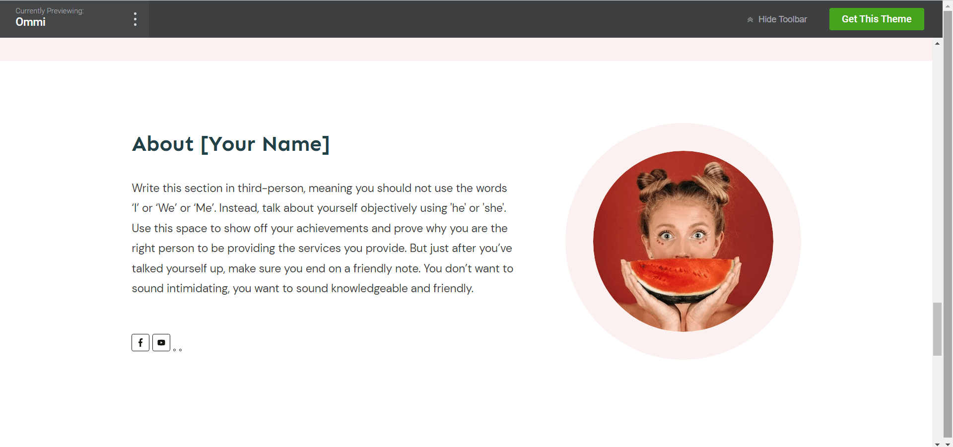
In our landing page templates, an “About” section is included, to help you fill in the information quickly.

An “About” placeholder from Ommi, one of our Thrive Architect landing page sets.
You also have the option to add one of your own, and Christine shows you how to do this in the tutorial.
3. Testimonials
Testimonials are a solid way to show new visitors that you offer high-quality products & services, and that your brand can be trusted to deliver.
With a few solid testimonial on your landing page, you can easily:
- Build trust,
- Establish credibility,
- Address objections,
- Add an emotional component,
- Model use cases, and
- Make your business seem more approachable.
Our most recent sales page templates that come with Thrive Architect have a testimonial section built right in. But if you’re building a landing page from scratch, or want to add testimonials to a lead-generation funnel, Christine shows you how to do this in Thrive Architect.
4. An Easy-to-Spot Opt-In Button
Buttons may be small but they play a big role in getting your website visitors to convert.
High-converting landing pages have opt-in buttons that are in plain view and fairly high contrast to the background of the landing page so that they are easy to spot.
In addition, the messaging on these opt-in buttons should be enticing; encouraging your audience to click and access your offer immediately.
In this tutorial, Christine answers the question, “Does the color of my opt-in buttons matter?” and shows you how to customize your buttons to your liking.
5. Optimized for Mobile
There are over 6.4 billion smartphone users worldwide, and the average adult spends up to 3 hours on their phone daily.
This stat alone is enough reason for you to take mobile optimization seriously. One of the biggest mistakes businesses make is assuming that their webpages are automatically optimized for mobiles - but this isn’t the case.
A number of core elements on landing pages, responsible for aiding conversions, can get skewed on smaller screens. So, while your page may look great on a desktop screen, it can look awkward and hard to navigate on a phone or tablet screen.
That’s why it’s important for you to view your landing pages on different screens and make sure that every element is in place.
All of the templates that come with Thrive Architect landing are already optimized for different screen sizes, and in this video Christine walks you through what a template looks like on different devices.
Bonus Tip: Always Split Test Your Landing Pages
The perfect landing page doesn’t exist - especially the first version. It takes more than guesswork to figure out the elements that work for your landing pages.
That’s why it’s important to test your pages frequently, to identify what’s working well and what needs to be improved.
Think of it this way:
More A/B testing
=
More insight into page designs that convert
=
More subscribers and sales
So, the more you test, the closer you are to creating consistent growth for your business.
When you build your pages with Thrive Architect, you also get access to Thrive Optimize to perform simple, fast and highly effective A/B tests directly on your WordPress website.
And if you’ve never run an A/B test before, now would be the perfect time to start.
2 New Features in Thrive Architect
1. Theme landing page sets are now available to every Thrive Architect User
Now, every user has access to 70 new Smart Landing Pages! Between those landing page sets, that includes over 480+ Page Blocks!
We have unlocked access to all Theme Landing Page Sets, making them cross-theme compatible too!
Whether you're using Thrive Theme Builder or a different WordPress theme, you'll see the Theme Landing Page Sets for Shapeshift, Ommi, and Kwik. And, all three are available regardless of your companion theme choice.
2. Exporting Your Landing Pages Now Includes Headers, Footers and More
Importing and exporting content from your website just got better. In our March release, we made it super easy to export non-landing page content (WordPress page content and blog post content) with just a few clicks.
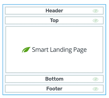
Now, you can include headers, footers, top sections and bottom sections, when exporting a Landing Page.

Headers, footers and other sections will be included in exports.
Headers, footers, top sections and bottom sections are all template sections... meaning they can easily be reused across multiple pages on your website. Update them once and they update globally.
So, if you created a really cool top section for your blog posts, you can now export that section, and import it to another website using Thrive Architect. You can learn more about this in the tutorial.
That’s It. Now, It’s Your Turn!
Now that you’ve got all the information you need to build or revamp your landing pages, it’s time to get to work. Your next set of conversions could be a few tweaks away!
Give your landing pages a look today and start making the necessary changes to them. Run a couple of A/B tests and let us know, in the comments, how this worked out for you.
Happy building!


