If you had all the money in the world, how would you design your dream home?
Would it be bold and expressive — saturated jewel tones and creative chaos? Would you go full minimalist beige like every other influencer (no shade)? Or would you keep it simple because it works — and it feels like you?
When it’s your space, you have the freedom to choose. But your website? That freedom comes with higher stakes — because every design decision affects how people behave.
Sometimes, the fix isn’t rewriting your copy or redesigning your layout. It’s as simple (and powerful) as updating your website color scheme — strategically, not randomly. A smart color shift can rebuild trust, guide attention, and create a more high-converting website without changing a single word.
And color matters more than most people realize:
Up to 90% of a user’s first impression is based on color alone
39% of users say color is the first thing they notice on a website
And a simple CTA button color change once increased conversions by 21%
So no, this isn’t just about aesthetics. It’s a website refresh that can actually improve performance.
And if you’re on WordPress? There’s an easy, code-free way to make these changes confidently — we’ll get to that soon.
Let’s walk through what makes a smart color update work — and why it might be the most underrated conversion move you can make.
Why Color is One of the Smartest Conversion Fixes You Can Make
When I first started building websites, I was obsessed with that ultra-minimalist, editorial look. Black, white, sharp lines, lots of whitespace – like every page was straight out of a fashion magazine.
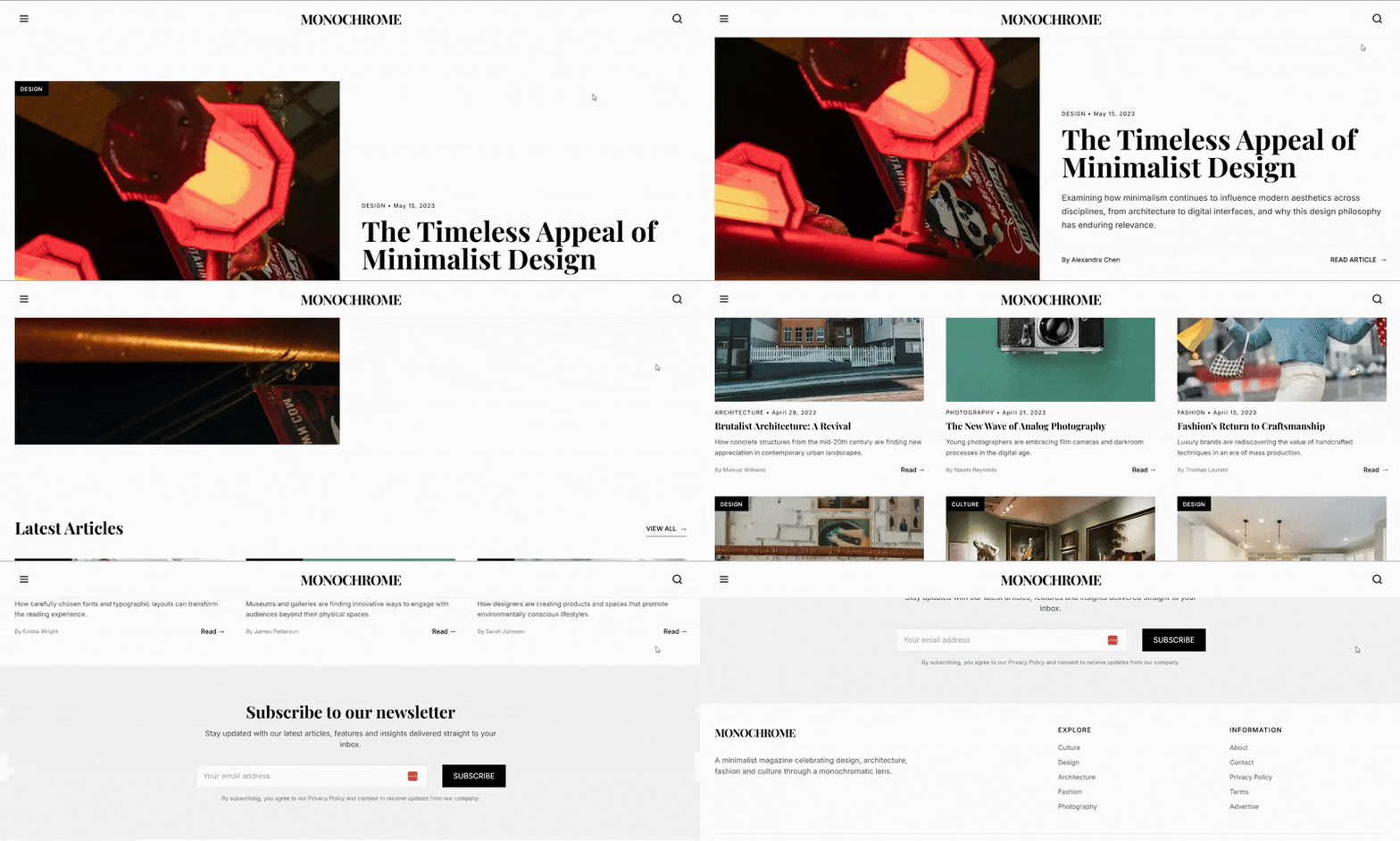
It looked clean. It looked “professional.”But it also looked… cold. And kinda forgettable.
So I went in the opposite direction. Full creative mode. Every page had its own shade of purple — lilac headers, plum backgrounds, lavender CTAs. It was a mood. It was also a user experience design nightmare.
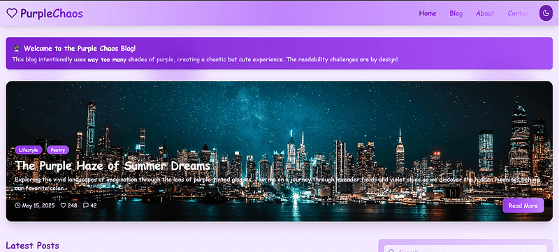
Turns out, picking a nice color isn’t the same as building a strategic website color palette — one that supports clarity, builds trust, and actually drives conversions.
If your site feels a little “meh” and you can’t quite figure out why, start with color. It’s one of the fastest ways to shift how people feel on your site — even if you don’t change a single word of copy.
Here’s why it works:
People form an opinion about your site in just 50 milliseconds, and color plays a massive role in that first impression
Consistent use of brand colors can boost recognition by up to 80%
One A/B test showed that changing the "Add to Cart" CTA button color led to an 18.4% increase in conversions
This is where color psychology in design becomes more than theory — it becomes a practical tool for building a high-converting website.
And the best part? You don’t need to redo your layout or rewrite your offer. A smart website refresh, backed by a little testing and good contrast, can get you real results — especially if you’re using tools like Thrive Theme Builder that give you control over global style settings, layout, and color application across your entire site.
🛠️ The Tools I Use to Make Color Changes Without Breaking My Site
Quick confession: I used to dread updating my site’s color scheme. I’d second-guess everything — “Will this mess up my buttons?” “What if I hate it after I hit publish?” “Why is this one heading still blue!?”
Then I started using Thrive Theme Builder and Thrive Architect, and honestly? It changed everything.
Now, I can test a new CTA button color in seconds, apply it across my site without touching code, and even preview what it’ll look like on mobile — before I commit. If something doesn’t work, I just roll it back. No stress, no broken layouts.
I’m not a designer. I just want my site to look good, convert better, and not give me a headache. Thrive makes that possible.
So if you’re working on your WordPress site and want full control over your visual style — especially your color palette — this is the setup I recommend. You’ll see how I use it throughout the next few steps.
How to Strategically Update Your Website Color Scheme (Without Starting From Scratch)
You don’t need to tear your website down to build something better.
Most of the time, a full rebrand or total redesign isn’t what your site actually needs — just a few intentional updates to your website color palette can create a clearer path for your visitors and a smoother experience overall.
I’ve seen some of the biggest improvements come from small, strategic changes: updating your CTA button color, swapping out a harsh background for something more readable, or fine-tuning your color contrast accessibility so your most important content doesn’t get lost.
This next section walks you through the same process I use when approaching a website refresh — whether it’s for a client or my own brand. It’s not about following the latest trend or throwing paint at the screen until something sticks.
It’s about applying color psychology in design to support your message, guide the eye, and create a user experience design that gently leads visitors toward the action you want them to take.
These aren’t just WordPress design tips — they’re smart decisions that build trust, improve flow, and help your website do what it was built to do: convert.
Let’s get into it.
1. Start With Strategy, Not Shades
Before you open up a website color palette or start fiddling with hex codes, pause.
This isn’t about picking “nice” colors. It’s about choosing colors that support your message, highlight your CTAs, and — most importantly — help people take action. Whether that action is clicking a button, signing up, reading more, or buying something, updating your website color scheme starts with clarity and intention.
Here’s where I always begin:
🔍 What’s the primary action on this page?
Is it booking a call? Submitting a form? Grabbing a freebie? Whatever it is, your color choices should lead the eye to that action — not distract from it.
🧠 What emotional tone supports that action?
Trust → deeper blues, soft neutrals
Energy or urgency → warm accents like red or orange
Calm and care → greens, light blues, gentle grays
Luxury or exclusivity → deep purples, black, gold, or metallics
Color sets the emotional tone before your words do. Choose the feeling first — then build your palette around it.
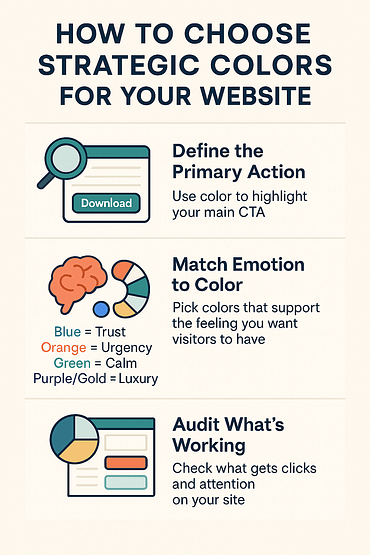
✅ What’s already working?
Do a quick color audit. Are there pages where people spend more time or engage more? Check the CTA button color, background sections, and supporting accents — you might already have clues about what resonates.
🎨 Color Psychology 101
The colors you choose don’t just influence aesthetics — they shape perception, trust, and behavior. This is the heart of color psychology in design. Use it to match your brand voice, speak to your ideal visitor, and build a more emotionally connected, high-converting website.
2. Build a Conversion-Driven Color System
This is where most people go wrong — they treat color like decoration. But on a high-converting website, color is structure. It’s how you direct attention, build trust, and reinforce your message without saying a word.
You don’t need a rainbow of options. What you need is a clear system that:
- Guides the eye to where you want people to click
- Reinforces your brand colors and emotional tone
- Keeps your site feeling consistent, professional, and easy to navigate
Here’s the color setup I recommend (and use myself in every website refresh):
🎯 Primary Color = Your Action Color
This is your MVP — the color that tells visitors, “Click here.” It should be used consistently on your buttons, key links, and anywhere you want action.
And it needs to work hard: strong color contrast accessibility, emotional alignment, and visibility across devices.
✏️ Examples:
Blue = trustworthy
Green = growth or wellness
Red = urgency or excitement
Purple = boldness or creativity
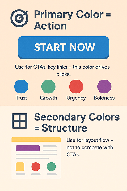
🧩 Secondary Colors = Visual Support
Pick one or two to complement your primary color.Use them for headings, icons, hover effects, or alternating section backgrounds. They add structure — without stealing the spotlight.
This is one of the easiest WordPress design tips to implement for better flow and cleaner page layouts.
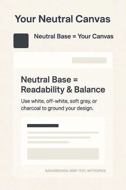
🔲 Neutral Base = Your Canvas
White, off-white, soft gray, or deep charcoal — these are the colors that keep everything else from feeling loud.Use them for backgrounds, body text, and whitespace. They anchor your design and make the colorful elements shine.
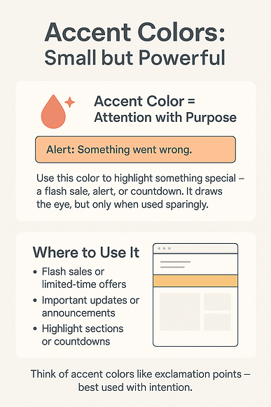
🚨 Accent Color = For Special Use Only
This one’s for the attention-grabbers: limited-time offers, flash sales, alerts, countdowns. It should be bold and contrast sharply — but used sparingly. Think “emotional punctuation,” not confetti.
💡 Pro tip (if you’re using Thrive Theme Builder): Set all of these using Smart Colors and global style settings. That way, you can update your entire color system site-wide with a single click — no manual re-styling, no guesswork.
This is where strategy meets scalability — and your design starts working for you, not against you.
3. Check for Contrast & Accessibility
I may love color, but I’m an unforgiving website visitor. If I land on a site and can’t read the text clearly, or the colors feel chaotic and clashing — I’m out. No second chances. (Looking at you Zara)
That’s the thing about user experience design — it doesn’t matter how beautiful your branding is if people can’t use your site.
Here’s how to make sure your website color palette actually works beyond your mockups:
🖍️ Prioritize readable contrast
That trendy soft gray-on-white text might look sleek, but on a mobile screen in daylight? It disappears.
According to WCAG standards (WebAIM):
Regular text should hit at least 4.5:1 contrast
Large text needs a minimum of 3:1
A quick check with a color contrast accessibility tool can save a lot of clicks — and bounce rates.
🎯 Your CTA button should never whisper
Your CTA button color should stand out like it means it — not blend into the background or compete with five other bright elements.
If it doesn’t visually pop at a glance, it’s not doing its job. Rethink your palette hierarchy.
🧠 Design for real users — not just ideal ones
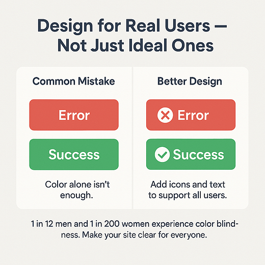
Roughly 1 in 12 men and 1 in 200 women experience some form of color blindness. Don’t rely on color alone to convey meaning.
✅ For example: instead of red vs. green for “error” and “success,” add a ❌ or ✅ and a short text label for clarity.
Small accessibility wins often lead to better trust, smoother flow — and a more high-converting website for everyone who visits.
4. Design Smarter, Not Slower — Thrive Makes Color Changes Low Risk and High Impact
I used to have real beef with the WordPress Customizer. And don’t even get me started on the block editor.Changing a simple CTA button color felt like a full-blown mission — click, preview, tweak, reload, break something, repeat. It was chaotic at best.It’s gotten better, sure. But it still doesn’t come close to the control I get now with my current tech stack.
💡 So here’s your encouragement: tap into your inner Einstein. Think of updating your website color scheme as a low-risk experiment — one that could lead to higher engagement, smoother user experience design, and a much more engaging website.
Here’s how I make that possible using Thrive Theme Builder and Thrive Architect:
✨ Update global style settings Need to change your primary brand color across your site? Do it once and it updates everywhere — no hunting, no stress.
🛠️ Tweak visually, test safely Want to try a bold new header color or change one section? Thrive Architect gives you full visual control without touching your live site.
🧪 A/B test color schemes Thrive Optimize lets you test button colors, background blocks, or full palette shifts — and get data, not guesswork. (Need to learn how to a/b test your pages? Check out this guide.)
👁 Preview before you publish From desktop to mobile, you’ll see exactly how your updates look before hitting "go live."
5. Use Color Updates to Fix Funnel Drop-Off Points
Sometimes the issue isn’t your copy, your offer, or even your layout — it’s that people aren’t seeing what matters.
If your scroll depth drops off halfway through, your CTA button color isn’t getting clicks, or users are ignoring key sections, it might be time to take a closer look at your website color palette.
Here’s how I use simple color tweaks to solve performance issues — without touching the funnel itself:
📉 Start with your data Check bounce rates, scroll maps, and form analytics. Ask yourself:
Is your CTA above the fold getting ignored?
Are key sections blending into the background?
Are form fields being skipped altogether?
These are prime candidates for a quick website refresh.
🎯 Adjust contrast to improve clarity If a conversion hotspot is drowning in similar tones, it won’t stand out. Try increasing color contrast accessibility with a bolder section background, a sharper CTA color, or simply more visual breathing room.
Even switching from white to soft gray can anchor a product block or opt-in form more effectively.
And in case you’d like a deeper look into what could be killing your conversions, check out this in-depth, actionable guide.
6. Don’t Rebrand Just Because You’re Bored
I know you’ve had those moments before. You look at your website and think, “Ooh, a change would be good…” Then suddenly you’re five hours into a totally unnecessary color overhaul. No? Just me? Okay.
Look, it happens. But here’s the thing: your creative boredom isn’t always a reason to mess with a perfectly good website color palette.
Yes, color tweaks can help — but only when they’re rooted in purpose, not a passing mood.
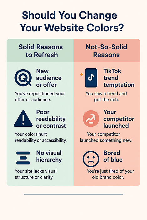
✅ Solid reasons to refresh:
You’ve repositioned your offer or audience
Your current colors hurt readability or color contrast accessibility
Your CTA button color blends into the background
Your site lacks clear visual hierarchy
🚫 Less solid reasons:
You saw a TikTok trend and got the itch
Your competitor launched something new and now you’re spiraling
You’re just tired of the blue you picked last year
If you’re unsure, don’t rebrand — run a test.As I’ve mentioned before, use Thrive Architect and Thrive Optimize to trial a small update or A/B test color schemes. Scratch the itch without risking your conversions.
7. Implement a Brand Style Page (Future You Will Thank You)
There’s nothing quite like realizing you’ve used three different “main greens” across your site — or sending your VA or designer hunting for the hex code you swore you’d remember.
Avoid the chaos. Create a simple internal brand style page — visual, lightweight, and right inside WordPress.
Here’s what to include:
🎨 Your website color palette List your exact hex codes for:
Primary CTA button color
Secondary + accent colors
Neutral backgrounds and base styles
Label everything. No guesswork.
🧭 Usage rules
When and where to use each color
Button styles (filled vs. outline)
Section backgrounds (light/dark, boxed/full-width)
🧱 Reusable blocks (if using Thrive Architect) Save styled CTAs, opt-ins, and testimonial sections so you can drag-and-drop on any page — and stay consistent.
📁 Keep it accessible Make it a hidden WordPress page. Not a PDF. Not a post-it note. Just something easy to find and use.
This isn’t just about branding — it’s about faster builds, fewer mistakes, and smarter global style settings.
Real Results: Thrive Customers Who Updated Their Website Design and Got It Right
You’ve seen the strategy — now here’s how it plays out on real websites built with Thrive.
These sites didn’t rely on flashy animations or full redesigns. They simply used color with purpose — to guide attention, support branding, and create better conversion flow.
Oliver Pfeil – oliverpfeil.de
What I like about this design:
Trust-building color hierarchy: The deep blue background paired with clean white content blocks immediately sets a trustworthy, pro-level tone. I like how the color contrast helps organize the page without feeling busy — a great example of thoughtful user experience design.
Bold, confident CTA button color: The orange CTA button (“Gratis Anleitung herunterladen”) is impossible to miss against the blue background. It grabs attention without clashing — which is harder to pull off than people think.
Effective section contrast: The green vs. red comparison block lower on the page is not just smart content — it’s visually engaging too. The color choices clearly reinforce the message (success vs. failure) without needing heavy explanation.
Consistent branding: From the logo to the CTA to the accent blocks, the website color palette sticks to a narrow, strategic range. Nothing feels random. Everything has a job.
What stands out most is how visually “tight” the design feels. It’s not flashy, but it’s confident — and it uses color to guide and clarify every step of the visitor journey.
Thrive's tools are the most important piece of the puzzle for all my WordPress projects and those of my customers. Thanks to Thrive I can make my content faster, more modern and more professional. Of course, this is also positive for my conversion and I win more customers through my website.
Oliver Pfeil
What I like about this design:
- Trust-building color hierarchy: The deep blue background paired with clean white content blocks immediately sets a trustworthy, pro-level tone. I like how the color contrast helps organize the page without feeling busy — a great example of thoughtful user experience design.
- Bold, confident CTA button color: The orange CTA button (“Gratis Anleitung herunterladen”) is impossible to miss against the blue background. It grabs attention without clashing — which is harder to pull off than people think.
- Effective section contrast: The green vs. red comparison block lower on the page is not just smart content — it’s visually engaging too. The color choices clearly reinforce the message (success vs. failure) without needing heavy explanation.
- Consistent branding: From the logo to the CTA to the accent blocks, the website color palette sticks to a narrow, strategic range. Nothing feels random. Everything has a job.
What stands out most is how visually “tight” the design feels. It’s not flashy, but it’s confident — and it uses color to guide and clarify every step of the visitor journey.
I love the Thrive Theme Builder style editor. Being able to set site-wide color schemes and fonts is fantastic.
So are the ready-made templates. They make it so easy to get a decent looking page built really quickly. I couldn’t believe how fast I was able to create my homepage – complete with blog post grid and newsletter sign-ups.
Dave Solis
Daniel David Wallace – danieldavidwallace.com
What I like about this color scheme:
- Subtle but confident: The soft blue background paired with deep navy and mustard accents creates a calm, scholarly feel that matches his tone as a writing mentor. It’s a great example of using color psychology in design to reflect expertise without feeling stiff.
- Focused action color: The bright yellow CTA button color (“Send me the first lesson!”) really pops against the soft background. I like that it’s used sparingly — it stands out because nothing else competes with it.
- Clean section contrast: In the second section, the bold yellow headers break up the page nicely, giving each block a clear visual anchor without overwhelming the eye. That’s smart color hierarchy in action.
- On-brand minimalism: There’s not a lot of color here, but what’s used is consistent, strategic, and supports the content. It feels thoughtful — not trendy.
What I appreciate most is how the site balances clarity and warmth. The website color palette supports the story-first message, while still guiding the user toward action in a way that feels natural.
I have a course business, a coaching business, and more recently I run events for my audience.
I think people should use Thrive Theme Builder and Apprentice to build a really great website, and then use tools like Thrive Leads and other lead-building tools within Thrive Suite to really focus on building up an email list.
Daniel David Wallace
✅ What all these sites have in common:
- A defined primary color used with purpose — usually for CTA buttons and conversion hotspots
- Neutral base colors that let content and actions breathe
- Strategic use of contrast and tone to guide the reader’s eye and prevent friction
Smart color updates won’t just make your site “prettier.” They make it more usable, more readable, and more persuasive — and Thrive tools make it easier to get there.
💬 FAQs: Updating Your Website Color Scheme (Real Answers for Real People)
1. How do I choose the right color scheme for my website?
Start by asking: What do I want people to feel when they land on my site?
Your primary color should match your brand’s energy — trust, excitement, calm, luxury — and guide visitors toward action. From there, build a simple, effective website color palette:
Secondary colors for structure (think: headings, icons, borders)
Accent color for urgency or special offers
Neutral base (white, off-white, light gray) to give everything room to breathe
If you’re starting with a blank website template, tools like Coolors and Adobe Color can help you find harmonious combos. And if you’re using Thrive Theme Builder, you can apply those shades as global style settings in just a few clicks.
2. What’s the 60-30-10 rule — and should I use it?
It’s one of those underrated WordPress design tips that makes a big impact:
60% = dominant/background color
30% = secondary/support color (section blocks, menus, icons)
10% = bold accent or CTA button color
If your site feels chaotic or visually noisy, this rule can help you create instant balance — especially during a website refresh.
3. How can I make sure my color scheme is accessible?
This part’s non-negotiable. Color contrast accessibility affects both usability and conversions.
Start by checking:
Contrast ratio — aim for 4.5:1 for body text, 3:1 for large fonts
Don’t rely on color alone — use icons, labels, or underlines for meaning
Use the WebAIM Contrast Checker to test your palette
Bonus: test your design for colorblind-friendly pairings too
Accessibility isn’t just about compliance — it’s core to good user experience design.
4. Can changing my color scheme actually improve conversions?
Absolutely — especially when you’re intentional about it.
Sometimes your copy is solid, your funnel is clear… but your CTA button color blends in with everything else. That’s a missed opportunity.
Even small updates — like swapping your opt-in form background to a contrasting tone or using a stronger action color — can lead to measurable results. One test showed a 21% boost in clicks just from changing a button from green to red.
If you want to know what really works for your site? A/B test color schemes with tools like Thrive Optimize. It’s one of the easiest ways to improve performance without redesigning everything.
Conclusion: Updating Your Website Color Scheme Is One of the Smartest Moves You Can Make
If your site isn’t converting the way it should, don’t panic-scroll through redesign templates just yet.
Start by updating your website color scheme — because the right color choices can quietly solve big problems: ✅ Unclear CTAs ✅ Low engagement ✅ Poor readability ✅ Or that vague “off” feeling that doesn’t match your brand anymore
Here’s what we covered:
How to choose colors that guide behavior — not just look good
How to build a system, not just pick a few trendy shades
How to apply changes without stress using smart, visual tools
And how real Thrive users are seeing results from small, strategic shifts
Bottom line? Color isn’t fluff — it’s function. When you use it intentionally, you create a site that not only looks better… but works better.
🟢 Ready to make color work for your brand — not against it? Whether you’re refreshing a few pages or reworking your whole site flow, Thrive Theme Builder + Thrive Architect give you the flexibility, control, and visual editing power to do it right.
Want the full toolbox? Thrive Suite gets you everything — including A/B testing, lead gen, and more.


So Orange and Brown are least favorite colors…but what if these are my two main brand colors…I don’t want to rebrand everything. Yikes!
Don’t rebrand just yet Lynnek! As you can see Neil’s website is orange and VERY popular 🙂
One thing I’ve never understood about Thrive’s smart colors… my understanding of accent colors is essentially they should be all the clickable elements like links and buttons. But Thrive’s accent color also gets used on the background of blocks too. Isn’t that against conversion best practices?
Hi Christina,
Things are not that black and white 😀
The main goal is for elements to stand out. Take the example of Shopify, they use the green both on the background sections AND on the call to action buttons but only when the CTA buttons clearly stand out against a light background.
Could you use a different accent color for the button? Sure and I would test it on my landing pages!
Thank you for the helpful article! This quote came to mind while reading it:
“You can have any color as long as it’s black.”
–Henry Ford
😀
hahahah well he was right about the faster horses… 😉
OMG this is golden advice. Something i have been looking for so long! thanks a lot!
Happy to hear James!
Great insights. Thanks, Hanne!
Happy you liked it Mario
Thank you so much Janne, you are the best!!!
Now I’m here, what about Shane? I haven’t seen him in these post for a long time… It’s every thing ok with him?
Yep he’s doing fine 🙂 He’s not involved in the day-to-day of Thrive Themes anymore but you can find him over at Ikario https://ikario.com/
Great article, Hanne! Quit often I have design discussions with customers. And sometimes it is hard to convince them to use a minimal amount of colors. Maybe your article helps!
Best regards,
Tom
Hi Tom,
I hope so too 🙂