In today’s ever-competitive online education market, having a top-notch course is just the beginning.
The real game-changer?
A finely tuned course sales funnel that effortlessly guides potential learners from first glance to final purchase.
The crucial element that differentiates a successful course creator from the rest is the efficiency of their sales funnel. This funnel is not merely a pathway to purchase; it's a carefully designed journey that leads potential learners from awareness to action.
It's about connecting your valuable content with those who stand to benefit most, through a process that educates, engages, and encourages enrollment. A well-structured sales funnel can transform casual browsers into committed students, ensuring your course finds its audience.
Join us as we explore the essential components of a course sales funnel that not only attracts but also retains learner interest, guiding them towards making that final commitment to join your course.
How to Set Up the Perfect Course Sales Funnel
Let's walk through the key steps of setting up a course sales funnel. We'll cover essential tips, examples, recommended tools, and put you on track to create a successful funnel.
Step 1: Understanding Your Audience
Creating a successful sales funnel for your online course starts with a deep understanding of your target audience. Knowing who you are trying to reach, what their needs are, and how they prefer to engage with content online are crucial first steps in crafting a funnel that converts. This section delves into identifying your target market and leveraging content strategies to attract potential learners at the very top of your sales funnel.
Identifying Your Target Market
The first step in creating a sales funnel is to identify your target market clearly. This involves understanding not just the demographics of your potential students, such as their age, location, and job role, but also their psychographics, including their interests, challenges, and motivations for taking an online course.
- Conduct Surveys and Interviews: Reach out to your existing audience or use social media platforms to ask direct questions about the challenges they face and the solutions they seek.
- Analyze Your Competitors: Look at who your competitors are targeting and how they position their courses. This can provide valuable insights into gaps in the market.
- Create Buyer Personas: Compile your research into 2-3 detailed buyer personas that represent your ideal students. These should include information on their goals, pain points, and where they spend time online.
Tool Tip: Thrive Quiz Builder or UserFeedback
If you have a WordPress website then one of the best ways to learn about your audience is with a plugin like Thrive Quiz Builder or UserFeedback. You'll be able to ask your users the questions that matter and get valuable insights.
Content Strategies for Top of the Funnel (TOFU)
Attracting potential learners to your site at the top of the sales funnel (TOFU) is all about engaging them with high-quality, relevant content that addresses their interests and challenges.
Here are some effective strategies to consider:
- Educational Blog Posts: Create content that answers common questions or addresses problems that your target audience faces (here are our top content marketing hacks). Optimize these posts for search engines to increase your visibility and attract organic traffic.
- Social Media Campaigns: Leverage social media platforms where your audience is active. Share valuable insights, course teasers, and engaging content like visuals and short videos to spark interest and encourage shares.
- Lead Magnets: Offer valuable resources for free in exchange for email addresses. These could be eBooks, webinars, or email courses that provide a taste of what learners can expect from your full course.
- Free Introductory Course: A powerful TOFU strategy is offering a free introductory course. This not only provides potential students with a direct experience of your teaching style and course quality but also helps in building trust and establishing your authority in the subject area. Ensure that this free course delivers real value, addressing a specific need or challenge your target audience faces. Use this opportunity to showcase the benefits of your full course, encouraging free course participants to make the transition to paid students.
The objective at this stage is not to sell but to educate and build a relationship with your audience. By providing real value through your content and free offerings, you create a pathway for potential learners to engage further with your brand, leading them naturally towards considering enrollment in your paid courses.
Take this example from Thinkful, a website that specializes in online bootcamps.

The above image is a completely free article that offers readers practical tips to help them with a data science job. So what do you think they do next?
They're going to give you an awesome write up packed with tons of actionable advice, and then, you guessed it - tell you about their course.
This is just a subtle CTA, but you can go a step further. You can showcase your courses through your article, or even add a banner to your sidebar. The important thing is you're attracting your target audience, engaging them, and making them aware of your offerings.
Through strategic content creation and the introduction of a free introductory course, you lay the groundwork for a robust sales funnel that effectively attracts and nurtures leads.
Step 2: Building Your Lead Generation Landing Page
Once you've engaged potential learners with top-of-the-funnel content strategies, the next step is to capture their interest and convert it into actionable leads.
A well-designed lead generation landing page (wondering what a landing page is vs a sales page?) is critical for this conversion process. This section covers the essentials of crafting an effective landing page using Thrive Architect, tailoring it to your audience's needs, and optimizing it for conversions.
Key Elements of an Effective Landing Page
Your landing page is often the first substantial interaction potential students will have with your course. It needs to make a strong impression, clearly communicate the value of your course, and encourage sign-ups.
Key elements include:
- Compelling Headline: Capture attention with a headline that speaks directly to the visitor's needs or goals.
- Engaging Content: Use concise, persuasive copy that outlines the benefits of your course and what students will learn.
- Clear Call to Action (CTA): Your CTA should stand out and encourage visitors to sign up for your course, download a lead magnet, or enroll in your free introductory course.
- Social Proof: Use difference kinds of social proof - Incorporate testimonials, endorsements, and success stories to build trust and credibility.
- Visual Elements: High-quality images or short videos that represent your course can increase engagement and help visitors visualize the learning experience.
Customizing with Thrive Architect
Thrive Architect allows you to build and customize your landing page with ease, offering a wide range of templates and drag-and-drop elements tailored for online course creators.
Here’s how to make the most of it:
Choose a Template: Start with a pre-designed landing page template that aligns with your course's theme and goals. Thrive Architect offers a variety of templates specifically designed for course sign-ups and lead generation.
Customization: Tailor the chosen template to fit your brand’s look and feel. Adjust colors, fonts, and layout to ensure consistency with your website and course materials.
Responsive Design: Ensure your landing page looks great on all devices. Thrive Architect’s responsive design settings allow you to adjust how elements look on different screen sizes.
Integration: Seamlessly integrate your landing page with your email marketing service to capture leads. Thrive Architect supports a wide range of integrations, making it easy to connect with your preferred platform.
Understanding Your Audience
Remember the hard work you put into identifying your target market?
Here’s your opportunity to show off everything you learned!
Influencing people to take action, in this case, become a lead, isn’t easy. You’ve got to show people that you understand the problems they face, you empathise with them, and that you have the answers.
You’ve got three key tools at your disposal to help you with this:
- Address Pain Points and Goals with Personality: Use the language and terms your audience uses to describe their challenges and aspirations. Showcase your personality and give people something to connect with, then highlight how your course directly addresses these points
- Testimonials and Success Stories: Feature testimonials that resonate with your target demographic. If your course helps professionals advance their careers, include stories from past students who have achieved this goal.
- Value Proposition: Clearly articulate the unique value your course offers. Whether it's a unique teaching method, exclusive content, or a supportive community, make sure it's front and center on your landing page.
Building a lead generation landing page with Thrive Architect not only simplifies the technical process but also ensures you can create a page that's optimized for conversion. Thrive Themes is packed full of conversion-focused features and tons of insights to help you streamline your funnel.
By focusing on the key elements of an effective landing page, customizing it to suit your brand and audience, and integrating audience insights, you can significantly increase the likelihood of converting visitors into leads and, eventually, paying students.
Example of Effective Course Landing Page
So, what does all this look like?
Well, here are some examples from foundr.com's influencer marketing course.
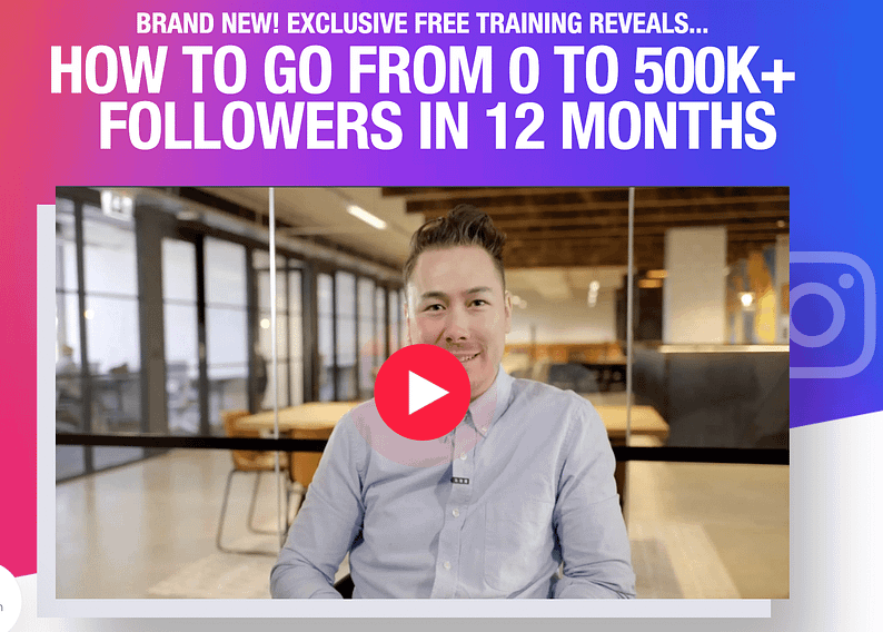
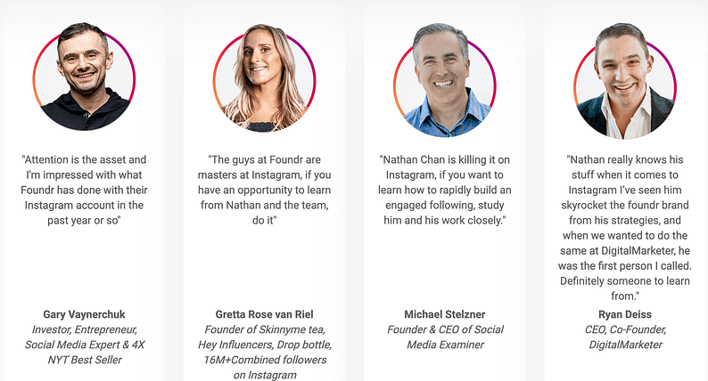
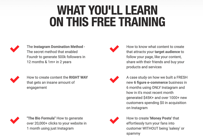
Here we have a strong headline that clearly articulates the value of the course, and then they're going to back it up by addressing pain points, showcasing testimonials, and creating a clear value proposition.
And now they expand on the value of the course...
Step 3: Creating Compelling Sales Pages
After capturing leads through your engaging landing page, the next critical step in your sales funnel is to convert these leads into paying customers.
Creating compelling sales pages that resonate with your audience and clearly communicate the value of your course is essential. This section will explore how to design both your normal and promotional sales pages using Thrive Architect and how to effectively showcase testimonials and leverage middle-of-the-funnel (MOFU) content to build trust and encourage purchases.
Crafting Your Sales Page with Thrive Architect
Creating a sales page that converts is crucial for turning interested leads into paying students. Thrive Architect stands at the center of this process, offering you the tools and flexibility needed to design both your main and promotional sales pages. This section will guide you through leveraging Thrive Architect’s capabilities to build a sales page that resonates with your audience and effectively communicates the value of your course.
Designing with Flexibility and Control
Thrive Architect provides a selection of ready-made templates that serve as the perfect foundation for your sales page. These templates are designed with conversion in mind, featuring elements that are known to engage visitors and encourage them to take action.
The true power of Thrive Architect, however, lies in the control it gives you over the customization of these templates. You can structure your sales page to fit your specific needs, allowing you to highlight the key benefits of your course, showcase engaging visuals, and incorporate compelling calls to action.
Whether you’re creating your normal sales page or a time-sensitive promotional sales page, Thrive Architect allows you to seamlessly add and edit various elements to match your design and brand aesthetics. From adjusting the color schemes and fonts to inserting dynamic countdown timers for promotions, every aspect of your page can be tailored to ensure consistency with your overall course branding.
Integrating Essential Elements
- Benefit-Oriented Headlines: Start with a strong headline that clearly states the main benefit or outcome of your course. Thrive Architect makes it easy to test different headlines to see which resonates best with your audience.
- Engaging Visuals and Videos: Use the drag-and-drop feature to add high-quality images or videos that give visitors a glimpse into the course content, the platform interface, or success stories from past students.
- Testimonials and Social Proof: Incorporate sections for testimonials and success stories right into your sales page. These elements are critical for building trust and can be easily customized to fit within your page’s design.
- Clear Calls to Action: Thrive Architect’s templates come with pre-designed call-to-action buttons, but you have the freedom to customize them. Ensure your CTAs are prominent and placed strategically throughout the page to guide visitors towards enrollment.
- Countdown Timers for Promotions: For your promotional sales page, adding an evergreen countdown timer creates a sense of urgency. Thrive Architect integrates with Thrive Ultimatum to make adding and customizing countdown timers straightforward.
The flexibility of Thrive Architect ensures that whether you’re setting up the main sales page or a promotional variant, you have all the tools necessary to create an effective and aesthetically pleasing sales environment. This approach not only enhances the user experience but also significantly increases the likelihood of conversion, moving leads one step closer to becoming enthusiastic participants in your course.
Building Trust through Testimonials
Testimonials and success stories are powerful tools for building trust and credibility. On both your normal and promotional sales pages, include testimonials that speak directly to the results and transformations your course has facilitated for past students. Highlight stories that resonate with the specific desires and challenges of your target audience. This not only provides social proof but also helps potential students envision their own success through your course.
Leveraging MOFU Content for Increased Conversions
Middle of the Funnel (MOFU) content plays a pivotal role in nurturing leads and guiding them towards making a purchase decision. Positioned between the initial awareness stage and the final decision stage, MOFU content is designed to address the specific concerns, questions, and needs of potential students who are considering your course but haven't yet committed to enrolling.
Understanding MOFU
MOFU represents a critical phase in the buyer’s journey where potential customers are evaluating their options, comparing different courses, and seeking more in-depth information about what you offer. At this stage, leads are already aware of their need or problem and are actively looking for solutions. Your goal is to convince them that your course is the best solution for their needs.
Importance of MOFU Content
The importance of MOFU content lies in its ability to educate and build trust with potential students. By providing valuable information that addresses their specific concerns and highlights the benefits of your course, you can effectively position your offering as the optimal choice. This type of content helps to:
- Build Credibility: Demonstrating your knowledge and expertise on the subject matter.
- Address Objections: Tackling common hesitations or doubts that may prevent a lead from enrolling.
- Showcase Value: Highlighting the unique advantages and outcomes of your course.
Boosting Conversions with MOFU Content
Incorporating MOFU content into your sales pages can significantly boost conversions by:
- Educating Your Audience: Use case studies, detailed course breakdowns, and instructor qualifications to provide a deeper understanding of your course. This educates your audience on the value and applicability of what you're offering, making the decision to enroll more straightforward.
- Answering Questions: Including a Frequently Asked Questions (FAQ) section addresses common queries and concerns directly on the sales page. This not only saves potential students time but also removes barriers to the purchase decision.
- Demonstrating Success: Share success stories and testimonials that focus on the transformation or results achieved by past students. This not only serves as social proof but also helps potential students visualize the impact your course could have on their own lives or careers.
By strategically using Thrive Architect to integrate MOFU content into your sales pages, you create a more compelling and persuasive narrative that resonates with potential students. This targeted approach not only educates and nurtures your leads but also effectively guides them through the decision-making process, leading to higher conversion rates and more successful enrollments in your course.
The Critical Role of Calls to Action in Your Sales Funnel
Calls to Action (CTAs) are the linchpin of any successful sales page. These direct prompts serve as the final nudge for potential students, guiding them from interest to action. Understanding the importance of CTAs and crafting them effectively can significantly impact your course's conversion rates.
The Purpose of CTAs
A Call to Action is designed to prompt an immediate response or encourage an immediate sale. It is not just a button or a line of text; it's a strategic tool that can guide your visitors through the sales funnel, from initial interest to final commitment. CTAs play a pivotal role in transitioning potential learners from browsing to enrolling, making their design and placement crucial elements of any sales page.
Why CTAs Matter
- Clarity and Direction: CTAs provide clear instructions on what steps visitors should take next, eliminating any confusion and helping streamline the decision-making process.
- Urgency and Motivation: A well-crafted CTA can create a sense of urgency or FOMO (Fear Of Missing Out), encouraging leads to act quickly to secure their spot in your course or take advantage of a limited-time offer.
- Conversion Optimization: The presence, visibility, and appeal of your CTAs directly influence your conversion rates. A compelling CTA can significantly increase the likelihood of a lead taking the desired action.
Crafting Effective CTAs
To maximize the impact of your CTAs, consider the following best practices:
- Visibility: Ensure your CTAs stand out visually from the rest of the page. Use contrasting colors, large fonts, and strategic placement to make them immediately noticeable.
- Conciseness and Clarity: Your CTAs should be short, clear, and to the point, conveying exactly what you want the visitor to do (e.g., "Enroll Now," "Download the Syllabus," "Join the Waitlist").
- Value Proposition: Embed the value proposition within your CTA. Let potential students know what they stand to gain by taking the action (e.g., "Start Learning Today" implies immediate access to learning materials).
Incorporating these elements into your CTAs using Thrive Architect allows for not only aesthetic customization but also functional optimization, ensuring that your CTAs contribute effectively to your overall conversion strategy.
Remember, the goal of your sales page is to convert visitors into students, and your CTAs are the critical elements that facilitate this transition. By giving them the attention and strategic thought they deserve, you can significantly enhance the effectiveness of your sales funnel.
Example of Effective Course Sales Page
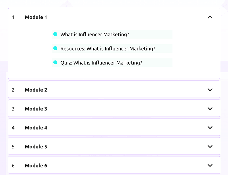
Let's look at another influencer marketing course, this time from Influencer Marketing Hub.

The instructor's credentials are established early on in the page and this is quickly followed up by a breakdown of the course modules.
And of course, to finish everything off, there's a strong CTA!

Step 4: Leveraging Scarcity and Urgency for Conversion Boost
When converting leads into paying students, leveraging psychological principles like scarcity and urgency can play a pivotal role.
These tactics, when used ethically and effectively, can dramatically enhance the attractiveness of your offer and compel action from your potential students. This section delves into how Thrive Architect and Thrive Ultimatum can be harnessed to instill these principles on your sales pages, making your courses more enticing.
The Power of Scarcity and Urgency
Scarcity and urgency work by tapping into a fundamental human instinct—the fear of missing out (FOMO). When a course or offer is perceived as limited in availability (scarcity) or accessible only within a specific timeframe (urgency), it becomes more desirable.
These principles can encourage leads who are on the fence to take the leap and enroll, motivated by the concern that delaying might mean losing the opportunity altogether.
Luckily, Thrive Architect allows you to design your sales pages in a way that highlights the exclusivity of your offer. Here are some strategies:
- Limited Seats Available: Emphasize that the course has a limited number of spots to convey scarcity. This can be effectively communicated through the text and visual cues on your sales page.
- Exclusive Bonuses: Offer bonuses that are only available for a limited time or to a limited number of students, enhancing the perceived value of enrolling sooner rather than later.
Creating Urgency with Thrive Ultimatum
Thrive Ultimatum is specifically designed to create time-sensitive campaigns on your website and along with Thrive Architect, it’s part of our Thrive Suite of plugins.
Here’s how you can use it to amplify urgency:
- Evergreen Countdown Timers: Set up an evergreen countdown timer for each visitor that triggers as soon as they land on your sales page. This personalizes the urgency, as each potential student sees their own ticking clock, pushing them towards making a decision before the time runs out.
- Special Offer Deadlines: Create campaigns for special offers or discounts that expire within a specific period. The looming deadline serves as a powerful motivator for leads to act quickly to take advantage of the offer.
Best Practices for Using Scarcity and Urgency
While scarcity and urgency are potent tools, they must be used judiciously to maintain trust and integrity with your audience. Always ensure that any limitations on availability or time are genuine. Misleading potential students can damage your reputation and trustworthiness.
Transparency is key—clearly communicate the terms of any offer and stick to them.
By integrating these principles into your sales strategy through Thrive Architect and Thrive Ultimatum, you can create a more compelling offer that encourages quicker decision-making. This not only boosts your conversion rates but also accelerates the growth of your student base, ultimately contributing to the success and scalability of your online courses.
Enhancing Your Funnel with CRM and Email Marketing Integrations
As your sales funnel begins to gather momentum, integrating Customer Relationship Management (CRM) and email marketing software becomes crucial. These integrations not only streamline lead management but also provide a comprehensive platform for nurturing leads and maintaining customer satisfaction.
This section discusses how combining CRM with email marketing software can significantly benefit your funnel, focusing on warming up leads and retaining customers.
The Dual Benefit of CRM and Email Marketing Integration
Integrating CRM and email marketing serves a dual purpose: it enhances the efficiency of managing leads and personalizes the communication journey for each potential student. A unified system allows you to:
- Automate and Personalize Lead Nurturing: With detailed information about each lead's interests and interactions, you can automate personalized email campaigns that guide them closer to enrollment.
- Streamline Customer Interactions: Keep track of every interaction, from initial contact to post-enrollment feedback, ensuring that customers feel valued and supported throughout their learning journey.
Choosing the Right Integrated Solution
The ideal solution would offer robust CRM functionalities along with comprehensive email marketing tools. Here’s what to look for:
- Seamless Integration: The software should easily integrate with your sales funnel components, including landing pages and sales pages, ensuring smooth data flow and lead capture.
- Scalability and Flexibility: It should grow with your business, handling increasing volumes of leads and allowing for complex segmentation and automation strategies as your marketing efforts evolve.
- Ease of Use: An intuitive interface minimizes the learning curve, enabling you to focus on strategy rather than technical management.
Warming Up Leads and Retaining Customers
Once integrated, use this powerful combination to engage your audience effectively:
- Segmentation and Personalization: Use CRM data to segment your audience based on behavior, preferences, and engagement. Tailor email content to match these segments, making each message resonate more deeply with its recipients.
- Educational Content and Offers: Send a mix of educational content that positions you as an authority and targeted offers that incentivize action. This could include exclusive insights into course topics, early bird enrollment discounts, or access to special bonus content.
- Feedback Loops and Customer Retention: Implement automated surveys or feedback requests post-enrollment to gauge satisfaction and identify areas for improvement. Use positive feedback as testimonials and address any concerns to enhance the learning experience. Additionally, keep your audience engaged with alumni stories, advanced course offers, or related workshops to encourage continuous learning and loyalty.
Integrating CRM with email marketing tools offers a strategic advantage in managing and nurturing your leads more effectively. By automating personalized interactions and maintaining a continuous dialogue with both potential and existing customers, you not only warm up leads more effectively but also build a foundation for long-term customer satisfaction and loyalty.
This holistic approach ensures that your sales funnel is not just a pathway to conversion but also a journey towards creating lasting relationships with your students.
Next Steps After Launching Your Sales Funnel
It’s going to feel great when your sales funnel goes live and starts converting!
But the journey doesn't end here. The initial launch of your funnel is just the beginning. To ensure its continued success and effectiveness, it's crucial to monitor, measure, and optimize your funnel's performance over time.
This section outlines the essential next steps you should take once your funnel is functional, focusing on analyzing performance, making data-driven decisions, and refining your strategies for better results.
Monitoring and Measuring Performance
The first step in optimizing your sales funnel is to establish a robust system for monitoring and measuring its performance.
Key metrics such as conversion rates, click-through rates, bounce rates, and the overall flow of traffic through your funnel will give you insight into where your funnel is performing well and where it might be leaking.
- Utilize Analytics Tools: Tools like Google Analytics and MonsterInsights can track the behavior of visitors on your sales page, providing valuable data on how they interact with your content.
- Track Conversion Rates: Pay close attention to the conversion rates at each stage of your funnel. Low conversion rates at specific steps can indicate areas that need improvement.
A/B Testing for Optimization
Once you've identified potential areas for improvement, A/B testing (also known as split testing) becomes an invaluable tool. By comparing different versions of your sales pages, CTAs, or even email marketing messages, you can determine which elements resonate most with your audience and lead to higher conversion rates.
- Test One Change at a Time: To accurately measure the impact of your changes, only test one element at a time. This could be the wording of a CTA, the placement of a testimonial, or the design of a landing page.
- Use Thrive Optimize: For users of Thrive Themes, Thrive Optimize integrates seamlessly with Thrive Architect, making it easy to set up and run A/B tests on your sales pages.
Continuous Improvement
The digital marketing landscape is always changing, and so are the needs and behaviors of your potential students. Continuous improvement should be a core philosophy in managing your sales funnel.
- Stay Updated on Best Practices: Digital marketing trends evolve, so it’s important to stay informed about the latest strategies and technologies that can enhance your funnel.
- Solicit Feedback: Regularly seek feedback from your students and leads. Surveys, feedback forms, and direct communication can provide insights into what’s working and what could be improved.
- Iterate Based on Data: Let the data guide your decisions. If an A/B test shows a clear winner, implement that change across the board. If certain content consistently leads to higher engagement or conversions, use those insights to inform future content creation.
Launching your sales funnel is an exciting step towards growing your online course business, but the work doesn't stop there. By committing to monitoring, testing, and refining your funnel, you can ensure it remains effective and continues to generate results over time. This proactive approach to funnel management not only helps you maximize conversions but also enhances the learning experience for your students, fostering a community of engaged, satisfied learners.
FAQs: Online Course Sales Funnel
Q: How do I measure the success of my online course sales funnel?
Answer: Track key metrics like conversion rates at each funnel stage, overall enrollment numbers, and email open rates. Use analytics tools to monitor these metrics over time for insights into your funnel's performance.
Q: What's the most effective way to increase conversions in my online course sales funnel?
Answer: Focus on A/B testing different elements of your sales pages, such as headlines, CTAs, and images. Use the results to refine your messaging and design for better alignment with your audience's preferences.
Q. How can I reduce drop-offs in my online course sales funnel?
Answer: Identify where drop-offs occur using funnel analytics. Improve these areas by enhancing the content's relevance, simplifying the enrollment process, and reinforcing value propositions with testimonials and success stories.
Elevating Your Course Sales Funnel
Launching and managing a sales funnel for your online course is a dynamic and ongoing process.
From understanding your audience and creating compelling content to integrating CRM and email marketing for personalized engagement, each step is crucial for converting leads into satisfied students.
By leveraging the powerful features of Thrive Architect for landing and sales page design, incorporating scarcity with Thrive Ultimatum, and optimizing your funnel through continuous testing and feedback, you can create a sales funnel that not only drives conversions but also fosters a community of engaged learners.
The journey doesn't stop with the launch of your funnel. The real magic happens in the iteration and optimization phases—fine-tuning your strategies based on data, feedback, and evolving marketing best practices. Remember, the goal is not just to sell a course but to deliver value, build relationships, and contribute positively to your students' lives and careers.
Ready to take your online course sales funnel to the next level?
Start by exploring the suite of tools offered by Thrive Themes, designed to make each part of your funnel more effective. Dive into the resources available for creating engaging content, and don't forget the power of A/B testing with Thrive Optimize to refine your approach continually.
And remember, the success of your funnel is a reflection of your commitment to your students' success. So, keep learning, keep optimizing, and keep delivering value. Your students—and your business—will thank you for it.
Get Thrive Suite and build the perfect course sales funnel today!


Thanks Phil
If this is set up in such a way that they have to sign up again via a special landing page to get access to the course you could make sure they see the promotional price.
If you have 1 signup and several free courses with open access then they would at some point be outside of the promotional window.
So in short the answer is: it depends what you prefer and both are possible 🙂
Thanks Martina, glad you found it useful!
Hi Kerstin,
No atm Thrive Ultimatum does not allow you to add countdowns in emails.
Happy this was helpful Christine!
Please disregard this comment, the shortcodes are displaying properly!
Hi Bryan,
You can now accomplish that with Thrive Automator! Have a look at this tutorial that shows you how to create an account on your course website when people sign up to another website (where your landing pages live): https://help.thrivethemes.com/en/articles/6064752-how-to-interconnect-two-independent-sites-using-thrive-automator
Could you please contact our support team. It’s almost impossible to debug without seeing the whole setup and understanding what’s exactly going on on your site.