You did it!
You spilled blood, sweat and tears but your sales page is finally up and running, ready to convert those visitors into customers.
First of all, congrats on taking the leap. I know it can feel like giving birth to an 8.8 pound baby to get that first version out there.
But just like you don't stop taking care of your baby, you shouldn't consider the first version of your sales page to be "final".
Let me show you 3 improvements you can make on your sales page today.
More...
Before...
We believe seeing a real world example is much more powerful than overwhelming you with theory. Which is why we're going to demonstrate these improvements in real life with this sales page remake.
The page we gave a make-over is the sales page of one of our Thrive Members, Karen from Life in Motion.
This is the sales page before make-over:
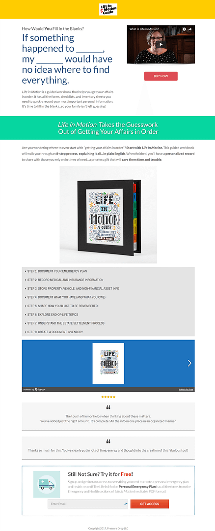
The original Life in Motion guide sales page
And After

This is the new sales page design
What stands out immediatly are the design changes we made to the sales page, but that's not all. We added several elements to increase conversions.
These elements are not specific to this sales page. They are universal and adding them to your sales page will increase your chances of visitors buying your product.
Let's have a look at them in detail...
Improving Your Sales Page
1. Multiply Your Call-to-action Buttons
Every sales page should at least have a call-to-action (CTA) button above the fold and one at the bottom of the page.
The top CTA button allows for visitors who are already convinced, after seeing your video or headline, to buy immediately.
The one at the bottom allows for those who scroll all the way down to easily convert into a customer.
If you have a long sales page, add one or more extra CTA buttons throughout the page. Every time you think a visitor might be ready to buy, there should be a button in view.
2. Stop Sending Visitors Away
You most likely think you're not making this mistake but let me ask you:
- Are you showing an opt-in form?
- Is there a video that's still showing "related videos"?
- Or maybe a free widget that's adding promotional links to your page?
Luckily this is easy to fix!
Do's and Don't for Lead Generation on Sales Pages
A sales page is not the place to ask for an email address. This applies to opt-in forms on the page, but also to opt-in forms that overlay the page such as lightboxes, screen fillers, etc.
If you used Thrive Architect or a Thrive Leads shortcode to add an opt-in form, simply delete the element from your page.
If you're using Thrive Leads to show opt-in forms, change the targeting of your lead group to exclude sales pages. Here's a tutorial on how to do that.
The only exception to this rule is an exit-intent lightbox. This type of lightbox will only show if the user is about to leave your sales page. If there're leaving the page anyway you might as well try to get their details. This will allow you to send follow up emails and slowly sell them.
You can set up an exit-intent lightbox with Thrive Architect or with Thrive Leads if you want detailed stats and A/B testing options.
Use the Advanced Video Settings
When you add a video to your sales page with Thrive Architect, you can use the advanced settings to hide related videos.
I also suggest hiding the title if you're using a YouTube video because it doesn't look good to have the title show on the video (and it's not necessary because you should have a benefit driven title right above the video anyways).
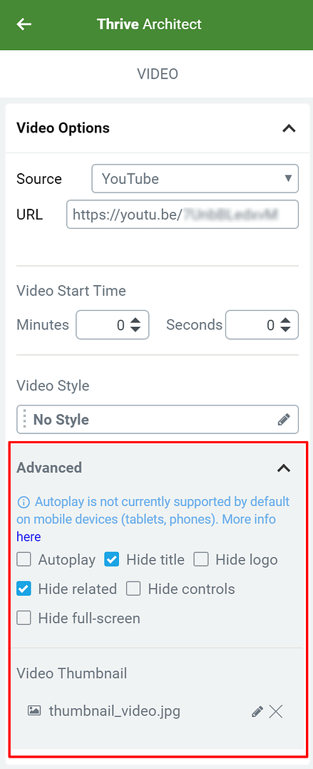
Advanced Video Options
Avoid Free Tools
This might come as a surprise but very little free WordPress plugins are truly free... Often, these free tools are used to generate traffic back to the tool's website.
You're paying by giving away some of your traffic and hard earned visitors.

Free tool with 2 links back to their site on YOUR sales page...
While you might not be using Issuu, you might be using one of these:

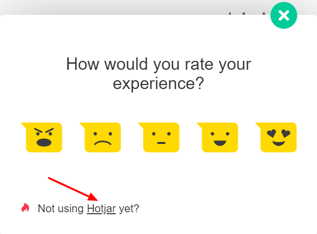

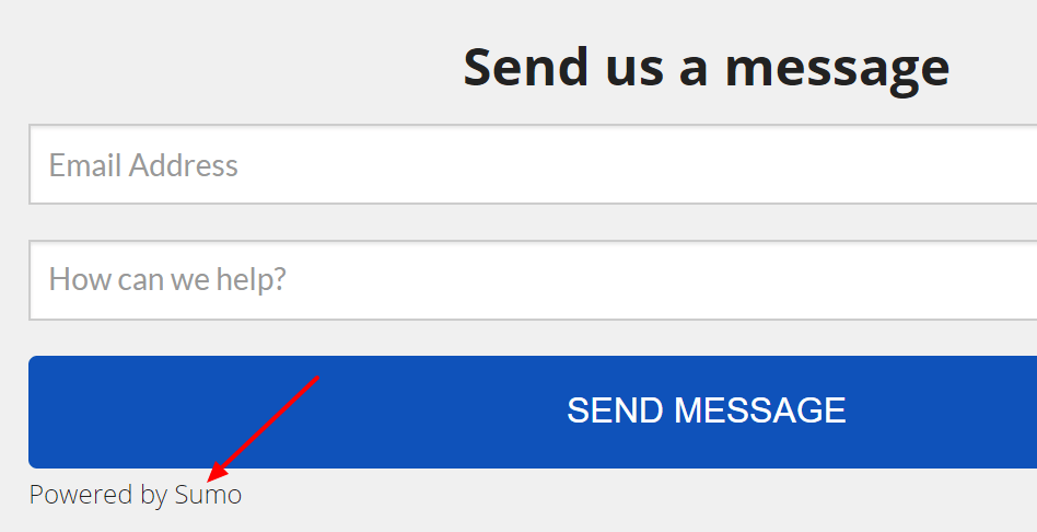
Make sure to turn these tools off on your sales page!
3. Present Yourself

The biggest battle online is to gain trust.
Your visitors have to trust that:
- they will not be scammed,
- you know what you're talking about,
- you'll be able to help them.
The quickest way to build this trust is by adding an "About the Author" or "About the Company" section on your sales page.
In this section, you tell the readers just enough so they feel you can be trusted and you're an expert.
A good question to answer is "Why did you create this product?" The answer to this question will often be a story which makes you relatable.
Now It's Your Turn
What did you think about this make-over? Did you learn something that will help you improve your sales page? Are you ready to use Thrive Optimize to test a new version of your sales page? Let me know in the comments below!


The two big improvements for me are the big power statements in the middle and bottom of the page. They get right to the heart of the reader’s “pain points” and offer a comforting solution.
Too many websites and sales pages don’t address the big question your website visitors will have: “What’s in it for me??” – as in why should I care? Why should I keep on reading what you have to say? Without answering these a big percentage of the visitors you’ve spent time/ money attracting will simply click away because it doesn’t seem like you;re answering their problem.
Nice job!
Very true Phil, thanks for sharing!
Hmmmm… I like it. Think I’m going to revisit my sales page and take a second look….
Thanks Steve. Happy this inspired you to improve your own sales page!
Is there any data that the first red button “BUY” is worthy to put at the top of the page? I cannot imagine why click anybody there.
Hi Tamas,
Imagine someone reading a blog post and you mention your product (like we do all the time with our content) at that point, someone comes to the sales page already convinced to buy. You do not want to have them scroll to find a buy button. You want to make it as easy as possible.
Hi Hanne,
Love the upgrade.
And the always awe-inspiring content you publish.
Quick question:
Can you add this sales page design as a bonus LP template in Thrive Architect?
Hi Nicholas,
Happy you like the content. Unfortunately for this make-over we can not add the design because it was made for Karen exclusively as part of the price for winning a members-only contest.
Hi Hanne, great content, as always. One question, though. For the video, I get why you made it bigger and more prominent. But why did you replace the thumbnail showing the author with a generic photo of a flower? Conventional wisdom suggests that people would connect more with another person rather than a stock image. (Then again, this might be a great thing to A/B test with Thrive Optimize!)
Hi Rick,
I agree that I would make a more “speaking” thumbnail 🙂 I would suggest Karen make something with a nice picture of herself in the style of the page.
” Every time you think a visitor might be ready to buy, there should be a button in view”
Love that! Great work, Hanne!
Thanks Yvette!
Good post Hanne! Simple any clear video, I love it!
Thanks Nebojsa
Great makeover. I learn a lot from these. Thank you.
Great to know Sandra
Nicely done… I appreciate the work effort made by Thrive Themes to showcase in tutorial format how to improve on business and strategies which work. To my knowledge no other page builder does this. I’m not Billy Shakespeare but a button by any other name wouldn’t work for me.
Thanks Larry. Happy you enjoy our teaching.
You made me realize I had exit promoting CTAs on my sales pages. Face palm.
Time to fix that Trenton 😉
Another great post! What do you think about having a Drift messenger on a sales page? Isn’t it a good idea for people to be able to get immediate help?
Hi Lindsay,
I’m not sure if Drift adds a link to their site on the widget or not… I think that type of widget can help if you’re really online to answer the questions live.
If it’s a widget that’s always there even if you’re not able to answer I don’t think it’s really a good idea.
Awesome makeover and some excellent tips too! Well done. 🙂
Thanks Joan
Hello Hanne,
As always, thank you so much for the tutorials and tips you provide us with on all your videos. I can assure you that every time I go through your posts I learn something new that can be applied to my business (online or offline).
I have a question for you:
From the templates already offered within Thrive Architect, what would you consider as your #1 recommendation for home page, about page and sales page?
Thank you so much,
Luis
Hi Luis,
Much depends on personal taste… I like the “no photoshop” page a lot and would pick that for a homepage. And I would probably adapt that same template for an about page.
For a sales page, I like the Clickjournalist page. But again, this is mostly personal taste 🙂
You can see an overview of all the landing pages here
The hyperlink is missing. 🙁
fixed it 🙂
Thank you Hanne. I have one final question on this topic.
If, for instance, I decide to pick the Home Page History – Personal Branding
https://landingpages.thrivethemes.com/thrive-landing-pages/?v=2&tcb_preview=tcb2-homepage-history-personal-branding
and want to sort of adjust the colors to a darker/stronger blue.
How do I keep the color branding consistent with the rest of the regular pages and blog posts from my WP Theme (where I´m not using Thrive Architect)?
I like the squared theme, but the blue color option it comes with, is different from the blue color used on the Home Page History – Personal Branding template.
How can I adjust the overall color of my Theme to be consistent?
Thank you so much for your help and patience.
Hi Luis,
So yes for the moment in our themes you can only select form a short list of colors.
To create the consistency, I would probably only change a few elements to the same blue as the theme (Eg. the CTA button on the opt-in form, maybe the icon color)
Hi Hanne.
“It can feel like giving birth to an 8.8 pound baby to get that first version out there”. Love this!….lol.
Also, Kudos to Karen for getting her site to the position it is in.
It is also very encouraging to see real life examples of other Thrive member’s sites and how they are using your products.
It is my understanding from reading the interpretative advisory from the better ads standards that exit intent light-boxes are in contention for future evaluation under the new European Union General Data Protection Regulation (GDPR), so for the time being be sure that any exit intent light-boxes used do not redirect your visitors to a 3rd party and is less than 30% of the size of the page it appears on to conform to the current guidelines for GDPR.
However, this is my interpretation so I may well be wrong. Can you possibly elaborate on this?
Hi Jonah,
It seems to me that you’re mixing up GDPR and the Better ads standards.
GDPR is about data protection. The same rules will apply to a “normal” lightbox as to an exit intent lightbox.
For the Better ads standards, you can read about it here.
That was great Hanne! Thank you!
You’re welcome George
Thanks for the breakdown on the sales page Hanne. You should always be looking for ways to tweak and improve your funnel, and these tips are gold! I had my website built using Thrive Architect at the start of this year…still learning.
Hi Brian, glad you found this helpful. And we agree, incremental improvements is where it’s at!
Thank you, Hanne. That’s the best use of an exit intent lightbox that I have seen!
Thanks Lewis
Great examples of the light boxes and the “before you go” pop up. Thank you Hanne you’re awesome!
Thanks Dave.
Hi Hanne,
I was wondering if you had tips on how to improve a sales/application page where there may be still be screening involved for customer fit or where additional nurturing required?
We offer education experiences where not everyone is necessarily suited for our program or would require more nurturing than simply being convinced by a landing page to pay.
A typical funnel for us would run along the lines of:
1. visit page of relevant “experience” or blog
2. submit basic info for a lead magnet, fill in basic enquiry form or apply for an experience
3. nurture via email till full application is received
4. review full application and arrange to interview candidate
5. send invoice and notice of acceptance
6. receive payment
I am wondering if there are suitable landing pages or tips you had for someone like us (particularly in steps 3-6) where we aren’t selling a physical product/e-book/course and so the process of the conversion varies greatly?
Cheers,
Matt
Hi Matt,
I don’t think we have landing pages for what you describe .
A lot will depend on how you’re taking full applications…
But I would actually treat step 4 as a sales page, the “sale” is to get them to fill out the full form. You can still apply all the tips here.
Instead of sending them to a page with only the application form, send them to a page that reinforces the benefits of applying, that presents the company, that has multiple call to actions to fill out the form etc.
Hi Hanne,
some people may want to fill out a full application after visiting the page for a particular experience. The 3 ways we may collect their info but not have a full application submitted are:
– fill in an enquiry form
– download a lead magnet (name and email only)
– or start but not complete their application
I suppose we could group the above as:
1. those who fill an enquiry form or downloaded the LM and send them to a similar page with the goal or “sale” being to get them to start and finish an application and outlining benefits/trust signals
2. those who have an incomplete application are sent to a “cart abandonment” type of page which will contain similar elements to the above
From there develop landing pages for scheduling their interview and post interview/invoice payment.
Do you think that framework would be the way to go?
Sounds good from what I understand 🙂
thanks, Hanne, so many valuable tips here to learn from. And thank you to Karen for sharing, really appreciated
Thanks for reading Ramesh!
Thanks so much for this, Hanne! I am still working on getting my new version live, but this inspired me to make incremental changes to the overall look of my site (which is converting better for sign ups already.) I’ll keep you posted, but I’m really happy with the makeover!
Yey, happy to hear this has paid of in other areas of you site already!
Please do let us know if you got better results with the new sales page (or not) 😀
Solid tips as usual Hanne! I like the tip on not using opt-in forms to distract your visitors, but the exit intent does give you an opportunity to continue your marketing efforts. Thanks!
Glad you found this helpful Shawn
Been reading the blog tips for a while now and relatively new member. I am currently looking at converting my main website to thrive themes and these tips help a lot. Just finishing off converting my blog to thrive themes, so keep the tips coming lol
Great to hear, will do Auggie
Great video Hanne thank you. I’m curious to know the video software you use to zoom in and out from the circular view of yourself to the full view? it’s pretty cool!
Hi Chris,
That’s done in Adobe Premiere. Our video editor made a tutorial on Revealed: How to Create the “Bubble Effect” we Famously Use in Our Video Tutorials
Awesome, thanks Hanne – keep up the great work with everything 🙂
i think it’s simple, thanks Hanne!
Thanks
Great tips, as always Hannah. I agree that presenting yourself shouldn’t be restricted to the About page. I notice that the improved version of the sales page makes better use of colors and content boxes too. The whole design comes across as more professional and, therefore, more credible. I’m a copywriter, but if I can give these sort of tips to my clients that don’t have a fancy website design company behind them, I’m definitely going to give them added value. Of course, as a Thrive Theme user, my own website benefits as well. Cheers!
Thanks Helen. I agree that a pro design will help but if the copy on the page isn’t good, no one will buy!
Thanks a lot. I needed it.
Thank you for your comment! Glad you liked it.
Wondering if Thrive themes or plugins have an option like “provely” that one can use on certain optin pages?
thanks
Hi Marion,
No we do not offer that option.
Hanne,
I really enjoy your tutorial. Thank you. I have a fitness niche related product that I am planning on promoting using Thrive Products.
Does it make sense to send the visitor from the ad to the mini-presale page (that has not price, just some information about about the product and learn more button) and collect their lead before sending them to the actual sales page?
Ad – Pre-Sale page (collecting leads) – Sale Page – Purchase
Or should I just stick to Ad – Sale Page – Purchase and maybe an exit intent lead collection?
My idea is to email leads that submitted email on pre-sale page but did not purchase a discounted version of a product or a bonus product if they decide to go through with the purchase this time.
What do you think?
Going from Ad to sales page is really hard if it’s “cold” traffic, meaning that these people don’t know you yet. The chances of converting someone from an email lead to a customer are much higher.
So then it’s all about math…
If you pay $1/click on your ad and you sell a $100 product and 1% takes you up on that offer, you’ll break even but you have no way to contact those 99 people who left without buying and you lost that $99.
If you have the same numbers, but you send them to an opt-in page that converts at 30% (which is achievable with a good offer) you would get 30 leads for $100 now you can nurture those leads and get higher conversion rates Eg. 6% which would give you 2 sales for the same $100…
Up to you to know your numbers 🙂
Great job Hanne. I love the simple two colour icons ( emergency plan, property assets etc) in the chapter section. Can I ask where they are from please?