


“How long is this gonna take to read?!”
That’s the subconscious question every online visitor asks themselves before reading anything you, me, or anyone has ever published.
And can you blame them?
With so many blog posts, books, news feeds, Netflix shows and YouTube channels out there vying for our precious attention, ain’t nobody got time to do it all.
That’s why most online content just gets ignored (including yours).
So other than putting the extra effort in to write catchy titles, make your headings skim friendly & create eye-popping visuals for your posts, are there any easy buttons you can press RIGHT NOW to help break through the noise and get visitors to keep reading right down to your comments section?
Keep scrolling to learn how you can boost your reader engagement by quickly adding Reading Progress Indicators to your blog posts if you happen to using a dedicated Reading Progress Bar plugin or the most powerful theme builder for WordPress...
Why Are Progress Indicators So Darn Engaging?
Reading progress indicators are typically displayed on sites that publish long form content.
It’s become one of the best ways to inform readers just how much time they’ll need to complete a given article — finishing it right then and there if it’s short, or setting aside an appropriate amount of time to read it later if it’s too lengthy for the moment.
Defining up front what’s required to consume your content provides potential readers with a finite framework from which to make a necessary time commitment. As Marina Konnikova states in her New Yorker article about why people love listicles (based on supporting evidence): “The more we know about something—including precisely how much time it will consume—the greater the chance we will commit to it.”
So when it comes to boosting engagement on your blog, displaying reading progress indicators is a simple & easy way to encourage online visitors to:
Start reading your posts (because they indicate the time required up front).
Feel less overwhelmed by your long articles (because it helps people feel oriented within lengthy content).
Complete an article once started (because the finish line remains in constant sight).
And given how search engines like Google interpret lower bounce rates & longer session times as positive signals that content is good, Reading Progress Indicators could have a meaningful impact on your site's search engine rankings too!
So now that we've covered the WHY behind reading progress indicators, let’s now discuss HOW you can deploy them on your own site using one of two options — with a standalone plugin, or with Thrive Theme Builder...
Option 1: Add a Reading Position Indicator Using a Separate WordPress Plugin
If you're looking for a straightforward way to add a progress bar to your WordPress posts or page, using a dedicated plugin is a great option. One highly recommended plugin for this purpose is Worth the Read. This plugin is specifically designed to add a reading progress bar to your posts and pages, enhancing the user experience by visually indicating how much content remains.
Step-by-Step Guide to Adding a Progress Bar with Worth the Read Plugin
Follow these steps to add a progress bar to your WordPress page using the Worth the Read plugin:
Step 1: Install and Activate the Plugin
1. Navigate to Plugins: Go to your WordPress dashboard and click on Plugins > Add New.

2. Search for the Plugin: In the search bar, type "Worth the Read" and hit enter.
3. Install the Plugin: Find the Worth the Readplugin in the search results and click Install Now.
4. Activate the Plugin: Once the plugin is installed, click the Activate button.

Step 2: Configure Your Plugin’s Settings
Once you’ve installed and activated Worth the Read, find the plugin in the WordPress dashboard left sidebar and select “Reading Progress”. A screen with the plugin’s settings will appear.
In the “Functionality” tab you can configure a variety of options, including:
Where to display your reading progress bar — posts, pages, or homepage
Whether to show the bar on custom post types (this depends on the other plugins you have installed)
Your progress bar’s placement — top of the page, bottom of the page, or in a sidebar
Whether to display the bar on mobile devices or touch-screen devices

Save changes once you’re done and select the “Style” tab. This is where you’ll find an array of customization options, including:
Progress bar thickness
Foreground color and opacity
Background color and opacity
Shadow settings

After editing the style options, don’t forget to save the changes to store your settings.
You can now visit any blog post or page on your WordPress website to see the progress bar in action.
Option 2: How To Add Reading Progress Indicators to Your Blog Posts Using Thrive Theme Builder
A super important part of engaging your audience is through web design. Are your pages and posts designed well?
Are your blog posts SEO-friendly, clean and easy to read?
Do your posts load quickly?
Do your images and videos fit on your page, or do they always look like they're clashing with your text?
If you’re unsure of the answer... a scroll progress bar will do little to improve your posts’ engagement. You need to revise your current website’s appearance and determine whether your current WordPress theme is helping or hurting your website.
If the answer is the latter... you need Thrive Theme Builder.

Thrive Theme Builder is theme builder that's designed to help you create a clean, conversion-focused website.
You can use this plugin to create your website's structure, and set up templates for all your site's important pages. And you can do this without needing to know how HTML, CSS, or Javascript — or spend hours in the WordPress Block Editor (Gutenberg)! It’s a smooth option for beginners and the ultimate convenient tool for advanced WordPress users and bloggers who want to build good-looking websites fast.
The easiest way to add Reading Progress Indicators to your WordPress site is by modifying your Post theme templates within Thrive Theme Builder.
When you use Thrive Theme Builder to create your blog post template, you can include Reading Progress Indicators like Estimated Reading Times in your above-the-fold Top Sections, Auto-Updating Reading Time Remaining indicators in your Sticky Sidebars, and Horizontal Progress Bars at the top of your articles.
Once you've installed Thrive Theme Builder, you'll need to navigate to the Templates area of your Thrive Theme Builder dashboard, and opening the visual editor for the Default Post template you’re going to modify:

Navigate to the Thrive Theme Builder dashboard’s Templates section and select a Post template to customize.
If you haven't configured your website's templates, then you'll need to go through the Thrive Theme Builder Setup Wizard, first.
Once the Thrive Theme Builder visual editor is locked & loaded, use the following instructions to deploy one (or even all!) of the reading progress indicators described below...
Adding Horizontal Progress Bars
Start by highlighting the “Theme Template Name” breadcrumb and opening the Main Options tab in the left sidebar.
From there, simply toggle ON the “Reading progress indicator” option and choose which “Progress indicator location” you want to use (in the dropdown box that appears).
You have 2 options...
Option 1: Top of viewport
Use this horizontal progress bar option with fixed headers (that disappear as you scroll down the page):

The “Top of viewport” horizontal progress bar option.
Option 2: Underneath the header
Use this horizontal progress bar option with your Sticky Headers or even Sticky Transition Headers:

The “Underneath the header” horizontal progress bar option. Note: this option can only be used with Headers using the Sticky scroll behaviour option.
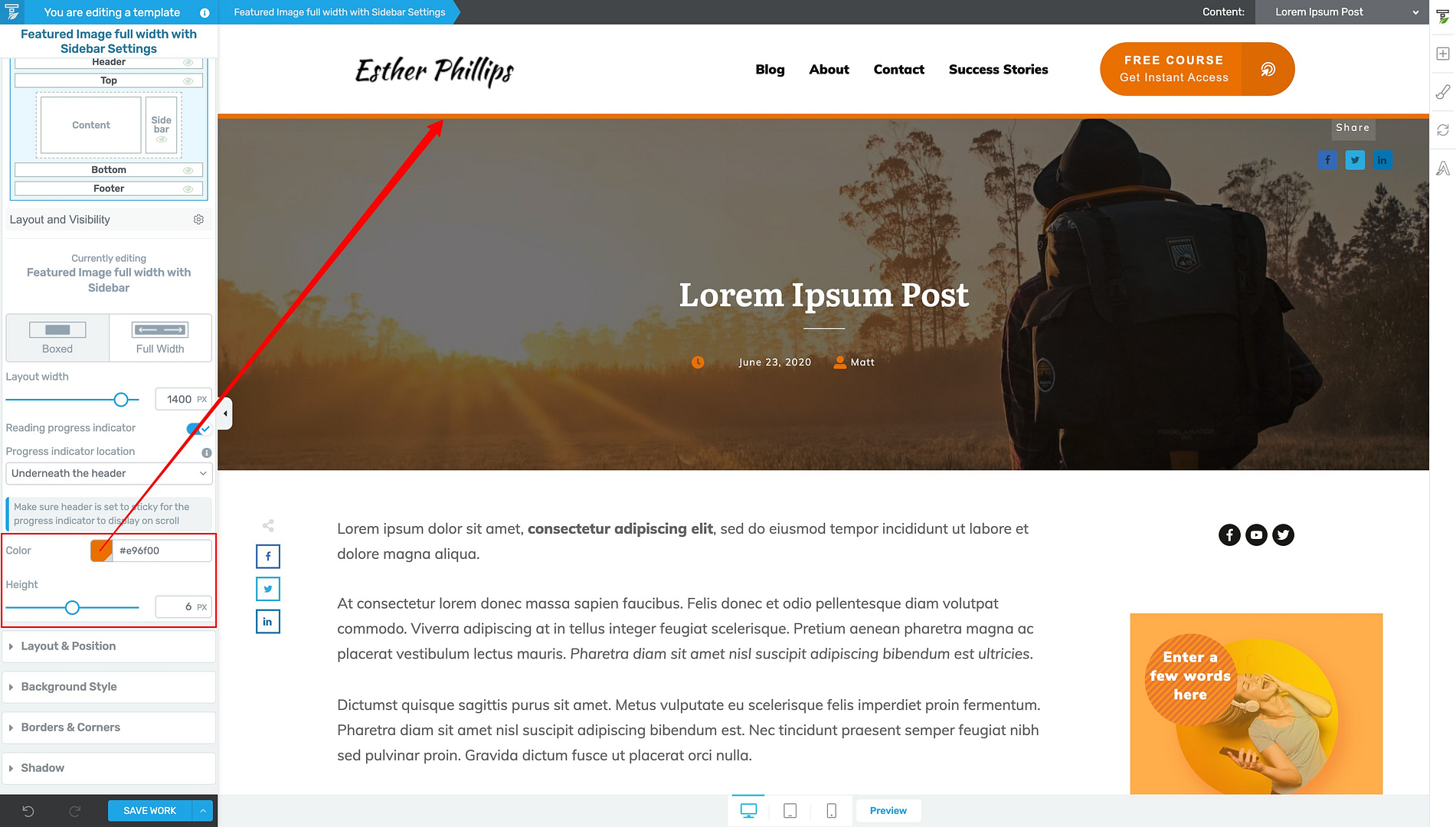
Once you select your progress indicator location, just assign it a color (your Thrive Theme Builder brand color is recommended) and modify its pixel height as you like:

You can also change the color and pixel height of your horizontal progress bar.
"Underneath the Header" Progress Bar Pro Tip
If you choose the “Underneath the header” progress indicator location, then you’ll need to make your header “Sticky”.
You can do this by highlighting your Header breadcrumb, entering the “Editing Header” mode, opening the Scroll Behavior tab in the visual editor’s left sidebar, and setting the “Behavior on Scroll” option to Sticky:

When using the “Underneath the header” horizontal progress bar option, make sure to change your Header’s scroll behaviour to Sticky.
And that’s it!
Save your work and you’ll have a Horizontal Progress Bar visually working to inform your readers just how much article they have left to cover when scrolling down your blog posts.
Adding Estimated Reading Time Indicators
To display Estimated Reading Times at the top of your blog posts, you’ll need to drag & drop any design element that uses text into the Top Section of your Default Post template so you can use it to show a particular dynamic text feature.
To do this, first highlight the default text you dropped onto the page and then click on the “stacked pancakes” looking icon in the text editor floating bar. From there, select the “Content” option from the first dropdown box, and then the “Reading time remaining (in minutes)” option in the second dropdown box:

To dynamically display an estimated reading time in the above-the-fold Top Section of your blog posts, set a Text element to the following Dynamic Text options: 1) “Content” & 2) “Reading time remaining (in minutes)”.
Once applied, the amount of time needed to read an article (in minutes) will replace the default text PLUS the words “minutes remaining”. Just modify this auto-generated suffix to say whatever you want (like “# Minute Read” instead).
Once you save your work, readers will be able to see exactly how long one of your articles takes to read — as soon as a post loads!
Adding Auto-Updating Reading Time Remaining Indicators
This last Reading Time Indicator feature is an adaptation of the Estimated Reading Time indicator discussed above.
Just like the previous indicator feature, first set your text to dynamically display the “Reading time remaining (in minutes)” option.
However, now you’ll make sure this dynamic text lives in a floating element (like a Sticky Sidebar) instead of a fixed, above-the-fold Top Section:

To dynamically display an auto-updating reading time remaining indicator throughout your post, add a Text element to a floating element (like a Sticky Sidebar) and set its Dynamic Text options to: 1) “Content” & 2) “Reading time remaining (in minutes)”.
Because the “Reading time remaining (in minutes)” dynamic text feature auto-updates itself as you scroll down the page, it’s perfect for showing readers how much time is left to finish a given article — no matter where they currently are within the text.
To get started deploying this feature, make sure the design element you’re adding the dynamic text to is “Sticky” (so it’ll remain visible as your readers scroll). Sticky Sidebars are great candidates for this job!
If adding this feature to a Sticky Sidebar, just highlight the Sidebar Section breadcrumb in your visual editor window, open its Scroll Behaviour tab in the visual editor’s left sidebar, and toggle ON the “Enable sticky sidebar” option:

Make sure your Sidebar Section’s scroll behaviour is set to “Sticky”.
Now you’re ready to add a Text element to the Sidebar Section. It’s best to do this in the middle of the Sidebar Section so it remains visible as readers scroll up or down a page:

Add a Text element to the middle of your Sidebar Section (so it remains visible for readers when scrolling up and down) and apply the same Dynamic text settings: 1) “Content” & 2) “Reading time remaining (in minutes)”. Adjust the prefix and suffix text as needed.
Just add or modify any prefix and/or suffix text you need to complement the “Reading time remaining (in minutes)” dynamic text to suit your Sticky Sidebar. Then save your work.
Now when your readers scroll through your articles, the time remaining will always be visible.
Where Should You Use Reading Progress Indicators?
It’s true that these Reading Progress Indicator features are pretty awesome and super easy to deploy on ANY of your theme templates inside Thrive Theme Builder…
...but should you use them across every single post and page of your website?
Definitely not.
Here’s some important suggestions about WHERE and WHERE NOT to use Reading Progress Indicators on your site to maximize their retention boosting potential:
DO Use Reading Progress Indicators on:
DON’T Use Reading Progress Indicators on:
How Long Does It Take to Read Your Posts?
Would your content benefit from more readers making it to the comments section?
Of course it would, so take a few minutes right now to add (at least) a read meter to your “Default Post” template inside Thrive Theme Builder.
And if you need additional WordPress tutorials to improve your website, check out these ones:
We’re constantly adding awesome new features AND professionally designed templates to all our products to make it easier, faster, and even fun to run a successful online business.
Or Start with Thrive Theme Builder, instead.
Still have any questions about Reading Progress Indicators or how to customize them to suit your website? Please share them in the comments section below!


Hi Chipo, thanks for this great post.
Is it possible to add a reading progress bar to our posts even if we use a custom template?
Hey Mira, yes it is!
In your custom template in Thrive Theme Builder, follow the same instructions in the tutorial and the progress bar option should appear