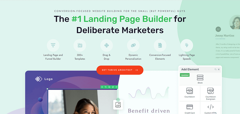
Do you want to add cool shadow effects to your WordPress site but worry because you don't know how to code?
You're not alone. Many people want their websites to look just right, with neat design touches like shadows that make pictures, buttons, texts, and elements stand out. Shadows can make your site look more interesting and professional.
Here's some great news: You don't need to be a coding wizard to make your website look awesome. With tools like Thrive Architect, you can easily add shadow effects and more, without ever touching code. It's all about making sure you can get your website to look exactly how you want, shadows and all, without settling for less.
If you've been dreaming of adding stylish shadows to your site, stick with us. We'll show you how to do it on your WordPress site, making your pages pop without any complicated code.
Why Your Website Needs That "Pop": Shadow Effects Explained
Just as a painter uses shadow and light to bring depth to their paintings, shadow effects can transform a flat, static website into a dynamic, engaging experience. It's these subtle touches, these nuances of design, that guide your audience’s eye and emphasize the elements most important to your story.
However, unlike the traditional artist who must master their craft over years, with the right tools, you wield the power to create depth with ease, turning your vision into reality without ever needing to delve into the complexities of coding.
Simple Yet Powerful Design with Thrive Architect
Adding shadow effects with Thrive Architect is as intuitive as a painter choosing the right brush for their next stroke. You don’t need to be versed in the language of web development or spend hours manipulating code.
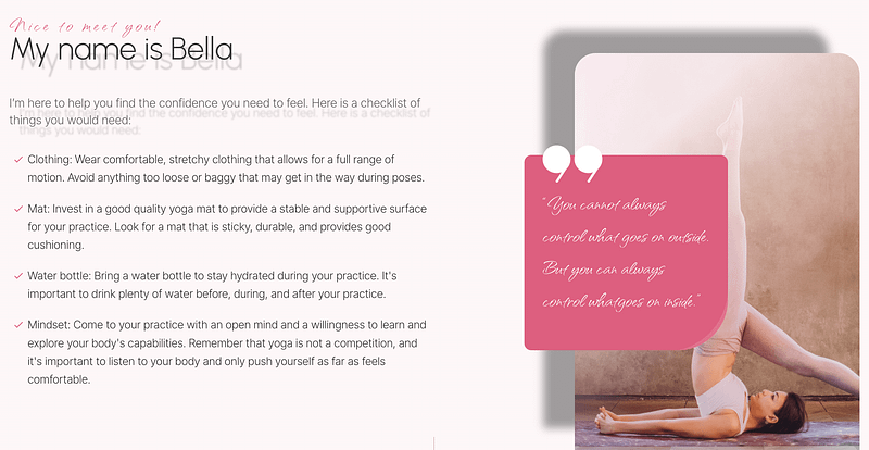
Thrive Architect offers a palette of design options that let you intuitively apply shadow effects, enhancing your website’s aesthetics and user engagement as effortlessly as drawing a brush across canvas.
Exploring Solutions: Adding Shadow Effects Without CSS
Adding shadow effects to a website has traditionally been a task for those familiar with CSS — the coding language that tells a website how its elements should appear. This method works, but it's akin to an artist having to mix their paints from scratch for each new piece. Effective, yet time-consuming and potentially overwhelming for novices.
The Traditional Path: CSS Coding
Normally, to get a shadow behind an image or button, you'd need to write specific lines of CSS. This isn't a problem for coders, but for many of us, it's a significant hurdle. It's like needing to understand the chemistry of paint before being able to use the color blue.
Easier Alternatives: Thrive Architect and More
Thrive Architect offers a straightforward, no-code solution. It's like being handed a palette with all the colors pre-mixed and ready to go. You can add shadow effects with a few clicks, adjusting their look and feel with simple sliders and buttons.
But what if Thrive Architect isn't the right fit for you? The good news is there are other tools and plugins available that also simplify this process, such as SeedProd, and various dedicated shadow effect plugins. Each has its own set of features and ease-of-use, allowing you to choose the one that best fits your needs and comfort level.
Thrive Architect: Simplifying Design
Thrive Architect transforms the process of customizing your website. It does so by offering:
Intuitive Controls: Adding shadow effects is straightforward. Select an element, choose the shadow effect, and adjust to your liking without ever writing a line of code.
Real-Time Previews: Instantly see how your changes look, enabling quick and effective adjustments.
Consistent Design Across Your Site: Apply shadow effects site-wide with global settings, ensuring a cohesive look and feel.
Your Toolkit for Web Design
Beyond shadow effects, Thrive Architect offers a range of tools to enhance your site's design, from typography to animation. It provides a comprehensive solution for those looking to elevate their site's aesthetics (here are some tips on what makes a great website) without delving into code.
In the following section, we'll guide you through the process of using Thrive Architect to apply shadow effects, making your website not just functional, but visually captivating.
Step-by-Step Guide: Creating Shadow Effects the Easy Way
Ok, so let's do this the easy way! Here's your step-by-step guide to adding shadow effects in WordPress.
Step 1: Install Thrive Architect - Unleash Your Site's Potential
Unlock Design Freedom
Thrive Architect isn’t just a tool; it’s your gateway to transforming any vision you have for your website into reality. With its drag-and-drop simplicity, you can add depth with shadow effects, engage with dynamic animations, and customize every detail without ever needing to code.
Built for Conversions
Every element within Thrive Architect is optimized for conversions. From compelling call-to-action buttons to attention-grabbing shadow effects, it’s designed not just to captivate your audience but to convert them into loyal customers.

Easy Installation
- Visit Thrive Themes: Head over to Thrive Architect sales plan.
- Select Your Plan: Choose the plan that suits your project's scale and ambition.
- Install and Design: Follow the straightforward installation guide. You'll be ready to create in no time, with access to a suite of customizable design options.
Your First Step to a Remarkable Website
Installing Thrive Architect is the first move towards a website that doesn’t just blend into the digital background but stands out and performs. It’s your design studio, where no vision is too ambitious and no detail too minute. Start with Thrive Architect today, and bring your website closer to your dream.
Remove Your Limitations: Start Designing with Thrive Architect Today!
Step 2: Create a New Page or Post
You can add shadow effects to both pages or posts with Thrive Architect.
Just go to Pages or Posts using your WordPress sidebar and then choose Add New before clicking Launch Thrive Architect.
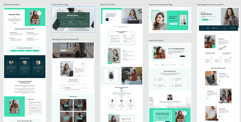
If you're creating a new page, then Thrive Architect is going to give you a helping hand by suggesting beautiful pre-built templates you can use. This is going to put expert design at your fingertips and save you a ton of time, so explore the templates and choose the one that best suits your needs. Alternatively, you can always build your page from scratch!
Step 3: Getting Started with Basic Shadow Controls
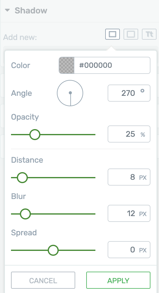
First, select the element you want to add a shadow to. Thrive Architect offers intuitive controls for both outside (box) shadows, inside shadows, and text. Here's a quick rundown of how to apply them:
- Choose Your Element: Click on the element (like a button or an image) you want to enhance.
- Find the Shadow Options: In the sidebar, look for the shadow settings. You’ll see options for adding outside shadows, inside shadows, and text shadows.
- Adjust the Shadow: Use the easy click-and-drag controls to adjust the shadow's size, angle, blur, and color. You'll see the changes in real-time, so you can tweak until it looks just right.
Text Shadows vs. Box Shadows
- Box Shadows: These apply to the whole element, creating a shadow around its outer edges.
Text Shadows: If you want to add shadows directly to text for better contrast or readability, especially against busy backgrounds, look for the text shadow options. This adds a shadow to the letters themselves, enhancing legibility.

The Always Bet on Black Rule
A simple rule for creating natural-looking shadows is to start with the color black and adjust the opacity. Why? Because a black shadow with reduced opacity looks good on any background, making it versatile and foolproof. Thrive Architect defaults to this setting, so you’re already set up for success.
Subtlety is Key
When it comes to shadows, less is often more. You’re aiming for a hint of depth, not an overt or harsh shadow that distracts from your content. Think of it as lightly sketching in the background rather than drawing bold lines.
Using Shadows for Conversion Focused Design
Shadows aren’t just for show; they can guide your visitors’ actions:

Highlight Buttons: A subtle shadow can suggest interactivity, encouraging clicks.
Elevate Important Content: Use shadows to "lift" key elements, making them stand out.
Draw Attention: Strategically placed shadows can lead visitors to focal points on your page, like special offers or calls to action.
Creating Design Effects with Shadows
Sometimes, shadows can be used for effects beyond simulating depth. For instance, a drop shadow with no blur and a solid color can create a "3D" look for buttons or frames, adding an extra layer of design without complicating the structure.
Over to You
Now that you're equipped with the basics of adding and customizing shadow effects in Thrive Architect, it's your turn to experiment.
Remember, the goal is to enhance your site's visual appeal without overwhelming it. Subtle, well-placed shadows can significantly boost the professionalism and user experience of your site.
Dive in and start transforming your website into a more dynamic and engaging space!
Breaking Free from Design Limitations
Many website owners hit a wall when their vision exceeds their technical capabilities.
Perhaps you've pictured a sleek, modern site with elements that seem to float off the page, creating an immersive user experience. But without coding knowledge, this vision might seem out of reach.
Thrive Architect dismantles these barriers, offering a suite of professional design elements at your fingertips, ready to be implemented with a simple drag-and-drop.
The Psychological Impact of Professional Design
First impressions matter which means your website has a fraction of a second to make an impact.
Professional design elements like shadow effects play a crucial role not just aesthetically, but psychologically, influencing how visitors perceive and interact with your site.
Creating Depth and Focus: Shadow effects add depth to your website, making it more visually engaging. This isn’t just about beauty; it's about creating a hierarchy of information. Just like in a painting, shadows can guide the viewer’s eye, emphasizing key elements like call-to-action buttons or featured products. This subtle guidance is rooted in our natural perception of depth, making elements seem tangible and actionable.
Inviting Interaction: A button with a shadow doesn’t just signal its importance; it invites interaction. This is based on the principle of affordance in design — the idea that objects' appearance suggests their usability. A shadow implies an element is raised, waiting to be pressed. It's a cue learned from the physical world, translated into the digital, making users more likely to engage.
Enhancing User Experience: Smooth, consistent use of shadow effects and other design elements can significantly enhance the user experience. A well-designed site signals to visitors that you care about their journey on your site. This not only makes the experience enjoyable but also builds trust. A site that looks professional and is easy to navigate reassures users, increasing their confidence in your brand and the services or products you offer.
Elevating Brand Perception: Ultimately, the design of your website reflects on your brand. Professional design elements signify attention to detail, quality, and reliability. They convey that you’re serious about providing a great product or service. This psychological layer adds depth to your brand's story, engaging users on an emotional level and fostering loyalty.
To implement these sophisticated design touches effortlessly, Thrive Architect stands as your ally. By enabling you to add shadow effects and other design enhancements with ease, it empowers you to harness the psychological power of professional design, transforming your website into a space that not only looks exceptional but feels intuitive and inviting.
Empowering Creativity and Consistency
With Thrive Architect, your creativity isn’t limited. Whether it's shadow effects, dynamic hover animations, or interactive galleries, every element is designed to empower your creativity while ensuring consistency across your site.
This balance is crucial for brand identity, ensuring that your website not only looks professional but is also cohesive and reflective of your unique brand story. Here are the fundamental design principles we will help you follow!
A Testament to Trustworthiness
A website's design speaks volumes about its credibility.
Professional design elements signal to visitors that you value their experience and take pride in presenting your brand in the best light. By using Thrive Architect to enhance your site's design, you're not just improving aesthetics; you're building trust.
A well-designed site (here's your helpful optimization checklist) reassures visitors that they're in the right place, encouraging them to engage with your content, services, or products with confidence.
Your Vision, Unrestricted
Gone are the days when implementing professional design elements required a developer or a deep understanding of CSS. Thrive Architect offers a bridge between your vision and reality, ensuring that no idea is too ambitious, no design too complex.
It's time to unlock the full potential of your website, to transform it into a space that not only looks professional but feels like a true extension of your brand.
Embrace Thrive Architect, and let your website be a testament to what's possible when design limitations are lifted, and creativity takes the helm. Your audience awaits an experience that only you can provide — make it unforgettable.
How Thrive Architect Turns Visions into Success Stories
Thrive Architect has empowered thousands to transform their online visions into realities. From affiliate marketers to e-learning providers, here's how Thrive Architect has been a game-changer:
- Dave Sollis at Running Directions found Thrive Architect to be a linchpin in expanding his coaching business online, saying, "I love the Thrive Theme Builder style editor. Being able to set site-wide color schemes and fonts is fantastic... Thrive Apprentice is also great and has been a real lifesaver for me too."
- Daniel David Wallace, a novelist and educator, leveraged Thrive Architect for his writing courses. His feedback underscores the value of Thrive's solutions: "I think people should use Thrive Theme Builder and Apprentice to build a really great website, then focus on building up an email list."
- Oliver Pfeil, an e-learning provider, praised Thrive's comprehensive toolkit, noting, "Thrive's tools are the most important piece of the puzzle for all my WordPress projects. Thanks to Thrive, I can make my content faster, more modern, and more professional."
What These Stories Tell Us
These firsthand accounts highlight Thrive Architect's pivotal role in online success:
- User-Friendly Design: Thrive Architect’s tools allow for the creation of professional websites easily, aligning with Dave Sollis’s appreciation for the intuitive style editor and template designs.
- Conversion Focus: Daniel David Wallace’s testimony reflects the importance of a conversion-focused design in turning visitors into engaged learners and customers.
- Scalability: Oliver Pfeil’s success story showcases Thrive Architect’s ability to cater to growing online business needs, emphasizing the suite’s impact on content speed and professionalism.
Your Turn to Shine
These testimonials are a testament to the transformative power of Thrive Architect in the hands of its users. With comments like Oliver Pfeil's, "Thanks to Thrive, I win more customers through my website," it's clear that Thrive Architect is more than just a tool; it's a pathway to achieving your online business aspirations.
Are you ready to craft your own success story? With Thrive Architect, the journey from vision to a conversion-focused website is not only possible but filled with potential. Join the community of successful Thrive Suite users and begin shaping the future of your online presence today.
Remove Your Limitations: Start Designing with Thrive Architect Today!
Mastering Shadow Effects in WordPress with Thrive Architect
The quest to add engaging shadow effects in WordPress speaks directly to the essential jobs your website must do: captivate visitors, guide their journey, and convert their interest into action. This task, however critical, often uncovers a success gap for many site owners — the gap between the desire for dynamic, professional design and the ability to implement it without delving into complex code.
Shadow effects, when used thoughtfully, can elevate your website from static to standout, guiding visitors' attention and highlighting key actions. Yet, the challenge of adding these effects without CSS knowledge can seem insurmountable, leaving your site lacking and your vision unfulfilled.
Enter Thrive Architect — the bridge over this success gap. It empowers you to add sophisticated shadow effects easily, ensuring your website not only meets but exceeds the jobs it's set out to do. With Thrive Architect, the technical barriers that once limited your creative expression are removed, allowing you to achieve a professional, engaging website that captivates your audience at first glance.
In embracing Thrive Architect, you choose a solution that addresses your immediate design needs while equipping you with a suite of tools to enhance every aspect of your site's interaction and appeal. Master the art of shadow effects in WordPress with Thrive Architect and watch your website transform into a dynamic, conversion-optimized masterpiece.
Remove Your Limitations: Start Designing with Thrive Architect Today


