We've been busy.
And we kept it a secret up until last week...
When we announced the launch of a brand new plugin for Thrive Themes, the first new plugin we've released in over 3 years!
If you missed the announcement, then you just have to see this!
But, that wasn't all.
Although the new plugin stole the show, another 5 new features slipped into Thrive Suite, focusing on increased design flexibility, ecommerce, and website speed.
Read on and I'll share the latest updates with you.
More...
1. Brand New Plugin - Thrive Automator
Last week, we proudly announced a brand new plugin that joins the ranks of Thrive Suite: Thrive Automator.
We announced it live on YouTube, with a presentation that shares what the plugin does and why we built it. You can re-watch the presentation below (skip to 7:04 for the big reveal).
Watch the replay of the YouTube Live where we announced it all!
Thrive Automator is a workflow automation tool, that interconnects all Thrive Suite plugins with each other and with 3rd party plugins and services.
Each Automation consists of a trigger and an action (along with optional filters and delays) that allows backend functionality to intelligently pass data when unique conditions are met.
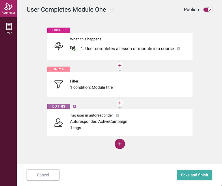
Thrive Automator lets you build intelligent workflow automations between Thrive Suite and 3rd party services.
Take for example: WooCommerce.
You can now easily create an Automation that triggers when a specific WooCommerce product is purchased on your website, and that automation can launch a 48HR countdown in Thrive Ultimatum for those new customers.
It's seamless.
Thrive Automator is in public beta, meaning we are actively adding more triggers, actions and conditions to it... but we want your feedback and ideas! We have an official feedback form where you can tell us how you would like to use Thrive Automator. This is your chance to help us shape the plugin into the tool you want it to become.
Share your feedback and suggestions on the feedback form here.
By the way, Thrive Automator was built from the ground up to be developer friendly. We made it easy for 3rd party plugins to quickly add their own triggers and actions, safely knowing it'll unlock connections to everything else that speaks through Thrive Automator.
If you are a developer or know someone that is, go here to learn about adding your own integration.
2. New Menu Layouts with Images and Icons
We have a vision: A new type of menu design that is centered around the online course student experience.
But to get there, we required a little more flexibility with the custom menu design.
So we've started laying the foundation for that vision by adding new menu layouts. Next time you edit a custom menu, you'll see the selector for adding icons to your menu has been updated with more options.
Let's take a look.
Look for the new 'Display' options in the Custom Menu
When selecting a specific menu item, you'll see a 'Display' dropdown with a few options.
Aside from 'Text only' (the default), you'll still find the option for adding icons, which is perfect for adding a bit of design to your menus.
Custom menus with icons + text
But there's a new option: 'Images'.
Exactly as the name suggests, this allows you to add a small image that sits alongside your menu item, perfect for customizing your menu when there is no suitable icon.

New support for images in menus!
We wanted images there for a reason— they can be dynamic. That means that you can change what images show in the menu based on the environment or visitor that is viewing it.
Can you see where we are going with this? (Give us one more release, just a few more weeks, and then we'll really show off why this is special).
Don't forget that menu items are grouped by default. If you click the green padlock above a menu item, you can 'break' it from the group, meaning your style changes will be applied to that item only.
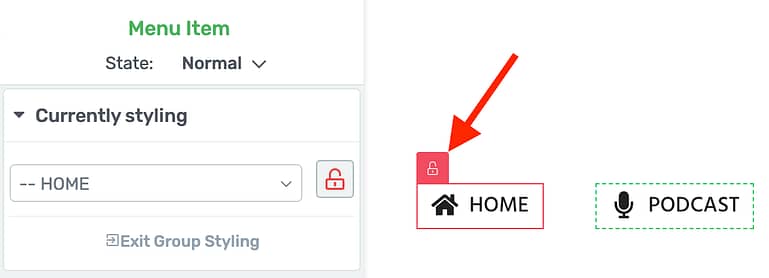
Unlock a group-edited menu item to customize the icon or image specific to it.
By unlocking your menu items from the group, making your changes, and then re-locking it, you can combine styles to add unique icons per menu item and add an image as well. Check out this example with one of each in the same menu:
You can now combine icons and images in the same custom menu!
The new display dropdown will give you the following options for your menu items:
The image only and icon only options mean you can simplify your menu for that app-like experience, making it look like this:
Disable text in menus entirely, if you'd prefer to just show icons.
But that's not all.
We've also added new alignment options for your menu icons and images.
With icons and images, you can now change the placement alongside the menu text
Alignment options mean you can choose where to place the icon or image in relation to the menu text. By default, it'll be to the left.
But you can now place the icon above it...
Menu icons and images placed above the menu text
...Or switch it around and place the icons underneath the menu text.
Menu icons and images below the menu text.
That little bit of design freedom, allowing you to include images, icons and adjust alignment, means you can get even more creative with your WordPress website menus.
But stay tuned. The real reason for this change will be apparent when we release one more change to the custom menu element, coming soon...
3. WooCommerce: Edit Design for 'Product Add-Ons' Extension
Out-of-the-box, WooCommerce is a simple eCommerce solution.
But as your eCommerce needs grow and change, you'll find a plethora of extensions— both official and third party— that add extra functionality to your online store.
One of the most popular official extensions is 'Product Add-Ons', created by the WooCommerce team.
Product Add-Ons allows you easily add radios, checkboxes, dropdowns and text fields on your WooCommerce product pages, letting your visitors add preferences to their purchase. It's a great way to increase the order size, and upsell right there on the page.
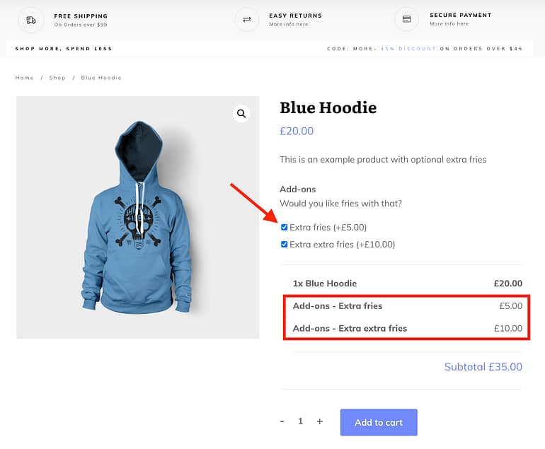
'Product Add-ons' adds more customizable eCommerce options on the product page in WooCommerce.
In our latest release, we now support Product Add-Ons in Thrive Theme Builder, meaning you can style and customize the appearance of these extra options when you're editing your theme templates.
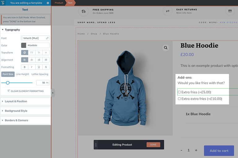
You can now style Product Add-Ons options with Thrive Theme Builder.
Product Add-Ons are still added from the backend of WooCommerce.
Remember, Thrive Theme Builder applies styles to existing WooCommerce content. The content areas are dynamically generated based on backend WooCommerce settings and options, and Thrive Theme Builder simply targets those items on the canvas.
To add your Add-Ons, you'd first apply them from the Product backend:
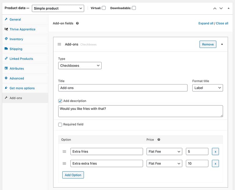
The Product Add-ons extension creates a new tab in the backend of a WooCommerce Product.
Thrive Theme Builder supports styling multiple choice (radio), checkbox, short text and long text options— which are the main uses for this extension.
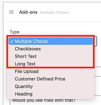
Thrive Theme Builder can style the main 4 add-on types
Once these have been enabled, you can open the WooCommerce product template in Thrive Theme Builder, click on your options and style them until it matches the branding of your whole page.

Group edit your text and make it look just right for your brand!
4. Project Lightspeed: New Google Font Optimizations
Remember our huge code optimization project we released in June?
Project Lightspeed was epic. With a single click, you were able to apply a new kind of site-wide code optimization that meant any content created with our visual editor would output leaner code.
Google loved it, and we heard from many of you that there was a significant boost to your website speed once enabled.
But if you thought that was all we were going to do about speed... guess again.
Website speed is a complex topic. It's impacted by a number of factors, some which are in our control, and others which aren't. Project Lightspeed definitely hit the 80/20 of improving your websites, but now our team are working through the smaller improvements.
...Including font optimizations.
Next time you open Thrive Dashboard and click on 'Project Lightspeed', you'll see some new options.
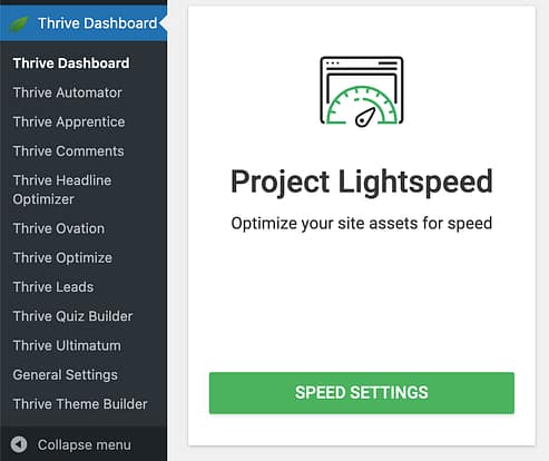
Revisit the Project Lightspeed card to find the new font optimization options.
You'll notice two different tabs on the left: Asset Optimization (the code migration), and a new option called Font Settings.
When you click on Font Settings, you'll be presented with 3 checkboxes.
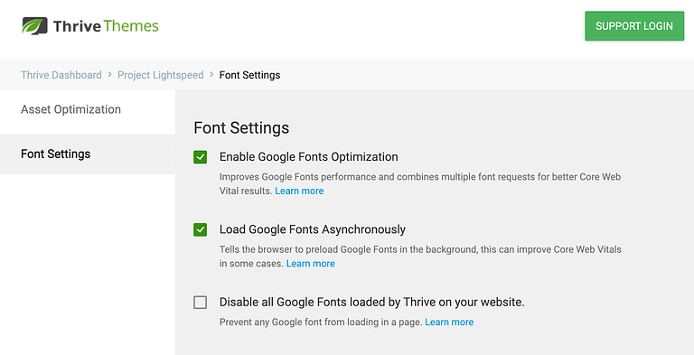
Font Settings presents 3 options that apply site-wide to your Thrive-built content.
So, what exactly do these settings do?
Before we go through them, it's important to understand that we've given you these options so you can test and see what is best for your website.
Core Web Vitals is not really a one-size-fits-all problem. The decisions you make to optimize your website will be different depending on what content you have, your page design, your server, your caching setup, etc.
You might find these options help greatly... or they might not. All you can do is try them, test them and see.
Let's go through them one by one.
Enable Google Fonts Optimization:
If your webpage uses more than one Google font, by default that page will load each of them one-at-a-time. As the code for that page is loaded from top-to-bottom, your browser will request the font files from Google as it encounters them.
That means a visitor's browser may make multiple requests to the Google servers just for one page.
By enabling this checkbox under Project Lightspeed, two things happen:
1. All Google fonts required for a page will be combined into a single request. That means a browser is only asking Google once, but will fetch all the necessary fonts.
2. A browser will use a fallback system font (one that's pre-installed on all devices) while it's fetching the Google font files, and will swap to the correct font face once it's available. This means text is readable even before the font files have been downloaded.
Both of these are preferable for Core Web Vitals, since Google often flags when fonts are not managed like this.
Load Google Fonts Asynchronously:
It's a big word, but 'asynchronously' in this context basically means "Please continue to download the rest of the webpage while downloading the font at the same time".
Most assets (images, javascript files, fonts, etc.) do not load asynchronously. As your browser starts to read the page code from top-to-bottom, it will pause every time it finds an off-site file to download and will resume downloading the page only once it has that file.
Google calls this 'render-blocking', since it pauses the visual rendering of the page.
By enabling this checkbox, there will be no pausing when fetching font files. You page continues to download, showing system fonts in the meantime, and swapping to your Google fonts once they are downloaded.
Disable all Google Fonts Loaded by Thrive:
Some people don't want any Google fonts. Why? Technically it pings the Google server, and if you're anti-google, you might never want to communicate with them at all. Or maybe you have purchased premium fonts and just have no need.
Either way, if you want to avoid Google fonts entirely, you might find it's easy to accidentally add a new template or element to your page which includes one.
Simply check this box and we'll make sure the Thrive editor never loads Google fonts at all. Any page content that was using a Google font will fall-back to the most compatible system font instead.
5. Thrive Apprentice: Easier Translations
The mammoth release of Thrive Apprentice visual editing in June meant that you could visually style everything about your online course experience.
Everything. Down to the pixel.
This level of brand-able flexibility for an online course platform was unheard of. And one of the key reasons why is because an online course environment is highly dynamic.
'Dynamic' meaning text, images, colors and content that show on front-end templates are unique depending on what course, lesson or module is being viewed and by which student or teacher.
We heard from some of our non-english course creators that you wanted easier access to translating dynamic text fields, so we've made two of those easier to edit.
Lesson Completed:
Under Thrive Apprentice > Settings > Labels & Translations > Course progress, you'll find the new 'Lesson completed notification' field.
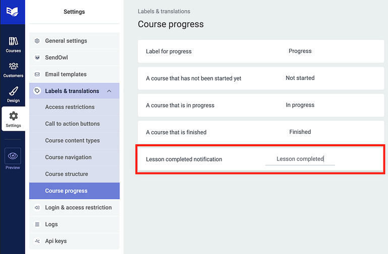
Changing your 'Lesson Completed' text is now super easy.
The text that you enter here is what will show on the notifications that appear in-browser when your students mark a lesson as complete.

This Lesson completed notification can be easily translated to any language or preferable phrase.
Renaming Default Difficulty
In Thrive Apprentice, you can assign a difficulty per-course and add custom difficulties. These labels will show on your course listing and course overview pages.
However, the default difficulty of 'none' doesn't make much sense to non-english speakers. Now just hover over any difficulty in the backend of Apprentice, click the pencil, and edit the text.
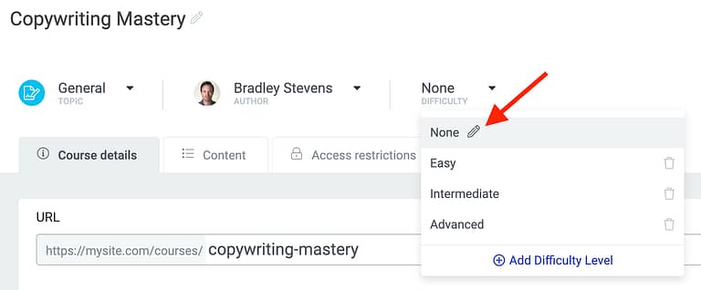
Rename your default difficulties with a click.
Lastly... No More Boxed Layout Jump
This is a small fix that will help with Google's Core Web Vitals, but only if you encountered a specific problem before.
One of the metrics Google is tracking is called 'Cumulative Layout Shift' (or CLS). When anything on a webpage moves unexpectedly without input from a user, Google sees this as a negative experience. The goal is to create visual stability by keeping things in their place unless a user interacts with it.
We saw that if you build a page in Thrive Architect or a template in Thrive Theme Builder using a Boxed Layout, and then added a background section, columns or header set to 'full width', then on page-load the section would start in it's boxed width before quickly jumping to full width.
It only took milliseconds, but it was enough for Google's CLS scores to notice.
We've re-coded how that page-width is now calculated, meaning that large jump has gone.
There's only one catch.
Because of how our re-coding works, you'll need to open any pages or templates with this problem and click 'save' in the editor to apply the fix. Our editor will rebuild the code while it's saving the page. Remember it only occurs on pages or templates set to 'Boxed' that also have sections set to Full-Width.
Leave a comment!
Any thoughts, questions or anything you'd like to share? You know we love to hear it, so drop it in a comment below.


Wow, I really like all the updates.
For Automator, any way to use a 3rd party’s webhook as a trigger? Or zapier ?
E.g. sale in 3rd party cart tool triggers Automator to give access to an Apprentice course.
There will be, yes— but we haven’t added it yet. That’s one of the new triggers we’ll be looking to implement during the public beta phase, because we know how many more use cases that’ll blow wide open!
Love the new menu options!
the best news in the week… every week thx to Thrive..
Woo’s Product Add On official extension is a plugin that costs $49 a year. Pay to Woo, not TT.
I do love the menu enhancements!
Yeah, it’s not our extension, we just allow you to style it now.
Danggggggggggg, y’all are rockin’ the updates! Thanks oodles and bunches. MamaRed
So great! Im just about to make my first online course via Woocommerce – Apprentice, and this is just what I needed. Thanks
Congratulations in advance! It’s a good combo, and we’ve got lots of help docs on our knowledge base to help you get set up.
Thrive Suite: The best tool for marketers and solopreneurs.
It would be very useful to integrate Thrive Automator & Video player (bunny.net, vimeo, youtube…) This would allow us to build evergreen autowebinar + deadline.
For example, after 75% of the video, to trigger the Thrive Ultimatum Offer or active campaign automation.
There’s a lot of potential in that idea, I like it! I see some technical challenges in it, but we’ll explore it as a team. Thanks Alexander.
Yes please! Can be very useful for VSLs as well, as a trigger to open a hidden or delayed content layout
Thrive Team you are truly awesome. Thank you for new features. I am having problem while having a full width section in a boxed layout and I never expected you would release a fix to this! Thanks for font optimizing and for menu improvements! Its all great.
Lastly, the secret, “real” reason behind the menu edits: Is it to let us built native-like mobile UI? 🙂 Bet it is!
On the boxed jumping I have an issue with the hello bar not showing immediately on load so then jumping when it does load again creating that negative experience especially on a mobile device where that small jump makes a big difference. Is this something that will be or has been fixed as I disabled my hello optin because of it?
You mean the ‘Hello Bar’ plugin? That’s not our plugin so we aren’t able to control or edit it, I’m afraid. However, you can build the exact same thing with a Thrive Leads ribbon. For CLS and the jumping problem, we’ve learned that Google is ok with placing content over the top of the page, but not when new content pushes the existing page around. Our developers are already working on some changes to our plugins that add ribbons to see what we can do for this.
Everything just keeps getting better and better. Thrive keeps eliminating more and more pain points along the way. We are able to drop additional third party plugins as you add to Thrive plugins, which makes everything much easier to maintain. Love the vision of Thrive.
Consistency is key. We can only do so much in one release, but if you do that every 3 weeks for years? Slowly more and more pain points fade away. Thanks for your comment, Allen.
I’ve realized that sometimes my pages load like jumping from the left. I don’t know if that has to do with the fix you mention as the last update. Just to make sure, which pages are set to ‘Boxed’? What does “Boxed” mean, anyway?
Thank you!!
Hey Sergio, this is my best attempt to show it in an image. [Edit] New image here: Full width section on a boxed layout. Hope that helps!
Thanks Bradley, but I’ve clicked on the link and cloudapp says “This item has exceeded its view limit!” Ouch
Oops, I just updated my original comment with a new link. It should work now!
when will you add gamification elements to thrive apprentice similar to xperiencify.com ? would be a massive update, maybe later this year? thank you!
There’s so much exciting stuff we have planned for Thrive Apprentice that has to come first, so if we do get to gamification, it would definitely be a 2022 goal.
Excellent guys! Thanks a lot 🙂
The level of commitment to improving this platform intelligently is amazing. I predict there will be case studies someday on how to grow a SaaS that satisfies users and developers equally. Impressive is serviceable but not nearly eloquent enough to describe Thrive Themes. It’s been a joy to be a small part of it.
Thank you for the kind words, Barney!
Hey Brad,
That’s some excellent updates to Thrive Suite. The last piece – solution to the CLS issue is something I have been looking forward too.
At least now we will not have to see that dreaded markdown because of this, by Google Pagespeed Insights.
Looking forward to many such improvements in the future.
Regards
Dilip
Let us know how you go. I have mixed thoughts about how much it will affect Google rankings, even if pagespeed insights says so.
Thanks for your comment, Dilip.
The CLS is a big thing to me. Not only did it look bad, but it lowered scores.
This update TOTALLY fixed this for my sites. Very happy. Well done.
Yeah? You tested it already? I’m so happy to hear it made a noticeable impact for you!
You guys just rolling out cool sh##.
Keep up the awesome work.
Just had a thought for a feature for thrive architect maybe TTB.
In elementor pro we can create headers, pages, footers, etc in elementor and have it override the default themes.
On 2 of my sites I can’t use TTB because I need the theme. But would love to beable to override some sections and create like a header with thrive architect.
Would this be a viable upgrade?
I hate having to use elemontor. I would love to just use thrive architect on these sites.
Can’t wait to see what’s next.
Hey Adam, thanks for the kind works!
Although it looks like a convenient way to go about building websites, from a code reliability POV, we don’t think overriding parts of a theme template is a good idea. It’s messy, and when I’ve brought this up with our developers, it’s made them very uneasy about how many problems it can and would introduce. This is one of the reasons why Thrive Theme Builder is truly a WordPress theme, with proper theme templates and a codebase that is written for and saved as Theme templates. It doesn’t write CSS over the top of something else: it builds new page structures from scratch, and that decision was deliberate. The only exception is stripping ALL theme code and overwriting it all at once, which is what Architect does if you load a landing page. But overwriting some visual pieces and not others… We’re likely not going to offer this any time soon.
Hello!
Disabled fonts as described in the instructions, but it did not work with the plugin for collecting and publishing reviews. As you can see on the page https://malynevskyi.com/vidguky/, the name continues to contain the font – Open Sans. The situation is similar with the feedback capture form on the page https://malynevskyi.com/zalyshyty-vidguk/. Can you tell me if this feature should work with feedback forms?
Respectfully yours, Pavel
Disabling fonts should work with every plugin from our suite, I see the issue on your page and noticed you submitted a support request about it, our support team is on it 🙂
After my comment, I also contacted support. I hope the issue will be resolved positively, and my site will become even faster.
Can’t wait for web hooks. It’s one of the few last things that keeps some of my customers from buying your product.
What’s your use-case, Dario? A little-known secret is that we’ve already had the ability to send webhooks for a while, but it was a bit limited. How would you use webhooks, so I can make sure our solution will cover it?
Thanks for these awesome updates. Thrive Automator is a great add-on to the suite.
Can we make the icon inside a circle style with soft background color like this example: https://imgur.com/a/5RKiBU5
Yes 🙂 And really easy to do too: https://share.getcloudapp.com/P8uG51w9
drop an icon on the page and then pick the “icon style” then you can still change the colors going into background style.
Wow, after enabling the Google font optimization my GTMetrix score went from B (75%/93%) to A (98%/94%)!
And a feature request for Thrive Automator: a connection with ActiveCampaign. For instance to start a Thrive Ultimatum timer when a tag is added. Or is this already possible?
Hi Wouter,
Stoked to hear about your scores!
Thanks for the suggestion for Automator, it’s not currently possible in Auotmator BUT we do have the “trigger webhook” option directly in Thrive Ultimatum. This means that from ActiveCampaign you can trigger a webhook (based on the tag) which would then trigger an Ultimatum campaign. You can learn more about it here: https://help.thrivethemes.com/en/articles/4625431-how-to-set-up-incoming-webhooks-in-thrive-ultimatum-using-activecampaign
Thanks for including the translation options 🙂
Thanks, Brad. I was working last week on Apprentice and noticed several updates already 😉 Still there are some translations, that we tried to do with Say What. But it is great already with all customization options.
Wow! These updates are game changing! Firstly, very happy to hear that Thrive now has API integration and clear documentation released. That will be very helpful. And then Thrive Automator … wow! This has HUGE potential. The key integrations I would like to see are you fire events to Google Analytics and the Facebook pixel. I do this with Gravity Forms at the moment – when someone submits a form we fire specific GA and FB events. We haven’t been able to do that with Thrive Leads or Thrive forms and have had to embed the event code on the page which is not ideal. So that would be great if those were integrated.
Thanks for the suggestion, Josh. Appreciate you taking the time to describe a specific use case. We’ll discuss this with the team