'Ka-Boom'.
That'll be your mind blowing...

...after you see what we've just added to Thrive Suite.
The latest software update has a few huge new features, on par with entire paid plugins. And if you've bought Thrive Suite, you get them all without paying a single extra dollar.
You're welcome.
Read on to see why this is a big deal especially for online course creators.
More...
1. New Image Gallery Element
Thrive Architect users, check your element tray. You'll find a brand new element called 'Image Gallery'.
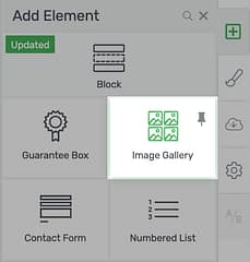
Look for the new Image Gallery element!
This element alone could be an entire plugin for WordPress. And yet... it now lives quietly alongside every other beautifully designed element and feature we've added to Thrive Architect over the years.
When you drop the Image Gallery element onto your page, the WordPress media library will spring open... with one key difference:
Rather than selecting a single image, you can select multiple and place them into a WordPress gallery.
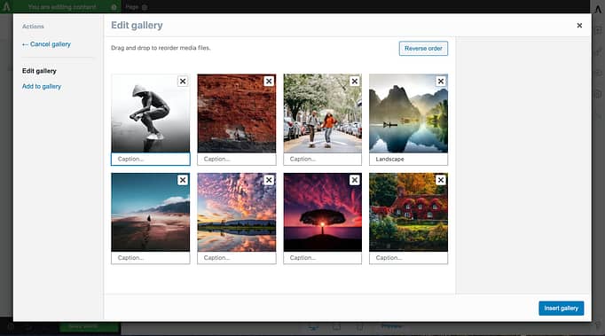
A WordPress gallery lets you group images together.
A WordPress gallery is just a collection of your images. From this window, you can drag to re-order them and add captions.
Once you're set, click 'insert gallery' and... Bam! Thrive Architect will assemble your chosen images into a grid on the page.
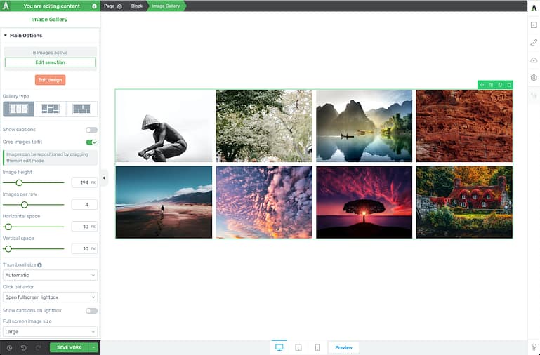
The new Image Gallery element loads your images in perfect alignment on the page.
The 3 Gallery Types
The Image Gallery element offers 3 different layouts for your images: Grid, Vertical Masonry and Horizontal Masonry.
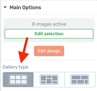
Choose from 3 gallery types.
Grid:
This will be your default gallery type, as seen above, with a matched number of rows and columns. The Grid gallery type is the only type that includes image cropping, to ensure images are presented in the same dimensions regardless of their upload size.
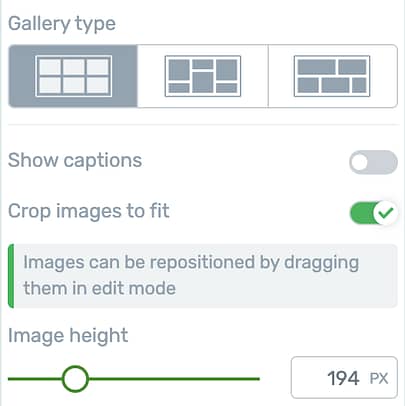
The 'Grid' gallery type allows you crop images to fit, and change their display height.
If you disable 'Crop images to fit', your images will spring back to their full dimensions, like this.

With 'Crop images to fit' disabled, the gallery will show all of your images, regardless of their dimensions.
Keeping 'Crop images to fit' enabled means you'll have access to an 'Image height' slider. With a simple click-and-drag, you change the size of the crop until the layout looks just how you need.
But how do you control the image placement inside the cropped grid?
Easy. Click 'Edit Design', and then you can click to drag your images, just like in this video below.
Reposition your images in their cropped area by entering edit mode and dragging them into place.
Vertical Masonry:
This gallery type will maintain the same number of columns, despite your image dimensions.
There is no crop option because this gallery type will intelligently slot your images in next to each other to make sure 100% of the image is visible at all times.

Vertical masonry keeps consistent image width, regardless of image dimensions.
Horizontal Masonry:
The horizontal masonry gallery type keeps a consistent row height, but does away with the concept of columns. You simply set the desired image height, and the element will figure out the breakpoint between rows for you.

Horizontal masonry keeps consistent image height, regardless of image width.
Resizing Your Gallery
Depending on the type of gallery you've selected, you'll see different options on the left hand side to control images per row, and spacing.
By reducing the spacing to 0px, each image will tightly press against the others with no white space in between.
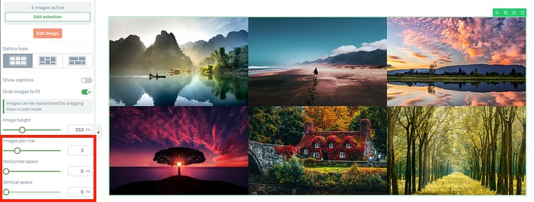
In this gallery, spacing has been set to 0px leaving no empty space between images.
Including Captions:
If you enable captions, then any caption text loaded in your original WordPress Gallery will be displayed under their respective images.
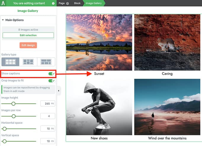
Captions can be toggled on and off with a click.
Yes, you can edit and style your image captions right inside of Thrive Architect too.
Once again, click 'Edit Design' to enter edit mode, and select your captions. There you can type out new captions and apply styling across the whole gallery.
You can even choose to show your captions above, below or inside your images.
If you select 'Inside image', set can set vertical and horizontal text alignment. Add a semi-transparent background and your caption becomes a ribbon across the image.
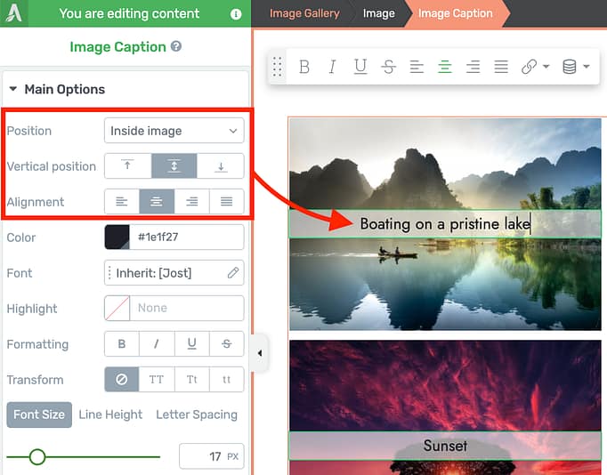
In Edit mode, you'll have additional alignment options for your captions.
Once you exit Edit Mode, any empty captions will be entirely hidden until you return to give them some text. That's attention to detail!
Thumbnail Size
Images are often the biggest files included in a web page and can impact your page loading times. We've factored this in to our thumbnail size control.
In the sidebar of Thrive Architect, you can choose between 3 thumbnail size settings: Medium, Large and Automatic.
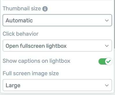
Set your thumbnail size and click behavior here.
By default, any time you upload an image, WordPress will generate 4 different sizes of the image: a 150px square thumbnail, a medium image size (up to 300px wide), large image (up to 1024px wide), and an original image (the size you uploaded it).
Best practices for page load time is to load the image size closest to your intended display size.
If you set this to 'Automatic', then two things will happen.
- The gallery will automatically select medium or large images depending on your display size, with the breakpoint being 300px image display width.
- If you have Thrive Theme Builder installed and you have enabled our built-in image optimization with Optimole, then the 'Automatic' setting will always show the largest image size. That's because Optimole will magically compress and resize your images for you, but it requires a higher image quality to do so.
We highly recommend you enable our built-in image optimization with Optimole, and then forget about it. Your website will run faster, and your image files will be small.
Why override Image Size?
Depending on your website, you may want to control the image size yourself rather than leaving it to be set automatically.
For example, if you need your website to load as fast as possible despite having big images in your gallery, you can force the image gallery to load medium image file sizes every time- reducing your page size at the expense of visual quality.
But if you're a photographer or you are showcasing a portfolio and require very sharp, high quality images, select 'Large'. They'll take a little bit longer to load but the quality will be noticeable on high resolution screens.
Click Behavior
In this new gallery element, you can control what happens when a visitor clicks on an image.
By default, the click behavior will be set to load a full screen lightbox view of that image.
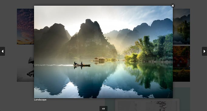
Full screen lightbox view will show your image over the top of your page when a visitor clicks.
You have the option to enable captions in the lightbox view, and to set what image size is displayed too.
Once again, photographers or websites with a need for very high image quality may want to choose 'original image size' to be loaded rather than large file created by WordPress.
Either way, the high quality lightbox images will not be downloaded on page load, meaning your load times stays fast. They will be lazy loaded once your visitors have shown intention to interact with the gallery by clicking on the images.
If you'd prefer, you can also set click behavior to 'none'.

Alternatively, choose 'none' and you can set links per image.
Once your click behavior is set to none, you can optionally add a link to individual images in your gallery.
To do this, enter 'Edit mode' once and select any image.
Enable the 'Add link to image' toggle, and you can turn each separate image in your gallery into a link that takes your visitors either somewhere else on your website or offsite when they click.
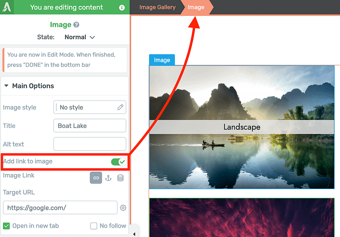
When click behavior is set to 'none', enter edit mode and you can add links manually.
Don't forget, you can customize the rows, columns and spacing between images per device, for mobile, tablet or desktop viewing.
And in Edit Mode, you can easily group-style the images in your gallery, adding borders, corners, shadows and even hover animations or image effects that apply across the whole group.
2. New Thrive Apprentice Course List
Online course creators, 2021 is a good year to be using Thrive Apprentice and Thrive Architect.
We're committed to growing Thrive Apprentice to be a leading online course platform for WordPress, and last week we released a new Course List element that is the best way to display your courses. Ever.
Full stop.
Best... both inside and outside of WordPress.
The Course List element is available in Thrive Architect when you have Thrive Apprentice installed.
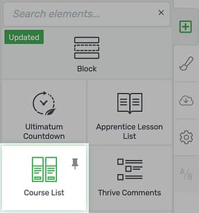
Find the Course List element under 'Integrations' in Thrive Architect.
If you have ever tried to customize a list of your courses with any tool before, then you'll know what I mean.
It's a headache! Clumsy shortcodes, rigid hard-coding, and inflexible forced designs that just don't fit your branding? Never again.
When you drop this element on your page, you'll be greeted with a window of super-flexible designer-made course list templates.
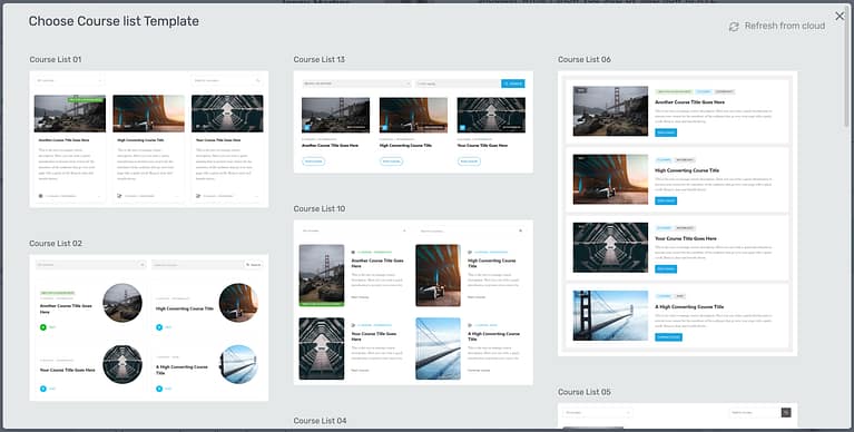
10+ beautiful course list templates out-of-the-box.
Pick your favorite, and immediately you'll see a beautiful display of your Thrive Apprentice courses on the canvas.
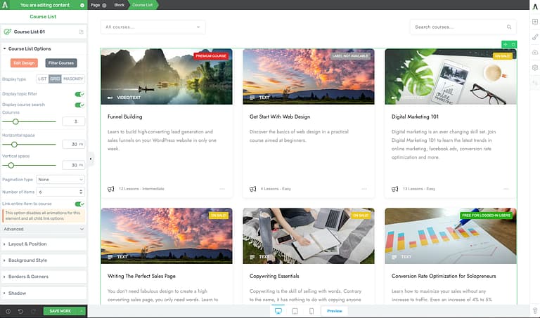
The Course List element loads your courses and gives you full control of how they look.
You can choose to display your courses in a grid, masonry layout with variable heights, or as a vertical list of full-width course cards.
But the real power of this element is found after you discover settings we built just for course creators.
Front-End Course Filters and Search
By default, each template will come with a topic filter and a search bar styled to match their template.
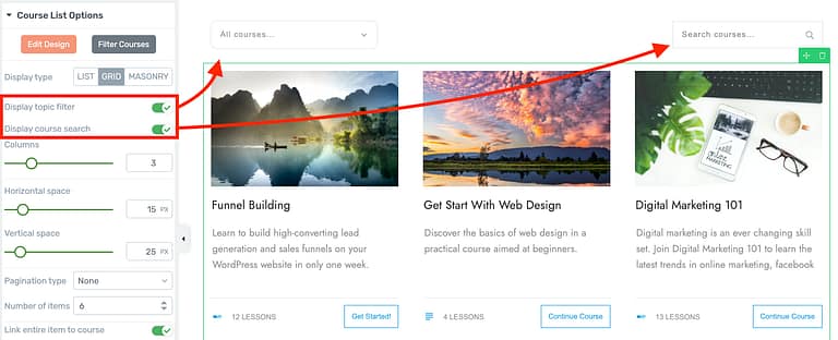
Enable or disable the topic filter and course search bar, which will appear above your course list.
These are fully visually editable, down to the typography, spacing, corners, shadows, colors and icons.
Better yet... you can drag them anywhere on the page, and the filter will still apply to the course list they came from.
A search bar should be self explanatory, but the filters dropdown will allow you to choose which filter options you want your visitors to have access to: topics, access restriction labels, or both.
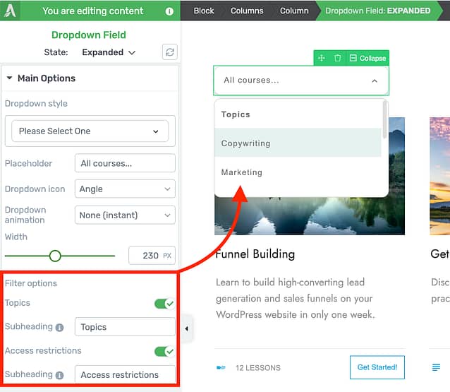
Select your dropdown filter and you can configure what filters are available to your visitors.
As soon as your visitors pick a filter or enter a search, the Course List will repopulate with courses that match their request.
New Dynamic Elements in Edit Mode
When you're ready to start tweaking the course list design, dive into 'Edit Mode'. In this view, you can move your course titles, images, descriptions, icons, texts... anything.
Changes you make will be group-applied to all the courses in the list too.
If you delete anything and want it back, open the element tray and you'll find 13 new elements you can drag-and-drop that will reload dynamic information from your courses.
All of your Thrive Apprentice course data will be available as dynamic text too!
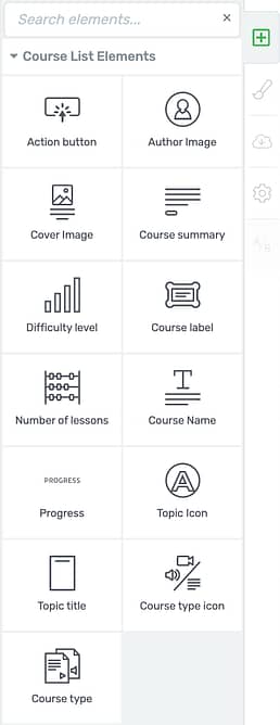
New dynamic elements available when you are in Edit Mode of the course list.
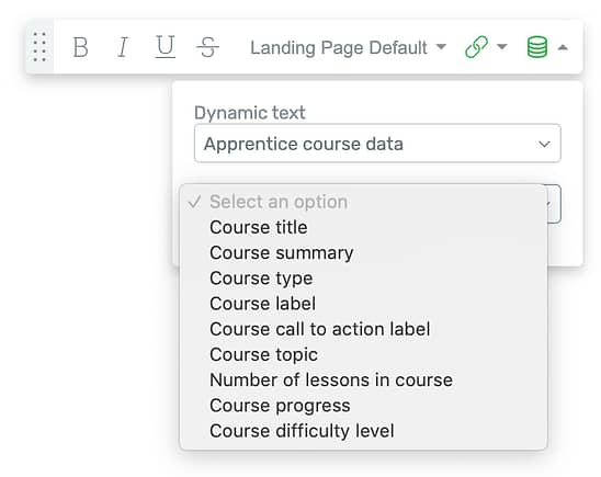
Load your Apprentice course data as dynamic texts inside your course list.
What does 'Dynamic' mean?
When we use the term 'Dynamic', we're referring to linked information from the front-end of your website (seen by visitors) to the backend (where you set it).
For example, dynamic text is used for a course title. It is not written directly into your course list. If it was, then when you want to change the name of your course, you'd have to manually change it in multiple places on your website.
Instead by loading the title text dynamically, as soon as you update the course title in the backend of Thrive Apprentice, every single course list will immediately update to reflect the new title. Easy!
The course list element connects lots of backend settings to the front-end of your website. It's ridiculously powerful!
Dynamic Course Colors, Topics and Labels
In Thrive Apprentice, you can set a topic and restriction label for each course. The restriction label is an easy way to communicate which courses are free or need to be purchased.
But both restriction labels and topics can have colors assigned to them, not just text.
Inside of the course list, you'll find a 'dynamic colors' tab available where you can choose to load the topic or label color onto an element.
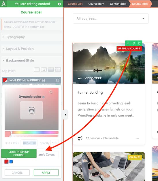
Label or Topic colors will be available in the dynamic colors tab.
Where are these topics and labels configured?
In the backend of Thrive Apprentice, under settings, you'll find all of your dynamic values that can be assigned to courses.
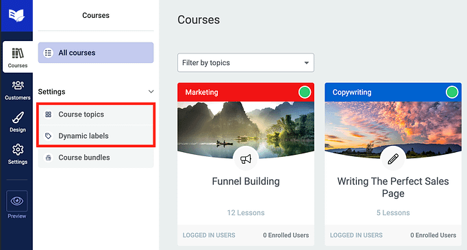
Set your dynamic labels, colors, topics and data under 'settings' in the backend of Thrive Apprentice.
Filtering Your Course List
This... this is where things get really interesting.
When you click 'Filter Courses', a window pops up with an impressive amount of filter control over what courses will show on the page. Just have a look!
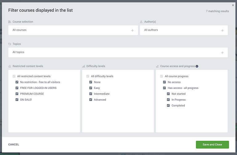
Click 'Filter Courses' to open an incredibly powerful filter window.
You can select individual courses to display, courses only by certain authors, or courses on a specific topic.
You can filter by restricted content level to only show free courses, or only show premium courses. You can also check or uncheck which difficulty level you want to display, and the courses that show will only be those that match your filter settings.
But it's that last box on the bottom right that holds the most power: Course access and progress filters.
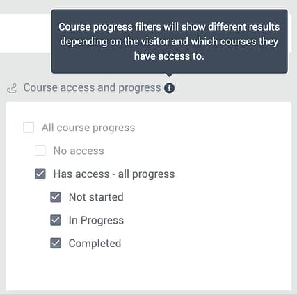
Access and progress filters are specific to the logged in user.
The option you choose here will show different results based on the access and progress of the logged in user, and will change depending on who is visiting.
Just let that sink in...
That means you can choose to show a user only the courses they already have access to! Or, vice versa, only show them the courses they haven't purchased yet.
That means with this one element, you can create 'My Courses' pages that list a students incomplete courses... or you can use it to upsell your existing students to other courses.
Now do you see what a big deal this is?
Note: Right now, Thrive Apprentice still has a default course home page that lists your courses and is not visually editable. We will have an update in the coming few releases that will let you replace that page with this new course list element.
3. Thrive Apprentice Course Overview Page Is Now Visually Editable
Related to the course list, we've now made the Course overview area in Thrive Apprentice fully visually editable.
When you open the Course Details tab in Thrive Apprentice for any of your courses, you'll see we've replaced an old text area with two new options:
'Course overview' (editable with Thrive Architect), and 'Set a course summary'.
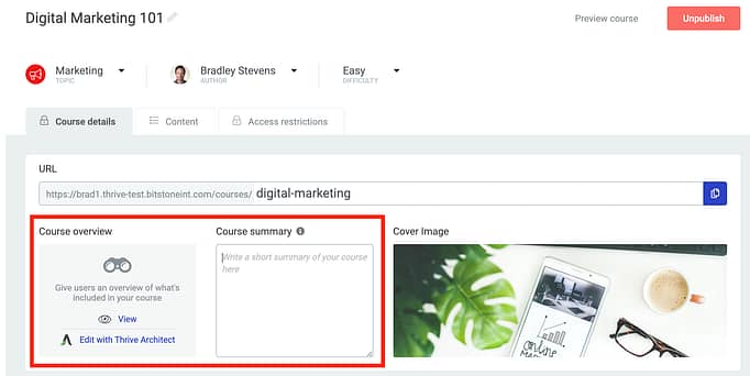
Look for the new Course Overview and Course Summary settings under your Course details tab.
The text area that was there before will remain visible in Thrive Architect, but often it's not ideal to show this on your Course List since it's better suited to a few short sentences rather than a long spiel.
So we now have a 'Course summary' field. Whatever text you enter here will show only in the description field on Course lists, meaning this area here:

The text area above is where your Course Summary text will be displayed.
As for your course overview, when you first load this page, there will be a WordPress Content element containing your old course overview.
We recommend you delete this, and then get creative with rebuilding an exciting course overview page with our design elements and pre-made content blocks. Anything you add to the page will sit between the 'About this course' title and the call-to-action button.
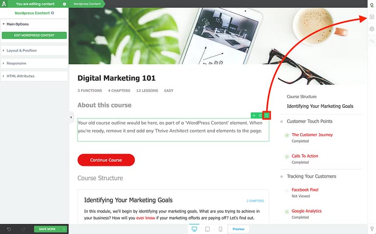
When you're ready, remove your old course description and add elements to spice up the page.
4. Thrive Apprentice Resources
Do you want to give your students even more value?
There comes a time when you're building an online course and you want to give your students access to other files, PDFs, images, documents, or links to pages on or off your website.
These resources are additional support for the content of your lessons, and now... they can be added into Thrive Apprentice in a few clicks!
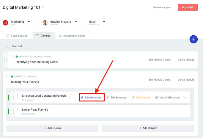
Look for the new 'Add resources' option per-lesson in Thrive Apprentice.
When you hover over any lesson in the backend of Thrive Apprentice, you'll see an 'Add resources' button.
Click it, and a window will popup where you can connect any resources to your lesson.
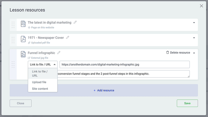
Add as many resources as you would like, including names, descriptions and resource type.
You'll have the option to link to an external file or URL, upload a file into your WordPress media library, or link to content on your own website.
Resources are set per-lesson and are dynamic content, meaning that if you don't add any resources, then the block will be hidden from your lesson view.
But as soon as you do, a resources box will appear beneath your lesson content and will remain updated with the links and information you load in the backend of Thrive Apprentice.
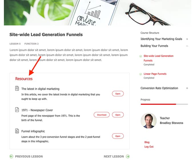
When a resource is detected, it will be listed at the bottom of a lesson.
What about the icons? Our designers have a small library of specialized icons that will display intelligently depending on the resource type.
Notice how there's a PDF icon and an image icon above? They were automatically applied to the correct resource based on the file extension.
5. Duplicate Courses and Lessons
Such a small feature, and yet so highly requested... we are pleased to now give you the ability to duplicate entire courses and specific lessons.
To duplicate a course, hover over the course card in the backend of Thrive Apprentice and you'll see a duplicate icon.
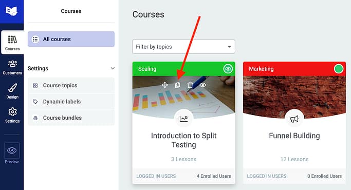
Click the double-page icon to duplicate an entire course and all of its contents.
Duplicating a course will duplicate all of the modules, chapters and lessons contained within, including all of their content, titles, images and media.
A duplicated course will be unpublished, and so too will its lessons. It won't have any access restrictions either, since we'd expect you to configure that per-course in your final step to publishing.
Individual lessons can be duplicated by hovering over the 3 vertical dots on the right-hand-side of a lesson view.
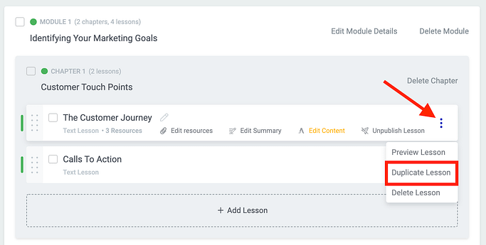
Hover the 3 dots and you'll find the new 'Duplicate lesson' option.
A duplicated lesson contains all of the Thrive Architect content and media associated with the original.
6. Reset URLs of Courses and Lessons
This feature, also highly requested, goes hand-in-hand with the new duplication option:
You can now easily reset or edit the URLs of courses and lessons in a few clicks.
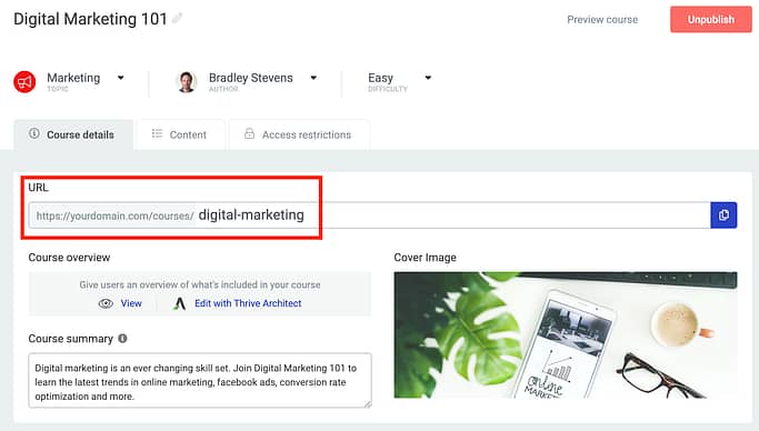
Change your course URL, and click the blue page icon to the right to copy your new URL link.
On the course details tab, type out your new permalink and it will instantly update. Links to the old URL will be redirected to the new one, unless another page on your site starts to use the old address.
For lessons, click on 'Edit summary' to get the lesson edit screen.
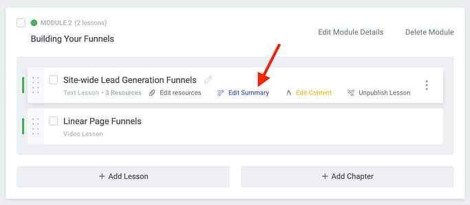
To see lesson-level options, click 'Edit summary'.
From here, enter your new lesson URL and you're done. Once again, links will redirect and your course breadcrumbs and internal links will immediately update when you click save.
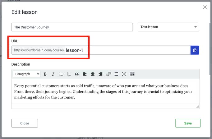
Change your lesson URL and hit save. Thrive Apprentice will do the rest!
It's a small feature, but very useful when you're now able to duplicate courses and lessons as a starting point for your course building.
7. Dynamic User Image
Did you know that images can be dynamic?
A dynamic image will change what's displayed depending on the source, and we've now improved our image element to load a dynamic User Image.
When you drop an image on the canvas, click 'Use dynamic source' rather than selecting from your media library.
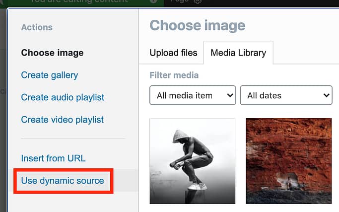
When you add an image to the page, select 'Use dynamic source' from the WordPress image lightbox.
From the Thrive Architect or Thrive Theme Builder sidebar, you can select 'User Image' as a dynamic source.
Since you'll be logged in at the time, you're going to see your own image. Afterall... you are the user.
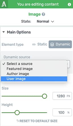
Select 'User image' from the dynamic sources.

This is my user image.
But this is different to an author image because it will dynamically display the user image for whoever is the logged in user. If you logged into my website, you wouldn't see my face in that image above... you'd see yours.
Profile pictures are locked in a 1:1 square ratio, since that's the standard of WordPress.
WordPress loads profile pictures from Gravatar, according to whatever email address a user registers on your website with.
Gravatar is a great way to globally set a profile image that works all across the web. You can change your Gravatar image by entering Users >> Profile in the backend of your WordPress site.
WordPress profile images are configured through Gravatar, accessed in your WordPress User Profile.
Why would you want to display user profile images?
With dynamic text, you can already create profile pages so that users can see their information. With the User Profile element we released last month, they can edit their name, email address, password and more.
Now you can include their image in their profile too.
If you're unsure how and why to use this yet, check out this article on how to build profile pages. Otherwise, don't worry too much... with this feature, we're laying the groundwork for more Thrive Apprentice changes to come.
8. Developer Documentation for 3rd Party Plugins
"What's that in the footer...?"
Over the last 8 months, we've been secretly reconfiguring how the code that drives our tools works.
One of the convenient side-effects of these changes is that we can open our tools to integrate more easily with 3rd party plugins and developers inside the WordPress ecosystem.
In other words, if you are a developer and you know what you're doing (or you hire someone that does), you can build your own custom plugin that talks to our tools through action hooks and custom functions.
In order to do this, you'll want to see our Developer Documentation which is now linked in the Thrive Themes website footer.
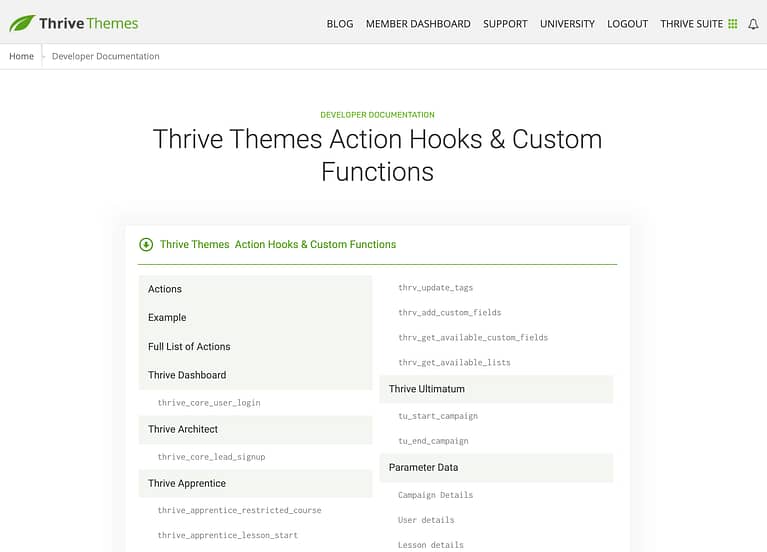
This is the start of our new developer documentation. Check it out!
If you are a developer and you have any questions, or there are specific hooks and functions that you would require for a specific use case, reach out to support team.
They'll help you get started and can log your feature requests in our system.
One more thing... Tutorials!
Do you want to know how to make the most of our tools?
Our documentation team have been working hard to build the most impressive knowledge base consisting of dedicated video tutorials, step-by-step walkthroughs and articles.
We launched our new knowledge base last year and already it's being viewed over 40,000 times per month!
These aren't just "click here, do that" articles. Many of these tutorials show you how to combine features in new and powerful ways to build a better online business.
So, we're launching a new monthly tutorial newsletter, where you'll be notified of brand-new tutorials once per month.
This is in addition to our marketing newsletter, meaning you can subscribe and unsubscribe from the tutorial newsletter without affecting any other mailing lists.
And as always-- we love hearing your comments, thoughts and feedback, as well as seeing how you're going to use these new features.
So please, drop us a comment below!


Hey,
can it be that the automatic thumbnail size control is also active for none gallery items?
Because yesterday I encountered the problem that images were only displayed in 300×200 pixel format. I didn’t have a gallery on the page and this problem drove me crazy.
Now, I just added a gallery with a few pictures and set the pictures to large and all the pictures in the gallery that are also somewhere else in the content are displayed right, but the other pictures in the content that are not in the gallery are still 300×200.
So either I am missing a control for the normal images and oversaw it or there needs to be a patch! Or the ability to have the thumbnail control for every image!
Otherwise, great new features. Especially the gallery. Most free or paid galleries aren’t as good as this one.
Keep up the great work!
Hey Claudius, one of the reasons we developed the automatic control is because WordPress gallery selections don’t let you manually choose an image size, but single images do.
For example, if you drop a single image element into Architect, load the media library, and select an image, you’ll see you can select the size here: https://share.getcloudapp.com/RBu4229l
But in gallery view, that’s not an option.
Because of this, I don’t think we’ll add the automatic option to a single image element, since we recommend using an image optimization tool like Smush or Optimole anyway.
As for that bug… hmm, it’s strange that single images are affected by your gallery size. If you clear your cache and it still occurs, open a support ticket with our team and we’ll take a look.
Hey Bradley, thanks for your long answer.
I only asked with the automatic control for all images, as I encountered this problem. I cleared the cache and choose the full size option, but I still get pictures with -300×200.jpeg.
I don’t have a gallery installed, but if I install one and add the same pictures everything works fine.
Just wanted to let you know that there could be or probably is a bug somewhere as this is also a new problem, that I didn’t see before.
Have a nice day 😉
Hi Claudius,
We tried to replicate this but couldn’t. Please open a support ticket so we can see what causes this on your site (and help you fix it).
Great update. Thanks!
Thanks Richard 🙂
Great updates on Apprentice. Thank you.
Is there a plan to integrate Apprentice with woocommerce?
Thanks Adrian. Yes, we’re weeks away from a WooCommerce integration.
Woop woop! Love the updates Brad!
Question about the Search Bar (“Search Courses”) inside the Course List feature: does it search in topics only?
Suggestion (maybe for your team) to be able to add keywords to each lesson so it can search into the lessons…
Or maybe it IS that 🙂
It searches the courses rather than topics, but I’m not sure how deep the search goes into the content of the courses. I’ll ask our developers and get back to you
Awesome updates! Keep it coming. Our customers love it and so do we 🙂
FYI the link to this blog post generates a redirect notice.
Awesome! Glad to hear your customers like it too.
Yeah, that’s a new google security thing that clashes with ActiveCampaign email links. We’re looking into it
Wow! Fantastic new features!!! I’m loving the ‘Image Gallery’ element, I’ve been praying you would come up with something like this for ages. I’ve been paying £50 a year for a ‘pro’ plugin (which is fantastic actually), but yours is right there on the sidebar, and I no longer need to use ‘WordPress Content” to click the ‘Add Gallery’ button, or insert a shortcode anywhere. Using your gallery element is also truly ‘wysiswg’, unlike the method I was using that doesn’t show the gallery in ‘Architect’ only on the preview, or live page.
The ‘User Profile’ element is something I’ll be making use of too. Great work as always, and a great post too Brad! I hate even sending my staff to the backend to update their profile, let alone anyone else.
This is so great to hear, Richard. We’ve wanted to build the Gallery element for some time, but other priorities kept cutting the queue. And you can see we’ve taken a lot of care to get it ‘right’ (but are always open to more feature suggestions of course).
Thanks for coming by to drop a comment. We’ve shared this with the developers
Finalllyyyyyyyyyyyyyyyyyyyy a gallery Widgettttttttttttttttttt!
Bye bye Modulla and Foo Galleries!
Mannnnnnnnnnnnn it took so longggg!
Modula gallery: $85 per year for 25 sites.
Foo Galleries: $199 per year for 25 sites.
The entire Thrive Suite, all of our plugins, and all features across all of them (including the new gallery): $228 p/y for 25 sites…
Not bad, eh?
Very glad to see the gallery modules!
I’m a professional photographer and hate the WP media folder.
I often have a slide show running with a smooth crossfade between images – I used to use WOWSlider which was very useful but no longer supported and no longer an option – so I started with NextGEN Pro.
Would way rather have a Thrive version – a nice simple crossfade transition and some simple cuts would go a long way to giving us tools that would be great for this usage – will check out the Thrive gallery and get back.
Thanks for all your work on getting this out to us!
Our gallery doesn’t have any of those features (yet). We have something in the works that might get you a closer result, but we’re avoiding going into any complex animations because the data shows that it’s detrimental to conversions.
Just…..unbelievable. You guys are AMAZING. You have created a set of tools so that little guys like me can create a fully functioning online business, AND make it look good! I am so proud to be a Thrive member. Sending lots of gratitude your way.
Thanks Andy.
I remember you understandably were having doubts a year or so ago with the Theme Builder delay. Really glad to see that we managed to win you over in time.
Thanks for the testimonial, we’ve shared it with the team!
Yes, indeed you have. And in a year’s time, you have really brought your A-game in a big way…first with Theme Builder, then WooCommerce, and now these Apprentice updates, which are real game-changers. Can’t wait to see what you come up with next. Cheers!
Awesome news Brad!
I’m currently working on setting up a whole bunch of member-only content into Apprentice, so the timing on this is spot on!
So many excellent features.
Grateful that my faith many months ago in going with Apprentice over other dedicated course plugins – on the basis that you would deliver on your promises in due course, has been borne out.
Cannot wait to put these new tools and features into action!
Thanks to all at Thrive!
Thanks Rob, we’re actually just getting started with Apprentice. If you’re happy with the features now, I can’t wait to see what you’ll think in a few months…
That’s one big update. And I love this sentence: “Once you exit Edit Mode, any empty captions will be entirely hidden until you return to give them some text. That’s attention to detail!” – I totally agree. I realise that’s a tiny fraction of all the goodness going on here, but as a former commercial coder, it tells me you really care.
I have one question. Will the Profile element have the option to be displayed publicly (or is it already public)? If so, I can see a way to use this as a public facing directory – which is something I’ve been wanting for some time now (every commercial plugin I’ve tried doesn’t come up to scratch). Thanks again. What an amazing set of updates.
I’m glad you can appreciate that, Quentin. There are plenty of lazy WordPress developers, but we try to think realistically about how and why someone would use a feature… and then best engineer it for that purpose.
Regarding profiles: Not quite. You can build a profile page where a logged in user can see their own profile, but since it’s built from dynamic content, a different user would see different content. To make public facing profile templates, we’d need dedicated user pages like .com/user/quentin
We’re not there yet, and not 100% we’ll go there. That might be better handled by the buddypress plugin, though we’ll consider integrating with it.
Huge improvements and lots of extras. You guys and girls rock. Keep them coming.
Thanks Bonnie!
Yes, an Image Gallery Element! 😉
Yeah it’s been a while coming..
Thrive team… Rocks!!!
Appreciate the support Ravinder!
Whoopee! Thanks for making it possible to duplicate Apprentice courses and lessons. Great work guys, you’ve made our team very happy!
It’s often the small things that make the difference 🙂
This all looks wonderful. Is there a way to have thumbnails of each module in our course?
…Sort of. We released a Lesson List element at the start of the year that can show you all the modules, lessons and chapters in your course. That Lesson List can easily list modules and show their featured images too, like a thumbnail.
However, right now- the lesson list is really only for embedding on sales pages to show what your users get. But there will be other uses for it coming soon
Hey Brad … you are faster than my desires/needs!! Great article and great new features
3 week development cycles move quickly, even for us! Thanks for stopping by, Michele
I’ve been tossing around the idea of using your courses, but right now I use Membervault. It’s free up to 100 people. The problem I see with it though is that I can’t have it directly on my site (Unless I am plugged into a monthly fee). I love membervault, but I’d love to have the course on my website. The other thing is that it uses API that works directly with Stripe and Paypal so I’m not paying extra fees for SendOwl or something else as a payment portal. So that’s why I’ve stayed with them. In the future if I end up with over 100 people, I’m considering my next steps. Does Thrive require I use something like sendowl or thrive cart? How does it handle payments? Will it work with my email subscriptions?
Hey Michelle, all good questions. I’d suggest checking out this article that will help you choose what tools will work best for you: https://help.thrivethemes.com/en/articles/4924755-should-i-integrate-with-a-checkout-tool-a-membership-plugin-or-both
Regarding email subscriptions, generally you’ll add a tag or subscribe a customer in a mailing list when they complete a purchase, and that’s handled by the payment tool. We have lots of email integrations, but no- we don’t handle payments right now.
We have a WooCommerce integration around the corner, though, which will allow you to start selling courses entirely for free. More info on that is coming soon.
thank you! I’ll be watching for the WooCommerce integration as I have a lot of experience with that.
Opening an API? This. Is. Huge.
Yeah, this API is the first step of big things to come in creating a more developer friendly open Thrive ecosystem.
This is awesome… I had to dig in code to create my own API for trigg Optimize Conversions. I wanted to use custom values and allow offline conversions.
Were you successful, Elton?
Yes. It’s running right now.
THIS IS FANTASTIC!!!!! Thank you!
This update is so comprehensive. I’ve been waiting for a bunch of these features that were always on my “nice to have” list… and are now working features!
Excited to implement these and show them to all my students.
Thank you for an amazing update!
Great to hear, thanks Ronen!
Thanks for the very nice new features in TA.
T.Apprentice is becoming more and more flexible in how lessons are organized and courses displayed. It’s still missing just one big feature: collecting payment. Do you plan to add it in the future, or TA will always need an integration , for example with Thrive Cart or SendOwl to collect payments?
WooCommerce integration is right around the corner.
I can’t say we’ll never build our own checkout tool, though. It’s not currently on the roadmap, but it’s not out of the question in the future if there’s enough demand.
Hi Paul, great news, thanks!
Will Thrive Apprentice + Woo Commerce be enough to sell courses, or some membership solution will still be needed to protect courses and lessons?
Thanks again for your reply
So excited about these apprentice updates!! THANK YOU THRIVE
You are very welcome! Glad that you’re sharing our excitement
Amazing! Thank you 🙂
Perfect timing, as we are implementing a new focus on adding courses to our repertoire! Thank you for all your amazing work!
Yes, it’s a very good time to be a course creator! Thanks Cher
Great as usual!
Cheers Fabio
Really happy with these new features! Can’t wait to jump in!
Lots to play with, enjoy Jeannette!
Oh wow!!! The gallery + API/docs are huge indeed!
I’m also excited about the API. Pretty basic at this stage, but it will evolve over time. Everything will become much clearer in a few months 🙂
Great update. Many Thanks!
Absolutely top! Especially the news for Thrive Apprentice!
Great! There is so much stuff in there, that I need 🙂 I love how you guys are listening to your customers.
Brad is the guy to thank!
He routinely goes through all the feature requests that comes in through the various channels for each product to figure out where we need to focus our time.
Thanks for the positive feedback!
Huge kudos to Brad! Amazing work from the entire Thrive team! 😀 <3
Brad – Interesting and powerful updates! I’ve got about 300 courses on Teachable, where I duplicate one and tweak the branding a little. These new Thrive updates might mean I could migrate to Thrive Apprentice and save $948/year? I’ll have to dig deeper and try them out.
I’ll openly admit that we haven’t tested Apprentice with such a high number of courses as we didn’t consider there’d be many course creators with such a huge repetoire. That said, I can’t see any reason why Apprentice wouldn’t be suitable…
Love the gallery feature. How do you remove an image if you decide you don’t want it in there?
Hey Shawn, it’s just a few steps:
1. Click ‘Edit Selection’: https://share.getcloudapp.com/DOu2yLzy This will show you all the images that have not yet been added to your gallery.
2. Click ‘Edit Gallery’: https://share.getcloudapp.com/NQuJmnyj This will swap to show you the images that are in your current gallery.
3. Click the cross next to any images in your gallery that you want to remove, then click ‘insert’: https://share.getcloudapp.com/Qwu9zyPQ
I’m a photographer and the new image gallery looks awesome. Ca’t wait to use it
It’ll be perfect for you, then. I imagine the option to display higher quality images would be important for you
Your link to “Join the monthly tutorial newsletter” generated a 404 error for me…(after filling in your form and submitting.)
I got the same error message.
We had a few visitors report this, and it may be related to some google redirect issues. If you reload the post again with a direct URL and nothing in the query string, it should work: https://thrivethemes.com/updates-early-march-2021/
YAY! Hooray for image galleries! That’s gonna make my life a lot better! So happy! THANK YOU!!!
Thanks jban! P.s. I love your profile picture. That looks like a good dog
She’s a hot bitch.
Thrive apprentice is starting to become a really good tool.
Can’t wait for woo commerce payments.
Any chance with thrive theme builder you will be integrating with buddypress?
Keep up the awesome work thrive team.
Yes, WooComm is right around the corner.
We have a policy to not give dates just in case things get delayed (Theme Builder… I’m looking at you), but it’s weeks and not months away at this point.
Outstanding as always. I think this round of updates has tipped us in favour of Thrive Apprentice. Thanks Bradley
Welcome to Thrive Apprentice, Brett! If you’re still a bit unsure, trust me when I say we have a great roadmap for other improvements too. If you need help getting acquainted with Apprentice, we have help documentation for everything you could ever hope to do.
Thanks Bradley. Is the roadmap public?
No, we keep a private roadmap for a bunch of reasons that would take too long to explain. But if you submit feature request tickets, they’ll get taken seriously.
Indeed mind blowing! I gonna rethink my courses entirely for visitor and user experiece
Yeah the course list element and the lesson list element open up a new wave of possibilities. Stay tuned for more to come, though…
Amazing updates. Thanks for bringing the gallery element to TA. Been waiting for this for a long time! Just love the editing features built into Gallery Element. 🙂
Thank you Soon! It’s pretty exciting times
BOOM! Love the new image gallery feature! Outstanding! ???? ThriveThemes rock!
E X C E L L E N T !
Great work Thrive Themes team! Another fantastic release.
As far as the developer API goes, does this mean we should start reaching out to any 3rd party plugins we’re waiting to see integrated to see what they can do? A few come to mind such as Fluent CRM.
Matt you can do certainly. Having said that, there’s no point reaching out to Fluent CRM since we already have an integration in the works that’ll be released in a few weeks.
Paul, that is amazing news! Thank you. The Thrive Themes team never stops wowing!
Any ETA for integrating Apretince with woocommerce?
So users get acces to course X when they buy product X?
Soon. Quite soon. I can’t say much more than that at this point…
I’m waiting for this one too! Keep up the good work Thrive 😉
Hello, thank you for new features.
However, when signing up with my email address, it takes me to 404 page afterwards.. hope you can fix it soon.
Thanks 🙂
We’ve had a few reports of this, but if you reload this blog post directly at https://thrivethemes.com/updates-early-march-2021/ and try again, it should work.
I am a big fan of yours, Thrive Team, I absolutely love what you have brought to wordpress.. I would honestly give up on wordpress if I would not come across Thrive Themes.
And I absolutely love that you actually use your own plugins, this Comment section is outstanding also!
Now gallery plugin will go uninstalled right away and replaced with your amazing gallery element.
Oh Thrive, you truly has become my addiction
Thank you for the kind words, Simon! We love hearing this kind of feedback because WordPress is powerful but can be clumsy. Our goal is to make it easier
Wow, thanks for the Image Gallery! this is Great. Good Work.
Thanks Daniel!
Reg. Point 4 – Resource section:
Where can I change the name of the headline (Resources) and the displayed name on the button?
Hey Johannes, for the time being- only the translated. But that will be changing in an update soon, where the element will become much more flexible.
[Edit] My mistake, the text ‘Resources’ can be translated in the Design tab of Thrive Apprentice, but not yet the Open/ Download buttons.
As usual, I love it all! The improvements to Apprentice are amazing, and the photo gallery is a really welcome addition that I know one of my clients in particular will love!
Awesome- I’m pleased to hear you’ll make good use of it, Lewis
Hi Brad,
In the “General Settings” of Thrive Apprentice, there is a fixed “Courses” page that cannot be edited with Thrive Architect. Now I would like to create a new course overview page with one of the new “Course layouts”. Do I then simply redirect the “old” course page (via 301 redirection) to the newly created course page and everything works as desired (logging into purchased courses …)?
Regards – Peter
Hey Peter, as I’m sure you’ve guessed- we’re going to bring the functionality of editing the Courses page soon. Off the top of my head, I don’t see there being any issue with building your own page and using a redirect, but we haven’t tested it out. If you can’t wait, give it a shot!
Hey Brad, I have created the course page and redirection as described above. Everything works as desired.
Great updates – keep it going!
I have just got a question regarding the resources in Apprentice. I haven’t seen an option to translate the buttons (e. g. “Open”, “Download”). Have I missed something or is it not possible to translate them at the moment?
Thanks very much in advance.
Yes, correct- it cannot be translated yet. But we have some changes coming soon that will make that possible.
[Edit] My mistake, the text ‘Resources’ can be translated in the Design tab of Thrive Apprentice, but not yet the Open/ Download buttons.
Thanks very much Bradley for your swift reply and great that the buttons will be translatable soon.
Keep up the amazing work guys.
Wheeeeeeeeeeeeeeee hawwwwwwwwwwwwwwwwwwwwww … this is great news! I’m in the process of building a course using Thrive Apprentice and these features are arrsome! Thanks to the team. Hugs&Blessings. MamaRed.
Well, this, with the coming Woo integration, makes me re-consider Apprentice as my courses platform.
Do you guys plan to release quizzes and certificate generation features?
Hey Sherif, I hope Thrive Apprentice can win you back at some point. Yes, we do plan to release those features, but to set your expectations- there’s some other bigger things we need to take care of first. So perhaps later in the year if all goes well.
Just so you know I get a 404 page when I try to sign up above. And I am not seeing a welcome email either. At least not right away.
The course list element is awesome! Thank you so much. I have really missed an elegant way to display courses other places than on the TA course page. Thank you!
It’s very impressive, glad to hear you’ll put it to good use!
There’s so much new features! I’m getting excited..
I wanted to try to join the monthly newsletter but when I finish signing up, it redirects me to a 404 page. https://prnt.sc/10jcmxk
Not sure if my details when thru to your crm because I really wanted to join the monthly tutorials. 🙂
Overall, Im excited!
Hey Cherrie, did you manage to sign up? If not, refresh this page and try again. There was a redirecting issue but it seems to go away when you reload the page.
I had another thought regarding the new developer API docs. Is this ready for someone to start developing better integrations for plugins such as Peepso or BuddyPress? There is a lot of opportunity for adding social media like community features to sites. I know that both plugins have support for that other big WP LMS that shall not be named.
It would be great to have options for Apprentice to have on-site groups to add communities of practice for courses. Or maybe private on-site groups that unlock for alumni who have completed a certain series of courses. Have an SEO course? Create a special group where only those going through or having completed the course can comment, share ideas, talk about the latest tools they’re using, or issues with getting their content to rank.
Once Apprentice has WooCommerce support, one could create a series of mental health support journaling classes + challenges that drip out monthly as part of a subscription plan. Only members can post in the associated group and only while they have an active subscription. If someone needs extra support they can chat with the course author. Network and make like-minded friends who are going through similar challenges.
Peepso I know has support for WooCommerce. Not as sure about BuddyPress but I assume so. There are a ton of ideas for integrating the Thrive Suite of tools with a WP based social networking plugin. The ideas are really starting to flow the more I think about the options out there!
Not sure I would use many of these features, as they appear more suited to photographic websites or those selling training programs BUT I have to say, it is impressive to see what is being rolled out withing Thrive Themes overall. It always seems to be holistic, in that you go the whole way in implementing new capabilities. We set up 3 microsites from scratch using Thrive Themes and I am converting my main side (carefully) but when done will be able to remove many plugins, be easier to make new changes and updates and far more capable.
When will Apprentice be compatible with woocommerce and let us sell standalone courses instead of a membership?
Isn’t that what Shane suggested few years ago? That in most cases standalone courses model is better than ongoing memberships.
Yes, we are working on our WooCommerce integration and it will sell standalone courses without need for recurring payments or membership tiers.
Image Gallery Element: Please, allow to get dynamic images from ACF.
Hey Elton, what are you trying to achieve by using ACF with the Image Gallery? What’s your end goal and why is it important? (These questions help us to evaluate your request).
I want to create a custom field and allow my user to edit and insert their images. And show them on ttb templates.
You want your regular website users to be able to upload their own gallery? Hmm ok, who are your website users- approved contributors, or random visitors? And for what end-goal do you want them to have a gallery displaying? Are they creating profiles, portfolios…?
Basically, I need to understand the value of supporting ACF in galleries. ACF is a nightmare for us to integrate with, and once we consider all edge-cases, it can easily be a project that blows out into a month or more of development work just to add this one feature. So the more I can understand what you’re trying to achieve, the better.
I am hoping that one day they can make the site in Spanish
Sorry Haarin that’s not going to happen anytime soon. As an international team it would limit us too much.
This is AWESOME! Thanks, Team Thrive!
You’re welcome, Joshua!
Bonjour,
Les apprenants peuvent-ils téléverser leur travail dans apprentice pour que le professeur puisse les corriger.
Merci pour votre réponse
Cordialement
Laurent
Hi Laurent,
In Apprentice you can add a form using the “file upload” feature which will allow students to submit their homework.