We recently challenged our Thrive Leads users to really put the plugin to use and show us the results they achieved with it. You've already seen one of the resulting case studies and in today's post, we present three more examples of how Thrive Leads users accelerated their list growth.
More...
60x List Acceleration
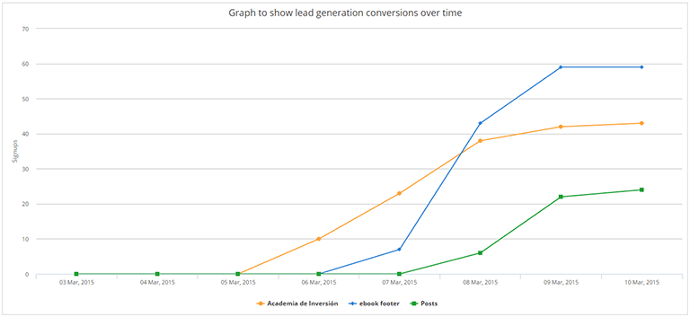
Here's a graph from Francisco's Thrive Leads dashboard, just a few days after he installed the plugin:

Francisco runs a Spanish website called Academia de Inversión and for more than two years, lead generation was something he did in theory more than in practice. He tells us:
Before Thrive Leads I only had got 375 subscribers in total in more than 2 years.
Now, after setting up Thrive Leads I got over 100 subscribers in 3 days. That’s amazing.
In other words, his site went from converting less than 0.5 visitors per day to converting 30+ visitors per day. To accomplish this, Francisco is making use of opt-in forms on all fronts. A combination of a large lead generation form on the homepage, a form in the sidebar and a timed lightbox ensure that all visitors get a clear and compelling offer to get on his list.
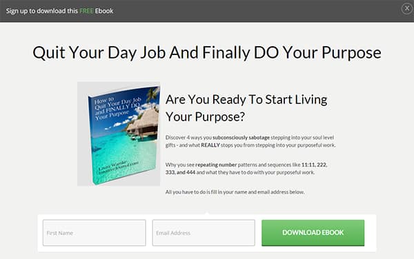
Here's an example of a form design he's using on his homepage:

Francisco also dove right in and started making use of the A/B testing feature from the get go, telling us:
…the best part is that the conversion rate can be improved a lot with A/B tests.
The main lessons you can learn from this impressive result are:
- Don't be shy about advertising your opt-in incentive and mailing list. Make sure that every visitor is aware of your offer and can easily find a way to subscribe.
- Start A/B testing right away. Even if it seems like your list is growing far too slowly right now, you might just be an experiment away from a dramatic turnaround.
159% Improvement with Targeting
Leelo runs the PCCCA website and lead generation has been an integral part of the site's strategy for many years. In the 2 month period before switching to Thrive Leads, 129 new email opt-ins were captured on the site. In the 2 month period after the switch the Thrive Leads, that number increased to 334 opt-ins.
How was it done? An important factor is that Leelo is running more than one offer on the website, making it possible to appeal to different segments of visitors. This results in better overall conversion rates than can be typically accomplished with a single "catch-all" offer:

Leelo says about her experience with using Thrive Leads:
…over the years, we have tried many ways to capture visitor information. A few have not worked at all, most have worked to some degree… but none as well as Thrive Leads.
Here's an example lightbox design Leelo is using on the site:

As you can see, Leelo is using vibrant colors and has made the whole design very visually striking. There's a much greater emphasis on images than on copy in this design and, looking at the conversion rates above, it's clearly working. It goes to show that you can sometimes say everything that needs to be said about your offer with just a few words.
A few lessons from this case study:
- Lightbox forms (sometimes also called 'popups') often get a bad rap because they are an intrusive form of advertising and they can be annoying. But time and time again, the data shows that they simply work.
- Less is more: in your next A/B test, try a version with fewer words and less text and more of a visual emphasis instead.
43+ Leads per Day With Multiple Offers
Laura from Intuitive Journal got a great result and a great list acceleration that she sent in.
After switching to Thrive Leads, she almost doubled her average conversion rate, going from 23 leads per day to 43 leads per day. Here's an example of a daily snapshot from her dashboard, showing the sitewide conversion rate of more than 3%:

Laura made use of the fact that you can easily run different opt-in offers in different locations on your site, using Thrive Leads. She created 2 new reports to offer as opt-in incentives and set up campaigns to show them to relevant segments of her audience.
Like we mention in our Next Generation List Building training, your offer (a.k.a. lead magnet) is one of the greatest leverage points for increasing conversions. Creating more than one offer and getting the most out of them by targeting and testing is the way forward.
Laura told us:
The best part about the additional functionality of this plugin is being able to see what is working and what is not working. Some of the A/B split tests showed marginal improvement while others were runaway winners.
Here's an example of a lightbox design Laura is using on the site:

This shows that you don't have to reinvent the wheel to make list building work for you. The classic opt-in form structure of large heading, some text, an image and the opt-in form is very effective at describing an offer and persuading visitors.
Laura's case study reinforces the lessons from the previous two cases:
- Don't be shy about advertising your offer - go to Laura's site and there's no way you'll miss the opt-in offer.
- Use a large, attention-grabbing lightbox - it may be annoying, but it usually works really well.
- Make use of the power of multiple offers, targeting and A/B testing. The difference these can make to how fast your list grows can be dramatic!
Over to You...
I hope these examples inspire you to take action and prove to you that anyone can build a mailing list (without having to be a rocket surgeon). Here's my question to you:
Which of the lessons from the above case studies will you apply to your site, to grow your list faster?
Leave a comment below with your answer!
I also want to send another big thank you to everyone who participated in our Accelerate Your List! challenge and sent in their results. It's very inspiring for the whole Thrive Team to see how you're putting everything we build into our products into action.
Finally, if you aren't using the best WordPress list building plugin of all times yet, click here to learn more about Thrive Leads.


I was wondering if offering multiple lead magnet would increase my conversion rate. This post answered it! Thank you!
Yes, I definitely recommend creating multiple lead magnets for testing and targeting.
Great case studies Shane!
My question is this though: what if someone opts in to multiple lead magnets on your site, e.g. free Facebook course and free Twitter course.
They’ll get customised sequences with each to begin with but (in my case, anyway) they’d eventually end up being presented with my core offer.
Is there any way to avoid them being presented with the core offer twice (once on each list), or is this just something we need to live with and hope they just unsub from one of the lists?
John,
My understanding is that what you describe could be taken care of via “marketing automation”, which is a step above basic autoresponders.
It’s ‘smart’ in that it can tell (or you tell it) that if someone signs up for two separate things, only send them down path A. Then if during path A they signal that they’re ready for something more (via a click or other action), you can move them to path B.
And so forth.
I don’t use this now, but am looking at it (Active Campaign is what I’m checking out).
I think Shane uses Infusionsoft, but of course he can answer that!
Shane,
Thanks for reinforcing that this stuff works. I just need to get it going and take action one day at a time!
Tommy
Thanks for your detailed reply, Tommy!
Hi John,
Tommy got it exactly right in his answer. You can do this, but that’s up to your autoresponder/marketing system. Many services you can use to send follow-up emails also let you set up automated rules such as “if this lead already purchased product x, don’t send this sequence of emails”.
Must take action…
Must take action…
I would be interested to see the results of a poll of which email service people use. I hear so many good things (and bad) about all of them, I am not sure which to go for!
Hi Tao,
It seems to me that there is no “best” solution. I’ve tried many and they all have their advantages and issues…
This is really exciting stuff here!
My new website using Thrive Themes (Pressive) went up the day before the Google ‘Mobile Friendly’ deadline (21 April 2015) – that’s just over two weeks ago, and it is already building a small but significant list using Thrive Leads. ( https://www.HideawaysInHay.co.uk )
We give away up to six weeks holiday a year in holiday competitions to those who enter from our list – and Trip Advisor Travellers have voted our cottages the Nº 1 Romantic Holiday Cottages in Wales, so our prizes are well sought after – and of course the odds are very high for anyone to win a free holiday with us, form a relatively small list. So that’s the incentive….
My experience is that when I run a competition, I grow my list easily – but to grow the list from people who are actually interested in our offering (rather than just interested in winning something for nothing) i.e. those who by definition have self-selected themselves to visit our website, adds a more targeted list for me to work with. And this is what’s really valuable.
From the info you give us here Shane, I now see how I can really go to town on growing not only a more targeted list, but also working out what display works best. And not only that, but where on my site they work.
This is a really magnificent and valuable tool… And it is easy to use and implement.
I had never built a properly functioning WordPress site before, and I was able to do all this with Thrive Themes, and your really great training modules, in two weeks from a zero start! I don’t know what you think, but from where I’m sitting, that’s impressive.
From zero to a fully functioning website for our business in less than 14 days tells me just how easy Thrive Themes makes building a site on WordPress. But to find everything I need to know to learn WordPress from scratch, in one place on your site, is something else. And your support service is outstanding.
Thanks for giving us Thrive Themes – and this great adjunct – Thrive Leads! I will now be using it in all my businesses.
It is such a buzz to be at the front end of the curve with you guys!
Michael
Thanks for your comment, Michael! It’s great to see that you’re getting value out of our products and our training and that you’re also putting it all into practice!
How do I create these beautiful lightboxes?
Hi Joe,
Start here: https://thrivethemes.com/tkb_item/thrive-leads-quick-start/
Then look here: https://thrivethemes.com/thrive-knowledge-base/?section_id=2377&parent=602
And there is more here: https://thrivethemes.com/thrive-knowledge-base/?section_id=602
It won’t take you long to be up and running…
Michael
Hello, our new website with ThriveThemes, Thrive leads and many improvements have been brought online today. Check it out …
https://online-marketing-site.de
We got immediately 4 new leads on the first day. That’s so impressive
Good result!
Hello,
I already own Thrive Leads, I love it and you can now see an awesome sidebar opt-in form on my site. Thank you for that! 🙂
Now, what I want to know is which option do I choose if I want to make an opt-in form that’s after every article on my blog? In other words, not a post footer, as that has to be done manually for each post. Instead, how to create the code for a post footer type of opt-in, so that I can then add it to my actual theme’s code.
I just want it to look the same for every post so that if I edit it, it edits on every post as well.
Thanks! Right now I’m making an awesome pop-up, so I’m exited to lauch that as well. 🙂
Keep up the awesome work,
Eduardo
Hello Eduardo,
What you describe is exactly what the post footer form type is for. 🙂
It will automatically insert at the end of each of your posts and if you edit it, it will change everywhere, instantly.
Pre-purchase question.
Coul I add form fields for thrive leads? Other fields in addition to just the name and email (like phone and address etc.) for lead gen.
Thanks!
Hello Jerry, Using the HTML integration, you can create the form in your autoresponder, copy the HTML over to Thrive Leads, and it will match the fields in the code. Short answer – yes!
Thanks for the case study. lets check the tool with my website. hope it would help me to generate some conversions.
Thanks for your comment! I’d love to hear how it works for you.
any plans for infusionsoft api?
There’s already a version of the Infusionsoft API in the plugin – we’re working on improving it so haven’t mentioned it in this post.
Thrive Leads is still kicking butt for me. I wanted to sink my teeth in for the contest but the client I was doing work for pulled the plug on my ribbon campaign. He’s staunchly anti-popup or anything else that interferes with the user despite having opt in forms at the top of the sidebar, in the footer, and after each post. All of those opt-in forms are more of an eyesore to me than any little ribbon could ever be but some people are stuck in their ways. He did however have me implement a pop-up on a pet project of his and this site averages 100 signups monthly but this month it hit 300 after implementation. The results prompted him to rethink his previous stance and not only gave me the go ahead to turn TL back on at the main site but rather than the little ribbon let me go full-blown screen filler. He hit 600 signups on a site that normally averages 400 and that is only running 15 days out of the month and with no lead magnet. Now…only if I could get him to let me remove some of those other forms…wishful thinking perhaps.
Wow, that’s a great result! Thanks for this comment, it’s always great to learn about users who are putting our tools to good use. 🙂
These case studies are inspiring us to go for the new level of building email lists and after reading this post i understood how much using this email subscription form is important. Thanks.
Thanks for your comment, Avnish!
Hi there,
A friend told me about Thrive Themes, so I’m checking out all of the features and the blog. In the content builder video, you demoed some content boxes with buttons…it looked like the buttons were limited in the colors that were available.
My website redesign has 6 core colors I’ll be using, so I need to ensure that all elements I’ll be adding, like buttons, links, and backgrounds of smaller elements can be any color. Is that a feature that’s currently available with the drag-and-drop or would I need to know how to do custom CSS?
Thank you!
Hello Dawn,
You can use a color picker to select the exact colors you need and you can also save those colors for quick access later. In a button, you can edit every color used and once you’ve created the perfect button for your site, you can save it as a content template and re-use it again with just a click, anytime you want.