Want to learn how to create a contact page that catches attention? Like this?

Keep reading.
Your contact page isn’t just a formality—it’s just as important as your other conversion-focused webpages. But, creating one that stands out isn't as straightforward as it seems. You need more than just a plugin; you need a strategy.
Don't stress, though. We’ve got your back with a step-by-step guide that's as simple as it is effective. From picking the right tools to making sure your page pops for conversions, we’re covering all the bases.
So, sit back and prepare to learn. Let's dive in.
You’ll Need More than a Basic Contact Form to Get More Prospects
Your website's contact page is often the first interaction a potential customer has with your business.
Think of it this way:
If someone lands on this page, it means they want to learn more about what you have to offer. That is an interested prospect.
Your contact page is where potential customers go to inquire about your products or services. But, a lot of businesses treat their contact page as an afterthought - a basic form slapped onto a generic page that offers no direction or incentive.
This is a missed opportunity to make a great first impression and turn more visitors into leads – and you don’t want that.
Your contact page should go beyond being functional. It should be welcoming and reflective of your brand's personality. See it as an opportunity to start a conversation and build a relationship — and a way to rev up your lead generation.
How to Create a Contact Page That Brings In Submissions
This WordPress tutorial will walk you through building an attractive, user-friendly contact page using Thrive Architect that encourages visitors to get in touch.
Having a well-designed contact page is a simple way to boost conversions from your website traffic.
Step 1: Download & Install Thrive Architect
Before we dive in, you'll need to get your hands on Thrive Architect.
Why a landing page builder over a simple contact form plugin?
A WordPress contact form plugin only helps you create a form, it rarely does anything else to help you get people to actually fill it in
There’s a high chance a separate contact form plugin will clash with your current WordPress plugin stack or won’t look as great as the rest of your pages
Thrive Architect isn’t just a landing page builder. It’s your toolkit for turning page visits into conversions.
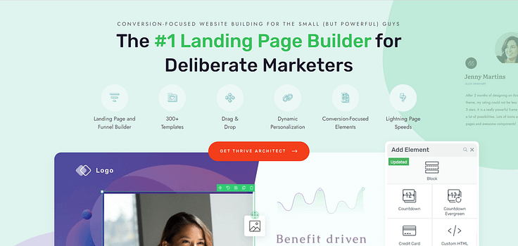
Thrive Architect is a drag-and-drop WordPress page builder that gives you total control over your site's design – without touching a single line of code (no HTML, no CSS).
With its huge library of conversion-focused elements and templates, it's the perfect tool for crafting high-converting contact pages (and pretty much any other type of page) — suitable for beginner and advanced users alike.
Unlike basic contact form plugins that are rigid, lack customization, and offer limited design functionality — Thrive Architect lets you build custom forms and surround them with persuasive copy, CTAs and other conversion boosters.
This level of customization is key for landing form submissions.
But it doesn’t stop there. Thrive Architect can be your key to generating a steady stream of conversions through other existing pages on your WordPress site.
Every template and design element is created with one goal in mind: to help you create SEO-friendly pages that land actual sales and sign-ups. No need to pay for additional addons.
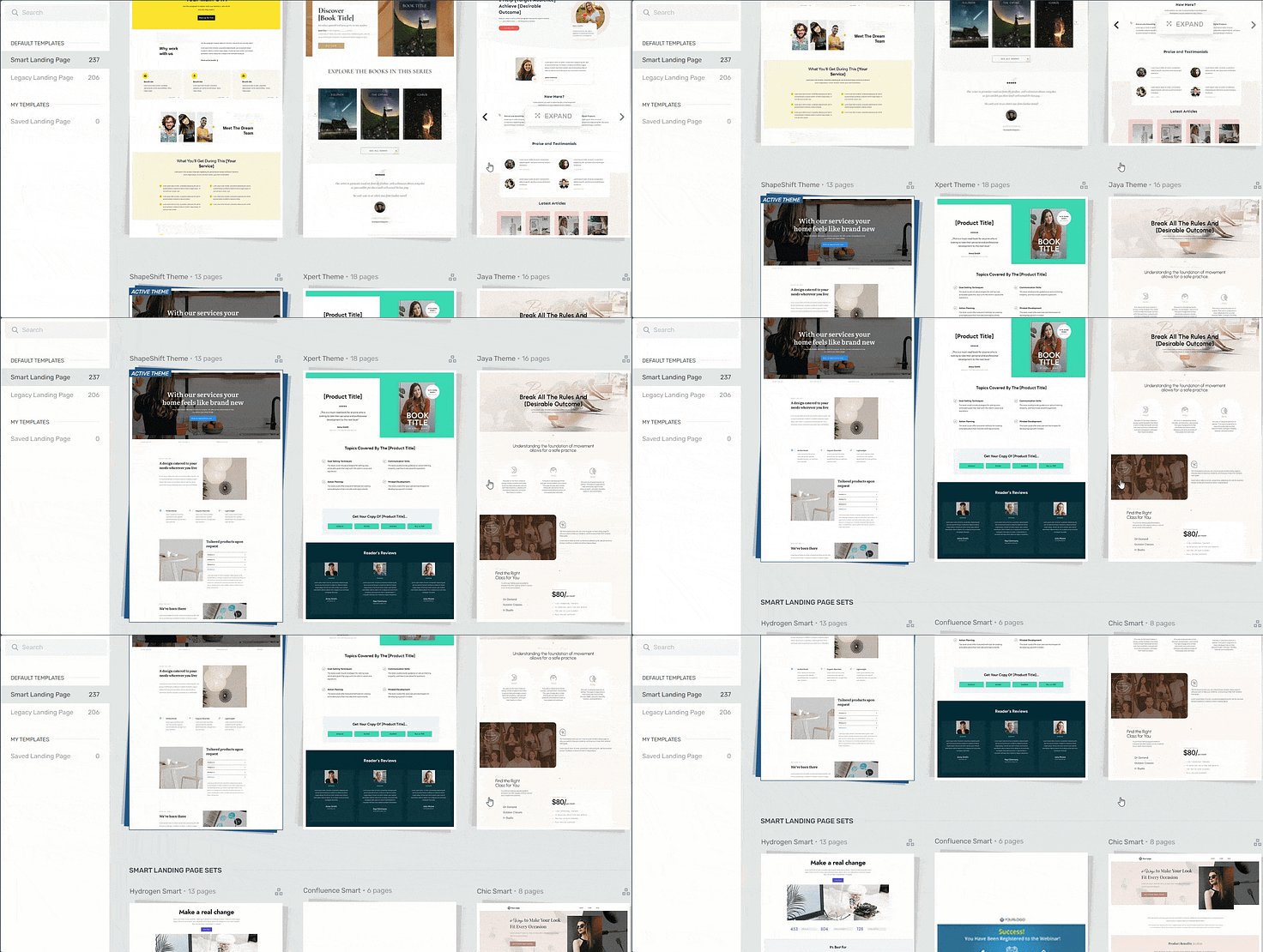
Landing page template sets in Thrive Architect
Easy building. Rapid implementation.
Step 2: Create a New Page & Launch Thrive Architect
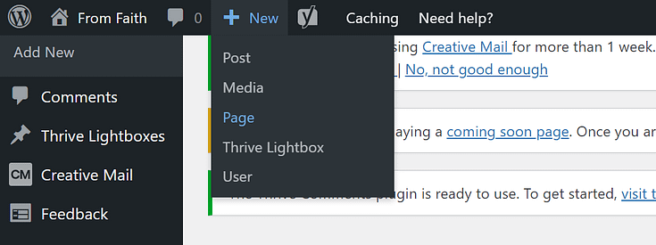
In the WordPress Dashboard, select the "Add New" button at the top of the page and select "Page" in the drop-down menu.
When taken to the next screen, name your page and select the bright green "Launch Thrive Architect" button.

After you launch Thrive Architect, a menu will pop up with four options:
1. Normal Page
2. Blank Page with Header and Footer
3. Completely Blank Page
4. Pre-built Landing Pages
We usually recommend choosing the "Pre-built Landing Page" option for easier building. But for this tutorial, I've chosen the "Blank Page with Header and Footer" because I'm going to build this page from scratch -- and it'll take me less than an hour.
How? Simple. I'll be using Thrive Architect's Block Template Library to design my page.
What is a Block Template?
Block templates are pre-designed sections you can easily add to your pages with just a click. These templates are made up of various elements like text boxes, images, contact forms, and buttons, all arranged in visually appealing layouts.
You can quickly customize these templates to match your brand, saving you time and effort in designing your website pages from scratch.
In a couple of clicks, you can drag and drop, re-order, and edit your custom site pages – all while inheriting your chosen theme fonts, heading formats, and colors.
To access the Block Template library in Thrive Architect, hover over the plus sign in the editor and click the blue button that appears. It'll look like this:

Or this:

Once you click the button, a library of templates will appear:

Here, you can choose any template you like and customize it into the part of your contact page you need. Awesome, right?
Step 3: Design an Attention-Grabbing Hero Section
Your hero section is the first thing visitors will see, so make it count!
Use a bold headline and engaging copy to let your audience know exactly what this page is for and why they should care.
I would also recommend adding a call-to-action button that leads to the form at the bottom of your page. You can easily set this up with a jump link (learn more here).

Customize a Hero block template and turn it into an engaging section for your page's top section.
Step 4: Throw In Some Supporting Copy to Emphasize Your Value
I always think it's good to add more than just a form on your contact page. You have your visitors' attention, why not use this space to convince them why they should reach out?
You have total freedom here. You could add several paragraphs or just one. Be intentional with this space, too. Make sure you're not just adding fluff.
Focus on being specific in the value you offer and how your audience will benefit from submitting their contact details.
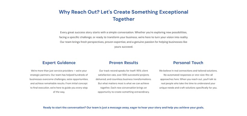
Add supporting copy to your contact page to connect with your audience and drive home the value your company has to offer.
Step 5: Add a Form to Your Page
Now for the most important part of your page -- your contact form.
Thrive Architect comes with a selection of contact form templates and they're in the Block Template library, too. This is the one I went with.
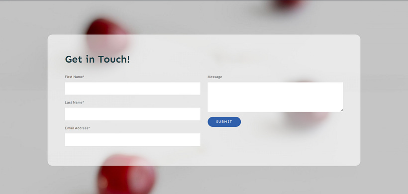
Select one of the form templates, add it to your page, and customize it to capture all the details you need from your website visitors. No need to use shortcodes or widgets to get this done.
Set up required fields and add a captcha (or any other form of spam protection) to make sure you're only getting high-quality submissions — and filter out the spammers & bots.
In the left sidebar in Thrive Architect, you’ll configure other form settings — connecting it to your email marketing tool, adding info for certain field types, etc.
Pro tip
Only include the most important form fields you need. People tend to drop off if they’re overwhelmed by the amount of work required to complete a form. If you need email addresses, first names, and phone numbers — let these be the main field options on your form. You should also use design elements like checkboxes to make it easier for people to select multiple answers.
For more tips on creating a great form, check out this tutorial.
Save your form once you’re happy with how it looks.
Step 6: Connect Your Email Marketing Tool to Receive Form Notifications
Of course, collecting leads is only half the battle – you'll also need to nurture them down your marketing funnel.
Connect your email service through API. You will only need to do this once for the first opt-in form you set up.
You can find tutorials for all major email providers here.
You should set up a confirmation email as well, to send to visitors after they’ve completed your form. Populate the email subject line with their first name — from the Form Name field — and let them know when you’ll contact them.
We also recommend setting up email notifications so you know when you receive a new form submission.
Bonus: Happy with Your Website and Need a Reliable Form Plugin? Consider WP Forms
Maybe you already have a high-converting website and need a form builder plugin that offers more than a couple of basic templates.
One of our top recommendations is WPForms. This drag-and-drop form builder provides you with everything you need to create powerful forms that work with your current WordPress theme and existing landing pages.
No need to wrestle with code or the WordPress Block Editor.
This plugin has a free version you can check out — WPForms Lite — if you want to give it a spin and see if it matches what you’re looking for.
Next Steps: Add a Click to Call or Click to Email Button to Your WordPress Website
Want to make it even easier for interested prospects to reach out?
Add a click-to-call or click-to-email button right on your homepage using Thrive Architect's button elements.
With just a couple of taps, visitors can instantly call your business line or draft a new email to your inbox – no more navigating to the contact page required!
These simple tweaks show you're serious about connecting with your audience. And when you make the process stupid-simple, you're much more likely to get those valuable leads rolling in.
Start Building Your WordPress Contact Page Today
While there’s no right or wrong when it comes to picking a color palette or the page layout, there are certain rules of thumb to follow when crafting an effective contact page.
Remember to make your contact page:
- Easy to find (and maybe don’t get too creative with the wording!)
- Designed with the user in mind (a.k.a. user friendly)
- Add a pinch of personality
- Give your visitors options
- Give them a reason not to contact you by providing answers to common questions and links to helpful resources
If you keep these tips in mind along with your conversion goals, you’ll end up with a contact page that works well for your online business. And don’t forget to test your forms and links to ensure they work and that the page is mobile responsive!
Thrive Architect is your best bet for creating landing pages that consistently convert.
But don't just take our word for it.


