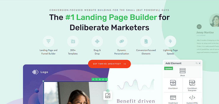
Do you want to know how to create an eCommerce homepage that actually drives sales?
This blog post is your guide.
Creating a homepage that converts visitors into buyers is more science than luck. You need a targeted approach that not only attracts attention but also encourages purchases.
An effective eCommerce homepage is at the heart of this strategy, serving as the digital front door to your online store.
If you're finding it challenging to design a homepage that meets these goals, don't worry.
We've put together a straightforward, step-by-step guide on how to create an eCommerce homepage that not only looks good but also brings in sales, optimizing every element to ensure maximum conversion rates.
What are the Key Elements of a Winning eCommerce Homepage?
Your eCommerce homepage isn't just a webpage; it's your brand's welcome mat and its best salesperson rolled into one.
For many shoppers, it represents their first real interaction with your brand.
To capture their interest and encourage purchases, your eCommerce homepage should include:
Clear Value Proposition: Spell out what makes your products special. Use snappy headlines to quickly communicate the unique benefits your store offers.
Streamlined Navigation: Your homepage should guide visitors effortlessly to where they want to go. Ensure your navigation is intuitive, making it easy for customers to explore your product categories and offers.
Prominent Calls to Action: Make it easy for visitors to know what to do next. Use standout buttons that say things like "Buy Now," "Discover More," or "Get a Discount."
Responsive Design: Your site needs to look great and work smoothly across all devices. Whether shoppers are on a phone or a laptop, the experience should be seamless.
Quick Load Times: Speed is everything in eCommerce. A slow-loading page can turn customers away before they even see what you have to offer. Optimize your site to load swiftly to keep those potential customers engaged.
Engaging Visuals and Compelling Copy: Attract and hold visitors attention with beautiful images and dynamic videos of your products. Pair these visuals with conversational, persuasive text that connects with your audience on a personal level.
Your eCommerce homepage is the gateway to your virtual store. Make sure it's designed not just to greet visitors but to transform them into customers.
Before We Get Started...Here’s What You Need
Setting up an eCommerce site is an exciting step for your business. It's like opening a new digital storefront—one that's open to the world 24/7.
For many entrepreneurs, setting up their first eCommerce business is the start of a new adventure in digital sales.
To make sure you start off on the right foot, here are the essentials you need to have in place:
Domain Name and Web Hosting: Choose a domain that reflects your brand and is easy to remember. Pair it with reliable hosting to keep your site running smoothly - and an SSL certificate to maintain a secure website.
Choose the Right eCommerce Platform: Whether it’s Shopify, Squarespace, Wix, WooCommerce, or another marketplace platform, pick one that fits your needs and start setting up your store. (This tutorial prioritizes WordPress).
Product Information Ready: Have clear and enticing product descriptions and professional new product images at hand. Know your inventory and pricing strategy.
Seamless Online Payment Processing: Choose a payment gateway that suits your needs and guarantees secure transactions for your customers through all types of payment methods — be it credit card, bank transfer, or through Stripe, Paypal, Amazon Pay, etc..
Shipping and Fulfillment Strategy: For businesses that sell physical products, decide how you’ll manage shipping and consider using a fulfillment service if you expect high order volumes. Will you manage this process on your own, or are you dropshipping? Answering these questions helps ensure a seamless customer experience.
Marketing Plan in Place: Build a strong brand identity and prepare your marketing strategies, from search engine optimization (SEO) to social media, so you can effectively promote your product listings.
Customer Service: Set up effective channels for customer support and establish clear policies for returns and exchanges.
Your eCommerce site is more than just a platform for selling; it's a crucial part of your brand's online presence. Make sure it's well-prepared to welcome visitors and turn them into loyal customers.
How to Create a Conversion-Focused Homepage for Your eComm Business (Step-by-Step)
This step-by-step tutorial will guide you through the process of creating a conversion-focused eCommerce homepage the easy way -- with Thrive Architect.
1. Download & Install Thrive Architect
Thrive Architect is the best landing page builder plugin for website owners who want to build and ship an impressive WordPress website and sell online fast.
This user-friendly landing page builder makes building (pages) from scratch easy – really easy. Saving you time in learning so you can focus on generating online sales for your small business.
This plugin gives you access to hundreds of customizable templates to create stunning webpages that leave your target audience going, “Wow. I want to learn more about this business”.
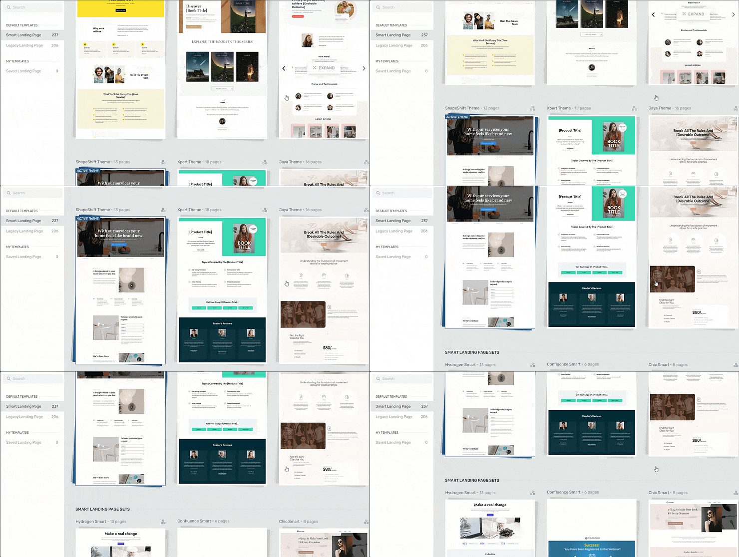
Landing page template sets in Thrive Architect
Every page template was built with conversion generation in mind, so you’ll find all the crucial elements you need to guide your site visitors to buy.
Want to make changes to a template or build a page from scratch? No problem. And no need to know HTML or CSS.
Ideal for WordPress beginners, the Thrive Architect editor comes with drag-and-drop functionality and a large selection of block templates and design elements you can easily add to your landing pages, sales pages, and product pages to create a custom design — in real time.
See? Web development made easy.
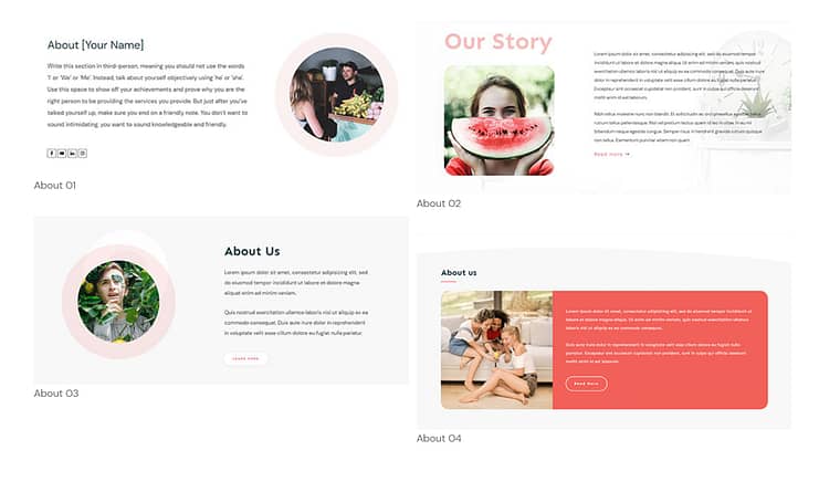
Examples of Thrive Architect Block Templates
All our templates are also tailored to create a responsive web design, so your audience can easily open, read, and engage with your pages from any device.
In terms of integrations, this plugin works seamlessly with most Google analytics plugins, email marketing tools, and the best SEO tools to help you track your metrics and optimize your online business for search engines.
You can also connect your pages to your checkout tool of choice if you run an eCommerce website.
Thrive Architect doesn’t have a free version, but this pro plugin offers a 30-day money-back guarantee, allowing you to try this tool risk-free.
Think of it as a free landing page builder trial.
But for now, get the tool and continue with this tutorial to learn how to make the best eCommerce
homepage for your business
2. Create a New Page in WordPress and Launch Thrive Architect
After you’ve installed and activated Thrive Architect, your next step is to create your new page in the WordPress Dashboard.
Head to the navigation bar at the top of the page and select “Page”. Next, click the “+New” button to create your page.
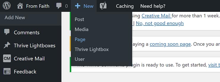
In the next screen, name your page and click the bright green “Launch Thrive Architect” button.

After you launch Thrive Architect, a menu will pop up with four options:
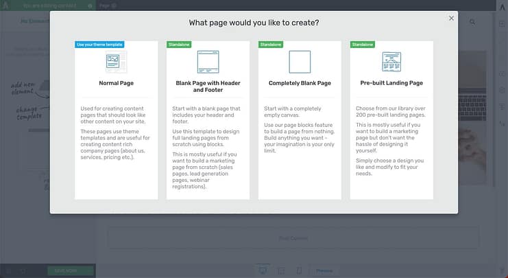
1. Normal Page
2. Blank Page with Header and Footer
3. Completely Blank Page
4. Pre-built Landing Pages
For this tutorial – and if you want to create an effective landing page without the hassle of building it from scratch – select Pre-built Landing Pages.
In the Landing Page Library, you can browse through 350+ conversion-focused landing page templates until you find the perfect one to promote your online course.
Focus on choosing a product-focused landing page design because we’ve incorporated all the key elements needed to boost your conversion rates.
And with our Smart Landing Pages, you can build the perfect landing page for your online course in minutes.
3. Customize Your Homepage with Thrive Architect
After you've selected and loaded your template, it's time to get to work and start customizing your page.
Your homepage needs a(n):
Attention-Grabbing Hero Section
Your hero section is the first thing your potential customers will see. It sets the tone for how they’ll interact with the rest of your online business.

Focus on using this section to grab your audience’s attention & connect with the inner goal they want to achieve.
A good hero section must have:
A clear, high-quality image of yourself, or something relevant to your business and products
A strong, compelling headline that addresses your audience’s needs, or introduces who your business and what you do
A supporting sub-headline or tagline to briefly elaborate on your headline and provide more information to your audience
A clear, compelling call to action button to prompt your visitors to take action – e.g, "Shop Now,"
Features & Benefits Section to Showcase the Value of Your Products
Use this section to paint a picture of how your product(s) can make your potential customer’s life better.

If they’ve kept scrolling to this point, they’re interested in learning more about your offer.
In your homepage copy, don’t just tell them what your product entails; describe how each feature will help improve your reader’s situation.
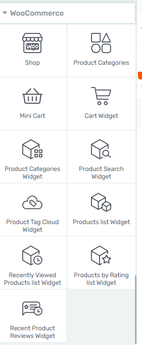
And if you have a store, consider using any of the following options below to showcase your products:
Social Proof to Build Trust
Social proof is key to strengthening your potential new customers’ trust in your business.
Share glowing customer reviews to show your audience that they won’t regret purchasing your products or services.

Most of our homepage templates include a testimonial section, but if you want to add more we recommend placing them in the following places:
Above the fold, right after your hero section
After the “Features/Benefits” section
Underneath the “About Us” section
Close to a call-to-action button
Tip: If you’re struggling to find the courage to ask for testimonials, read this guide to learn 5 effortless ways to add testimonials to your WordPress website and sales pages.
About Section to Share Who You Are
Adding an “About Us” to your homepage helps your audience get to know you better.

This is the place to mention who you are and include details that add to your credibility – certifications, work experience, academic achievements, awards.
These show your audience that you’re well-versed in your field, helping them trust you more.
If you have a team, this is the perfect place to share more information about the people running the business with you.
Don’t forget to add a high-quality photo of yourself (and your team members) to further build trust.
CTA Sections to Drive Action
The goal of your homepage is to introduce your business to your visitors and get them to take action.

You can use these sections to encourage your audience to:
Add a new product to their shopping cart
Register for a webinar
Try out a free trial of your online course or other digital product
Purchase a discounted product from your eCommerce store
Fill a form to get their results from an online quiz
Contact your business via a “Call Now” button
Submit their contact information in a designated contact form
…the list goes on
We recommend including two or three CTA sections – depending on the length of your page.
Make sure your CTA sections have a:
Clear, compelling headline (e.g., a question or benefit-driven statement)
Supporting image to draw attention to the section
Bright CTA button that has a compelling prompt and clearly communicates what your visitor should do next (e.g., “Buy Now”)
Your CTA must be impossible to miss. For example, consider adding a brightly colored button to your hero section with a clear prompt like “Shop Now.” It’s eye-catching, and it gives your visitors an instruction they can act on immediately.
FAQs Section to Address Potential Questions or Concerns
Your site visitors are going to have questions about your products and online shop that they’ll want to be answered before they decide to buy.
Get ahead of this by adding a FAQ (frequently asked questions) section to your homepage, that includes common questions & answers on your online store, pricing, available payment options, shipping process (if you sell physical goods), refund policy, and any other details that might not be clear.

In Thrive Architect, you can add this section to your sales page as a plain text box and simply put your questions and answers there.
But if you want to get a little creative, you can use the Toggle Element to create a stylish FAQ section. You can add icons to the section, change the FAQ section’s background color, and even add a background shadow to your text.
Next Steps: Finalize Your Site Navigation
Lastly, don't forget to configure your navigation menu and add the correct social media links to your header or footer — to create a smooth user experience.
To make navigation easier for your visitors, we also recommend adding a search bar to your homepage.
You can add these elements to your website in 1 of 3 ways:
Use the existing header and footer from your current theme
Create a header and footer in Thrive Architect
Pre-set your custom header and footer in Thrive Theme Builder, our custom theme plugin
For option 3, you can use Thrive Theme Builder and Thrive Architect to build a conversion-focused website design.
In addition to high-quality webpages built in Thrive Architect, you also get a custom WordPress theme that makes your site truly unique – and memorable to your potential customers.
You can also integrate these tools with WooCommerce or another WordPress eCommerce solution, turning this duo into an affordable, user-friendly eCommerce website builder.
You can purchase Thrive Theme Builder and Thrive Architect, the best WordPress website-building duo, as a bundle.
Start Driving Website Traffic to Your New Homepage
Now that you’ve got an impressive eCommerce homepage, it’s time to get it in front of the right eyes.
Here are 4 free website & marketing tutorials to help you grow your audience & get your business noticed:
- How to Get Your Business Noticed & Grow Your Audience
- 8 Content Marketing Strategy Hacks to Grow Your Online Business
- 7 Keyword Research Tips for the Busy Entrepreneur (Improve Search Page Rankings)
- How to Create SEO-Friendly Blog Posts Users and Bots Will Love (14 Tips)
As you’ve seen, building landing pages for your WordPress site isn’t hard when you’re using the right tools.
Thrive Architect is your go-to for crafting a hassle-free pages that are designed to convert visitors into quality leads and customers – helping you grow your business.
This tool simplifies the technical side of things, freeing you up to concentrate on what you do best: connecting with your audience and delivering standout content that drives your business forward.
So if you’re ready to level up and create funnels that boost your conversion rates — and snag more potential customers — you know what to do.


