Is your website accessible? Can you say yes – confidently, 100% – without a second thought?
If you just paused, even for a second… your site may already be losing visitors, clicks, and sales.
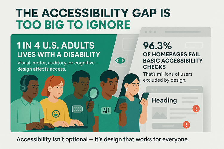
If not, you're already losing visitors, clicks, and sales. And that isn’t an exaggeration. Check it out:
That means most websites are quietly (and unintentionally) shutting people out. And yours could be one of them.
I learned this lesson the hard way. A visitor emailed me – polite, patient, and clearly frustrated – to say my opt-in form didn’t work with keyboard navigation. No obvious error. No broken code. Just an invisible wall I didn’t know I’d built.
That moment shifted everything for me. Inclusive web design stopped being a background concern and became part of every design decision. Not because it checked a box, but because it made the entire experience stronger, clearer, and more usable for everyone.
Designing for web accessibility gives your content more reach, earns more trust, and keeps more people moving through your site — all the way to conversion. Why? Think of all the people bouncing off because your website isn’t helpful. Now imagine what your numbers would look like if you catered to them too?
So, in this guide, we’ll walk through ten essential questions every website owner should ask — and the practical steps that can turn silent drop-offs into meaningful results.
10 Questions Every Website Owner Should Be Asking About Accessibility
You don’t need to be a hardcore developer, legal expert, or WCAG encyclopedia to start making your website more accessible. You just need to ask better questions. The kind that help you see your site through someone else’s experience.
This section gives you a clear, practical starting point. These ten questions cover the most common accessibility gaps – the silent issues that block real people from engaging, signing up, buying, or coming back.
For each question, you’ll get a quick TL;DR, followed by actionable tips in later sections. Start here, and you’ll start seeing your site differently — not just as a page that looks good, but as one that works.
TL;DR: WCAG compliance means your site follows clear accessibility rules. Start with automated tools, but don’t stop there. Manual testing = real insight.
WCAG stands for the Web Content Accessibility Guidelines — an internationally recognized set of standards for making websites accessible to people with disabilities. These guidelines are created by the W3C (World Wide Web Consortium) and serve as the foundation for accessibility laws in countries like the U.S., U.K., Canada, and many in the EU.
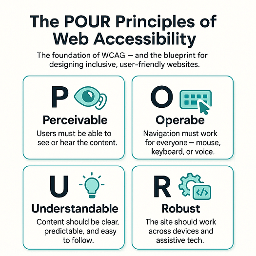
At its core, WCAG compliance means your website meets criteria in four key areas (aka the POUR principles):
- Perceivable – Can users see, hear, or otherwise access your content?
- Operable – Can they navigate and interact with your site using different tools (like keyboards or screen readers)?
- Understandable – Is your site predictable, readable, and easy to follow?
- Robust – Does it work across browsers, devices, and assistive tech?
🧪 How to check if your site is WCAG-compliant:
- Use tools like WAVE, Lighthouse, or Accessibility Insights for an automated scan.
- Then test manually — Can you navigate everything using only a keyboard? Do forms have labels? Are color contrasts strong enough?
⚠️ Important: A passing score from a tool doesn’t guarantee full compliance. Real accessibility requires testing with real people — especially users with disabilities.
→ TL;DR: It’s the foundation of modern accessible design — and it helps your UX too.
The POUR framework is a simple, four-part checklist that helps you build a more accessible website for all users — including those with disabilities. It stands for:
- Perceivable – Can people see, hear, or understand what’s on the page?
Add alt text to images, use captions or transcripts for video and audio, and make sure your content has enough color contrast to be readable. - Operable – Can users navigate and interact with your site without a mouse?
Ensure your site works with just a keyboard (Tab, Enter, Space), that links and buttons have visible focus states, and that navigation is logical. - Understandable – Is your content clear, consistent, and predictable?
Use plain language, avoid jargon, keep layouts intuitive, and make form instructions obvious. - Robust – Does your site work across different devices, browsers, and assistive technologies?
Use valid HTML, semantic tags (like<button>instead of styled<div>s), and only use ARIA roles when necessary.
🧠 How to take action:
Pick one page on your site and review it through each POUR lens. Fix what’s missing. Repeat. That’s the start of designing for web accessibility — and it gets easier from there.
→ TL;DR: Alt text, color contrast, headings, form labels.
You don’t need to start from scratch to improve accessibility. A few quick updates can make a huge difference in how usable your site is — especially for screen reader users, people with low vision, or those with cognitive disabilities.
Here are 4 fast fixes to implement today:
- Add alt text to every meaningful image.
Describe what the image shows and why it’s there. This helps users who rely on screen readers — and it’s great for SEO. - Check your color contrast, especially for buttons, links, and body text.
Tools like WebAIM’s Contrast Checker can help you meet WCAG contrast ratio guidelines. - Use proper heading structure — don’t skip from an H1 to an H4.
Clear headings create better structure for assistive tech and help all users scan content faster. - Label all form fields clearly, including dropdowns, checkboxes, and inputs.
Every user should understand what’s being asked — without guessing.
These small changes improve inclusive web design, support WCAG compliance, and help create an experience that works for everyone — not just people Browse with a mouse and perfect vision.
→ TL;DR: Think structure, predictability, and simple language.
If your page feels overwhelming to you, imagine how it feels to someone with ADHD, autism, or processing differences. Clear hierarchy, plain language, and logical layout aren’t just nice — they’re necessary. Avoid information overload, long blocks of text, or erratic formatting. Give users breathing room. Inclusive web design isn’t just about tools — it’s about respecting how differently people think, process, and navigate the world.
→ TL;DR: Be descriptive, not decorative. Add context, not confusion.
Bad: alt="image123.jpg"
Better: alt="Woman using a laptop with a service dog resting nearby"
The goal isn’t just to describe what’s visible — it’s to communicate what the image means in the context of your content. Decorative images (like abstract dividers or purely aesthetic visuals) should have empty alt text (alt="") so screen readers skip them. But every important image should be clear, useful, and specific. Think of alt text as your image’s voice.
→ TL;DR: Use Tab to navigate your site. If it gets weird — it’s broken.
Open your site, put the mouse down, and start hitting Tab. You should be able to move through menus, forms, and buttons in a logical order. Every link and button should show a visible focus indicator (like an outline or glow). If you get stuck in a weird loop, miss important actions, or can’t tell where you are — that’s a sign your site isn’t keyboard accessible, and many users won’t be able to interact with it at all.
→ TL;DR: Screen readers don’t care how it looks — they read your code.
If you’re using <div>s and <span>s to fake buttons and headings, assistive technologies won’t know how to handle them. Proper HTML elements — like <button>, <h1>, <form>, <nav> — signal meaning and structure. That’s how screen readers and browsers understand your content. If the markup isn’t meaningful, your site might look fine but functionally collapse for users who depend on assistive tech.
→ TL;DR: Using divs for buttons, no focus states, misusing ARIA.
Some of the biggest accessibility issues are surprisingly easy to avoid:
- Interactive elements without real HTML tags
- Poor or missing focus styles
- Overusing ARIA roles without knowing what they do
- Relying on hover-only navigation or hidden labels
These things confuse screen readers, frustrate keyboard users, and create a fragile experience overall. Accessible website design starts with clean, intentional code and user-friendly behavior.
→ TL;DR: It helps. Better UX = more trust = more action.
There’s a myth that accessibility limits creativity or conversion potential. The truth? It enhances both. Clear buttons, readable forms, predictable layout — these are good for everyone, not just users with disabilities. Accessibility removes friction, earns trust, and builds a wider funnel. It also supports SEO, mobile usability, and brand perception. In short: accessibility doesn’t cost conversions — it powers them.
→ TL;DR: Start with automated tools, but always follow up with real-world testing.
Start with:
These tools flag common issues, but they can’t catch everything. Run manual tests, use a screen reader, and ideally include users with disabilities in your testing process. Designing for accessibility isn’t something you do once — it’s something you continue to improve.
Most Websites Are Built for One Kind of User (And That’s the Problem)
If you have full vision, hearing, mobility, and a brain that processes information the way most interfaces expect — chances are, your website works just fine.
That’s also why you might think it’s accessible.
But here’s the uncomfortable reality: most websites are unintentionally built for people just like their creators.
We design based on our own habits. We test what’s familiar. And we assume the experience is clear and usable — because it is, for us.
Meanwhile, users with disabilities are quietly locked out:
These aren’t dramatic bugs. They don’t crash the site.
They just quietly exclude people.
And the cost? It’s real.
No feedback. No complaints. Just one more person who came to your site, couldn’t use it — and left.
Accessibility issues don’t show up as errors. They don’t crash the funnel.
They just weaken it — one bounce, one missed lead, one broken experience at a time.
TL;DR: When you don’t design for accessibility, you’re not making a mistake loud enough to fix — you’re creating a silence you can’t measure. And it’s costing you.
Here’s What You Lose When You Ignore Accessibility
TL;DR: Every accessibility issue is a leak in your funnel. Ignore it, and you’re not just losing users — you’re bleeding potential, invisibly.
If the problem is invisible barriers, the fallout is even harder to detect — and far more costly.
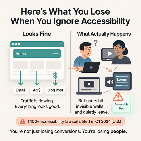
Every time someone can’t navigate your site with a keyboard, that’s a potential lead gone cold.
Every uncaptioned video? Lost engagement.
Every form that screen readers can’t interpret? A silent bounce you’ll never trace.
And you’re still paying for that traffic.
The ads. The emails. The blog content. All working hard to drive clicks — only for those users to hit a wall and quietly exit your funnel.
Worse, you’re building a reputation you can’t see — and can’t fix — because no one’s telling you. They’re just not coming back.
There’s also legal risk you can’t ignore. Countries like the U.S., U.K., Canada, and many in the EU now enforce digital accessibility standards — and the lawsuits are ramping up. In the U.S. alone, over 1,100 accessibility lawsuits were filed in the first quarter of 2024.
But for most businesses, the damage isn’t legal — it’s financial. It’s the quiet erosion of trust, traffic, and sales that comes from building something some people can use, while the rest hit dead ends.
A Deeper Dive: What Is POUR and How Does It Make You a Better Designer?
You’ve seen the problem. Now here’s the framework to fix it — not just piece by piece, but at the foundation.
The POUR principles — Perceivable, Operable, Understandable, and Robust — are the backbone of the Web Content Accessibility Guidelines (WCAG). But more than that, they’re a blueprint for designing for web accessibility that actually works in the real world.
This isn’t just about checking boxes or passing audits. It’s about asking the right questions at every stage of your design:
→ Can people perceive your content, no matter how they access it?
→ Can they use your site with different tools and inputs?
→ Is the experience clear, consistent, and predictable?
→ Will your site still work tomorrow — and on the devices you’ve never tested?
In the next four sections, we’ll walk you through each principle, show what it looks like in action, and highlight the easy-to-miss mistakes that silently create barriers.
Let’s start with what users can see, hear, and read.
Perceivable – Can Users See, Hear, or Understand What’s on the Page?
The first step in inclusive web design is making sure your content reaches people — whether they see, hear, or interact with it using assistive technology.
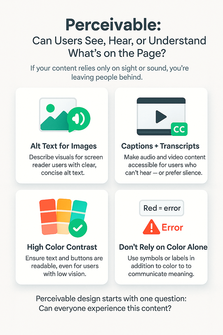
If your content relies solely on sight or sound, you’re leaving people behind.
Here’s how to make it perceivable:
- Write meaningful alt text for images. Alt text is a short description that screen readers use to describe visuals to blind or low-vision users.
- Add captions and transcripts to videos and audio content. This helps users who are deaf, hard of hearing, or just watching without sound.
- Use strong color contrast for text and buttons. You can check this using WebAIM’s contrast checker — a free tool that compares text and background colors for readability.
- Don’t use color alone to communicate meaning (like “red = error”) — add symbols or labels too.
🛠️ Thrive tip: Use clear fonts, high-contrast backgrounds, and layout blocks to group related content. These small visual cues support accessible website design without compromising your brand style. (Learn more about better font management here and getting your website color scheme right here)
Operable – Can They Navigate and Use It Without a Mouse?
Not everyone uses a mouse. Many people with mobility impairments rely on a keyboard, screen reader, or voice command to navigate websites. If your site breaks without a mouse, it’s not operable.
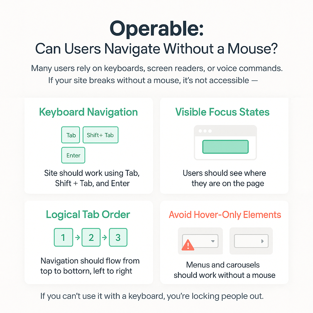
Here’s how to support keyboard-only users:
- Try navigating your site using just Tab, Shift + Tab, and Enter. If you get stuck or lost, that’s a problem.
- Ensure tab order flows logically from top to bottom, left to right.
- Add visible focus states — visual indicators (like outlines or highlights) that show which element is selected when tabbing.
- Avoid hover-only menus or carousels that can’t be triggered without a mouse.
Understandable – Is It Predictable, Clear, and Structured?
Accessible WordPress design doesn’t stop at code. Your content and layout must also be easy to follow — especially for neurodiverse users or those with cognitive challenges.
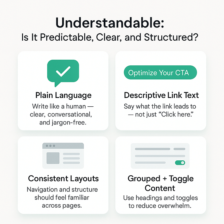
Make your site feel safe, simple, and consistent:
- Use plain language. Write like a human, not a lawyer or dev.
- Use descriptive link text. “Learn how to optimize your CTA” is better than “Click here.”
- Maintain consistent website layouts and navigation.
- Group related content with headings and toggle blocks — this helps reduce overwhelm and gives users control.
🛠️ Thrive tip: Use labeled toggle sections for FAQs or extra content. Avoid hiding important info behind vague prompts or unclear buttons.
Robust – Will It Work Across Devices, Readers, and Future Tech?
Your website might look great on your laptop — but what happens when someone visits using a screen reader? Or an older phone? Or a voice-based browser five years from now?
Designing for web accessibility means building sites that don’t fall apart when technology changes. That’s what robust design is all about.
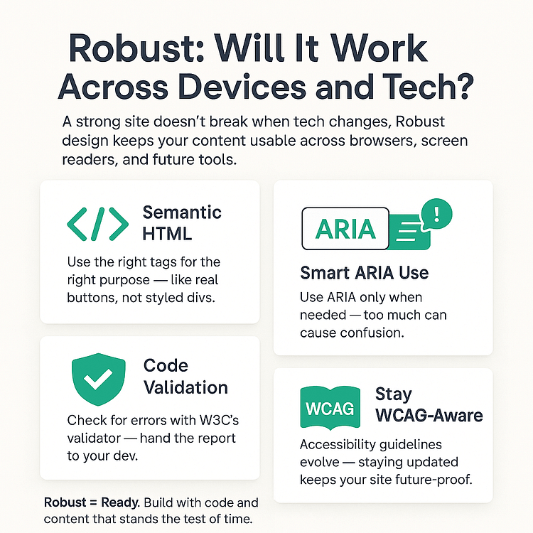
Here’s how to keep your site flexible, stable, and future-proof — even if you're not a developer:
- Use semantic HTML (and don’t panic — your builder probably already helps).
Semantic HTML means using the right tags for the right purpose — like using<button>for clickable actions, not a<div>that looks like a button.
Good news: Most modern tools (including many WordPress themes and page builders – and Thrive Architect) generate semantic HTML by default — so you’re already on the right track if you’re using quality tools. - Apply ARIA labels only if you need to.
ARIA (Accessible Rich Internet Applications) roles are advanced labels that help assistive tech make sense of complex elements. If you're not building custom components, you likely won’t need to add these manually — and too much ARIA can actually cause issues. - Check your code using W3C’s validator.
W3C’s validator is a free tool that flags HTML errors that could confuse browsers or assistive devices. You don’t need to fix everything yourself — just hand the report to your developer (or website support person) and say, “Can we clean this up?” - Keep an eye on WCAG updates.
If your business serves international customers or operates in a regulated space (like education, healthcare, or finance), staying aligned with the latest accessibility standards is a smart move — and a legal safeguard.
5 Quick Wins That Instantly Improve Accessibility
If you’re feeling overwhelmed by the technical side of accessibility, don’t worry — this isn’t about perfection. It’s about progress.
You can make your website significantly more usable and inclusive with just a few small tweaks — no developer required, no full redesign needed.
Let’s start with five fast, beginner-friendly fixes that will instantly improve accessibility for everyone.
1. Add Proper Alt Text (With Example Comparison)
Alt text — short for “alternative text” — is what screen readers use to describe images to users who are blind or visually impaired. But here’s the thing: it’s not just about saying what something is. It’s about saying why it matters.
Think of alt text like a tiny caption whispered in someone’s ear. It should help them understand what they’re missing visually — not just fill space.
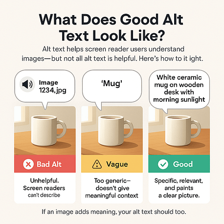
✅ Good alt text: “Golden retriever puppy sleeping on a pile of autumn leaves.” This tells us what’s happening and sets a clear scene.
❌ Bad alt text: “Dog” / “Image1234.jpg” / “Cutie!” These either say nothing useful or leave users guessing.
If the image is purely decorative — like a flourish or divider — you can use alt="" (empty alt text). That tells screen readers to skip it so users aren’t distracted by meaningless details.
Quick tip: Don’t just repeat nearby text. Alt text should add new context — not echo what’s already on the page. Think clarity, not redundancy.
2. Fix Your Heading Structure (Don’t Skip Levels!)
Headings aren’t just about design — they’re how many users navigate your page.
For people using screen readers, headings work like a table of contents. They help users jump between sections quickly — just like flipping to a chapter in a book.
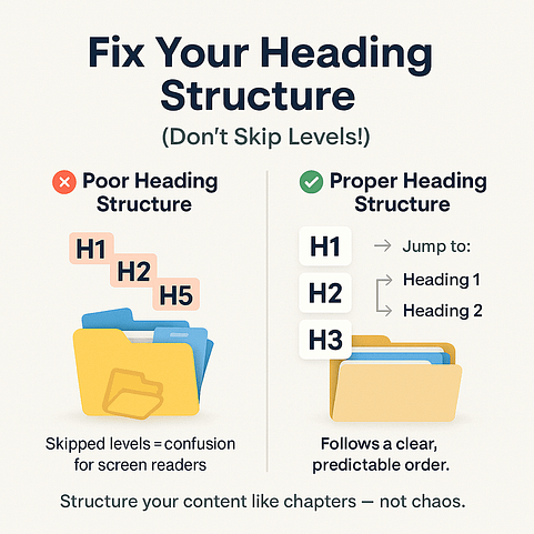
Here’s how to keep things clear and accessible:
- ✅ Use your page builder’s built-in heading elements — and follow a logical order:
Start with Heading 1 for your page title, then Heading 2 for main sections, Heading 3 for subpoints, and so on. - ❌ Don’t skip levels just to change the font size. If you want smaller text, use the styling options — not the wrong heading level.
Think of it like nesting folders. Keeping the order consistent makes things easier for everyone — including search engines. A good heading structure = better accessibility *and* better SEO.
3. Check Your Color Contrast
Ever tried reading pale gray text on a white background? Annoying, right? Now imagine that with low vision or color blindness — it’s practically unreadable.
Color contrast isn’t just a design preference — it’s a usability essential. If your text blends into the background, visitors miss your message completely.
✅ Aim for at least a 4.5:1 contrast ratio — that means your text stands out clearly enough against the background to be readable for users with low vision. Tools like WebAIM’s Contrast Checker make it easy to test.
❌ Avoid low-contrast combos like light gray on white or pastel buttons on pale backgrounds. They might look modern, but they’re a nightmare for readability.
Even a small contrast tweak can be the difference between someone engaging with your site… or giving up and clicking away.
4. Label Every Form Field Clearly
Forms are where conversions happen — signups, checkouts, contact requests. But they’re also one of the most common places accessibility fails.
If someone using a screen reader lands on an empty box with no label, they won’t know what to do — and they’ll leave.
Here’s how to make your forms easier for everyone to use (no coding required):
- ✅ Always add clear, visible labels next to every field — like “Email address” or “Your full name.”
- ✅ Use your builder’s built-in form elements (not just text boxes). These usually handle the behind-the-scenes code for screen readers.
- ❌ Don’t rely on placeholder text alone. It disappears when someone starts typing and often isn’t picked up by assistive tech.
Also: If something goes wrong, be specific.
🛑 “Please enter a valid email address” is far more helpful than a vague “Error.”
Clear labels and helpful feedback don’t just make your site accessible — they also lead to more form completions and fewer frustrated users.
5. Use Real Buttons, Not Styled Divs
This one trips up a lot of sites — often without the creator even knowing it.
Some page elements look like buttons, but they’re actually just fancy <div> or <span> elements with styling slapped on. The problem? Assistive tech and keyboard users can’t interact with them properly. So your “Click Here” moment? Totally inaccessible.
But don’t worry — if you’re using a visual builder, you don’t need to code anything.
✅ Just make sure you’re using the tool’s button element for actions like submitting forms or opening pop-ups.
✅ Use the link element for navigating to other pages.
❌ Don’t drag in a plain box or styled container and give it a click action — it might look right, but under the hood, it’s invisible to many users.
👉 Quick sanity check: If you can’t tab to it using your keyboard, or press “Enter” to activate it, it’s not really accessible.
The good news? Most quality builders use semantic HTML for buttons automatically — as long as you use the right elements. So stick with your builder’s built-in tools, and you’re already on the right path.
✅ Fix these 5 things and you’ll be ahead of 70% of websites out there — in less than an hour.
No fancy tools. No coding knowledge required. Just a few tweaks that make your site easier to use, easier to trust, and easier to convert on — for everyone.
How to Test If Your Site Is Truly Accessible
Making accessibility improvements is a strong start — but how do you know they’re actually working?
The truth is, a site can look great and still be unusable for someone relying on a keyboard, screen reader, or assistive tech. Automated scanners can catch the basics, but they’ll miss the deeper flaws — the confusing forms, the broken tab flows, the buttons that don’t behave.
Testing for true accessibility means stepping into someone else’s experience. It's not just a technical checklist — it’s a usability check.
In this section, we’ll walk you through the two-part approach:
Let’s dive in.
Start with Tools
Before you dive into manual testing, automated tools are your first line of defense. They quickly scan for common accessibility issues — things like missing alt text, low color contrast, broken heading structure, and more. They won’t catch *everything*, but they’ll save you hours by identifying low-hanging fruit.
Here are three go-to tools used across the industry:
- Axe: A browser extension that scans live pages and overlays issues right on your screen. You’ll see exactly what is wrong and why it matters, making it great for beginners and pros alike.
- Lighthouse: Built directly into Chrome DevTools, Lighthouse runs a full audit — covering performance, SEO, and accessibility. You’ll get a numeric score and prioritized recommendations. Pro tip: Don’t chase perfection, but aim for consistency in the 90s.
- WAVE: This tool shows your site’s accessibility structure in color-coded overlays. It’s particularly helpful for checking form fields, ARIA landmarks, and screen reader behavior.
These tools won’t replace human judgment — but they do give you a fast pulse check to make sure your accessible website design isn’t breaking in obvious ways.
Thrive Tip: Run one of these tools before you publish any major page — especially landing pages, opt-in forms, or content meant to convert. This habit alone will put you ahead of most site owners.
Then Test Like a Human
Once you’ve run your scans, it’s time to step into someone else’s shoes — someone who might not use a mouse, someone who might not see your page at all.
This is where manual testing shines — and where most websites quietly fail.
➤ Try a Keyboard-Only Walkthrough
Unplug your mouse or trackpad and try navigating your site using only your Tab, Shift + Tab, and Enter keys.
Ask yourself:
- Can you move through the page in a logical order?
- Is there a visible focus indicator showing where you are?
- Can you open dropdowns, submit forms, or trigger popups?
If the experience feels frustrating, jumpy, or unclear — imagine how much worse it would be if that were your only way to interact with the page. This is a core part of designing for web accessibility.
➤ Explore with a Screen Reader
Screen readers convert text into spoken feedback or braille, allowing users who are blind or visually impaired to “hear” or “feel” your site. Even if you don’t use one regularly, trying it out can be eye-opening.
Try:
- NVDA (Windows) — free and widely used
- VoiceOver (built into every Mac)
Start from the top of your homepage and let the screen reader narrate your content. You’ll instantly spot issues like:
If your site feels confusing or disjointed to the screen reader, that’s a red flag — for both accessibility *and* usability.
➤ Test Forms and Popups (They Fail Quietly)
Many websites get the main content right, but fail in high-impact areas like:
Here’s what to check:
- Are form fields properly labeled (visibly and in the code)?
- Can you navigate and submit the form with just a keyboard?
- Do error messages appear in a way that screen readers can catch?
If any of these fail, you’re losing conversions from users who can’t complete critical actions.
TL;DR:
You can’t fix what you don’t test. And if you haven’t tested your site manually — using only a keyboard or screen reader — you haven’t truly tested it.
Accessibility isn’t just about passing a scan. It’s about creating a digital experience that works for real people, regardless of how they access the web.
Next, let’s explore how to combine accessibility *and* conversion — because yes, you can have both.
Can a Website Be Accessible and High-Converting?
Spoiler: yes.
There’s a persistent myth floating around — that designing for web accessibility somehow limits your creativity, dulls your CTAs, or slows down your funnel.
That’s flat-out wrong.
Some of the most effective websites on the internet are also the most inclusive. Because when you design for usability, you’re designing for clarity. And clarity converts.
Accessible websites aren’t basic. They’re smarter. They anticipate friction, build trust faster, and make it easier for *everyone* to take action — from clicking a button to completing a checkout.
In this section, we’ll show you how accessibility actually supercharges conversions when done right — with forms, layouts, and CTAs that perform better because they work for more people.
Accessible CTAs That Still Pop
A good call-to-action doesn’t just look clickable — it feels like the obvious next step for everyone. That includes users with low vision, motor impairments, or those navigating by keyboard or screen reader.
Here’s how to make your CTAs work for all:
- Use clear, descriptive button text. Instead of “Click here,” try “Download the Free Guide” or “Get Instant Access.” This helps screen readers and improves clarity for all users.
- Ensure strong color contrast. Your button text should clearly stand out against the background. Tools like WebAIM’s contrast checker can help.
- Make buttons large enough to tap. Especially on mobile, aim for at least 44x44 pixels.
Thrive Tip: Use Icon + Text buttons to boost visual clarity and reinforce meaning. Combining symbols with text helps users scan faster and act with confidence.
Forms That Don’t Frustrate
Forms are where most of your conversions *should* happen — email opt-ins, contact requests, signups. But for many users, they’re where the experience silently falls apart.
Here’s how to make your forms inclusive and effective:
- Label every field clearly. Don’t rely on placeholder text alone — it disappears when typing and doesn’t always get picked up by screen readers.
- Show error messages with context. Instead of “Invalid input,” try “Please enter a valid email address.” Make sure errors are visible and accessible via ARIA or clear focus.
- Group related fields using proper HTML structure — e.g., name + surname should be in the same logical block.
Good news: If you’re using Thrive Architect or Thrive Leads, you already have accessibility-friendly form foundations — just don’t override them with inaccessible custom styles.
Page Layouts That Include, Not Confuse
A sleek layout doesn’t mean a complex one. In inclusive web design, clarity is a competitive edge. Your layout should guide users naturally — not leave them guessing.
Here’s how to keep everyone on track:
- Avoid hover-only menus or tooltips. These are nearly impossible to access via keyboard or screen readers. Make sure vital actions are always visible or accessible via focus/keyboard.
- Use grid sections, toggles, or tabs that work with keyboard navigation and don’t require a mouse. (vertical tabs work great here)
- Structure your page with headings, jump links, and clear reading order — this helps all users, especially those relying on assistive tech.
TL;DR: Accessibility builds trust, and trust drives conversions. When users feel seen and supported, they stay longer, act faster, and come back. That’s not just good UX — it’s smart business.
Want to Go Deeper? Start Here
Designing for web accessibility isn’t a one-and-done checklist — it’s a mindset. And the more you learn, the more confidently you can build experiences that include everyone.
Whether you’re just starting or looking to level up, these resources will help you go beyond the basics:
These aren’t just resources. Think of them as your support crew. The more you explore, the more inclusive your designs become — and the more your site works for everyone.
Common Questions About Designing for Web Accessibility
Designing for web accessibility means building websites that everyone can use — including people with visual, auditory, cognitive, or motor disabilities. It ensures your site is usable no matter how someone navigates, perceives, or interacts with content.
The POUR framework stands for Perceivable, Operable, Understandable, and Robust. These four pillars guide inclusive web design and form the foundation of global standards like WCAG. When you follow POUR, you're creating a website that works better for everyone.
Start with tools like Axe, Lighthouse, or Accessibility Insights to catch common issues. Then go further — try navigating your site with just a keyboard or using a screen reader to uncover deeper usability gaps.
Done right, accessibility increases conversions. It improves usability for all visitors, strengthens trust, removes friction, and even boosts SEO — all of which lead to higher engagement and more sales.
Designing for Web Accessibility: The Web You’d Want Your Family to Use
If your website were a city, would your loved ones be able to navigate it?
Could your dad tab through a form with ease? Would your cousin with ADHD know where to click next? Could your friend with low vision actually read your product descriptions — or would they bounce before ever seeing the buy button?
That’s the real test.
Most websites aren’t built with these people in mind — not out of cruelty, but out of default. We design for ourselves. For speed. For what looks “slick.”
But designing for web accessibility means zooming out. It means building roads, not gates. Creating spaces that welcome, guide, and support every visitor — not just the ones who browse like we do.
And here’s the kicker: accessibility isn’t a limitation. It’s a competitive advantage. Inclusive design is cleaner, smarter, and more effective — because it removes friction, builds trust, and makes conversion paths easier for *everyone*.
This isn’t just about doing the right thing. It’s about doing the smart thing — for your users, your brand, and your bottom line.
🌱 Want to build pages that include everyone — and convert better because of it?
👉 Try Thrive Architect — semantic code, flexible layout, no trade-offs.
Because the best websites aren’t just beautiful. They’re usable. By everyone.


