

TL;DR: The Only Website Layout Ideas You Need
The best website layout is the one that matches how your visitors read, browse, and decide. These are the 16 proven patterns, grouped by what they do best:
- Reading-pattern layouts: Z-pattern and F-pattern, built on how eyes actually move across a screen.
- Visual-impact layouts: fullscreen image, hero section, and full-width, for when the first impression does the selling.
- Structured layouts: grid, card-based, masonry, magazine, and boxed, for organizing lots of content without chaos.
- Navigation-driven layouts: single-page, sidebar, and fixed navigation, for guiding people through your content.
- Bold layouts: split-screen, asymmetrical, and horizontal scroll, for brands that want to stand out on purpose.
And if you want my personal shortcut, I think most business sites do best with a hero section over a Z-pattern and a fixed nav. I explain why in each section below.
You've probably been through the inspiration sites already.
Awwwards, Pinterest, gallery after gallery of beautiful websites, and somehow you're no closer to knowing what YOUR site should look like. Pretty examples don't tell you why a layout works or when it fails.
That's the part I can help with, because layouts are my actual job. I build pages with Thrive Architect and Thrive Theme Builder every week, my own website included, and the difference between a layout that converts and one that just looks nice comes down to things galleries never show you.
So this guide does both jobs. You get all 16 proven layout patterns with real examples from brands like Shopify, Apple, and LVMH, and you get my working perspective on when I'd actually reach for each one. By the end you'll know which layout fits your site, and you'll be able to name what you're looking at on any website you admire.
Before you even think about layouts, it's super important to understand the bigger picture of How to Plan a Website (Like Someone Who Wants Results) that actually delivers.
Does Your Website's Layout Actually Matter? (Spoiler: Yes, a Lot)
Have you ever landed on a website and just felt good about it?
Your layout decides where visitors look first, what they read, and whether they find your call to action before they lose interest.
I've seen beautiful websites fail to convert and plain ones thrive, and the difference almost always comes down to structure. A good layout does four jobs at once: it makes your site predictable (brains love patterns, and familiarity means visitors focus on your content instead of decoding your navigation), it builds trust quietly (clear organization signals professionalism before a word gets read), it works for every visitor regardless of tech comfort, and it sells without pushing, steering people toward action like a friendly usher.
The best part is that none of this requires reinventing anything. The 16 layouts below are proven recipes. Your brand supplies the flavor.
What a Solid Layout Does for Your Audience and Business
- It makes things predictable (in the best way). Our brains adore patterns. When a website follows familiar layout conventions, your visitors can focus on your content and what you're offering, instead of trying to decipher how to navigate. This reduces cognitive load, and happy brains stick around longer.
- It builds trust, quietly. When was the last time you truly trusted a website where the navigation was a maze, or contact information felt like a hidden treasure hunt? A clear, organized layout signals professionalism and reliability.
- It works for everyone. From your tech-savvy niece to your grandmother who just got her first tablet, good layouts make websites accessible. They don't discriminate based on digital literacy, which is just good business.
- It sells without being pushy. A thoughtful layout naturally steers visitors towards your calls to action. It’s like a friendly usher, guiding them to the main event without feeling manipulative or aggressive.
And here’s the neat part: you don't need to reinvent the wheel. The layouts we're about to explore are like proven recipes. They give you a solid structure to work with, leaving plenty of room for your own unique flavor and brand personality.
I like to think of it this way: if content is king, then layout is the kingdom. Even the most brilliant content falls flat if people can't find their way around their site. The layouts we'll look at next have been battle-tested by some of the web's most successful sites, and I'll show you exactly why they work so well.
If you're just starting out and want to build something that truly stands apart from the DIY crowd, our guide on How to Build a Website That Doesn’t Look DIY is a must-read.
How to Pick the Right Website Layout for Your Project
Before the list, a quick reality check: there's no universal best layout. A design that works for a food blog can sink a law firm. When I'm choosing a layout for a project, I run through five questions:
- Who's the audience: busy scanners want F-patterns and cards; portfolio browsers want fullscreen visuals.
- What's the content: text-heavy sites need readable structures like magazine or boxed layouts; visual content wants grids and masonry.
- What's the goal: lead generation points to Z-patterns and single-page layouts with prominent CTAs; brand awareness can afford immersive fullscreen moments.
- What's the brand: luxury wants white space and minimalism; startups can go asymmetrical and bold.
- Does it work on a phone: not optional. Whatever you pick has to collapse gracefully to a small screen, so think mobile-first from the start.
Understanding these core principles is key, and you can learn more about the 13 Fundamental Web Design Principles for High Converting Websites here.
And making sure your site looks great on smaller screens is crucial, so be sure to check out these tips on How to Make Your WordPress Site Mobile-Friendly (9 Tips) here.
Quick Tip for Building Better Layouts:
When you're ready to put these ideas into practice, you'll want tools that let you build freely without wrestling with code.
That's where a visual editor like Thrive Architect comes in. It's part of Thrive Suite and lets you drag and drop elements, customize sections, and implement these sophisticated layouts without ever touching a line of code. It's how I make sure my strategic visions actually come to life on the page.
Website Layout Names: The Quick Reference
Here's the whole list in one scannable table, with what each layout is and where it shines. Every one gets its full treatment below.
Layout name | What it is | Best first use |
|---|---|---|
Z-pattern | Content along the eyes' natural Z-shaped path | Landing pages |
F-pattern | Structured for left-edge scanning | Blogs, news, docs |
Fullscreen image | One dominant visual above the fold | Luxury, portfolios |
Split-screen | Two side-by-side choices | Two audiences or categories |
Grid | Uniform rows and columns | Portfolios, stores |
Single-page | Everything on one scrolling page | Landing pages, events |
Asymmetrical | Deliberate imbalance for energy | Creative brands |
Magazine | Multi-column editorial richness | Content hubs |
Card-based | Self-contained modular tiles | Product listings, feeds |
Hero section | Big visual + headline + CTA up top | Business homepages |
Sidebar | Main content plus a persistent side column | Blogs, documentation |
Boxed | Content in a centered container | Classic, readable sites |
Full-width | Edge-to-edge immersion | Visual-heavy modern sites |
Fixed navigation | Menu that stays while you scroll | Long pages, stores |
Masonry | Varied heights packed like stonework | Galleries, mixed media |
Horizontal scroll | Sideways navigation | Experimental storytelling |
16 Website Layout Ideas That Actually Work (and Why)
I've picked these layouts because they strike that sweet spot between modern design trends and practical usability. Whether you're running a blog, a business site, a portfolio, or an online store, you'll find options here that align with your goals.
For each layout, I'll show you what it looks like, which types of websites it suits best, and why visitors respond well to it.
Let's explore these layouts, starting with…
1. The Z-Pattern Layout: The Natural Eye-Catcher
The Z-pattern layout taps into one of the most fundamental principles of human behavior: our natural reading pattern. When we land on a webpage, our eyes typically move horizontally across the top, then diagonally down to the left, and finally horizontally again across the bottom — forming a 'Z' shape.
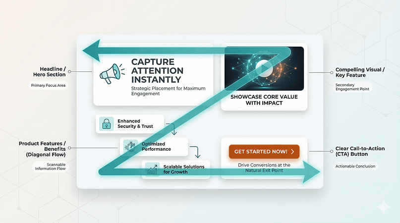
Smart designers use this pattern to strategically place key elements like headlines, compelling visuals, product features, and calls-to-action along this natural eye path. It's particularly powerful for pages where you need to guide visitors through a specific sequence of information before they take action.
Why This Layout Works
The Z-pattern works because it aligns perfectly with how we naturally consume information online. By following familiar reading patterns, it creates a clear visual hierarchy that guides visitors through your content without feeling forced. This layout leads smoothly to call-to-action buttons while naturally breaking up content into digestible chunks — making it much easier to direct your users to a specific action (Sign Up, Buy, etc.).
Best Use Cases for Z-Pattern Layout:
- Landing Pages: Designed to capture leads or drive conversions, so users quickly move from the headline to the CTA.
- Simple Business Websites: Need a clean and clear introduction to their brand with a prominent CTA.
- Startups & SaaS Websites: Benefit from guiding users through key selling points to a sign-up button.
Real-World Examples:
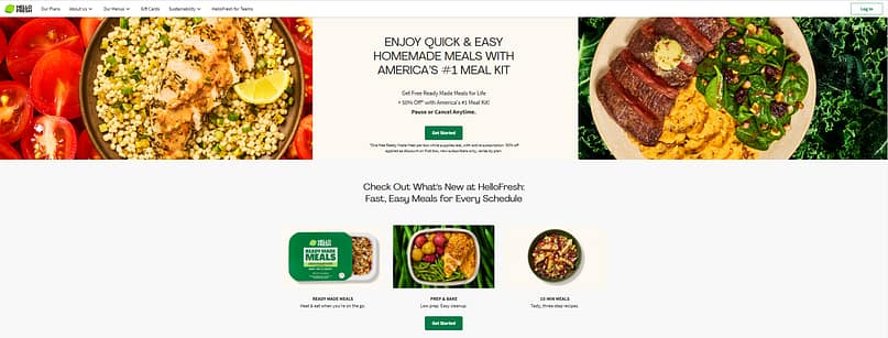
HelloFresh
HelloFresh uses the Z-Pattern to direct readers from their navigation menu straight to a desired action — getting started with their meal kit delivery service. Your mind naturally moves from one section to the next — from visuals to text, and finally to the call-to-action button.
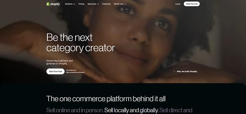
Shopify
Shopify uses the Z-Pattern to buy into their big offer — "being the next category creator." As you move from one heading to the text, your eyes finally land on the call to action button "Start a Free Trial." The absence of any other action buttons or heavy text in the hero section further strengthens their strategy: moving your attention to the most important CTA in less than a second.
2. The F-Pattern Layout: Making Content Scannable and Digestible
If you've ever caught yourself skimming through an article (like this one!), you're already familiar with the F-pattern layout. It's based on eye-tracking studies that show how people actually read online: they scan across the top, then move down and across again, and finally scan down the left side, creating an 'F' shape.
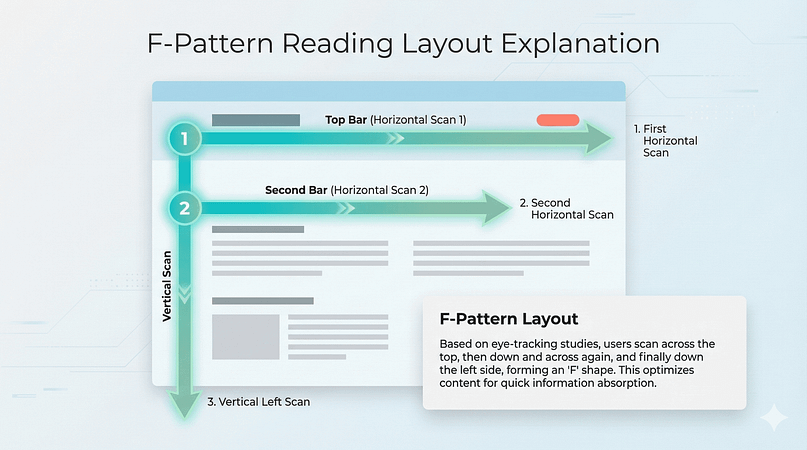
This layout organizes content to match this natural behavior, making it easier for readers to find and absorb information quickly, while still catching the important bits.
Why This Layout Works
The F-pattern works because it embraces how people actually read online, rather than how we wish they would read. When you structure content in this familiar F-shaped pattern, it makes long-form content feel approachable instead of overwhelming. Readers can quickly scan down the left side for key points while still having easy access to detailed information when they want it. It's fantastic for user experience (UX) because it respects how people naturally consume information.
Best Use Cases for F-Pattern Layout:
- News Websites: Readers can easily scan headlines and summaries before deciding what to read.
- Blogs & Content Hubs: Text-heavy content benefits from a natural left-to-right reading flow.
- Long-Form Articles: Helps readers follow structured content with subheadings and bullet points.
Real-World Examples:
Hootsuite
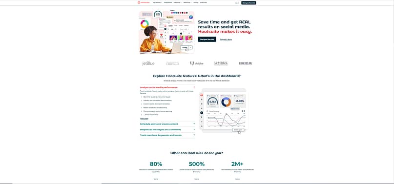
This Hootsuite page follows the F-pattern by placing key info where people naturally look. The top section grabs attention with a bold headline and call-to-action, while the left side has features that are easy to scan. As users move down, their eyes catch more details in a second horizontal sweep. This layout makes it easy to absorb the main points quickly without feeling overwhelmed.
Medium
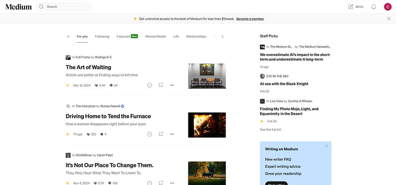
Medium’s homepage follows the F-pattern by making it easy to scan and find interesting reads. The top bar grabs attention with the logo, search, and navigation tabs, while the main content area highlights article titles and descriptions in bold, left-aligned text. Thumbnails on the right break up the layout and add visual interest. As users scroll down, their eyes naturally follow the list of articles on the left, while the "Staff Picks" and "Writing on Medium" sections sit on the right as secondary content. It’s a smooth setup that helps readers quickly spot what they want while offering extra recommendations along the way.
The F-pattern works great for content hubs, too, and that's a fantastic way to keep visitors engaged. Placing key categories, featured posts, and CTAs along the natural reading flow makes it easy for users to find what they need and explore more.
3. The Fullscreen Image Layout: Making That First Impression Count
Think about the difference between flipping through a glossy magazine and scrolling through a spreadsheet. One pulls you in instantly, while the other... well, you get the point.
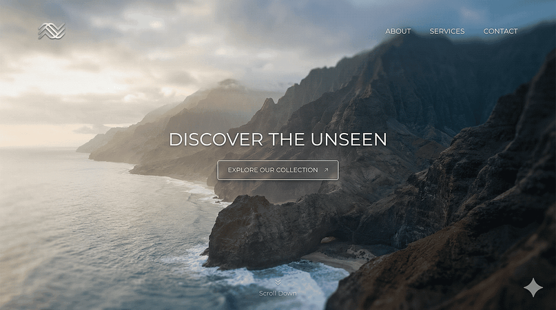
The fullscreen image layout brings that magazine-like impact to web design, dedicating the entire above-the-fold space to a single, powerful visual. It's a bold move that breaks away from the traditional header-menu-content formula we've all grown used to.
Instead of greeting visitors with navigation menus and welcome text, this layout leads with pure visual storytelling — whether through a striking photograph, a product shot, or an atmospheric video background.
Why This Layout Works
This layout's effectiveness lies in its ability to create an immediate and lasting impression. By commanding the entire screen with a single powerful image, it sets a strong emotional tone right from the start while keeping the user's initial interaction remarkably simple. This layout naturally makes your brand more memorable, as visitors are greeted with a clear, unified visual message rather than fragmented content. It's a masterclass in visual communication.
Best Use Cases for Fullscreen Image Layout:
- Luxury & Fashion Brands: Create a strong visual impact to showcase high-end products.
- Photography & Portfolio Websites: Highlight work with immersive visuals.
- Creative Agencies: Establish a bold first impression with striking images or animations.
Real-World Examples:
LVMH
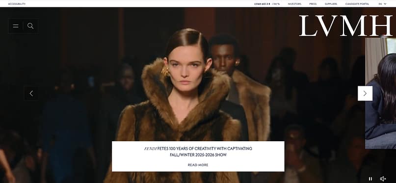
LVMH uses a fullscreen layout to create an immersive, high-end experience that pulls visitors in right away. The homepage is dominated by a bold, cinematic image that instantly highlights luxury and craftsmanship, with minimal distractions. Navigation elements are kept sleek and unobtrusive, sitting neatly at the top, while large, elegant typography reinforces the brand’s prestige. Instead of overwhelming with text, the layout lets visuals do the storytelling, making it feel like stepping into a high-fashion runway moment rather than just browsing a website.
Bottega Veneta
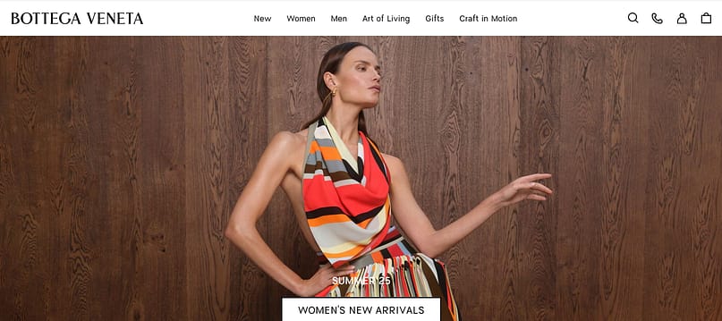
Bottega Veneta’s homepage keeps things sleek and minimal, using a fullscreen layout that feels more like a high-fashion editorial than a typical e-commerce site. The bold imagery takes center stage, with a striking model and rich textures setting the mood. The navigation stays clean and simple at the top, letting the visual storytelling do the heavy lifting. Instead of cluttering the screen with too much text, a single, well-placed call-to-action invites visitors to explore the latest collection, making the experience feel curated and effortless.
4. The Split-Screen Layout: When Two Choices Are Better Than One
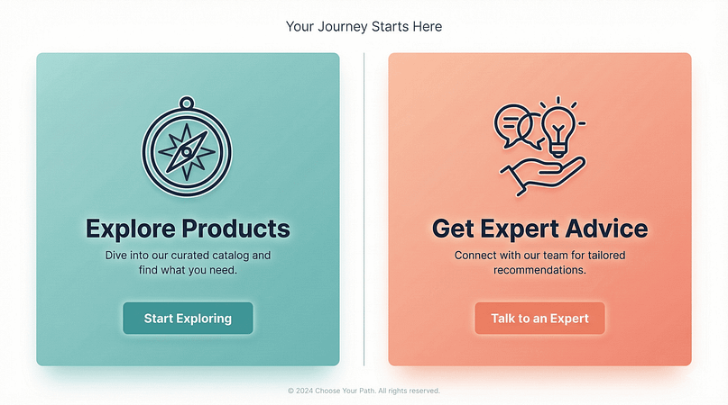
Remember those "Choose Your Own Adventure" books? The split-screen layout brings that same engaging choice-making experience to web design. Dividing the screen into two distinct sections creates a clear, visual fork in the road for your visitors. It's elegant in its simplicity: two options, two paths, no confusion. This layout has evolved from a creative experiment into a powerful way to guide different audience segments exactly where they need to go.
Why This Layout Works
The split-screen layout creates a visually balanced design that pulls attention to both sections, making a strong first impression from the start. It works especially well because it speaks to different types of users at the same time, guiding each one to the content that matters most to them. Instead of overwhelming visitors with choices, it offers clear, distinct paths that feel intuitive and easy to navigate. It's a clever way to cater to diverse user intents right from the homepage.
Best Use Cases for Split-Screen Layout:
- E-Commerce Stores: Easily display two product categories (e.g., men’s vs. women’s collections).
- Service-Based Businesses: Highlights two core services or customer choices (e.g., "For Individuals" vs. "For Businesses").
- Portfolio Websites: Separates visuals from descriptions or navigation.
Real-World Examples:
Wise
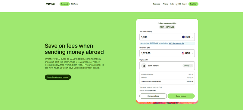
Wise uses a split-screen layout to keep things clean and functional while highlighting its main selling points. On the left, bold text and a simple message explain their core service, while the right side features a clear call to action. This dual approach immediately addresses two common user needs: understanding the service and taking action, all within a balanced and easy-to-digest visual space.
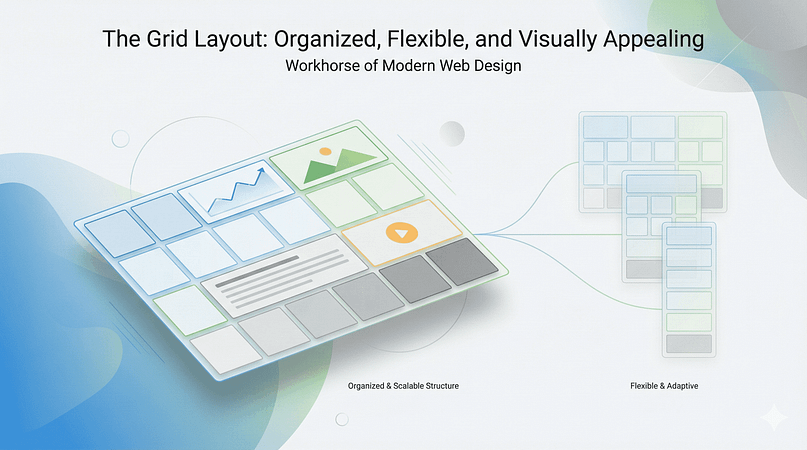
5. The Grid Layout: Organized, Flexible, and Visually Appealing
The grid layout is the workhorse of modern web design. It's built on a foundation of rows and columns, creating a highly organized and scalable structure. Think of it like a neatly arranged gallery or a well-indexed library. This layout is fantastic for showcasing a large amount of diverse content in a way that feels structured and easy to digest, even if you’re just quickly scanning.
Why This Layout Works
The grid layout appeals to our innate desire for order and predictability. It makes content scannable and helps users quickly identify what they're looking for. Because it’s inherently modular, it adapts beautifully to different screen sizes, making it a champion of responsive web design. Plus, it gives designers immense flexibility to create visual rhythm and hierarchy by varying the size and placement of individual grid items.
Best Use Cases for Grid Layout:
- Portfolio Websites: Display multiple projects or pieces of work in an organized gallery.
- E-Commerce Stores: Showcase product categories or individual products.
- Blogs & News Sites: Present articles, images, and videos in a digestible format.
Real-World Examples:
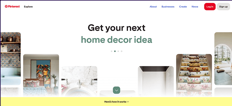
Pinterest is the quintessential example of a grid layout. Its entire platform is built on an infinitely scrolling grid of "pins," each representing an image or video. This allows users to quickly scan vast amounts of content, discover new ideas, and easily click through to explore further. The varying sizes of pins add visual interest while maintaining an underlying sense of order.
Behance
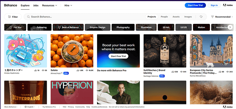
Behance, a platform for creative professionals, uses a grid layout to showcase portfolios. It allows artists and designers to display their projects in a clean, visually driven format. The grid makes it easy for visitors to browse diverse creative work, click on projects that catch their eye, and explore the details.
6. The Single-Page Layout: Concise, Focused, and Direct
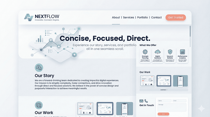
The single-page layout, sometimes called a "one-page website," presents all its content on a single, continuously scrolling page. Instead of navigating through multiple pages, users simply scroll down to find different sections like "About," "Services," "Portfolio," and "Contact." It’s like a well-structured presentation where each slide flows seamlessly into the next.
Why This Layout Works
This layout is fantastic for telling a focused story or presenting a specific offering without distractions. It simplifies navigation, making it incredibly intuitive for users, especially on mobile devices where scrolling is second nature. It also creates a strong sense of narrative flow, guiding visitors through your message in a controlled sequence. For businesses with a clear, singular message, it can be incredibly effective at driving conversions.
Best Use Cases for Single-Page Layout:
- Landing Pages: Perfect for campaigns with a single goal (e.g., sign up, download, purchase).
- Personal Portfolios: Showcase a concise body of work and contact info.
- Small Business Websites: For services or products that don't require extensive sub-pages.
Real-World Examples:
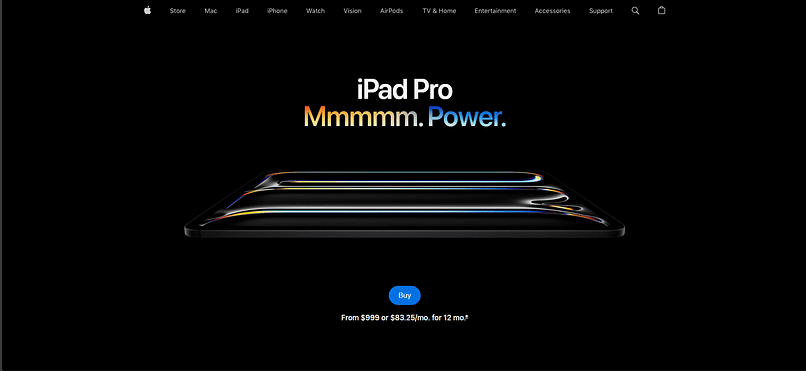
Apple Product Pages
While Apple's main site is multi-page, their individual product pages often function like single-page layouts. They tell a complete story about a product – from features to specs to purchasing options – all on one long, beautifully designed scroll. This allows them to control the narrative and highlight key selling points in a sequential, immersive experience.
7. The Asymmetrical Layout: Dynamic, Modern, and Eye-Catching
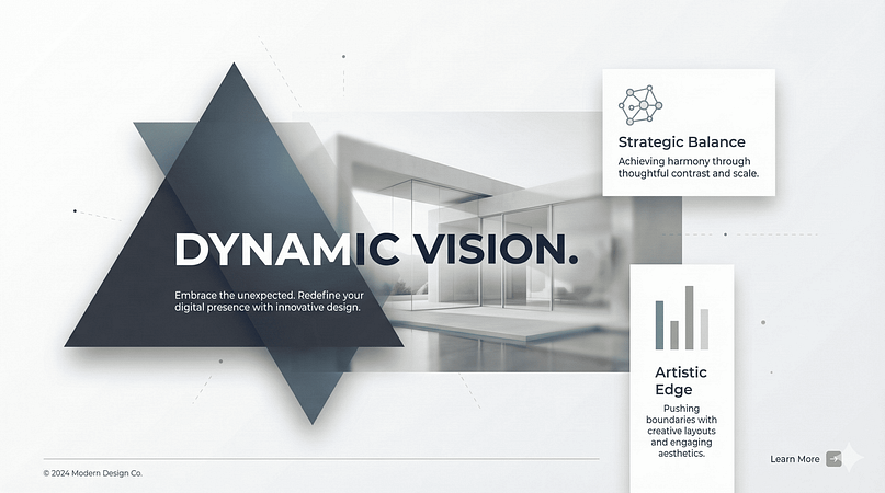
If the grid layout is about perfect balance, the asymmetrical layout is about dynamic tension. It intentionally uses uneven distribution of elements, sizes, and white space to create visual interest and direct attention. Instead of mirroring elements, it balances them through contrast, color, and scale, resulting in a design that feels modern, artistic, and anything but boring.
Why This Layout Works
Asymmetrical layouts are inherently more engaging because they break predictability. They challenge the eye to find balance, making the viewing experience more active and memorable. When executed well, they can convey creativity, innovation, and a bold brand personality. It's a fantastic way to make your site stand out from the crowd and leave a lasting impression.
Best Use Cases for Asymmetrical Layout:
- Creative Portfolios: Designers, artists, or photographers looking to showcase their unique style.
- Fashion & Lifestyle Brands: Conveying a modern, edgy, or artistic brand identity.
- Agencies & Studios: Highlight creativity and innovative thinking.
Real-World Examples:
Many Modern Agency Websites
Many creative agencies and design studios use asymmetrical layouts to immediately communicate their innovative approach. They might feature a large, off-center image balanced by smaller text blocks or an unusual navigation placement, all contributing to a dynamic and unique user experience.
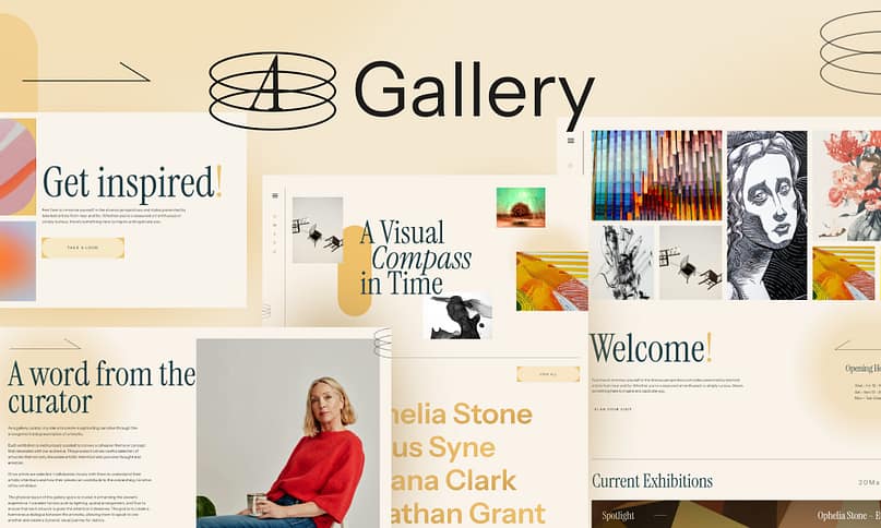
Gallery theme, one of our very own from Thrive Themes, uses a dynamic and artistic layout that feels fluid and engaging. The mix of floating images, layered typography, and subtle animations creates a visually rich experience that feels more like an art exhibition than a typical website.
8. The Magazine Layout: Rich, Diverse, and Content-Heavy
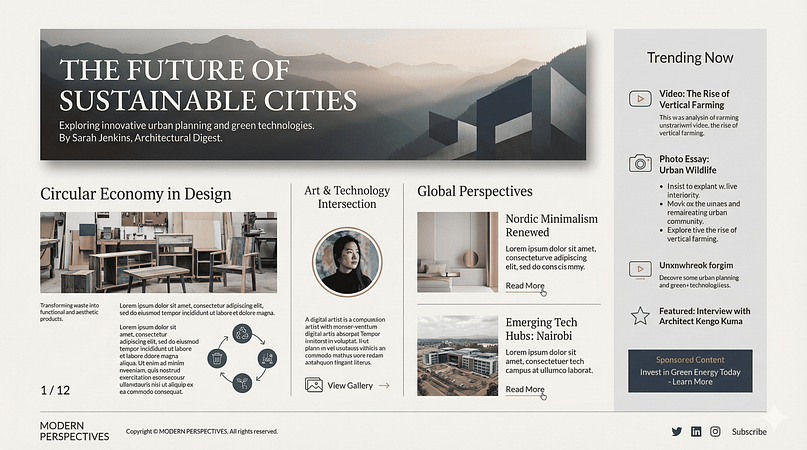
The magazine layout, sometimes called a "editorial layout," is designed to handle a large volume and variety of content – articles, images, videos, ads – all on a single page. Much like a physical magazine, it uses multiple columns, varying font sizes, and distinct content blocks to create a rich, engaging, and highly browsable experience. It’s about presenting a lot of information without feeling overwhelming.
Why This Layout Works
This layout is perfect for content-rich websites because it allows users to quickly scan headlines, glance at images, and dive into articles that pique their interest. It offers a sense of discovery, encouraging exploration rather than linear consumption. The varied visual elements prevent monotony and keep the user engaged, making it ideal for sites where content consumption is the primary goal.
Best Use Cases for Magazine Layout:
- Online Magazines & News Portals: Displaying multiple articles, categories, and featured content.
- Blogs with Diverse Topics: Presenting various posts, authors, and media types.
- Content Hubs: Organizing a vast library of resources, guides, and articles.
Real-World Examples:
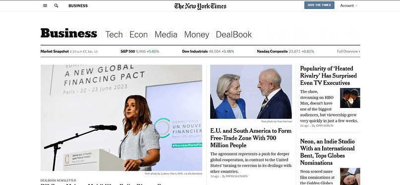
The New York Times Online
The New York Times website is a classic example of a magazine layout. It skillfully balances breaking news, feature articles, images, and advertisements across multiple columns and sections. Users can quickly scan headlines, see prominent stories, and delve into areas of interest, all while maintaining a clear sense of hierarchy and organization.
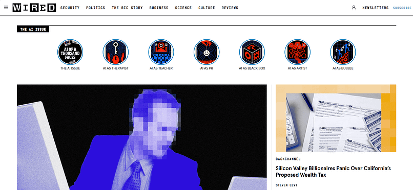
WIRED
WIRED magazine's online presence uses a dynamic magazine layout to present its tech and culture content. It features a mix of large hero articles, smaller trending stories, and diverse media, all arranged to encourage exploration and discovery. The layout feels modern and engaging, perfectly suiting its audience.
The F-pattern works great for content hubs, too, and that's a fantastic way to keep visitors engaged. Placing key categories, featured posts, and CTAs along the natural reading flow makes it easy for users to find what they need and explore more.
9. The Card-Based Layout: Modular, Flexible, and Mobile-Friendly
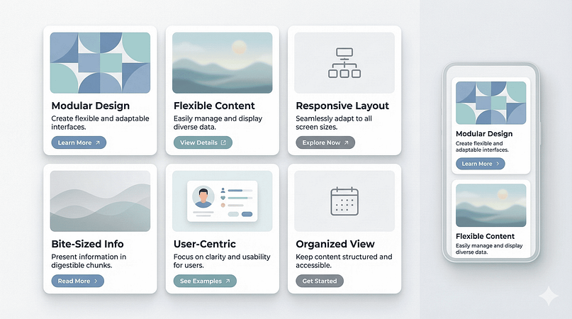
The card-based layout organizes content into distinct, self-contained "cards" that are easy to scan and interact with. Each card typically contains a bite-sized piece of information – an image, a title, a short description, and sometimes a call to action – making it highly modular and adaptable. Think of it like a deck of digital index cards, each with its own story.
Why This Layout Works
Cards are incredibly intuitive. They naturally chunk information into digestible pieces, reducing cognitive overload and making content easy to scan. This modularity also makes them inherently responsive, as cards can simply reflow or stack on smaller screens. They're excellent for presenting diverse content types (articles, products, profiles) in a consistent and visually appealing manner, fostering a sense of discovery.
Best Use Cases for Card-Based Layout:
- Social Media Feeds: Pinterest, Twitter, Facebook all use card-based designs.
- E-Commerce Product Listings: Displaying multiple products with images, prices, and quick info.
- News & Blog Archives: Presenting articles in an easily browsable format.
Real-World Examples:
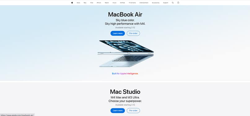
Apple
Apple’s website leans into a cards layout to keep things clean, structured, and easy to scan. Each product section is designed as a separate "card," with a bold image, short description, and clear call-to-action buttons.
This approach makes it easy for visitors to digest key details without feeling overwhelmed. The layout stacks cards vertically, using generous white space to keep the focus on the products. Each card feels like its own spotlight moment, making the browsing experience smooth and visually engaging. It’s simple, effective, and very Apple.
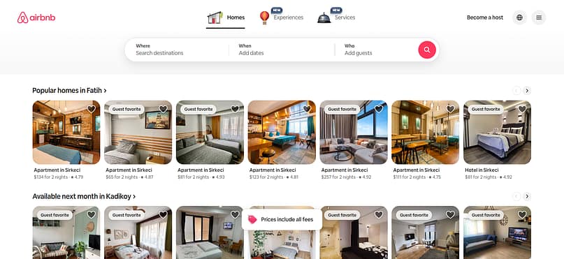
AirBnB
Airbnb’s card-based layout makes browsing feel like a fun, seamless experience. Each listing pops with high-quality images, clear pricing, and guest ratings, so you can quickly spot the perfect stay. The horizontal scrolling keeps things moving, letting you explore dreamy destinations without clicking through endless pages. At the top, categories and filters make it easy to jump straight into whatever vibe you’re after—beachfront views, cozy cabins, or design-forward spaces. It’s a smooth mix of function and inspiration, making trip planning feel effortless and exciting.
10. The Featured Image/Hero Section Layout: Bold, Impactful, and Direct
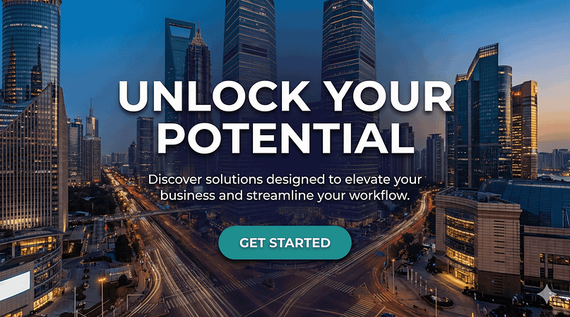
This layout dedicates the top portion of a webpage to a large, prominent image or video, often accompanied by a concise headline and a clear call to action. It’s designed to make an immediate impact, grab attention, and communicate your core message or offering right away. Think of it as the billboard of your website.
Why This Layout Works
A strong hero section immediately establishes the mood and purpose of your site. It leverages the power of visual communication to convey complex ideas quickly and emotionally. By placing the most critical information (your value proposition and primary CTA) front and center, it minimizes distractions and guides visitors toward their next step, making it excellent for conversion-focused pages.
Best Use Cases for Featured Image/Hero Section Layout:
- Product & Service Pages: Introduce a key offering with a compelling visual.
- Company Homepages: Establish brand identity and primary value proposition.
- Landing Pages: Drive specific actions like sign-ups, downloads, or purchases.
Real-World Examples:
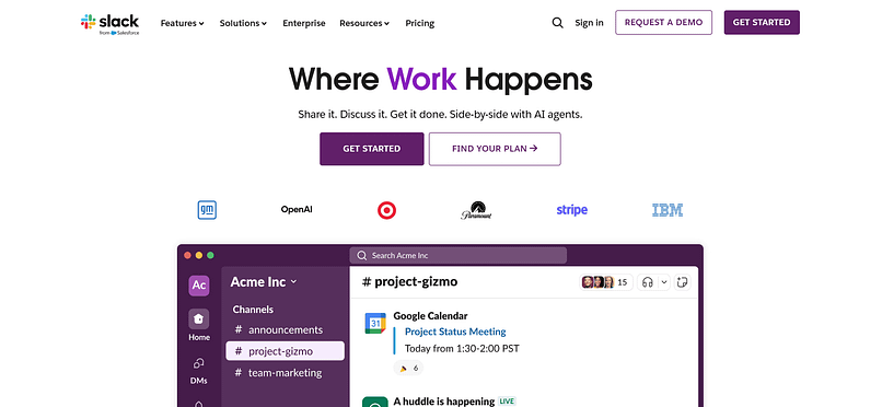
Slack
Slack's homepage often features a vibrant, illustrative hero image showcasing people collaborating, paired with a bold headline about team communication and a clear "Try for free" button. This immediately communicates their value proposition and encourages action.
11. The Sidebar Layout: Supportive, Navigable, and Information-Rich
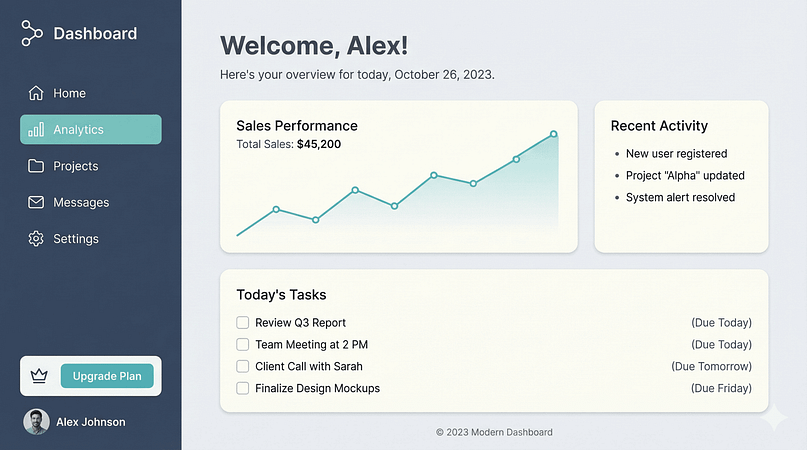
The sidebar layout features a main content area alongside a distinct vertical column (the sidebar), typically on the left or right. This sidebar is often used for navigation, supplementary information, advertisements, or calls to action that remain accessible regardless of where the user is on the main content.
Why This Layout Works
The sidebar provides persistent access to important elements without cluttering the main content area. It's particularly useful for websites with a lot of secondary information or complex navigation structures. It helps users orient themselves and quickly jump to related content or tools, enhancing overall usability and information architecture.
Best Use Cases for Sidebar Layout:
- Blogs: Display categories, recent posts, author bios, or social media links.
- Documentation & Knowledge Bases: Provide a table of contents or related articles.
Real-World Examples:
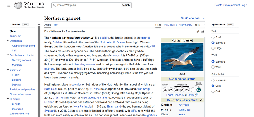
Wikipedia
Wikipedia uses a left-hand sidebar for its main navigation, including links to different languages, tools, and community portals. This ensures that users can always access the site's core functionalities while reading an article.
12. The Boxed Layout: Structured, Focused, and Classic
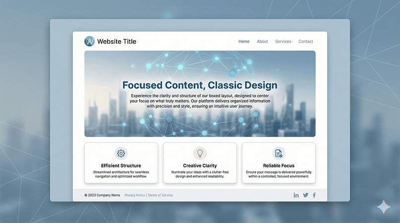
A boxed layout confines the main content of the website within a central container, leaving a distinct background visible on either side. It's a classic design choice that creates a clear boundary for your content, making it feel contained and focused.
Why This Layout Works
The boxed layout creates a strong sense of visual hierarchy, drawing the eye directly to the content. It can feel more traditional and formal than a full-width layout, which might be desirable for certain brands. It also provides a consistent reading width, which can improve readability, especially for text-heavy sites. The background outside the box offers an opportunity for subtle branding or visual interest without distracting from the main message.
Best Use Cases for Boxed Layout:
- Corporate Websites: Conveying professionalism and a structured approach.
- Blogs & News Sites: Providing a focused reading experience.
- Educational Institutions: Presenting information clearly and authoritatively.
13. The Full-Width Layout: Immersive, Modern, and Expansive
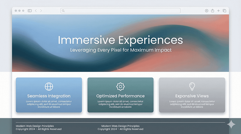
In contrast to the boxed layout, the full-width layout stretches content across the entire width of the browser window. It leverages every pixel available, creating an expansive and often immersive experience. This design choice is popular in modern web design, especially with high-resolution monitors becoming standard.
Why This Layout Works
The full-width layout creates a sense of spaciousness and modernity. It allows large images and videos to truly dominate the screen, making a powerful visual impact. For sites with minimal text and strong visual content, it can be incredibly engaging, drawing the user deeper into the experience. It feels contemporary and can make a website feel more dynamic and less constrained.
Best Use Cases for Full-Width Layout:
- Photography & Art Portfolios: Maximize the display of visual work.
- E-Commerce Stores: Showcase products with large, detailed images.
- Creative Agencies: Convey a modern, cutting-edge brand image.
14. The Fixed Navigation Layout: Always There, Always Helpful
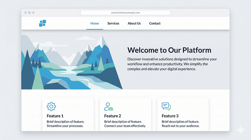
A fixed navigation (or "sticky header") layout ensures that the main navigation menu remains visible and accessible at the top (or sometimes side) of the screen, even as the user scrolls down the page. It "sticks" in place, providing constant access to key links.
Why This Layout Works
This layout significantly improves user experience by eliminating the need to scroll back up to find the menu. It's particularly useful for long pages or content-heavy sites where users might lose their place. By keeping navigation ever-present, it reduces friction, makes exploration easier, and can lead to higher engagement and conversion rates.
Best Use Cases for Fixed Navigation Layout:
- Long-Form Articles & Blogs: Allows users to jump to other sections or articles easily.
- E-Commerce Sites: Keeps shopping cart, account links, and categories always available.
- Web Applications: Provides constant access to core features and user settings.
Real-World Examples:
Google Docs/Sheets
In web applications like Google Docs, the menu bar remains fixed at the top, providing constant access to file operations, editing tools, and sharing options, regardless of how far down you scroll in your document.
15. The Masonry Layout: Organic, Dynamic, and Visually Engaging
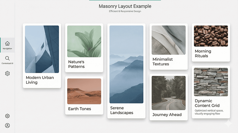
The masonry layout is a grid-based design where items of varying heights are arranged compactly, like stones in a masonry wall. Unlike a traditional grid that forces all items into uniform rows, masonry optimizes the vertical space by fitting items together based on their actual height, minimizing gaps.
Why This Layout Works
This layout creates a visually rich and organic feel, making the page appear less rigid and more dynamic. It's excellent for showcasing content with diverse aspect ratios (e.g., images of different sizes). The continuous flow encourages endless scrolling and discovery, making it highly engaging for visual content. It also makes efficient use of screen real estate.
Best Use Cases for Masonry Layout:
- Image Galleries & Portfolios: Displaying photos and artwork of various dimensions.
- Blogs with Mixed Media: Articles, videos, and images presented together.
- E-Commerce Product Showcases: Highlighting products with different image sizes.
Real-World Examples:
Pinterest is the ultimate example of a masonry layout. Its "pins" (images, videos, articles) are arranged in a dynamic grid, with items of different heights fitting together seamlessly. This creates an endless, visually stimulating feed that encourages users to keep scrolling and discovering.
Behance (some sections)
While Behance primarily uses a standard grid, some of its project displays or curated collections might lean into a masonry-like arrangement to showcase diverse project visuals more organically.
16. The Horizontal Scroll Layout: Unique, Interactive, and Immersive
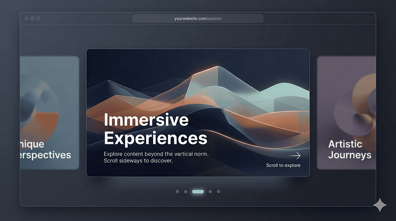
Breaking away from the vertical norm, the horizontal scroll layout requires users to scroll sideways to navigate through content sections. This can be implemented for an entire page or for specific sections within a vertically scrolling page. It’s a bold design choice that offers a distinct, often artistic, user experience.
Why This Layout Works
Horizontal scrolling can create a highly immersive and interactive experience, especially for visual storytelling or presenting sequential content. It feels unique and can make a website memorable. When used strategically, it can guide users through a narrative or a series of visual elements in a controlled, almost cinematic way. It's particularly effective for showcasing large, panoramic images or a series of distinct, but related, items.
Best Use Cases for Horizontal Scroll Layout:
- Creative Portfolios: Presenting a series of projects or artwork in a gallery format.
- Brand Storytelling: Guiding users through a company's history or a product's features.
- Product Showcases: Displaying different angles or variations of a product.
Real-World Examples:
Many Modern Photography & Design Portfolios
Some cutting-edge portfolios use horizontal scrolling to present a series of large images or design projects, creating an art gallery-like experience.
Tools and Resources for Designing Your Website Layout
You don't need to code any of this. My working setup, and what I'd point you to:
- For planning: Figma is my favorite for sketching layouts and wireframes before building; free and browser-based.
- For building on WordPress: Thrive Architect is what I use daily; every layout in this article is drag-and-drop buildable with it, and Thrive Theme Builder handles the site-wide pieces (headers, footers, blog templates).
- For inspiration with a UX backbone: Awwwards and Behance for visual ideas, and Nielsen Norman Group when you want research-backed answers.
That's genuinely the whole toolkit. More tools mostly means more decisions between you and a finished website.
Tired of Layout Limitations? Meet Thrive Suite.
You've got the vision for a website that truly connects with your audience, but are your tools holding you back? I've seen too many brilliant ideas get watered down because the platform couldn't keep up. That's why I'm such a proponent of Thrive Suite.
It's not just a page builder; it's a complete ecosystem designed to help you build a website that converts. Imagine being able to:
- Visually sculpt any layout we've discussed today – from a dynamic Z-pattern landing page to an immersive full-width hero section – all without a single line of code.
- A/B test different layouts and elements to see what truly resonates with your visitors and drives action.
- Create engaging quizzes, courses, and scarcity campaigns that seamlessly integrate with your chosen layout, pushing visitors further down your conversion funnel.
Thrive Suite gives you the strategic control you need to not just design a website, but to build a powerful marketing machine. It's about turning those layout ideas into tangible results.
Ready to build a website that performs?
Explore Thrive Suite and see how it can transform your website strategy.
Frequently Asked Questions About Website Layouts
I often get asked about the practicalities of website layouts, so I've put together answers to some common questions to help clarify things even further.
What is a website layout?
A website layout is the structural arrangement of everything on a webpage: text, images, navigation, and calls to action. It's the blueprint that decides where visitors look first and how they move through your content.
What are the main types of website layouts?
Most layouts fall into five families. Reading-pattern layouts (Z-pattern, F-pattern) follow how eyes move. Visual-impact layouts (fullscreen, hero section, full-width) lead with imagery. Structured layouts (grid, cards, masonry, magazine, boxed) organize volume. Navigation-driven layouts (single-page, sidebar, fixed nav) guide the journey. And bold layouts (split-screen, asymmetrical, horizontal scroll) break convention on purpose. The quick-reference table above names all 16.
What is the most common website layout?
The hero section over a Z-pattern, with a fixed navigation bar, is the closest thing the modern web has to a default, especially for business sites. It's common because it works. You get a clear first impression, a natural reading flow, and an action that stays within reach.
How do I choose the best website layout for my business?
Match the layout to your audience, content, and goal rather than to trends. Scanners get F-patterns and cards, visual brands get fullscreen and full-width, and conversion-focused pages get Z-patterns and single-page layouts. The five-question checklist earlier in this guide walks you through it.
Can ChatGPT design a website layout?
It can suggest one, and honestly, it's decent at telling you which pattern fits your situation. What it can't do is build the page, judge the result against your brand, or notice that your hero feels slightly off. My take, as someone who builds layouts every week, is to let AI help you narrow the options, then build with a visual tool where you can see and adjust the real thing.
How does website layout affect SEO and user experience?
Layout shapes the engagement signals that correlate with rankings: time on page, bounce rate, and scroll depth. It also decides whether visitors find what they came for, and a clean structure helps search engines parse your content hierarchy. I think of layout as UX first and SEO second, because the second tends to follow the first.
Can I change my website layout without coding?
Yes. Page builders like Thrive Architect let you rebuild any layout on this list with drag and drop, and theme builders handle the site-wide templates. Coding is optional for all 16 patterns here.
Final Thoughts on Your Website's Layout
I hope this guide made one thing clear. A layout is a strategic choice as much as a visual one, and every pattern in this list earns its place by guiding visitors somewhere on purpose. The right one for you depends on the answers you gave in the how-to-pick section, not on what's trending on the galleries.
My honest advice is to pick the layout that matches your goal, build a rough version, and let real visitors tell you the rest. I feel strongly about this part, because I've watched too many projects stall at the sketch stage waiting for perfect.
And if you want the toolkit I use to build every layout in this article, from Z-pattern landing pages to full-width heroes, that's Thrive Suite. It bundles the visual builder, the theme builder, and the quizzes and opt-ins, all designed to work together, and it's what I use to turn these ideas into actual pages.
Ready to build a website that truly performs?
If you're serious about turning your website into a strategic asset, one that guides visitors effortlessly and converts them consistently, then you'll want the right tools in your corner. My recommendation? Thrive Suite. It's the complete toolkit for building conversion-focused websites, giving you the power to implement any of these layouts – and so much more – without needing a developer on speed dial.
Discover how Thrive Suite can help you build a smarter, more effective website today.


