Fancy ecommerce landing page designs don’t always equal sales.
I’ve seen it firsthand – beautiful pages with cinematic banners, clever taglines, and pixel-perfect layouts... that barely convert.
I’ve also worked with ecommerce brands that didn’t bother with a polished homepage at all and still pulled in sales like clockwork. Their secret? Not the aesthetic. Not the clever copy. Just conversion-focused landing pages aligned to the sales funnel and obsessively clear about the next step.
But this is something I’ve learned: Over the years, I’ve also seen brands use style strategically; pairing strong design with smart page flow to build profitable ecommerce experiences.
So, breathe. You don’t have to sacrifice beauty to land conversions. You just need clarity on what your landing page is actually for. And in a market where retail ecommerce sales are expected to exceed $4.3 trillion by 2025, every click counts.
So, in this post, we're going to do something different. Instead of a long tutorial, we're opening up the lookbook. We’ll deconstruct real ecommerce landing page examples that are absolutely crushing it—from their product imagery and layout to the tiny trust signals that make all the difference.
Let’s skip the theory and get straight to the inspiration. We'll start with a few quick answers to your most pressing questions, then dive into the examples.
The E-Commerce Answers You’re Looking For — Right Upfront
Before we dive into the visual gallery of e-commerce landing page examples, let's get straight to the point. Here are the quick, high-level answers to the questions every e-commerce owner has.
What are the essential elements of a high-converting ecommerce landing page?
Every great e-commerce page is built on a few core components: a benefit-driven headline that speaks to your customer, stunning product photography or video, a single, unmissable call-to-action (like "Add to Cart"), and powerful trust signals like customer reviews and secure checkout seals.
For a complete breakdown of each component, our guide to the 8 essential sales page elements is the perfect next read.
Do I really need a unique landing page for each product or ad campaign?
Yes, because different traffic has different intent. A visitor from a Google Ad searching for a specific product is ready for a direct offer, while traffic from a Facebook ad might need more persuasion. Creating unique pages ensures your message always matches the visitor's mindset, which is a key principle of our overall landing page strategy.
How do I stop people from leaving my checkout page?
High cart abandonment is often caused by unexpected shipping costs, a complicated checkout process, or a lack of trust signals. The solution is to be transparent with pricing, simplify your forms, and display security badges prominently.
We cover this in-depth in our guide on how to reduce cart abandonment.
Real Ecommerce Landing Page Examples That Are Crushing It
Now, onto the good stuff: Real ecommerce landing pages that are conversion kings (and queens).
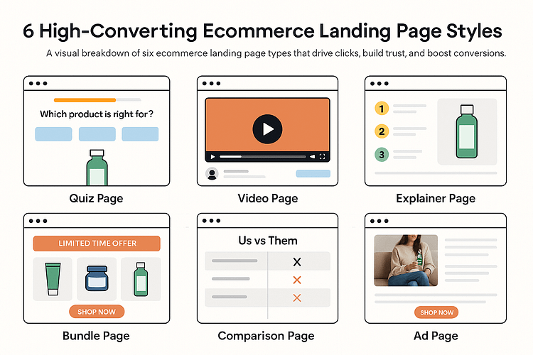
Below are several ecommerce brands doing it right — and not just in one niche. I’m talking cookware, skincare, art supplies, even composters.
To keep the playing field level by only focusing on their homepages as this is one of the most important ecommerce landing pages (and the one lots of business owners get wrong).
From high-ticket offers to artsy products, each one shows a different angle of landing page success and you’ll see how to use the same strategies on your own site.
⚡ Quick Navigation:
Each of these ecommerce landing pages proves that high-converting design isn’t about looking flashy — it’s about flow, clarity, and the right emotional triggers.
Once you understand what makes them tick, you can start adapting these same tactics to your own landing page templates, whether you’re using a visual landing page builder or starting from scratch.
Let’s break them down, one by one.
Type: Sustainability-First Explainer Page
Lomi sells a countertop composter, but they keep the pitch simple. The homepage quickly covers why someone would want this, how it works, and what impact it can make — all without sounding preachy.
There’s a clean hero section, short-form explainer video, before-and-after shots, and a healthy dose of reviews and FAQs. The tone is direct and helpful, making a potentially “weird” product feel mainstream.
✅ Great for: eco brands, home appliances, lifestyle change products
Type: Objection-Handling Product Page
Selling soda that’s actually good for you isn’t easy but Olipop tackles that head-on. Their homepage leads with gut health benefits, natural ingredients, and customer love, not just branding fluff.
Instead of pretending skepticism doesn’t exist, they meet it with transparency: expert endorsements, clinical info, and strategically placed FAQs.
✅ Great for: wellness brands, functional beverages, low-trust niches
Type: Bundle Landing Page
HexClad knows their cookware isn’t cheap — so they lead with value. From the get-go, it’s clear this isn’t your average pan: chef endorsements (hi, Gordon Ramsay), sleek visuals, and bundle-first offers help justify the price.
They smartly layer press features, user reviews, and explainer videos to handle objections before they come up.
Great for: high-AOV products, luxury DTC, bundled offers
Type: Bold, Brand-First Homepage
Death Wish Coffee is unapologetically intense. From its black-and-red color scheme to the punchy messaging (“If you’re not first, you’re last”), everything screams identity.
You get product carousels immediately, not founder monologues. There’s smart use of seasonal promos, press logos for trust, and a membership CTA framed like a club — not just a discount plan.
✅ Great for: bold brands, seasonal promos, identity-based subscriptions
Type: Community-Driven UGC Page
Ohuhu turns every landing page into a mini art gallery. They showcase their markers using customer art, YouTube videos, creator tutorials, and community hashtags.
This makes the brand feel alive. You’re not just buying pens — you’re joining a world of creators. It’s fun, visual, and trust-building without feeling forced.
✅ Great for: creator brands, hobby niches, lifestyle ecommerce
Flower Moxie
Type: Visual Step-by-Step Sales Page
Wedding flowers can be overwhelming, but Flower Moxie takes the pressure off. Their homepage calmly walks you through the process: what’s included, what to expect, and how to get started.
The tone is warm and approachable, with clear steps, gentle nudges, and a smart mid-scroll opt-in form that doesn’t interrupt flow.
✅ Great for: wedding services, event-based ecommerce, curated offers
Type: Story-First Product Experience
Milk doesn’t just sell beauty products — they sell a movement. Their homepage is rich in visuals, short on fluff, and filled with badges like “Clean at Sephora” that instantly build credibility.
Behind-the-scenes reels, creator shoutouts, and bold headlines give you a sense of personality and polish.
✅ Great for: Gen Z-focused brands, values-based commerce, lifestyle beauty
Type: Sensory Brand Showcase Page
Brightland’s homepage is a visual feast. They sell olive oil, but everything about their page — from the colors to the copy — taps into taste, origin, and ritual.
There’s product education, beautiful packaging, and bundle options that feel like thoughtful gifts, not upsells.
✅ Great for: food and beverage DTC, premium sensory brands, gifting
Deep Dive — Real Ecommerce Landing Page Examples and Why They Work
Now that we’ve covered the core strategies, let’s look at how they play out in the wild.
These are real ecommerce landing pages from brands doing it right — not just in theory, but in actual performance. I’ll break each one down with screenshots, highlight what works (and why), and share how you can apply the same tactics in your own landing page design — especially if you’re building with Thrive Architect.
Let’s dig in.
Lomi’s page is a masterclass in the Explainer Page format, a type of landing page designed for innovative products that need a little teaching. It doesn’t just explain what the product is; it shifts how you think about kitchen waste. The entire page is structured like a conversation: inviting, visual, and persuasion-driven.
🔹 Hero Section: Straightforward, Curious, Effective
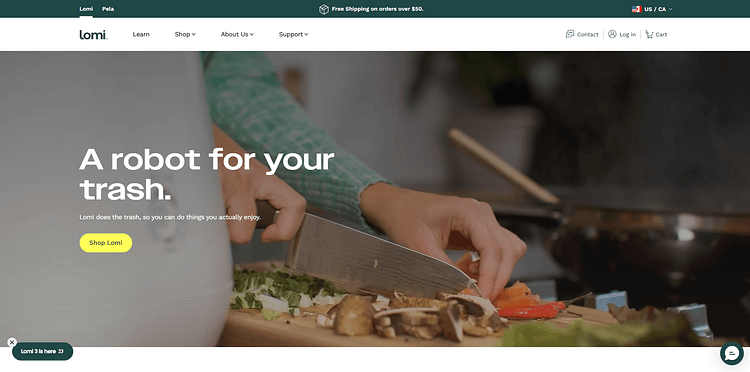
Headline:
“A robot for your trash.”
When I first saw this, I actually paused. It’s bold, memorable, and instantly piques curiosity. You don’t need context — it tells you something new is happening, and you want to know more.
Subheadline:
“Lomi does the trash, so you can do things you actually enjoy.”
This reframes the product around time and freedom — not composting. It’s smart positioning.
Visuals: A motion-based kitchen scene instead of a sterile white-background shot. Hands prepping vegetables, sunlight in the room — it feels lived-in and practical.
CTA: A bold yellow “Shop Lomi” button placed right under the copy. No competing links, no second-guessing. This is what strong ecommerce landing page design looks like — clear path, clear ask.
🔹 How It Works: Benefits First, Features Later

Headline:
“Finally, a garbage disposal without the expensive installation.”
This is where I smiled. It’s not trying to oversell — it answers a very real objection before I can even ask it.
Process Section:
The 3-step flow makes it feel easy:
Each step is paired with simple icons and quick captions. No dense text. Just a visual path to understanding.
💡 This kind of conversion-focused content shows that even new or unusual products can feel approachable with the right structure.
🔹 Social Proof: Specific, Thoughtful, and Targeted
“More than 215,000 happy households.”
That phrasing stood out to me. Not just “customers” or “users” — households. It speaks to families, caretakers, and anyone who runs a kitchen.
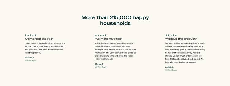
The testimonials that follow are short, honest, and well-positioned:
Each one answers a real concern while adding warmth. It’s not just about trust — it’s about showing how the product fits into real lives.
🔹 Comparison Section: “Why Lomi?” Answered Visually
This section is a clean side-by-side breakdown of Garbage Disposals vs. Lomi, and it does the job with zero exaggeration. Instead of saying “we’re better,” they walk you through:
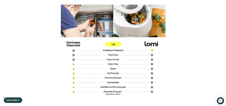
It’s specific and relevant — two qualities I look for in a high-converting landing page.
🔹 UGC Section: Social Proof in Action
“As Seen On @getlomi” pulls in lifestyle content that’s low-key but compelling. You see people using Lomi in real homes — with plants, pets, and busy kitchens. It feels like peeking into someone else’s routine and realizing, I could totally do this too.
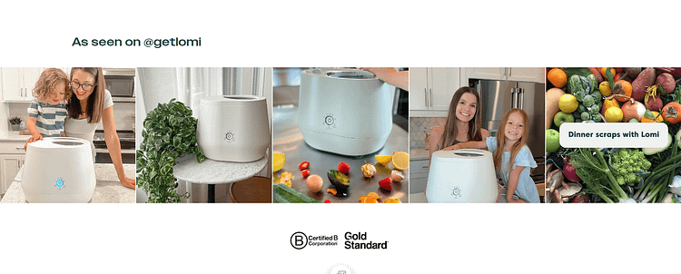
It ends with Certified B Corp and Gold Standard icons — no explanation needed. The placement is subtle but gives an instant trust boost.
What You Can Take from Lomi’s Product Landing Page
If your product is a little unfamiliar or needs a moment to explain, Lomi’s landing page is a perfect example of how to do that without overwhelming people. It's the kind of ecommerce landing page that feels effortless, but clearly took real intention to get right.
Olipop’s product landing page is a perfect example of an Objection-Handling Page. It knows it's selling a "healthy soda," which comes with inherent skepticism. The page is designed to proactively address these objections with transparency and smart copy.
🔹 Hero Section: Lead with Feeling, Not Features
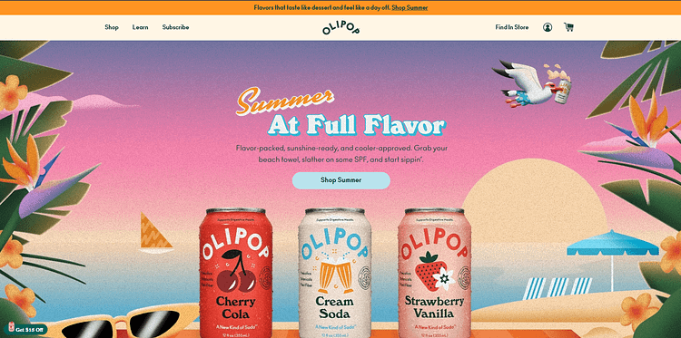
Headline:
“Summer at Full Flavor”
They don’t open with fiber stats or gut health claims. They open with a vibe. This is mood-first copywriting — because if you want to improve your ecommerce conversion rate, you need emotional buy-in before logical arguments land.
Subheadline:
“Flavor-packed, sunshine-ready, and cooler-approved. Grab your beach towel, slather on some SPF, and start sippin’.”
It’s so visual, I could practically hear seagulls and a can cracking open. This kind of ecommerce landing page design draws people in with lifestyle before introducing the product.
CTA:
“Shop Summer” — simple, focused, and right in your eyeline. The button pops with color and doesn’t compete with anything else on the screen. That’s solid landing page UX.
🔹 “Join the Club” – Community as a Conversion Strategy
Just when you think it’s a regular product page, they hit you with:
“Join the Summer Soda Club”
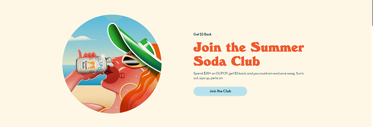
This caught my attention immediately. It’s not a hard sell — it’s an invitation.
The copy is casual, benefit-packed, and layered with micro-conversions:
“Spend $20+ on OLIPOP, get $5 back, and you could win exclusive swag. Sun’s out, sips up, perks on.”
Beyond the fun tone, this is a smart way to collect emails and increase AOV (average order value) — all under the umbrella of brand loyalty.
🔹 Objection Handling? Tactfully Done.
Here’s where I really appreciated their restraint. Instead of leading with “healthy soda” and scaring off the flavor lovers, Olipop waits.
Midway down, they quietly drop this:
“A New Kind of Soda”
With small but powerful bullets: High Fiber. Less Sugar. Delicious Flavors.
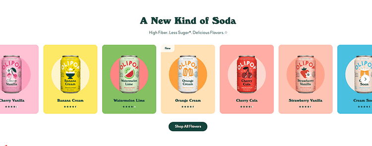
It’s subtle, intentional, and far more persuasive than a full-on nutritional pitch. This is how high-converting landing pages work in health-conscious niches — by removing pressure and building quiet trust. You don't need to overload your page with lines and lines of health-related data. Your audience won't want to read all that.
🔹 Product Grid: Interactive and Instinctive
This section is a masterclass in scrollable ecommerce landing page design. It’s colorful, clickable, and designed for dopamine:

You barely need to read. It’s built for skimming — and it works.
What also stood out to me most was how naturally the calls to action appear. They don’t all shout “Buy Now!” — instead, they meet different visitor types where they are:

That’s the kind of multi-lane funnel strategy most ecommerce brands miss. And it makes the whole product landing page feel effortless.
What You Can Learn from Olipop’s Product Landing Page
If you’re in a space where skepticism is high or differentiation is tricky, Olipop’s ecommerce landing page shows you how to break through without going overboard. You don’t need a hard sell — you need a smart experience.
HexClad’s product landing page iis a perfect example of a Bundle Page, designed to stack value and increase the average order value for a high-ticket product. It knows its cookware isn’t cheap—so it leads with value.
If you’ve ever wondered how to build a high-converting landing page for a big-ticket product, this is your blueprint.
🔹 Hero Section: Lead with the Offer, Not the Ego
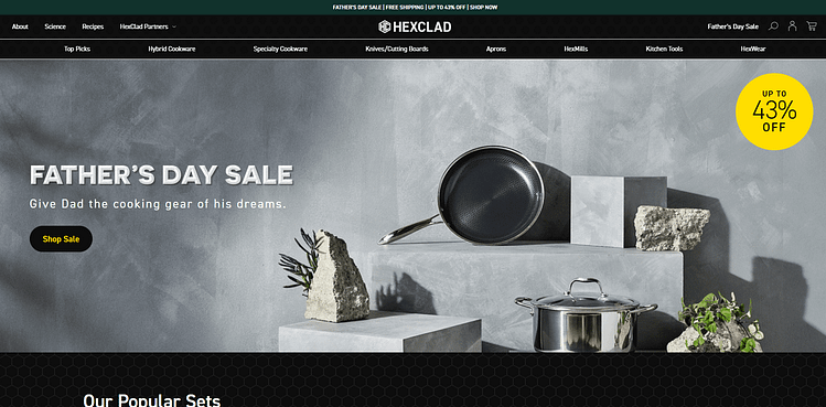
Headline:
*“Father’s Day Sale – Up to 43% Off”*
It’s simple, seasonal, and loaded with urgency. Instead of waxing poetic about craftsmanship or heritage, HexClad gets straight to the point. The background is sleek. The product shines. And that bright yellow discount tag? It practically pulls your eyes down the page.
CTA:
*“Shop Sale”* — you can’t miss it. High contrast, high intent. This is smart ecommerce landing page design: put your strongest value prop front and center.
🔹 Product Showcase: Sleek, Skimmable, Sales-Ready
This section is where the layout earns its stripes. You get:
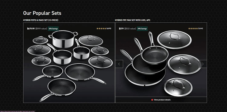
There’s no fluff here. And that’s intentional. When you're selling premium products, confidence comes from clarity — not clutter.
🔹 The Ramsay Effect – Social Proof With Weight
One scroll down and boom — Gordon Ramsay appears. Not in a loud promo video, not in a pop-up, just a well-placed quote:
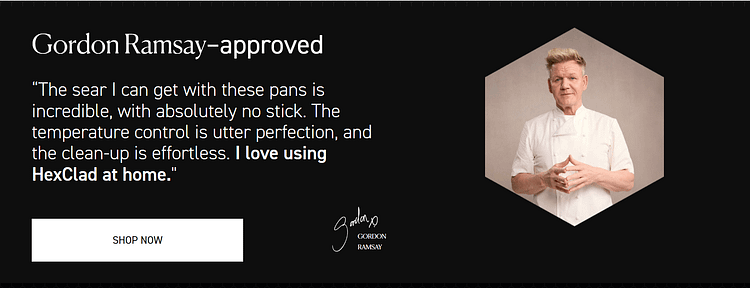
“The sear I can get with these pans is incredible... I love using HexClad at home.”
I thought this was smart. They don’t lean on celebrity just to flex. They treat Ramsay like a trust anchor — giving the quote room to breathe, and then pairing it with another clear CTA. That’s how you use a testimonial as a conversion tool, not just decoration.
Takeaway:
Even if you don’t have a celebrity chef, you do have access to experts in your niche. Get their buy-in, display it tastefully, and let it elevate your credibility.
🔹 Feature Reinforcement Without the Noise
This is where most landing pages would go off-track with too much explanation. HexClad doesn’t.
Instead, they layer trust and value with intention:
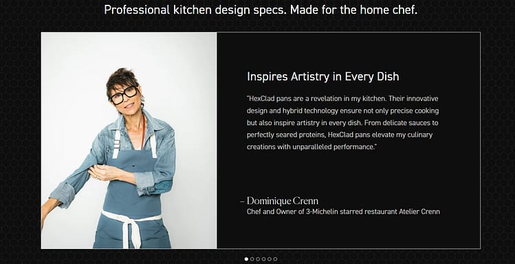
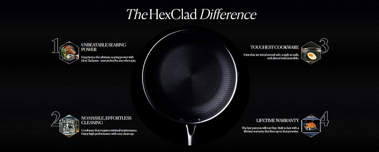
Each section builds on the one before it, like a well-paced argument. That’s landing page UX done right — especially when you're asking people to invest in a high-end product.
🔹 Clean Design That Converts
HexClad’s ecommerce landing page layout feels like walking into a luxury showroom — everything has its place, and nothing fights for attention. You don’t scroll endlessly. You move steadily toward a purchase.
This is one of the best examples of a landing page template optimized for conversion and brand perception.
Why This Page Works So Well
What You Can Borrow for Your Own Funnel
If you’re building an ecommerce landing page for a high-ticket offer, remember:
You don’t need bells and whistles to sell something expensive. You just need intention in every pixel — and HexClad nails it.
Milk Makeup doesn’t sell products. They sell a point of view. Their ecommerce landing pages lead with energy, emotion, and expression — and the moment you land, you feel it. From the loud, text-first hero (“LONG-LASTING HYDRATION”) to the vibrant product visuals, every element is intentionally built for speed, scrollability, and style.
Hero Section: Visually Loud, Strategically Smart
I thought the opening was especially bold — a full-screen statement that doesn’t waste time trying to impress with cleverness. It just says it: Long-Lasting Hydration.
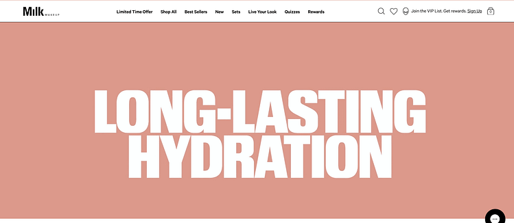
Right below? “Quench Your Lips.” A new product drop (the Balmdade Electrolyte Lip Balm), paired with a clean CTA: Shop Now.
This setup hits several landing page design wins:
Product Grid: Show, Then Tell
Instead of easing you in, Milk dives straight into their product lineup. The grid is crisp and skimmable. I liked how they labeled standout products (“New Drop,” “Award Winner”) and kept descriptions minimal but clear.
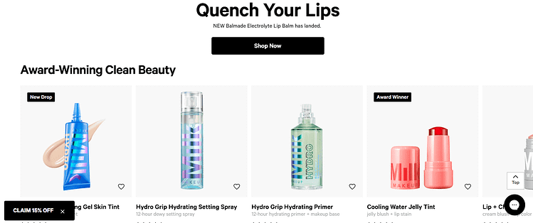
It’s very “buy it if it fits your vibe” — a perfect fit for a customer who doesn’t want to read five paragraphs before Browse. It’s also a quiet lesson in conversion-first UX:
Soft Brand Story, Placed Strategically
Instead of leading with a founder bio or mission statement, Milk places their “why” after you’ve seen what they sell. Smart move. It reads like a natural pause between scrolls — not a detour.
The tone is just as intentional:
“We believe it's not about how you wear your makeup, it's what you do in it — and how you Live Your Look® — that matters.”
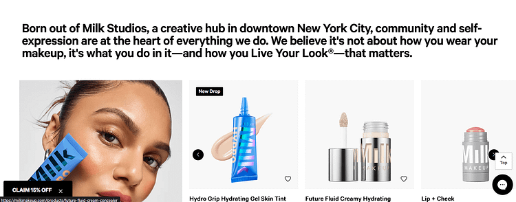
I love this because it turns self-expression into a shared value, not just a brand pitch. It also avoids the usual startup clichés and instead feels rooted in culture.
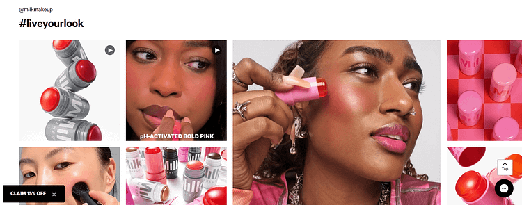
Social UGC Feed: Live Your Look in Action
Scroll a bit further and you hit the real conversion accelerator — a grid of diverse, stylish users applying the products. This isn’t just social proof. It’s aesthetic alignment.
Each image and video reinforces the product promise: bold, clean beauty that looks good on real people. You’re not being told what to expect — you’re seeing it. Plus:
Smart Mobile Experience: Built to Convert on the Go
Everything — from sticky “Add to Bag” buttons to variant-swapping previews — screams built for mobile commerce. No pinching. No confusion. No lag. It’s fast, fluid, and joyful to browse.
Why This Page Converts
What You Can Learn from This Page
If you sell visual products to a Gen Z or millennial audience, Milk’s ecommerce landing page is the blueprint. It’s cool without trying too hard. Clear without being boring. And built for a user who doesn’t just shop — they scroll, tap, and share.
This isn’t your standard coffee landing page — and that’s exactly the point. Death Wish Coffee leans into its brand identity with zero apologies. From the moment you land, you know what kind of experience you’re in for: loud, intense, and caffeine-fueled. And surprisingly? That sharp aesthetic doesn’t get in the way of conversion — it enhances it.
A Bold Hero with a Split Personality
The first thing that caught my eye was the black-and-red color palette. It’s confident, rebellious, and fully on-brand. In an ecommerce world obsessed with minimalism and white space, this felt like a refreshing punch in the face — in a good way.
Their hero is actually a 2-slide carousel, which I thought was really smart:
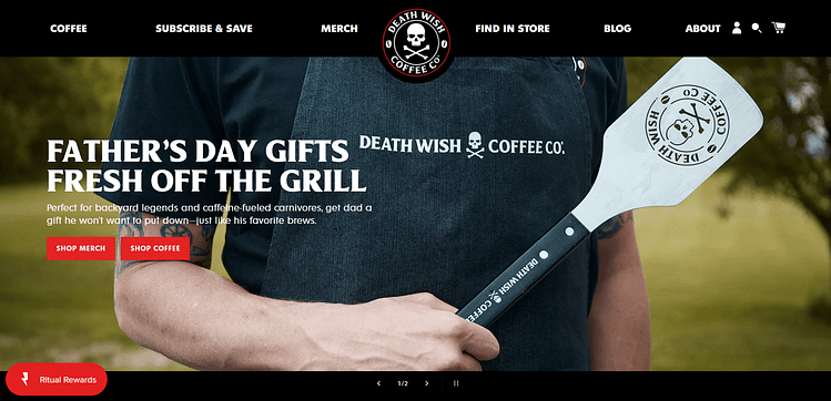
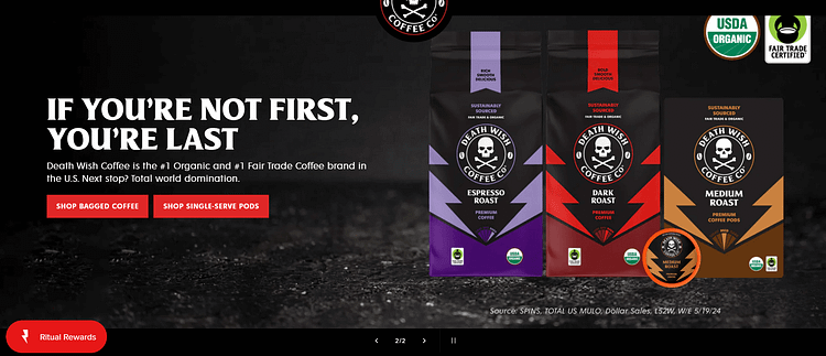
👉 Lesson: If your product has personality, lead with it. Don’t water it down with overly safe design.
Product Grid, Fast. No Storytime First
What I liked here is that they don’t force you to scroll through a founder’s note or a sustainability manifesto before showing what’s for sale. It jumps straight into a dynamic "New Arrivals" carousel, and every product image pops off the black background with serious contrast.

From a UX perspective, this is great for product-led ecommerce. You’re not guessing what they sell. You’re instantly skimming mugs, gear, and gifts — perfect for gift buyers or repeat fans.
Social Proof Section: Simple, Powerful, and Tastefully Placed
A little further down, there’s a “Featured On” bar with logos from BuzzFeed, Goop, Trendhunter, etc. It's not flashy — and that’s what makes it work. It says, “We’ve been vetted. You’re not the first. You won’t be the last.”

No review wall. No aggressive name-drops. Just subtle authority placement that backs up the vibe.
Membership = Retention Play (But Framed as Identity)
Then comes one of my favorite moves on this page — the Society of Strong Coffee section. Instead of “Subscribe and save,” it’s:
“JOIN THE SOCIETY. Subscribe and save 30%.”
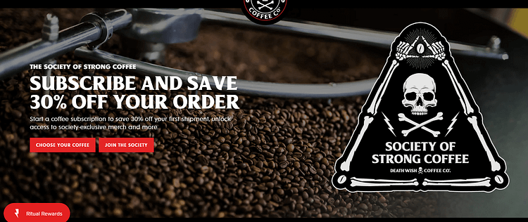
It’s a simple subscription CTA, but it feels like joining a club — and the visual branding supports that. You get a sense of exclusivity and belonging, not just a discount.
I thought this was a neat way to transition from one-time buyer to recurring customer. It’s not aggressive. It’s identity-based.
What Makes This Page Convert?
Steal This For Your Store If…
This page doesn’t try to be everything to everyone. It’s unapologetically niche — and that’s what gives it power. The structure is conversion-focused, the voice is clear, and the design says “we know our audience” in every pixel.
If you’re looking for a landing page that sells hard without feeling forced, Death Wish Coffee is a killer example.
Ohuhu's page is a brilliant execution of a User-Generated Content (UGC) Page. It sells art supplies to a creative community, and its page is a living gallery of customer art, videos, and tutorials.
True story: I bought my first Ohuhu marker set after seeing them pop up in multiple TikTok coloring videos. At first, I didn’t think much of it — just another art supply going viral. But I clicked through one day, landed on their site… and well, a few months later, I’m the proud owner of a 320-pack of alcohol-based markers.
No regrets.
The colors? Incredible. The site experience? Warm and intentional. I didn’t just feel like a buyer. I felt like I was joining an elte company of hobby artists (yes, it was that serious).
This is exactly what Ohuhu does best: they make you feel like you're not just purchasing tools — you're becoming part of a creative community.
🎨 A Hero Section That Feels Like a Celebration
The landing page bursts onto the screen — bright yellow background, playful typography, cartoon mascots with birthday hats, and a banner that proudly says:
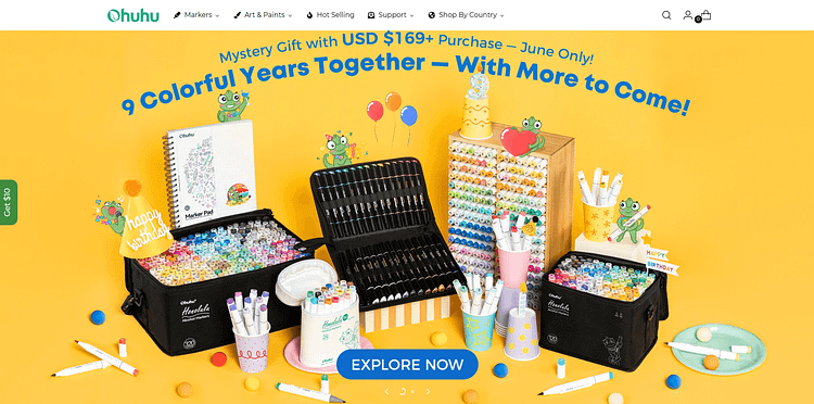
“9 Colorful Years Together — With More to Come!”
There’s a sense of pride and playfulness here, like you're being invited to a party, instead of a product page. It's also solid established authority. They've been in the game for 9 years which means their products are worth checking out.
The CTA is unmissable: “Explore Now.”
And what’s clever is how they lead with their product front and center — you immediately see the full range of Ohuhu’s art markers, cases, accessories, and paper. No confusion about what they sell. No need to scroll for answers.
Clean Category Grid for Fast Browse
Ohuhu has a huge product catalog, but it never feels overwhelming. Their homepage includes a visually organized “Category” grid:
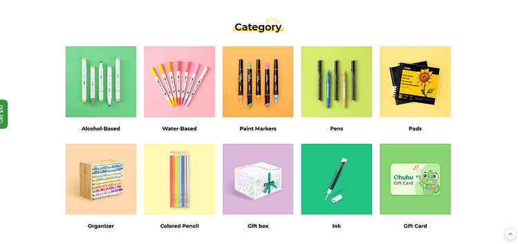
Each tile uses a pastel background and crisp photography — no over-design, no wasted space. Just: here’s what we have, click and go. I thought this was smart, especially since art supply shoppers tend to know what medium they need.
Top Sellers, No Guessing Required
Further down, they showcase their bestsellers — and again, it’s clean, intentional, and conversion-minded.
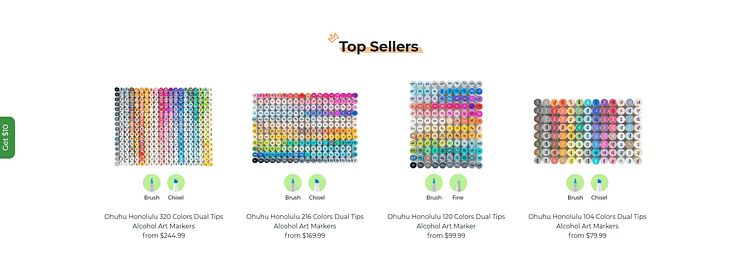
You get flat lays of marker tops organized by color, with quick visual cues like “brush tip” or “fine tip” symbols and clear pricing. You don’t need to read to shop. That’s great UX for visual learners (like, well, most of us in creative fields).
🛡 Trust Signals That Actually Work
Further down, you’ll spot key trust-builders placed with intention:

Who would say no to that?
I appreciated how these weren’t hidden in the footer or forced into the checkout flow. They’re part of the Browse experience — there to reduce anxiety before it even shows up.
A Real Community That Buys and Builds
Now here’s where they really shine. Ohuhu’s customer base isn’t just a pool of buyers — it’s a full-blown artist community.
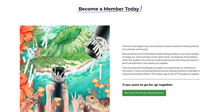
They even say: “We wanted everyone to be able to enjoy these pockets of bliss.”
You can tell this wasn’t written by a marketing automation tool. It’s brand voice with heart.
And as someone who did get pulled in by UGC, I can say: this stuff works. I didn’t land on this site looking to buy 300+ markers. But here we are.
What You Can Learn from Ohuhu’s Landing Page
Ohuhu’s page is proof that even if your niche is "just markers," you can scale — if you lead with clarity, community, and joy.
Planning a wedding is chaos. I say this as someone who’s been a bridesmaid more than once — it doesn’t matter how organized you think you are, florals always seem to teeter on the edge of meltdown.
Flower Moxie knows that — and instead of tiptoeing around it, they lean in.
Their landing page doesn’t whisper promises of “elegant arrangements” and fade into pastel minimalism. No. It kicks down the door like your loudest, most capable bridesmaid — the one who shows up with a clipboard, snacks, and absolutely zero patience for overpriced peonies.
They’re not just selling flowers. They’re selling the ultimate vibe: “I got you.”
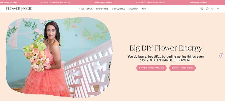
1. A Hero Section That Calms the Chaos and Calls You In
The top of the page hits you with unapologetic attitude:
“Big DIY Flower Energy.”
And beneath that, a rallying cry:
“You do brave, beautiful, borderline genius things every day. YOU CAN HANDLE FLOWERS!”
I loved this. It instantly reframes the buyer’s anxiety.
This isn’t about whether you’re ready — it assumes you already are and gives you exactly two clear next steps:
There’s no hand-holding. No condescension. Just empowerment and clarity.
👉 Takeaway for your own landing page: If you know your audience is stressed, don’t add to it by making them choose from 14 nav options. Show them you see them — then hand them the action button.
2. Visual Product Displays That De-Risk the Purchase
Let’s be honest: DIY florals sound amazing until you're panicking over colors and wondering if “terracotta” is closer to orange or pink.
Flower Moxie removes all that friction with stunning, real-world visuals.
These aren’t overly stylized product shots on sterile backdrops. You see:
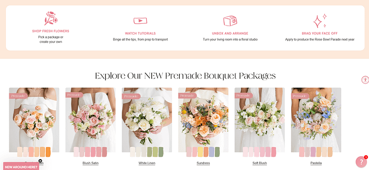
And each one comes with:
I thought this was really smart — especially the color swatches. It cuts down decision fatigue fast. And that’s crucial when your customer is planning a literal life event.
👉 Try this: Show your product in its intended environment. Add tags like “Best For: Budget Brides” or “Last-Minute Friendly” to help people self-select without second-guessing.
3. Soft Authority: How They Earn Trust Without Flexing Too Hard
You know what you won’t find here?
A screaming “AS SEEN ON” banner with flashing logos.
Instead, there’s a soft pink bar that simply says: “Loved By:” followed by outlets like:

It’s done tastefully. Quietly. Like a wink.
It builds trust without hijacking the vibe.
Which is honestly perfect — because budget-conscious or not, brides still want to feel like they’re buying from someone respected in the industry.
👉 If you don’t have big press yet?
Get creative. Feature quotes from industry peers, influencers in your niche, or customer praise that actually sounds like a real human wrote it.
4. Funnel Tactics That Respect the User
Here’s where it gets extra clever:
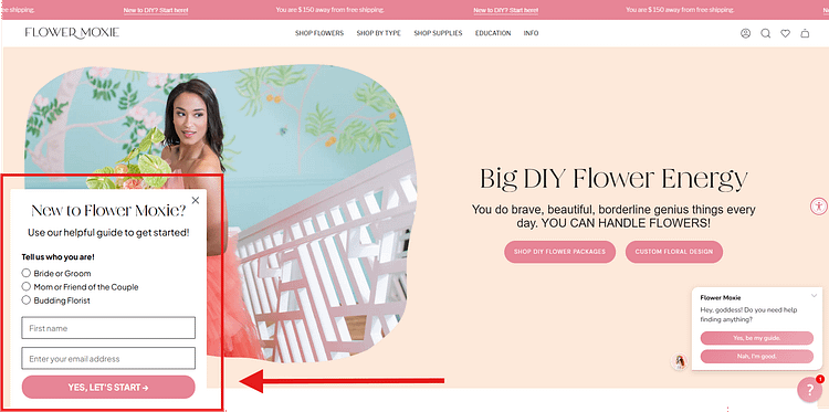
There’s a slide-in form right on the hero image — but it doesn’t scream for your email like an internet stranger begging for your number.
Instead, it quietly offers a hand:
“Hey, who are you?”
You choose: Bride/Groom, Friend, Florist. Then enter your name and email.
That’s it.
It’s segmentation disguised as support.
You can bet they’re using that intel to send helpful follow-ups — not just generic promos, but role-specific content that makes people feel understood.
👉 Lesson for your own funnel: Not all segmentation needs to live behind a 12-question quiz. Sometimes just asking “where are you in this?” is enough to personalize and convert.
What Makes This Landing Page Convert
Why I Think This Works (And What You Can Steal)
This landing page is fun. It’s human. It knows the stakes — and instead of smoothing them over with soft beige branding, it leans into the madness with clarity and confidence.
Flower Moxie isn’t just selling flowers.
They’re selling peace of mind with a wink and a color swatch.
So if you’re in a high-emotion niche — weddings, baby prep, moving, etc. — study this one.
Because trust + levity + no-nonsense direction?
That’s how you sell to a frazzled audience… and actually make them feel good about buying.
Brightland sells olive oil — technically. But this landing page isn’t about olive oil. It’s about a feeling. You land on the site and immediately know: this is not a grocery store product. This is elegance for your kitchen shelf. A gift-worthy pantry upgrade. A little bit of California sunshine, bottled.
I didn’t go looking for olive oil when I first found this page. I stayed because everything about it felt like a deep exhale. No clutter. No pitch. Just quiet beauty, purpose, and proof.
1. Hero Section That Feels Like a Magazine Spread… in Motion
The hero video caught me off guard — in a good way. Someone’s cracking eggs with freshly painted nails over a pan, and somehow it made me think: I should eat better. But not in a guilty way — in a ritual is beautiful kind of way.
The headline?
“Meet the Everyday Line.”
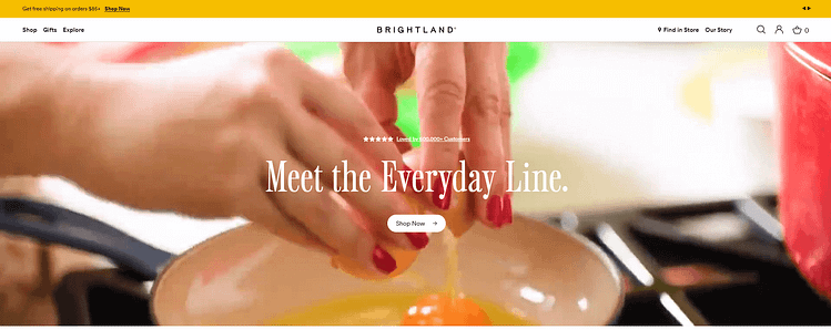
Short, smart, and surprisingly emotional. It tells me this isn’t just a premium product — it’s for me. My counter. My Tuesday night meals.
And then right above it:
“Loved by 600,000+ Customers.”
That stat alone made me pause. If 600,000 people love this, there’s probably something worth trying.
👉 Takeaway: A hero doesn’t need fireworks. Just show your product in action, give me a reason to care, and let the vibe carry the rest.
2. Featured Collections That Guide, Not Overwhelm
As someone who’s absolutely clicked off websites that tried to show me everything at once, I appreciated this section a lot. Five neat tiles. No decision fatigue.

It’s visually clean, softly sunlit, and organized in a way that respects your time. I remember thinking, Oh, I could actually browse this.
👉 Smart move: Framing product categories as “collections” gives the whole page more polish. It makes even your most practical SKU feel curated.
3. Founder Story Done Right
Let’s talk about that little founder moment — Aishwarya Iyer holding her dog in a kitchen that looks both real and aspirational. The quote beside her says:
“Brightland brings joy, beauty, and everyday magic to your table.”
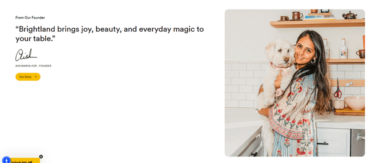
That line stuck with me. I didn’t even click into the full story the first time. I didn’t need to. Just seeing her, seeing the warmth — it was enough to humanize the brand in two seconds flat.
👉 If you’re writing your own About block: You don’t have to give us your resume. Give us your why. Let us feel you behind the product.
4. Social Proof That’s Soft but Strong
Instead of a reviews section, Brightland drops a yellow-backed quote like a mic drop:
“Brightland appears like a ray of sunshine compared to traditional olive oil brands.”

Then you see logos: Goop, Fast Company, The New York Times, Wirecutter.
It’s not braggy — it’s elegant. It says: We don’t need to tell you we’re great. These voices already did.
👉 Steal this idea: If you’ve been featured somewhere — even a niche podcast or a small blogger — show it. Prestige isn’t about scale. It’s about alignment.
5. Social Feed That Feels Alive
The “Fresh From the Feed” section is, honestly, a non-negotiable for brands now — and Brightland nails it. It’s not perfectly polished influencer content. It’s everyday people pouring oil, making salads, filming dinners by the sea.
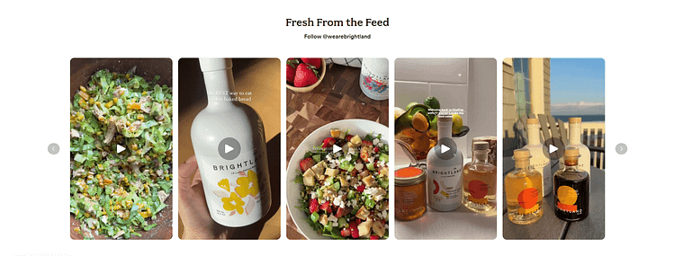
I thought: This is the kind of thing I’d send to a friend. Or repost. And that’s what you want, right?
👉 Reminder: Your customers are your best content team. Use them, credit them, and let them build your brand for you.
Why This Page Converts — Without the Usual Tricks
Final Thought: You’re Not Selling Olive Oil. You’re Selling a Moment
This landing page works because it doesn’t try to be everything. It just chooses one emotion — thoughtful delight — and builds every section to support it.
And let me tell you: I didn’t expect to be emotionally moved by olive oil, but here we are.
That’s the power of slow, intentional branding. When done right, it doesn’t just convert — it resonates.
How to Apply These Lessons to Your Own Ecommerce Landing Page
You’ve seen how top brands do it—from Lomi’s crystal-clear explainers to HexClad’s high-trust bundles. While their products differ, the principles behind their high-converting pages are the same.
The good news? You don’t need a massive design budget to implement them. You just need to focus on what works.

Here are the core lessons from these examples, distilled into a simple action plan:
- Define the Page’s One Goal. Before you design anything, be obsessive about the page's single purpose. Is it to sell a specific product? Launch a new collection? Get sign-ups for a waitlist? Every element on the page must support that one goal. This is the foundation of a successful landing page strategy.
- Build Trust Above All Else. Every single example we looked at uses trust signals masterfully. From customer reviews and press mentions to secure checkout seals, they work to eliminate doubt at every step. This is non-negotiable for converting cold traffic.
- Make the Offer Irresistibly Clear. A confused visitor will never buy. Your page must instantly answer "What is this?" and "Why should I care?" This is where a strong sales page strategy comes in, ensuring your copy, visuals, and pricing are easy to understand.
- Remove Friction Everywhere. The best pages feel effortless to use. They load fast, have big, obvious buttons, and don't ask for unnecessary information. A smooth experience is one of the most effective ways to reduce cart abandonment and keep your visitors moving toward the sale.
The Right Tools Make It Possible
Seeing these examples is inspiring, but turning that inspiration into a real, high-converting page can feel daunting. You don't need to be a developer to build pages that look and perform like the ones above.
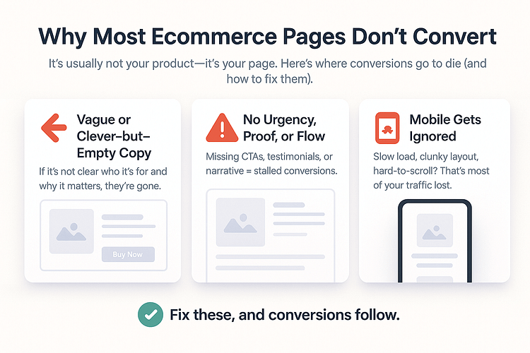
This is exactly why we built Thrive Architect. It’s a drag-and-drop page builder for WordPress that’s designed for one thing: conversions. It gives you the flexibility to create stunning, custom layouts for your products without writing a single line of code.
With Thrive Suite, you get the entire conversion-focused toolkit, including:
- Thrive Architect: To build your pages.
- Thrive Ovation: To gather and display powerful testimonials.
- Thrive Ultimatum: To add ethical scarcity for your launches and sales.
It’s everything you need to build a professional, high-converting ecommerce store right inside WordPress.
FAQ: Ecommerce Landing Page Examples — What People Really Want to Know
An ecommerce landing page is any page designed to drive a specific action — like a purchase, quiz result, email signup, or bundle add-to-cart. While many landing pages are standalone and campaign-specific, others live right on your site. A homepage, a product page, or even a quiz can function as an ecommerce landing page if it’s optimized for conversion and focused on guiding the visitor toward one clear next step.
The key difference isn’t the URL — it’s the intent and structure. A good landing page design walks your visitor through a clear decision — no detours, no confusion.
Because product pages are made for Browse — not converting. They often have menus, multiple links, and too many options. A strong ecommerce landing page matches the ad or email that brought someone in, warms them up fast, and leads them toward one clear action. It’s how you control the user experience and improve your conversion rate.
Not if you want consistent results. Cold traffic needs more context. Warm audiences need urgency or incentives. High-ticket offers require more trust-building. That’s why I use a flexible landing page builder like Thrive Architect — I can create and test different pages based on audience, product type, and where they are in the sales funnel.
Avoid vague messaging, weak CTAs, and cluttered layouts. If your landing page design buries important info or makes users scroll endlessly to find the offer, they’ll bounce. Use visual hierarchy. Make the value obvious. And stop hiding your testimonials like they’re a footnote — they’re conversion fuel.
I use Thrive Architect because it combines beautiful landing page design with real marketing functionality. I can A/B test headlines, customize layouts for mobile, speed up build time with smart blocks, and optimize pages based on performance. It’s everything I need to build, launch, and refine high-converting ecommerce landing pages — without a dev in sight.
Conclusion: Your Landing Page Is the Closer — Make It Count
If you’ve made it this far, you already know — one page can change everything.
Whether you’re running ads, launching a new product, or just trying to turn more browsers into buyers, your landing page is where the magic happens. Or doesn’t.
That’s not meant to add pressure. It’s to remind you: this is where your effort finally pays off.
And the good news?
You don’t need to be a designer. You don’t need fancy tools. You just need:
With tools like Thrive Architect, you can take all the inspiration from this post and actually build something that converts — without spending weeks or needing a developer.
So if you’ve been sending traffic to a homepage that’s doing too much and converting too little…
Now’s the time to change that.
You’ve got this — and we’ve got the tools to help.
💡 Ready to build ecommerce landing pages that do the selling for you?
Try Thrive Architect and launch your next high-converting page in under an hour.


