I’ve lost count of how many course creators tell me, “I just need more people to see my premium program.” And I always answer: before you sell, you need to prove.
That’s where a free course becomes a game-changer. A well-designed free course gives people real value up front. They test your style. They see a result. They decide whether you walk the talk. And today, the numbers back this up:
Email marketing delivers an average ROI of $36 for every $1 spent. Building your list with a high-value free course isn’t just smart—it’s profitable.
Education landing pages convert at a median rate of 8.4%, which is significantly higher than the 6.6% cross-industry average. A free course funnel helps you capture that momentum.
When I build a free course funnel, I lean into that. Students get something they can use right away. I earn trust. My premium offering starts to feel like the obvious, exciting next step—not a leap in the dark.
In this guide, I’ll walk you through how I structure free course funnels that grow my subscriber base, deepen trust, and consistently convert browsers into paying students — all without feeling pushy or salesy.
The Psychology — Why a Free Course Funnel Works
When I think about why free courses work so well, it always comes down to this: people need proof before they commit. Nobody wakes up and says, “Sure, let me hand over hundreds of dollars to a stranger on the internet.” They need a reason to believe you.
That’s where your free course comes in. By giving away real value with no strings attached, you create trust. It taps into a powerful principle of reciprocity — when someone benefits from you, they naturally feel more open to taking the next step with you.
And let’s be honest: a course feels different from a checklist or PDF. A mini-course has weight. It shows your teaching style, gives your students a quick win they can feel proud of, and positions you as the person who can help them go further.
Here’s why it works so well:
- Reciprocity: When you give value upfront, people want to give back.
- Authority: Your teaching style shows you know your craft.
- Trust: A quick win proves your advice delivers results.
- Perceived Value: A structured course feels premium compared to a static download.
For me, that’s the beauty of a free course funnel. It’s not a gimmick. It’s a relationship starter. When your students experience a real result upfront, they stop seeing you as just another voice in the crowd — and start seeing you as their guide.
How To Turn Uncertain Potential Customers Into Paying Course Students
Think about the last time you signed up for an online course. Chances are you didn’t buy immediately.
You wanted to:
- get a feel for the teacher’s style
- check if their approach aligned with yours
- see proof that they could deliver results
That pause is natural — and it explains why free courses are such powerful bridges to paid programs.
A free course allows your future students to:
- experience your teaching in a safe, low-stakes way
- achieve a quick win that builds confidence
- develop trust in your expertise before committing financially
The magic lies in how you design the experience. A free course should provide genuine value on its own while guiding students toward the next step: your premium program.
When that balance is in place, the upgrade feels effortless. Students already believe in your process, and enrolling in the paid course feels like the most logical and rewarding move forward.
How to Build a Funnel for a Free Course to Attract Clients: Step-By-Step
Before we dive in: this tutorial assumes you've already created both your free and paid courses. If you haven't built those yet, check out our course creation guide first. For everyone ready to go, let's walk through how to set up a funnel that turns free students into paying clients!
1. Download and Install Thrive Suite
Selling digital products takes a different approach than a regular online store. When you're selling courses, ebooks, or other digital products, every interaction with potential customers counts. They need to trust your expertise and value your offer before they'll buy. One confusing experience or technical glitch could cost you sales and hurt your reputation.
Your choice of tools makes all the difference. Everything needs to work together smoothly to create a professional journey for your customers. Landing pages, opt-in forms, lead magnets, testimonials, and checkout processes – each piece should feel like part of one seamless experience.
You might think you need to buy multiple expensive platforms to make this happen. But here's the good news: Thrive Suite gives you everything you need in one WordPress plugin bundle.
Think of it as your complete funnel-building toolkit:
- Thrive Architect lets you build professional pages without touching code
- Thrive Leads helps you capture leads across your entire site with one form
- Thrive Ovation shows social proof at the perfect moment
- Thrive Ultimatum adds real scarcity to drive action
And if you're looking for a top course platform to sell online courses, Thrive Apprentice is included in Thrive Suite, too.
With this toolkit, you can build your entire funnel in WordPress – without spending thousands on separate tools or wrestling with complex integrations.
2. Create Your Lead-Gen Landing Page With Thrive Architect
Your first task is building a landing page that promotes your free, irresistible online course to your potential clients.
And this is where Thrive Architect comes in.
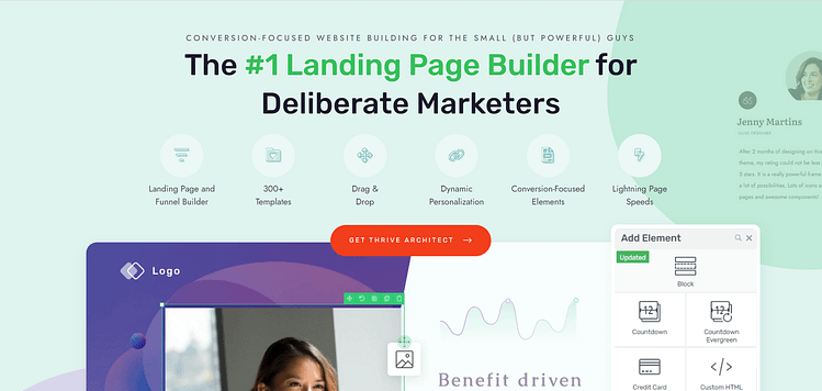
This is the landing page plugin you need to create pages that grab attention and convert curious website visitors into leads and customers.
The Thrive Themes team has fused years of marketing experience into the templates and design elements in this plugin to help you get solid results.
All you need to do is hop in and start designing.
Thrive Architect’s drag-and-drop editor makes the landing page creation process much easier — and more enjoyable! You can easily move around whole sections, or small design elements without compromising the rest of your page.
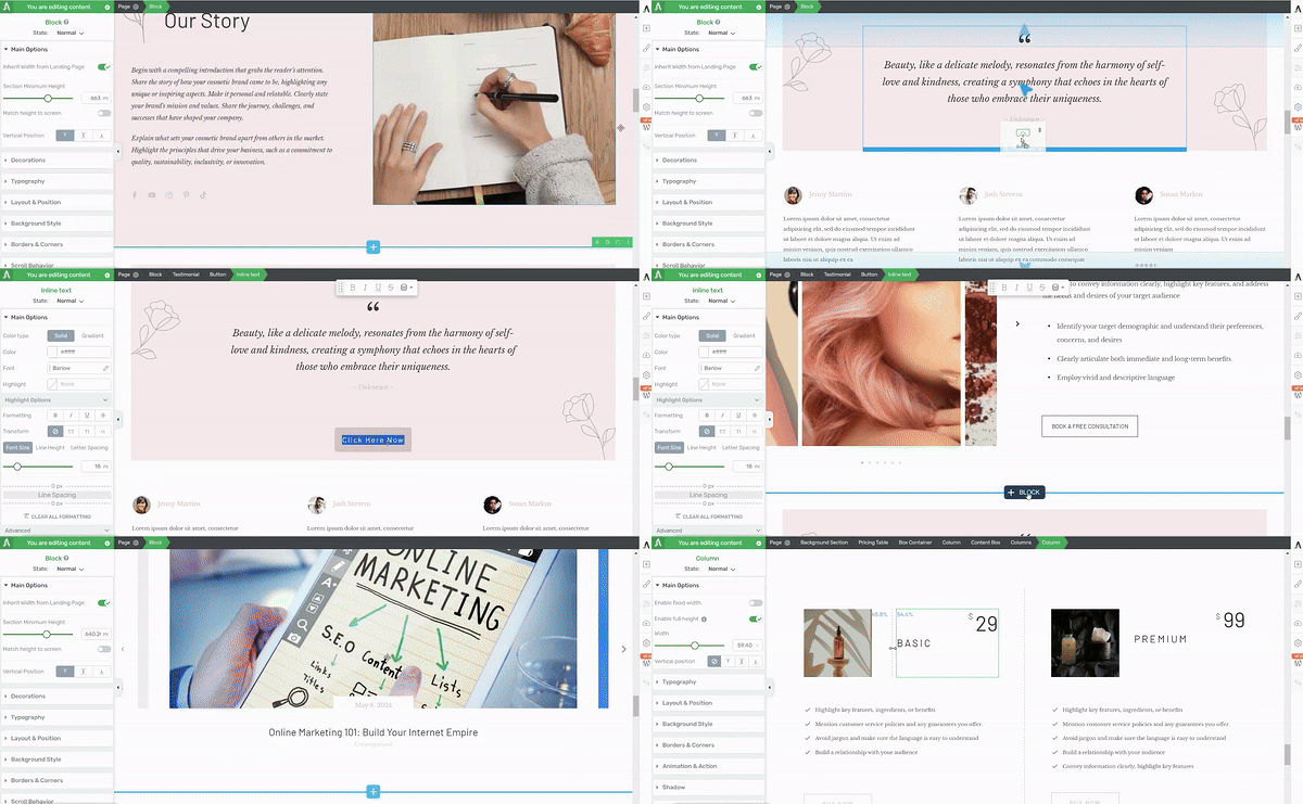
Thrive Architect in action
About the templates I mentioned earlier…
Starting from scratch can be intimidating. That's why Thrive Architect offers a variety of templates designed to make your life much easier. Whether you're creating a landing page for a digital product, physical product, service, or even a membership site, you'll find templates that fit your needs. Using these templates can save you a ton of time. Instead of starting from scratch, you can pick a template that's close to what you want and then tweak it to fit your needs.
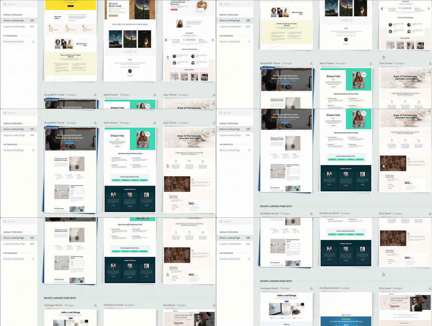
Landing page template sets in Thrive Architect
Thrive Architect is full of features to help your funnel work better. Want to grab your visitors' attention and keep them reading? Thrive Architect lets you add eye-catching buttons, countdown timers, progress bars, colorful content boxes and so much more to make your page stand out.
Building Your Landing Page: Let’s Walk Through the Process
First, open Thrive Architect and select 'Create New Landing Page.' You can either start from scratch or choose from their pre-built templates (which often saves time).
Your page needs three key elements:
- A compelling headline that speaks directly to your ideal client's needs
- Clear description of what they'll receive (your lead magnet)
- A prominent sign-up form or button
When writing your page copy, focus on the specific value your lead magnet delivers. For example, instead of saying "Download our free guide," try something like "Get our step-by-step blueprint for scaling your consulting business." (For more copywriting tips, check out this handy guide).
Don’t forget to add social proof to your landing page. A few well-placed testimonials from previous clients can significantly boost your conversion rate. Even better if these testimonials specifically mention results related to your lead magnet's topic.
Pro tip
For more tips on creating an eye-catching landing page for your course, check out this tutorial: How to Create an Online Course Landing Page (Step-by-Step Guide).
Remember to keep your design clean and focused. While there is the temptation to add fancy elements and animations, stick to what guides visitors toward your sign-up form. Too many distractions can actually hurt your conversion rate (which you can learn more about here).
3. Build Your Lead-Gen Form With Thrive Leads
Now that your landing page is ready, you'll need a reliable way to collect your visitors’ information.
Thrive Architect’s landing page templates include a solid opt-in form, but if you want to get maximum results from your high ticket funnel, you’ll need to ramp up your lead generation strategy on your website.
A landing page is just one way to turn visitors into leads. But, what if you could add entry points to your funnel on the most relevant parts of your website – with one form?
Enter, Thrive Leads.
Expand Your Funnel’s Reach with a Thrive Leads Form
Thrive Leads complements your lead-generation strategy by effectively capturing and organizing leads. While your landing page creates interest, Thrive Leads handles the technical side of converting that interest into leads.
My favorite part of this tool is its wide selection of form templates. The Thrive team has literally gone ahead and done all the work for you in terms of creating a conversion-focused opt-in form design.
You just need to find a template that suits your preferences, customize it in the visual editor (which is quite easy to use, I might add) to turn it into the perfect lead magnet form.
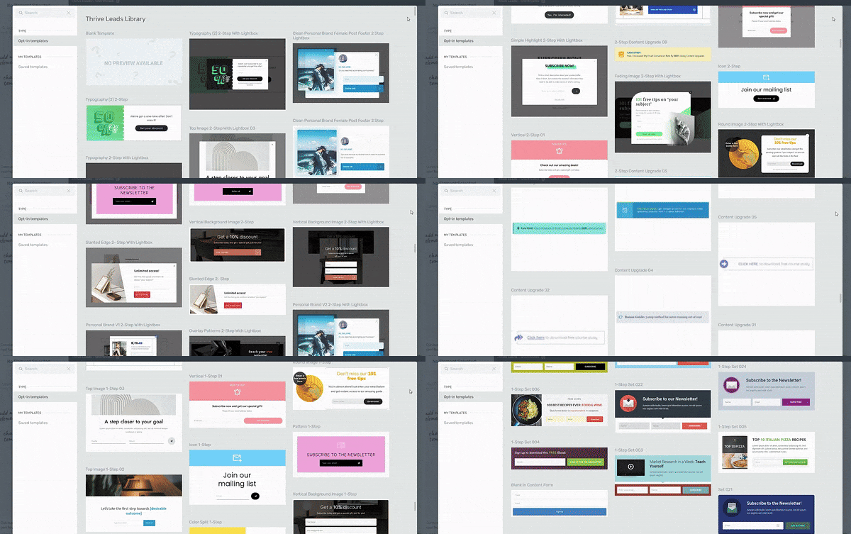
Form Templates in Thrive Leads
And then it gets better...
Often, your target audience will land on pages and posts that are related to your lead magnet. Now, the idea of manually embedding a form on every page is exhausting and you don’t have the time for that.
That’s where Thrive Leads comes in.
For a given form, you can program the display logic to show your forms sitewide, on specific posts and pages, or even exclude specific posts or pages.
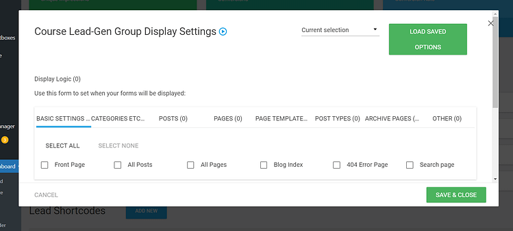
Display Settings in Thrive Leads
Make sure your form includes all these important features, to increase your opt-in chances:
- A headline that grabs attention: Make it clear what you're offering and why it matters. Think "Get More Clients with Our Free Course"
- A quick pitch: Tell folks what they'll get and how it'll help them. Keep it short and sweet - a sentence or two should do the trick.
- Only the important form fields: Don't ask for their life story. Stick to name and email. The less you ask, the more likely they are to sign up.
- A standout CTA button: Make your "submit" button pop. Use colors that catch the eye and words that make people want to click. "Get My Free Guide" works better than plain old "Submit."
- A good visual: Add a picture of your lead magnet or a relevant image. It breaks up the text and gives people an idea of what they're getting.
This is just the tip of the iceberg. For more info on how to create the best opt-in forms, check out this tutorial.
4. Set Up an Upsell Popup or Landing Page for Your Premium Course
That moment right after someone enters their email for your free course? It's prime real estate for introducing your premium offering.
Set up a popup or "thank you" page that appears immediately after they opt in, but before they access the free materials. Make the offer more interesting by adding a discount code.
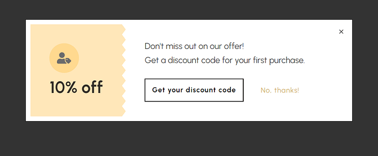
The timing works so well here because you've caught them in an action-taking mood. They're already interested enough to share their email, their guard is down, and they're excited about learning from you.
This is when you can introduce your premium course with something like "Want to skip ahead to the complete system?" or "Ready for the full transformation?"
Don't worry about this hurting your free course signups - many people will appreciate having the option to go all-in right away.
Pro tip
Want to learn how to create pop-ups that grab attention (at the right time) and lead to conversions? Check out this tutorial.
5. Create a Checkout Page
With your upsell page ready to go, you'll need somewhere to send interested buyers. Create a streamlined booking or checkout page that makes it easy for students to enroll in your premium course. This page should be simple, clear, and focused on a single action - getting your new students started with your paid material.
If you’re using WooCommerce to sell your products, you can use Thrive Theme Builder (which is also a part of Thrive Suite) and Thrive Architect to customize the default WooCommerce checkout page and connect it to your email marketing service, too.
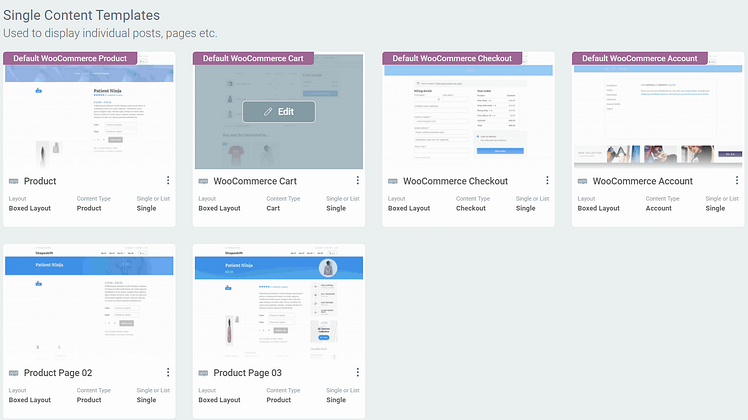
WooCommerce Templates in Thrive Theme Builder
But other third-party tools like ThriveCart, WP Simple Pay, and others may require you to design a checkout page from within the app.
Make sure this page is easily accessible from both your initial upsell offer and any other places you'll promote the course later on. You'll likely reference this page in your free course content, email sequences, and social media posts, so it's worth taking the time to make it polished and professional.
Keep the URL simple and memorable too - you might find yourself mentioning it during live sessions or podcast interviews, and you want potential students to be able to find it without hassle.
6. Deliver the Free Course via Email or Learning Platform
Now it's time to get your free course into your students' hands. You've got two solid options here - you can send the lessons directly to their inbox through your email platform, or host everything on a dedicated course platform like Thrive Apprentice.
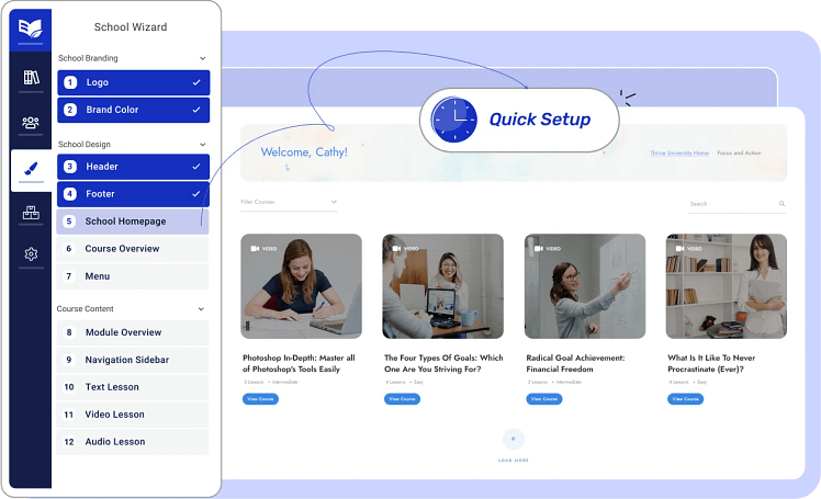
Setting Up Your Course in Thrive Apprentice
Email delivery works beautifully for keeping students engaged. You can drip out lessons over a few days or weeks, which helps prevent overwhelm and keeps your teaching fresh in their minds. Plus, since they're already checking their email daily, your lessons become part of their natural routine.
If you prefer to host your course on a learning platform, you'll give your students a more structured experience. They'll have a proper dashboard to track their progress, and they can move through the material at their own pace. This approach also makes your free course feel more premium and organized.
Pro-Tips for Creating Engaging Course Content
A free course is more than just information. The design of your lessons determines whether students finish with momentum—or drift away before they ever see your paid offer. Keep these principles in mind:
- Focus on One Quick Win: Shape your 5–7 lessons around a single, clear outcome. Resist the urge to teach everything at once. A defined success builds confidence and keeps attention high.
- Make It Actionable: Give each lesson a small task, reflection, or question. This transforms students from passive readers into active participants who engage with your material.
- Brand Your Concepts: Name your frameworks, processes, or methods. A memorable term or model makes your teaching easier to recall, easier to share, and more distinct from other instructors.
Expert Tip: “By turning passive readers into active students with simple homework, you build stronger relationships and increase the chance of upgrading to your paid course.”
Pro tip
We've got the perfect tutorial to help you formulate and build your online course from scratch, and you can check it out right here: The Ultimate Online Course Launch Checklist: Everything You Need to Know.
7. Include Lead Nurturing Content Alongside the Course
Your free course shouldn't just exist in a vacuum - weave in additional content that deepens your relationship with all students, especially those who haven't yet bought your premium course. This ongoing connection is crucial because many people need more time and touchpoints before they're ready to invest.
Sprinkle in real student success stories that show what's possible. Share behind-the-scenes tips that didn't fit in the main lessons. Send quick wins and actionable insights that complement what they're learning. This extra content shows your expertise and genuine commitment to their success, whether or not they've bought your premium course.
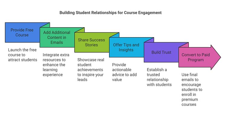
The magic happens when students start thinking of you as their trusted guide, not just another course creator. Some might join your paid program right away, while others might need months of staying connected through your emails and bonus content before they're ready.
As you consistently provide value, you build an even deeper relationship that can lead to future sales, referrals, and an engaged community around your work.
8. Add a Call-to-Action for Your Paid Offer in the Final Module of Your Course
The end of your free course is the perfect moment to invite students to take the next step with you. By this point, they've worked through your material, gotten some wins, and seen your teaching style firsthand. Use your final module to show them how your paid course builds on everything they've just learned.
Be specific about what's next - connect the dots between their current progress and the bigger results they could get with your premium course. Share how the paid course goes deeper, adds more tools and support, or helps them implement what they've learned in a more comprehensive way.
Pro tip
Call-to-actions play a huge role in turning free users into paid customers. For key tips on how to create successful CTAs, take a look at this guide.
Next Steps: Start Promoting Your Free Course Funnel
Now that you've built your entire funnel, it's time to get it in front of the right people. Before you dive into promotion, run through the entire funnel yourself one more time. Sign up as a student, check every email, click every link, and make sure the journey feels smooth from start to finish. This final check can save you from headaches once real students start flowing through your funnel.
Here's where to start promoting your free course:
Share it with your existing email list - these people already know and trust you, making them perfect first students to test your funnel and provide testimonials
Post about it on your social media channels, focusing on the specific problem your course helps solve rather than just announcing "new free course!"
Reach out to potential partners who serve similar audiences - offer to promote their relevant content in exchange for them sharing your free course
Consider running some targeted ads once you've proven the funnel works with organic traffic - this can help you scale up quickly
Remember - a well-built funnel will keep working for you long after the initial launch, so take the time to get it right. Your future students (and your future self) will thank you for it.
Frequently Asked Questions: How to Create a Course Lead Magnet
If you’ve been thinking about using a free course to grow your business, you probably have a few concerns. Is it worth giving away so much value? How do you make sure it doesn’t just attract “freebie seekers”? What’s the right length, structure, or timing for an upsell?
This FAQ section tackles the most common questions creators ask when deciding whether to use a free course as a lead magnet — and how to design one that actually leads to paid sales.
Not all free leads are created equal. A well-designed free course acts as a filter, not a giveaway. It requires time and attention to complete, which are valuable forms of commitment. By focusing on a specific, high-value problem that ties directly to your paid product, you’ll naturally attract the right students — the ones most likely to invest later.
Both models can work. Paid mini-offers often bring in “proven buyers,” while free courses generate larger lists at scale. In practice, many businesses succeed with free lead magnets even though only about 3% of sign-ups convert. The key is ensuring that the revenue from that 3% covers acquisition costs and drives profit.
The trick is building in a “strategic gap.” Your free course should solve one clear, meaningful problem completely — but in doing so, it should reveal a larger challenge that your paid program addresses. Students walk away with a win, but also an awareness that they’ll need your premium course to go further.
A strong format is 4–8 modules with 3–7 short lessons each. Many successful creators use a 5–7 lesson structure delivered over a week, or daily micro-lessons of 10–15 minutes. This keeps the material digestible while still delivering a sense of progress and momentum.
Free courses accelerate email list growth, establish authority and trust, and improve SEO by drawing consistent organic traffic. They also give you a platform to demonstrate expertise at scale. Even if many leads don’t buy, the ones who do often generate enough revenue to make the funnel highly profitable.
The most powerful moment is at course completion. By then, students have achieved a win, trust your teaching, and feel momentum. This is when an invitation to continue with your paid course feels like a natural next step — not a pushy sales pitch.
Use a mix of organic and paid strategies. Organic channels like SEO, YouTube, and social media posts build long-term, low-cost traffic. Paid ads on Facebook, Instagram, or Google give you immediate reach. Partnerships, guest appearances, and online communities can amplify your message further, putting your course in front of highly qualified prospects.
Ready to Build Your Course Funnel?
Your free course can become your most powerful marketing tool — consistently bringing in new students and growing your course business. A well-built funnel lets you showcase your expertise, deliver real value, and make your premium course the natural next step.
With Thrive Suite, you can build this entire ecosystem in one place - from landing pages to course delivery, email integration, and conversion tools. Start building your course funnel today and watch your student base grow.
Start building your free course funnel with Thrive Suite today.



Adding ThriveCart Code… What’s the difference between adding the code via “wordpress content” and “Custom HTML” element?
I would love to find a way to do the upsell without having to add ThriveCart to the mix. It’s not just the additional expense. My membership is set up with Memberpress and even though ThriveCart supposedly integrates I’ve heard many horror stories.
WOW! That was very helpful, and shows how much work is involved! My question is, if you close the course and someone signs up to be contacted, how do you keep track of those potential customers?
Thanks for the valuable information ,
I want to know is there any possibility to put premium course restriction through WOCOMMERCE.
Thanks,
Thank you soooo much for all these valuable information.
I would like to know if i could use Sendowl instead of Thrivecart, in order for the entire funnel to run properly.
I’m currently using Sendowl which is what was recommended in Course Craft. Is there a tutorial to show how to use it instead of ThriveCart? Thank you.
Wow – this video will save me a ton of time setting up a sales/course funnel. Clear and concise. Excellent presentation. These are the types of videos that allow us to hit home runs.
Hello where can i find ep1 and 2 regards
Hi Pierre,
Episode 2 is here: https://thrivethemes.com/evergreen-webinar-funnel/
And Episode 1: https://thrivethemes.com/free-challenge-funnel/
Hanne this series is priceless. Breaking down the psychology of what and why the funnel is structured like that is better than any course on funnels you can ever buy ????????
Thanks Nataliya!
Is there an update to this course after apprentice 4.0 has been released?
I guess the user restrictions should not be implemented using wordpress roles anymore.
Hi there, that didn’t change 🙂 WP roles are still the way to go