We’ve all been there.
You’ve worked hard to write an amazing blog post or build a new homepage for your website…
...something your online followers are really going to love.
But now you're faced with the troublesome task of finding the perfect images needed to help illustrate your point.
Of course, you know better than to just swipe any image you find off of Google — you don’t want copyright infringement lawyers to come knocking on your door, right?
And on top of that, you’re already aware that bland stock images hurt your conversions…
So how do you find compelling images to use in your online content that don’t cost money and keep you out of copyright court?
Well, this post is going to show you where — and then teach you how to weave them into your website like a design pro.
Ready to solve this visual content woe for your website? Awesome. Let’s get started…
More...

Part 1: Where to Find the Best, Free & Copyright-Free Images
Let’s begin by learning where to look for amazing copyright free images to accompany your online content.
The following are image and illustration hosting platforms you can use without needing to cough up any cold hard cash. (In fact, all the stock photos used within this post were found using them!)
Here’s 6 digital places you can search through (in recommended order) the next time you need a copyright-free image for your site...

1. Your Own Smartphone!
That’s right.
It may sound obvious, but it needs to be said.
If you have a smartphone, then your ability to produce the photo you’re looking for is right there in your pocket.
Grab a lamp or two to get the lighting right and then snap some pics to at least attempt to get what you need. Heck, you may already have the perfect pic buried in your camera roll right now!
Truthfully, snapping your own stock images (if you can make them look decent) is awesome because they:
- Cost you nothing, and
- Give you the copyright by default.
So don’t be afraid...
Take some quick pics with your smartphone and see if that helps get your next piece of content published with the visuals you were thinking of.
How to Create Great Images for Your Online Business — Especially if You're Not a Photographer
Need a little help snapping your own stock photos?
Here's a few tips to remember that will ensure that the personal images you take make your content look pro:
- If you have a personal branded website, make sure that many of the stock photos you ultimately use look unique, authentic and involve you. Nothing gets ignored by visitors more than generic looking stock photos.
- Make a list of all your content topics (both past, present and future) to help you brainstorm image ideas you can schedule photoshoots for. This way, you can create a portfolio of images to update your old content with and have at the ready to include in your future content.
- When it comes to actually taking your photos, make sure your shot is in focus and use lots of light to illuminate the subjects of your images. Try to eliminate harsh shadows by diffusing your light or even using multiple light sources.
- To give yourself the most options when editing your photos, start by taking the highest resolution images possible and then optimizing the dimensions and file size of your images last to ensure they load quickly on your website.

2. Pexels
Not much of a photographer?
Well then, our favorite online platform for finding free — and copyright free — stock images is Pexels.
Here’s how this image hosting platform describes itself:
Pexels provides high quality and completely free stock photos licensed under the Pexels license. All photos are nicely tagged, searchable and also easy to discover through our ‘discover pages’.
If you’re wondering what a “completely free" Pexels license entails, here’s the gist of it in a few bullet points:
- All photos on Pexels are free to use.
- Attribution is not required. Giving credit to the photographer or Pexels is not necessary, but always appreciated.
- You can modify the photos. Be creative and edit the photos as you like.
That’s a pretty sweet deal, right?
But to be in full compliance with the Pexels license agreement, just make sure that you also mind their DON’T bullets:
- Don’t let identifiable people appear in a bad light or in a way that is offensive.
- Don't sell unaltered copies of a photo (e.g. don't sell it as a stock photo, poster, print or on a physical product without adding any value).
- Don't imply endorsement of your product by people or brands on the image.
- Don't redistribute or sell the photos on other stock photo or wallpaper platforms.
Got all that? Good.
Images on Pexels often rival many of the premium stock photo platforms out there, it’s a good idea to search their image collection whenever your own comes up empty.

3. Pixabay
A close runner up to Pexels is a similar free image platform called Pixabay.
In fact, here’s how Pixabay describes itself:
Pixabay is a vibrant community of creatives, sharing copyright free images and videos. All contents are released under the Pixabay License, which makes them safe to use without asking for permission or giving credit to the artist - even for commercial purposes.
So yeah, Pixabay provides the same sort of licensing agreement for its images as Pexels does in terms of being able to use their photos without fear of copyright infringement.
In truth, you’ll find that there’s a lot of image overlap between Pexels and Pixabay images (since contributors often upload their images to both). However, unique images do exist on one platform that don’t exist on the other, so Pixabay is always a solid next stop for free image hunting.

4. Unsplash
Unsplash has an impressive collection of free stock photos.
With over 500 millions visits to their homepage every month they are well loved by web designers and creatives alike!
The license is simple:
- All photos can be downloaded and used for free
- Commercial and non-commercial purposes
- No permission needed (though attribution is appreciated!)
What is not permitted ????
- Photos cannot be sold without significant modification.
- Compiling photos from Unsplash to replicate a similar or competing service.
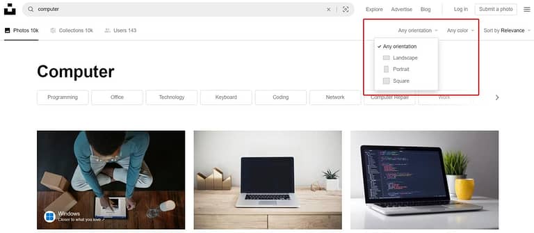
Easily filter by orientation or color to find the perfect image!
One feature I particularly enjoy on the site is the ability to filter by orientation and by color. This makes it easy to find the right image for your features blog image or for your landing pages!
5. BarnImages
Not nearly as well known as the websites above but a good alternative for exclusive photos! BarnImages was launched in 2015 by two friends who were unhappy with the then available stock photos.
They add new images weekly.
The difference with this website is that other photographers can't submit their images, which is why you'll find exclusive photos here.
The collection is mainly landscape images and the feel is much more "home picture" than professional photoshoot. I consider these photos a good alternative for in content photos.
The website is also much less user-friendly then Unsplash, Pixabay or Pexels but if you're willing to dig, you can find gold.

6. FreePik
If you’re still in the lurch looking for images after looking through the other databases, give FreePik a try.
Unlike the brand name suggests, FreePik actually charges for most of its images through a monthly subscription plan. However, you can find free images on FreePik (which always
require attribution) by using their search filter.
Just click the “Free” license box in the search filter sidebar and know that you’re limited to 3 downloads per day as a guest user and 10 downloads per day as a free registered user.
There are a lot of unique images on FreePik that you won’t find elsewhere so it’s always worth a search, but due to all their extra requirements and limitations, we recommend looking through Pexels, Unsplash and Pixabay first.
7. Flickr
Dating all the way back to 2004, Flickr is one of the original internet image hosting and sharing platforms.
And although there’s tens of billions of photos hosted on Flickr, know upfront that many of them aren’t copyright free. On top of that, the quality of images available in their creative commons area isn’t guaranteed to blow your socks off either.
However, you can find some hidden gems lurking in the Flickr wild, so give this platform a go when you can’t find what you’re looking for elsewhere.
Just make sure to limit your searches to copyright free images only. You can do that by applying the appropriate Creative Commons search filter (“Commercial use & mods allowed” in most cases)...
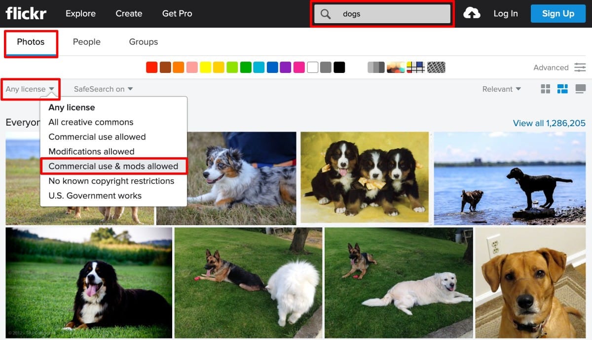
Set your Flickr photo search filter to "Commercial use & mods allowed" to limit your results to the Creative Commons.
...but then you'll have to manually check the actual Creative Commons license agreement for any image you want to use to ensure you’ll be in copyright compliance:
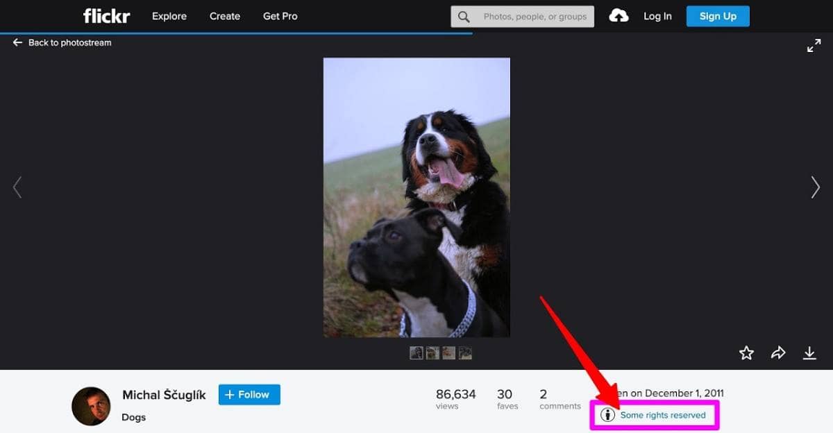
Make sure to click the copyright license details link beneath the Flickr photo you choose.

8. Google Search
Okay, so you were warned at the beginning of this post not to blindly lift Google search images to use in your content...
However, there is a way to search for copyright free images on Google when necessary. Just know that — like the Flickr recommendation above — the onus is on you to make sure you understand the exact copyright license behind any image you decide to use.
That being said, to search Google for copyright-free images:
- Start by loading the Google Images search page and searching for your keyword.
- When the image results page appears, filter your search by clicking on the “Tools” box underneath the search icon of the Google search bar...
- ...and then setting the Usage Rights option to “Labeled for reuse with modifications” in the drop down menu that appears beneath the search bar:
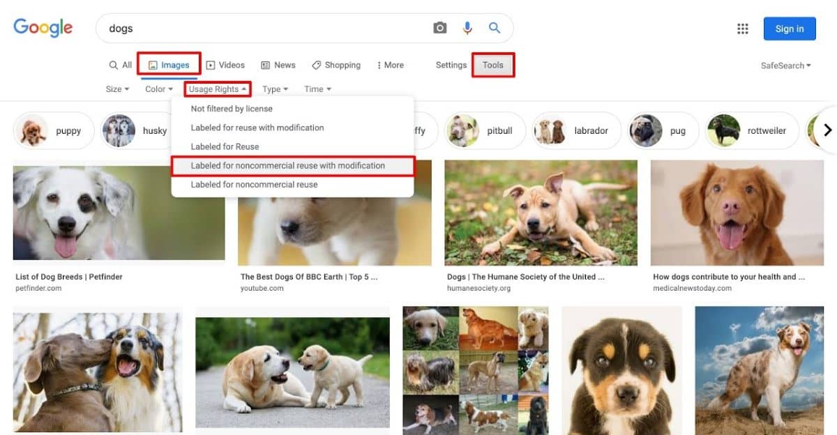
To limit your Google image searches to copyright-free results, click the "Tools" box and then select the "Labeled for noncommercial reuse with modifications" from the Usage Rights drop down menu that appears.
This Google image search filter will then produce only those images that have been labeled for modification and reuse by others.

Part 2: How To Use Your New Stock Images
So now that you’ve found those perfect photos for your online content, how do you best use them on your website?
In this section, we’re going to show you several ways to incorporate them into various digital real estate to make sure your blog posts look pro, your landing pages convert better and your homepage pops.
Let’s start by discussing how to display great photos on the most prime locations of your site...

Hero & Background Images
The first place you can drop your new images is in your Hero Image and background image spots.
If you’re not aware, Hero Images are the front-and-center, first-thing you see, text overlay photos that load at the top of many online pages:

Here's a Hero Image homepage example. The image fills the full width of the screen, but allows for space where text can be overlain on the right side. Check out the Personal Branding landing page template in Thrive Architect to make building something similar for your website quick and easy.
Hero Images aim to visually illustrate a particular landing page’s main idea while the text it’s paired with uses words to make the point more specific.
Background images on the other hand, are images that add texture to a page’s background space (usually the full width of the page) and can be deployed anywhere along a webpage.
Hero and background images are so common on most websites now that you might be an ugly internet duckling if you don’t use such designs.
However, the good news is that if you’re running your website on WordPress, hero and background images are super easy to create with Thrive Architect.
Just follow the Thrive Architect directions in this post to setup a slick Hero Image for your homepage and check out the tips in this post to make sure your background images shine.
But to give you an idea of just how easy it is to get a Hero Image set up on your homepage with Thrive Architect, check out these 4 quick steps...
Step 1: Drag & Drop a Background Section Underneath Your Header
Open the right Thrive visual editor sidebar and then drag & drop the Background Section element beneath your homepage header. Adjust the height of the Background Section element, vertically center it, and then set the background image:

Step 1: Drag & drop a Background Section element beneath your header, set its height, vertically center its content, and select a background image.
Step 2: Drag & Drop a Column Element Into Your Background Section
If your Hero Image has an object of interest on one side of the image and a (more-or-less) empty background on the other side of the image (as shown in this example), you'll want your text to display over the empty background.
An easy way to set this up is to drag & drop a Column element inside the Background Section element, select the 2-column 1/2, 1/2 option, and then add some pixels of padding to the left and right edges of the Column element.
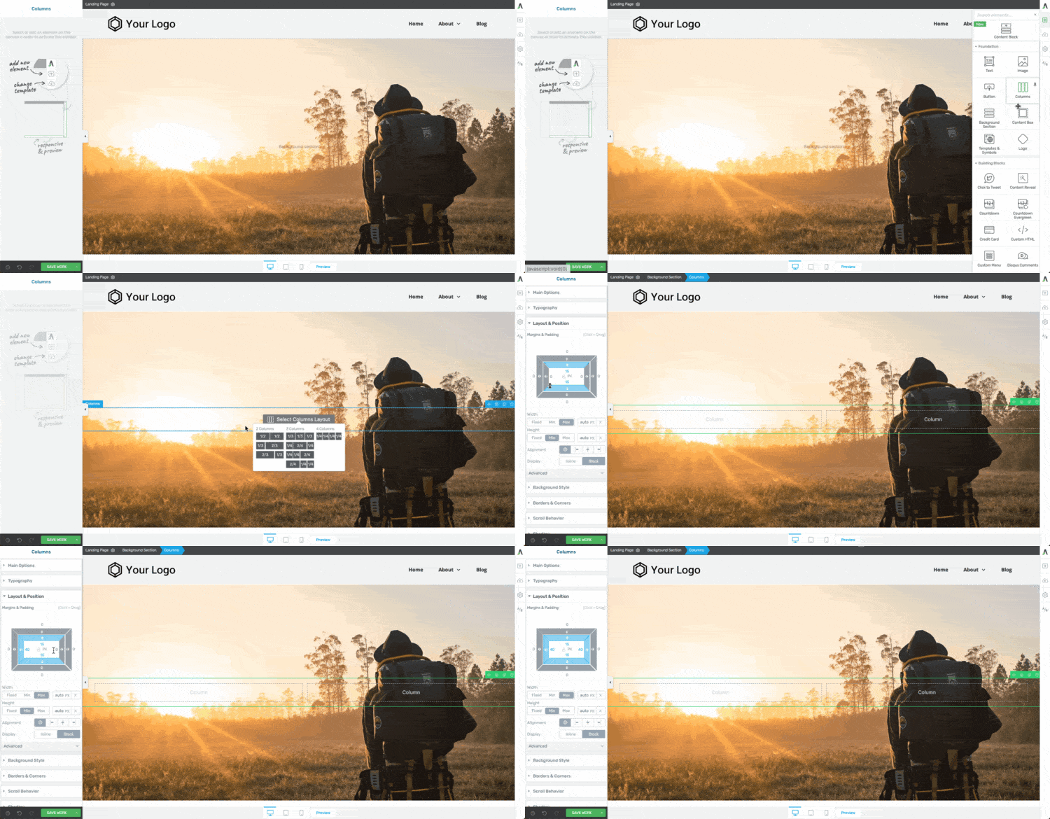
Step 2: Drag & drop a Column element into your Background Section, select the 2-column 1/2, 1/2 option, and then set the margin and padding spacing for your column element.
Step 3: Drag & Drop Text into One of Your Columns
Now it's time to add your Hero Image heading and tag line text.
You can do this by drag & dropping 2 Text elements into one of your columns. Set the heading text as an H1 and customize its color, size and font to fit your design (make sure that there is high contrast between the background image and the color of your font).
Make sure your tag line text is set as Paragraph text and do similar customizations.
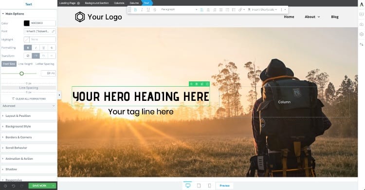
Step 3: Drag & drop your Hero Image text elements (usually an H1 heading and a paragraph tag line) into the Column element above the empty side of your photo. Customize the text with your branded fonts, font size, a font color that has high contrast with the background, etc.
Step 4: Tablet and Mobile Optimize Your Hero Image Design
One last thing... don't forget to optimize your Hero Image design for Tablet and Mobile!
You'll likely have to adjust the Background Section height, Column width, and font sizes to make sure your new Hero Image design looks good on all screen sizes.
Here's what it can look like when you optimize your Hero Image for tablet:
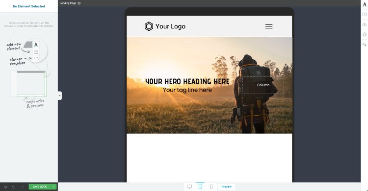
Make sure to optimize your new Hero Image for tablet...
And here's what it can look like when you optimize your Hero Image for mobile:
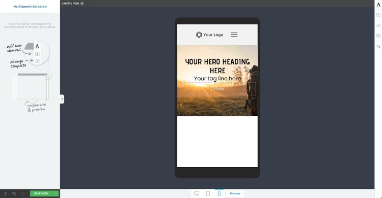
And finally make sure your new Hero Image is optimized for mobile.
Pretty quick and easy to get an awesome Hero Image set up on your homepage, right?

Checkered Layouts
Another modern photo or graphic layout you can use on the posts or pages of your website is the checkered layout.
Much like the alternating design pattern of a checkerboard, a checkered layout on web pages is achieved by alternating the side-by-side position of images and text as you scroll down vertically.
Here’s an example of a checkered layout on our “Chic Smart Homepage” landing page template:
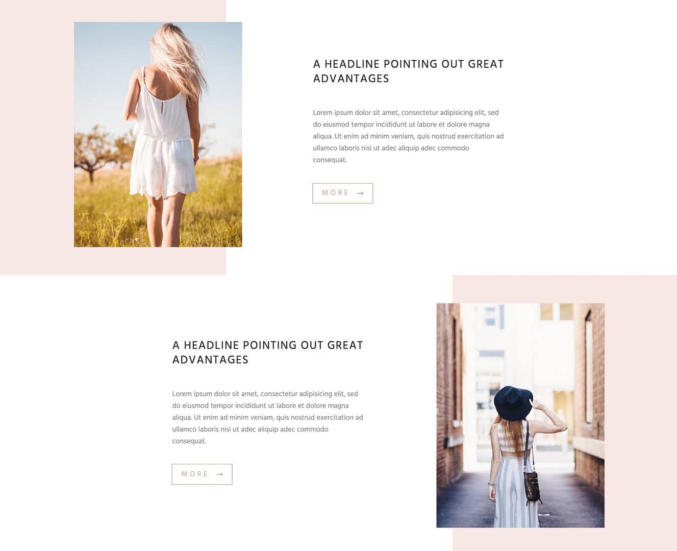
Here's an example of a Checkered Layout from the Chic Smart Homepage template available in Thrive Architect.
As you can see, the checkered layout is an especially useful way to present multiple features, benefits or talking points to readers in an aesthetically pleasing and professionally designed manner.
To achieve this effect in Thrive Architect, you can use Column elements to set up alternating text-next-to image pairs.
Create Impressive Content Box Layouts
One of the most versatile ways you can display your new images on a Thrive Architect built blog post or landing page is through the use of the Content Box element.
The Content Box is a basic Thrive visual editor design element that allows you to set any background image, color or pattern you want — and then add virtually any other Thrive visual editor element inside of it including Text, Images, Columns, and more.
To show you how quick and easy setting up a professional looking Content Box design is with Thrive Architect, check this out:
Yup, nothing gives you the freedom to use your photos in professional digital designs quite like Thrive Architect!

Chapter Headings, Breaking Up Text Walls and Illustrating Points
Finally, one of the simplest ways to deploy images in your content to boost engagement is just placing self contained images — in the right places.
In Thrive Architect, this is usually done through the use of our Image element:
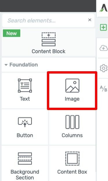
Drag & drop the Image element onto your Thrive visual editor window to add images where needed.
But where should you drop such images to make them most effective?
Well, here’s a few ideas that you can use to spice up both your landing pages or blog posts...
Above Your Chapter Headings
That’s right, you can use images (especially icons or graphics) above your chapter headings or major page sections in order to add clarity and create visual breaks within your content.
To give you an idea what that might look like in a piece of content, look at the following illustration:
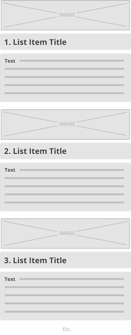
Use images (can be photos, icons, or graphics) as chapter headers to help give your content a visual structure for your readers.
You can use photos, icons or graphics as images for your chapter headers, just make sure they have a visual consistency between them all. For example, if you use a well-designed icon for your first chapter header, use similarly designed icons for all the remaining chapters like this:

An example of icon chapter image headers in a blog post.
Adding images in these spots not only makes your content more engaging, but also breaks the monotony of text-only scrolls that modern day web readers find frustrating to stick with.
In fact, if you’d like to take this chapter heading image strategy to the next level, read our blog post on Content Patterns here to get more ideas of how to visually structure your long-form content.
Within Text Heavy Sections of Your Content
Like we mentioned above, it’s important to make sure you never end up with long walls of text that are void of visuals in your blog posts or landing pages. Such blocky lumps of text are intimidating to read and have little aesthetic appeal outside of text books:
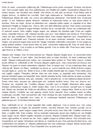
Not very enticing to read, right? Your online content isn't a novel so break up text with lots of white space & images to make it more readable.
Instead, make sure to use images in a way that breaks up your text every screen length or so (much like we did with the screenshots, chapter images and graphical elements — like blockquotes — in this post). This also helps to illustrate the important points your content is trying to convey.
Image Modification Options
Finally, it's super easy to make instant modifications to your images within the Thrive Architect editor. Just add an image to a post or page in the Thrive visual editor, highlight the image, and then open the Image Effects tab in the left sidebar:
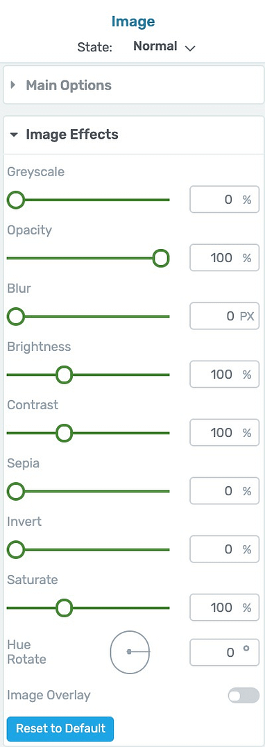
Want to turn a color image into a black & white image? Adjust the Greyscale slider bar 100%.

Unmodified color image. (0% Greyscale)

Image Effects: Greyscale option turned up to 100%.
Need to make your image more transparent? Crank the Opacity slider down.

Unmodified color image. (100% Opacity)

Image Effects: Opacity option turned down to 50%.
Think an image would look better in Sepia? Yup, there's even an Image Effect slider bar for that option too!

Unmodified color image. (0% Sepia)

Image Effects: Sepia option turned up to 70%.
There's actually 10 different Image Effects options you can dynamically apply to your images in Thrive Architect. So if you're in need of some on-the-fly image editing, the Thrive visual editor has got you covered.
Ready to Give Your Own Content a Visual Upgrade?
Now that you know where and how to find amazing images for your online content, what are you waiting for?
Go ahead and give the image hosting platforms a search and see if you can weave them into your posts and pages with the design strategies discussed above.
And if you have any other image resource tips or clever visual design strategies that belong in this post, let us know about them in the comments below!


Thank you to share that, good image sources are never too much.
I still have problems with images in the Post List, they always appear with some distortions depending on the size/resolution of the screen of computers, tablets, and cell phones: https://querotemostrar.com.br
As TT doesn’t tell what are the ideal sizes for Posts featured images, I don’t know how to solve this to show images correctly on all devices.
Any tips?
Thanks Soraia! As for the Post List images, because the element’s dimensions are completely customizable, it’s impossible to recommend a one-size-fits-all image dimensions for it. The best way to manage this is to standardize your featured image dimensions for all posts, then customize your Post List design to look good on Desktop, Tablet and Mobile for that image dimension with the mobile responsive editor.
Thanks. I’ll bookmark this page.
Awesome… glad you found the post helpful Stephen!