Ever found yourself puzzled over how to create that perfect Call-To-Action (CTA) in WordPress?
You’re in the right place, because this blog post has got you covered.
A standout CTA is key to guiding your visitors, encouraging them to take the steps you desire, whether that’s subscribing to a newsletter, downloading a guide, or making a purchase. It’s your digital way of saying, “Hey, this way!”
But it isn't just about slapping a button on your page and hoping for the best. You need a strategy -- and that's where we come in.
We’ve prepared a friendly, straightforward guide on how to create a Call-To-Action in WordPress—the right way.
Ready? Let's dive in.
Avoid The Big CTA Trap: A Common Mistake That’s Killing Your Conversions
We’ve all been there – yes, even us.
Early marketing days, setting up landing pages with what we believed was necessary – a bit of text here, a couple of images, a blaringly bright background…
And the finisher… a big, bold “BUY NOW” button.
Only for the page to pull in minimal conversions… if any at all.
Falling into the Big CTA Trap is an easy mistake to make. It's that common pitfall where we put all our hopes on a flashy Call-to-Action button to do all the heavy lifting in converting visitors.
The truth? It’s a strategy that's likely killing your conversions.
The misconception lies in thinking that if your CTA button is bold enough, persuasive enough, or big enough, it will work magic on its own.
If it was that easy, all you’d need to do is open the Block Editor, add a button block to your page and change its color, text, border radius, etc. — or use a basic CTA WordPress plugin — but it doesn’t work like that.
Here's the deal: A CTA button isn't a standalone hero; it's the final act in a much longer play. The entire journey your visitor takes on your landing page—from the headline they first read to the images they see and the copy they digest—builds up to that CTA. Ignoring this narrative, and focusing solely on the button itself, overlooks the essence of what truly moves a visitor to take action.
And Here’s The Thing: You Don’t Need a CTA Button…
You Need a CTA Strategy….
Remember, you don’t just want someone to click a button…
You want someone to fill in a form and sign up for your email list…
You want someone to exchange their info in return for a free offer or locked content…
To register for your webinar…
To buy your products…
You want their commitment and interest.

It’ll take more than pasting a “Do This” Button on the bottom of your page to achieve that.
Every part of your landing page needs to guide your visitors to make that move.
And once they land on your CTA section, what they see is enough to turn their interest into action.
The reality is, a successful conversion is the result of a well-crafted, cohesive landing page experience. Every element on the page should harmoniously guide the visitor towards the action you want them to take. It's about creating an intuitive, compelling path that makes clicking that CTA the most natural next step for them.
What Does the Optimal CTA Look Like?
The optimal CTA is visually striking, with a contrasting color to stand out on the page.
It features concise, action-oriented text that clearly communicates what the visitor will get by clicking. It's placed in an intuitive location, where it naturally draws the eye following the flow of the content.

Also, it's designed to feel like a natural next step for the visitor, seamlessly integrated design of the landing page.
It’s not an isolated part of your page. It plays a part in the overall story you’ve presented to your audience.
But, to get this right, you need to think beyond the Block Editor or rigid templates that offer no design freedom.
You need to use the right tools to create a successful path from interest/awareness to conversion.
Use These Tried-and-Tested Tips to Get More Conversions from Your CTA
First, Download and Install Thrive Architect
Now, if design isn’t your forte and marketing feels a little tricky at times, you know that creating “successful” landing pages can sometimes feel like trying to solve a Rubik’s Cube blindfolded.
Enter Thrive Architect – your secret weapon for creating high-converting, SEO-friendly pages in minutes like a pro. It’s the ideal solution for beginners and advanced users alike.
We aren’t exaggerating when we say this is the landing page builder you need to turn browsers into leads and buyers. Your trusty companion along the road of building a successful business, and here’s why we say so:
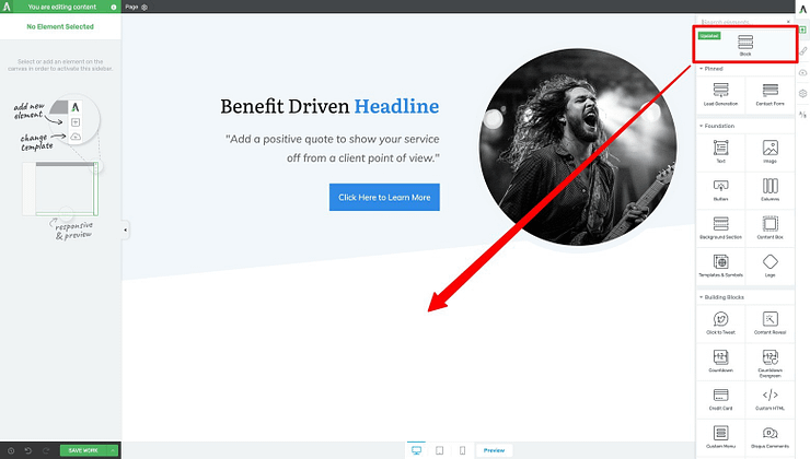
Drag-and-Drop Functionality: Imagine being able to move elements around your page as easily as rearranging puzzle pieces on a board. That’s Thrive Architect for you. No coding, no unnecessary shortcodes, no fuss. It’s all about giving you the freedom to bring your vision to life, fast.
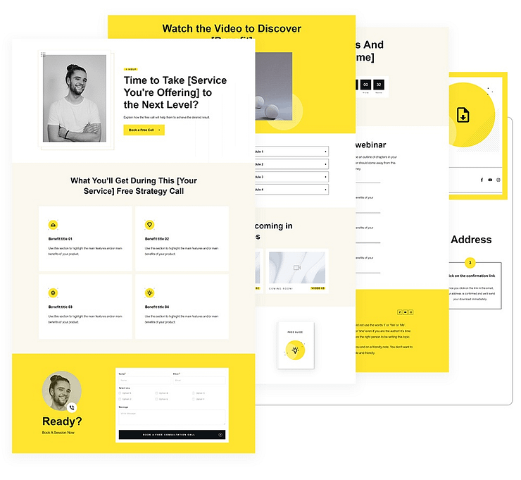
- Ready-to-Roll Templates: Thrive Architect comes with a treasure trove of templates that are not just easy on the eyes but optimized for conversion. Think of it as having a team of design and marketing gurus handing you a blueprint to success.
- Lead Generation Made Easy: Want to grow your email list? Thrive Architect has got your back with customizable email opt-in forms and conversion elements that blend in seamlessly with your design. It’s about turning casual visitors into loyal followers.
- A/B Testing Magic: Not sure if your headline should promise dreams or solve nightmares? With integration options like Thrive Optimize, you can test away and find out what resonates with your audience. It’s like having a crystal ball, but better.
- Looks Good Everywhere: In a world where your audience might be scrolling through your homepage or landing page on anything from a smartphone to a widescreen monitor, Thrive Architect makes your site look flawless everywhere. Responsive design controls let you tweak until everything’s perfect.
- Light & Fast: Nobody likes a slow website. Thrive Architect webpages load quickly, keeping your visitors happy and engaged. A fast page equals a lower bounce rate and more conversions.
- Integrates Well with Other Tools: Whether you need to connect to your email marketing tool (e.g. Mailchimp) or an eCommerce tool like WooCommerce, Thrive Architect seamlessly connects with a variety of other tools, making it a breeze to fit into your existing marketing stack.
Thrive Architect gives you the freedom to easily design your landing pages – and call-to-action sections – with no stress.
No need to know HTML or CSS. No wrangling with the Block Editor (Gutenberg). No limited “all-in-one” solutions.
You’re in the driver’s seat with the cheat codes you need to drive conversions. And the next few sections will show how you to achieve that.
Goal 1: Create a CTA to Get More Newsletter Subscribers
If you want people to sign up for your newsletter, to learn more from you about a certain topic, you can’t just throw a contact form on a page and say “Sign Up” here.
Why should they trust your content? What makes you different from the competition?
Your CTA strategy to get more newsletter subscribers could look like this:
Start with an attention-grabbing opt-in form at the top of your page. This captures their interest immediately and tells them what action to take.
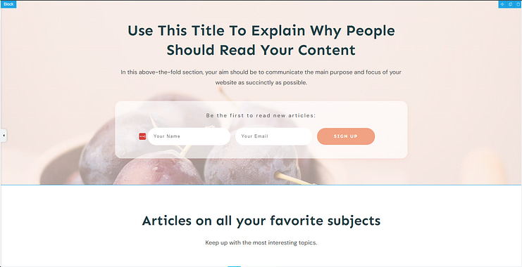
See the helper text in the content block? Thrive Architect’s blocks feature these little nudges in the right direction to help you put your copy in the correct space.
And take a look at what’s under the form – a section dedicated to spotlighting articles from your blog. The best way to convince a potential newsletter subscriber to join your list is to show them some of your thought leadership pieces – blog posts, videos, podcast episodes, etc.
Throwing this right under your CTA section helps capture the visitors who scroll past the form initially and need more convincing.
You can further reinforce your credibility by adding a couple of testimonials right after the posts list section – which Thrive Architect automatically adds to their pre-designed landing page templates.
Alternatively, you can add your own posts list element to your page with a simple click, or drag and drop from the right sidebar.
Newsletter sign-up pages don’t need to be long, since the desired action is low cost and low commitment.
So wrap up your page with one more CTA section for the people who’ve made it to the bottom.
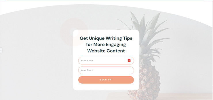
Make sure your CTA heading (and button text) is consistent with the first call to action at the top of your page, so your visitors know its the same offer.
Also, notice how this type of CTA doesn’t look like a bland button or form just placed randomly on the page. There’s thought and intention behind it, and the background colors and visual support make it more enticing.
When you use Thrive Architect to build your landing pages, you don’t just get the basics. You get building blocks that are infused with the strategy you need to generate conversions.
Goal 2: Create a CTA to Get More Lead Magnet Downloads (Lead-Generation)
Now, if you want to get more email sign-ups through a free offer – your lead magnet – your CTA strategy will be slightly different.

You might want to use a hero section that shows your audience what your lead magnet will look like on any type of device. Not only is this attention-grabbing, it’s stunning to look at.
You aren’t just plastering a .png or .jpeg file of the cover of your downloadable offer. You’re giving your audience a real sneak peek into what they can expect from the whole experience – something that’s easy to digest, works on all devices, and is a must-have.
The headline and supporting text, which you can enhance with the text highlights feature in Thrive Architect, will assist with capturing your visitors’ interest, too.
And since this offer does require a bit more commitment than a newsletter sign-up, you should strengthen your call-to-action with testimonials from previous clients or users, and outline the main benefits of your offer.
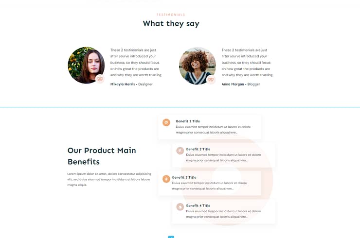
Use the benefits section to paint a solid picture of how your audience’s lives will change after they opt-in and consume your lead magnet.
Once you’ve driven this interest and got your visitors ready to take action, end your page off with another call-to-action. You can use the pre-designed CTA provided by your Thrive Architect landing page template, or simply add a CTA block of your own.
No need to build each element from scratch – the professionals have already done it for you.
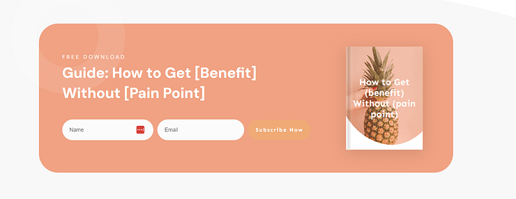
Once again, this isn’t a plain, ordinary form. You have a space to add a high-quality image of your lead magnet’s cover, a pre-designed form with pre-filled text, and a neat button right next to the form that removes any confusion.
Goal 3: Create a CTA to Land More Webinar Attendees
Your webinar landing page doesn’t need to be long and elaborate to get people to sign up. Once again, you just need the right elements.

Starting with a high-quality hero section above the fold. This comes pre-designed in Thrive Architect’s landing page template sets, but there are a range of block templates you can choose from too.
Here’s one stunning template from the Block library:

See, you also get options. So if you want to start your webinar registration page with a more interactive CTA section – that also lets you add a video preview – you can.
That’s the essence of Thrive Architect. You don’t get rigid templates that you have to follow. No, you get freedom of choice and maximum design flexibility.
Every element can have its color changed, size redone, images replaced, until you have a landing page that reflects your brand.
You can also use elements like countdown timers or “limited spots left” sections to push hesitant visitors to take action. Just drag and drop the countdown timer element and select the one that you like best.
Goal 4: Create a CTA to Drive More Product Sales
This is a big one. The one that keeps a lot of business owners up at night.
Putting together the right sales page elements to get more clicks and conversions might feel like trying to redefine Newton’s law…
But with the right tools you can launch your offer with a sales page that serves as one big call-to-action.
As we’ve said earlier, Thrive Architect’s landing page sets are designed for action. We provide you with the framework, and you go in and add your personality through copy and visuals.
Basically, we leave you with the fun stuff 😉
Now, since your desired action on a sales page involves your potential customers exchanging money for your offer… you’ll need to support your CTA buttons with a lot more evidence.
You can follow the same approach and start with your CTA section at the top of your page like this:
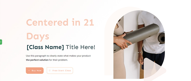
Or this:
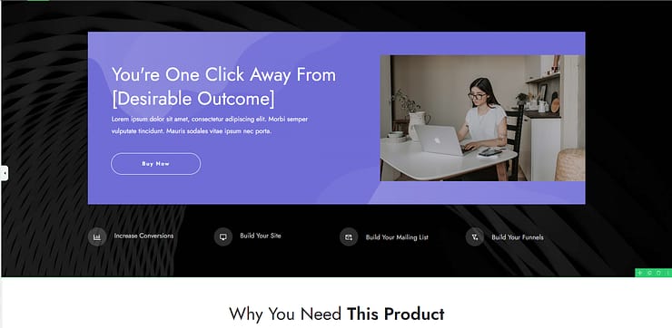
Take a look at what follows right after. A key sales page principle – “leading with why”.
The next parts of your sales page aren’t just there to fill space. The hero’s journey, pain points, and other elements all play a part in driving your potential customers to the “Buy Button”.
You already know what your “Buy Button” should look like – bright color, contrasting with your page, etc.
But what are you adding before and after your call-to-action to get your audience to take action?
Here’s the answer
Testimonial sections
Features and benefits sections
Frequently asked questions
Money back guarantee
Pricing tables
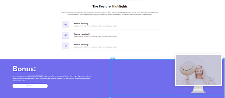
These sections are a part of the path to your sale. The big mistake business owners make is treating their sales page like a collection of separate, unrelated elements.
And that’s how you lose your audience.
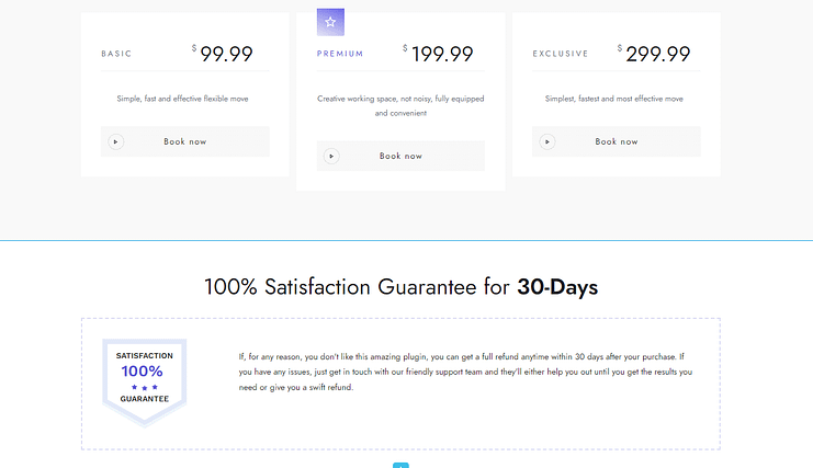
Think of your sales pages like a set of dominoes. As your audience reads through one section after the other, another piece falls, and their interest grows.
By the time they get to your next CTA button, they’re ready to click it because they’re fully informed and ready to try our what you have to offer.
Goal 5: Create a CTA to Get More Consultation Requests
For coaches, consultants, and other service providers this one’s for you.
You can use the advice from any of the above pointers, but there are a few more elements you can add to your pages to turn curious visitors into excited clients.
Starting with a small but powerful option. The “Click to Call” button – which can also be a “Click to Email” button.

You can add it as a separate CTA section on your page, like in the example above.
Or you can create a specific button to add to your menu, header, or footer:
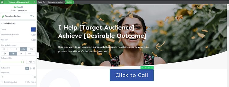
The button above is an example. You’ll definitely want to make yours a different color, or size, but what’s important is its purpose. Sometimes your prospects want to talk to you immediately and don’t want to use a form – while others prefer to leave a message.
You can cater to both audiences by offering a form as one of your main call-to-action sections, and sprinkling a couple of “Click to Call” buttons on your page – one or two is enough.
With conversion generation, simple is always effective. You’ll notice that our landing pages, blocks, and design elements aren’t overly complex or fancy – but they get the job done.
They don’t sit on your pages like stationary figures, no. They all play a part in converting your audience into leads, subscribers, and customers.
And if you want word to spread about your content, or offers, simply add a social sharing button to get your audience to share.
And all these tools are at your disposal with a single Thrive Architect subscription.
Next Steps: Add a Pop-Up To Boost More Conversions
It never hurts to add a few creative elements to your page to speed up conversions.
Pop-ups get a lot of flack, but it’s mainly because of how they’re used. Some sites use them too often and restrict visitors from being able to exit them with easy – of course they’re going to be hated.
But a tool is only as effective as its wielder.
With the right strategy – and pop-up builder – you can leverage this conversion element correctly and see a major uptick in results.
Here are a couple of step-by-step WordPress tutorials to help you get started:
How to Build a CTA: Ready to Start Working?
So that's a deep dive into creating a call-to-action strategy that will help you build conversion focused landing pages and blog posts faster.
Thrive Architect is the tool you need to make this happen.
Think of how much easier your life will be when you can design your landing pages in minutes and not hours.
Think of how much time you'll save -- and who doesn't love free time?
If you're serious about changing your current strategy so you can see the results you really want, this is your chance.


