If your most important content is getting skimmed past, ignored, or lost in a wall of text… it’s not your copy. It’s your layout.
I've done my research and found that 40% of people focus on images, 21% on videos, and the rest are influenced by things like layout and color. So, if your message isn’t visually highlighted, it’s not reaching your audience, get this, even if it’s the best thing on the page.
And that’s exactly why WordPress content boxes matter more than most people realize.
They give your message a container that stands out. A place to breathe. A way to draw attention without shouting. And they do it in a way that fits naturally into your design.
I use them all the time. Styled boxes help me:
It doesn't matter how you're building posts or pages — using a basic Gutenberg content box or a visual editor built for conversion, this guide will show you how to use content boxes the right way, so you’re not wasting your best content on layouts that don’t support it.
Let’s fix that.
What’s a Content Box in WordPress (and Why You Should Care More Than You Think)
A content box is, well, exactly what it sounds like: a box that holds content. Sounds basic, right? That’s what I thought too.
At first, I figured I could just throw some padding and a background color on a block and call it a day. But once I started using properly styled, reusable WordPress content boxes, everything changed.
My pages felt cleaner.
My layouts were easier to scan.
And my conversions? They started going up.
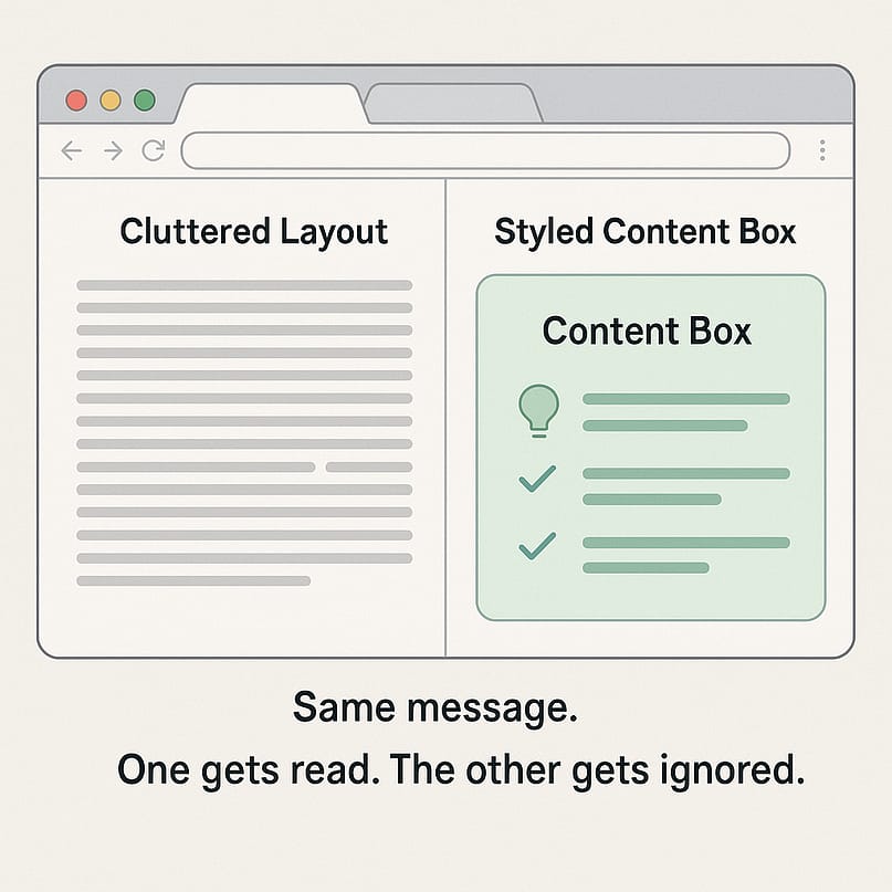
Turns out, content boxes are doing quiet but essential work on almost every high-performing site you’ve ever admired. They help:
- Frame testimonials so they actually get read
- Highlight key features in bold, skimmable layouts
- Wrap CTAs in a way that draws clicks, not yawns
- Break up long-form content into something your reader wants to keep scrolling through
Think of them like visual road signs: clear, helpful, and designed to guide your visitor toward the next step without friction.
Your WordPress layout tools should work with you, not slow you down. Content boxes are one of the simplest ways to make that happen.
🛠 The Main Ways to Create a Content Box in WordPress
There are a few different ways to create content boxes in WordPress, and depending on what you’re building (and how much of a perfectionist you are), some will suit you better than others.
Let me walk you through the three I’ve used myself—what works, what doesn’t, and what I’d recommend if you want something that looks good and gets the job done.
1. The Basic (Gutenberg) Way
If you’re using the default WordPress editor—aka Gutenberg—you can absolutely create a content box without installing anything extra. Just use a Group block or Columns block, set a background color, and add whatever content you want inside.
I’ve done this more times than I can count, especially for quick blog callouts or summaries.
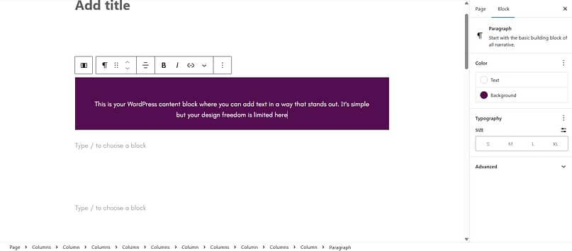
Pros
Poi nts to Consider
This is a good starting point if you’re brand new to WordPress content boxes, but it can get frustrating fast if you want more design control — or consistency across multiple pages.
2. The Plugin Route (Stackable, Ultimate Blocks, etc.)
If you want more styling options without diving into code, there are plugins that give you pre-designed styled content boxes. Stackable and Ultimate Blocks are two of the more popular ones, and they add handy new blocks to your editor for things like feature highlights, notification boxes, or callouts.
Pros
Points to Consider
I’ve used this setup when I needed something quick for a client—but long term, it’s not super scalable. Think of it as a helpful shortcut, not a full-on solution.
3. The Thrive Architect Way (What I Actually Use)
Okay, real talk—this is the method I always come back to.
Yes, Thrive Architect is a full visual editor. And yes, I get why that might sound like overkill for something as “simple” as a content box. I thought the same thing at first.
But here’s what changed my mind: I wasn’t just trying to build a box. I was trying to make my content clearer, my layouts cleaner, and my pages actually convert.
And doing that with Gutenberg and a bunch of plugins felt clunky. I was wasting time on small fixes, fiddling with margins, or trying to get spacing to look right across devices.
Thrive Architect made that stuff go away.
Here’s what I love about it:
You get dozens of pre-designed templates and responsive content blocks—testimonials, features, bonuses, you name it
You can drop anything into the box: buttons, videos, forms, icons, timers
Everything is responsive out of the box—no extra steps, no guessing
You can save boxes as templates and reuse them wherever you want
I use it for:
Blog callouts
Bonus reveals, course highlights, call to action containers—you name it
So no, I didn’t get Thrive Architect just for content boxes. I got it because I wanted a better way to build the kinds of pages that actually support my business. The content boxes? They’re just one of many reasons I’d never go back.
If you're tired of patching things together and want your WordPress content boxes to work as hard as the rest of your site, this is the tool I’d recommend—every time.
How to Build a Stand-Out Content Box in Thrive Architect (Step-by-Step)
If you’ve ever spent too much time nudging elements into place or trying to get padding just right, I’ve got good news—this part is going to feel refreshingly easy.
Here’s how I create content boxes in Thrive Architect that look polished, stay consistent, and actually support my goals (not just “look nice” in a vague way).
Step 1: Open Your Page in Thrive Architect
Start by opening the page or post you want to edit—could be a blog post, sales page, thank-you page, whatever you like. Click “Edit with Thrive Architect” to launch the visual builder.
You’ll get a live preview of your page, and yes, everything is drag-and-drop.
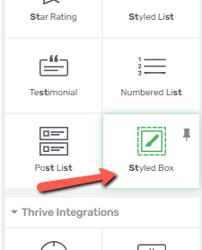
Step 2: Drag the “Styled Box” Element into Your Layout
On the right-hand side, search for “Styled Box” (it’s under the “Foundation” elements). Then just drag it onto your page where you want the content box to appear.
You’ll instantly see a clean-looking container you can start customizing.
Step 3: Choose a Template That Fits the Job
Here’s where it gets fun—you can choose from a bunch of built-in templates:
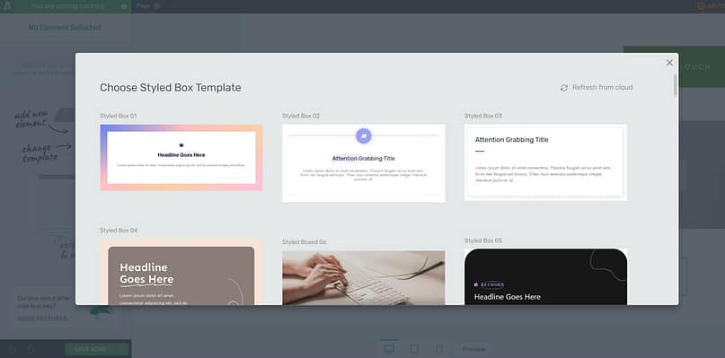
Testimonial boxes
Feature highlights
Bonus callouts
Tip or warning boxes
Simple color-blocked containers
Pick the one that best fits the message you're trying to highlight. You can always tweak the design after.
Step 4: Customize Everything (Without Breaking Anything)
Click on any part of the box—headline, background, icons, spacing—and edit it live. No code. No guesswork.
Want to change the background color? Done. Need to adjust padding? Drag a slider. Feel like swapping the font or layout? Totally doable.
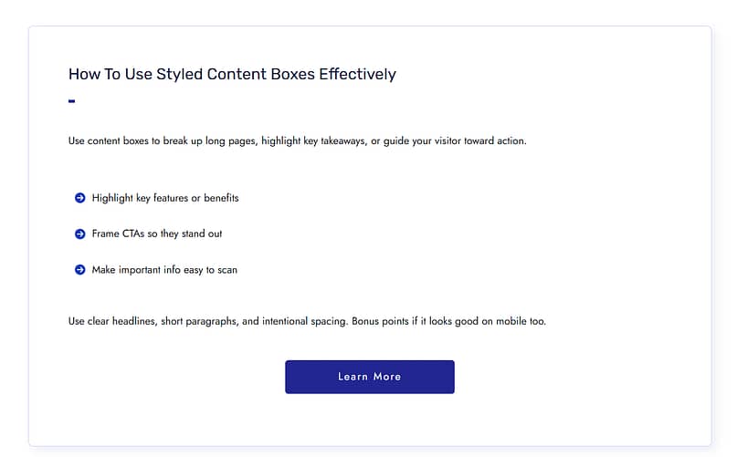
Bonus: You Can Add Anything Inside Your Box
This is where Thrive Architect really shines. Your content box isn’t just for text. You can drop in:
Images or icons
Lead generation forms
Testimonials
Even nested columns or other content boxes
There are no layout limitations, which is why I use this setup for everything from blog post summaries to launch promos.
Optional but Highly Recommended: Save as a Reusable Element
Once you’ve designed a box you love, save it as a template. That way, you can reuse it across pages in just a few clicks—no rebuilding, no copying and pasting.
It’s one of my favorite time-saving tricks, especially for recurring CTAs or feature boxes.
Smart Ways to Use Content Boxes on Your Site
Once you start using content boxes, it’s hard to stop. They're one of those “why didn’t I do this sooner?” kind of tools.
Here are a few simple but powerful ways I use WordPress content boxes to make pages more engaging—and more effective.
✅ Highlight Benefits Without a Wall of Text
Instead of a long paragraph, use a 2–3 column feature box layout to make product or service benefits pop. Great for homepages and landing pages.
✅ Pull in Testimonials (That Actually Sell)
Wrap a great review in a styled content box so it doesn’t get buried. Bonus points if you include a photo, star rating, or result (“Saved me 4 hours a week!”).
✅ Reinforce CTAs with Bonus Clarity
Instead of dropping a lone button at the end of a section, add a content box that builds context:
Why this offer matters
What they’ll get
What to do next
Think of it as a CTA with a supporting cast.
⚠️ Mistakes to Avoid (Yep, I’ve Made Them Too)
Let me save you a little frustration (and a lot of redesigning) by sharing a few content box mistakes I’ve definitely made so you don’t have to:
🚫 Using five different box styles on one page It might feel fun in the moment, but it ends up looking like a patchwork quilt—confusing, not cohesive.
🚫 Letting boxes go full-width on mobile Been there. Learned that squinting isn’t a great user experience.
🚫 Forgetting to preview on mobile entirely Thrive Architect has a mobile view for a reason. Use it. (Trust me, future you will be grateful.)
🚫 Dropping a content box in without a clear goal I used to add them because they looked good. Now I ask, what do I want the reader to do next? Click? Read? Sign up? Clarity is everything.
Your boxes don’t have to be fancy—they just have to be clear, consistent, and purposeful.
❓FAQs
Do I need Thrive Architect to create content boxes in WordPress?
Not technically—Gutenberg content boxes and plugins like Ultimate Blocks can get the job done. But if you want them to look polished, load fast, and be easy to reuse across your site... Thrive Architect is honestly the best tool I’ve used. It just makes everything smoother.
Will adding content boxes slow down my site?
Only if you go overboard with heavy plugins or oversized media. I keep mine lightweight and clean. Thrive Architect is well-optimized, and I always compress images just to be safe.
Can I use content boxes on landing pages or course pages?
Absolutely! I use them on sales pages, lead gen pages, even inside my Thrive Apprentice lessons. They work beautifully for testimonials, bonuses, next steps—whatever you want to call out.
What’s the difference between a content box and just using padding or dividers?
Great question. A content box gives you structure, styling, and focus all in one. It's not just about spacing—it's about guiding your reader's attention and keeping your layout clean and intentional.
Conclusion: WordPress Content Boxes Are a Small Shift With a Big Impact
When I first started using WordPress content boxes, I didn’t expect them to make such a difference. I thought of them as a nice-to-have design element—something to make things look a little cleaner.
But over time, I realized they were doing something way more important: They were helping people actually see the content I cared about. Click the button I wanted them to click. Take the next step without getting overwhelmed or distracted.
Now I use them everywhere—because they make my message clearer, my pages easier to navigate, and my CTAs so much more effective.
And when I started building them with Thrive Architect, that’s when everything clicked. No more fiddling with spacing. No more rebuilding from scratch. Just fast, flexible tools that support the bigger picture: building pages that connect, convert, and feel like me.
👉 Want to give it a try?
Open Thrive Architect, drag in a styled box, and start creating content that doesn’t just look better—works better. It takes minutes, and you’ll feel the difference immediately.



Wow ! These are amazing. My designer will go crazy with delight. It seems to me that with TA its nearly irrelevant which theme you choose… to a point. Thanks for such a great toolset.
Thank you, Jonathan!
Brilliant! This truly is an awesome tool – Thanks, Shane 🙂
Thank you, Kevin!
Shane, great video! Sparked a lot of inspiration. It would be cool to tie all of these technical design tutorials to the content development tutorials (content patterns, etc) in a Thrive University course.
I’m getting the idea that it would be good form to develop a style guide for each of my websites. It would include how to present summaries, lists, content upgrades, notes, sidebars, etc. All of these content boxes could become templates that I just pull up anytime I need to present a specific content “module”.
I agree with you very much, Martin. I’m a big believer in style guides and design systems and that is indeed the direction we’re developing Thrive Architect in. Of course, making a design system capable visual editor that isn’t totally overwhelming to the user is a bit of an audacious goal, so it’s a long term project.
What you can already do (and what I do for my sites) is to create the basic layout elements that you’ll use repeatedly – like button styles, note boxes, highlight boxes and so on. Save those as content templates and re-use them.
Content boxes are a good example of this, actually. I use 2 – 3 different content boxes per website. No more. So, I’m not designing the thing from scratch, every time. I create it once and then keep using it. It’s convenient and also very good for visual consistency.
Hi Shane, again a great Video. One question: What is the best way to setup a vertical Divider between two columns? Thanks, Thomas
Hi Thomas, you can add a border to a column (and only add a left or a right border. This will give you the “vertical divider” look 🙂
Those tutorials are great and super handy. However, it’d be great to have those elements built in inside TRHIVE ARCHITECT instead.
We’re working on that Andres 🙂
Very inspiring Shane!! Thanks for that! I am the opposite of an “early adopter”, so I was kind of irritated by the new look and feel of TA. But luckily through all the great demo cases by you and Hanne, I get more and more inspired to embrace TA! So, again: Thanks!
And by the way, another thank you for giving the templates you’ve made available for us in TA.
Thank you for your comment, Harry. It’s great to see that we are winning you over. 🙂
We’ll be creating lots more of these types of tutorials. If you have any specific questions or requests, please let us know. We’re very interested in making these as useful as possible.
GREAT!!!
So nice to see you build custom style content boxes to fit any taste and website.
It’s pretty cool, right? 🙂
I’m glad to know you found this tutorial useful as well.
Very nice video, I definetly will use this feature.
Glad to hear it, Claudemir. 🙂
Thanks, this is good stuff for those of us who don’t have quite as good an eye for design.
Thank you for your comment, Randy!
I LOVE the new Thrive Architect!!! We depend on it DAILY for our website.
Will there be options to change the border line-style in in the TA GUI? I.E. Dashed, Dotted, Gradient or even Image borders?
That would be a lovely addition.
Richard
Hi Richard,
I’ve got great news for you: dashed and dotted borders are already available. I should have shown an example in this video, now that you mention it.
When you set a border, you see a line of icons, starting with “none”. There, you can set solid, dashed or dotted borders.
You must be reading my mind, Shane.
Had an urgent need for some content box ideas — and along you came with this tutorial.
So many great suggestions.
Now the issue is where to start!
And thank you so much for making the content box templates available to us, as well.
That’s great to know, Phil. I’m glad that this tutorial was useful and timely for you. 🙂
I’ve said this before, but Thrive just keeps getting better. This is the first time I’ve seen a breadcrumb interface used so intuitively – it’s so much more than a navigation element! Clever stuff. Keep these videos coming. I learn more every time.
Thank you, Quentin! We do aim to keep getting better relentlessly. 🙂
Hi Shane,
I was trying to add an Image which when hovered, will show some text describing the image with an overlay to make it readable.
But I couldn’t figure out how to add text just to the hover state. Is it even possible with Architect?
We don’t have a feature for this yet, no. One of our planned features is an extension of animation and hover effects and we will include something like this as well. However, it’s a relatively low priority feature compared to things like A/B testing for landing pages, so it won’t happen soon.
Really helpful.
I was struggling with similar city picture on a page and this was really illuminating. Thanks…
And, more designs please…
Thanks for your comment, TJ. It’s great to know that this was useful for you.
Shane,
Great video! Thanks for sharing. However, I noticed that I don’t have nearly all of the updated templates in my Thrive Architect update that you show in the video. For example, my templates don’t show any of the guarantee boxes, content boxes, “Big Picture”, Pricing Tables, etc. Are these supposed to be purchased separately? I was under the impression that when Thrive Architect updated that it automatically updated new templates as well.
Hello Sharon,
There are no templates included here that you’d need to purchase separately. If you don’t have access to these templates yet, please make sure that you’ve updated to the latest version of the plugin and try doing a hard refresh (Ctrl + F5) on your page, before loading the templates gallery. If that doesn’t help, please contact our support team.
Hi guys, awesome tools thanks Shane as always. Quick question, how would we use an image in the place of the icon, so I’d love to place an image in a roundel in the corner of my content box?
Hello Jay,
You can apply the exact same thing to an image. Just a few notes: the image will retain its proportions. That means: if you want to have a perfect circle, you need to use a perfectly square image. On a square image, you will get this circle effect if you apply a large enough border radius. Also, the icon has a background that you can apply a color or other styles to. For an image, this would only work if you use an image with a transparent background.
Wow that’s pretty eye-opening. I know you guys mentioned that every previous template can be built from scratch, but it’s only seeing it in action that leads to the realization that we can do it too.
Thank you for your comment, Thomas! That’s great to hear. 🙂
This is awesome!
Question. Is there any way to take a content template that you create like this inside Thrive Architect and insert it somehow in WordPress editor – with Thrive short codes perhaps?
Thank you for the tutorial Shane.
Hello Igor,
No, I’m afraid that’s not possible.
I just love these videos. I’m a new Thrive Theme user and I find these tutorials immensely helpful for instruction AND for inspiration. Shane has a great teaching style, as well. Please keep them coming. I especially love the design ideas, and I carefully watch and take notes from every one.
Thank you for your encouraging feedback, Soraya!
Hey, Shane thanks for this video and for the downloadable template for the content box. Very helpful. I wanted to ask if you can do the same thing for the footer. My footer is not looking attractive at all and I can visually see where to go and not knowing how to use the plugin as much works against me as well. So it would be great if you can do a video on creating some footers examples and having some footer examples as a downloadable element. That would help out.
Thank you for the suggestion, Luis!
I can make a video showing how to create a simple footer layout. However, you can’t apply Thrive Apprentice headers or footers to theme pages and posts. Not yet, anyway.
Brilliant and very useful, thanks, Shane! Just starting to use TA now (but longtime Thrive Themes member) and really appreciation both these tutorials and the templates to help not have to start from scratch.
Those content boxes are sooo flexible, and no more hand-coding div after div and css … love it!
Quick question: Will TA be affected by the proposed WordPress Gutenberg changes?
Hi Robert,
It’s great to hear that you appreciate the flexibility we’ve baked into Thrive Architect.
Regarding Project Gutenberg: it won’t impact anything we do, at least not for the time being. So far, the reception in the WordPress community has been mostly negative, so it’s uncertain how soon it will make it into core. Even once it does, it’s a really limited, overly slimplistic editor. It’s lightyears away from being a really useful tool for either webdesign or marketing. My guess is that there will be practically no overlap between what Gutenberg does and what we do, for at least a few more years.
Shane,
Another theme company just added some animations to their theme, but I see you already have them! This is much easier to use than the other theme (Divi) I have used for a couple of years! I thought the other theme was drag and drop, but it’s not true drag and drop like this! The other theme is riddled with short codes and much slower (bad, as it hurts load time and ranking). I also know that Google guys and gals will be going into “material” design with layers, and you already have layers built in!
Keep up the good work.
The more tuts and layouts, the better.
You can probably emulate what I call “the rise of elegantthemes” if you are familiar with it, and skyrocket your theme’s success.
Jeff
Thanks for your comment, Jeff. You know, this is a problem I see a lot, in our market. There are a lot of tools that are advertised as front end editors, drag and drop, WYSIWYG, fast, intuitive and so on, but they are actually none of those things.
I’m glad you like the tutorials. There are many more I’m planning to do.
I’d be interested to know your thoughts about the rise of elegant themes. I have my ideas about it, but I’d love to hear your perspective on it. 🙂
Amazing. Unfortunately my website is locked up in Divi. But I use thrive leads and was wondering how TA worked. Very helpful and inspiring video.
Thank you for your comment, Jim! Sorry to hear that you find yourself locked into Divi. For the moment, there’s not much we can do to alleviate that problem, I’m afraid.
Your Training Videos are the best around – thanks
Thank you, Dale!
As usual, this was so helpful! It’s really awesome to see how many design ideas can come from a “simple” content box! I especially like the last example with the background image, overlay, and icon effects! The templates are icing on the Thrive Cake! 😉 Loving Thrive Architect! It’s truly a game-changer!
Thank you, Karen! I’m pleased to know that you found this inspiring. 🙂
I loved content box in TCB but TA is even more awesome – looks like fun 🙂
I agree that this is way more awesome. 🙂
OMG, how amazing this is! Can this be set as a template for a single site or is it also possible to set the templates for different sites. Now, I open a new site and have to start building the same template again for using in the site I am working on (which is not that much of a work seeing this post, but still the you can build a collection of content boxes).
But, great work. Its amazing!
Hello Johan,
If you want to use the same templates on multiple sites, the fastest way to do that is to create a new, blank landing page, add all the content boxes and other custom elements you want to use there and then export the landing page.
You can then import that landing page to any other site and save the elements you created as content templates.
It’s not the most convenient solution imaginable, but it’s the best one we have right now, for moving styles between websites.
Absolutely loving the look and feel of Thrive Architect. Thanks so much Shane. The tutorials are amazing. :-)) Looking forward to playing around and implementing these new features to my website.
Thank you, Sue! I’m happy to know that you find the tutorials useful. 🙂
Many thanks, Shane! A lot of interesting info!
I want to ask a qustion: It’s possible to make a header like that ( https://www.upwlondon.co.uk/ ) with video without sound in background and text with button above?
Thank you!
Yep, that’s pretty easy to do with Thrive Architect. Video backgrounds are already available in the plugin and we will be creating a blog post about them soon.
Wonderful! A blog post about them will be wellcome!
Thank you! 🙂
Thanks Jonathan, this is very cool. The new features give so much more creative flexibility.
Once more, you have overdelivered:-). I was missing the styled boxes from TCB – and now there is such a variety of new boxes alongside with this great tutorial and even templates. Thank you!
As always…you guys ROCK!!! My decision to become a member for a year was so easy after experiencing the superiority of your products and service. Leadpages is now advertising a 14-day trial, so I thought I’d give it a shot. After just about an hour tinkering with their landing page builder, I cancelled the Leadpages account…they don’t come near to what you guys have here at Thrive. Wishing you continued success!
Shane. I love the tutorials you (and Hanne) produce and this one is no exception. TA has so many options so it’s great that you show us what can be done. Your tutorials really shorten the learning curve.
Thank you for all the helpful tips. ideas and the templates. Absolutely love TA.
THANK YOU SO MUCHHHHH!!!!
That’s absolutely amazing!! thank you so much!
Hi Shane,
a while back in TVE you added a feature that allowed vertical alignment within columns. You can see it at work here in a site I am developing (I have not upgraded this site to Architect for this reason). I cannot find this feature in Architect. Is there a work-around, or will this be added?
Thanks,
Alex
Hello Alex,
The feature is included in Thrive Architect as well. Click on anything inside your column layout, then click on “columns” in your breadcrumbs at the top of the screen. You can see an example of it used in Tip #4 in this blog post.
Thanks for your quick reply Shane – Just as an FYI, I had found that vertical alignment option but it wasn’t working. I then used another browser and it works fine. There are several items in Architect that seem to be problematic in Safari, but work fine in Firefox (and others I assume). The vertical alignment is one example and strangely, it works on the end product (viewing the published page) but while in the editor the elements do not respond to the alignment? Small issue in what is otherwise a great upgrade!
Thanks for the info. I know that some browser specific issues have been logged and we’re working on resolving any such bug that comes our way.
They are awesome Shane ! Just so impressed with the diversity of boxes you showcased. Thank you!
They are awesome Shane ! Just so impressed with the diversity of boxes you showcased. Thank you!
It’s fantastic and so simple! Now, we can create beautiful content boxes.
Thank you, Irena!
A bit out of context… but with the liberty that architect allows us to have, would you build a complete custom made website and or as complex as wordpress theme using architect ? Or you would stay away from building complete website with architect.
Using Thrive Theme Builder, Thrive Architect, and the rest of their ecosystem of products, I’d absolutely build an entire ‘custom-made’ website from sctach using Thrive. “Why wouldn’t you?”, is probably the question you need to ask yourself.
Amazing! I love it 😀 thanks for such nice tutorial! 🙂
Brilliant! My favorite parts were…..the hover section. I completely overlooked its functionality before. And how you implemented the purple gradient overlay to allow the text and the image to both shine without clashing against each other.
Thanks a lot!
It is so much fun to see what is possible. Shane, brilliant!
These are great styling options, but to be honest, I very much appreciated the former templates in TCB, because I am not a designer and with templates I had working and good looking suggestions for specific elements. I could change them as I wanted, but I appreciated not to have to design everything on my own. So I am happy that you offer saved templates in your LP templates for all who are not that good at designing.
whoa Shane…
what an amazing tutorial. Just one question bugs me constantly: Do you guys ever sleep?
Producing great plugins AND amazing tutorials!
Not only do you give us specific step by step instructions but then you give us the completed content of the tutorial. Mind boggling service Shane. My heartfelt thanks.
Very impressive. I work with companies to present their information, and this particular segment — with the downloadable content at the end — was brilliant. I am starting to get a big confused with the Thrive Content versus the Thrive Architecture tutorials, but this was great!
Thank you for your comment, Cat!
All Thrive Content Builder tutorials are outdated, at this point. We’ve removed and replaced them where possible, but there are still old blog posts featuring the previous builder.
Awesome tutorial! Is it possible to adjust the height when you have slanted sides? It appears they have to be at least a certain height? I can’t seem to make them smaller.
Will TA ever include flip boxes like X or Elementor has?
We don’t have such a feature on the roadmap at the moment.