TL;DR: Your Online Course Landing Page is Your Best Salesperson
You've built an incredible online course, but getting it in front of the right students can feel like a maze. This article cuts through the noise, showing you how to build an online course landing page that doesn't just inform, but actively converts visitors into paying students.
Key Takeaways for Skimmers (and a nudge to read on):
- It's a Dedicated Sales Tool: Your landing page isn't just another website page; it's a focused sales pitch designed to guide visitors to one action: enrollment. If you're just linking to your course platform, you're missing a huge opportunity to persuade.
- Strategy First, Design Second: Before you touch a single button, you need to deeply understand your ideal student, pinpoint your course's unique value, and articulate the transformation it delivers. This strategic groundwork is what makes a page convert.
- Build with Purpose, Refine with Data: I'll walk you through every essential element, from the attention-grabbing hero section to the trust-building testimonials. Then, I'll show you how to use tools like Thrive Architect to build it efficiently and how A/B testing and analytics can continuously make it better.
If you're ready to stop hoping for sales and start strategically attracting them, stick around. I'm going to show you how.
Let's talk about getting your online course into the hands of the people who need it.
You've poured your expertise, time, and passion into creating something valuable. Now, the challenge isn't just having a great course; it's making sure your ideal students actually find it and understand why it's the perfect fit for them. That's where a truly effective online course landing page comes in.
I see a lot of course creators get stuck here. They've built an amazing curriculum, but when it comes to presenting it online, the marketing side feels like a foreign language. They end up with pages that are pretty, maybe even informative, but they just don't turn visitors into paying students. It's frustrating, and it leaves a lot of potential on the table.
My goal here is to cut through that confusion. I want to show you how to build a landing page that doesn't just look good, but actively persuades. We'll cover the strategy behind it, the key elements that make a difference, and how you can put it all together without needing a marketing degree or a design team. Think of this as your practical guide to turning browsers into buyers.
If you're still in the early stages of bringing your course idea to life, we've got a comprehensive guide on How to Create an Online Course: The Pro Way that'll walk you through everything.
Why Your Online Course Needs a Dedicated Landing Page (And What It Actually Is)
An online course landing page is more than just another page on your website. It's a focused, single-minded sales tool designed with one purpose: to turn a visitor into an enrolled student. Unlike a general website page with multiple navigation options, a landing page keeps the spotlight firmly on your course and guides your visitor towards a single action – signing up.
You might be thinking, "Can't I just link directly to my course platform?"
You could, but that's like inviting someone to a party and just giving them the address without telling them what to expect or why they should even go. Your course won't magically appear in front of the right people, and even if it does, they need a compelling reason to stick around.
A well-crafted landing page acts as your course's dedicated salesperson.
It should:
- Grab attention immediately. You have seconds to make an impression.
- Speak directly to your audience's problems. Show them you understand their struggles.
- Clearly articulate your course's unique value. Why your course, and not someone else's?
- Showcase undeniable proof. Real results from real students.
- Answer burning questions. Address doubts before they become objections.
- Guide them easily to enrollment. Make the "next step" obvious and appealing.
Without a page that does all this, you're essentially hoping for the best. And hope, while lovely, isn't a business strategy.
Before you even think about building, you might want to check out our tips on How to Plan an Online Course: Strategy First, Film Later to get that foundation solid.
Before You Build: Laying the Strategic Groundwork
Before you even think about headlines or buttons, we need to get clear on a few things. This groundwork is what separates a generic page from a high-converting one.
1. Know Your Ideal Student Inside Out
Who is this course for? I mean, really for. What are their aspirations? What keeps them up at night? What specific problem are they trying to solve, or what skill are they desperate to learn? The more detailed you get with this "student persona," the easier it becomes to write copy that resonates deeply.
- 💡Ask yourself: What language do they use? What other products or services do they consume? What are their biggest fears related to this topic?
2. Pinpoint Your Course's Unique Selling Proposition (USP)
In a crowded online learning space, "another course on X" isn't enough. What makes your course different? Is it your unique methodology, your personal experience, the specific outcomes you guarantee, or perhaps a niche angle no one else is covering? This isn't just about features; it's about the distinct benefit only you can offer.
- 💡Consider: What's the one thing you do better or differently than anyone else teaching this subject? Why should someone choose you?
This is essentially crafting your unique value, and we dive even deeper into that with our guide on How to Write a Value Proposition.
3. Define the Core Transformation Your Course Delivers
People don't buy courses; they buy transformations. They're not just getting modules and videos; they're getting a new skill, a solution to a problem, a path to a better future. Your landing page needs to sell that "after" state, not just the "what."
- 💡Think about: What will your student be able to do or feel after completing your course that they couldn't before? Be specific.
What Makes a High-Converting Online Course Landing Page?
Now that we have our strategy, let's break down the actual components of an effective landing page. Each section has a job to do, and when they work together, magic happens.
If you're curious about the general concept, we've got a great primer on What is a Landing Page? that explains all the ins and outs.
1. The Hero Section: Your Grand Entrance
This is the very first thing visitors see, above the fold. It's your one shot to hook them.
Hero Section Key Elements
- Compelling Headline: This isn't just a title; it's a promise. It should immediately tell your ideal student what problem you solve or what benefit they'll gain. Make it benefit-driven and intriguing.
- Example: Instead of "My Course on Photography," try "Get Stunning Photos: Master Your Camera in 30 Days, Even If You're a Complete Beginner."
- Sub-Headline: This expands on the headline, offering a bit more context or an additional benefit.
- Engaging Visual: A high-quality image or video that's relevant to your course and audience. It could be you, a student achieving a result, or a visual metaphor for the transformation.
- Immediate Call-to-Action (CTA): A clear button that tells them what to do next. "Enroll Now," "Get Instant Access," "Start Learning Today." Don't make them search for it.
For a ton of inspiration and expert analysis, you should definitely check out our post on 50+ Hero Section Examples that really nail it.
2. Addressing the Pain Points: Showing You Understand
After the hero, you'll want to look closely at the problems your audience faces. This builds empathy and shows them you're speaking directly to their experience.
- Relatable Language: Use phrases your audience would use to describe their struggles.
- Focus on Consequences: What happens if they don't solve this problem? What are they missing out on?
- Visual Reinforcement: Icons or small images can help break up text and make pain points more digestible.
3. The Solution & Benefits: What They'll Gain
This is where you introduce your course as the answer to their pain points. But remember, focus on benefits, not just features.
- Feature vs. Benefit Table: A simple table can be incredibly effective here.
Course Features vs. Benefits
Feature (What it is) | Benefit (What it does for them) |
|---|---|
Self-paced modules | Learn on your schedule, no deadlines, fit it into a busy life. |
Downloadable worksheets | Apply concepts immediately, reinforce learning, get tangible results faster. |
Live Q&A sessions | Get personalized answers, overcome roadblocks, direct access to expert guidance. |
- Clear, Concise Language: Avoid jargon. Explain how each part of your course directly contributes to their desired outcome.
If you're ever stuck on how to phrase things for maximum impact, our guide on Copywriting Formulas can be a lifesaver.
4. Social Proof: Building Trust and Credibility
This is non-negotiable. People trust other people. Testimonials, case studies, and endorsements are powerful persuaders.
- Student Testimonials: Include photos, names, and specific results or transformations. A vague "Great course!" isn't as impactful as "I increased my income by 20% in 3 months thanks to [Course Name]!"
- Video Testimonials: Even better if you can get them. They're incredibly authentic.
- Authority Logos: If you've been featured in publications, taught at reputable institutions, or have relevant certifications, display them.
- Numbers: "Over 500 students enrolled," "90% success rate," etc.
- Strategic Placement: Don't just dump them all at the bottom. Sprinkle them throughout the page, especially after you've outlined pain points or benefits.
And speaking of trust, learning How to Add Google Reviews to a WordPress Website is another fantastic way to build social proof.
5. Course Curriculum/Modules: The Roadmap to Transformation
Once they're interested, they'll want to know what the journey looks like.
- Outline the Journey: Present your course content in a clear, easy-to-understand format. Use collapsible sections or a simple list.
- Highlight Key Takeaways: For each module, briefly mention what students will learn or be able to do.
- Don't Overwhelm: Provide enough detail to be informative, but not so much that it feels like a textbook.
6. Instructor Bio: Why You Are the Guide
Your students are investing in you as much as the content. This section builds rapport and authority.
- Your Story: Briefly explain your journey and why you're uniquely qualified to teach this course.
- Credentials & Experience: Mention relevant certifications, years of experience, success stories, or unique insights.
- Relatability: Share a bit of your personality. A good headshot helps here too.
7. Pricing & Guarantee: The Investment and the Assurance
This is where you make the offer. Be transparent and confident.
- Clear Pricing Structure: Present your price clearly. If you have different tiers, use a comparison table.
- Value Justification: Remind them of the transformation they're getting for this investment. Break down the value if it helps (e.g., "That's less than $X a day for lifetime access!").
- Money-Back Guarantee: This significantly reduces perceived risk. A strong guarantee shows confidence in your course. "30-day no-questions-asked money-back guarantee."
Getting your numbers right is crucial, and we've got some solid advice on Pricing Strategies for Online Courses to help you out.
8. Frequently Asked Questions (FAQs): Clearing Up Doubts
Anticipate objections and answer them proactively. This saves you support time and helps hesitant buyers.
- Common Questions: Think about what people usually ask before buying.
- Concise Answers: Get straight to the point.
- Placement: Often towards the bottom, before the final CTA.
Learning to Answer Before They Ask! How to Handle Customer Objections is a game-changer for any sales page.
9. Multiple Calls-to-Action (CTAs): Guiding the Way
Don't just have one "Buy Now" button at the bottom. Guide your visitor throughout the page.
- Strategic Placement: A primary CTA in the hero section, another after benefits, perhaps one after the curriculum, and a final one before the footer.
- Clear & Action-Oriented Language: "Enroll in the Course," "Get Started Now," "Join the Program."
- Visual Prominence: Make your CTA buttons stand out with contrasting colors.
If you want to make sure your buttons are irresistible, we've got some awesome hacks to Boost Your Call-to-Action Click-Through Rates that you'll love.
How to Build Your High-Converting Page: The Practical Steps
Okay, we've covered the strategy and the elements. Now, how do you actually build this thing? I've seen too many course creators get bogged down by technical hurdles or design paralysis. It doesn't have to be that way.
1. Choose the Right Tool for the Job
You need a page builder that lets you focus on your message, not on wrestling with code. For WordPress users, I've found Thrive Architect to be incredibly effective. It's built for conversion, not just pretty designs.
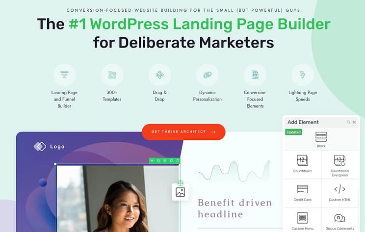
When you use a tool like Thrive Architect, you're not starting from a blank canvas and hoping for the best. You're starting with templates that are already designed with conversion best practices in mind.
This means the layout, the flow, and the placement of key elements are already improved. My team and I have used these principles to generate significant revenue from our own courses and products, so I can tell you firsthand that it works.
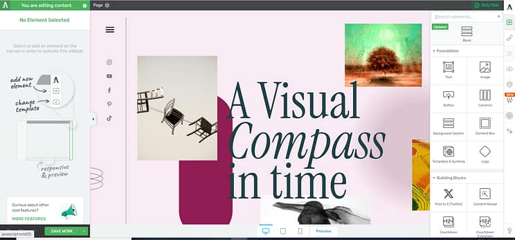
To get started, you'll want to get Thrive Architect (it's also part of Thrive Suite, which gives you a whole toolkit for building your online business, like A/B testing and lead generation tools). Once you've got it, you can easily set it up on your WordPress site.
2. Start with a Conversion-Focused Template
Once Thrive Architect is set up, you'll create a new page in WordPress and launch Thrive Architect. Instead of starting from scratch, you'll select "Pre-built Landing Pages."
You'll find hundreds of templates in the library. My advice? Look for ones designed specifically for products or online courses. These templates already have the sections we just talked about – hero, pain points, benefits, testimonials – laid out for you. This is a huge time-saver and makes sure you don't miss any important components.
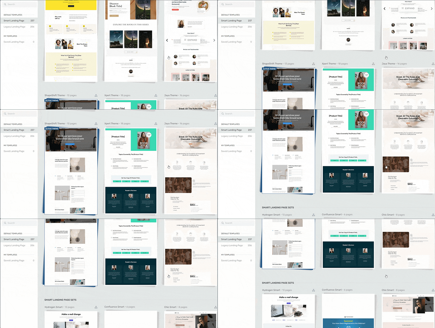
For example, I might pick a template from our Xpert companion theme, which is designed for online coaches. But honestly, any of the product-focused templates will give you a solid foundation. The beauty is that the steps we're about to cover apply no matter which template you choose.
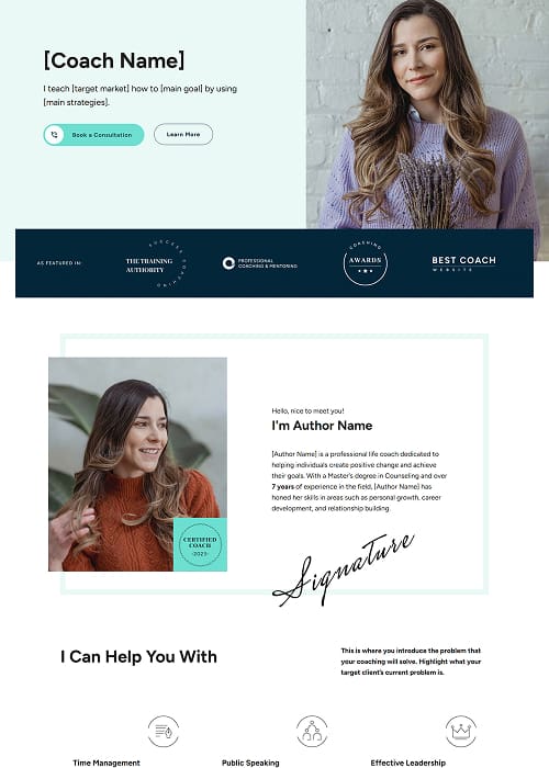
3. Customize Your Hero Section
This is where you make that important first impression.
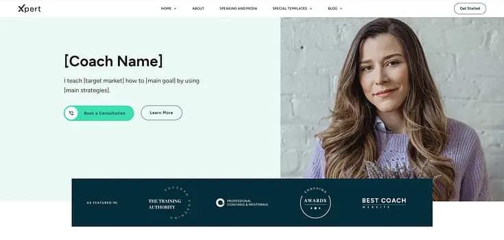
- Replace Placeholder Text: The templates come with guidance text. Your job is to swap that out with your compelling headline and sub-headline. Remember our discussion about benefits and clarity? This is where it shines.
- Add Your Visuals: Upload your course image, a professional photo of yourself, or a relevant video.
- Tweak the CTA: Make sure the button text is clear and action-oriented.
4. Outline Your Audience's Pain Points
Scroll down to the section dedicated to pain points.
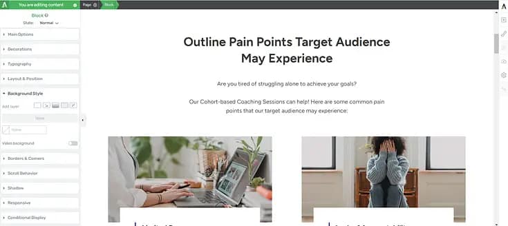
- Write Your Copy: This is where you connect with your audience on an emotional level. Use the insights from your ideal student persona.
- Add Supporting Visuals: Many templates offer spaces for icons or small images next to each pain point. Use them to reinforce your message.
5. Integrate Social Proof
Find the testimonial sections.
- Insert Your Testimonials: Copy and paste your best student testimonials. Include names and photos if you have them.
- Consider Video: If you have video testimonials, embed them.
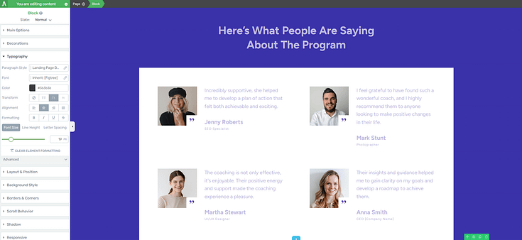
- Don't have testimonials yet? You could offer a free or heavily discounted version of your course to a small group in exchange for honest feedback. Or, launch without them and make it a priority to collect them from your first students.
6. Showcase Your Course Benefits
Move to the benefits section.
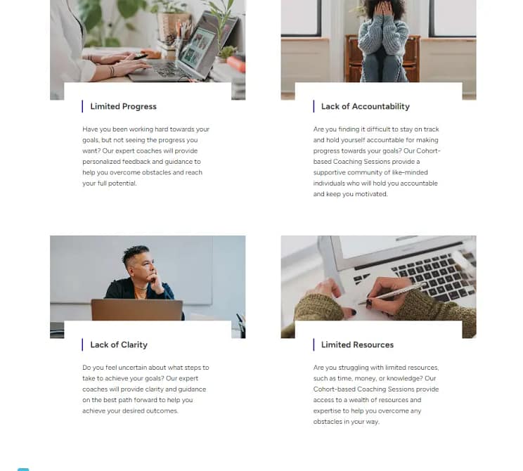
- Transform Features into Benefits: Use the table example we discussed earlier. Explain what each part of your course does for the student.
- Use Visuals: Again, templates often have spaces for icons or images that can make this section more engaging.
7. Display Your Course Curriculum
This is the logical next step for an interested visitor.
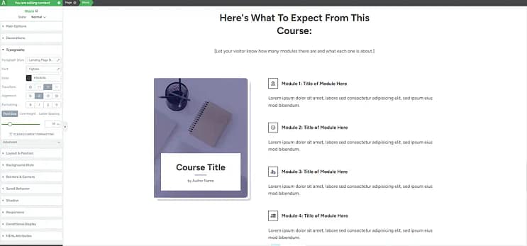
- List Your Modules: Clearly outline what's covered in each part of your course.
- Highlight Key Learnings: Briefly describe the outcome or skill gained from each module.
8. Add Your Instructor Bio
This is your chance to build trust and authority.
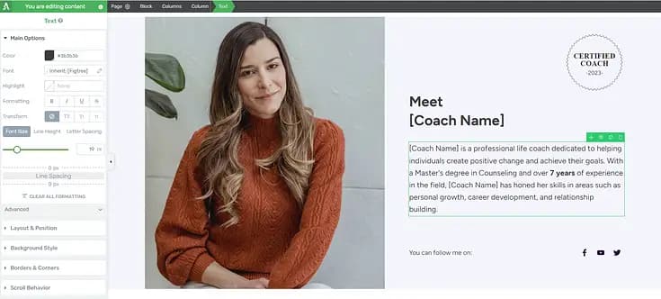
- Tell Your Story: Share your relevant background, experience, and why you created this course.
- Professional Photo: A good headshot helps immensely.
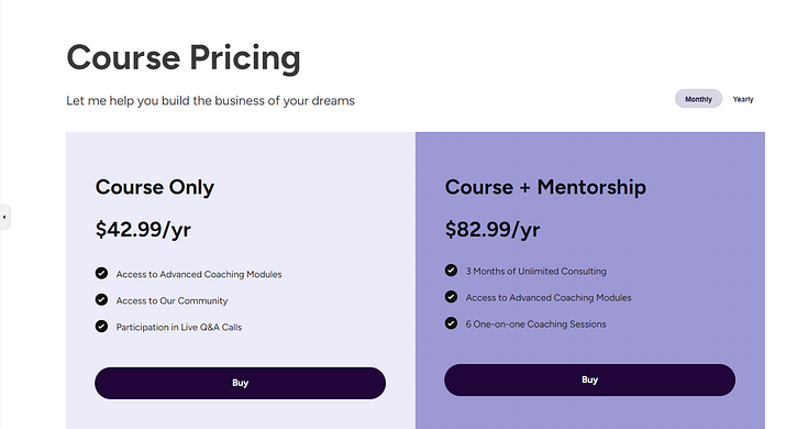
9. Present Your Pricing Information
Keep this straightforward and clear.
- Use a Pricing Table: Thrive Architect has pre-designed pricing table blocks that you can easily customize.
- Include Your Guarantee: Reiterate your money-back guarantee here.
10. Create an FAQs Section
Anticipate and answer common questions.

- List Questions & Answers: You can use a simple text box or, for a more polished look, use a "Toggle Element" (like an accordion) to keep the page clean until someone clicks to expand an answer.
11. Place Clear Calls to Action
Review your entire page and make sure there are clear CTAs strategically placed.
- Review Placement: Is there one in the hero, after benefits, before pricing, and at the end?
- Consistent Messaging: Make sure the CTA text is consistent and encourages the desired action.
And if you're looking for inspiration specifically tailored to service-based businesses, you can check out these coach landing page examples for more ideas.
Make Your Landing Page Better for Conversions: Beyond the Build
Building the page is a fantastic start, but it's not the end of the journey. A truly effective landing page is a living thing that you continuously refine.
A/B Testing: Let Your Audience Decide
This is where you stop guessing and start knowing. Tools like Thrive Optimize (part of Thrive Suite) let you create different versions of your page (e.g., different headlines, different images, different CTA button colors) and show them to different segments of your audience. The version that converts better wins.
- Test one element at a time: Don't change everything at once, or you won't know what made the difference.
- Focus on high-impact elements: Headlines, hero images, and CTAs are great places to start.
Analytics: Understanding Visitor Behavior
Connect your landing page to analytics tools (like Google Analytics). This gives you insights into how people are interacting with your page.
- Bounce Rate: How many people leave immediately?
- Time on Page: Are they reading your content?
- Conversion Rate: The ultimate metric – how many visitors turn into students?
- Heatmaps & Session Recordings: Tools like Hotjar can show you exactly where people are clicking, scrolling, and getting stuck. This is invaluable for identifying friction points.
Driving Traffic to Your Landing Page
A perfect landing page is useless if no one sees it.
- Email Marketing: Send your list directly to your landing page.
- Social Media: Share your page across your platforms.
- Paid Ads: Facebook, Instagram, Google Ads can drive targeted traffic.
- SEO Basics: Landing pages are often direct-response, but making sure your page is technically sound and has relevant keywords can help with organic discovery for specific course topics.
For those on a tighter budget, don't miss our tips on Budget Friendly Course Marketing With Zero Ad Spend to get your course out there without breaking the bank.
Beyond the Landing Page: Building Your Entire Course Funnel with Thrive Suite
You've got your high-converting online course landing page ready, and that's a huge win. But what about everything else? What about capturing leads before they're ready to buy? What about delivering your course content beautifully, or running A/B tests to make sure every element of your funnel is performing its best?
This is where I see a lot of course creators piece together a Frankenstein's monster of plugins and services. You end up paying for five different tools that don't quite talk to each other, and you spend more time troubleshooting than actually teaching. It's a headache, and frankly, it's a drain on your energy and your budget.
Imagine having a complete toolkit designed from the ground up to work together, all focused on helping you build and grow your online business. That's what Thrive Suite offers. It's not just a page builder; it's a comprehensive ecosystem that lets you:
How Thrive Suite Builds Your Complete Course Funnel
- Build stunning landing pages (like the one we just discussed) with Thrive Architect.
- Create engaging quizzes to segment your audience and recommend the right course with Thrive Quiz Builder.
- Design beautiful online courses directly within WordPress using Thrive Apprentice, complete with drip content, progress tracking, and student management.
- Capture leads with conversion-focused opt-in forms and pop-ups using Thrive Leads.
- A/B test every step of your funnel with Thrive Optimize to constantly improve your conversion rates, from your lead magnet to your sales page.
- Craft compelling sales pages and entire websites that reflect your brand and convert visitors into paying students and loyal customers.
This isn't about buying another plugin; it's about investing in a unified strategy. It's about having all the pieces you need to build a complete, high-performing course funnel, from the first time someone hears about you to the moment they become a successful student. It means less tech frustration and more time doing what you love: teaching.
If you're serious about building a sustainable, profitable online course business, you need more than just a landing page. You need a complete system.
Ready to build your entire course funnel, not just a single page?
Explore Thrive Suite and see how it can transform your online course business.
Frequently Asked Questions About Online Course Landing Pages
I get a lot of questions about how to make these pages work. Here are some of the most common ones I hear:
Final Thoughts
Creating a high-converting online course landing page might seem like a lot to tackle, but I promise it's a skill you can absolutely master. It's less about fancy design and more about clear communication, empathy for your audience, and a logical flow that guides them to a decision.
By focusing on the strategic groundwork, understanding the purpose of each key element, and then using the right tools to bring it all to life, you'll build a page that truly serves your course and your students. And remember, it's an ongoing process of learning and refinement. You've got this.
Now, go build that page and share your amazing course with the world.
Ready to stop piecing together tools and start building a cohesive, high-converting online course business?
I've seen firsthand how much easier and more effective it is when all your marketing and course delivery tools work together. Thrive Suite gives you that integrated power, letting you focus on your content and your students, not on technical headaches.
Discover the full power of Thrive Suite and build your complete online course funnel.


