Believe it or not, there’s an art to creating video thumbnails that help make viewers go “CLICK”.
As insignificant as they may seem, don’t overlook the importance of your video thumbnails or you’ll be leaving lots of viewer engagement on the table.
In this quick post, I’m going to show you 7 thumbnail creation tips to attract more views while uniquely branding your video content at the same time.
Read on to learn how you can level up your video thumbnail game to get more views and boost your online conversions.
More...
Why Are Video Thumbnails so Important?
You've put a ton of effort into making your video, so naturally you want people to watch it, right?
Well, if you're not putting enough thought into your thumbnails, then you're not going to achieve this goal.
Why?
Because first impressions count!
There are tons and tons of videos out there talking about similar topics, so why should someone spend their valuable time on yours? Unfortunately, you don't get a minute to convince people. You don't even get 10 seconds.
All you get is a thumbnail... because that's the first thing people see.
Your thumbnail and perhaps a small description have to earn you the click - no matter how amazing your video is.
So, the question is, are you putting enough thought into your video thumbnails?
Whether you're sharing your videos on YouTube, your own site, social media, or anywhere else, a high-quality thumbnail is going to be essential to your video marketing strategy.
How to Improve Your Video Thumbnail Click Through Rate (CTR)
Let's look at some actionable steps you can use to improve your click through rate on your videos.
These might seem like simple tips, but when you're nailing all of them, they're going to make sure a lot more people actually watch your videos.
1. Youtube Thumbnail Size
First off, always use the best resolution possible for your custom thumbnails because they usually get blown up as image placeholders within the video player before streaming begins.
For Youtube videos, you're limited to 2 megabyte sized thumbnails. Very often, this means you're forced to follow the Youtube thumbnail dimension recommendations of 1280 x 720 pixels.
However, video resolutions are usually capped at 1080p, so if you can make 1920 x 1080 pixel thumbnails that are under 2 MBs in size, do that instead.
When using other video players without thumbnail size limitations like Wistia, make your thumbnail resolutions 1920 x 1080 pixels. Wistia will automatically scale down your thumbnail images to match smaller video resolutions for you.
If you want to know whether you should save your thumbnail images as a JPEG or PNG files, Shane wrote a blog post all about it for you here.
2. Boost Your Click Factor
If you use videos on your sales or landing pages, or a variety of different platforms, good thumbnails play an important role in enticing people to watch your sales pitch.
Treat your video thumbnails like visual headlines enticing potential customers to actually click play and enter the slippery slope of your sales funnel.

Did you end up clicking on the play button and nothing happened? That's because it's just a thumbnail... the same one we use for our Thrive Quiz Builder sales video. The purple call-to-action copy and arrow (pointing at the play button) offer that little extra intrigue to get more views.
Like the Quiz Builder thumbnail example above, sometimes adding a simple call-to-action paired with an arrow pointing at the play button can create just enough intrigue to get people interested to learn more about a product, service or free offer.
3. Set the Mood
When creating your video thumbnails, it’s important to consider the impression you want to create about your video for potential viewers.
Are your thumbnails bright, fun and exciting?
Do you find them interesting and attractive?
Ultimately, will your thumbnails draw viewers in and make them want to see what your videos are all about?
With this in mind, don’t settle for the auto-generated thumbnail YouTube or Wistia throw at you when uploading your video. Instead, spend some quality time crafting an image that creates interest and appeal through one of the following strategies:
- Action
- Fun or silliness
- Mystery
- Unique topics
- People smiling directly into the camera
If you include images of people within the thumbnail, try to capture your subjects showcasing genuine smiles, looking directly into the camera lens to make the images more inviting.
Pro Tip:
The smile you’re aiming for in your images is what’s known as a Duchenne smile or “smiling with your eyes”.
If the cheek muscles raise the corners of your mouth to create crow’s feet (wrinkles at the outside corners of your eyes), this usually comes across as a genuine smile expressing an appealing, positive emotion.
Eye contact and genuine smiles increase the likelihood viewers will actually click through to see what your video is about so it’s definitely worth a try if you often feature yourself in videos.
A great example of Duchenne smiling for video thumbnails can be seen on the Strange Parts YouTube channel. The creator Scotty racked up 322,000 subscribers and over 12 million total views when he had only 2 videos on his channel!
One year later, he now has 25 videos, almost 1 million subscribers and 40+ million total views with almost all of his video thumbnails featuring a Duchenne smile.
Even though his content is super engaging, I’m willing to bet Scotty's big, inviting smile helps boost the click factor of his videos too.

The Strange Parts YouTube channel showcases one of the best Duchenne smiles I've seen on the internet. Scotty doesn't use text on his video thumbnails, just interesting images paired with a warm and inviting smile.
4. Create Visual Consistency
If you haven’t taken our free Thrive University course on featured image design yet (create your free account and login to access it), it will illustrate the importance of creating visual consistency across your website's images for you.
Visual consistency in images helps to brand your website and blog so people can instantly recognize your content whenever they come across it online.
The great thing is that visual consistency can also be applied to your video thumbnails. The images you create can work to represent your brand every time someone streams one of your videos.
Now, when I say branding, don’t let your mind leap to thoughts of needing professionally designed logos.
Of course unique logo design is helpful when it comes to branding your content, but there are simpler (and cheaper) ways to brand your thumbnails without having to hire expensive designers.
Branding can also involve the creation of templates that consistently apply the same visual elements, in the same positions, across many of your thumbnails. You can use software like Canva or Photoshop to create reusable templates that look great and make your job super easy.

Guitar Control uses a colorful sidebar, logo and consistently styled text to brand its thumbnails. It also maintains the same positioning of its visual elements across thumbnails.
For example, you might include a sidebar element on your thumbnails that shows across multiple images. On that sidebar, you can display your brand name using a set text size and font style. If you happen to have a logo already, you can include that as well.
This way, whenever viewers come across one of your videos, they instantly recognize it as yours — just from glancing at the thumbnail!
Check out a few more examples demonstrating this strategy below:

Yoga with Adriane uses a colorful sidebar and consistently styled text to brand its thumbnails. However, the positioning of the blue heart logo (bottom right) should be changed as it keeps getting covered by YouTube's time length overlay.
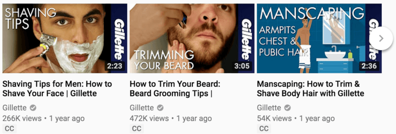
Gillette uses a right aligned sidebar and consistently styled text to create a crisp and branded look for their video thumbnails.
5. Use Bright & Attractive Colors
Although it’s tough to offer any hard and fast rules about the use of colors on your video thumbnails, keep these general guidelines in mind.
Try to use bright, but attractive (not obnoxious) colors. You can see good use of bright colors in the sidebars of the Guitar Control and Yoga With Adriene video thumbnail examples above.
Of course, dark colors can work well too (as shown in the Gillette example), but they're not always as attention-grabbing as vibrant colors.
Also, notice how the sidebar colors in the examples above are maintained across multiple online videos to create a sense of branding. Chances are, if you enjoyed a Guitar Control video, you’ll instantly discover another one waiting for you in the YouTube sidebar.
Just to demonstrate why this attraction factor is so important for engaging more viewers on a video platform like YouTube, consider how video thumbnails look when they’re sitting above and below each other in the “Recommended” sidebar:

A screenshot of 3 video thumbnails from the "Recommended" sidebar on YouTube. Which thumbnail stands out the most in terms of interest and channel branding?
Which thumbnail jumps out and grabs your attention?
And which one has the most recognizable brand?
The answer is obvious... Guitar Control for the win!
WARNING!
Most of the time, do not use white backgrounds when creating your video thumbnails.
Although a thumbnail with a white background may look good on its own, most websites and video streaming platforms use white for their browser backgrounds so your thumbnail will just get camouflaged when shown in the search results or recommended video sidebar.

Notice how the white Sprouts video thumbnail at the bottom just blends in to YouTube's white browser background? It simply doesn't command the same level of attention as compared to the 2 thumbnails above it.
Make sure to take the background color of your viewing platform into account when choosing thumbnail colors for your videos!
6. Use Overlays to Increase Your Text Readability
Have you noticed how effective thumbnails on YouTube use text overlays to try and increase engagement from viewers?
While not every thumbnail needs text, it’s proven to be a useful strategy in stimulating more views and increasing video content clarity.
If you decide you want to add text to your video thumbnails, it’s crucial to add it in a way that preserves readability.
This usually isn't a problem when you add text to solid color backgrounds, but becomes a big issue when adding text to photo images. Since photos usually have areas of bright and dark colors, your text can blend in with those areas of the image that have the same color or brightness.
A simple trick to sidestep this issue is adding an opaque or semi-transparent overlay between your text and image to increase the contrast. High contrast text usually translates into better readability.
The following are some good text on photo thumbnail examples that do a great job in preserving readability while also being attractive within the overall design:

The Late Show with Stephen Colbert video thumbnails use a transparent, triangular overlay in the bottom right corner of their guest interview videos. The slanted text is an interesting touch that avoids the problem of getting covered by YouTube's time length overlay.

Space Time's video thumbnails are awesome for their graphics alone, but they also do a good job creating transparent overlays to add easily readable headlines. Notice that the PBS logo is in the bottom left hand corner where it can't be covered by video player overlays.

BuzzFeed Blue's channel offers an example of simple white text over a transparent black overlay. Notice how they also try to boost interest by using faces looking into the camera, mysterious facial reactions and unique images like the NYC haircut.
7. Consider Your Video Streaming Platform
Something else to keep in mind as you create your video thumbnails is the positioning of your video player’s overlay elements.
This includes elements like:
- Time markers
- Play buttons
- Playlist overlays


Always consider how your video player's overlays will affect thumbnail appearance. When it comes to YouTube, the time annotation (1st image) is placed in the bottom right and the playlist overlay (2nd image) is placed over the right third of the thumbnail.


The Wistia (1st image) and YouTube (2nd image) play buttons are placed in the center of your video thumbnails. Because of this, try to avoid placing faces and other important visual elements in the center of your thumbnails.
When placing your logo, text, faces or other important image features, consider these video player overlay positions (they’re in the same location every time) so they won’t interfere with the viewer’s ability to read or interpret the thumbnail.
Several More Examples
I went ahead and collected a smattering of different, well branded video thumbnail examples for you to look through.
These examples are intended to act as guides to help you come up with your own unique, recognizable and attractive thumbnail style:

Thrive Themes co-founder Paul McCarthy's Warrior Habits thumbnails command a strong visual hierarchy. First the eye is drawn to the attractive and readable text to give a headline around what the video is about. The eye then shifts to the image to generate more interest and help explain the text.

The new Thrive Themes video thumbnail style shows the same logo in the upper left hand corner while also using intriguing illustrations to help drive viewer interest to click. Shane needs to work on his Duchenne smile a bit more though!

HP's video thumbnail style is simple yet powerful. Their use of various logos and sidebars links the different types of thumbnails under a single branded identity.

Code With Chris uses branded sidebars, text overlays and photo images to convey lots of information to potential YouTube viewers. From a design perspective, this style is very busy, but a good example of thumbnails that combine several of the tips discussed in this post.

Internet Marketing Tutorials uses silliness, smiles, bright colors and consistent background styles to brand its video thumbnails.

WP Crafter uses the same hero image of the founder Adam Preiser in every video thumbnail. Background designs and text will change, but in this example, it's the consistent hero image that brands the thumbnails.
Did You Know...
...you can use Thrive Architect to override a streaming video's source thumbnail you include within your posts or pages?
To override the source thumbnail:
- Click on the video element in your Thrive Architect editor window.
- Click on the "Video Options" tab in the editor sidebar.
- Click on the "Advanced" sub-tab.
- Click on the "Choose File" button in the "Video Thumbnail" area.

Visual diagram of the 4 steps described above illustrating how to load a video thumbnail to any video element in the Thrive Architect visual editor.
Once the new image is uploaded to your WordPress media, it will be shown to visitors regardless of what the source thumbnail of the video you are linking to uses.
Now It’s Your Turn
Hopefully this article has given you some insights into how you can design and brand your thumbnails to boost views and engagement like a video marketing pro!
Take what you’ve learned here and see if you can create a simple yet strong visual identity for your thumbnails to increase the click factor for your videos.
If you have any questions about creating thumbnail designs, feel free make some noise in the comments section below!


Some great tips here Matt! Inspired me to go back and fix my more boring ones.
Cheers Keith…so glad to hear this was helpful for you to upgrade your own video thumbnails!
Great post… The kind that takes things from mysterious to obvious!
Well done!
That’s music to my ears…thanks Trevor!
This is perfect and came right on time!!! Thanks!!
Thrive Themes content, on demand… 😉
Cheers Sean!
Awesome Post. In step 2. How can I create the (Doodle CTA) For My Video Thumbnail?
Thanks Alante! To add a “doodle” like the CTA arrow in the Step 2 example, you’ll need an image editor like Photoshop, PicMonkey, Canva, or one of the many other options out there.
We’re spoiled here at Thrive Themes since we have a team of pro designers to make our thumbnails for us, but I use simple tools like PicMonkey to self-create images for my own personal blog content.
Thank you Matt! Very good information and lots of examples – love the entire article!
Many thanks for the kind words Gail… it was a fun post to write!
Thanks Matt! Very helpful and lots of examples! Love your article!
Thanks so much Bobbie!
Awesome post!
Cheers Nathan!
By embedding a video like this with TA, can I be sure, that this is GDPR Compliant? I think, no … or?
Hi Marko,
GDPR was put in place to fight against personal data, data breaches and direct marketing without consent.
While some people interpret the law to include anything that calls an external server, there have been no actions taken against this.
If you feel uncomfortable with it, you would have to stop embedding all videos stored on a 3rd party website.
We’re not planning to stop doing that ourselves anytime soon, but of course you should check with your own lawyer to make an informed decision on this.
Hi Matt, great tutorial, I’ll definitely implement what I learned here.
Way to put theory into practice Albertus!
Great tips. Would you recommend using Kraken on the thumbnail to get it under 2 MB?
Thanks Stephen!
I would definitely use an image optimization tool like Kraken.io to reduce your image size if it helps get you under the 2 MB data size limit.
I am credited with a backlink if I put a youtube video in text like, to watch this video Click Here with the words Click Here being a hyperlink taking them to the video on youtube. However if I use the link in Thrive Content builder like you’re showing on this post will the same backlinking effect for SEO take place? If not I can just do both yet afraid of being penalized for link stuffing. Thanks for another great post!
Hi Martin,
If I’m interpreting your question correctly, embedding a link in HTML, the WordPress editor or Thrive Architect should all act the same as far as Google is concerned.
And since it sounds like you’re linking to YouTube videos in your content, YouTube gets the link juice. I wouldn’t really worry about this issue much as the way you choose to link your videos will have negligible impact on your own site’s SEO results.
This article is extremely helpful. I am about to begin my video marketing creations for my digital product website. Certainly, I will use many of these suggestions and instructions. Thank you.
Thanks for your comment Valerie and good luck with your video marketing efforts!
Great article! Any suggestions for resources for thumbnail templates for those of us that are ‘creatively designed challenged’ 😉
Thanks Jeremy!
I don’t know anywhere you can download video thumbnail templates off the top of my head. If I were you, I’d look at the some of the more simple design strategies shown in the examples above and see what sort of simple tactics you can do yourself to get started.
Also, if you can do a simple sketch of what you want, think about hiring a designer on Upwork or Fiverr to make the template for you. After that, you can do your own simple thumbnail edits for each new video that you publish.
Very nice I like
Cheers Diomedes!