Let’s be honest — cart abandonment sucks.You’ve done the hard part: attracted the visitor, convinced them to add something to their cart… and then they vanish.
It’s frustrating. And when it keeps happening, it starts to feel like a personal rejection — like something must be wrong with your offer, your product, or your entire checkout flow.
But cart abandonment isn’t personal. It’s behavioral. It’s mathematical. And that means it’s fixable.
Back in my freelancing days, I worked with several ecommerce brands that faced the exact same issue — and I know firsthand how disheartening it can be. So if you're stuck watching potential sales disappear, you’re not alone.
In this guide, you’ll learn how to reduce cart abandonment with strategies that actually work — from fixing friction points to recovering lost sales and creating a smoother path to purchase. Some changes are simple. Others take a bit of setup. But all of them are grounded in how real people behave online.
Let’s get into it.
The Real Cost of Cart Abandonment (It's Worse Than You Think)
Let's talk money – specifically, the money silently walking out of your digital door.
Quick refresher – what exactly is cart abandonment?
It’s what happens when someone adds products to their cart but bails before buying. No confirmation, no sale – just a missed opportunity (and it adds up fast).
When I audit online stores, owners often focus on their visible losses: "If this $100 product got abandoned 10 times today, I lost $1,000." But that's just the tip of the iceberg. The real cost of cart abandonment goes much deeper:
Direct Revenue Loss
Every abandoned cart represents more than just a lost sale. Think about:
Hidden Costs You're Probably Missing

Let's put this in perspective. If your store:
Gets 1,000 visitors per month
Has an average cart value of $85
Sees the typical 70% abandonment rate (based on 2024 data)
That means 700 potential customers are walking away monthly. Even if only half of those were serious buyers, you're still looking at potential losses of over $29,000 every month. And that's before considering the long-term value of those customers.

Immediate Actions to Reduce Cart Abandonment (Do These Today)
If you want quick wins, start here. These are the low-effort, high-impact fixes that can immediately reduce friction and stop people from slipping away mid-checkout.
1. Make Your Pricing Crystal Clear
According to research, hidden fees are one of the fastest ways to lose a sale.
When someone clicks “Add to Cart,” they’re already doing mental math — not just for the product, but the total cost. If shipping, taxes, or service fees show up late in the game, that math feels wrong. Even if the price is fair, the timing makes it feel shady.
Want fewer abandoned carts? Stop playing hide-and-seek with your pricing.
Your Clear Pricing Checklist:
Your pricing doesn’t have to be cheap. It just has to be honest.
Still not sure if your pricing is turning people away?
Even well-meaning store owners make common mistakes that lead to lost sales. Before you tweak your next price or offer, read this:
👉10 Pricing Mistakes That Kill Conversions (And How to Fix Them) →2. Streamline Your Checkout Process
Most checkout pages feel like paperwork.
Too many fields, too many steps, and too many reasons to second-guess the purchase. If your form feels like a task, people will treat it like one — and skip it.
Munro Agency ran an A/B test on a client's "Book a Demo" page. One version used a complex Calendly widget; the other replaced it with a straightforward Sharpspring form asking only for a name and email.
Result?
The simplified 3-field form boosted conversions by 35%.
The takeaway? Whether it’s a demo request or a product checkout, less friction = more completions. Simplifying forms, removing distractions, and cutting down steps can make a major difference.
Streamlining Checklist:
Simplify the path. Respect people’s time. The more effortless it feels, the more likely they’ll finish what they started.
Here’s something most store owners miss: the way someone interacts with your checkout page isn’t all that different from how they engage with your opt-in forms. If your lead capture rates are flat, it might not be the offer — it might be the form layout.
👉Read this guide on creating high-converting opt-in forms — the same principles apply.
Design isn’t just about looking good — it’s about making people feel safe.
If your checkout page looks unprofessional, cluttered, or inconsistent, even the most interested buyer will hesitate. Online shoppers are already cautious. It’s your job to remove doubt before they have time to second-guess.
Trust signals don’t need to be loud — they just need to be visible where it counts.
Trust-Building Priorities:
With a smart design and trustworthy signals in the right places, you’re not just making the page look good — you’re making it feel safe to buy.
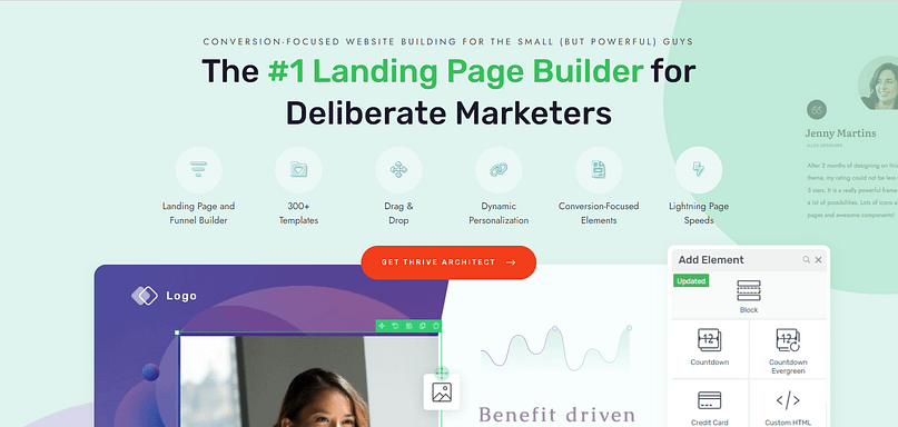
If your current setup doesn’t give you control over these details, take a look at Thrive Architect. It’s my go-to tool when I need to quickly create high-quality pages that look trustworthy and provide a great experience for my readers.
It’s also great for checkout pages, and you can easily create a cleaner version of your current one or fine-tune the layout without getting stuck in theme limitations or code.
You can also drag and drop trust elements exactly where they matter — like next to payment fields, under your call-to-action, or in a floating sidebar — so nothing important gets buried or missed.
I love this landing page plugin, and our customers do too.
Thrive's tools are the most important piece of the puzzle for all my WordPress projects and those of my customers. Thanks to Thrive I can make my content faster, more modern and more professional. Of course, this is also positive for my conversion and I win more customers through my website
Oliver Pfeil
Does your site give the right first impression?
If your website doesn’t immediately feel professional, safe, and on-brand, you could be losing visitors before they ever reach the checkout page. A trustworthy experience starts with consistent design and solid user experience across your entire site.
👉 Learn how to build a professional website using customizable templates →
4. Expand Payment Options (But Don't Go Crazy)
When it comes to offering different payment methods, the secret isn't offering every payment option – it's offering the right ones for your customers. Here's how to do it in an effective way:
Start with the Proven Winners:
Major credit cards (because duh)
PayPal (still the gold standard of "I trust this enough to pay")
One digital wallet option (Apple Pay or Google Pay)
A Buy Now, Pay Later service (because sometimes payday is next week)
Need help choosing the right payment setup for your store?
Check out our guide to the best payment gateway plugins for WordPress →
We compare top options based on ease of use, transaction fees, customer trust, and integration features.
But if you need a couple of recommendations I’d say give WP Simple Pay or Easy Digital Downloads a try.
💡 Tip: Watch your analytics like a hawk for two weeks. If nobody's using a payment method, it's just cluttering your checkout page.
Remember: clarity beats options every time. Need a reliable WordPress analytics tool to get the job done? MonsterInsights is the one for you. It makes setting up Google Analytics on your WordPress website so easy, you’ll wonder why you weren’t using it before!
5. Fix Your Mobile Experience
If your checkout works great on desktop but falls apart on mobile, you're losing a big chunk of buyers.
Mobile now accounts for almost 60% of all website traffic – but mobile conversion rates are still significantly lower than desktop. That gap usually comes down to bad design, slow performance, or unnecessary friction.
Here’s what a mobile-optimized checkout actually looks like:
Speed first.
Test it like a customer would. Try buying something from your site on your phone. While walking. Or with one hand. If you can’t complete a purchase easily, your visitors can’t either.
These tips don’t just apply to checkout.
If your other forms — opt-ins, lead magnets, surveys — aren’t mobile-friendly, you’re likely losing conversions there too.Mobile visitors expect fast, easy interactions across your entire site, not just at checkout.
👉 Learn how to create mobile-friendly forms that actually convert →6. Create a Safety Net (Because Life Happens)
Here's a truth bomb: even if you nail everything we've talked about, some customers will still abandon their carts. Maybe their boss walked by, their kid started crying, or their cat knocked over their coffee (speaking from personal experience on that last one).
But did you know? A lot of people never intended to check out right away—they’re just using the cart like a “save for later” list. It’s a way to bookmark products they’re interested in so they can come back, reevaluate, or wait until payday. In fact, studies show that a sizable chunk of cart abandonments come from people who are simply browsing or planning for a future purchase.
The good news? These aren’t lost sales -- they’re just delayed ones… if you set up the right recovery systems..
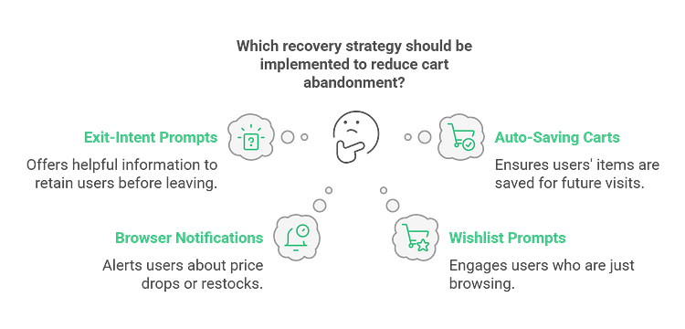
Here’s how to catch them when they’re ready:
Email Sequence (AKA "The Perfect Follow-up"):

Pro Tip: Use Thrive Leads to capture a visitor’s email early – before they reach the final stages of checkout. With Thrive Leads, you can set up smart opt-in forms that appear when someone scrolls through a product page or shows exit intent. This gives you a direct line to follow up with them later, even if they don’t complete their purchase right away. It’s one of the simplest ways to turn abandoned carts into second chances.
Monitor and Adjust (Like a Detective with a Spreadsheet)
Assumptions can cost you sales. If people are abandoning their carts, don’t guess why — check the data.
What to track:
Set aside 15 minutes a week to review your analytics. Look for patterns, fix the obvious friction points, and keep testing from there.
Small tweaks, backed by actual data, can lead to big improvements.
Implementation Priority (Because You Can't Do Everything at Once):
Start with pricing transparency—it's the low-hanging fruit.
Then tackle checkout streamlining.
Think of it like renovating a house: fix the foundation before you pick out curtains.
Advanced Recovery Strategies (For When You're Ready to Get Serious)
Alright, you've implemented the basics, and you're seeing improvements. But if you're anything like me, you're thinking, "What else can we squeeze out of this orange?" Well, buckle up, because this is where it gets interesting.
Start with your recovery emails.
Most abandoned cart emails are forgettable — or worse, ignored.
We already touched on the importance of capturing emails early, but here’s a quick recap (and a few next-level tips) to actually bring those shoppers back:
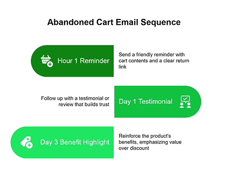
A simple three-part sequence can do wonders:

Next, level up your retargeting.
If you’ve ever seen an ad for a product you almost bought, that’s retargeting in action. It’s a powerful way to bring back visitors who showed interest but didn’t convert.
Retargeting lets you show personalized ads—usually through platforms like Facebook, Instagram, or Google—to people who visited your site or added something to their cart but didn’t check out.
Most beginners stop at simply showing the same product again. But that’s just the starting point.
Tip: Want to dig deeper into retargeting and how to set this up? Check out this guide to learn more→

If you're using Thrive Ultimatum, you can run real-time countdown campaigns that trigger the moment someone returns to your site.
With these countdown timer campaigns, the timer starts the moment someone clicks through—whether from an email or ad. They land on your site and instantly see a live, personalized countdown tied to a real offer.
Then, personalize based on intent.
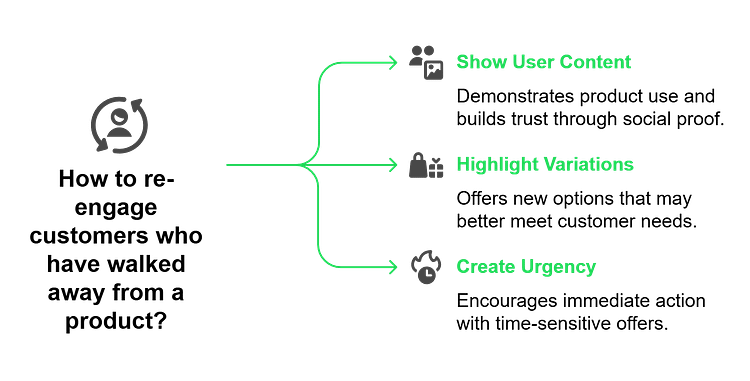
Not every shopper leaves for the same reason. Use behavior cues (like time on page or what they clicked) to tailor your message:

Don’t wait for them to leave.
Some of the best recovery strategies happen before abandonment. Try:

Finally, build a simple system to track what’s working. Review your recovery data monthly, test one change at a time, and keep a log of results. Over time, you’ll develop a recovery process that’s not just reactive — it’s reliable and optimized.
The Bottom Line
Advanced recovery isn't about throwing technology at the problem—it's about understanding and responding to human behavior. Every abandoned cart tells a story. Your job is to make that story have a happy ending.
Ready to Take Action?
Start with one strategy. Test it. Refine it. Then move to the next. This isn't a sprint; it's a marathon with a really big prize at the finish line.
Conclusion: Making Cart Recovery Your Competitive Advantage
You know what keeps me excited about cart abandonment? (Yes, I just said "excited" and "cart abandonment" in the same sentence. Bear with me.) It's that every abandoned cart represents an opportunity—not just to recover a sale, but to learn something valuable about your business.
Here’s the big picture:
Fix common friction points like hidden costs, confusing forms, and slow mobile performance
Recover lost sales with smart email sequences, retargeting, and personalized follow-ups. For example, you could use a tool like Thrive Quiz Builder to create a quick, post-abandonment survey and uncover what’s holding people back.
Build long-term recovery systems with ongoing testing, real-time urgency, and behavior-based triggers
The goal isn’t perfection. It’s steady improvement — one smart recovery at a time.
Start with one change. Implement it today. Track what happens. Then keep building from there.
Behind every abandoned cart is a person who got distracted, had a concern, or just needed a better reason to buy. Give them one.
Need help putting this into action?
👉 Thrive Suite gives you the tools to implement everything we covered — from trust-building design to time-sensitive offers. Check it out here.
Whether you're improving your checkout design with Thrive Architect, capturing leads before the cart is abandoned with Thrive Leads, creating urgency with Thrive Ultimatum, or building smart recovery funnels with Thrive Quiz Builder — it's all included.
Plus, you'll get everything else you need to build a professional, conversion-focused website:
- High-converting landing pages
- Smart form integrations
- Real-time A/B testing
- Dynamic content targeting
- And more
If you’re serious about turning abandoned carts into loyal customers, Thrive Suite is your all-in-one toolkit.


