Are you looking for simple, straightforward copywriting tips for beginners?
You've come to the right guide.
Have you ever read a blog post or sales page and thought, “Wow, this is amazing writing. I wish I could write like that.”
Well, you can.
This guide includes 13 effective tips to help you create great copy for your emails, web pages, funnels, social media platforms, marketing campaigns and more.
Let's dive in.
How to Write Copy That Turns Reading into Sign-Ups and Sales
You put everything into creating content that should make people pause their endless scrolling, but instead...nothing. Or, an average of 5 clicks a week.
That’s enough to leave you questioning your skills as you stare at analytics that barely budge. We’ve been there before. 10+ years in the marketing game and we know what it’s like to publish content thinking “This is going to hit the mark!” Only to hear crickets... Ouch.
But, we’ve cracked the code on what “good copywriting” looks like and you’re about to learn our simple strategies that have led to 20,000+ people buying our products.
Before we dive in, let’s clear up something: copywriting is not the same as regular content writing.
Think of “regular writing” as your everyday communication—emails to friends, personal blogs, or quick social media posts on LinkedIn, Facebook, etc..
Copywriting, on the other hand, is how you turn your target audience into new sign-ups and customers.
It's not just about sharing; it's about driving action. Whether it's convincing someone to make a purchase, subscribe to a list, or click on a link, effective copywriting taps into persuasion and psychological insights to turn passive readers into active participants. It's the art of turning stories into strategic calls to action.
You can’t have an effective content marketing strategy without good copywriting.
But to write good copy, you need to know the techniques — and practice.
If you've tried writing copy for your business, and feel like it isn't pulling in your desired results -- these tips are definitely for you.
Time to Turn Passive Readers into Excited Customers: 13 Proven Copywriting Techniques
Whether you're completely new to the copywriting world, or feel like you need to return to the basics to improve your current content, there's something for you to learn from this copywriting for beginners guide.
We’ve condensed everything you need to know into 13 actionable tips you can use to build great copywriting skills and create marketing materials that lead to conversions.
1. Know Your Audience
Your copy is only effective if it’s directed at the right audience.
And to get this right, you need to spend time understanding who your audience is and what they need.
We call this creating a buyer persona.

Simply put, a buyer persona is a profile of your target customer. This profile includes key information like your customer’s:
- Age, occupation, and financial status
- Wants & desires
- Pain points
- Shopping habits & brand preferences, etc.
Having a clear idea of who you’re talking to helps you create copy that resonates with your audience, making it easier for them to trust you and eventually buy from your business.
To start creating a buyer persona for your business, you need to put yourself in your customer's shoes. A few starter questions are:
- Who is my ideal customer?
- What are their goals and challenges?
- What influences their buying decisions?
- Where do they get their information?
- What do they value most?
Bonus Tips to Create Relevant Copy
You also need to know what they’re searching for — and that’s where keyword research comes in.
Think of keyword research is as to detective work: it's all about uncovering the exact phrases your audience types into search engines.
When you identify these keywords, it’s easier to create laser-focused copy that resonates with your audience and is perfectly positioned to attract them. This is an SEO copywriting basic.
If you’re new to keyword research, you should start with free tools before paying for an expensive subscription. Two of our top recommendations are the WPBeginner Free Keyword Generator and Google Trends.
2. Keep Your Writing Simple (for Better Readability)
The best way to get your audience to understand you is to keep your writing concise and to the point.
Most beginner copywriters make the mistake of trying to use “clever” wordplay, thinking this is what makes good copy. But this often doesn’t work and just confuses readers.
Usually, the right words to use in your copy are simple and straightforward. Your audience is more likely to immediately understand what you’re saying, which prevents them from losing interest and leaving your web pages.
So, stick to using common words, short sentences, and avoid beating around the bush.
3. Focus on the “Why”
One mistake business owners make is only focusing on the “What” and “How” in their copy – listing products, outlining features, explaining processes....
But the key to creating persuasive copy is in the “Why”.

Delving into the “why” helps you understand your audience’s motivation and desires, allowing you to connect with them on a deeper level.
Think about what would lead your target customer to search for your business or click on one of your ads:
- What is the underlying problem are they trying to solve?
- What do they want to achieve?
- How will your product or service make them feel happy/satisfied/accomplished/etc.
By doing this, you can easily empathize with your customers’ pain, helping you connect with them and earn their trust.
If your audience trusts you, they’re more likely to learn more about your products and make a purchase.
4. Speak Directly to Your Reader
One of the most effective ways to connect with your readers is to write as if you’re having a one-on-one conversation.
Direct communication grabs attention.
For example: “You can lose up to 30lbs with this product” is more impactful than “People can lose up to 30lbs with this product”.
When you address your readers directly, it invites them into an active dialogue – even if it’s just in their mind.
This is further reinforced when you use an active voice over the passive voice. So, less verbs that end in “-ing”, and more direct present tense.
As they read through your copy, they’ll ask questions, reflect on your words, and visualize outcomes personally.

Some of the best ways to speak to your readers directly include using 2nd person pronouns (e.g. “you” and “your”) and asking questions (e.g. “Do you want to…”)
As you write, picture your reader. Imagine that you’re writing your sales copy to send to one person.
By focusing on the individual, your copy transforms from a broad announcement to a personal invitation.
This technique, though seemingly small, can be the difference between a reader scrolling past and one taking action.
So, remember, as you write, you're not addressing a faceless crowd; you're talking to a real person seeking value.
5. Take Your Readers on a Journey
Your writing, no matter what medium it’s for, should have direction. You need to guide your users through a clear structure so they know when and how to take action.
Structuring your content as a “journey” creates a logical flow. Your readers can easily follow the sequence from problem to solution, making it easier for them to understand.
The best way to create a logical flow in your content is:
- Introduce a problem
- Present a solution to the problem
- Expand on the positive outcomes of your solution
- Instruct your readers to take action
Where possible, use scenarios or real-life examples to make your content more relatable. That way, your readers can see how your message relates to them personally.
6. Use Strong Headlines
When a reader lands on your page, it takes them seconds to decide if they’ll keep scrolling…or exit the page without reading further.
Headlines play an important part in grabbing your audience’s attention and convincing them to stay.
To create compelling headlines, you should:
- Keep them concise and to the point – don't use jargon or complex words
- Use action words – e.g. “Triple Your Income with these Copywriting Tips”
- Address the reader directly – e.g. “How to Upgrade Your Writing Skills”
- Ask questions – e.g. “Overwhelmed by Burnout?...”
7. Focus on Benefits, Not Features
When your potential customers come to your landing pages, the one thing on their minds is, “What’s in it for me?”
How will purchasing your products change their lives for the better? What makes your business worth spending money on?
You need to focus on describing the amazing benefits they’ll receive when they make a purchase.
This table illustrates the difference between outlining features, and describing benefits:
Product | Feature | Benefıt |
|---|---|---|
Fitness Tracker | "Heart Rate Monitoring Technology" | "Stay On Top of Your Heart Health at All Times" |
Professional Cleaning Service | "We Use Eco-Friendly Cleaning Products" | "Creating Safer & Healthier Living Spaces" |
Virtual Assistant Services | "Available 24/7" | "Providing You With Uninterrupted Support for Your Business" |
Benefits make your copy relatable, helping your readers visualize the outcome of purchasing your offer. Use bullet points to list them out (and also make them easier to read).
Your potential customers are more interested in how your offer solves their problems than in a list of technical specifications.
By spotlighting benefits, you tap into your readers' desires and emotions, encouraging them to engage and convert.
8. Get to Know the AIDA and PAS Copywriting Formulas
Most of the best copywriting courses and guidelines you come across are based on these two formulas – AIDA and the PAS formula.
Every content writer implements these formulas in their writing because they work.
And we recommend studying these formulas to become a better copywriter.
AIDA stands for:

Attention: Grab your reader’s attention with a compelling headline or an interesting opening sentence before leading into the intro.
Interest: Build on your reader’s interest by delving deeper. Support your headline or opening statement with solid statistics, quotes from industry experts, testimonials, etc.
Desire: Position your product or service as the solution to the problem. Paint a picture of the benefits your reader will receive from purchasing your offer to make them want it more.
Action: Guide the reader on what to do next. This could be buying a product, sharing your article, or joining your mailing list.
PAS, on the other hand, stands for:

Problem: Identify a pain point or challenge your audience is facing. This creates relatability and shows empathy.
Agitate: Expand on the problem, highlighting its consequences and the discomfort it causes. This amplifies the need for a solution.
Solution: Present your product or service as the solution to the problem. Connect the benefits of your product to how it solves the issues you previously described.
Think of creating compelling copy as a process. There are steps you can follow to achieve your desired outcome – and these two formulas can help you do this in a simple, repeatable way.
9. Always Outline Your Work & Edit Aggressively
Your writing process should always start with an outline.
Creating an outline for your blog posts and landing pages helps you follow a clear structure your audience can understand.
Before you start writing, jot down the key points of your piece and make sure they flow.
Once you’ve written out your first draft, the next step is to edit aggressively.
Your editing should include:
- Ensuring your content’s tone and structure are clear and consistent
- Trimming unnecessary words and long, winding sentences to eliminate fluff
- Checking spelling and grammar for errors – use a tool like Grammarly for efficiency
- Reading aloud to identify awkward phrasing
- Removing paragraphs that don’t serve your overall goal
We recommend spending at least one to two hours proofreading and editing your copy before publishing it.
10. Add Social Proof to Your Text
Social proof makes your writing credible and trustworthy.
When your audience reads through your sales pages and learns about how your offer solves their problems, they’ll be interested…and skeptical.
They want to see tangible proof of your claims before making a purchase – this is where your social proof comes in.
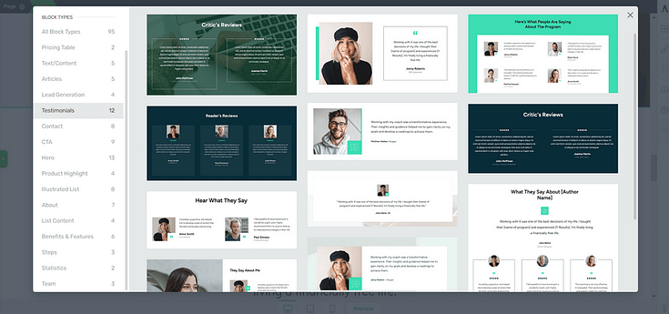
Testimonial block templates in Thrive Architect, our landing page builder
Including positive feedback from real customers shows your target audience that your products really do what you say they do.
Consistent positive feedback not only sells a single product but also elevates your brand’s image – people love a business that sticks true to their word.
The best types of social proof to add to your landing pages, blog posts, or emails are:
- Positive testimonials from real customers
- Case studies or customer success stories
- Endorsements or awards from reputable industry leaders
11. Always Include a Call to Action (CTA)
Remember, the goal of copywriting is to prompt action.
Every piece you create should focus on getting your readers to do something – sign up for a newsletter, opt-in to receive a lead magnet, purchase a product, register for a webinar, etc.

CTA section template from Hydrogen, one of our smart landing pages
Without a CTA, your audience might enjoy your content, but will remain passive.
A clear directive can turn passive readers into active participants, leading to higher conversion rates.
CTAs also eliminate ambiguity. They tell your audience exactly what to do next, removing guesswork and guiding them down a clear path.
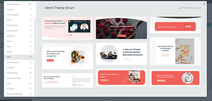
Examples of CTA section templates from Thrive Architect, our landing page builder plugin
To create eye-catching CTAs that encourage your audience to take action:
- Be specific: avoid using vague phrases like “Click This”, and use more direct phrases like “Join Us” or “Buy Now” or “Click to Call”
- Create urgency: Add supporting phrases like “Limited Offer” or “Only a Few Spots Left” to push your audience to take fast action.
- Stand out: Include design elements that grab attention, like buttons or links that are clear to see.
We also recommend adding a countdown timer to your CTA sections to create a sense of urgency and give hesitant buyers a good push.
12. Track Your Analytics
To understand how effective your copywriting is, you need to become familiar with the metrics behind your work.
Studying your site’s analytics helps you identify what’s working and what needs to be improved. With this data, you can make targeted changes to your landing pages to generate more conversions.
We recommend using MonsterInsights to track your website’s analytics.
MonsterInsights is the best Google Analytics plugin for your WordPress website.
This plugin includes a user-friendly dashboard to help you understand your Google Analytics reports, and track your site data (e.g. pageviews, conversions, sessions) with ease.
13. Most Importantly: Be Yourself
One of the best copywriting tips to remember is to add your personality to your writing.
Your unique voice is valuable and will resonate with the people who need your help. But if you focus on trying to sound like Neil Patel, Seth Godin, or one of the Thrive Themes writers…
You’ll lose the one advantage you have over the competition – your authenticity.
Authenticity is a key element of effective copywriting because it helps foster genuine connection with your audience and sets you apart from your competition – making your brand memorable.
“Being yourself” can look like:
- Sharing relevant personal stories or experiences to support your main points
- Using simple, conversational language to communicate with your audience
- Sharing your work with your peers to receive feedback on whether your writing truly reflects your voice.
Next Steps: Write Your First Blog Post or Sales Page
Now you have all the best copywriting tips to create copy that generates conversions, it’s time to start writing.
Here are four additional resources to help you create effective sales pages and blog posts to boost your conversion rates:
- How to Build Your First Sales Page on WordPress
- Short Form vs Long Form Sales Pages (Everything You Need to Know)
- How to Create the Perfect Long Form Sales Page (+ Templates)
- How to Create SEO-Friendly Blog Posts Users and Bots Will Love (14 Tips)
And here's a video from Tony, with more actionable copywriting tips you can implement easily:
Is Your Website Helping or Hurting Your Conversion Rates?
Good copywriting is important, but if your website is hard to navigate and hard to read…your readers will drop off.
Your website's design should contribute to winning your audience's attention, instead of driving them away.
So, if you think your website could be much better, it’s time to make a change so you can finally reach your business goals.
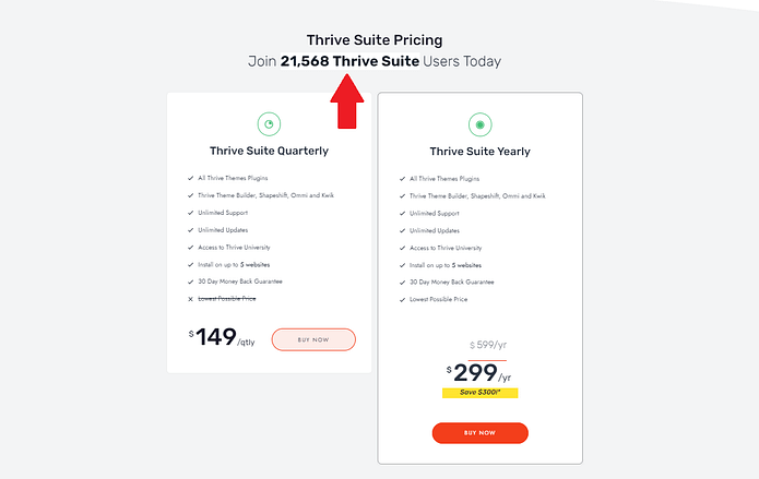
We recommend using Thrive Suite to overhaul your website and create something that’ll impress your audience and encourage them to convert.
And if you don’t have a website yet, and are looking for the best WordPress plugin bundle to get started, this is still for you.
Thrive Suite is an all-in-one toolkit that contains plugins, landing page templates, opt-in form templates, quiz templates and more; designed to help you create an amazing website for your business.
If you've been thinking about taking your business to the next level and want to use high-quality tools for a crazy reasonable price - Thrive Suite could be for you.



Beautiful article, I learnt a whole lot about copywriting and can’t wait to commence on my journey as a professional copywriter…