Ready to see what new features are packed inside our latest software update?
When you update to Thrive Architect version 2.5.5 (and your other Thrive plugins to match) you'll get a handful of great new features and improvements.
If you're new around here, we're a fast moving company and once every 3 weeks we roll out improvements that will magically appear in our plugins when you update to the latest version.
In this post, I'll show you what's new and where to find it. Read on!
More...
1. Table of Contents
See the table of contents above?
Tip your hat to it and thank it for it's many years of service... because this is the last time we'll use that design on the Thrive Themes blog.
After years of hard work providing quick navigation links on your websites, the Table of Contents element has now been completely rebuilt, blowing the lid off any previous design limitations.
(Don't worry, it's backwards compatible and safe to update).
Here's a quick look at a few of the templates that it comes with out-of-the-box:


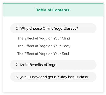

It looks pretty, right? It's the customizability of this element that will impress you the most.
Let's cover the basics first.
The Table of Contents element will automatically pull in the headings from your content and display them as jumplinks. That means your visitors will see a list of your headings and can click to jump to the ones that interest them the most.
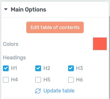
Under main options, you can select which heading types should load in your Table of Contents.
Combine the Table of Contents with Sticky Scroll behavior and it will float alongside your content as your visitor scrolls up and down the page.
We've taken it a step further by allowing you to highlight the headings as your visitor scrolls past them, helping them locate where they are on the page. Check out an example of this below.
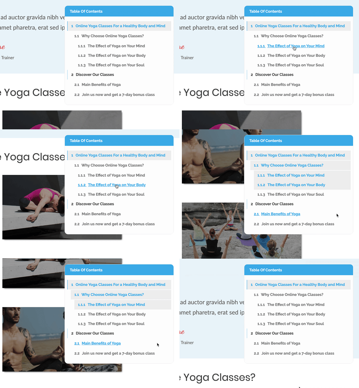
A Table of Contents with Sticky Scroll can be used to show where a visitor is on a page
This element is a big one, so let's go over the finer details.
New Settings Under Main Options
The Main Options panel is where you control the high-level features of any element. For the Table of Contents, you'll find a few new options there.
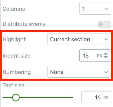
These new settings will appear under Main Options
Highlight:
This controls the behavior of the highlighted items when a visitor scrolls up and down the page with a sticky Table of Contents. Highlight options include:
Indent Size:
As you can see from the designs above, each sub-heading is indented. With this control you can easily change the depth of that indent or just remove it entirely.
Numbering:
Numbering can be set to basic, advanced or off. Basic will apply a number before each of the level 1 headings in your table of contents, whereas advanced will apply progressively nested numbers in the format of 1.2, 1.3 and so-on.
Rename and Hide Headings
Sometimes you may want to modify the headings that show on your Table of Contents. Perhaps one of your headings is too long for your chosen design or maybe you want to hide an H3 that has auto-populated.
With the new Table of Contents, you have complete control over your headings.
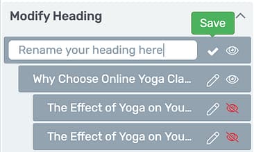
Renaming or hiding headings is easy!
The Modify Heading section beneath Main Options lets you rename or hide any headings that your Table of Contents has loaded without changing the content on the rest of your page.
Fine Tuning Your Table Of Contents
The new Table of Contents uses an Edit Mode to give you absolute precision on everything.
Once you enter Edit Mode, you can change every font, color, border, background and corner of each heading level. Changes will be applied to all headings displayed in that level, indicated by the dotted green lines below.
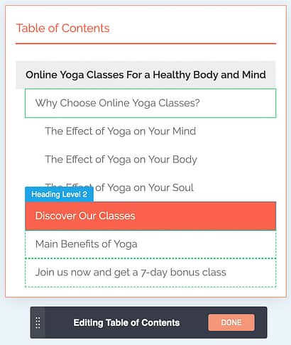
Fine tune everything from Edit Mode.
While in the Edit Mode, you can access 3 states: Normal, Hover and Highlight. Highlight is the appearance of your active headings when seen in Sticky Scroll.
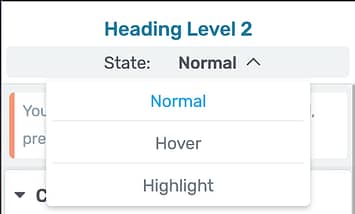
Look for 'Highlight' under the states dropdown.
Support for Dynamic Table Of Contents
Those of you building templates with Thrive Theme Builder will love this: a Table of Contents can be dynamically populated.
Let's use an example. You can create a blog template that includes a sticky Table of Contents in your sidebar.
In this case, you want the Table of Contents to display different headings depending on which blog post is loaded. When used in a template, you'll see a notice about how dynamic headings will be loaded.
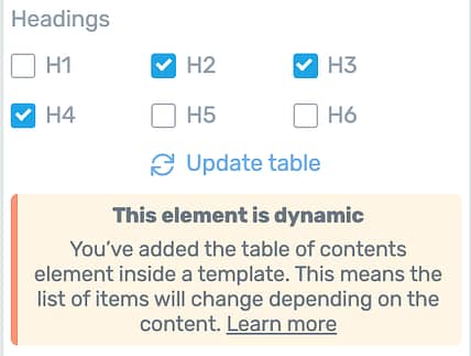
Used in a template, the Table of Contents is dynamic.
The trouble with a dynamically created Table of Contents is that you may still want to customize headings or hide them entirely. But if you add your Table to a template, how can you see the different headings that will be loaded from different content?
Well, we have a solution built in. When you are writing a blog post or any other content, you have some new options under 'Advanced' for any headings that you are editing.
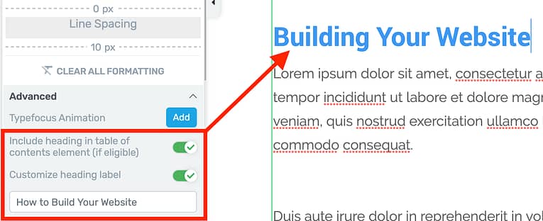
Configure Table of Contents behavior right from the heading!
Right from the heading itself you can customize the heading label or hide them from any dynamic Tables of Contents that may be pulling in your content.
2. Split Menu with Logo
Have you ever browsed the web for design inspiration and seen one of those beautiful headers with the company logo in the middle of the menu?
Something like the MicroConf website?

The MicroConf header has its logo in between menu items
When you build your own header, you've previously put your logo to the left or the right of the menu.
But now you want to get it in the middle...

So you want to put your logo here?
Don't worry, we've got you sorted!
Now when you add a menu anywhere on your website, you'll find a new toggle in the main options called Split menu with logo.
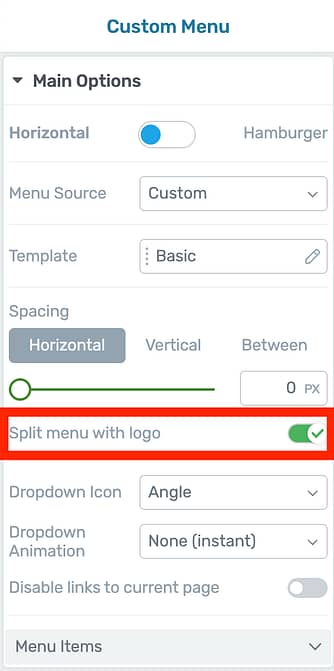
This toggle is the answer!
Clicking this toggle is going to place a logo element inside your menu.
With a few edits to the logo size, you'll quickly have a menu that looks like this:

Yes! Logo in the middle!
Now that you have a logo element in the middle of your menu, you can select it to find one more option: Position when menu is hamburger.
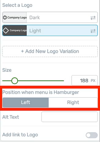
When a logo is inside a menu, you'll see this new button available.
If you're not splitting your menu, your logo will stay wherever you put it - left or right. This new option is for when you are splitting your menu.
The menu element will intelligently collapse into a hamburger menu when there isn't enough room on your visitor's screen and the position setting will tell the logo which side it should move to.
When set to Left, it will look like this:

On tablet or mobile your split logo jump to the side you have selected.
Suffice to say, we do our best to think through and solve your design issues before you've even encountered them.
Research-Backed Pro-Tip!
The Nielsen Norman Group are a user experience research agency that publish excellent studies on web design best-practices. In 2016 they published some research into the use of centered logos in website headers.
The conclusion was that centered logos will hurt ease-of-navigation... unless you include a 'Home' link as the left-most menu item.
We're giving you design freedom, but we believe in conversion-focused websites. If you wish to use a centered logo in your header, we highly recommend you follow NNgroup's suggestion and add 'Home' as the first menu item on the left.
3. Custom Tags on Lead Gen Selection
Over the last 6 months, we've rolled out impressive updates to the lead generation form with checkboxes, radios, dropdowns, text areas and more, allowing you to make forms like this:
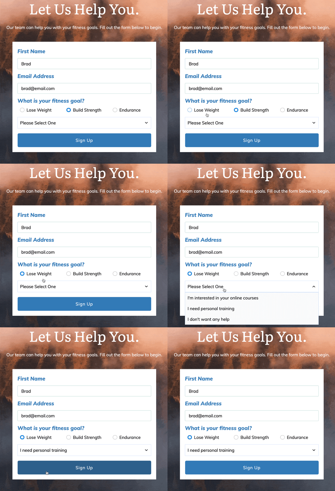
Lead Gen forms can now offer options to your subscribers.
But most of these features have relied on Custom Fields in your email autoresponder to store your subscriber's choices.
Not anymore.
This week, we've added another option: Tags.
You can now pass Tags to your email autoresponder... depending on the selection your subscribers make.
How to Add Tags Per Selection
There are 2 places you can apply these tags.
The first is from the container that holds the options (radios, checkboxes or dropdowns).
In the image below, you'll see I've selected the container around 3 individual checkboxes. From this container I can click to enable 'Send answer(s) as tag'.
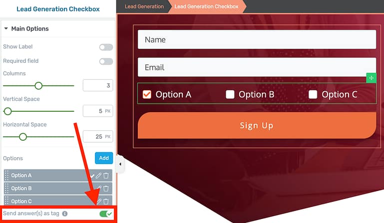
Look for the 'Send answer as tag' Toggle
Because this is enabled at the container level, your lead generation form will automatically create Tags from the text on the label. That means that if a user picks the first option, then the tag 'Option A' will be automatically applied.
Of course you can edit the tag with the second method - configuring the Tag per option.
In the image below, you'll see that instead of selecting the container for all of the checkboxes, I have selected a specific checkbox, Option B.
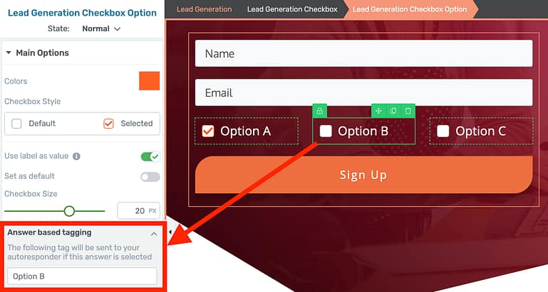
You can set the tag that will be applied if your subscriber chooses this option.
With a specific checkbox selected, I can edit or add a Tag value that will be applied to that subscriber only if they select that option. This applies to radio buttons, checkboxes and dropdowns.
The end result?
Your visitor makes a selection while submitting the form and is appropriately tagged inside of your email marketing service at the same time.
NOTE: These tag options are only available once you have connected an email service that supports tags to your lead generation form.
4. Send Form Values To The Thank You Page
While configuring your Lead Generation form, you'll find a new toggle that automatically sends form values to your thank you page through the URL query string.
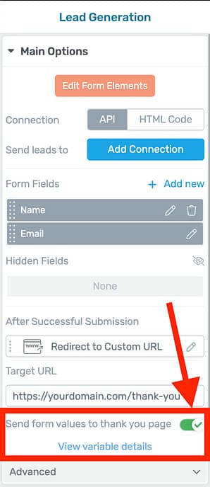
One toggle? So easy!
With one click, this toggle is going to append your subscriber's form entries to the thank you page address as a URL query string.
Clicking 'View variable details' will show you how the query string will look. For a Lead Generation form that includes a Name and Email, it will look like this:
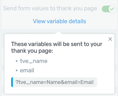
A quick view of how your form fields are passed forward
This means that if I were to fill out the lead generation form and click submit, I'll be redirected to the chosen thank you page with a URL that looks like this:
mywebsite.com/thank-you/?tve_name=Brad&email=[email protected]
Now those form fields can be collected and displayed on the thank you page with our dynamic text feature!
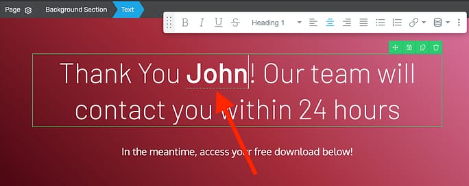
Dynamic text lets you use your subscribers name right on the page
To display any form field on your thank you page, simply place a text element and insert Dynamic Text from the typography bar by clicking this icon:
From here, you can choose which variable you are looking to display and set a default value if there is no query string available.
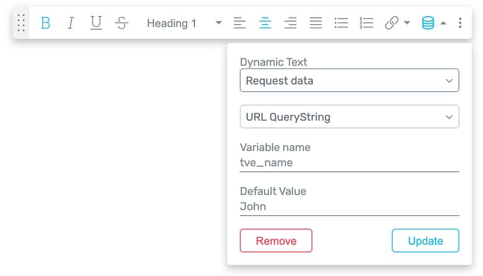
Try these options to display the your subscriber's name on the thank you page.
It's seamless!
NOTE: The variable called 'name' is reserved by WordPress. For this reason, your name fields will be loaded in the query string as 'tve_name' instead.
5. Email Quiz Answers and Results
The recent updates to our email notification editor have paved the way for a new feature inside Thrive Quiz Builder:
You can now send quiz answers and results in an email from your website to your quiz takers or to yourself whenever someone submits a quiz.
Quizzes are a high-converting lead generation tool because they use an opt-in gate. This is a lead generation form at the end of a quiz but before the results page. In order to see their result, quiz takers submit their email address.
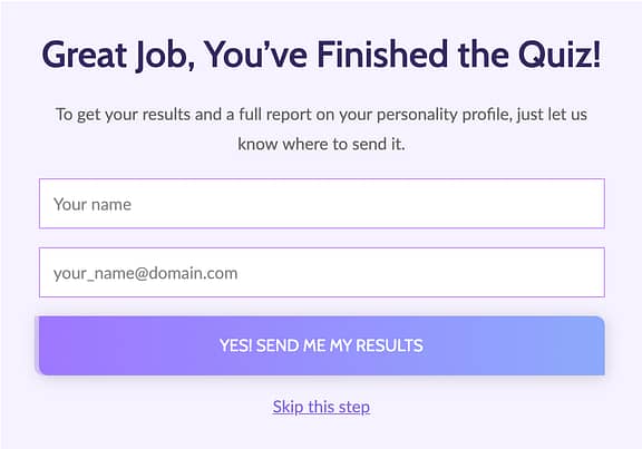
An example opt-in gate made with Thrive Quiz Builder
While customizing this lead generation form inside of Thrive Quiz Builder, you can add an email connection that will send emails directly from your website once the quiz is submitted.
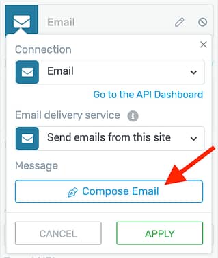
Compose an email inside Thrive Quiz Builder to be sent whenever a quiz taker completes your quiz.
When you click to compose that email, you'll find a quiz-friendly email template pre-written for you.
You can customize this email however you please and you'll find new quiz shortcodes available for the quiz name, answers and result. Don't forget that you can send an email to yourself and a different one to your quiz takers if you'd like.
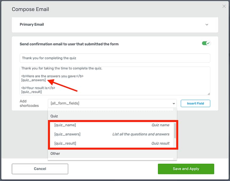
Shortcodes will be replaced with the correct values for your quiz taker.
When that email arrives in your quiz taker's inbox, the shortcodes will be dynamically replaced with the content from their quiz experience.
As an example, the email formatted above applied to a short personality quiz will arrive in an inbox looking like this:
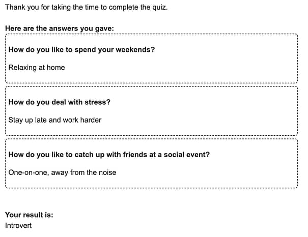
This is how the quiz shortcodes render in an email
6. Set Mega Menu Width Per Dropdown
When we did the mega menu step-by-step tutorial, many of you were impressed with the flexibility of the element. But you also pointed out a restriction of our implementation and that restriction is now lifted!
Up until now, the mega menu dropdowns would automatically take on the width of the entire mega menu. This works fine for multi-column mega menu layouts, like this:

A mega menu spread across 2 columns
...But not quite as good for mega menu dropdowns with less content, like this:

A mega menu in just 1 column.
That's why we added the option to set the width of the dropdowns individually, meaning you can resize it until it's just the right size for your content:

Set the dropdown menu width until it's perfect!
To find the new max-width setting, navigate to the Mega Menu Dropdown breadcrumb in Thrive Architect and you'll see your new width slider in the main options.
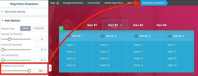
Manage Mega Menu dropdown widths independently
7. Under The Hood Improvements
Each release includes a few minor improvements you may never notice, but if you like to pay close attention, here are the noteworthy ones:
Element Color Matching
If you add a Smart Color enabled element (such as a button, tab, toggle, etc.) to a Smart Landing page or Thrive Theme Builder website, the element will now automatically match the colors of your page. Of course you can change it as you see fit, but out-of-the-box it'll inherit your brand color.
Shortcodes in Hyperlinks
In the WordPress environment, you may wish to use a shortcode as a hyperlink so another plugin can provide the URL value for that link.
We've improved the dynamic Button and hyperlink settings to make this easier for you to implement.
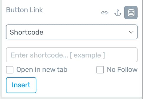
Use the shortcode link option to insert any shortcode you want
Like the updates? Leave a comment!
It's always a highlight for our development team to hear your feedback and new feature suggestions. Drop us a comment below and let us know what you like, don't like, and what you'd like to see next.


Great updates – so glad I found you guys. Can’t wait to start using the custom tags for lead gen.
I agree that this is a powerful feature for segmentation and targeted marketing. Glad you like it and thanks for the comment.
Love the table of content, lead gen tags and thank you page personalization!
Glad you like the updates!
Its such a pleasure to work with thrive, guys. So easy. So useful. And again: So many great features. Thank you.
You’re welcome, Markus
Wow, dynamic text for name is a game changer! Hope we can use it outside TYP too, like in after purchase page inside the funnel.
Also, I really really hope you guys improve your customer support, it’s been nightmare for the past few months.
It’s taking 1-2 days just to get a SINGLE reply from support, which is taking me more than a couple of days, if not weeks just to solve small issues. It’s taking way too long for a response, and causing delays in my projects. I’m sure many people can relate to this.
I miss the time when support was very fast, which was a few years ago.
– We have a big update to the support system that we’re using to come shortly. In short, we’re moving away from the forum to a far more user friendly system that will make getting help much easier
– Regarding response times, we were at 4 hours on average before the Theme Builder launch. After the success of the launch, we’re scaling up the support team to get response times back down again. We have another three team members starting just next week and we’re launching a number of new initiatives to help you get support faster.
Thanks Paul!
I figured your support team would be slammed after TTB launch! (Remember that’s a good thing! 😉 LoL!) To your entire Thrive Team’s credit, Hanne and others actually provided a LOT of very welcome “support” in comments on Builder posts and videos!
Still think Thrive is the best! 😀
That’s amazing Paul! It’s incredible how responsive and fast you guys are at solving problems. Keep up the good work! ????
That’s great to hear! If possible, would love to see LOOM incorporated for faster /clearer communication between Thrive support team and challenged Thrive fans.
A dynamic table of contents that is sticky in the sidebar and that can be added to the template? Wow, that is some amazing stuff! Very useful to have an automatically added, sticky TOC added to blog posts. Can’t wait to convert my site to TTB and try this out!
Glad to hear you’ll use some of the advanced features, Michiel
Great updates! Will I be able to use the shortcodes in hyperlinks to set up a better looking than woocommerce store?
Although I haven’t tested that exact example, that’s exactly the idea. Also, we’re releasing some big updates related to WooCommerce in the near future… so keep an eye out for those.
I love everything about this update. ???? I’ve been upgrading all my clients sites to Thrive Theme Builder as there isn’t any other product on the market so advanced when it comes to conversion focused sites. Plus the team must have some incredible processes in place to move as quickly as they do. I wish every company had the same values and behavior I see from the Thrive team. Their customer service team is spectacular too. Something that is rare as companies grow but Thrive has seemed to master. Kudos to your team for their hard work!
Thank you Amanda! That’s so awesome to hear.
Is Table of Contents only available in posts produced with Thrive Architect?
1) Most of my blog was produced years ago before I used Thrive
2) Thrive Architect on my machine is so slow I only use it if I really need special features.
Thanks
Yes it’s a Thrive Architect feature and only available when you use Architect.
As for the speed issues – please can you describe what is slow for you? I’d like to get to the bottom of this.
Thanks Paul, no specific feature – just everything. My PC just freezes – I’ll try it again and see if I can notice when. I’m a computer programmer in the real world, so should be able to spot some pattern!
Perhaps it’s because I find it Thrive Architect so very complicated to use overall. Wish there was a ‘Lite’ version, as half the features I have no idea what they even mean 🙁
I’m still using the Focus theme which I gather may not be the recommended one to use any more, but scared to change to anything else in case it unravels the settings I already use.
Sorry – I’d love to love it – but every experience leaves me feeling drained, so I just stick with WP editor because I can write quickly that way. I’m only a part-time blogger and just need to be fast LOL
Joy
Thanks for the detailed response Joy. May I ask what browser you’re using to edit with Thrive Architect? Are you using a PC or a Mac?
Thanks Paul, I’m using Chrome and PC. My PC isn’t new, and my new the laptop might be faster but I find it difficult to read all the options on the smaller screen on the laptop. I need to finish a squeeze page and thank you page some time, so I’ll see if I can get on better and notice anything specific.
FWIW, like Joy & MamaRed indicate, I’ve also had some Architect speed issues in the past… I chalked it up to my being on a slower Windows 10 laptop…or possibly the WiFi I was using…
This was months ago and I have not noticed it on my own high-speed network at home (since we’re now all “locked up” 😉 LoL!)
I also commonly ran Evernote concurrently with Architect, & have since learned that Evernote is both a battery drain (on mobile) and a memory hog for the OS… I still use both since all my research is archived in Evernote, but have not experienced these speed issues recently…
Just hoping this feedback might help others… 🙂
Thanks for the information Karen – what browser are you using? Also are you using a PC or a Mac?
My laptops are all Windows 10, with Chrome… I do have Firefox installed, but typically use Chrome.
My mobile devices are all iOS — iPad Pro & iPhone 8+ — but I learned way back (pre-Architect) that touch & mobile devices didn’t work well with typically ‘drag-and-drop’ mouse-centric software…;-)
In this area, however, Architect has really improved (as I guess have the abundance of true “touchscreen laptops”) so I can actually do some rudimentary tasks like “updates” from my iPad…
Hope this helps! 🙂
Thanks for the information Karen – we managed to reproduce some slowdown by throttling the processor during testing.
We’re working on some performance improvements that should fix this. Some are coming out on the 1st July, the rest will be ready on the 22nd July.
Hi Paul,
Thanks for the information (& sorry for the delay in responding as I have been working in Shane’s Audience course)…
It’s really impressive to see how much testing you have done — “reproduce slowdown” — to improve things… I guess that’s necessary with all of the myriad of computers and devices out there… It boggles the mind to think about all the possible scenarios! 😮
But it’s greatly appreciated the lengths you go to in testing to keep improving your products! 😀
Can you let us know what happened to the integration of Thrive Leads with Zoho that was planned for this update?
It’s in testing at the moment. Any time we give dates it’s always subject to change, but I can assure you it’s on it’s way.
That has never been scheduled for this update. It’s scheduled for 1st July
Thanks Brad and Paul. I got that date from Hanne in a thread about the updated forms functionality, but no worries as long as it is coming, I’m happy.
would love to see
1) woocommerce integration/custom cart etc
2) checkout optimization features in the future! love you guys
3) product sliders (Shopify style)
If u do this I have no reason to go anywhere else. (already a thrive membership member) <3
1) We’re getting close to releasing our WooCommerce integration with Thrive Theme Builder. Stay tuned!
2) We’ve been discussing this but a few things will have to come first.
3) Hmm… I’ll have to investigate Shopify’s example to see exactly what you mean. We’re cautious of sliders because they can be harmful to conversions but only in certain situations. I’ll discuss this with the team.
Thanks Sergios!
Woo Commerce integration will be released on the 1st July – it’s in the release candidate now.
Will it also be set up for multivender plugins?
I assume these multivender plugins use the standard WooCommerce hooks. We’ve taken the time to make sure that our WC implementation is extensible and all hooks are respected.
So, in short: I haven’t specifically tested multivender plugins, but they should work.
Halleluja! The lack of formatting flexibility in the TOC has irked me for some time. 🙂 Glad it is available now! You’re the best!! 🙂
The Form option is also great!!!
We’ve been wanting to update it for a long time… but, we’ve had other higher priorities first. Good to have it out now, though!
How about fixing a basic function such as making the parallax scroll work on an IOS? Not that hard really as you advertise a theme that does it and yet it doesn’t work!
What exactly isn’t working? I just tested all parallax effects on both Chrome and Safari on iOS without any issues. This means it’s likely that it’s specific to your website environment. If you open a support ticket, our team will investigate your issue for you.
Thank you for the detailed description of updates. I’m a new Thrive member and just launched my website about a month ago.
Is it advisable to push all of the updates when they become available or do you only update as needed? What is a best practice process for updating plug-ins.
Thanks!
We update every three weeks. The best practice would be to have a staging site where you can update, check everything out, and then push to live once you’re happy with it.
We do a LOT of testing at our end but because WordPress is an open ecosystem there are literally thousands of different plugin, theme and hosting environment combinations so there may sometimes be conflicts.
This looks great. Any plans to add some of the menu changes — particularly “width per menu” to Thrive Theme Builder as well? It would be nice to be able to set this globally for the main header menu.
Theme Builder users the same codebase as Architect so the changes (including this custom menu update) are available across both products.
It’s almost like Christmas every few weeks when you all roll out your latest features!
Love what I see with the new TOC as well as the dynamic TY page text ????????
One thing I’m still really hoping to see soon is some kind of gallery w/ lightbox element. In my space, many clients want a portfolio gallery to showcase their work and would be super awesome to have a builtin option with the Thrive customizability vs cobbling in other plugins with far less options.
Thanks for the feature request, Eric. I’ve taken note.
A gallery element or separate plugin would be so beneficial to me too. Instead I have to go back-and-forth between windows and plugins to implement a gallery in a post or page using shortcodes. It works ok, but is a faff and a lot of extra steps. The gallery plugin I use causes issues with Thrive comments too, so I currently do not have commenting enabled on my site. A Thrive Gallery Plugin or Element would solve this tremendously!
Love the new improvements to table of contents. Exactly what i was dreaming about!
Glad to hear that, Timo
Hello, this update is nice but I ask you if you have any major improvements co ing for Thrive Apprentice. When it was released 18 months ago it was presented like a “work in progress” with more features and integrations coming. Any news about it? You have released some nice courses in the last year, but your course-plugin has been quite abandoned… keep the great work and give me some good news 🙂
From July 1st we’ll have a dedicated team working on improvements for Apprentice relentlessly. You’ll see many big changes to Apprentice shortly thereafter…
Great to hear that. I am eagerly waiting for an option to tag subscribers in my email list based on what course they signed up for!
Thanks for the feature request – duly noted!
How about Import and export courses, like you Have with thrive quiz builder.
Will this include the ability to track the progress each student had made and time spent at each stage?
For sure that’s something we want to include, yes.
Love Send Form Values.
Any plans to have ability to identify a current user on the site and use his data from other sources and the ability to implement logical conditions to show the content?
For example if I have quiz results, that this user answered one question and chose Option A, I apply to one block of content a condition logic: If he has this option in his profile he sees a different version of that block/object, otherwise system show default version.
If Thrive team can implement these smart web features – That would be amazing. If you need any help with the concept – I`m more than happy to help and show examples of what I mean.
We are planning to build a rules-based dynamic content element that allows you to specify the context in which content appears. If x then show y, for example.
The challenge is building it in a simple way while also being cache friendly and doesn’t slow down load times.
I agree that such functionality is particularly important for a smart site, especially with the template editing abilities of Theme Builder.
Long read…will you be doing a video on the new features? (my preferred way to consume Thrive Themes content)
Colin is going to make some videos on the bigger features, yes, but they take longer to make than a written roundup post.
You have fantastic ideas. Congratulation.
Appreciate it, Falk
Love it. Thank you Thrive Team Members! ❤️
Thanks for the positive feedback!
is there a tutorial on ‘Shortcodes in Hyperlinks ‘?
No there isn’t. It works just like a hyperlink. If you have a plugin on your site that can create a link in a shortcode, then you can paste that shortcode inside of a Thrive Architect button or text hyperlink and style it with our software instead.
Brad – have created a custom menu to test the split menu with logo feature, but how do I get rid of the wordpress menu…or even the wordpress header? I was able to turn off the logo in the wordpress header customization, but can’t seem to get rid of the menu, thus leaving me now with two menues.
https://www.rickbrowncommunications.com/
Thanks for all the great new features!
Hey Rick, this gets a little complex and it’s one of the problems we’re fixing with Thrive Theme Builder. I’ll do my best to keep my answer short… Your WordPress header is created by your WordPress theme. It’s a template element meaning it’s used across multiple places on your site such as your blog. You have 2 options. 1) You could turn your homepage into a blank Landing Page and then copy in what you’ve built. This will remove the theme elements such as your header and footer just from that page, allowing you to style every single part of it with Thrive Architect. However, the new header you make won’t be used across your site- only on your homepage. 2) If you want to change your header on all of your pages across your site, then that’s a function of your theme and it’s something we can’t edit with Thrive… unless you are using Thrive Theme Builder.
I hope that helps. If you need any more guidance, you can open a ticket with our support team and they’ll happily help guide you with what you’re trying to achieve.
Hey, Brad!
Always great to hear from you & read your in-depth & helpful articles! <3
These updates are all awesome, but the biggest help to me is the serious upgrade to the TOC element! You know I love your OpenPDF long form content and the TOC is an absolute necessity for that type of post!
The TOC was great before, but having these fine-grained customization abilities is truly amazing and so useful… 😀
Before, I had to make sure NOT to use a particular H tag unless I specifically wanted it to populate in the TOC… (not great for content structure, I know! ;-o)
Now, being able to customize each heading or section is great! 🙂
Also love the scrolling feature for the TOC… Really enhances the overall reader experience!
Thrive continues to confirm my going "all-in" with Thrive products was the best business decision I have made, after commiting to WordPress 10+ years ago!
Thanks to everyone on the team for making this happen!
Hahaha, I knew you’d like the TOC for the Open PDFs. It’s a perfect match, especially if you break out the Open PDF chapters into separate pages and manage them with a TTB template. That’s getting complex, but it’s absolutely possible!
You’re right about that, Brad! 😉 That’s the first thing I thought about when I saw your TOC upgrades! 😀
I have already created a dedicated OpenPDF template in TTB but it’s just a single page… Any chance on learning how to do the multi-page template you described? LoL! 😉
I love TTB, but am just learning all the nuances of it! 😉 It does so much, I’m sure there are lots of subtleties I’m missing! 😮
I’m not clear on how I would set a “multi-page” template up as you described…
Thanks! <3
OK Karen, now you’ve got me drooling with curiosity. What is “OpenPDF long form content?” Hugs&Blessings. MamaRed.
Hi MamaRed!
Brad created a long-form article where he introduced this concept )it’s his own term) & I loved it!
You can find it here: https://thrivethemes.com/build-high-converting-ultimate-guide/
The article is really tutorial on how to actually produce these long-form pieces… I’ve archived in Evernote because I refer to it so often… It’s packed with great information! 😀
Nice to hear from you! <3
Thanks oodles and bunches Karen! I have a feeling I’m going to be adding this to Evernote too (lord have mercy, I LOVE me some Thrive Themes products, ideas, and all that jazz….now, keeping up with all of it is another ball of wax entirely. I’m in the process of creating 3 websites (2 client and 1 mine) using the new Thrive Theme Builder. I confess I’ve wondered around in the weeds…a lot.
That said, the Thrive support team keeps on answering my billions of questions. Thank goodness for that.
While I’m at it…great to meet you!
Blessings
MamaRed
Great to “meet” you too, MamRed! <3
I’ve seen your comments in various threads for some time and always appreciate your perspective! 😀
I hear you about getting a handle on all the cool Thrive products & functions! Lots to wrap your head around!
I practiced with TTB on 2 demo sites I use for teaching, and it was so simple & error-free I switched it over to my “real” site (a new site, so it was easier). I love TTB!
Experimenting — like with “double-custom-menus” —has created some challenges too! Diving off the deep end of experimentation! ;p LoL!
Enjoy learning about the OpenPDF! 😉
XOXO
When the WooCommerce integration???? =(
July 1st
I love updates guys. One further request on the email results to user from the quiz… it would be great to be able to handle individual quiz answers on their own, instead of the whole quiz being lumped into a single code. For example – if I’m trying to gauge a person’s level of knowledge on a particular issue, I want to be able to reply to them with the correct answers to certain questions, along with a little explanation, so that they can actually learn something from the email, making it more useful to them.
This is an excellent suggestion Jonathan. We all know feedback is of more value to all parties’ educational objectives than the overall result.
We already have answer feedback built right into Quiz Builder which I think you’ll find more versatile than the answer email. Have a look at the 4:24 mark in this video from Shane.
I want to dig a bit deeper. Would you do this for every question, or just a select few? And would your explanation be the same whether they answered the question right or wrong? It sounds like this may require some complex logic
Hi Bradley. In my case, I’d do it for most, but not all, so yeah, a select few. Reason being, most of my quiz is knowledge based and then there’s an open ended question at the end to elicit feedback for market research. I don’t really need to address that one, but all the others I’d like to add explanation to. In my case, I’d be ok with giving the same response regardless of what they answered. I can see value in providing further flexibility, but as you noted, this would start requiring more advanced logic.
As a hybrid developer/marketer, I appreciate these updates and am digging your suite of products so far. Great job!
Thanks Steven. That hybrid combo is a winner!
Any update on Woocommerce integration with Thrive Theme Builder?
It’s in the very late stages of completion so you should see it very early next month. We’ll make a lot of noise about it as soon as it’s out
This is just brilliant! Love your work guys!
Thanks Joshua
Amazing job guys!
I love this, and hopefully you can add some features which ConvertFlow has such as dynamic content personalization, plus, I believe some chatbox features, and website alerts features will be considered for the next upgrade? 😉
Thank you!
I’ll add your feature suggestions. What would you like to see for dynamic content personalization?
All it can offer, to be able to track users from A to Z when they click, just like we do with the Thrive QuizBuilder 😉
Awesome! with the quiz builder mail feature, I think you have just solved an issue that I have been struggling with… linking quiz taker information with the quiz responses! I would still like to see an easier to use report, but this means I will be able to launch my survey this week!
The other additions look awesome as well!
Glad to hear that, Dean!
I’m just wondering – is there a custom option in the header where I can add a call-to-action button (business phone number), for example?
Hi Frank,
If you’re using Theme Builder, there are actually pre-designed headers that have a button in them… Sounds like this might be what you’re looking for… 🙂
You’ll be amazed how easy this is. There’s 2 parts to it.
1. To make a CTA button in a header, you can just add it as a menu item and then ungroup it by clicking the lock icon. See here: https://share.getcloudapp.com/bLujG62B – When you click the padlock and it turns red, you can then style that menu item to look different to the rest. Add your ‘Call Us’ text, and you’re good to go.
2. To make a clickable business phone number, just use this format in the hyperlink– “tel:+555555555”. If someone clicks the link from a mobile it’ll immediately load a phonecall to that number. In this video, Shane will show you how it works.
H Brad, The new updates are great for the lead gen form BUT I wish we could capture an actual date field, using a calendar, and then pass that date field onto our autoresponder. This includes the hidden field as well. It says in the notes that you can add date & time but that is still an input field, and my autoresponder can’t convert an input field into a date, to trigger automations by date. Hope you’ll add a date field soon.
I’ll add your request, though this could be challenging since autoresponders handle non-text input fields differently. Which autoresponder are you using? And may I ask why you are asking your subscribers for a date – Are they scheduling something?
The ‘Table of Contents’ is really great, but a ‘Back to the Top’ button on the lower right or left hand corner like in the generatepress theme would be even better. Please can you add that as an independent option or for addition to the ToC.
We have some work scheduled on the roadmap that will make it possible to build this, but I’ll include your suggestion with it
This can actually already be done pretty easily by adding a text hyperlink inside any table of contents element and setting the jumplink target to be the header.
But you’d have to do that on every page and post. It would be MUCH better if you could create it on 1 central place on the website.
I have it with an external plugin, but it would be awesome to be able to create it with Architect or so. (I can’t use TTB because of my super specific look and feel of the site.)
The less other plugins the better! For loading times, safety and possible clashes.
Thinking a solution could be to add a
“distance from the bottom” setting option
for sticky elements.
Hi Guys,
Great update, love those!
Thanks Christiaan
Nice work!
What about bringing some of those TOC features to the numbered list element?
-Ability to have sub-items.
-Ability to have different numbering options like a, b, c, I, II, III, etc…
-Possibility to insert different dividers: 1), 1-, 1>, etc…
-Possibility to create styled list items as a sub-item.
Thank you!!
Great suggestions, Alexandre. I have a note to improve our styled and numbered lists but I’ll add your vote to it
I agree that this is needed – let’s prioritize this Brad.
I’m so glad I discovered Thrive Themes about a year ago. At first I was skeptical, but now with the late updates I see this product as simply outstanding… above and beyond my expectations. You’re a model of greatness! Totally delighted with your product. Keep doing it!
I’m pleased to hear that, James. We do our best to keep improving without slowing down
Just FYI, when a table of contents is within a toggle on a template, it doesn’t update with every blog post.
I haven’t tried it in that environment, thanks for the info. I’ll take this to the team and see what we can do. I’m assuming you’re trying to create a collapsible TOC, yeah?
Yes, that’s right.
Please add my vote to this feature request Bradley!
A simple Hide/Unhide toggle built into the ToC itself is a pretty fundamental function for a ToC.
Thanks.
I’m surprised by the demand for a show/hide feature in the table of contents element because we didn’t see many requests logged. It appears to be quite an important addition, so we’ll add this in a future update.
Yup, it ‘s important. The visitor should be able to hide it and get it out of the way and bring it back when needed.
Love the sticky table of contents you designed! Would it be possible for it to position itself like the video element “sticky float on scroll” where it would jump to the right side of the screen?
Yes, it is important. I have missed that feature since the beginning and it is the reason why I have another plugin for ToC. I am looking forward that update!!! Thanks!
We’re working on a second round of improvements to the ToC. May I ask what the other plugin that you use is?
You guys just keep getting better. Can’t wait to use some of these. Thank you.
Thanks Jane!
Love them all! Thanks for keeping improving and adding new features for us.
Just one quick question, I notice 15-19/20 emails sent from my contact forms go to Spam. Why? How can I fix this?
Hi Samphy,
The contact form is using your webserver to send emails, depending on you hosting and server setup, this can lead to a lot of emails in spam.
That’s why we always recommend using an email delivery service like Postmark of Mandril.
We’re grouping the lead generation element with the contact form element really soon.
For now, I would suggest replacing your contact form with a leadgeneration form with a text field (will look exactly like your contact form) and then connect an email delivery service.
Postmark is the one we use and recommend (https://postmarkapp.com/).
Thanks a lot, Hanne. That’s right! I replaced all my contact forms with lead generation forms and it worked. I’ve tested a few more just before writing this comment.
I’m excited about the grouping and also other features I know that you are working on and will release in a few weeks!
Hanne, what do you mean with ‘grouping’? I mean… what features will the 2 plugins be able to handle, when cooperating?
Excellent improvements as always. Thank you Shane and the team
Glad you like them Tom!
Thanks for updates!
The ToC ones are nice enough but I really expected to see a simple ‘Hide’ option for this element. I’ve always been confounded as to why this wasn’t included from the outset.
I know it can be set up using a nested Toggle option but that’s SOO clunky and unnecessary. A simple Hide/Unhide toggle built into the ToC itself is a pretty fundamental function for a ToC.
PLEASE add this in the next round of updates!
Thanks!
Duly noted Rob – it’s too late for the next release in 3 weeks but we have a round of small table of content updates planned so we’ll add it to that.
Hey Rob, I’m curious about what you mean. Can you elaborate a bit on your feature request?
Hieke, Rob’s referring to having a show/hide function similar to those seen on certain sites. Wikipedia, for example:- https://gyazo.com/a0e0885a64069f57f61d321f5cdedfc6
Oh! Yes, that would be great, especially for long indexes. One vote from me too! 🙂
Well diddly damn, another great features and functions release. I’m starting to sound like a 60s groupie! lol I just built 2 contact forms for a client a couple of days ago. I didn’t use the Lead Generation element since they aren’t, yet, ready to go whole hog in an email list. They’ve just installed MailPoet for their newsletter creation so I’ve got some learning to do for both MailPoet and for TA/TTB!
Potentially ridiculous question and I’ll ask anyway…if folks aren’t yet using an autoresponder, is there a way to generate a spreadsheet or something similar (e.g., a CSV file), to gather the results from a LeadGen element?
Blessings to ya’ll!
P.S. like @Joy Healy I’ve had some speed issues that others haven’t been able to duplicate. I’ve found that moving to Firefox has sometimes helped.
I haven’t specifically tested this, but I’m pretty sure that you can capture leads and populate a spreadsheet by connecting the lead generation element to Zapier which passes subscriber data onto something like Google Sheets.
Here are some of the zaps available with Thrive Themes and Google Sheets:- https://zapier.com/apps/thrive-themes/integrations/google-sheets
If the one you’re looking for is not listed there, then you can also build your own pretty easily.
Sweeettttt! Thanks!
Would like to see the ability to add a little CTA button at the bottom of a sticky TOC menu that a user could click at any time while scrolling.
You already can! We designed the Edit Mode for the TOC to allow other elements to be added including buttons, text, content boxes and images. Drop in a button and you’re good to go.
When will we see the ability to create our own apprentice layouts using TTB?
At this point all I can say is… in the not too distant future 🙂
These are some pretty cool updates!
I do have some concerns though..
Are there any *performance* upgrades to Thrive Leads on the roadmap?
It’s such a resource hog and a real detriment to performance/speed (especially with more concurrent users on a site – even on proper, optimized hosting).
I really hope you guys keep a close eye on performance across the board because at this rate the theme and plugins are only getting bigger and bigger (and most assets are loaded everywhere).
I couldn’t care less about speed scores or 0.5 sec page loads, but the ever increasing weight of pages is becoming a real problem on (especially sub-optimal) mobile connections.
Cheers 🙂
Yeah, it’s funny you mention this. We’re actually running a project with WPX hosting at the moment to make as many performance improvements such as these as possible.
On the 1st July, we have a bunch of improvements coming out for Thrive Leads and Thrive Comments that will lower server side resources quite substantially.
Ooh nice, i’ll keep an eye out, cheers Paul!
Love the updates.
My organization is heavily event driven. I would love to see integration with an event plugin such as Modern Tribes Event Calendar or Webnus’ Modern Events Calendar.
When you say event driven, can you link to a specific example of what you’re trying to achieve?
Can I jump in here? I’m trying to add an events list or an events calendar to my home page but I don’t think it’s possible (or I’ve not found a way so far – though it may be me). Think I just need a widget option to connect to Modern Tribes Event Calendar.
Hey brad any improvements for using a table of contents on mobile yet?
All the table of contents elements are mobile responsive and work well on mobile
Great job! I’m wondering what you mean with the last section about the Shortcodes in hyperlinks…?
Great updates! Is the split menu with logo not available for the mega menu template? Thanks!
Nice Updates
Thanks Aziz
YES!!!: Send Form Values To The Thank You Page
Very happy with this update… 😉
Glad you like it, Wouter.
Great Job every month! You really do care of your clients and I appreciate it! Hope you guys add a chat support to make it feasible for us contacting with Thrive Theme and get a response asap. Additionally, I appreciate if you guys make the theme useable for other languages like Farsi (Persian). Cheers!
Please add a way to do wide and full width images like Gutenburg (https://johnregan3.wordpress.com/2018/12/19/how-to-add-full-width-images-in-gutenberg/)
Hi Dean,
You can very easily add full with images… Either in a background section and then make sure the background section stretches to full width and add it as a background image, which allows to then add other elements on top of simply by adding an image.
If you let us know the layout you’re trying to build, I can tell you exactly how to do it 😀
Great features.
New designs for countdown will be great! The existing ones are a bit old 😀
Like the updates? Yes too much…What you’d like to see next… Gallery Please 😉
Thank you!!
Re: Contact form & Lead Generation Element:
The radio and check boxes are nice addition. Thank you! : )
Request:
Add an option for the visitor name and email to populate the “from” field. Currently when someone completed my contact form, it arrives with my own address in both the from and to fields, with the visitors data only in the body of the message.
Although I know there’s and option for visitor data to show in the subject line, would must prefer it to be in the same place as if they sent me an email.
That would make it easier when viewing, sorting, and replying to inquiries.
Great update.
Great updates as always guys. Well done. May I ask what the progress is on importing csv reviews into ovation as we have hundreds from our Bookeo appointment system which we desperate to move over into your wonderful features
Great, i love it 🙂
@Bradley Stevens @Paul McCarthy, can you please look into an integration with Automizy? When could something like this be realistically available?
Hi Brad,
Still reading, but wanted to let you know (grammar police here, lol!) that this sentence should read ‘its’, instead of ‘it’s’:
“The Modify Heading section beneath Main Options let’s you rename or hide any headings that your Table of Contents has loaded without changing the content on the rest of your page.”
I hope this makes you happy, not mad! I love when readers correct a mistake of mine, so I can fix it. Cheers!
I think you mean ‘lets’ rather than ‘its’, and you’re right. It’s nice to see people read the words I write so thoroughly. I’ll make that change.
LOL! Too funny. Yes, I meant ‘lets’. You knew what I meant. : D. Also, great job on the article. Thanks! I now know better how to use the TOC. Just what I needed.
Is there any option in the Table of Contents in order ot choose to show or hide it, like other plugins? Thanks!!
Thanks, Bradley for the valuable information.
OMG Paul! Keep up the good work! ?