Do you want to learn how to make an online resume using WordPress?
This blog post is for you.
Creating a professional online resume isn’t just about compiling your credentials. You need to present them in the best light possible to prospective employers and clients.
An online resume on WordPress allows you to showcase your skills and experiences in a unique, customizable format.
If you’re unsure where to start, don’t worry.
We’ve put together an easy-to-follow, step-by-step guide on how to create a standout online resume and optimize it to attract potential employers.
Imagine Having a Resume That Stands Out From the Crowd…
…and puts you at the front of your potential employer or client’s mind.
Well, with the right tools you won’t have to imagine this. It’ll happen.
Building a resume site is a great way to stand out in a sea of CVs and LinkedIn profiles. But how you build it also matters – a lot.
Now, you could use a popular resume builder or a standard WordPress resume theme since these are “more convenient” options.

But, you should also consider that while these options are seemingly convenient, they aren't the most effective.
Think of it this way: if thousands of other people are using the same template as you – and these templates often come with minimal customization options – you're going to create an online resume that's the same as almost 100 to 200 or even more people in your field.
This means when someone takes a look at your online CV, they aren't going to be impressed, and might not even be encouraged to keep scrolling because they've seen it before.
If you really want to stand out, you need to go a couple of steps further and build your website with a landing page builder instead.
Most people who don't have a technical background tend to shy away from this option because they think it involves complex code or having to hire a developer, but with the right tool, you can build a stunning resume website that impresses your potential clients – all on your own.
And we’re about to show you how…
How to Build an Online Resume That Stands Out From the Rest
To get started with your one pager for your WordPress website, you’ll need to choose a web hosting provider, buy a domain name, install WordPress and activate your WordPress theme.
Once you’ve completed these steps (selected a WordPress hosting plan, etc.), the fun begins. It’s time to start building.
1. Download & Install Thrive Architect
Thrive Architect is the WordPress plugin you need to create a high-quality resume site or one-pager.
This landing page builder makes building (pages) from scratch easy – really easy. Saving you time in learning so you can focus on generating results and landing gigs.
This easy-to-use WordPress plugin gives you access to hundreds of customizable website templates to create stunning pages that leave your audience going “Wow. I want to learn more about this person”.
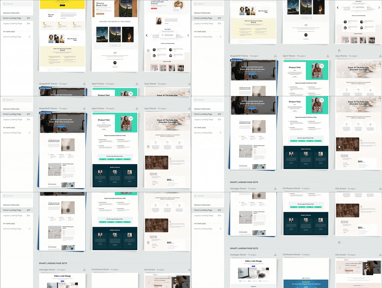
Landing page template sets in Thrive Architect
Everything works harmoniously in our templates — from the fonts to the color scheme.
Every page template was built with conversion generation in mind, so you’ll find all the crucial elements you need to guide your site visitors to contact you.
Want to make changes to a template or build a page from scratch? No problem. And no need to know HTML or CSS.
Ideal for WordPress beginners, the Thrive Architect editor comes drag-and-drop functionality and a large selection of block templates and design elements you can easily add to your pages to create a custom design. Web development made easy.
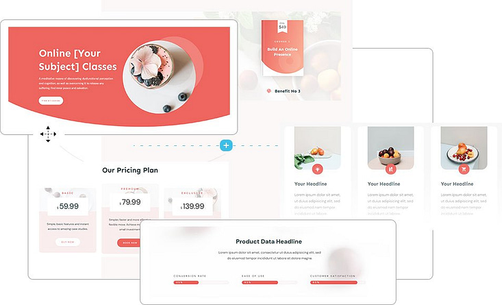
Like we said – easy building.
All our templates are also tailored to create a responsive design, so your audience can easily open, read, and engage with your pages from any device.
In terms of integrations, this plugin works seamlessly with most Google analytics plugins and the best search engine optimization (SEO) tools to help you track your metrics and optimize your content for search engines.
Thrive Architect doesn’t have a free version, but this pro plugin offers a 30-day money-back guarantee, allowing you to try this tool risk-free.
Think of it as a free landing page builder trial.
But for now, get the tool, and continue with this tutorial to learn how to make pages that actually generate conversions.
2. Create a New Page in WordPress & Launch Thrive Architect
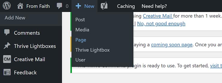
In the WordPress Dashboard, select the “Add New" button at the top of the page and select "Page" from the dropdown menu.
When taken to the next screen, name your page and select the bright green "Launch Thrive Architect" button.

After you launch Thrive Architect, a menu will pop up with four options:
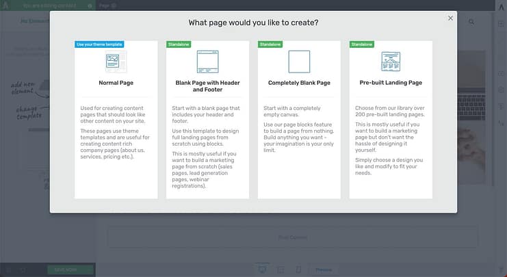
1. Normal Page
2. Blank Page with Header and Footer
3. Completely Blank Page
4. Pre-built Landing Pages
Usually, we’d recommend choosing the "Pre-built Landing Page" option since it’s the faster option. You get to choose from hundreds of professionally designed templates that are designed to convert.
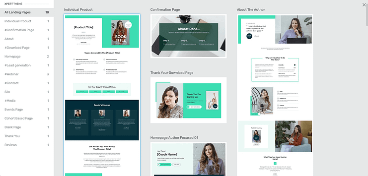
More templates to choose from
Since we’re building from a blank template, you have two options to choose from:
A blank template that includes your site’s header and footer (perfect for homepages or other core site pages)
A completely blank template that doesn’t have any headers, footers, etc – this is better suited for landing pages that aren’t connected to your site (sales pages, lead-gen pages, etc.)
We’re choosing option 2 because we’d like our page to have the header and footer included.
Let’s carry on.
3. Create Your Page’s Hero Section
Your hero section serves as your introduction to potential employers or clients.
This is where you grab their attention and encourage them to keep scrolling while also offering a very brief summary of who you are and what you do.
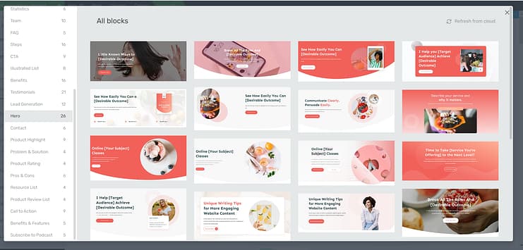
So, for example, in this hero section I’ve designed for “my resume”, you can see the person's name, picture, profession/area of expertise, and a call-to-action button for anyone who’s immediately interested in working with “me.”
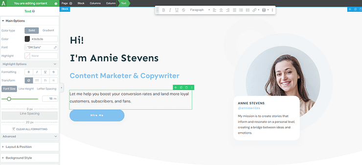
I created this hero section using one of the blocks from Thrive Architect's block template library – and it took a couple of minutes to customize.
Our block templates are one of the winning features of Thrive Architect. If you don't find a full-page template you want to use to build your online resume site, you can easily put one together by choosing a series of blocks in the block template library. Your design on your terms.
4. Next, Add a More Detailed About Section to Build Trust
After introducing yourself and grabbing your audience's attention with your hero section, your next step is to provide more information on who you are, along with basic details, featuring relevant keywords, that will give your potential employer or client a better idea of who exactly they are reviewing.
In the next section I created, you can see an “About Me” section that offers a brief bio on who this person is.
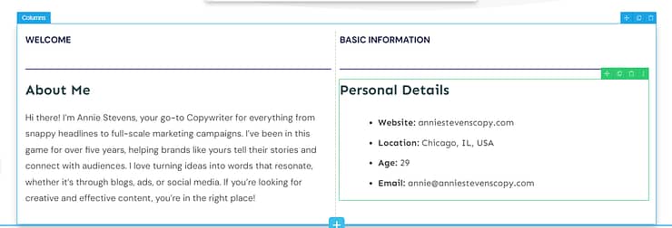
Next to it, there are a few important personal details—website link, location, email address…
You don't have to share all this information, but we do recommend adding a website link and your email address so you're easy to contact.
If you work in a field where your location is important, you may want to share that as well. You don't have to share your full address, just the city, state, or country where you’re based.
This section was created with three elements in the right-hand sidebar of Thrive Architect:
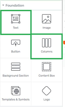

The column element, the text element, and the divider element.
And how you'd go about creating this is pretty straightforward. First, drag and drop the column element and select the ½ option.
Next, add as many text and divider elements as you’ll need and move them around until you have a section that either resembles what we've designed here or something that you prefer or something of your own choice.
Alternatively, you can use one of the multi-text blocks in Thrive Architect to provide the summary. It doesn't have to look like the example image. My design is just a suggestion. And that's the beauty of using Thrive Architect to design your web pages, blog posts, etc.
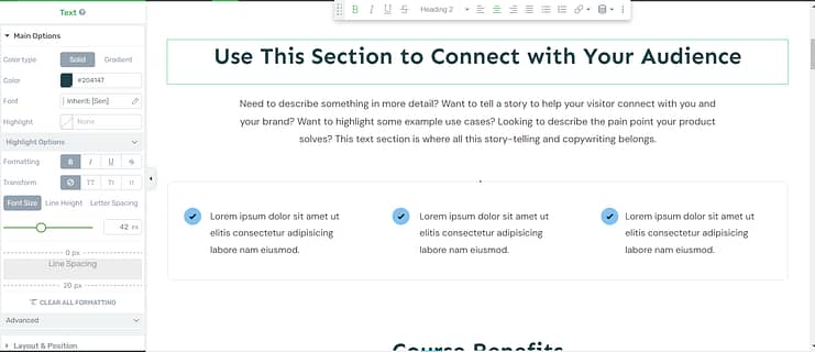
You can design it however you like, whether you want it to look like a conventional resume site or add a more creative spin.
5. Create a Section for Your Work Experience
Since this is an online resume site, an important section to have is recent work experience.
Most potential employers or clients will want to know where you've worked before, what you worked on, and your level of experience.
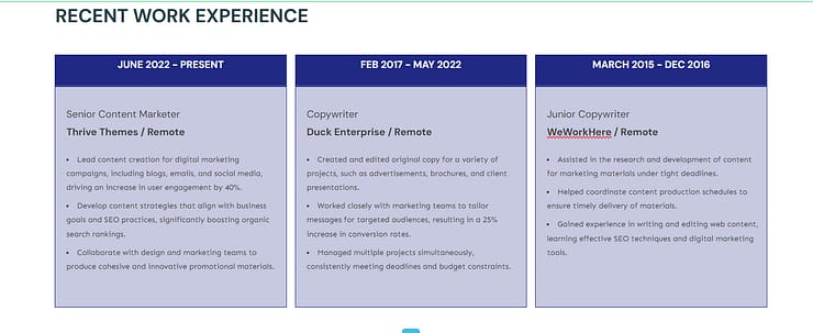
You can, again, create this using one of the blocks in the template library, or you can use the text box element and customize it to look like what I’ve done here.
To achieve a similar look like this, all you would need to do is go to the left sidebar in Thrive Architect and add a background style and borders to your text boxes.
That way, you'll be able to change the colors of your background and create custom boxes like the ones in this example, but if you want a simpler option and don't want to toy around with the tools too much, we recommend sticking to one of the block templates that you'll find. This is a good example of one that you can use as well.
6. Add Your Education Experience, Too
Next, your education.
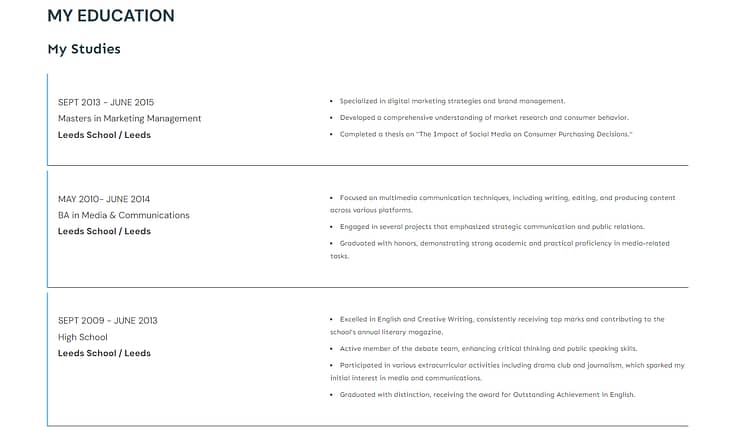
In some fields, your education experience matters. For some industries, like Marketing or Design, potential clients might not look at where you studied or whether you have an Ivy League degree, but it does help to add your education experience to strengthen yourself as an authority, give yourself a competitive edge, and build further trust.
You can build a section like this using the columns and text elements in Thrive Architect.
This may be a bit complicated because you’ll need to add borders and play around with the padding and margins in Thrive Architect, but it's quite simple once you get the hang of it.
Alternatively you can use a “List Content” or “Illustrated List” block template to create a similar section.
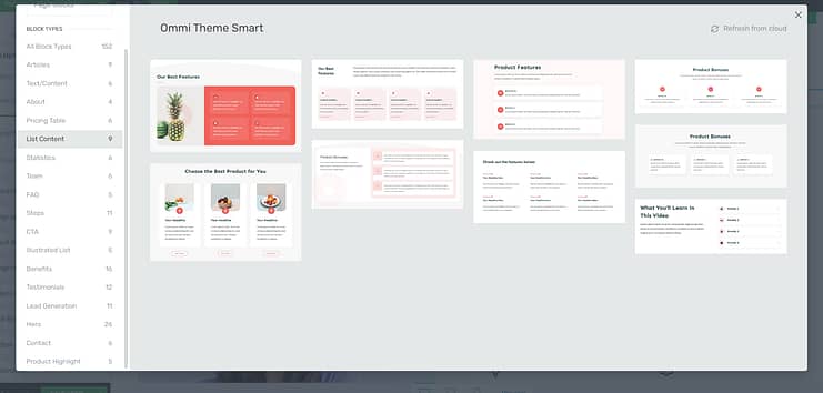
List Content blocks in Thrive Architect
7. Link to Some of Your Existing Work
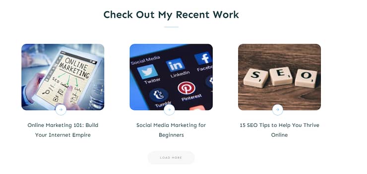
Since this example site is for a copywriter (or someone who's in the writing field), we added a “Check Out My Recent Work” section that links to several blog posts that this “writer” published on her website.
All you need to do is add an “Articles” block from the template library to your site.
However, for your blog content to appear accurately, you need to have existing published posts that Thrive Architect can pull and display like this.
Now, if you work in a different industry where you can't just put what you've done in a blog post and display it that way, this section might look different for you.
You can add a text element to your page and include links to external portfolios on other sites – Behance, GitHub, Dribbble, Pinterest, or even websites you’ve built.
You could also use an image grid layout or a carousel to spotlight your top projects or certifications before directing visitors away from your site. Your options are endless here.
What matters is showing potential clients or employers that you have work that can be checked out.
8. Solidify Your Profile with Social Proof (References)
If you've been in your field for a while and you've worked with multiple clients or worked for different companies, then you'll want to show proof of that.
One of the best ways to do that is with references.
To build this in Thrive Architect, while we don't have a specific “References” block, we do have testimonial blocks, which work the same way.
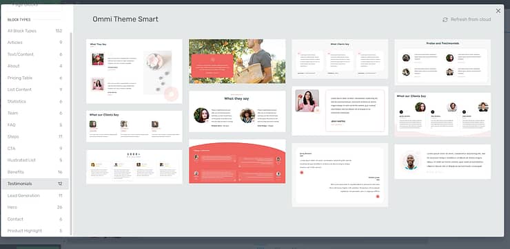
You get different pre-designed templates that allow you to include an image and quotes from people you've worked with (or for) in the past.
These templates are great to look at, easy to read, and keep your audience's attention.
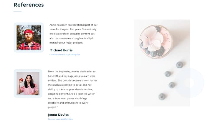
So, if you have references on standby that you want to include, this is a great place to put them.
Social proof is a great way to build trust with potential clients and show them, not just in your own words but also through other people's words, that you can be trusted and are good at what you do.
9. Add a Contact Form to Your Page
Last but not least, you need a contact section.
Every landing page needs to have a call-to-action section of some sort. For a sales page, it would be a “Buy Now” button. For a lead generation page, it may be an opt-in form.
But, for your online resume, you’ll need a “Contact” button or contact form because you need interested clients or employers to leave their details so you can connect with them and hopefully land a gig.
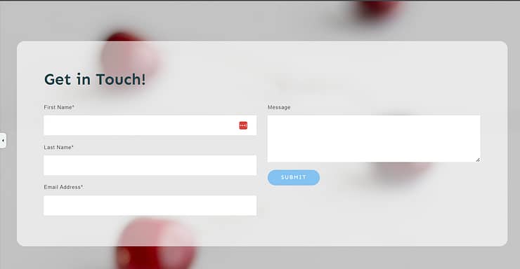
I recommend adding a form instead of just leaving your contact information and social media links, or placing a button that directs away from your website. The fewer steps a website visitor has to take to complete an action, the better.
That way, they're less likely to drop off before leaving their contact info.
Your contact form should include the following fields:
First name
Last Name
Email address
A small text box for further details
Don't forget to add a ReCaptcha or anti-spam feature to prevent bots or spammers from filling out your form.
Next Steps: Turn Your Landing Page into a Personal Website
A one-pager as your portfolio website is ideal for people getting started or trying to plan out the web design for their full WordPress site.
But if you’re an experienced designer, marketer, writer, freelancer, etc., you should really consider turning this one-page professional resume homepage into a full website — complete with a blog, “About page”, and other pages that really sell your capabilities.
Here are four free WordPress tutorials to help you get started the right way:
And you can get started easily if you purchase Thrive Architect and Thrive Theme Builder.
In addition to high-quality webpages built in Thrive Architect, you also get a custom WordPress theme that makes your site truly unique – and memorable to your potential customers.
All drag-and-drop. No need for shortcodes or odd bits of HTML or CSS.
Your site. Your way.
If you want to sell products or services through your website, you can also integrate these tools with WooCommerce or another WordPress eCommerce solution, turning this duo into an affordable, user-friendly eCommerce website builder.
You can purchase Thrive Theme Builder and Thrive Architect, the best WordPress website-building duo, as a bundle.
Start Driving Website Traffic to Your New Homepage
As you’ve seen, building landing pages for your WordPress site isn’t hard when you’re using the right tools.
Thrive Architect is your go-to for crafting hassle-free pages that are designed to convert visitors into quality leads and clients – helping you land gigs and earn money.
This tool simplifies the technical side of things, freeing you up to concentrate on what you do best: connecting with your audience and delivering standout content that drives your business forward.
So if you’re ready to level up and create funnels that boost your conversion rates — and snag more potential customers — you know what to do.


