TL;DR: Splash Pages in 2026
If you’re skimming (or just want the quick version), here are the core takeaways before we dive deeper:
- Splash pages aren’t dead — but they’re risky. They still show up for age verification, regional targeting, and event announcements, but most other uses slow visitors down and hurt SEO.
- Hero sections and smart popups are better alternatives. They give you the same impact (bold visuals, clear messaging, strong CTAs) without the friction that drives people away.
- The best websites focus on speed, clarity, and trust. That means replacing splash pages with conversion-focused design built directly in your homepage.
👉 Skimmed this far? Keep going — the examples and strategies below will show you exactly how to make smarter first impressions in 2025.
Wondering what a splash page is and if you even need one in 2026?
This blog post is just what you're looking for.
Navigating the fast-paced digital world can be daunting, especially when it comes to making a memorable first impression on your website visitors. Splash pages were once the go-to for a dramatic intro, but as web design evolves, their effectiveness is up for debate.
Designed to capture attention with bold announcements or flashy promos before visitors dive into your main content, splash pages have their perks. But do they still make sense for your website today?
Don't worry if you're on the fence about using a splash page. We've crafted a friendly guide to break down what splash pages are, weigh their pros and cons, and discuss modern alternatives that might better suit your needs in 2026. Stick with us to find out if it's time to splash or dash!
What Is a Splash Page (and Why It's Time to Say Goodbye)
A splash page typically appears before the main homepage and may feature animations, flashy introductions, or a bold welcome message.
Think of it as your website visitor’s first impression of your online business.
Originally intended to captivate users, this “introductory page” often incorporate Flash animations, branded video intros, or eye-catching background images to showcase a company's branding and set expectations.

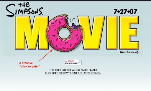
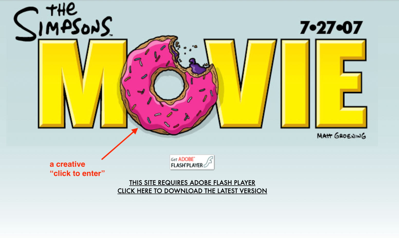
Image from the Wayback Machine internet archive. The Simpsons Movie Splash Page circa 2007 complete with a request to download Flash.
Some splash page
use cases include:
And some splash page examples serve an aesthetic purpose – take ZARA’s website for example.

While the intent behind splash pages was to build excitement and anticipation, they frequently achieved the opposite effect by annoying site visitors who just wanted to get to the meat of the website without any unnecessary delays or distractions.
Today’s web users are all about speed (fast web page loading times) and ease. They want to find what they need without any fuss or hurdles. That’s why opting to use splash pages can interrupt the smooth experience users expect and keep your audience from getting straight to the good stuff—your actual content.
And the last thing you want is to drive away potential customers.
10 Excellent Splash Page Examples for Inspiration in 2026
Splash pages are still around, but their use is much more specialized. Below are 10 real-world examples, grouped by their function, so you can see how brands use them today.
Age Verification Splash Pages
1. White Claw: Clean & Minimal Age Gate

White Claw greets visitors with a simple age verification form. No distractions—just a brand-aligned background and a clear “Enter” button. It fulfills legal requirements while staying fast and user-friendly.
2. Bell’s Brewery: Playful Compliance

Bell’s Brewery takes the age gate a step further with branded visuals and light copy that makes compliance feel less like a chore. It’s functional but also reinforces brand personality.
Location & Language Selection
3. Zara: Region Selector Splash Page

Zara uses a splash page to direct users to the correct regional store. This ensures the right currency, language, and shipping options are shown, making the browsing experience seamless.
4. Moët & Chandon: Country Preference Gate

Moët & Chandon’s splash page asks users to choose their country (and verify their age). This is a practical use of splash pages—helping customers see accurate product info without confusion.
5. Oysho: Global Language Selector

Oysho’s splash page functions as a simple dropdown for language selection. It minimizes friction while ensuring customers land on the correct localized site.
Lead Generation & Promotions
6. GAP: Incentive-Based Splash Page

This splash page offers a discount code in exchange for an email signup. It’s designed to capture leads before visitors even explore the main site.
7. Craft Beer Market: Limited-Time Offer

Craft Beer Market uses a splash page for promotions, highlighting special releases and events. The design blends urgency with a bold CTA that drives conversions.
User Segmentation & Paywalls
8. Spreadsheeto: User-Type Splash Page

Spreadsheeto’s splash page segments visitors based on their learning goals. This quick upfront choice helps guide users to the most relevant content immediately.
9. The New York Times: Paywall Splash Page

The New York Times uses splash screens as subscription gates. They appear when a reader hits their article limit, prompting login or signup with strong subscription CTAs.
Announcements & Events
10. Resident Evil Requiem: Event Teaser Splash Page

Capcom used a splash page to promote the release of Resident Evil 4. These announcement splash screens are common in entertainment, generating hype before a launch.
These examples show that splash pages aren’t extinct—they still serve very specific purposes, from legal compliance to regional targeting or big product announcements. But outside of those narrow use cases, splash pages can quickly become a barrier rather than a benefit. That’s why the real question isn’t just what a splash page looks like, but whether you actually need one in 2026.
Splash Page vs. Landing Page: Key Differences Explained
Setting the Stage
It’s easy to confuse splash pages with landing pages, but they serve very different purposes. A splash page is a gateway — a brief stop before visitors access your main site. A landing page is a destination, designed to drive a specific conversion.
Here’s a quick comparison:
Splash Page vs. Landing Page
Splash Page | Landing Page | |
|---|---|---|
Purpose | Acts as a gatekeeper or intro screen | Built to drive a single conversion (sign-up, purchase, etc.) |
Content | Minimal — often one message or action | Full persuasive copy, visuals, and supporting elements |
Navigation | Usually none; one clear action or exit | Standalone with a single CTA, no full site menu |
SEO Impact | Can block crawlers or count as “thin content” if poorly built | Optimized for SEO and campaign targeting |
Key Takeaway
Understanding the difference matters because splash pages are about stopping a visitor briefly, while landing pages are about guiding them to act. Mixing the two can lead to confusion, missed opportunities, and weaker results.
💡“Want to go deeper into building high-converting landing pages? Take a look at our Complete Guide to Landing Pages for a full walkthrough.
The Truth About Splash Pages & SEO in 2026
I’ve seen far too many brands cling to splash pages out of nostalgia—only to find they’re quietly sabotaging their SEO and conversions. Today’s search engines are laser-focused on user experience. Unfortunately, traditional splash pages often miss the mark.
These are the risks:
And here's how to mitigate these issues:
- Instead of sending visitors to a separate splash page, use a simple overlay that appears on top of your main content. That way, search engines (and your visitors) can still access your site without hitting a dead end.
- Make the exit obvious—a large, thumb-friendly “X” button is critical on mobile.
- Avoid popups or screens that completely block the page. Google has warned for years that these hurt the mobile experience, and in 2023 they doubled down on discouraging them.
Why I Recommend Moving On:
In most cases, splash pages simply aren’t worth it. They’re flashy, yes—but at what cost? Instead, consider conversion-focused hero sections or well-timed popups. They catch attention, invite action, and keep both users and search engines happy.
Here’s a Modern Alternative: Hero Sections
Splash pages had their moment, but in 2026 there’s a smarter way to make a first impression — the hero section.
What’s a hero section?
A hero section is the bold, eye-catching block at the very top of your homepage or landing page. Think of it as your digital handshake: the first thing visitors notice when they arrive. It usually features:
- A clear headline that sums up your biggest promise or value.
- A short supporting line to add context.
- A striking visual — an image, video, or background graphic.
- One strong call-to-action (CTA) that tells visitors what to do next.
This simple combination sets the tone right away and invites people to keep exploring.
Why hero sections work better than splash pages:
The strength of hero sections lies in how they blend form and function. They don’t just look impressive — they make navigation easier and push visitors toward meaningful action.
In other words, hero sections are splash pages reimagined. They keep the drama and energy of that big first impression but strip away the friction that drives visitors to bounce.
A strong hero section doesn’t just grab attention — it also builds trust. Adding elements like testimonials or client logos here can reinforce credibility. If you’d like to learn how to do this effectively, check out our guide on How to Collect and Display Testimonials
How to Create a Conversion-Focused Hero Section (Quick Steps)
You don’t have to be an expert developer or graphic designer to create a hero section that grabs attention and encourages conversions.
And you’ll see that in these next steps:
Step 1: Define Your Conversion Goal
Before anything else, determine what you want to achieve with your hero section. Do you want to increase sign-ups, boost sales, or perhaps encourage more downloads? Setting a clear objective is crucial as it influences every aspect of your hero section, from the messaging and visuals to the placement of your call-to-action (CTA). Think about the most important action you want visitors to take and how your hero section can guide them towards that.
Step 2: Choose the Right Tool to Design Your Hero Section
The tool you choose to build your hero section can greatly impact its effectiveness and functionality. For WordPress users, Thrive Architect stands out as an excellent choice.

This landing page builder plugin is ideal for creating high-quality pages (and hero sections) that prioritize conversion-focus.
This front-end visual page builder lets you see your edits in real-time. And building couldn’t be easier with its drag-and-drop interface, where you can easily add elements, adjust layouts, and customize pre-made templates without needing to know how to code.
Step 3: Add a Hero Section to an Existing Page
If you're working within an existing website, integrate the hero section at the top of your homepage or key landing page.
In the WordPress Admin Dashboard, open your page and click the green “Launch Thrive Architect” button. You’ll be taken to the visual editor where you can start working on your hero section.
Step 4: Customize Your Hero Section
This is where the fun begins — designing your hero section.
In Thrive Architect, this can be as simple as adding a hero section from the Block template library, or designing your own from scratch.
Regardless of which option you pick, make sure your hero section includes the following:

- Catchy Headline: Your headline is your hook. Make it snappy and clear. What’s the biggest benefit you can offer? Put that front and center.
- Stunning Visuals: Choose an image, video, or graphic that grabs attention and matches your message. This visual should scream your brand and appeal directly to your audience’s wants or needs.
- Supporting Text: This is your chance to give a little more detail without overwhelming your visitor. Just a few lines should do the trick, providing just enough info to make them want to act.
- Clear Call-to-Action: This is the big CTA button that asks your visitor to take the next step. Make it impossible to miss and irresistible to click. Use a readable font and active language like “Start Your Free Trial” or “Discover ABC”, or “Download Now.”
If you feel like being creative (and have the time to do so) consider adding a neat image overlay to your hero section to give it the splash page feel. The only difference here is your hero section won’t interfere with your visitor’s experience and could encourage them to click or take action.
Ready to Build One Yourself?
Creating a hero section that actually converts isn’t just about picking a nice image and slapping on a headline. The best ones are strategically designed to capture attention, communicate value fast, and drive action in the first few seconds.
If you’d like a full step-by-step breakdown — with examples, design tips, and templates — check out our in-depth guide: How to Build a Conversion-Focused Hero Section. It’ll walk you through the exact process so you can turn your homepage into a conversion engine.
Another Splash Page Alternative: Well-Timed Popups (As a Bonus Strategy)
Hero sections are your front-line for making a strong first impression. But what about visitors who scroll further, spend time on your content, or look like they’re about to leave? That’s where popups come in — not the annoying kind that hit you the moment you land, but smart, well-timed prompts that feel helpful instead of pushy.
Two of the most effective types of popups are:
- Exit-Intent Popups:
These trigger when someone moves their cursor toward the browser bar or “back” button. Think of them as a last chance to reconnect — offering a discount, free resource, or newsletter signup right before a visitor bounces. - Scroll-Triggered Popups:
These appear only after a visitor has engaged with your page (e.g., scrolling 50% down an article). Because they’re timed with interest, they feel more like a natural next step than an interruption.
When popups are designed well — clear message, real value, and an easy exit option — they can lift conversions significantly without hurting user experience. In fact, recent studies show well-targeted popups can increase opt-ins by 40% or more, while irrelevant or intrusive ones send visitors away.
The takeaway? Popups shouldn’t be your first impression, but they can be a powerful second chance. Used alongside a strong hero section, they give you multiple opportunities to connect with visitors and guide them toward action.
👉 Want to dig deeper? Check out these guides:
Frequently Asked Questions About Splash Pages
If you’re still unsure about how splash pages work, you’re not alone. They’re often confused with landing pages, and people have plenty of questions about when to use them, how they affect SEO, and whether they even make sense in 2026. Here are answers to the most common questions we see.
A splash page is an introductory screen that appears before visitors access the main content of a website. It’s often used for age verification, language or region selection, event announcements, or special promotions.
Splash pages can hurt SEO if they’re set up as separate, thin-content pages that block crawlers from reaching the rest of your site. However, lightweight overlays that load quickly and don’t interfere with navigation are less risky.
A splash page is a gateway with minimal content and a single action, while a landing page is a full standalone page built to drive a conversion, such as signups, sales, or downloads.
No. Splash pages are designed to focus attention on one message or action. Adding a navigation menu introduces distractions and defeats the purpose.
Yes, but only in very specific contexts. They’re still widely used for legal compliance (like age gates) and global e-commerce sites (for language or region selection). For promotions and announcements, most businesses now use hero sections or popups.
They can. Adding an extra step between a visitor and the main content often increases bounce rates. The exception is when the splash page is required (e.g., legal reasons) or offers clear, immediate value, such as a discount code.
Mobile users expect speed and easy access. A splash page that loads slowly or has a hard-to-close button can frustrate visitors and cause them to leave. Google also penalizes intrusive mobile interstitials in search rankings.
The essentials are: one strong visual, a short headline or message, a single call-to-action button, and (unless restricted by law) an obvious exit or “continue” option. Anything more tends to clutter the experience.
Next Steps: Work on the Bigger Picture – Your Landing Page
Hero sections are just one step in getting more customers to convert. As an online business owner, you need to think of your entire landing page as a pathway to conversions.
Whether it’s a sales page or lead-generation page, you need to make sure every component contributes to the overall goal — getting your website visitors to take action.
Here are four tutorials to help you get started:
Final Words: Rethinking Splash Pages in 2026
If you’ve been wondering whether splash pages still have a place on your site, I get it — they were once the norm. They looked dramatic, felt cutting-edge, and gave brands a sense of flair. But times (and user expectations) have changed. Today, people want speed, clarity, and trust from the moment they land on your site.
That doesn’t mean you’ve done it “wrong” if you’ve used splash pages before. It just means there’s a better path forward. By focusing on conversion-focused hero sections and well-timed popups, you can capture attention without slowing anyone down. You give visitors the welcome they deserve while guiding them toward the actions that matter most.
Here are a few practical next steps you can take right now:
- Update your homepage with a bold hero section. Make your headline clear, your visuals engaging, and your call-to-action obvious.
- Replace outdated splash screens with overlays or popups. Use exit-intent or scroll-triggered popups to re-engage visitors at the right moment.
- Test and refine. Even small tweaks to your hero copy or popup timing can have a big impact on conversions.
And here’s the important part: you don’t need to wrestle with code or design from scratch. With Thrive Architect, you can drag-and-drop your way to high-impact hero sections, smart popups, and conversion-ready landing pages — all in one tool.
At the end of the day, updating your site isn’t just about keeping up with design trends. It’s about respecting your audience’s time and building trust from the very first click. Thrive Architect makes that possible.