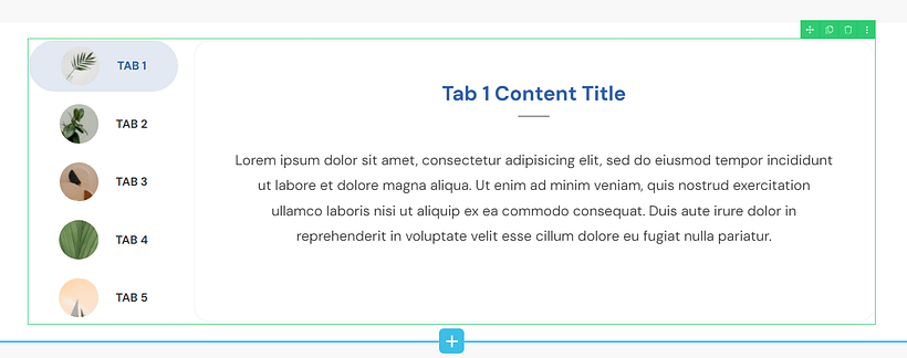
Do you want to learn how to add vertical tabs in WordPress? A section on your page that looks like this:
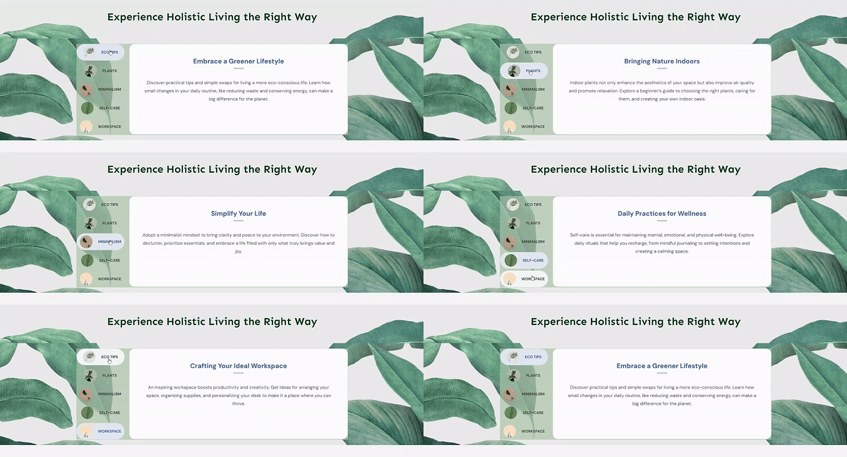
You’re in the right place.
I’ve created a simple, step-by-step tutorial to show you how to add this neat design element to your landing pages and improve your visitors’ experience.
Tabs are great for sharing a lot of information in a neat, interactive way – and you’ll get to see that throughout this guide.
Ready to jump in? Let’s begin
Do Tabs Make a Difference on Your Website?
When it comes to organizing content on your website, tabs might seem like a small design element, but they can dramatically transform how users interact with your content.
You know that feeling when you land on a website and there's just... too much? Too much text, too many sections, too much of everything? Tabs solve this problem beautifully. They break things down into bite-sized pieces, save precious space (especially on those tiny phone screens), and actually make people want to explore your content because it feels manageable.
Horizontal vs. Vertical Tabs: Making the Right Choice
The choice between horizontal and vertical tabs depends on your content needs, though vertical tabs often offer more flexibility. While horizontal tabs work fine for simpler layouts with just a few sections, they can become cramped quickly, especially on mobile.
Vertical tabs, like those shown in the example, handle multiple content sections effortlessly, allow for longer labels, and maximize content width - all while keeping navigation consistently visible. They create a clean, professional look that's easier to scale as your content grows.
Choose your layout based on your specific needs, but don't be afraid to lean toward vertical tabs if you want room to grow. Get this right, and you'll transform a cluttered page into an organized experience that keeps visitors coming back for more.
How to Add Vertical Tabs to a Page in WordPress (Step-by-Step)
As I said earlier, tabs might seem like a simple feature, but they can completely transform how your visitors interact with your content.
In this quick guide, you'll learn how to create a great-looking tabs section. Let's dive in
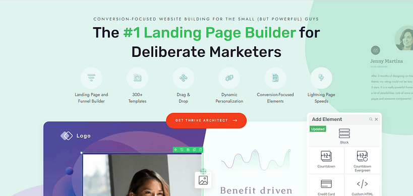
1. Download Thrive Architect: The Best Landing Page Plugin
I know. I know. An entire landing page plugin to add one thing to your pages? Hear me out.
Your goal here isn’t just to add vertical tabs to your webpages, right? You want your pages to lead to an action – a sale, sign up, share, etc.
So, your tabs are part of the bigger picture. And to build this bigger picture – your high-converting landing pages – every part needs to work harmoniously.
Now, if you go the route of installing different plugins to add different features to your pages – carousels, pricing tables, etc. – you’re going to end up with a slow website and frustrated website visitors (which is a big no in our site speed optimization guide).
That’s why I recommend using a reliable landing page plugin to build your pages, instead. And my top recommendation is Thrive Architect.
If you want to create a smooth experience that guides your visitors exactly where you want them to go – this is the tool for you. Every element on your page, from your headlines to your call-to-action buttons, will work together harmoniously.
And we’ve infused this kind of conversion-focus into all our templates, which you can easily set up to create high-quality landing pages quickly.
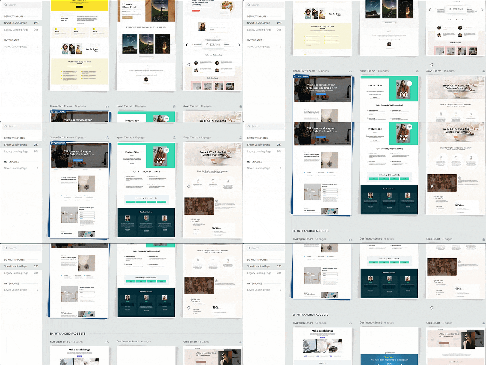
Landing page template sets in Thrive Architect
And a large variety of design elements to customize your pages and give them a unique look – including tabs. Take a look at the high-quality templates you get as well:
With Thrive Architect, you’re in the driver’s seat. You design your pages your way – and have the freedom to add a selection of elements to hook your audience’s engagement and get them to take action (which you can learn more about here).
In the long run, having all your design elements speak the same language isn't just about looking pretty - it's about building trust with your audience and making it dead simple for them to take action. When everything on your page works together smoothly, your conversion rates will show the difference.
2. Create or Open a New Page in Thrive Architect
In the WordPress Dashboard, select “ Add New” (+New) in the top drop-down menu and choose “Page”.

In the Classic Editor, name your page and click the “Launch Thrive Architect” button.
Thrive Architect will give you four options:
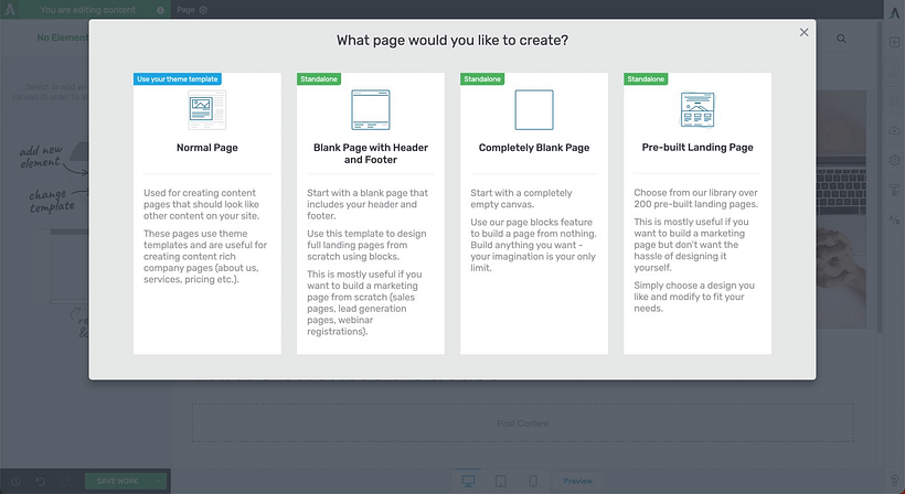
1. Normal Page
2. Blank Page with Header and Footer
3. Completely Blank Page
4. Pre-built Landing Pages
For easier and faster building, I recommend choosing the “Pre-built landing page” option.
When you’ve found the right template, click on it and it should load.
3. Add the Tabs Element to Your Landing Page
Now let’s work on adding Tabs to your page. In the right sidebar in Thrive Architect, search for the “Tabs” element. Drag and drop it onto your landing page.
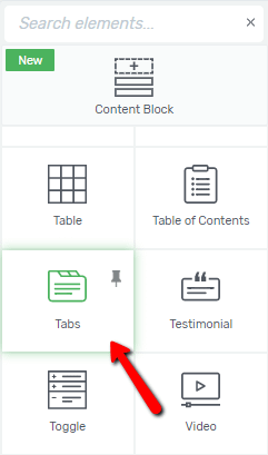
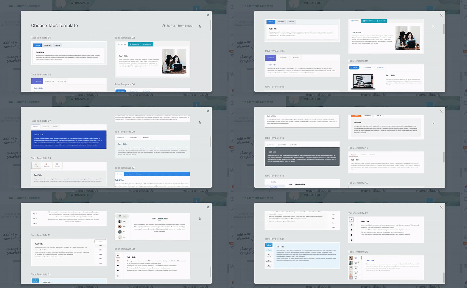
Next, a screen will pop up, displaying different Tabs templates for you to choose from.
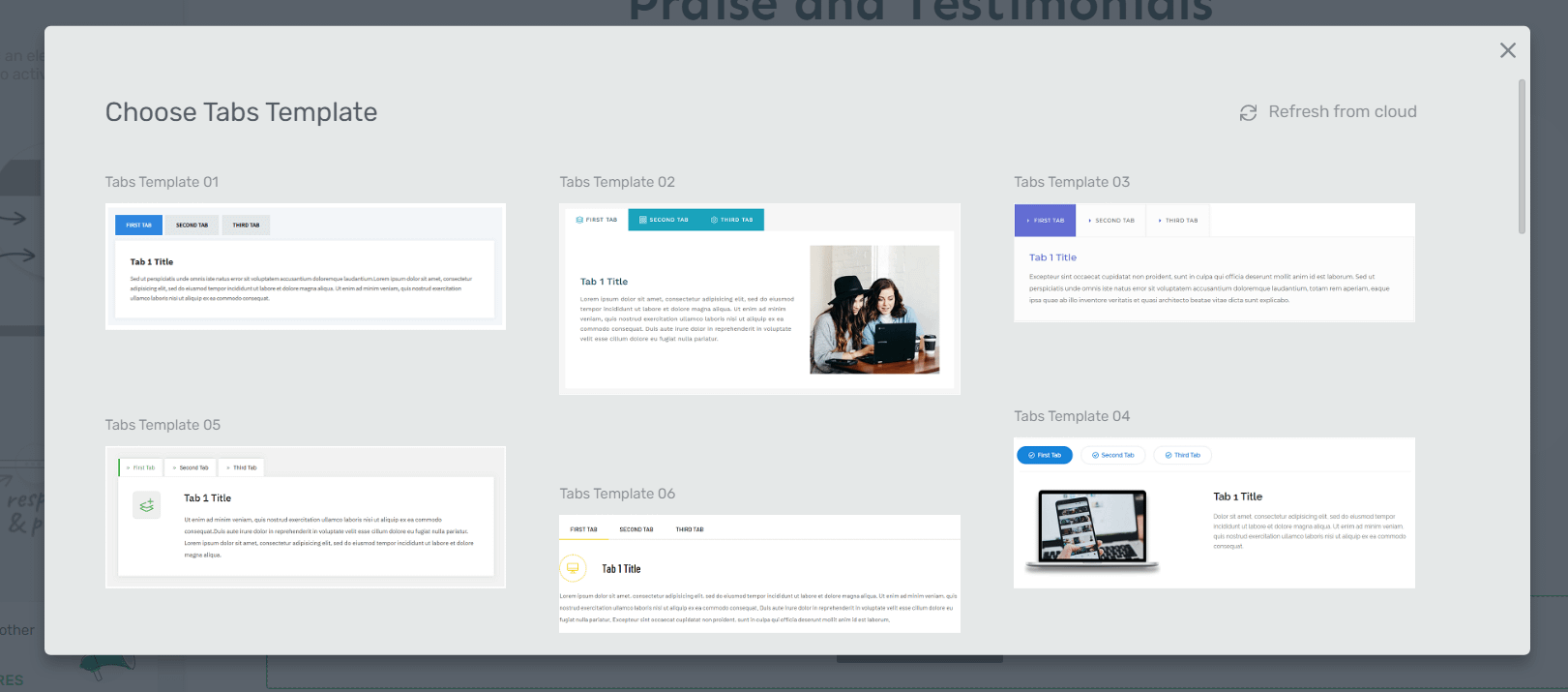
You get a variety of design styles to choose from, which I think is great because you have more freedom to find the template that matches your exact needs.
Once you’ve selected your template, it will appear on your page.
4. Customize Your Tabs
Now, let’s work on customizing the Tabs template.
Change Your Tabs’ Orientation
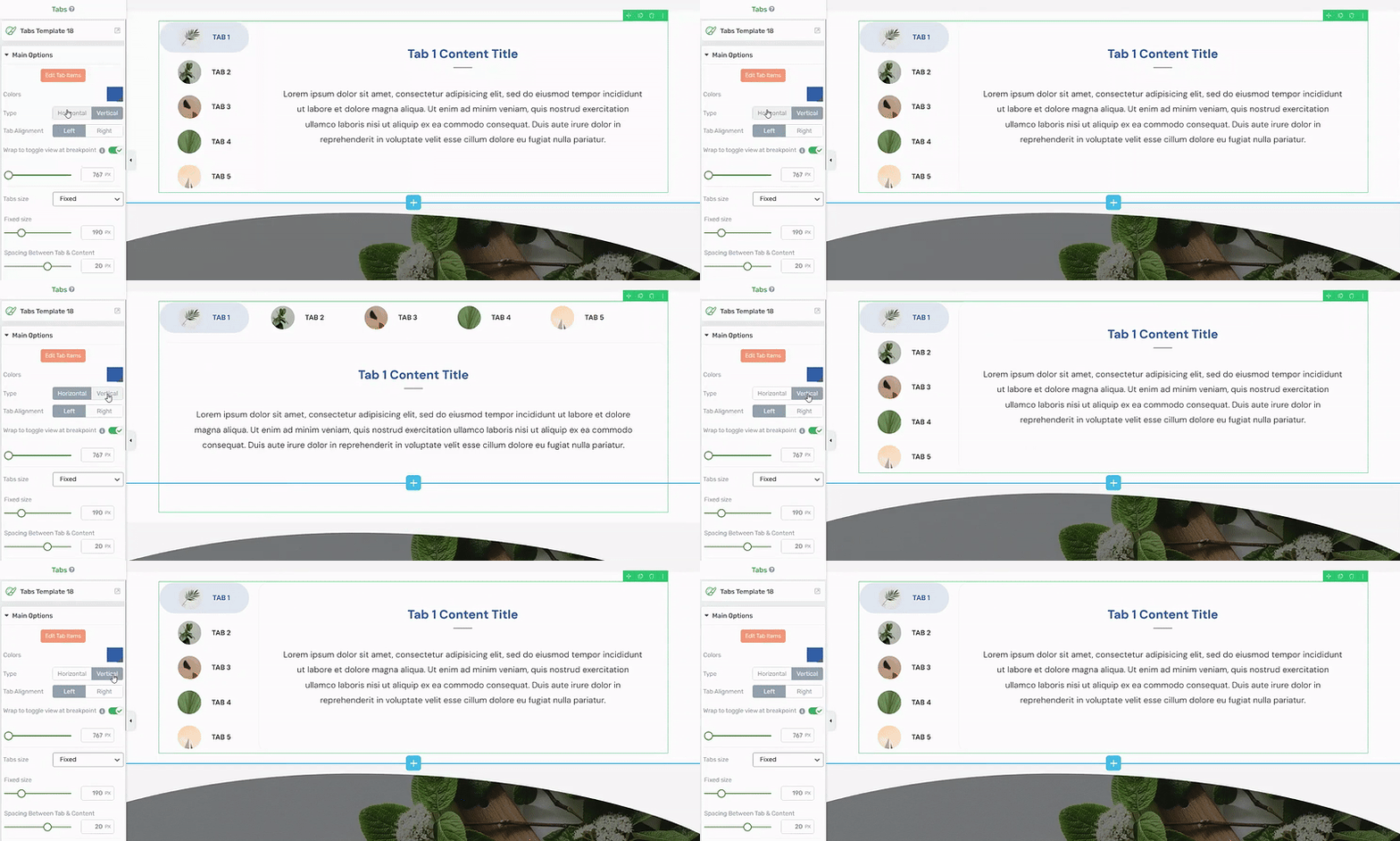
For some of the templates, you’ll need to change the state of the tabs from “Horizontal” to “Vertical”. You can easily do this by selecting the “Vertical” option in the left sidebar.
Adding and Removing Tabs
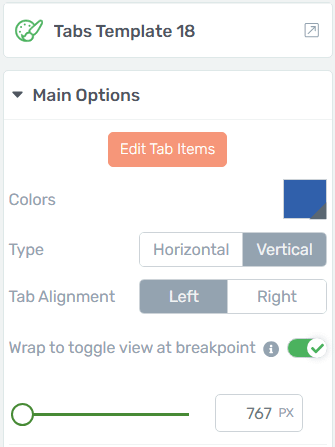
To add or remove tabs from your design, start by selecting the “Edit Tab Items” button in the left sidebar.
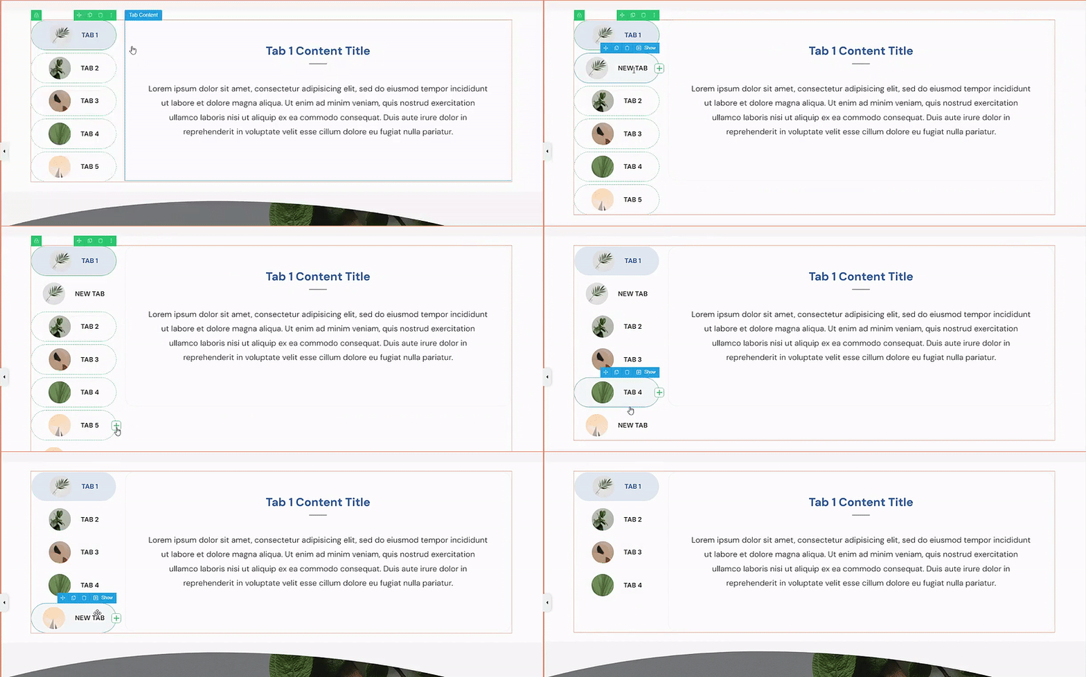
Hover over any of the tabs and select the green “+” sign that appears. Add as many tabs as you want.
To remove a tab, select the little trash can icon that appears – as seen in the demo below.
Customizing Your Tabs
The “Edit Tabs” mode is also where you can make smaller, more focused changes to your tabs.
Using the options in the left sidebar, you can change your tabs’:
- Typography
- Font size and color
- Background color
- Icon style
And if you want to customize the entire Tabs element and not just the individual tabs, exit Edit Mode first. Just like in the video below:
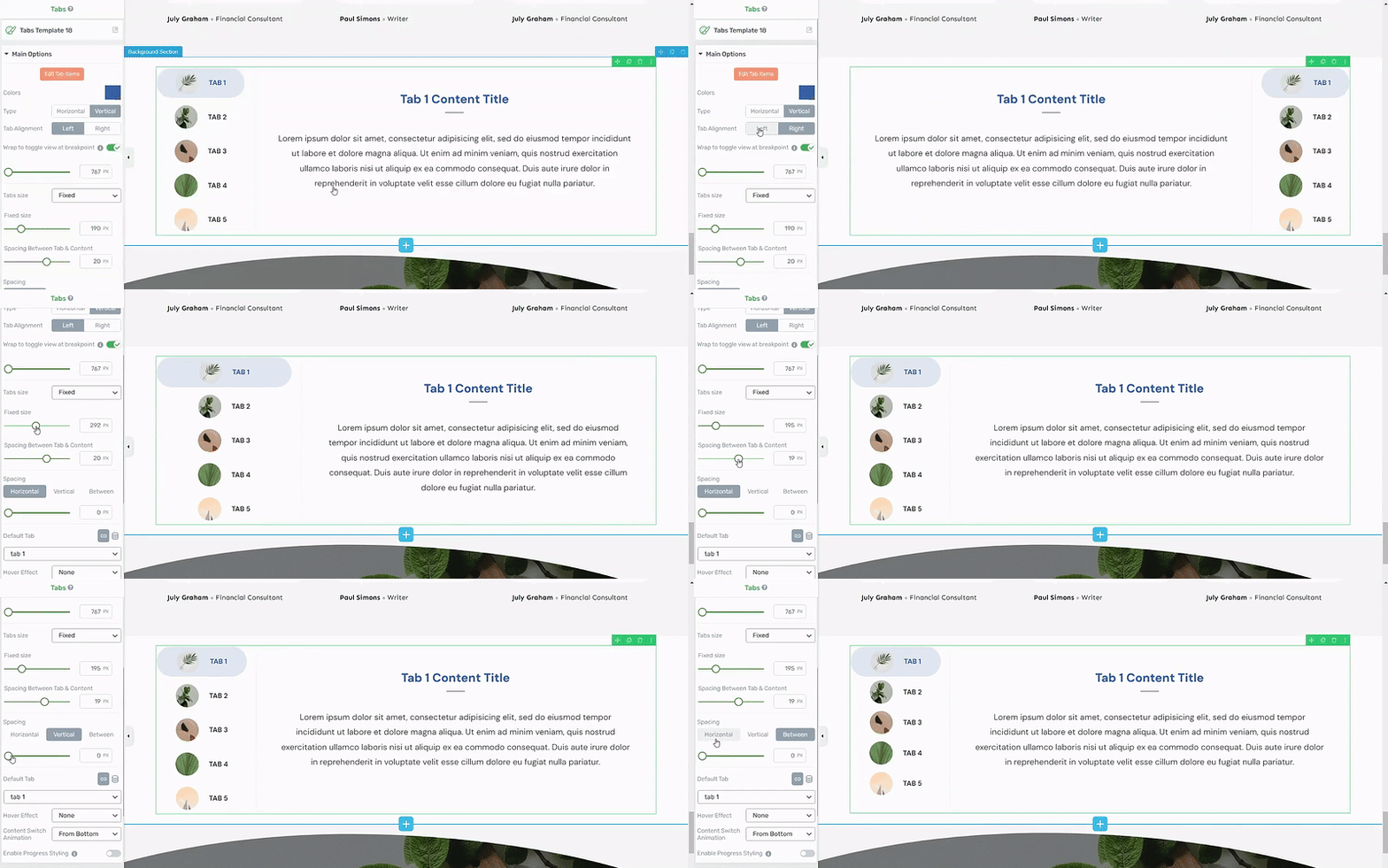
The left sidebar also offers additional customization options like changing a section’s background and modifying your typography to end up with a section that looks like this:
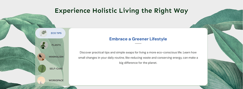
Your visitors get a cleaner, more intuitive way to navigate your info. And you? You get the flexibility to pack in all the content you need without sacrificing style.
Next Steps: Improve Your Site’s Navigation
Now that you know how to add vertical tabs to your pages, let's talk about leveling up your overall site navigation. Clear navigation is like having a good map - it makes the whole journey better for everyone involved.
Start by taking a quick audit of your current navigation structure. Are your most important pages easily accessible? Could a first-time visitor find what they need in under 30 seconds? Pay special attention to your mobile menu - that's where most of your visitors are likely coming from.
If you're using Thrive Architect (like we discussed earlier), try experimenting with a dropdown navigation menu or consider adding a "jump to section" menu on longer pages. These small tweaks can make a huge difference in how long visitors stick around.
And for more tips on how to improve your site’s navigation, check out this detailed guide: How to Create a User-friendly Website with the Right Tools.
How to Add Vertical Tabs in WordPress: Wrapping Up
Your website deserves to shine, and well-organized content is the key to making that happen. Tabs are one of those simple changes that make a huge difference in how professional your site looks and how easily visitors find what they need.
Why piece together different solutions when you can have it all work smoothly in one place? Thrive Architect gives you beautiful, conversion-focused tabs plus everything else you need to create pages that actually convert.


