TL;DR: What Are the Most Important Web Design Trends in 2026 — and Why Should I Care?
"How should I design my website in 2026 to stay ahead, convert better, and actually meet user expectations?" If you're still designing your site like it’s 2020, you’re not just behind — you're bleeding traffic, conversions, and trust. In 2026, web design is no longer about being trendy. It’s about being strategic, ethical, lightning-fast, and human-focused. Whether you're a business owner, freelancer, or digital creator, here's what you need to know before investing in your next redesign:
🔟 Key Stats That Define 2026 Web Design
- 75% of users judge your business’s credibility based on your website’s appearance.
- Good UX can increase conversions by up to 400%.
- Mobile traffic will exceed 75% of all internet use by the end of 2025.
- 53% of mobile users abandon sites that take over 3 seconds to load.
- Personalized CTAs perform 202% better than generic ones.
- 90% of online content is expected to be AI-generated this year.
- Accessibility improvements can help you reach 20% more users.
- Web accessibility lawsuits have increased 13% annually since 2019.
- The internet’s carbon footprint is projected to double by the end of 2025.
- 81.9% of smartphone users prefer dark mode, especially on OLED screens.
If your site isn’t fast, personalized, accessible, and intentionally designed — you’re losing visitors and leaving money on the table.
Want to see exactly what to use, what to ditch, and what actually drives conversions in 2026? Keep reading. We’ll show you the key trends and how to implement them using the right tools.
Web design is moving at laser speed. Blink, and you’ll be left behind.
I’ve been in the web design industry for over a decade, and I’ve never seen shifts happen this fast. The expectations for user-centered web design, mobile-first performance, and conversion-focused layouts are rising — and most sites aren’t keeping up.
In 2026, 75% of people judge your business based on your website design. And they decide whether to stay or bounce in under 50 milliseconds. If your site is slow, clunky, or just… forgettable? You're losing leads before they even see your offer.
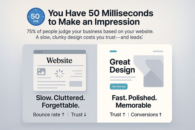
That means if your site is slow, cluttered, or lacking a clear digital experience strategy, you’re losing leads before they even see your offer.
This guide is your fast track to fix that.
I’m breaking down the top web design trends that actually drive engagement and improve website conversion rates — and how to implement them right now with tools that support responsive design, accessibility, and smart personalization.
From scroll-based animations and dark mode UX to ethical user experiences and AI-powered content personalization, this is what’s working in 2026— and what’s worth your time.
The future of web design is already here. If your site still feels like it’s coasting, it’s time to get in gear.
What People Are Asking About 2026 Web Design Trends
These are the real questions people are asking right now — in Google, in ChatGPT, and in Slack threads when traffic tanks. So let’s get straight to the answers.
✅ AI-powered personalization
Real-time content updates based on user behavior, dynamic CTAs, and smart segmentation are now table stakes. Personalized CTAs perform 202% better than generic ones, and 76% of consumers say they’re more likely to purchase from brands that personalize
✅ Custom illustrations & the end of stock fatigue
Generic stock photos don’t cut it anymore. Original graphics generate 20% more engagement and users want to feel a human behind the design — not a photo bank.
✅ Interactive scroll + motion (done with purpose)
Micro-animations and scroll-triggered effects help guide user attention. Micro-interactions alone can increase user retention by up to 60%— when they’re not overdone.
✅ Privacy-first, data-minimizing UX
With trust at an all-time low, ethical design is now a growth driver. 90% of U.S. users say online privacy is important to them — and your site needs to reflect that with transparent, consent-based design.
✅ Dark mode + toggle UX
81.9% of smartphone users prefer dark mode, especially on OLED screens where it also reduces power consumption by up to 63%.
✅ Text-led hero sections & bold typography
Big typography, clear contrast, and minimalist intros help users instantly understand where they are and why it matters. Remember: users form an opinion in 50 milliseconds.
✅ Thoughtful micro-interactions
Subtle visual cues like hover states, button animations, and scroll indicators give users feedback, build trust, and keep people engaged.
✅ Voice-first and Zero UI interfaces
Voice search is projected to make up over 50% of all searches by 2025. Designing for voice — or designing interfaces that don’t rely on screens — is becoming a real advantage, especially for accessibility.
✅ Sustainable, fast-loading layouts
Every second counts. A 1-second delay in load time can drop conversions by 7%, and websites that load in under 2 seconds have significantly lower bounce rates. On top of that, optimized assets can cut CO₂ emissions by 50%, which matters to the 73–80% of consumers who prefer eco-conscious brands.
✅ Personalized layouts based on behavior
Whether it’s showing a different CTA based on quiz answers or adjusting content to match the user’s intent, personalization drives results. Businesses using generative AI for this report 60%+ cost savings and 80% faster content delivery.
✅ Strong CTA contrast & strategic placement
Color and spacing still matter — especially on mobile. Users respond faster when CTAs are visually distinct, especially with warm, bold colors (reds, oranges, greens) placed in high-visibility zones.
✅ Storytelling through custom visuals
Static pages don’t sell — stories do. Scroll-based narratives with visuals keep users reading longer and converting more. Remember, video increases time-on-site by 88% and can boost conversions by up to 80%.
✅ Accessibility improvements
15% of the world — and 26% of U.S. adults — have a disability. Optimizing for WCAG standards isn’t just ethical, it expands your market and improves SEO. Bonus: accessibility updates can help you reach 20% more users.
✅ Ethical UX that builds trust
No dark patterns, no manipulative tricks. Transparent design, honest opt-ins, and user control reduce bounce rates and build loyalty. With web accessibility lawsuits increasing 13% annually, this isn’t optional anymore — it’s a smart risk reducer.
✅ Start with layout and structure
You want drag-and-drop flexibility, but with performance in mind. I use a tool like Thrive Architect to build custom layouts that work on every screen size, without relying on bloated themes or needing a developer. Mobile-first previews and responsive controls are non-negotiable in 2025.
✅ Segment and personalize the experience
Behavior-based personalization isn’t just for massive ecommerce brands. I’ve found that even a simple quiz can dramatically improve conversions. I use Thrive Quiz Builder paired with Thrive Leads to segment users and show more relevant opt-ins, content, or offers based on their responses — all without touching code.
✅ Make accessibility part of your workflow
Accessibility isn’t a side feature anymore — it’s core to good design. That means labeling form inputs, adding alt text, structuring headings properly, and making sure buttons are easy to tap on mobile. Most of this can be handled directly in the builder if you're using something like Thrive Architect, which helps me bake these standards in as I go.
✅ Use animation with purpose
Animations can be great for storytelling, but too much can hurt performance. I like using subtle scroll-triggered effects and lightweight video embeds — nothing flashy, just enough to guide attention. Tools that allow you to control these without extra plugins keep your site clean and fast.
✅ Offer dark mode flexibility
Dark mode isn’t just a design trend — it’s a user preference, especially on mobile where over 80% of users prefer it. If your builder supports toggle-based theming (Thrive does), it’s worth setting up. It gives users a sense of control and can even reduce bounce rates in low-light environments.
Here’s Why Your Site Isn’t Converting Like It Used To
If your traffic hasn’t dropped but leads have slowed to a crawl, I get how frustrating that can be. You’re doing the hard work — creating content, showing up consistently, driving people to your site — and yet, nothing’s converting the way it should.
You're not alone. I’ve seen this happen across dozens of projects, and the good news is: it's rarely a visibility problem. More often, it's a case of your website performance and user experience design falling slightly out of sync with what today’s visitors expect.
Here’s what I often see when auditing underperforming sites:
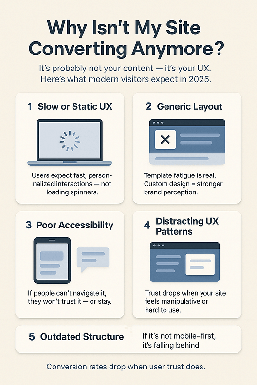
Bottom line? Even if your content is strong, poor user interface design, outdated layouts, and trust-killing UX patterns can quietly sabotage your conversion rate. A few smart, modern updates can make all the difference.
What Happens When You Ignore These Trends
"If your site feels the same as it did in 2020, you’ve already lost the race.”
Ignoring what’s shifting in web design doesn’t just make your site look outdated — it quietly erodes your traffic, trust, and conversions behind the scenes.
- 📱 You’ll lose mobile users
Over 64% of global web traffic is mobile. If your layout isn’t fast, responsive, and thumb-friendly, your bounce rate will spike — and your offers won’t even get seen. - ⚖️ Accessibility lawsuits are rising fast — and expensive
More than 95% of websites still fail basic WCAG checks. And with legal action up 13% annually, even a single oversight can lead to hefty fines, bad press, or both. - 🧠 Trust declines when users detect outdated or manipulative design
Dark patterns, generic templates, confusing navigation — users spot them instantly. And once trust is gone, your conversion funnel collapses. - 🔍 Your SEO performance takes a hit
Slow load times, unoptimized images, and poor mobile UX hurt your rankings. A 1-second delay can drop conversions by 7% — and compound over time. - 🏆 Your competitors will take the lead
The brands adopting these trends — ethically, intentionally, and strategically — are already converting better and building loyalty. If you’re standing still, you’re handing them your leads.
These aren’t surface-level issues. They’re the quiet killers of growth — and fixing them doesn’t just make your site look better. It makes your business work better.
Thrive-Backed Trends You Can Implement Today
Knowing the trends is one thing — putting them into practice is where the real momentum happens.
If you’re anything like me, you’ve probably read articles like this before and thought, “Great... but how do I actually do this on my site without breaking everything or hiring a developer?”
That’s why I’m sharing the exact tools I use — not because they’re trendy, but because they’ve helped me build smarter, faster, and more conversion-focused sites. These tips are powered by Thrive Architect, Thrive Quiz Builder, and Thrive Leads — tools I rely on when I want more control, better results, and zero fluff.
Here’s how to bring the best of 2026 web design to life — today.
Want to add AI-like personalization without coding?
This is one of the most common questions I get: “How do I personalize my site content like the big brands without touching code or installing heavy AI tools?”
The good news? You don’t need a dev team or custom scripts to make your site feel smart and responsive to each visitor.
Personalization in 2026 isn’t about complexity — it’s about context.
Can your website greet different people with different offers, content, or CTAs based on their needs, preferences, or behavior? If yes, you’ve already entered the world of AI-like personalization.
Here’s how I do it — and what’s worked best on the projects I’ve led:
Bonus: Thrive’s conditional display rules also let you customize content based on device,
referral source, or user tag — so every visitor sees the most relevant version of your page.
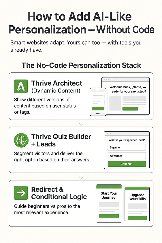
Bottom line: you don’t need AI to feel like AI. Smart personalization is doable — and when done right, it feels like your site is reading minds (without being creepy).
Want to make your site more accessible and ethical?
If you’ve ever wondered, “How do I make sure my website works for everyone — and doesn’t accidentally push people away?” — you’re already asking the right question.
Accessibility and ethical design aren’t just legal checkboxes anymore. They’re conversion boosters, trust builders, and honestly, the right thing to do.
As I mentioned earlier, in 2026, over 1 in 4 adults in the U.S. live with some form of disability. And web accessibility lawsuits are rising 13% every year. But beyond the legal pressure, there’s a bigger reason to care: when your site is easier for everyone to use, more people stick around — and more of them convert.
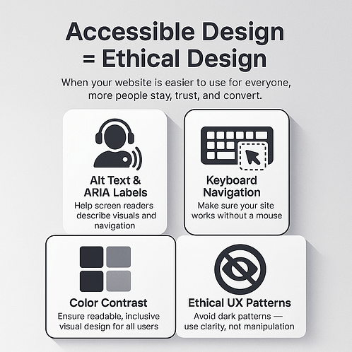
Here’s what I do to keep things simple, inclusive, and trustworthy:
Want a deeper dive into ethical UX and accessibility best practices?
I wrote a full guide on how to design your website for accessibility — from contrast ratios and keyboard navigation to real-world examples of what inclusive design actually looks like. If you’re serious about making your site usable for everyone (and future-proofing against legal risk), this is a must-read.
Want immersive storytelling without wrecking performance?
One of the biggest design mistakes I see in 2026 is this: chasing *wow* at the expense of *load time*. You don’t need to choose between beauty and performance — you just need to be intentional.
Storytelling works. Scroll-triggered animations, bold typography, and visual rhythm can turn a static page into an experience. But if your site loads like it’s stuck in 2011? Users are gone before the story begins. (And don’t forget — a 1-second delay can drop conversions by 7%.)
Here’s how I create immersive, scrollable, engaging layouts *without* tanking performance:
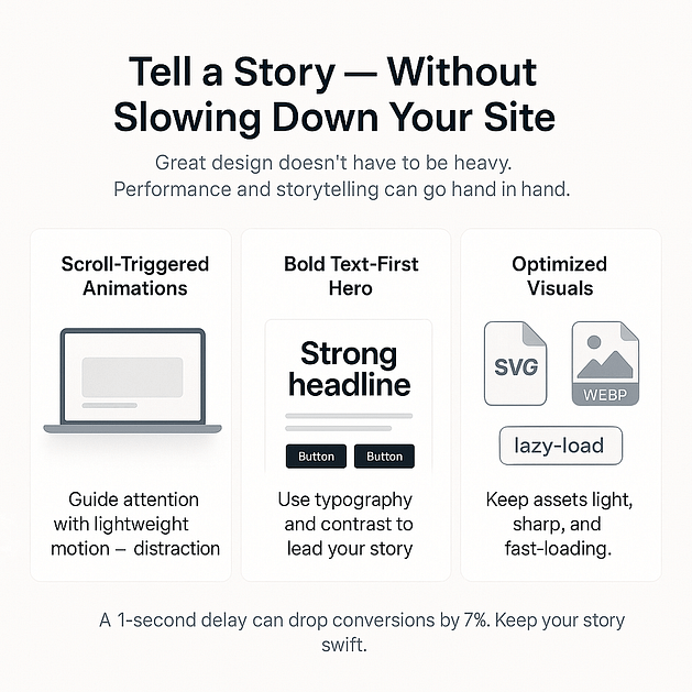
Immersive doesn’t have to mean expensive — or slow. When your story flows and your site stays fast, you’re already ahead of most of the internet.
Visual Cheat Sheet: Trends That Work vs. Trends That Hurt
A quick-reference guide for what’s worth using in 2026 — and what to skip if you want better performance, trust, and conversions.
🔥 Trend to Use | ✅ Why It Converts | 🚫 Trend to Avoid | ❌ Why It Fails |
|---|---|---|---|
Smart personalization | Makes users feel seen and understood — leads to higher click-through and loyalty | Generic sliders | Visually dated, ignored by most users, and slow down mobile performance |
Mobile-first UX | Over 75% of web traffic is mobile — mobile-first design is now non-negotiable | Desktop-first layouts | Breaks on smaller screens, frustrates users, and tanks mobile conversions |
Dark mode toggle | Gives users visual control and reduces strain — especially on OLED screen | Always-on dark mode | Doesn’t suit every brand or user preference; can reduce readability |
Ethical opt-ins | Transparent, friction-free flows increase signups and build trust long-term | Hidden checkboxes | Violates user trust and can open you up to legal risk |
Scroll-based animation | Adds movement and storytelling without sacrificing performance | Overused parallax | Can feel gimmicky and disorienting, especially on mobile devices |
Keep it simple, intentional, and user-first. Every design decision should earn its place — and help the person on the other side of the screen take action.
FAQ: 2026 Web Design Trends
Real questions users are asking — with practical, conversion-focused answers.
Focus on lightweight personalization, mobile-first design, and user-friendly layout. Tools like Thrive Architect help you implement subtle scroll effects, dynamic content swaps, and conversion-focused page structure — all without bloating your site or slowing performance. A modern website today is fast, clear, and personalized.
Chasing visual trends at the expense of function. If a feature doesn’t improve user experience, site accessibility, or conversion rate, it’s just noise. In 2025, successful web design prioritizes site performance, ethical UX, and clear calls to action over flashy animations or cluttered pages.
Start with WCAG 2.2 compliance and design for inclusivity — especially for mobile accessibility. Use Thrive’s structure tools to build clear heading hierarchies, label forms correctly, and maintain sufficient color contrast. Avoid dark patterns and popups that mislead. Designing for inclusive user experience isn’t just ethical — it expands reach and improves conversions.
Yes — but smartly. AI web design tools can accelerate layout testing, content generation, and even basic branding. But your website’s voice and identity still need a human touch. Combine AI workflows with tools like Thrive Architect to maintain control over your visual storytelling, conversion design, and brand personality.
Conclusion: Web Design That Works in 2026 Is Smart, Ethical, and Fast
Trends don’t grow businesses — execution does.
The truth is, most websites look decent in 2026. But the ones that actually convert? They’re built with intention. They’re fast, inclusive, mobile-optimized, and personalized without being overwhelming.
It’s not just about having the right elements — it’s about using them well. A dynamic CTA, a scroll animation, a single touch-friendly form field — these small details are what separate a pretty page from a high-performing one.
The best part? You don’t need a developer or a rebrand to get there.
With tools like Thrive Architect, Thrive Leads, and Thrive Quiz Builder, you can bring these trends to life — and start building a site that actually helps you grow your audience, your list, and your business.
💡 Final Call
Want to future-proof your site and stay miles ahead of design trends?
🚀 Start building with Thrive Suite today — it’s the fastest way to design for 2026 and convert like it’s 2030.


