TL;DR: Designing Your High-Converting Artist Homepage
Your artist homepage is the most valuable piece of digital real estate you own. It's not a storage unit; it's a curated gallery entrance. If you only have two minutes, here is what you need to know about designing a homepage that actually sells work:
- Curation Over Archive: Stop dumping every piece you’ve ever made onto the front page. Feature only 3–6 of your absolute strongest works in a clean grid. This reduces collector anxiety and proves you know what your best work is.
- The Hero Must Land the Punch: The first thing people see must be one single, stunning piece of art, your name, and one clear call-to-action (CTA). No messy sliders, no vague taglines.
- Make the Path to Purchase Obvious: If a collector loves a piece, they should be one click away from seeing the price and availability. Use clear CTAs like "Shop Originals" or "View Full Gallery"—don't make them hunt through the navigation.
- Show Your Credentials: Art is a high-trust purchase. Add a small section displaying logos of galleries you’ve shown in or a quick, quotable testimonial. This is your social proof.
- Speed is Non-Negotiable: Because your site is visually heavy, technical performance matters. Use modern image formats (like WebP) and ensure your site loads fast on mobile. A slow site is a closed gallery door.
If you’ve ever wondered why visitors bounce quickly, the answer is usually structural, not aesthetic. Read on, and I'll show you how to build an artist homepage that feels as confident as your art.
As a creative (and someone who’s definitely said “my work will speak for itself” more than once), I know how you may be feeling. You didn’t become an artist to worry about conversions or web design.
But the thing is… if your artist homepage isn’t turning visitors into subscribers, buyers, or even semi-curious fans… it’s really holding you back.
And you’re not alone. The average art website conversion rate hovers around 4.6%, but some online artists have shared that this could be even lower:
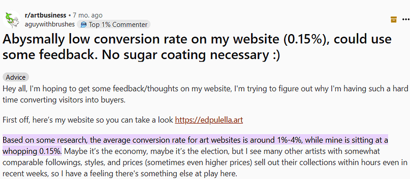
…some as low as 0.15%. That’s almost everyone clicking away without taking any meaningful action. The problem with most online art portfolios is that they look good but don’t do much. No clear direction. No opt-ins. No gentle nudge to say, “Hey, stay a while.” Just a quiet scroll and a silent bounce. But in this algorithm-driven, attention-span-shrinking digital world, your website needs to do more than just sit there and look good. It needs to work for you.
This isn't a full guide to building your entire website (though if you need that, I have a full guide to building your art gallery website in WordPress you might find helpful). This is a focused look at the structure, design, and visual storytelling of the homepage itself.
The key is making sure you How to Build a Website That Doesn’t Look DIY so that your online presence looks as professional as your physical gallery presence.
What Are The 7 Essential Elements for a High-Converting Artist Homepage Design?
When I look at a successful artist's website, I see seven elements working in harmony. These aren't just suggestions; they are the non-negotiable architectural pillars of a high-converting, anxiety-reducing homepage.
1. A Stunning Full-Screen Hero Section Featuring Your Best Work
The hero section is everything above the fold—the first thing a visitor sees before they scroll. It needs to land the punch immediately. If the hero doesn't grab them, nothing else matters.
The design rule here is curation, not collage.
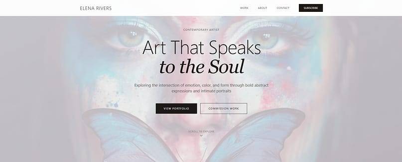
I’ve studied hundreds of websites, so if you need more inspiration, check out the I’ve Studied 50+ Hero Section Examples: Here Are the Best I’ve found.
Don’t try to cram five different images into a messy slider. Instead, feature one breathtaking piece of your current best work, or maybe a small, tightly curated set of three that speak to a current theme. This single image sets the entire tone and communicates your style instantly.
Design Rules for the Hero
Hero Section Design Rules
- Keep Text Minimal: Your name, a concise tagline (e.g., "Abstract Expressionist Painter based in Brooklyn"), and one clear call-to-action (CTA). That’s the limit. If you have more than three lines of text, you’re doing it wrong. (That concise tagline is essentially your hook—if you struggle with distilling your message, learning How to Write a Value Proposition can really help.)
- Mobile First: The image must look incredible on a phone. If the focal point of your painting gets cropped out on mobile, you’ve lost the visitor.
- Clear Primary CTA: This is your conversion angle. Ditch vague language like "Enter" or "Click Here." Use action-oriented language: “View Full Gallery,” “Shop Originals,” or “Explore the New Collection.”
You could try a subtle scroll animation that reveals detail shots of the hero piece as the visitor moves down the page. It’s a smart way to draw the eye without cluttering the initial view.
To really nail that first impression, you need to know How to Create a Hero Section in WordPress That Stops the Scroll.
A Quick Word on Building Visually
Designing a visual-first layout like an artist's site demands a page builder that respects design freedom without sacrificing speed. I use and recommend Thrive Architect for this exact purpose. It gives you features like full-height background sections, overlay gradients for text legibility, and precise mobile adjustments—all of which are non-negotiable for a professional gallery site.
If you’re curious about the tool I use to make all this happen, you can read my full Thrive Architect Review: This Is The Real Take You Need.
2. Clear Navigation Structure: Guiding the Collector
This is where I see the most talented artists sabotage themselves. They get creative with the navigation links, calling their portfolio "The Vault" or their shop "Acquisitions." Stop it. You are selling art, not solving a puzzle.
Your navigation is the map for the collector. It needs to be instantly recognizable, highly visible, and prioritized for sales.
Navigation is one of the key elements of a good user experience; make sure you haven't missed any other critical elements by reviewing the Must Have Website Features list.
The Essential Navigation Links (and Their Priority)
Your main navigation should live in the header, always visible, and should contain no more than five primary links.
Placement Matters: On desktop, use a standard horizontal header. On mobile, you might use a hamburger menu, but make sure the icon is large and the menu contents are clearly labeled and easy to tap. Never hide the navigation completely.
Making sure your site works flawlessly on smaller screens is crucial, so don't forget these 5 Proven Mobile Landing Page Best Practices to Get Ahead.
3. A Clear, Concise Bio & Artist Statement
People don't just buy art; they buy the artist. They buy the story, the context, and the connection. Your homepage needs to offer a quick, human introduction immediately after the hero section.
This isn't the place for your 500-word life story (save that for your About page). This is the micro-bio—a quick, confident statement about who you are.
What to Include in Your Homepage Micro-Bio
Pair this text with a high-quality, relaxed portrait or a photo of you working in your studio. This adds immediate authenticity and warmth. Make sure the typography is clean and readable. If the font size is under 16px, it’s too small, and you’re making your collectors squint.
If you need a hand creating professional-looking images for your site (beyond the art itself), check out my tips on How to Create Images for Your Blog or Website.
The conversion angle here is simple: Add a subtle CTA like, “Read my full story and process” linking directly to your About page.
Branding the Artist
This is essentially the core of your brand, and you can learn How to Create a Personal Branding Website That Feels Like You for more on this topic.
And if you’re serious about selling yourself as the artist, you need to nail your Personal Branding for Entrepreneurs: How to Ace It Today.
4. A Curated Portfolio Grid (3–6 Pieces That Represent You Best)
Think of your homepage portfolio grid as your "featured wall." This is your chance to show off your range and skill without overwhelming the visitor.
This is where many artists make a critical error: they treat the homepage like an archive. They feel obligated to show everything. Resist this urge. If you overwhelm the visitor here, they’ll panic, and they’ll leave.
Show 3 to 6 of your absolute strongest, most representative pieces. These should immediately communicate your style, scale, and color palette.
Portfolio Grid Design Tips
- Consistency: Use consistent aspect ratios or crops for the images in the grid. Visual harmony is paramount in a gallery setting.
- Hover States: Add simple hover states that reveal the title, medium, and size of the piece. This provides context without cluttering the initial view.
- Context: If possible, include one image that shows a piece "in-room" or next to a person. This helps the collector visualize the scale of your work in their own space.
Clicking any piece in this grid should feel like a smooth, logical path into the full portfolio or, ideally, directly to the product page where they can check availability and pricing.
You can make these featured pieces really pop by using WordPress Content Boxes: The Easiest Way to Highlight What Matters on your homepage.
5. Integrate Trust Signals and Social Proof
Buying art, especially online, requires a significant leap of faith. The collector is asking themselves: Is this artist legitimate? Is this a safe purchase?
My job is to answer those questions before they are even asked. You do this by weaving in small, powerful trust signals that validate your professional standing.
This isn't about bragging; it's about reducing friction. It’s the visual equivalent of having your work hanging in a respected gallery.
Essential Trust Signals
- Gallery/Exhibition Logos: A clean, minimal strip of logos showing where you have exhibited or been represented. If you’ve shown at a respected regional gallery, add their logo.
- Testimonials: Use one or two short, powerful quotes from previous collectors. Don't use generic praise. Use quotes that speak to the experience of owning your work ("The piece arrived perfectly packaged and transformed my living room").
- Press Mentions: If you’ve been featured in an art blog or publication, a small "Featured In" banner with the publication's logo adds instant credibility.
Place this section strategically—it works beautifully right below the micro-bio or just above the final CTA. It acts as the final nudge of confidence a buyer needs.
If you're using Google for reviews, you'll want to know How to Add Google Reviews to a WordPress Website to maximize that social proof.
6. A Clear “Next Step” Call-to-Action
After a visitor has seen your best work, read your micro-bio, and been reassured by your credentials, they are ready for a decision. You need to give them a single, obvious next move. Don't make them hunt for the navigation menu.
This CTA often works best placed right under the curated portfolio grid, or sometimes in the footer as a final "Ready to...?" prompt. (This placement is key to the overall flow; you can find the optimal spot for every element by understanding the Optimal Landing Page Structure.)
Examples of High-Impact CTAs
A clever trick I've seen work well is a dual CTA: one button for the committed buyer ("Ready to Collect") and one for the curious browser ("Just Browsing the Archives"). This respects the visitor's intent and directs them to the right place immediately.
If you want those buttons to really work overtime, check out these 9 Hacks to Boost Your Call-to-Action Click-Through Rates.
7. Technical Must-Haves: Speed and SEO
Look, I know you’re an artist, not an engineer, but ignoring the technical side of your artist homepage is like hanging a masterpiece in a dark, damp basement. It doesn't matter how beautiful the art is if no one can see it easily. Since your site is image-heavy, performance is a critical conversion factor. Slow sites lose sales.
How to Optimize Your Visual Assets
The biggest killer of speed on an artist's site is unoptimized imagery. You need to upload high-quality images, yes, but they must be compressed and served efficiently.
Technical Must-Haves for Image-Heavy Sites
- Use Modern Image Formats: Stop using JPEGs where you don't have to. You'll want to use modern formats like WebP, which offers superior compression without sacrificing visual quality. Many modern builders and plugins handle this conversion for you automatically. (If you're still confused about image formats, I broke down the difference between PNG vs. JPG and why it matters for speed.)
- Implement Lazy Loading: This is a non-negotiable feature. Lazy loading ensures that images only load as the visitor scrolls down the page. If your hero image is the only thing loading initially, your site feels instantly faster.
- Alt Text is Your Friend: Alt text isn't just for accessibility; it’s crucial for SEO. Use the alt text field to describe the artwork clearly (e.g., "Abstract oil painting on canvas titled 'Urban Decay' by Artist Name"). This helps search engines understand what your visual content is, which is how people actually find your work when they search for specific styles or mediums.
Remember that Google prioritizes mobile speed above all else. If your phone load time is over three seconds, you are actively driving away potential collectors.
If you want a full breakdown of everything you need to check off, grab my Website Optimization Checklist.
And don't let technical debt kill your sales; use this guide for WordPress Site Speed Optimization tips you can implement right now.
Design Showcase — Deconstructing 3 Artist Homepage Styles
Deconstructing successful sites is the fastest way to refine your own design strategy. Remember, we are borrowing principles of structure and conversion, not copying aesthetics.
Example 1 – Minimal “White Cube” Homepage
This is the classic gallery approach. It screams confidence through restraint.
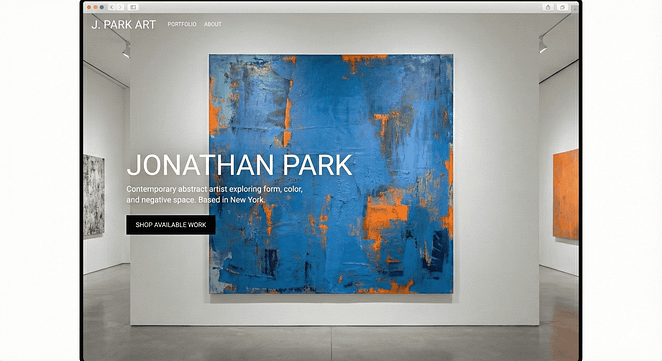
What this style does well: Space, space, and more space. The site uses a high-contrast black-and-white palette, letting the art provide all the color. Typography is clean, simple, and large, instantly conveying authority. The navigation is often placed cleanly in the top left corner to minimize visual clutter, but never hidden unless on mobile.
How it works: The hero is a single, large image with the artist's name centered below it. The bio snippet is just two lines of text. The portfolio grid is a perfect, symmetrical 3x2 layout.
What you’d borrow: The confidence of simplicity. If your art is complex, your website structure should be simple.
What I’d tweak for conversions: Minimal sites sometimes forget the shop link. I’d make sure the CTA under the portfolio grid is a strong, contrasting button clearly labeled “Shop Available Work.” Don't let minimalism sabotage your sales.
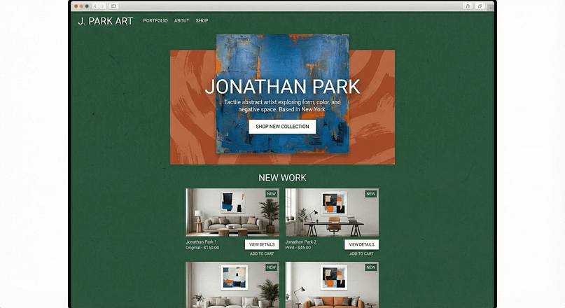
Example 2 – Tactile, Maximal, Color-Forward Homepage
This style suits artists whose work is highly textural, illustrative, or uses bold, non-traditional color palettes. The homepage acts as an extension of the art itself.
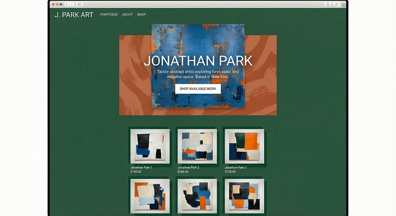
How it works: The homepage uses rich background colors (maybe deep forest green or terracotta) that complement the art. They often use subtle textures or overlapping image blocks to create depth.
Why it still works: Even with maximal visuals, the site maintains a clear hierarchy. The navigation remains simple, and the portfolio grid, while colorful, uses clean lines and consistent spacing. The artist successfully balances "fun" and performance by ensuring the images are optimized and the text remains legible. High contrast is essential when you use bold colors.
What a reader could recreate: Use full-width background sections with custom colors and add a subtle pattern overlay to match the tactile feel of your art. Thrive Architect handles these layered visual elements beautifully.
Example 3 – Hybrid Homepage with Strong Shop Emphasis
This design is for the working artist who needs to sell prints and originals regularly. The homepage blends the "gallery" feel with the "storefront" efficiency.
Smart design decisions:
Conversion wins: Clear "Add to cart" or "View details" buttons are visible on hover or directly below the featured images. They also often include trust markers like logos of galleries they’ve shown in or a short testimonial strip ("What collectors say").
How to Build Your Artist Homepage Design with Thrive Architect
Building a visual-first site doesn't have to mean hiring a developer. The key is using a tool that gives you drag-and-drop precision and visual freedom. Here is the exact flow you'll want to follow to set this up quickly and professionally.
Step 1 – Start from an Art-Focused Landing Page Template
Don't start from a blank canvas—that's what you do with your physical art, not your website. Open Thrive Architect and choose a visually driven template.
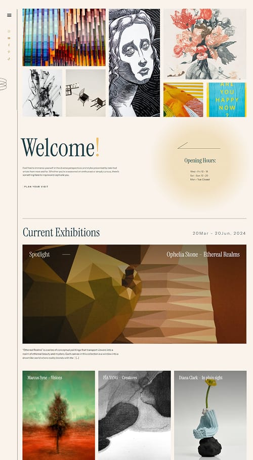
Look for one that emphasizes large imagery and minimal text. Swap the placeholder images with your own hero piece and adjust the colors and fonts to match your artistic brand. Keep the structure; change the content.
Step 2 – Build the Full-Screen Hero Section
Use one of our pre-built hero elements to quickly create this section. Set the background image to your chosen hero piece if you want it to be especially custom.
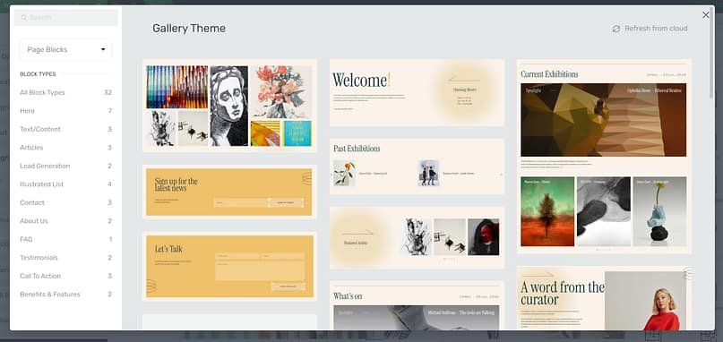
Add your name in a large, confident heading, and drop in a single, primary CTA button linked to your gallery. Make sure you check the mobile layout and adjust the image focal point so your art isn't cut off.
Step 3 – Add Your Micro-Bio + Portrait Block
Use a 2-column layout. Place your portrait on one side and your introductory text on the other. This creates visual balance and breaks up the large images.
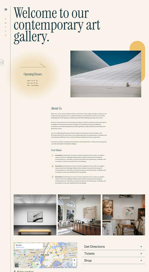
You could try placing this entire section inside a Content Box with a subtle border or background color. This helps separate your story from the art above and below it. Don't skip the "Read my story" button linking to your dedicated About page.
Step 4 – Create a Curated Portfolio Grid
This is where the magic happens. Use the Gallery element or the Post List element (filtered to show only posts tagged "Featured Work").
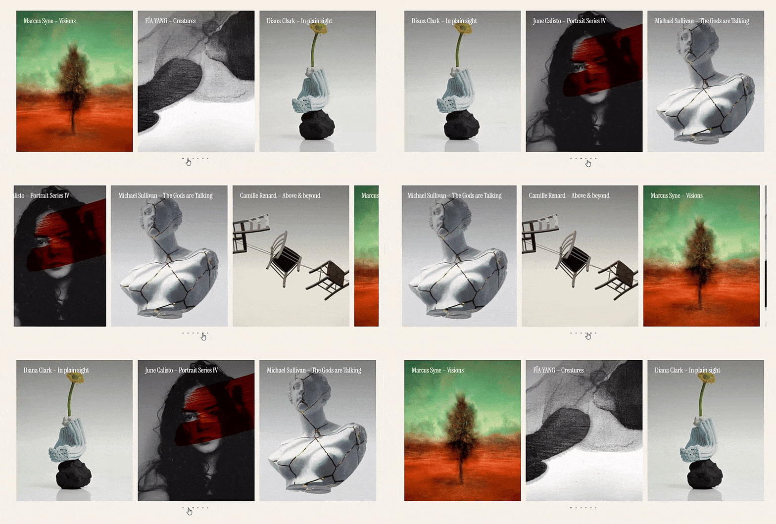
Keep the grid simple: 3 or 6 images. Use the settings to add hover overlays that display the title and a short descriptor. Crucially, ensure that clicking these images takes the visitor smoothly to the detailed portfolio page or the shop page for that specific piece.
Step 5 – Drop in Your Trust Signals
Below the micro-bio or above the final CTA, add a narrow full-width section dedicated to trust. Use the Image element to display 3-5 gallery or press logos, or use the Testimonial element to feature one strong quote. Keep the design clean and minimal—the logos should speak for themselves.
Step 6 – Drop in Your “Next Step” CTA Section
Use a clean, contrasting block—maybe a strong color that pops against the white background—with one strong message and button. This is your final invitation.
Example CTAs: “View Full Gallery,” “Shop Limited Edition Prints,” or “Request a Commission.”
Optional Enhancements with Thrive Architect
Because you’re using a flexible builder, you can easily add elements that boost trust and conversions:
If you’re building a full portfolio site rather than just a single homepage, you’ll want to check out our guide on how to create a portfolio website for more detailed structural advice.
This article is focused on the homepage, but if you need a broader strategy for getting eyes on your work, check out these Smart Marketing Tips for Artists.
Common Artist Homepage Design Mistakes (and Quick Fixes)
I’ve seen these mistakes derail otherwise beautiful websites. They are usually easy to spot and even easier to fix. If you fix these five common errors, your website will immediately perform better than 80% of your competition.
Artist Homepage Mistakes and Fixes
Mistake | Why It Hurts | How to Fix It |
|---|---|---|
Confusing Navigation | Visitors can't find what they need (e.g., "Writings," "Musings," "The Vault"). | Use plain, standardized language: "Gallery," "Shop," "About," "Contact." Prioritize sales links in the main header. |
Archive Dump | The homepage is full of every artwork ever created, overwhelming the eye. | Curate ruthlessly. Feature only 3–6 of your strongest, most representative pieces. |
No Clear Path to Buy | The visitor loves the work but can't find pricing or a shop link. | Add a prominent "Shop" link in the main navigation and a clear CTA button under the portfolio grid. |
Illegible Typography | Tiny fonts, low contrast, or overly stylized fonts that are hard to read. | Use simple, high-contrast font pairings. Ensure body text is at least 16px and has sufficient line height. |
Slow, Image-Heavy Pages | High-resolution images are uploaded without optimization, causing long load times. | Compress all images before uploading. Use WebP format and enable lazy loading. |
Frequently Asked Questions About Artist Homepage Design
If you’re researching how to design an artist homepage, you’re probably not just looking for inspiration—you’re looking for clear answers.
Collectors, curators, and buyers behave in predictable ways online, and the same questions come up again and again: How much should I show? Where should pricing live? Do I need SEO? Why are people leaving my site so fast?
The questions below address the most common artist homepage design concerns, using best practices that balance visual presentation, usability, and conversion. They’re written to help you make confident design decisions—without second-guessing every element on your site.
If one of these questions matches what you’ve been stuck on, you’re in the right place.
Let Your Homepage Be as Confident as Your Art
Your artist homepage is your gallery entrance and your invitation to collectors. It’s the visual handshake that determines whether someone stays for five seconds or five minutes.
Don’t overthink the aesthetics, but never underthink the structure. Start by implementing the seven essential elements—the stunning hero, the clear navigation, the concise bio, the curated grid, the integrated trust signals, the clear next step, and the necessary technical polish.
Use these examples for inspiration, not imitation. The goal is to build a site that is visually powerful and structurally sound, allowing your art to shine without distraction. By building it visually with a tool like Thrive Architect, you can easily adjust and refine the experience as your work evolves.
You’ve done the hard work of creating the art; now give it the professional home it deserves.


