You’ve set up your opt-in form, followed the advice you’ve read online… and still, barely anyone’s signing up. It’s frustrating — especially when you know your offer is solid.
Here’s the thing: the average form conversion rate is just 1.7%. And even when people do click on your form, only 45% actually finish filling it out.
That means more than half of your potential leads are slipping through the cracks.
But you don’t need to overhaul your whole site to fix this. Often, a few simple changes to your form design, copy, and placement can make a big difference — and that’s exactly what this guide will help you do.
You’ll learn how to build high-converting opt-in forms in WordPress using Thrive Leads — no tech overwhelm, no guesswork, and no fancy design skills required.
Whether you’re growing a blog, launching a course, or just getting started, this guide is here to help you build smarter forms and turn more visitors into subscribers.
If a form isn’t pulling its weight, these are the four levers I pull first. They’re fast to implement and move the needle quickly.
- Focus on the offer first. A strong lead magnet does the heavy lifting—make the “why subscribe” unmistakable.
- Keep fields minimal. Email (and maybe name) is enough for most goals; fewer hurdles = more sign-ups.
- Placement & timing matter. Test inline forms, a short delay before popups, and exit-intent to catch people at the right moment.
- Use double opt-in. Protect deliverability, confirm consent, and build a cleaner, more engaged list.
Nail these four and you’ll feel the lift—then the fun tweaks (colors, layouts, microcopy) actually pay off.
💡This guide is part of our bigger framework on how to create a lead generation website
💡See how opt-in forms power conversion in our landing page strategy guide
What Are the Essential Elements of a High-Converting Opt-In Form?
I won’t lie to you — I never used to care much about my forms.
I added them because I was supposed to. One in the sidebar, another at the bottom of a blog post... and that was that. I didn’t see them as part of a real strategy — just something you “should” have.
But here’s the thing:
Forms are the highest-converting lead generation tool for 50% of marketers . That means if you’re not taking yours seriously, you’re probably leaving a lot of leads on the table.
So what makes an opt-in form actually work?
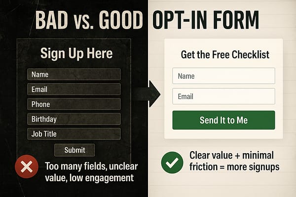
Once you start viewing your forms as conversion tools — not just filler content — everything changes.
In the next section, we’ll show you how to build one that actually performs.
Why Does Every Opt-In Form Need a Lead Magnet?
Even the best-designed form won’t convert if there’s no real reason to sign up.
That’s where a lead magnet comes in — it’s the incentive you offer in exchange for someone’s email. And it doesn’t have to be complicated. What matters most is that it feels valuable and relevant to the person seeing it.
💡Before you decide on the format, pause and ask: what does my audience truly need right now? The best lead magnets aren’t random freebies — they’re focused solutions to burning questions your readers are already asking.
Look at your blog comments, your most-opened emails, or even the FAQs customers send you. The patterns you spot there are your goldmine. When your lead magnet directly answers a struggle your audience can’t ignore, it feels irresistible — and that’s when form conversions skyrocket. 💡
Here are a few lead magnet ideas that work across different types of businesses:
- A checklist or cheat sheet — quick, actionable, and easy to deliver
- A free guide or mini eBook — great for educating or warming up leads
- A discount code — ideal for eCommerce or product-based businesses
- A quiz or scorecard — interactive and highly engaging (bonus: segment leads!)
- Early access or exclusive content — useful for bloggers, creators, or memberships
- Content upgrades — hyper-relevant downloads offered inside blog posts (we show you how to create effective content upgrades here)
What you offer should match what your audience cares about — and what your business can follow up with.
💡 Pro tip: Make the lead magnet the hero of your form. Let it guide the headline, form design, and call to action.
Want to see how to actually deliver your lead magnet — and turn new subscribers into paying customers?
For more on crafting irresistible offers, read our lead magnet strategy guide
How Do You Create a Great Email Opt-In Form for Your Landing Pages? (Step-by-Step)
The best way to create a great opt-in form for your WordPress site is with a plugin that offers customizable templates and advanced targeting features to help you build with ease.
Yes, there are a number of powerful WordPress plugins to choose from, but our top recommendation is Thrive Leads — and you’ll learn why.
This WordPress tutorial shows you how to create an easy, eye-grabbing opt-in form with Thrive Leads, one of the best WordPress lead-gen form plugins available.
Step 1: How Do I Download and Install Thrive Leads?
Thrive Leads is your number one choice if you're looking to create opt-in forms to convince your audience to convert.
First off, you're going to love how easy it is to use. With its drag-and-drop functionality, designing custom forms is a breeze, even for beginner WordPress website owners. No need to try figure out HTML or CSS.
This tool is all about making things simple and efficient for you. And with a variety of templates (450+ to be exact) that are not just eye-catching but conversion-optimized, you're set to capture your audience's attention.
What's really cool about Thrive Leads is the way it lets you get specific with who sees your forms and popups.
You can tailor your content based on what your visitors are into, where they came from (e.g. a social media post), and more. This means you can make your content super relevant to each visitor, increasing the chances they'll engage with it.
In terms of integrations, you can easily connect this plugin with your favorite email marketing services and marketing automation tools.
This means you can manage your new leads easily and effectively. Plus, the plugin’s detailed analytics engine helps you keep track of how your forms are performing, giving you the insights you need to keep improving.
We know how important it is for your content to look good on every device, which is why everything you create with Thrive Leads is mobile-responsive.
Giving you everything you need to create high-converting opt-in forms and land more email subscribers.
Step 2: What Is a Lead Group and Why Does It Matter?
To build a new opt-in form for your pages or posts, you’ll need to create a new Lead Group.
What is a Lead Group?
A Lead Group in Thrive Leads is a way to manage and organize your email sign-up forms.
You can decide when and where each form should show up for your visitors, making it easier to get more people to sign up. It helps you organize your forms neatly and use them smartly to grow your email list.
First, access your WordPress dashboard, navigate to the "Thrive Dashboard," and click on "Thrive Leads".
In the Thrive Leads dashboard, find the “Lead Groups” section and select “Add New”.
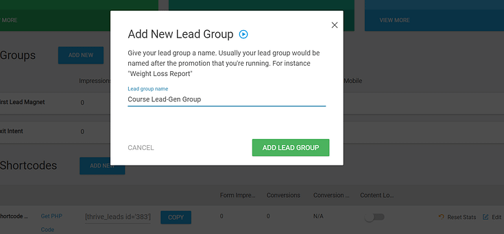
A popup will appear, asking you to name it. Give your shortcode a simple name and click the “Add Lead Group” button.
Next, click the “Edit” button in your Thrive Leads Dashboard. Now it’s time to design and customize your opt-in form.
Step 3: How Do I Build and Design the Form in WordPress?
Next, you’ll need to choose the type of form to build. Click on your newly created Lead Group and click the “Add New Type of Opt-In Form”.

A new pop-up window will open where you will have to select the type of opt-in form you want to create. You have multiple form types to choose from — inline, widgets, sidebar, and more.
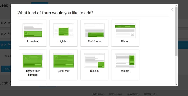
Select the form type of your choice.
After you’ve created your form type, you need to add an actual form to it.
Click the "Add" option – which can be found – on the right of the form type you have just created
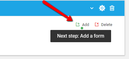
In the next screen, click the blue “Create Form” button, give it a name, and click the green “Create Form” button.

On the right side of your newly created form, you’ll see several icons. Click the blue icon – the edit button – to choose a design.
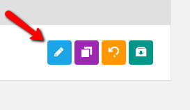
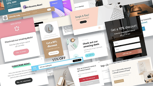
Scroll through our library of professionally designed templates until you find the perfect one for your offer.
Once you've selected a template, the Thrive Visual Editor will open, allowing you to customize your form.
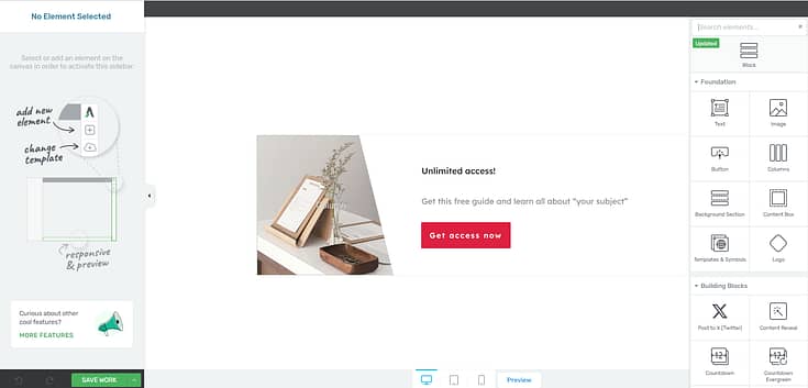
Step 4: How Do I Customize My Opt-In Form Template?
Once you've selected a template, the Thrive Visual Editor will open, allowing you to customize your form.
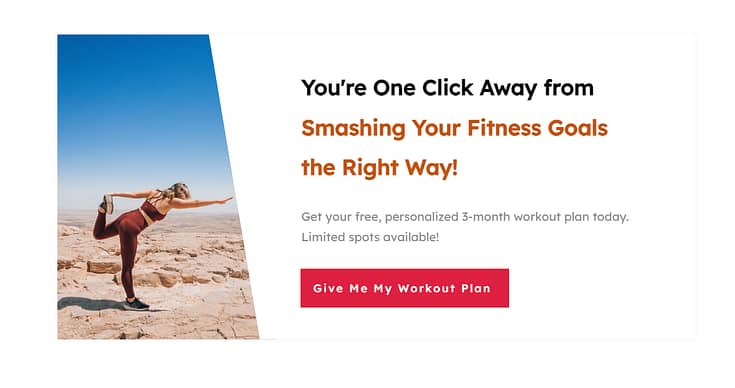
As you work on your form, make sure all of the following elements are included:
Bold, compelling headline to grab your audience’s attention and encourage them to keep reading.
A clear value proposition so potential leads know exactly what they’re signing up for
Minimal form fields that only request the important info you need (e.g. Name, email address, phone number)
Strong call-to-action with a CTA button that stands out and uses action-oriented language to encourage website visitors to click through and opt in.
A high-quality supporting visual (if it can fit) to support your form copy and help your audience visualize the benefits they will receive
Your forms also need to be responsive so that they can be easily viewed and filled in on mobile devices and desktops.
You don’t have to worry about manually configuring this when using Thrive Leads. Every form template is mobile-friendly right out of the box.
Always include a short note below your CTA button for transparency, such as: “We respect your privacy. Unsubscribe anytime.” Link this to your site’s Privacy Policy — it builds trust and keeps you aligned with compliance best practices.
Step 5: How Do I Set Up Smart Targeting for My Form?
Thrive Leads lets you determine where and when your forms should be placed on your pages or posts. This is known as “Setting up form targeting rules”.
Once you have finished editing/customizing your opt-in form and you saved it, go back to its page in the Thrive Leads dashboard.
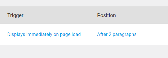
Here you will find other settings that you can apply to your forms, such as its trigger, its display frequency, and animation:
To set how you want the form to appear, i.e. what you would like to trigger its appearance, click on the text "Displays immediately on page load" from this option:
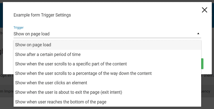
This will open up a pop-up window with the trigger settings. Click on the down arrow from the "Trigger" section to see every available setting:
In the drop-down that opens, you can select when the form should appear. Choose whichever trigger you prefer from the list:
Then, depending on which trigger you have chosen, there will be different settings you will have to complete. Once you have done that, click on the "Save" button from the pop-up window to apply the new trigger to your form.
💡 Pro Tip: Placement and Timing Matter More Than You Think
Even the most persuasive form won’t convert if it’s shown at the wrong time or buried in the wrong place.
- 📍 Inline forms inside content perform well because they appear when the reader is already engaged — research reports that embedded, single-opt in forms have an average conversion rate of 1.28%, but that can jump when paired with the right offer.
- 📌 Sticky ribbons and slide-ins keep your offer visible without interrupting the experience. And since above-the-fold content captures 57% of viewing time , it’s smart to place your form (or a teaser for it) where attention is naturally focused.
- ⏳ Popups triggered after a delay convert better than those shown immediately. Popups that appear after 5 to 15 seconds convert than instant ones.
- 🛑 Exit-intent popups give you one last chance to catch a lead — data shows that they can reduce bounce rates by up to 15%.
👉 Test different placements and triggers based on page type and visitor behavior. A well-timed form that feels relevant will always outperform one that feels random.
Step 6: How Do I Configure My Form Display Settings?
Once you’ve created your form and saved it, head back to the main Thrive Leads dashboard and find your new form.
There will be a red cog, with an exclamation mark, on the right side of your form.

This is where you’ll set when and how you want your form to display on your site. No need to embed a shortcode or manually add the form to your pages or posts.
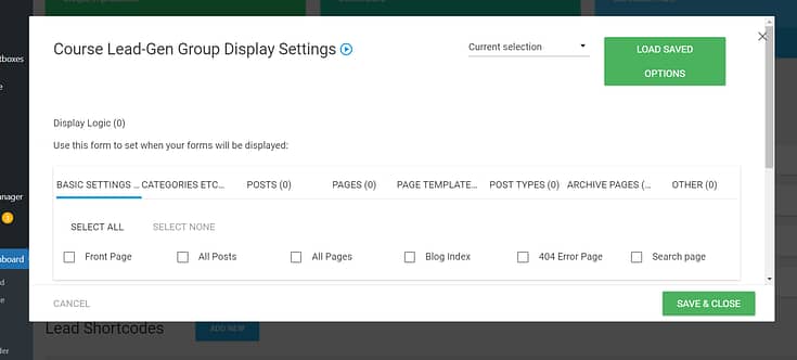
Simple tick the relevant checkboxes to indicate where you want your forms to appear.
It all gets taken care of right from your Thrive Leads dashboard.
Here, you can:
- Specify on which webpages, posts, categories, or custom post types the form should appear on your WordPress site. You can include or exclude specific pages (e.g. the homepage) or categories.
- Define rules based on visitor behavior, such as new vs. returning visitors, or based on referral source.
- Choose whether the form should be displayed on desktops, tablets, mobiles, or a combination of these.
- Set rules based on the amount of time a visitor has spent on your site before the form is shown.
- Enable the form to appear when it seems like the visitor is about to leave your site (this is mainly for popup forms).
Different options will appear, depending on the opt-in form type you’ve chosen.
This feature is useful for your business because it lets you have total control to show your sign-up forms to the right people at the right time, increasing the chances they'll sign up.
Where Should I Display My Opt-In Forms for the Best Results?
There’s no single “best” location — your ideal placement depends on how and when visitors engage with your content. Here are proven spots that consistently drive higher sign-ups:
- Inline (within a blog post): Perfect for content upgrades, since the offer is directly tied to what the reader is already learning.
- Sidebar: A classic option for ongoing visibility, ideal for a general newsletter invite.
- Timed popup: Triggered after 5–15 seconds to catch engaged readers without overwhelming new visitors.
- Exit-intent popup: Fires just as someone is about to leave, giving you one last chance to capture them.
- Sticky ribbon/floating bar: Always visible at the top or bottom of the screen, keeping your call-to-action subtle but present.
💡 Pro tip: Don’t rely on just one placement. Test a mix of inline forms and one strategic popup to see what resonates with your audience.
Step 7: How Do I Connect My Opt-In Form to an Email Service Provider?
You'll need to configure your email provider so that a confirmation email lets them know their signup was successful.
This is different for every email provider, but a quick Google search should help you out.
Example: “How to create a confirmation email in Drip” — or ConvertKit, ActiveCampaign, etc.
Be sure to create a follow-up email sequence to engage your new leads and build a relationship with them.
🧠 Quick Note: What’s the Difference Between Single and Double Opt-In?
When you connect your form to your email provider, you’ll choose between:
- Single opt-in: Subscribers are added to your list the moment they hit “submit.”
- Double opt-in: Subscribers must confirm by clicking a link in their inbox before they’re added.
While single opt-in feels simpler, double opt-in is the smarter long-term choice. It ensures your list is made up of real, engaged people (not bots or mistyped emails), improves deliverability, and reduces the risk of spam complaints. It also provides a clear record of consent — important for compliance with privacy laws like GDPR.
If building a clean, high-quality list matters to you (and it should), enable double opt-in.
According to Kaspersky, 45.6% of global email traffic in recent years was spam, so it’s no surprise that many marketers use double opt-in to protect their sender reputation and improve deliverability.
What Are the Best Practices for High-Converting Opt-In Forms?
Want to make sure your opt-in form is set up for success? Here’s a quick checklist to guide you:
✅ Offer a clear, valuable lead magnet — Make the “why” obvious and irresistible
✅ Use a benefit-driven headline — Focus on what your subscriber will gain
✅ Keep form fields to a minimum — Name and email is often all you need
✅ Write a bold, action-focused CTA — Avoid generic buttons like “Submit”
✅ Choose a design that fits your brand — But don’t sacrifice clarity for style
✅ Make sure it’s mobile-friendly — Most of your visitors are on small screens, so test your form layout on mobile first. (We’ve broken down the full details in our guide to mobile-optimized opt-in forms)
✅ Place it where attention is high — Mid-post, after scroll, or on exit intent
✅ Test different versions over time — Even small tweaks can lead to big wins. 👉 Learn how to A/B test your opt-in forms
Even one or two improvements here can make a noticeable difference in your conversion rates.
👉 Read our guide on how to improve your opt-in form conversion rates to go deeper into optimization tactics that actually move the needle.
FAQ: Opt-In Forms (Strategy, Design, Tech)
Before we wrap up: here are the seven questions that come up the most—clear, quick answers you can act on right now. Use this as a final checkpoint to spot easy wins, then jump to the conclusion for next steps and links.
An opt-in form is the permission-based gateway to your audience. It earns explicit consent to contact someone and starts a trust-first relationship. Done right, it shifts you from interruption (pushy ads) to invitation (useful, expected messages), which drives higher engagement and long-term value.
- Inline/Embedded: Best for “content upgrades” tied to the topic the reader’s on.
- Floating bar: Always visible, low-friction for site-wide offers.
- Slide-in: Triggers on scroll; good mid-engagement prompt.
- Pop-up (lightbox): High visibility—use for major offers; time it well.
- Welcome mat (full screen): Max attention for single, high-priority campaigns.
- Two-step opt-in: Click → then form; leverages micro-commitment.
- Gamified (spin-to-win): E-commerce engagement + discounts.
Pro tip: Form type matters, but trigger logic matters more (scroll %, delay, exit-intent, inactivity).
- Within / end of blog posts: Highest relevance; perfect for content upgrades.
- Header or footer: Persistent, expected placements for general sign-ups.
- Sidebar (sticky): Keeps the offer in view while scrolling.
- Timed pop-ups (5–15s) & scroll-depth triggers: Catch engaged readers.
- Exit-intent: A last-chance offer before they leave.
Use one primary placement + one behavioral trigger to avoid fatigue.
Start with audience research: comments, support tickets, top-opened emails, FAQs. Then:
- Solve one urgent problem (specific > broad).
- Deliver fast value (checklist, template, mini-course, discount).
- Match the page intent (upgrade a post with a related resource).
- Set clear expectations (what they get, format, frequency).
- Single: Faster list growth, more risk of fakes/typos, weaker deliverability.
- Double (recommended): Confirms real interest, cleaner data, better inboxing, stronger consent trail (often required in stricter regions).
If quality, reputation, and long-term ROI matter, choose double opt-in.
- Clear consent: No pre-checked boxes; plain-language purpose.
- Granular choices: Separate checkboxes if you have multiple uses.
- Easy opt-out: Unsubscribe must be as easy as subscribing.
- Link your Privacy Policy near the CTA and state how data is used.
- CCPA/CPRA: Provide “Do Not Sell/Share” options; special rules for minors.
Track Conversion Rate = subscribers ÷ form views, segmented by device, page, traffic source, form type, trigger timing. Run steady A/B tests on:
Offer/lead magnet (e-book vs checklist).
Headline (benefit-first).
CTA (first-person, action verbs).
Fields (email-only vs email+name).
Placement & triggers (delay, scroll %, exit-intent).
Keep winners, form new hypotheses, and repeat—optimization is a loop, not a one-off.
Next Steps: What Should I Do After Creating My Opt-In Form?
Designing the right type of opt-in form is one step. There’s still more work to be done to convert more of your audience into leads.
The success of your opt-in forms also depends on ensuring you attract the right audience and guide them to see the value in your offer, convincing them to sign up.
Here are four more tutorials to help you optimize your forms for more conversions:
- How to Set Up a Complete Lead Generation Funnel
- How to Boost Your Call-to-Action Click-Through Rates (9 Hacks)
- How to Improve Your Opt-In Form Conversion Rates
- 21 Easy Hacks: How to Increase Conversion Rates
And if you’re looking for creative ways to drive your audience to convert, consider using online quizzes as lead magnets.
Quizzes are a fun and dynamic way to capture attention and increase engagement with potential customers.
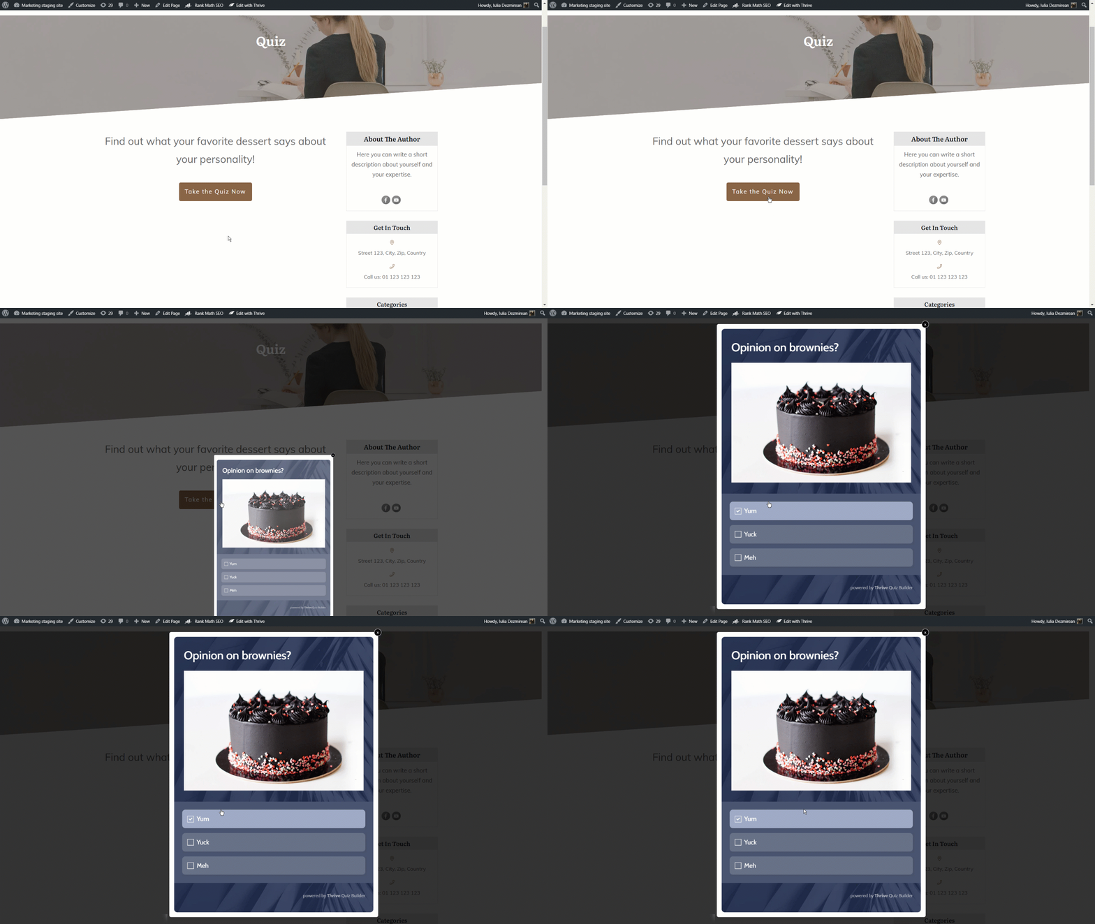
You can use them to collect valuable insights about your audience's preferences and needs through their responses.
At the end of the quiz, you can guide these engaged leads further into your sales funnel, turning their interest into actionable conversions.
And with an easy-to-use plugin like Thrive Quiz Builder, you can create eye-catching, engaging quizzes with no hassle.
You can get Thrive Leads and Thrive Quiz Builder together, along with 8 other premium plugins when you purchase Thrive Suite, the ultimate WordPress plugin bundle for building a high-converting online business.
How to Create an Opt-In Form: Turn This Tutorial into Action
With this tutorial, you can rev up your lead-generation and gain more leads through your opt-in and contact forms.
And Thrive Leads helps you get this done fast and with ease. Our templates were built with conversion optimization in mind so you don’t have to spend hours trying to figure out the best design principles for your forms.
Whether you’re a blogger who wants to turn more readers into subscribers, or an eCommerce store owner who’s trying to get more leads in their funnels, Thrive Leads can help.
The best part? You can get this plugin for a really great price.
But don’t just take our word for it.
Get Thrive Leads and start turning more visitors into subscribers today.



Do your forms integrate with HighLevel?
Hey Jimmy!
We don’t have a direct integration with HighLevel (yet), but there is a way to do it with webhooks. This tutorial focuses on connecting Thrive Apprentice to HighLevel, but there should be a workaround to connect your forms in a similar way.