Of course you know that great images help make your content more engaging.
But what should you do if you can’t find the right photo or don’t have a designer on staff to help make any graphics for you?
It just so happens that there are several awesome tools available to help you bridge that visual content gap right now if you use Thrive Architect to build your online content.
This post is going to walk you through eight of them so you’ll have plenty of visual bricks on hand to get the job done — without always having to go search for picture perfect photos.
Keep reading to learn how easy it is to drop visually engaging elements into your online content with the Thrive Architect visual builder for WordPress...
More...

Visual Element #1: Content Blocks
The Content Block element in Thrive Architect should be one of your go to visual tools whenever you need to spice up your content.
All you have to do is drag & drop a Content Block element into your Thrive Editor window to see a library of over 65+ (and growing!) pro-designed content templates (searchable by content type) appear on screen via a popup selection lightbox.
Here’s a few of the many different types of Content Block you’ll find within the template library…
Styled & Numbered Lists
If you ever need to explain a series of “How To” steps or highlight some important points — while making them stand out from the surrounding content — the numbered list Content Blocks templates are where it’s at:
Styled list templates like these are also great for Ultimate Guide content as they’ll instantly elevate the production value of your content without the cost of hiring an expensive web designer or having to purchase readymade images:
Styled Blockquotes
A quick and easy way to bring a visual boost to your text is by visually showcasing a quotable passage from your writing (like many magazine and journalistic articles do) or highlighting a quote from an authority to support your point.
Lucky for you, the Content Blocks template library has several predesigned blockquote designs for you to choose from:


Just add the appropriate quote, change the highlight color to fit your brand, and swap the photo (if it includes one) to match the person you’re quoting and it’s ready to publish.
Product Reviews
If you run an affiliate marketing website, you’re going to love the Product Review Content Block templates.
With them, you can quickly describe the pros and cons of the product you’re reviewing without having to do any other design work:



At most, just swap any images in the template to match the product you’re discussing and get that review published!
Visual Element #2: Styled Boxes
The next visual content asset in your Thrive Architect war-chest is the Styled Boxes element.
Much like Content Blocks, the Styled Boxes element provides you with a smorgasbord of pro-designed content templates, but primarily in ways that help you highlight key text sections with eye-catching designs.
Want to make an important point stand out within a blog post? It’s as simple as customizing the color and copy of a Styled Box template like this:
Need to drop a slick looking Author Bio Box onto your online course sales page? How about customizing this Styled Box template to get the job done?

Have a recommended products page in need of some short and sweet feature boxes? Yup, this template here is what you’re looking for:

Thrive Architect
Thrive Architect is the fastest and most intuitive visual editor for WP.

Thrive Leads
Thrive Leads is your all-in one email list building tool for WordPress.

Thrive Quiz Builder
Create fully customized quizzes for your WordPress website.
Take a browse through the Styled Boxes template library and you’ll see that there’s a multitude of ready made designs just waiting to be deployed on your next piece of content to enhance its visual appeal.

Visual Element #3: Customized Content Boxes
If you want to build your visual elements in Thrive Architect from scratch, then there's no better way to go about it then with the Content Box element.
There's so many design features available for you to use to make an awesome looking visual, that the sky is really the limit in terms of what you can create.
Inside a Content Box element, you can add, text, images, icons, logos... any element available in the Thrive Editor right sidebar. Then, when customizing your Content Box, you can apply visual features in the left sidebar including Decorations, Shadows, Border & Corner designs, Background Styles and Animations.
For example, you could use the Fancy Dividers feature in a fresh Content Box element to easily build a visual Content Box like this:
Use a Content Box element with a customized background (like the color gradient shown here) and a Fancy Divider (the bottom pattern seen here) to create amazing visual elements inside your content!
The Fancy Dividers feature can be found within the Decoration tab of the left sidebar when your Content Box element is highlighted.

Visual Element #4: Click to Tweet
A slight variation to the blockquote visualization strategy discussed previously is the Click to Tweet element within Thrive Architect:
“There are three things your online business needs to thrive: a good offer, traffic and a website that converts.”
The Click to Tweet element allows you to not only visually highlight an important point or quotable passage from your content, but then gives your readers the chance to one-click share it to their Twitter feeds.
That’s two awesome benefits built into the DNA of a single Thrive Architect feature!

Visual Element #5: Post Lists
One way to keep your readers on your website longer is to present them with a rabbit hole of relevant content placed in strategic locations across your site.
The best way to pull this strategy off is with Thrive Architect’s Post List element.
From a visual perspective, the Post List element is awesome because — like many of the Thrive Architect elements we’ve already discussed — it comes with a litany of pro-designed templates you can choose from:
On top of that, you can customize those Post List templates to fit your exact needs within relevant blog posts or special types of content like your homepage.
The filtering power of the Post List element also allows you to set up sophisticated rules to dynamically display the most relevant posts or pages possible in order to keep readers clicking down your content rabbit-hole.
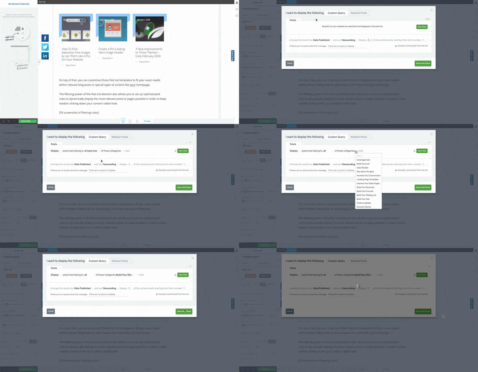
To set a display filter on your Post List element, click on your Post List element, then click on the Post List tab in your left side bar, click the "Filter Posts" button, and then set your display rules in the lightbox that appears.
For example, when you're writing a long blog post, add a post list halfway through to visually grab the attention of your readers again.
Or you could make sure posts with the highest engagement always get displayed on your homepage to hook new visitors.
Use the Post List element wisely and you’ll not only be exposing your online visitors to the right content at the right time, but you’ll have a visual element on hand that doesn’t need any extra photo work.
Visual Element #6: Icons
One of the easiest ways to jazz up your content when missing photos or images is to leverage the Font Awesome icons available within Thrive Architect’s Icon element:
Sometimes, a well placed icon can illustrate an idea or point you want to convey just as well as a fancy photo. In fact, Icon elements in Thrive Architect are super easy to customize in order to give them a unique visual appeal:
To achieve a customized icon like the brain icon on the right, use the following steps (check it out... I'm going to use one of the "Steps" Content Block templates for this):
How To Customize an Icon Element:
Drag & drop the Icon element from the right sidebar into your Thrive Editor and then select an icon from the"Choose an icon" lightbox that appears:
Next, customize the settings of your icon background:
- Adjust the padding to something like 30 pixels on all sides within the Layout & Position tab.
- Set the corners to something like 12 pixels (squarish) or 90 pixels (circle) within the Borders & Corners tab.
- Select your background setting (either a solid color, image file, color gradient, or pattern) within the Background Style tab.
- Set either an Inner Shadow or Drop Shadow in the Shadow tab.
Finally, select the size and color of your actual icon in the Main Options tab:
Using icons like this can also make placing customized graphics above each of your post chapter headings super easy.
So if you’re using Thrive Architect to build a sales page, lead generation page or blog post, don’t be afraid to jump into the vast Font Awesome icon library and see what you can use to get the right visual on your page fast.

Visual Element #7: Google Maps
If you run a local business or promote live, in-person events on your website, then don’t forget there’s a Google Map element inside Thrive Architect for you to use.
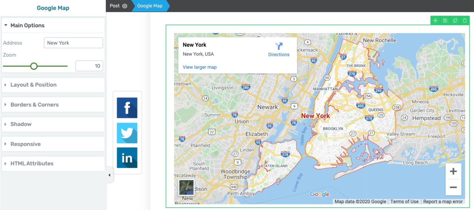
With the Google Map element, you can set the address of your location, level of zoom, as well as the Layout & Position display settings within the Thrive Editor window.
It’s a quick and easy way to add an interactive map feature to your brick & mortar business homepage or to a live event landing page.
Just customize the map with the correct address and zoom setting and you’ll have a useful visual aid to help direct your customers and attendees exactly where to find you.
Visual Element #8: Custom HTML Element (to Embed Social Media Posts)
Finally, don’t forget that Thrive Architect provides a Custom HTML element which you can use for a variety of visual purposes.
A popular use case for the Custom HTML element is as a way to embed relevant social media posts into your content.
Want to break up the text of a post or landing page with a relevant Instagram post?
You just need to:
1. Copy the embed HTML code for the Instagram post you'd like to display. You can find the embed code in the settings area of your individual posts.
NOTE: you can choose to get an embed code that does or does not display the caption.
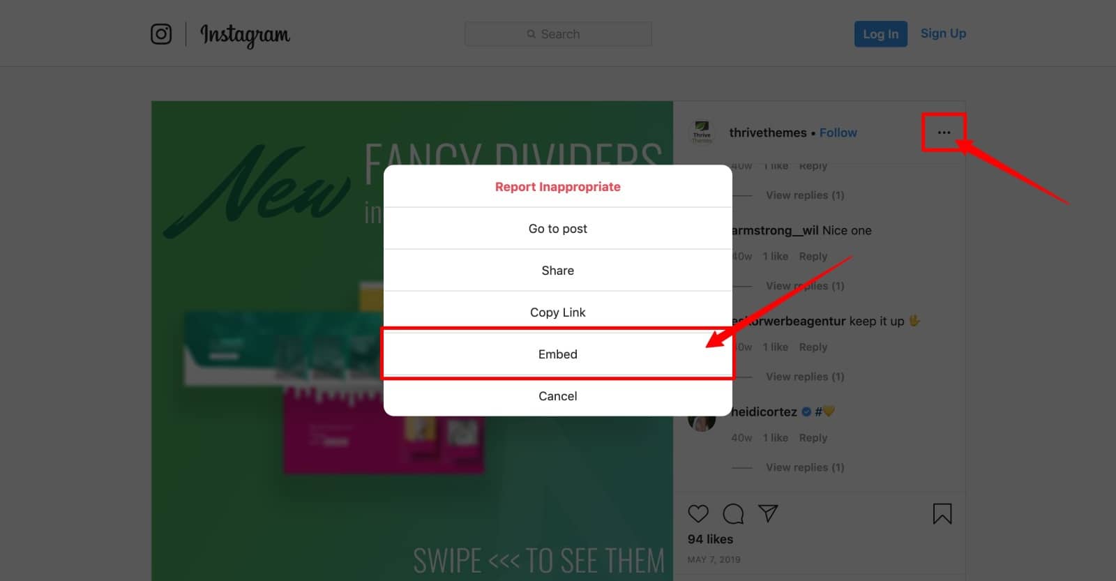
To find the HTML embed code for your Instagram post, click on the 3 dots icon, select the "Embed" option that appears and then copy the code Instagram then provides you with.
2. Paste that embed code into a Thrive Architect Custom HTML element:
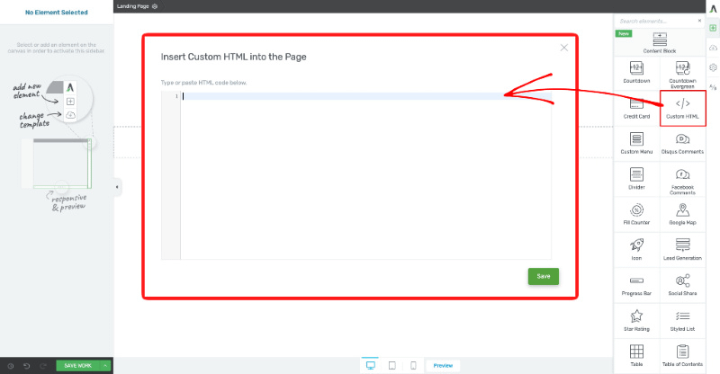
Drag & drop the Custom HTML element in the right sidebar into your Thrive Editor window and paste the Instagram post embed code into it.
3. And customize the Custom HTML element in the Thrive Editor to make it display properly within your content:
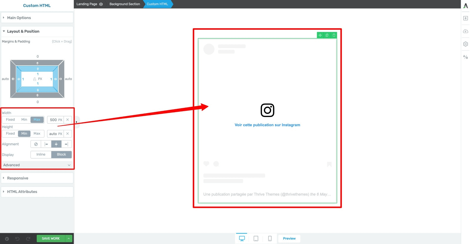
Finally, customize how the Custom HTML element displays onscreen via the Layout & Position tab options in the right sidebar.
The result is a great looking Instagram post displaying itself proudly within the middle of your own website's content:
You can use the exact same process to embed any Facebook post within your content as well:
What a great way to leverage the visual content you publish on your social media accounts on your own website as well!
Ready To Make Your Own Visual Content?
See how easy it is to add visual content to your website without having to go hunt around for photos and graphics all the time?
With the Thrive Architect features discussed in this post, you now have the power to get awesome visuals added to your upcoming content fast without having to spend extra cash or wasting lots of effort.
Take what you’ve learned and go add some visual awesome sauce to your next blog post or landing page right now.
And if you’ve got any questions about the Thrive Architect elements discussed in this post, make sure to leave us a comment below!


Great ideas!
However, your content blocks don’t seem to be growing at all. It seems very promising (this is exactly what people like me need!!), but as far as I can tell, you haven’t added any since its initial release. It still just says “Content Marketing Pack” with the same bunch of blocks. Do you have plans to grow this? It would be great to have content that is also designed for static content, not just blog posts.
Keep up the great work!
Thanks Andy!
Yes, we definitely have plans to grow the Content Blocks templates, but team resources are currently laser focused on the upcoming Thrive Theme Builder release.
I’ve learned great something from this Step By Step guide. I’ve using Thrive Architect for my personal blog. Thrive Architect has helped and saved me a lot of time for creating eye-catching blog post. Thank Thrive Team for your best effort in the web design and theme industry..
Thanks Rakib!
You’re mostly welcome Matt
There’s some awesome stuff in there Matt. Going to be reading, then re-reading to get some inspiration for my own sites.
Love these articles. Thanks again, Rowan.
Cheers Rowan! Glad to hear it was such a useful post for you.
These are great and I can see from afar how they would all look good but I struggle in knowing what best to use, how to use them and where to use them.
So I’d like to see a real step by step user case example of how you would use these and put them together to create a real page/post.
Thanks for the use case content idea Jonah! Until then, one of the best ways to get good at using these visual elements well in a post is with practice. The more blog posts and landing page content you create with Thrive Architect, the better it’ll turn out each time. Incremental improvement really compounds over time.
Thanks Matt. My intention was to create a reusable page/post template using these ….so that I can skip the practice. Hence adding those examples. Was hoping for a working example of these being put together to save me months of practising.
So awesome to see all these cool tools that I’ve been neglecting. Thanks for this, Matt!
You’re welcome Lexi!
Thank you Matt. I definitely spend too much time selecting photos.
The section on REVIEWS made me think… Have you considered creating come content about Schema markup?
Thanks Michael! Some Schema markup content may be on its way to the blog before too long…
I find the blocks very useful. I wish could use the blocks in a regular Gutenberg blog post, but other that the blocks do help make content scannable and visually appealing.
Glad to hear they’re so helpful for you Bakari! Since the Content Block templates are part of Thrive Architect, they can’t be used within the Gutenberg editor. I suspect the lack of content creation features in Gutenberg might be one of the reasons you started to use Thrive Architect instead…
There is so much you can do with these tools it’s difficult to know where to start. I think they need to be used sparingly.
Thanks Dermod! I recommend using these tools as you need them in your content.
3 years now using TT, Architect and all the plugins. The more I use it, the more I love it. Thank you for improving them and adding new features all the time! TTB will be a game changer.
Thanks so much Samphy!
The article is very informative, but I had to skip most of the stuff because dont like reading tutorials. I would have really learnt all that your are trying to convey in this article by watching a video of this. I am sure there are a lot of people out there that would learn more by watching a video tutorial that a reading tutorial.
Hi Debra, there are links to other blog posts and Thrive Knowledge Base articles in each of the sections discussed that have tutorial videos for you.
Great features that most of us are aware of. However, this breakdown does a great job at showing how useful they are as well as teaching us how to obtain the best results from each one.
Thank you for sharing, Matt.
Best regards.
I’m ashamed to say I had no idea ANY of this was possible and I’ve been a Thrive member for many years, right from their start. This is an excellent reference post which I have bookmarked. Thank you, Matt.
Hi Matt,
This is great stuff. I bet engaging visual content can improve user experience by multiple folds.
The only visual element I dislike in TA is the “Table of Content”. Why can’t TA add an option for expanding & collapsing it?
Hi Roger, the Table of Content element has been totally redesigned and upgraded with the option to expand & collapse now!
I’m wondering about the “click to tweet” box… Is there a way to make it “click to facebook it” (“share it”)?
Wow never thought we could customize our blog page or post this way also.
I just got some awesome ideas to redesign my blog post to give them refreshing look to engage my users.
I really liked how we can use fancy dividers and modify icons to make our blog content visually attractive.
Thanks for this awesome article.
Lots of great options to use and given they are different from the typical (stock photos with text on top), it will serve as a pattern interrupt and get the attention of the reader in a different way.