With Thrive Architect, you can add custom color gradients to any element that has a background. You can even create gradients as overlays on top of images or background patterns.
In this tutorial, we'll take a quick tour through all of the gradient features. Then, we'll take a look at the dos and don'ts of using color gradients in web design, so that your results will loo pro.
More...
Resources & Inspiration
In the video, I showed two sites where you can find inspiration and even copy the color codes of pre-designed gradients. Here are the links:
And here are some examples of gradients used well in web design:
Example 1: The Natural Light Effect
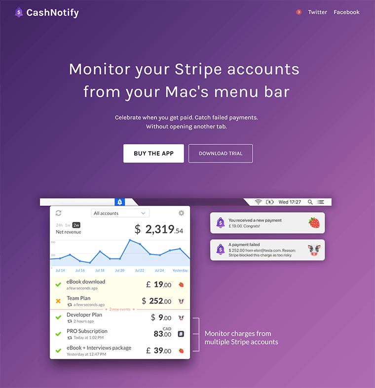
CashNotify, an app that integrates with Stripe payments, uses a gradient in the first section of their homepage.
We can learn an important lesson from the way this gradient is designed: it looks good because it looks natural. It looks like something we might encounter in the real world, if we were looking at a purple surface that has a soft light shining at it from the bottom right corner.
You can achieve this effect with almost any color, if you do two things:
- Pick your main color, then shift the color towards a lighter tone for the second point in your gradient. You can also shift it slightly towards a yellow hue, to create a natural light effect.
- Keep the difference between the two colors in the gradient small.
Conversely, this explains why gradients with a big difference between the color points tend to look a bit disturbing: they look unnatural.
Example 2: Opacity Gradient for Readability
Quuu Promote has an attention grabbing top section on the homepage. The gradient overlayed on the background image goes from opaque to semi-transparent. This creates a visually pleasing effect and also provides added contrast in the background area of the logo and top menu.
Example 3: Bolder Colors
Since their redesign in 2015, Asana have made gradients part of their brand identity. They use gradients on their homepage and other pages of the site, as well as throughout the user interface of the product. The design doesn't shy away from some bolder gradients as well.
Example 3: Subtle, Light Gradients
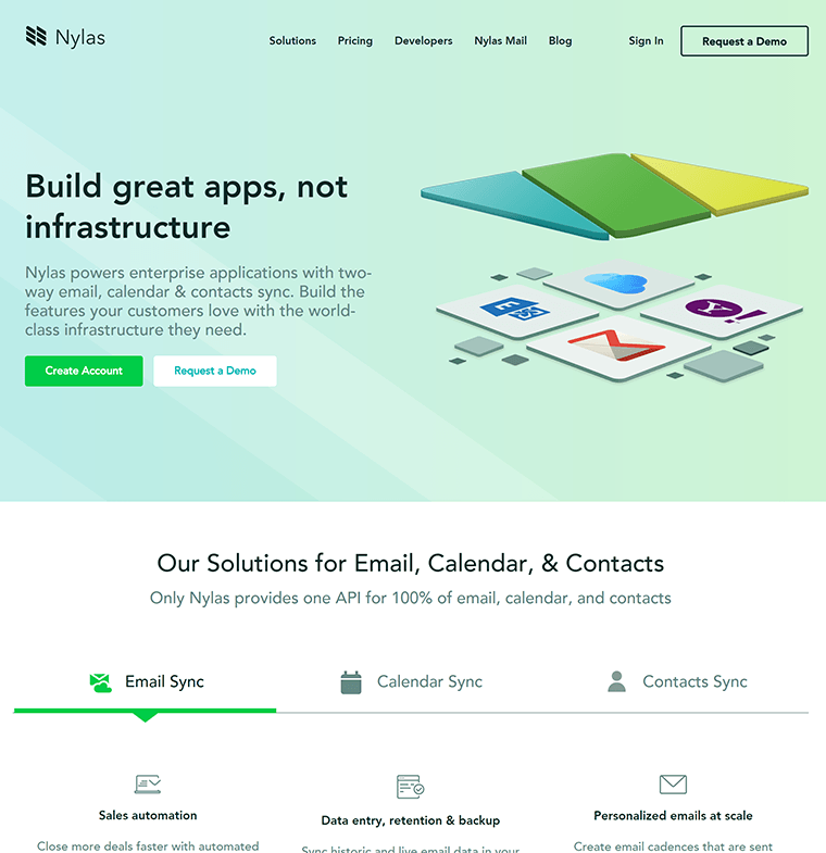
The Nylas homepage uses gradients combined with geometric shapes in several places. The top background gradient on the homepage uses colors light enough to provide contrast for the dark text on top. This is particularly difficult to pull off without the colors looking flat or dull (you'll notice that usually, gradients are darker, with light text on top).
Discover More
If you like what you've seen so far and you've got an appetite for more, these will interest you:
- 5 Design Rules for Non-Designers - this blog post gives you a simple set of rules you can follow to ensure that all your design work looks great, even if you aren't a designer.
- 25 Free Design Sources - our master list of places to get free images and other design resources to use on your sites.
- How to Craft Featured Images that Support Your Brand Identity - this free Thrive University course teaches you how you can get a unique look for your blog posts that creates a consistent brand image - without having to hire expensive designers.
- How to use the gradient effect to create a good looking Hero Header Image - In this tutorial you'll discover how to create a header image for a personal brand and the gradient option is used to create a real WAW-effect.
I hope you enjoyed this post! If you have any questions or suggestions for other design-related or Thrive Architect related tutorials you'd like to see in the future, let me know by leaving a comment!






Thanks for the advice on gradients and the very useful resources Shane. I have not tried it yet but was thinking of doing this on the background of my web site. Can you do a multiple select of all the separate colour points together and adjust the overall opacity of the gradient and them globally as well as individually ? It would make sense to have a balance slider?
I like how you showed how to make text stand out more using the gradient feature. This is often a challenge with background images and a beautiful alternative to adding a darkened background box behind the text. My love for Thrive Architect grows more and more each day!
Thank you, Chik! Happy to know you like the tutorial!
Stripe can also be a great example for gradients
They have a very fancy gradient background on their site right now, yes. 🙂
Shane, thanks a lot for the tips, I’ll start exploring this area better, I think it’s very important for conversion as well.
Thank you for your comment, Mirella! Glad you enjoyed this content. 🙂
awesome post. Thank you so much.
Thank you, Sabina!
This is such a helpful video – thank you Shane
Thank you, Paul! I’m happy to know you liked it.
Great work and advice thanks Shane!
Thank you Makere! Glad you liked it. 🙂
Another wonderful tutorial! You’re the master! Thank you so much. – Kevin
Thank you for your comment, Kevin!
Gradients are really cool, I use them all the time in my designs!