

TL;DR: What a Landing Page Is and How to Build One
A landing page is a standalone web page with one job: turning one visitor into one specific action. This guide covers what landing pages are, how to structure one, how to write the copy, and how to keep improving it once it's live, with two real pages torn down along the way.
- Focus is everything. A landing page must have one single job. Remove all navigation and distractions. If it doesn't support the goal, cut it.
- Strategy before design. Great design won't save a weak strategy. Use the 3P Conversion Framework™ (Purpose, Psychology, Performance) to structure your page before you think about colors.
- Copy does more work than design. The words on your page, especially the headline and CTA, will make or break your conversion rate. Most pages fail at copy, not layout.
- Test assumptions, not colors. A/B test high-impact elements like headlines and CTAs. If you aren't testing, you're guessing, and guessing is expensive.
So someone told you that you need a landing page, or the term keeps showing up in every marketing tool you try, and now you're wondering what it actually means. Is it just any page someone lands on? Your homepage? Something else entirely?
Here's the short answer:
A landing page is a standalone web page built for one single goal: getting the visitor to take one specific action, like joining your email list, booking a call, or buying one product. It works differently from your homepage, and that difference is where most of the conversion power hides. I'll show you exactly how the two compare in a minute.
Why does this one page type get so much attention? Because it's where marketing effort either pays off or quietly leaks away. Unbounce's 2024 Conversion Benchmark Report, which analyzed billions of visits across real landing pages, found the median conversion rate across all industries is 6.6%. The typical page loses more than 93 visitors out of every 100, and the losses come from strategy rather than design. The design is fine. The offer is reasonable. What's missing is a clear system for turning attention into action.
That's actually good news if you're starting from zero. The businesses losing those visitors already spent the money and built the pages. You get to learn the system first: what a landing page is, when to use one, how to build one step by step, and two real pages torn down so you can watch the principles work in the wild.
Ready to build pages that actually convert?
If you're tired of relying on expensive developers or clunky, slow platforms, you need a tool that puts conversion strategy first. That's why I'm recommending Thrive Architect. This tool lets you design and deploy high-converting landing pages quickly, without writing a single line of code.
Don't believe me? Check out my full Thrive Architect Review: This Is The Real Take You Need before you commit.
So, What Is a Landing Page?
A landing page is a standalone web page created for a single marketing goal.
It's the page someone lands on after clicking a link in an ad, an email, a social post, or a search result. Unlike the rest of your website, a landing page is not trying to do multiple things at once. It exists to guide a visitor toward one specific action.
That action might be:
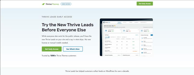
This landing page we created for an Early Access event for Thrive Leads is an example you can study.
Landing Page vs. Homepage: What's the Difference?
Landing pages and homepages serve very different roles, and this difference is why sending paid traffic to your homepage is often a waste of money. You wouldn't send a dinner guest to the middle of your house and tell them to figure out where the kitchen is.
Feature | Landing Page | Website Homepage |
|---|---|---|
Primary Goal | One focused conversion (sign-up, purchase, booking) | Multiple goals (branding, navigation, exploration) |
Navigation | Minimal or removed to eliminate distraction | Full navigation menu and site links |
Audience | Highly targeted campaign traffic with specific intent | Broad, general audience |
Message | Tailored to one offer and one specific pain point | General overview of the business and offerings |
Role | Drives immediate, focused action | Supports long-term exploration and brand building |
A homepage is a central hub. It introduces your brand and helps visitors explore what you offer. A landing page is a focused conversation. It meets visitors at a specific point in their journey and guides them toward a single decision. (Don't neglect that hub, though. Here's how to create a homepage in WordPress that makes a strong first impression.)
Best practice: always remove the main navigation bar from your landing pages. This single action dramatically increases focus and reduces the chance of visitors leaving before converting.
The 3P Conversion Framework™: Strategy for Predictable Results
I'll admit something first. I used to treat landing pages like mini-websites, packed with navigation menus and multiple calls to action. The result was confused visitors and weak conversions. I felt like I was running a digital charity, giving away traffic for free.
I developed the 3P Conversion Framework™ after I stripped everything back and focused on what actually drives action. It's the lens for everything in this guide.
What is a Landing Page's Structure?
When I talk about the Psychology pillar, I mean structuring the page so it answers questions and overcomes objections in a logical order. A great landing page reads as a narrative flow, and the flow runs through six elements.
1. The Hero Section (Above the Fold)
This is the most important real estate on your page, and you have about three seconds to prove you're relevant. The headline must be clear, benefit-driven, and match the source of the traffic. Don't be clever; be clear. Under it sits your value proposition (one or two sentences on why they should care right now), a visual that shows the product or the result, and the CTA or form itself. Avoid generic stock photos that look like they came free with your operating system.
2. Benefit-Driven Copy (The Argument)
Once you've hooked them, build the case. People don't buy features; they buy solutions to their problems. Start with the pain point, show you understand it, then introduce your offer as the direct solution. List your features, but immediately translate them into benefits. And keep it scannable, because nobody reads long blocks of text on the internet. They scan for relevance.
3. Social Proof and Trust Elements
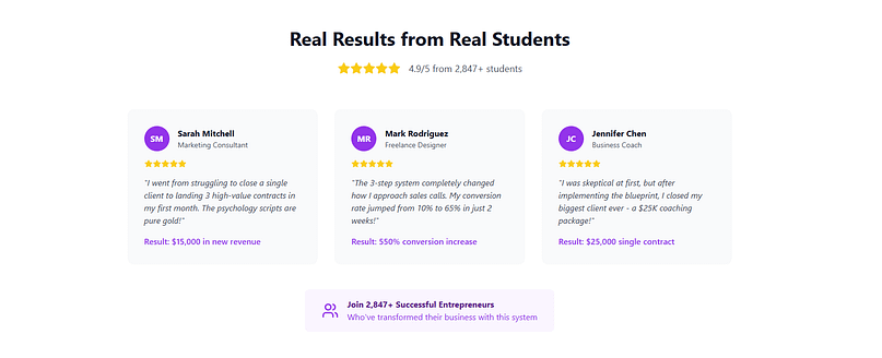
This is where you prove you aren't making things up. Use specific, authentic testimonials that address real objections ("I made $5,000 in the first month" beats "This product is great"), logos of companies or media you've worked with, and short case-study summaries that show the journey from problem to result.
4. The Lead Capture Form
The form is the gateway to conversion, and the general rule is that the higher the value of the offer, the more information you can ask for. For a free PDF, ask only for the email. Every extra field reduces conversions. Add a small privacy line near the form confirming you won't spam them; it's a tiny psychological barrier reducer.

5. Clear Call-to-Action (CTA)
Your CTA button should be the most visually distinct element on the page. Skip "Submit" and "Click Here" and use action language that names the outcome: "Get My Free Guide Now," "Start My 14-Day Trial," "Book My Strategy Session."
6. Footer (The Necessary Details)
Even a distraction-free page needs a minimal footer with your Privacy Policy, Terms of Service, and a contact link. It builds trust, and it's often legally required.
Landing Page Example in The Wild (What You Can Learn)
The anatomy above is theory until you see it working on a page that real money flows through. So let me walk you through a live page that's doing a great job. It wasn't built with our tools and that's fine. The principles are the point, and they transfer directly to anything you build in Thrive Architect.
Marie Forleo's Time Genius Page: a Sales Page That Earns Its Length
If the Shopify page shows what ruthless brevity looks like, Marie Forleo's Time Genius page shows the opposite end of the spectrum done right: a long-form sales page for a paid program, and every extra scroll is there to earn the higher ask. When I checked in September 2026, the hero was one line ("Learn to live distraction-free and be joyfully productive, on your terms"), one primary button ("Get Time Genius Now"), and almost no navigation. For a page selling a premium course, that restraint takes discipline.

Then the page walks the exact narrative flow from the sales-page type in this guide. It names the problem, and I love that she gives it a name you can hold onto: the "Time Stress Trap." It promises outcomes rather than features ("2-5X your Creative Output," not "5 training modules"). And the testimonials are the kind our social proof section asks for: specific and concrete, like "With Time Genius, I finished my novel in two weeks" and "I now have a fresh 20 hours of focus time." Nobody writes "great course, five stars" on this page, because vague praise converts nobody.
What I'd steal is the sequencing. Name the problem, promise the outcome, prove it with specifics, then ask. If your page sells anything over impulse-buy prices, that order is the whole game, and it's the same structure you'll find in the long-form sales templates in Thrive Architect.
If you want more examples in this vein, I've collected 8 hero sections that work and a full set of lead generation landing page examples with the same kind of commentary.
How to Create a Landing Page (Step by Step)
Everything above tells you what a landing page needs. Here's the order I'd actually build one in, because sequence matters more than people expect. Get the early steps wrong and no amount of design polish at step five will save you.
Step 1: Define the One Job
Decide the single action this page exists to produce: an email address, a booked call, a sale. Write it down before you open any tool. This is the Purpose pillar, and it decides everything downstream.
Step 2: Nail Down the Offer
For lead capture pages, that means a lead magnet worth trading an email for. "A free guide" is not a lead magnet. "A 10-step checklist for writing Google Ads copy that converts for local service businesses" is. The more narrowly it solves a concrete problem for a specific person, the higher the page converts. A quick test I like: if you can describe it in a sentence that makes someone say "I could actually use that right now," it's specific enough.
Step 3: Pick the Page Type
Match the format to the ask. The table in the next section covers the three main types, but the short version is that free offers get short squeeze pages, priced offers get click-through or long-form sales pages, and the trust deficit decides the length. The bigger the gap between how much visitors trust you and how much you're asking for, the more copy you need.
Step 4: Write the Copy Before You Design
Start with message match. Your headline must mirror the ad, email, or link that brought the visitor, precisely, because the visitor clicked on a specific promise. A reliable headline formula is specific outcome + specific person + objection removed: "Build a WordPress landing page that converts, no coding required." Then translate every feature into a benefit. The test is to read the feature and ask "so what?" The answer is the benefit.
And write simpler than feels natural. Unbounce's 2024 data found pages written at a 5th to 7th grade reading level convert at 11.1%, while professional-level writing converts at 5.3%. Simple copy literally doubles the sophisticated stuff. When a sentence on your landing page sounds impressive, that's your cue to rewrite it.
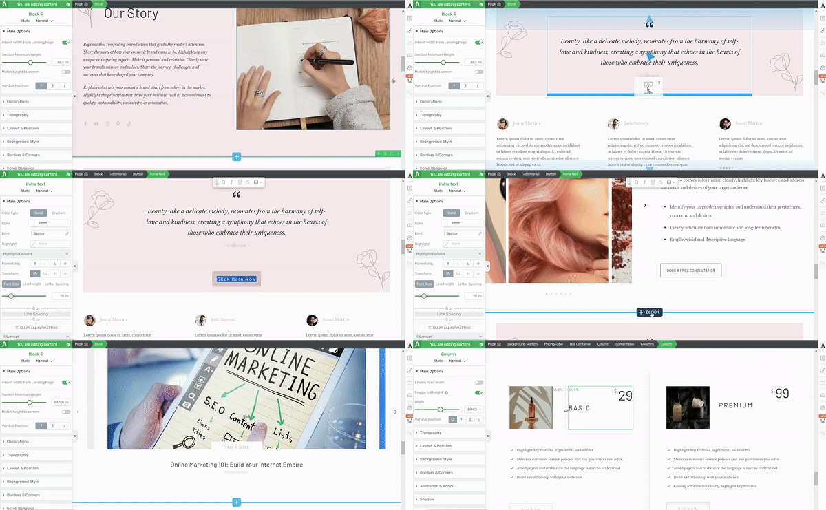
Step 5: Build the Page
Assemble the six anatomy elements in order: hero, benefits, proof, form, CTA, footer. Strip the navigation.
This is where I use Thrive Architect, because the conversion-focused templates already follow this structure and I can customize everything by dragging things around. Whatever tool you use, design mobile first: in Unbounce's 2024 data, 83% of landing page visits happened on phones, yet desktop converts 8% better. That gap exists because most pages are designed on a laptop and merely tolerated on a phone, and it's your opportunity, because your competitors haven't closed it either. Single-column layout, tap-friendly buttons, the CTA visible without scrolling, and every image compressed.
Step 6: Don't Waste the Thank You Page
The page a visitor sees after converting is the highest-intent moment in your entire funnel. They just said yes. A good thank you page confirms the action ("You're in. Check your inbox for the download link."), delivers the promise immediately, and suggests one clear next step: a related resource, a low-priced introductory offer, or an invitation to book a call.
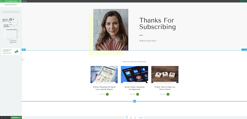
What it should never be is blank. If you want to run a time-limited offer at that moment, Thrive Ultimatum is built for exactly that.
Step 7: Publish, Measure, Test
Connect your form to your email service (this is what Thrive Leads handles on my pages), publish, and start collecting a baseline.
Then test the high-impact variables one at a time: headline framing, CTA copy, form length, image vs. video. Skip the button-color experiments; they're vanity tests. Two pitfalls to dodge: don't change three things in one test, because you won't know which change did the work, and don't stop a test after 48 hours, because that's usually just noise. With Thrive Optimize the A/B test lives inside the builder, so going from "I have a test idea" to "the test is live" takes an afternoon, not a sprint.
Want the whole workflow in one place?
Everything in the seven steps above (the templates, the drag-and-drop build, the opt-in forms, and the A/B tests) lives inside Thrive Suite. Thrive Architect handles the build, with conversion-focused templates for every page type in this guide. You can browse them in the template gallery before you commit to anything. And Thrive Optimize runs your A/B tests right inside the builder, so you're not paying monthly for separate testing software. If you'd rather start smaller, grab Architect on its own and add the rest when your pages start earning it.
The Three Landing Page Types (and When to Use Each)
Purpose dictates structure. You wouldn't use a short, sharp squeeze page to sell a $5,000 coaching package, and you don't need a 4,000-word sales letter to give away a checklist. Here's how the three main types divide the work.
Type | Use when... | Key feature |
|---|---|---|
Lead capture page (squeeze page | You're building your email list with a free, high-value offer | Extremely short form, often just email, placed above the fold |
Click-through page | You're selling a product, trial, or membership that needs context before the price tag | No form; the CTA says "Continue," "See Pricing," or "Start Trial" |
Long-form sales page | You're selling high-ticket offers that need trust, explanation, and proof | Narrative flow: problem, agitation, solution, proof, offer, guarantee, CTA |
Shopify's free trial page from the teardown above is a close cousin of the click-through type: the whole page exists to earn one click forward. And if you're building the lead capture kind, the lead magnet does most of the converting, so pick it before you design anything.
What Counts as a Good Conversion Rate (Real Benchmarks)
The median landing page conversion rate across all industries is 6.6%, according to Unbounce's 2024 Conversion Benchmark Report. Industry medians in that data range from 3.8% to 12.3%, so before you judge your page, check where your industry actually sits.
Here's why I love working from a real median instead of a vibes-based target. If your page converts at 7%, you're beating most pages on the internet, and you can stop chasing a mythical 15%. If you're at 2%, you know there's genuine headroom, and the math on fixing it is dramatic: moving from 1% to 2% doubles your results from the exact same traffic and the exact same ad spend.
The goal isn't a magic number. The goal is to beat your own baseline consistently, with the industry median as your reality check.
Where the Traffic Comes From (and Why It Changes the Page)
A landing page with no visitors converts no one, but not all traffic is worth the same. Unbounce's 2024 data puts numbers on it: email is the highest-converting channel at 19.3% on average, converting 77% better than paid search and 60% better than paid social. The pattern behind those numbers is trust. The warmer the audience, the higher the conversion.
So let the source shape the page. Email traffic already knows you, which means shorter pages and bolder offers work. Paid traffic is cold and unforgiving, which makes message match everything; if you run several ad angles, clone the page and match each one. Social traffic should link straight to the landing page, because every extra click is a dropout point. And retargeting visitors have seen the pitch once, so show them a different angle, like a testimonial or a deadline, rather than the same page again. Thrive Architect makes the cloning part painless: duplicate the page, swap the headline, point it at the campaign.
Frequently Asked Questions About Landing Pages
The same handful of questions comes up every time I talk about landing pages, so here are the direct answers. Most of these are covered in more depth earlier in the guide, but these versions are the ones you can lift, quote, and act on right away.
What is a landing page?
A landing page is a standalone web page built for a single marketing goal. It's where someone arrives after clicking a link in an ad, an email, or a social post. Unlike a homepage, a landing page has no navigation menu, no competing links, and no secondary objectives. Everything on it is designed to guide the visitor toward one specific action: signing up, downloading, buying, or registering.
What should a landing page include?
A landing page should include six elements: a headline that matches the ad or link the visitor clicked, a short value proposition, one supporting visual, social proof (testimonials, logos, or review counts), a lead capture form or a single call-to-action button, and a minimal footer with legal links. Just as important is what it should not include: no navigation menu, no competing links, and no second goal.
What is the best structure for a landing page?
The highest-converting structure runs in this order: hero section (headline, value proposition, and visual above the fold), benefit-driven copy, social proof, the form or CTA, and a minimal footer. Long-form sales pages expand the middle with objection handling and more proof, but the order holds. The structure works because it answers the visitor's questions in the sequence they naturally ask them: what is this, why should I care, can I trust you, what do I do next.
What is the best tool to create a landing page?
I use Thrive Architect, and my honest reason is that it's a drag-and-drop WordPress builder with conversion-focused templates and A/B testing built in through Thrive Optimize, so building and improving happen in the same place. If you're not on WordPress, dedicated builders like Unbounce or Leadpages do the job. The tool matters less than whether you can build, publish, and test a page yourself without waiting on anyone.
Can I make a landing page for free?
Yes, within limits. Most dedicated landing page builders offer free tiers with their branding on your page and caps on traffic or pages. If you already have a WordPress site, you can build one with the free block editor, though you'll assemble the conversion structure by hand. My take is that free works for testing an idea, but once a page is making you money, the constraints (branding, no A/B testing, limited templates) cost more than the tool does.
What is a good example of a landing page?
Two live ones are torn down earlier in this guide: Shopify's free trial page, a lead capture page that pairs a one-field form with social proof at the exact moment of doubt, and Marie Forleo's Time Genius page, a long-form sales page that names the problem, promises outcomes, and proves them with specific testimonials before asking for the sale. Both work for the same reason: one page, one job, no distractions.
What is a good landing page conversion rate?
The median landing page conversion rate across all industries is 6.6%, based on Unbounce's 2024 Conversion Benchmark Report, with industry medians ranging from 3.8% to 12.3%. Lead capture pages offering something free tend to convert higher than sales pages, and warm email traffic converts far better than cold paid traffic. The most useful benchmark isn't the industry number, though. It's your own baseline. Once you have a control page, measure improvement against that.
What are common landing page mistakes?
The five I see most often are keeping the site's navigation menu on the page (it leaks visitors), a headline that doesn't match the ad that brought them, copy that lists features instead of benefits, fake urgency like countdown timers that reset, and slow load times, especially on mobile. Every one of them is fixable in an afternoon, and the navigation menu is the one I'd fix first.
What is message match on a landing page?
Message match is the alignment between the ad, email, or link that brought a visitor to your page and what they see when they arrive. If your ad promises a free content calendar template, your landing page headline should reference that template, not a generic "grow your business" statement. When the message matches, the visitor immediately knows they're in the right place. When it doesn't, they assume they've been misdirected and leave.
Should I use a long or short landing page?
The right length depends on the trust deficit, which is the gap between how much the visitor trusts you and how much commitment the offer requires. Short pages work when the offer is free, the audience is warm, and the ask is low-risk. Longer pages are needed when the offer costs money, the visitor doesn't know you yet, or the product requires explanation before someone will act.
Final Thoughts on Your Landing Page Strategy
Building a high-converting landing page comes down to applying the 3P Framework consistently: define a clear Purpose, design with human Psychology in mind, and commit to continuous Performance improvement. If you start with clarity, your audience will reward you with conversions.
The next smart step is to audit your existing pages. Pick the one that's underperforming and ask three questions. Does this page follow the "One Page, One Job" rule? Is the copy focused on benefits? What's the single highest-impact element I can A/B test right now? If you want a model to compare against, scroll back to the Allbirds and Shopify teardowns and hold your page next to them. The gaps will announce themselves.
And if you're ready to start building landing pages, then check out Thrive Architect here.


