TL;DR: how to create a website for a non-profit organization
If you’re here because you want to know how to create a website for a non-profit organization, this guide walks you through the exact process I use when I’m helping nonprofits build a site that’s clear, credible, and designed to inspire action. I cover the platform choices, the must-have pages, the donation tools, and the simple structure that makes your nonprofit website feel trustworthy and easy to navigate.
Here are the three big takeaways I want you to keep in mind as you read:
- Your platform choice matters more than you think.
It affects your budget, your flexibility, and how easily you can update your site or run donation campaigns. - A nonprofit website works best when it prioritizes clarity and conversion.
When your mission and impact are easy to understand, people are far more likely to support your work. - You can build a professional, high-impact site on almost any budget.
With free tools, nonprofit discounts, and a simple strategy, you can launch quickly and grow over time.
If you’re someone who likes to skim before diving in, this guide expands on each point with practical steps you can apply immediately — no tech expert required.
Want to learn how to create a website for non-profit organization all on your own? Well…
You're going to need more than a couple of “nice-looking” webpages if you want people to donate, volunteer, or care enough to come back.
People don’t give to nonprofits just because the logo is clean or the homepage scrolls smoothly. They give when they feel something — and when your nonprofit website makes it easy to act on that feeling.
I’ve worked with nonprofits on both sides of the spectrum. Some didn’t care about the budget — they just wanted something thrown together quickly. It got done… but so did their credibility. Others went all-in on design: bold colors, gorgeous photos, sleek pages. And still, their donation page sat untouched because the site looked great but felt completely hollow.
The mission was there but the website didn’t do it justice.
What You’re Up Against: Key Challenges
- 60–70% of visitors bounce after viewing just one page — meaning your message isn’t landing.
- 57% of nonprofit traffic comes from mobile, but 75% of online donation revenue happens on desktop — so if your nonprofit website builder isn’t responsive and strategic, that’s money lost.
- The average donation form converts at only 12%, and that’s if people stick around long enough to find it.
- The typical organization sees 12,000+ visitors per month, yet most struggle to generate recurring donations or meaningful action.
This guide is here to help you build a nonprofit website that doesn’t just look nice — it works. Whether you’re trying to create a fundraising site from scratch, fix what’s not working, or finally turn all that traffic into volunteer signups and email subscribers, this is your blueprint.
Most Non-Profit Websites Aren’t Working — Here’s Why Yours Might Not Be Either
I’m always up for donating to a worthy cause – and there are a lot of them out there, today. But it makes me sad to say that a lot of non-profit websites are helping themselves out.
They’ve got buried CTAs no one sees, vague messaging that doesn’t move anyone, and donation forms that feel like tax documents. Some were clearly built for “presence” — not purpose. And when that happens, even the best missions get lost in the noise.
Before you come for me, I’m not the only one to think so.
Roughly 60% of donors abandon the donation process before completing it. Which means you’re losing a lot of potential support and it’s because your website isn’t building trust or credibility.
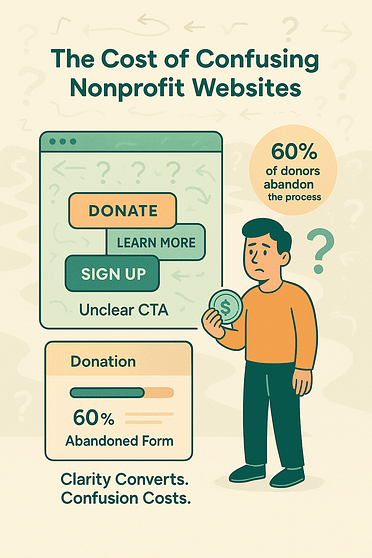
It doesn't matter if you're using a basic non-profit website builder or if a well-meaning volunteer threw something together. The outcome is often the same: a site that looks okay on the surface but doesn't actually drive results.
Here are a few red flags I see constantly when auditing nonprofit websites:
And don’t get me started on broken sites still running on platforms like Blogger or free WordPress themes with no customization.
A Costly Oversight
I once worked with a friend that hadn’t touched their non-profit fundraising site in over three years. They couldn’t figure out why nobody was donating. Turns out, the site was still built on Google Blogger — complete with broken images, overlapping text, and a donation button that looked more like a quiz than a payment gateway. A textbook case of “set it and forget it”… and it was quietly costing them credibility and contributions.
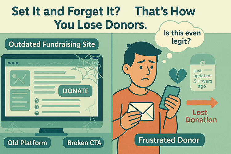
And that’s really the problem:
If your nonprofit website isn’t guiding people toward action — whether it’s giving, signing up, or sharing your mission — then it’s just a sunken cost with nice colors. Visitors come, they glance, they bounce. No connection. No conversions. No impact.
The good news? This is fixable.
Next up, we’ll break down how to build a nonprofit website that doesn’t just show up — it steps up. One that converts, connects, and gives your cause the online presence it deserves.
Your Step-by-Step Guide to Building a Non-Profit Website
Building an effective non-profit website can feel like a big project, but it doesn't have to be overwhelming. I like to break it down into manageable steps. Think of this as your blueprint, guiding you from the initial idea to a fully functioning site that supports your mission.
Step 1: Define Your Mission & Goals
Before you even think about colors or buttons, you need absolute clarity on why you're building this website and what you want it to achieve.
- What's your primary purpose? Is it to raise funds, recruit volunteers, educate the public, or all of the above? Pinpoint your top 1-2 priorities.
- Who is your audience? Donors, volunteers, beneficiaries, community leaders? Understanding them helps you tailor your message and design.
- What actions do you want visitors to take? Donate, sign up for a newsletter, volunteer, share a story, attend an event? Be specific.
- How will you measure success? More donations? Increased volunteer sign-ups? Higher email list growth? Knowing this upfront helps you track progress later.
Step 2: Choose Your Platform: Where Will Your Website Live?
This is a key decision that impacts your budget, flexibility, and ease of management. Don't rush this. You need something you can confidently manage, that won't break your budget, and that can grow with your organization.
I've put together a comparison of the platforms I recommend most often. These are the ones people typically look for when searching for the "best website builder for non-profits" or "non-profit website platform."
Platform Comparison: Best Options for Nonprofits
Platform | Best For | Price Range | Key Advantage | Key Limitation |
|---|---|---|---|---|
Nonprofits wanting maximum flexibility and control | $50–$500/year | Infinitely customizable with thousands of themes and plugins (like GiveWP for donations) | Requires more technical knowledge or a developer | |
Beginners who want an all-in-one solution | $0–$300/year | Extremely user-friendly with drag-and-drop editing and built-in features | Less flexibility for advanced customization | |
Organizations prioritizing beautiful design | $144–$408/year | Award-winning templates that are mobile-responsive out of the box | Limited third-party integrations | |
Membership-focused nonprofits | $600–$3,000/year | Built-in member management, event registration, and payment processing | Higher cost, niche focus |
My recommendation: For most nonprofits, WordPress.org offers the strongest long-term value. It’s flexible, scalable, and supported by a huge ecosystem of nonprofit-friendly tools. But if you need something fast and easy — something you can set up in an afternoon without touching code — Wix is a fantastic place to start.
Both give you the freedom to grow, adapt, and build the kind of website that truly supports your mission.
Before you jump into choosing a platform, it can help to step back and map out the structure and goals of your website as a whole — especially if you want every page to support your mission clearly and strategically.
👉 Here’s a practical guide on how to plan a website that gets real results.
Budget-Friendly Options and Free Resources
One thing I always remind nonprofit teams is this: you don’t need a huge budget to build a website that does its job well. In fact, most organizations I’ve worked with start small—using free tools, discounted software, and simple setups—and then scale as their visibility and funding grow.
There are so many companies that genuinely want to support nonprofit missions, and they offer free plans, affordable upgrades, and even grants if you know where to look. So if you’re working with limited funds (or no funds at all), you still have plenty of options.
Here are some of the most helpful budget-friendly tools I point nonprofits to:
Free Website Builders
If you're just getting started and need something simple:
- IM Creator is one of the few builders that’s completely free for nonprofits once you complete their verification process.
- SeedProd offers a free plan you can easily start with to build your nonprofit website.
- Wix and Weebly offer free plans too — they come with platform branding, but they’re perfectly fine for small organizations or early-stage projects.
Nonprofit Discounts and Grants
These resources can save you hundreds of dollars a year:
- Google for Nonprofits gives you free access to Google Workspace (email, Docs, Drive, and more).
- TechSoup offers deeply discounted software — everything from design tools to productivity apps to hosting services.
- Some hosting companies, like DreamHost, offer free or heavily discounted hosting for verified nonprofits.
Free WordPress Tools
If you’re building on WordPress, you can still keep costs low:
- Themes: Free themes like Kadence, Astra, and OceanWP offer beautiful nonprofit-friendly templates.
- Plugins: Tools like WP Charitable (donations), The Events Calendar (event listings), and WPForms (contact forms) all have free versions that are more than enough for most organizations.
Typical Cost Breakdown
This is the simple breakdown I usually share:
- DIY with Free Tools: $0–$50/year (domain only)
- DIY with Premium Tools: $100–$500/year (domain, hosting, premium plugins/themes)
- Professional Build: $1,000–$10,000+ depending on custom needs
No matter where you’re starting from, the goal is the same: build something you can manage today and easily scale tomorrow as your nonprofit grows, raises more funds, and expands its mission.
And if you want to make sure you’re investing your limited budget in the right places, it helps to know which website features actually move the needle for usability and trust.
👉 See the must-have website features every organization should prioritize.
PLUS, if you do choose WordPress, having a clear, beginner-friendly roadmap for building your site can make the whole process far less overwhelming.
👉 Here’s how to build a WordPress website that doesn’t look DIY.
So What Does a High-Converting Nonprofit Website Actually Look Like?
Look, you don’t have to pull out all the stops (and break your limited budget) to get the right kind of non-profit fundraising site.
You don’t need the flashiest homepage or the trendiest color palette. Your focus should be on building a site that earns trust, removes friction, and makes it easy for someone to say, “Yes, I want to support this.”
That kind of site doesn’t happen by accident. It’s intentional — built to connect, guide, and convert.
In this section, we’ll break down what actually makes a nonprofit website effective — and how you can build one that brings in more donations, more signups, and more support for your mission.
Here’s what this section covers:
How to build a nonprofit website that’s more than just informational
How to create a donation page (and the key elements of this page)
Choosing the right nonprofit website builder (without overcomplicating it)
What to look for in a donation plugin for WordPress
How to connect with a simple CRM for nonprofit websites
Design principles that work across nonprofit website templates
Practical nonprofit website design tips that actually increase engagement
The tools that make it easier to accept donations online — and keep supporters coming back
Step 1 – Start With One Clear Conversion Goal
Before you build anything — the homepage, the donate button, the volunteer form — you need to know what your website is actually for.
Most nonprofit websites try to do too much at once. They welcome visitors, share a mission, announce events, collect donations, recruit volunteers, highlight blog posts, show board members, and… lose people in the first ten seconds.
Let’s fix that.
Pick one primary goal for your site. Just one.
It could be:
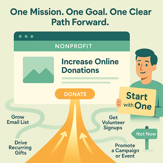
Everything else can support that goal — but your homepage, layout, and CTAs should point in the same direction.
Chipo's Tip: Treat Your Homepage Like a Funnel
I know people say this a lot, but your homepage isn’t some kind of “digital welcome mat.”
It has a much bigger job because it’s the entry point to your non-profit fundraising site — and it should be guiding people toward your core action from the first scroll.
That means:
- One strong hero section tied to your mission
- A clear call-to-action button (Donate, Join, Subscribe)
- A visual path that moves people forward, not sideway
If you’re using a nonprofit website builder or working with a designer, make sure this focus is baked into the first fold — not buried halfway down the page.
Once you have that goal locked in, every decision becomes easier: what content to include, how to create your donation page, which CTAs to use, and even what kind of WordPress donation tools you might need.
Start here — and you’ll avoid the “pretty but passive” trap so many nonprofit sites fall into.
Step 2 – Choose Tools That Put You in Control (Not in a Corner)
One of the most important decisions you’ll make — right after clarifying your website’s goal — is picking the right tools to build and manage it. And I don’t mean the most expensive or ones with 1000 different plugins to achieve basic site function. I mean tools that actually make your life easier, day in and day out.
If you’re going to build a nonprofit website that performs and lasts, your tech stack needs to:
Chipo's Insight: What to Look for in Your Tech Stack:
- A visual nonprofit website builder that doesn’t require coding or outside help
- A reliable donation plugin for WordPress that lets you create unlimited campaigns and accepts recurring donations
- Mobile-optimized nonprofit website templates that look good and load fast
- Flexible tools that integrate with a CRM for nonprofit websites
- Easy customization without needing a developer every time you want to update a page
What I Personally Use (and Why)
For nonprofits that want full control without the technical stress, I always recommend starting with WordPress for nonprofits. From there, these two tools have been my go-to combo:
- Thrive Suite – It’s the ultimate WordPress toolkit that lets you create pages, sign-up forms, and layouts designed to convert — not just “look good.”
You can run A/B tests, build email forms, and design campaign landing pages in minutes. It’s one of the best plugins for nonprofits who want performance and ease of use. - WP Charitable – A clean, powerful WordPress donation plugin made specifically for nonprofits. You can create donation campaigns, set custom giving amounts, accept recurring donations, and never worry about hidden platform fees. Plus, it integrates beautifully with your existing CRM or email tool.
Together, Thrive Suite + WP Charitable give you a solid foundation to accept donations online, grow your supporter base, and manage everything from one flexible system.
Pick tools that grow with you — not ones you’ll have to replace in six months. The right setup will make every piece of your website work harder for your cause.
Coming up next: how to build a homepage that leads with purpose, not just pretty pictures.
Step 3 – Build a Homepage That Works Like a Funnel Entry Point
Think of your homepage as the front door to your nonprofit’s online universe (dramatic, I know, but stay with me) — but instead of just welcoming visitors, it should guide them straight to action.
Most nonprofit websites try to say too much upfront. But the truth is, people don’t scroll because they’re curious — they scroll because something caught their attention. That’s your job.
Let’s start with the first impression:
Above-the-Fold Checklist:
The content people see before they scroll should do three things:
- Headline – Be clear, compelling, and mission-focused. Nothing unnecessary.
- Value Proposition – Tell people why your work matters, and why they should care.
- CTA Button – One call-to-action. Not three. Not five. Just one. (Donate, Join, Sign Up, etc.)
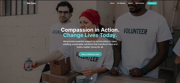
This is where many nonprofits drop the ball — either by hiding the CTA in the menu or leading with a poetic mission statement instead of a real reason to act.
Add Trust-Building Elements (Just Below the Fold)
Once you’ve earned the scroll, use that space to build credibility. That can include:
- Impact stats (e.g. meals served, lives changed, projects completed)
- Logos of trusted partners or funders
- A short testimonial or quote from someone you’ve helped
- Media mentions or “as seen in” blocks
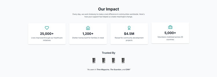
These are simple ways to reinforce that you're not just doing good work — you’re actually making a difference.
Feature Mission-Driven Content (Without Overwhelming)
Further down the page, highlight your strongest stories, campaigns, or upcoming events. Don’t try to cram in every blog post or board member bio — just the content that supports your primary goal.
This might include:
- A featured campaign with a bold CTA
- A powerful mission story with a photo and quote
- A short video that explains your work in action
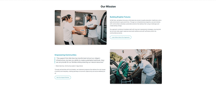
Keep it skimmable. Keep it focused.
Chipo's Bonus Tip: Test and Tweak What Matters
What headline works better — “Support Our Work” or “Help a Family Eat Tonight”? Does the red donate button outperform the green one?
You won’t know until you test.
If you're using a flexible builder like Thrive Suite, you can use A/B testing with Thrive Optimize to experiment with different headlines, layouts, or CTAs — and let the data tell you what works best.
🛠 Want a Homepage That Actually Works?
If your homepage doesn’t guide people to act, it’s just another wall of info.
👉 Use this step-by-step homepage guide to learn how to build one that does its job — using WordPress, with no code and no guesswork.
You’ll see how to:
- Write a headline that makes people care
- Focus your layout around one clear goal
- Add trust signals without clutter
- Guide every visitor to a next step that matters
✅ It’s made for nonprofits. It’s easy to follow. And yes — it’ll help you get more support, not just more “visits.”
When done right, your homepage becomes more than a static intro — it becomes the first step in your funnel. A place where new visitors turn into committed supporters.
Step 4 – Create Pages That Build Trust AND Drive Action
Once your homepage pulls visitors in, your internal pages should keep that momentum going. This is where you go deeper — showing who you are, what you do, and how someone can get involved right now.
But here’s the key: every page still needs a purpose. If a visitor lands on your About page, your Programs page, or even Contact, they should always know what to do next.
Let’s walk through the essentials.
About Page → Share Your “Why” and the People Behind It
Now, this isn’t just a history lesson or org chart. Use your about page to connect emotionally:
- Start with your why — the reason your mission exists
- Introduce your team, founders, or volunteers with warmth and authenticity
- Use a CTA like “See the Impact” or “Get Involved” instead of ending the page cold
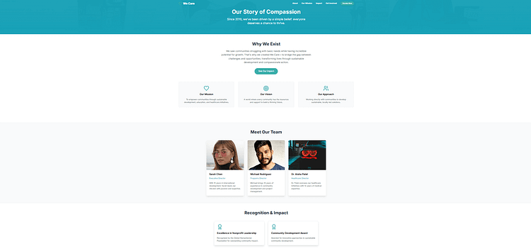
A strong About page builds credibility and can be a great place for social proof, impact stats, or awards.
Programs Page → Highlight Results and How to Support Them
Show what you're doing, but also what it leads to:
- Describe each program in plain language
- Include quick impact stats or quotes
- Pair each section with a “Support This Program” or “Donate to Keep It Going” CTA
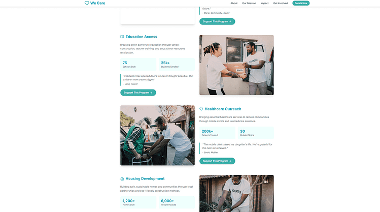
If you’re using a nonprofit website builder like Thrive Suite, create a clean, scrollable layout that separates each program clearly — don’t bury the good stuff in long paragraphs.
Donate Page → Make It Simple, Emotional, and Actionable
This is your fundraising engine, and it needs to do more than ask nicely.
- Lead with a compelling headline — one that speaks to the outcome, not the ask
- Offer donation tiers with real-life impact (e.g. "$25 = School supplies for 1 student")
- Use your donation plugin for WordPress to offer recurring giving and multiple payment methods
- Include visual trust signals: testimonials, a short story, partner logos, or donation security badges
- Keep the form short and friction-free (need more form tips? Check out this guide)
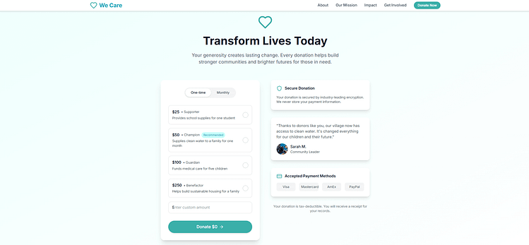
This is where testing different layouts, images, or button text (again, using Thrive Optimize) can make a big difference.
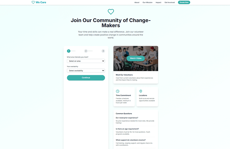
Volunteer Page → Make It Easy to Raise a Hand
This isn’t just a contact form — it's a mini onboarding experience.
- Use a multiple choice form (with Thrive Leads or similar) to segment by interest or skill
- Add a short intro video or quote from a current volunteer
- Include logistics like time commitment, training, or FAQs
- Add a follow-up CTA like “Get Volunteer Updates” to collect emails from visitors who aren’t ready yet
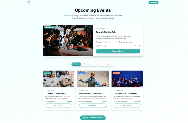
Events Page → Inform, Invite, and Inspire Action
If you run events — fundraisers, cleanups, info sessions, community days — this is your hub.
- List upcoming events with clear calls to register, donate, or share
- Use images from past events to build FOMO and credibility
Even if you don’t host frequent events, this page is still a great place to promote your next big campaign.
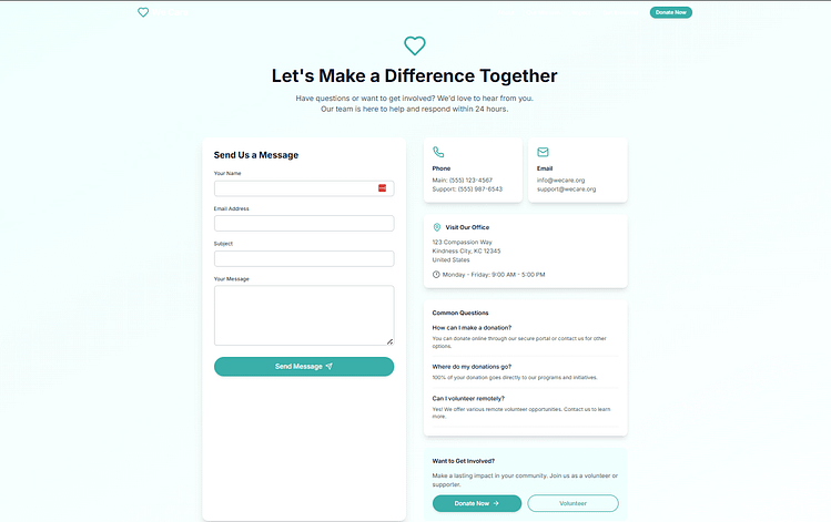
Contact Page → Let People Reach Real Humans
The worst mistake here? Making contact feel like a dead end. So make sure your contact page engages by:
- Including a short, friendly welcome message — not just a form
- Listing email addresses or team contacts (when appropriate)
- Adding a “What’s this form for?” to set expectations
- Including a CTA like “Want to get involved?” with a link back to your donation page or newsletter opt-in
Step 5 – Tell the Stories That Make Your Mission Real
Your nonprofit does meaningful, life-changing work. But if that impact isn’t visible on your website, you’re leaving powerful connection (and funding) on the table.
Storytelling is more than a nice touch — it’s a conversion strategy with real results.
Nonprofits that lead with storytelling retain donors at nearly twice the rate of those that don’t. And 81% of donors say they’re more likely to give when they hear a real person’s story.
Still not convinced? Charity: water built an empire of empathy — raising over a billion dollars — by centering the people behind the cause.
Where Your Stories Should Live
- Homepage: Feature one clear, emotional story with a CTA like “Help more people like Joy.”
- Donate Page: Show the transformation a gift creates — before you ask for the next one.
- Impact Page or Blog: Add a case study or short profile tied to each major program.
- Thank You Page: Reaffirm donor trust with a personal story tied directly to their gift.
Chipo's Storytelling Tips That Actually Work
- Focus on one person’s journey — not the entire program
- Use real quotes, images, and emotion (with permission)
- Keep it concise and scannable
- Tie the story to a CTA — donate, volunteer, share
- Use your nonprofit website builder (like Thrive Architect) to structure the story clearly
- If you’re using WP Charitable, embed the story into your campaign for added emotional pull
I've seen this flip conversions in real time. When visitors feel what your mission really means, they don’t just click — they commit.
Step 6 – Build a System, Not Just a Site
A few days ago (from the time this article was written), I came across a donation site for a cause I really cared about. The story moved me, the need was real — so I gave.
But wow, the experience? Clunky.
The donate button was buried halfway down the page. No follow-up message. No confirmation email. I even wanted to reach out and offer some support — but there was no contact info anywhere. If they hadn’t linked their GoFundMe, I honestly might’ve left.
Now, I still donated. But not everyone will be like me. Some people need a nudge. A reminder. A path. A reason to trust.
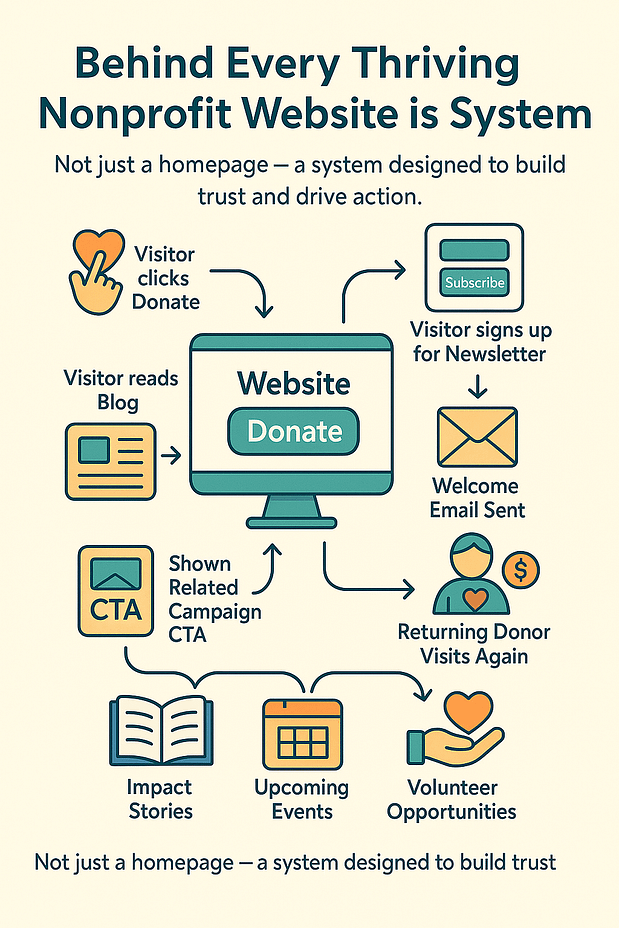
That’s where a real system comes in — one that doesn’t just look good, but quietly does the work of turning interest into action.
What a High-Converting System Actually Looks Like
Over the years, I’ve seen a clear difference between nonprofit websites that quietly thrive — and ones that stay stuck in “brochure mode.”
The thriving ones have a system behind the scenes. A rhythm.
Not just a homepage and a donate button, but a real structure that guides people toward taking meaningful action and staying engaged afterward.
In my own setup, here’s what that usually includes:
- A proper CRM that lets you tag and segment people — donors, volunteers, newsletter readers, first-time visitors
- Automated email follow-ups (even just a welcome message) that build trust after someone engages
- A content strategy that connects the dots — your stories, blog posts, and event pages should naturally feed into each other
- CTAs that aren’t static — someone who’s already donated shouldn’t see the same ask as someone new to your site
None of this has to be overwhelming. You just need the right pieces — and a simple flow that keeps your mission front and center.
🧰 How I Set This Up (Without Burning Out or Blowing the Budget)
Here’s what I personally use when setting this up for clients — or even tinkering on test sites for fun (yes, I’m that person):
- Thrive Suite is my go-to for form building, layout design, and automation flows. Thrive Leads and Thrive Automator make it easy to connect everything without needing third-party workarounds.
- WP Charitable handles donations. It’s simple, flexible, and doesn’t take 15 steps to customize a campaign or donation tier.
- For email and CRM, I usually lean toward FluentCRM or Groundhogg, depending on the size and budget. They integrate well and give you more control than something like Mailchimp.
A basic journey might look like this:
- Someone reads a blog post → sees a contextual opt-in → gets added to a simple email sequence
- Someone signs up for an event → gets a reminder, a thank you, and a follow-up invitation to volunteer
- A new donor lands on a personalized thank-you page → gets updates tailored to their giving history
You don’t need enterprise tech to make this work. Just thoughtful setup.
And if I’m being honest, most of the nonprofit websites I’ve seen struggle not because they lack passion — but because no one ever helped them turn that passion into a process.
This is the step that makes your website feel alive. Not just designed — but designed to respond.
Step 7 – Keep It Accessible, Secure, and Compliant
I know, I know — accessibility, privacy policies, plugin updates... not exactly glamorous. But skip this, and you’re risking more than just a few bounce rates.
You could lose trust, turn away potential supporters, or worse — end up violating important regulations.
At a minimum, make sure your nonprofit website includes:
And please — don’t forget your contact info. If someone wants to donate, partner, or even offer feedback, they shouldn’t have to hunt you down.
This stuff might feel small… but it’s a big part of building trust and keeping your mission running smoothly.
Step 8 – Optimize Like a Marketer, Not a Webmaster
Here’s where most nonprofit websites stall out: they get launched… and then forgotten.
But your mission evolves. Your supporters evolve. Your website should too.
If you want to build a nonprofit website that actually supports fundraising goals and boosts conversions, you need to treat it like a living, breathing campaign.
Here’s what I do (and recommend):
Whether you're updating a donor thank-you message or running experiments to increase average gift size, optimization is where your nonprofit website turns from passive platform into active conversion engine.
Because beautiful sites are nice — but high-converting ones make an impact.
Frequently Asked Questions About Building a Non-Profit Website
Frequently Asked Questions: How to Build a Nonprofit Website
The best “free” option really depends on what you need. If you want a website that looks professional without spending anything, IM Creator is one of the only platforms that’s completely free for verified nonprofits. If you prefer more long-term control, WordPress.org (paired with a free theme like SeedProd or Astra) lets you build a powerful site for the cost of a domain and hosting. And if you want something simple and visual, Wix also has a free tier — just note that it comes with Wix branding.
It can be surprisingly affordable.
A DIY website using free tools can cost as little as $0–$50/year (usually just the domain).
If you want to add premium tools or hosting, most nonprofits land in the $100–$500/year range.
Hiring a designer or agency can cost $1,000–$10,000+, depending on how customized you need the site to be. I always tell teams: start with what you can manage, and scale as your organization grows.
At minimum, I recommend including:
- A Homepage that clearly states your mission and directs visitors to take action
- An About Us page that shares your story, your team, and your impact
- A dedicated Donate page that’s simple, trustworthy, and mobile-friendly
- A Programs or Impact page showing who you help and the work you do
- A Contact page with easy ways to reach you or get involved
You can always expand from there, but these core pages create a strong foundation.
Not at all. You can build a beautiful, effective website without touching a single line of code. Platforms like Wix, Squarespace, and WordPress (with tools like Thrive Architect, Elementor, or Kadence Blocks) let you design everything visually. Coding knowledge is helpful if you ever want to tweak something very specific, but it’s completely optional.
The easiest way is to use a donation tool that handles payments securely and integrates with your platform. On WordPress, WP Charitable is my go-to plugin because it’s built specifically for nonprofits. Wix and Squarespace include built-in donation functionality, so you don’t need extra software. You can also embed tools like Donorbox, or even use PayPal Giving Fund to accept donations on any website.
How to Create a Website for a Non-Profit Organization That Actually Works
Most nonprofit teams are juggling a thousand things at once — events, outreach, budgets, board meetings. It’s no surprise the website often becomes an afterthought.
But here’s the hard truth: if your website isn’t making it easier for people to support your mission — to donate, volunteer, attend, or even just understand what you do — then it’s working against you.
This isn’t about being trendy or perfect. It’s about creating something purposeful. A site that works like part of your team. One that quietly carries your message forward while you focus on the rest.
And yes — you can build that. Without an agency. Without a dev team. Without a 5-figure budget.
Because when your nonprofit website is built with intention, it doesn’t just inform — it inspires. It converts. It supports your mission like a silent partner who never clocks out.
You’re already doing the hard work. Now let your site do some of it too.
Whenever I help nonprofits build or rebuild their websites, a few questions always come up. These are the ones I hear the most — along with the answers I usually give to help teams make confident decisions.


