TL;DR — How to Make Headlines Stand Out in 2026
If you only have a minute, here’s the essence of what works right now:
- Lead with relevance. Call out the problem your audience is dealing with and signal that you have a solution worth their time.
- Work in power words — carefully. A single word can create urgency (limited), spark curiosity (revealed), or build confidence (battle-tested).
- Keep it clear and specific. Make sure the promise of your headline is obvious at a glance — no guesswork.
- Add numbers or stats when you can. They give your headline weight and help it stand out in busy feeds.
- Talk directly to your reader. Use “you” and “your” to make it personal.
- Match the headline style to intent. How-to headlines for instructions, listicles for quick wins, curiosity-driven ones when you want them to lean in.
- Test before you hit publish. Run multiple headline variations through tools like AIOSEO, CoSchedule, or MonsterInsights and go with the top scorer.
You have THREE seconds to get your reader’s attention… or at least, you used to.
The scene has changed drastically in the last year or two. AI is flooding the internet with content. Everyone’s fighting for the same eyes. And your audience has seen it all. They’re sharper, pickier, and quicker to scroll away.
The average human attention span has dropped to just 8.25 seconds — shorter than a goldfish (seriously). And on-screen, people switch focus in under 47 seconds. That’s in the best case. For your headline, you’ve probably got less than a blink.
That’s when the decision happens: stay or go. You or the competitor.
And your headline is the dealbreaker.
So you have to be ready. It's game time. Let's make that win yours.
In this guide, you’ll get 13 proven ways to make your headlines stand out in 2026 — rooted in copywriting formulas, psychology, and smart design — so you can stop the scroll, win the click, and turn attention into action.
FAQ: Writing Headlines That Stand Out in 2026
A great headline makes your reader stop scrolling and think, “This is exactly what I was looking for.”
It’s clear, specific, and promises something valuable — fast. In just a split second, your audience decides whether to click or keep moving.
That’s why the best headlines are built on empathy: you understand their exact problem and signal that your content has the answer. And here’s the key — you actually deliver on that promise, so you get the click and the trust.
Headlines that convert often tap into human nature. Some proven triggers include:
- Negativity bias: People pay more attention to problems they want to avoid.
- Curiosity gap: Give them just enough to intrigue, but not enough to satisfy without clicking.
- Urgency and scarcity: Deadlines and “last chance” framing push quick action.
- High-arousal emotions: Awe, fear, inspiration, and surprise make people share and engage.
The trick is to use these honestly. Hype without substance might get you a click, but it won’t keep readers coming back.
Numbers make a headline feel solid and easy to digest. They instantly tell people what to expect and make the promise feel more believable. Odd numbers often feel more authentic, while big numbers work when they clearly mean big value (like “101 tips”). Pairing numbers with a power word — “7 Proven Ways” or “5 Smart Steps” — makes the headline even more irresistible.
Some formats have stood the test of time because they work across almost every niche:
- How to [Achieve Goal] Without [Pain Point] — Solve their problem, skip the hassle.
- Who Else Wants [X]? — Adds curiosity and a sense of community.
- [Number] Ways to [Outcome] — Gives structure and a clear benefit.
- The Secret to [Achieving Goal] — Promises insider knowledge.
They’re popular because they speak to basic human drives: solve my problem, give me something valuable, and make me feel like I’m part of the “in” crowd.
Start by finding the exact phrases your audience is typing into Google.
Put your main keyword close to the start of the headline and keep it under 60 characters so it won’t get cut off in search results. Most importantly, make sure it still sounds natural and appealing.
Pair the headline with a strong meta description and a clean, keyword-rich URL so you’re winning both clicks and rankings.
Test it. Create a few variations, split your audience, and see which gets the best mix of clicks and engagement.
Tools like CoSchedule’s Headline Analyzer, AIOSEO, and MonsterInsights can give you a performance score before you even hit publish.
But don’t just chase clicks — if your headline gets a high CTR but people leave after two seconds, it’s a sign you promised something you didn’t deliver.
7 Steps to Write Headlines That Demand Attention
Your headline is the moment of truth. In just a few words, it can spark curiosity, signal value, and convince someone to give you their time. Or it can let them slip away to the next tab without a second thought.
The following 7 tips are practical, fast to apply, and rooted in copywriting principles that work. Use them to craft headlines that draw readers in, earn the click, and set the stage for the action you want them to take.
1. Include a Problem and a Solution
When I’m writing headlines, I always start by identifying the exact challenge my audience is dealing with, then I work in a hint of the solution. This simple step keeps the headline relevant and makes readers feel like I understand where they’re coming from.
Here’s how I apply it:
I write down the main problem the content addresses.
I note the specific solution the content offers.
I combine both in a single, concise headline.
This strategy makes it easier for your audience to believe you know how to help them, building trust.
Example:
Problem: Persistent sugar cravings
Solution: 7 remedies to curb them
Headline: Constant Sugar Cravings? Try 1 of these 7 Failproof Remedies
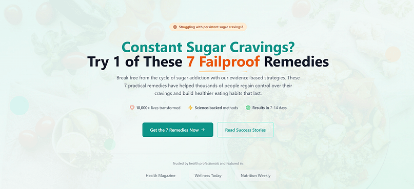
This approach works whether I’m creating a blog post, a sales page, or an email. By showing the reader that I understand their problem and have a solution worth exploring, the headline does half the job of getting them to engage. If you want more structure for framing your problem and solution, try the PAS copywriting technique — it’s one of my go-to methods.
2. Use Power Words
Next, impact. When I want a headline to stand out, I look for words that create an emotional reaction — curiosity, urgency, excitement, even a little fear. These “power words” make the headline feel more alive and give readers a reason to click.
I don’t just pick them at random. I think about what the audience needs to feel in order to act:
- Urgency: words like now, limited, deadline
- Curiosity: words like revealed, secret, unexpected
- Confidence: words like proven, guaranteed, failproof
Ultimate Guide: 10 Battle-Tested Weight Loss Hacks Revealed. is an example of a headline with power words.
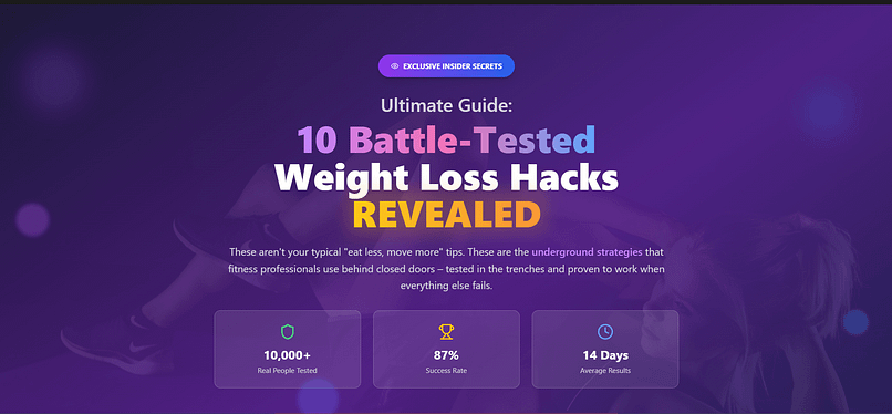
"Battle-Tested" signals these tips have been tried and refined in real situations.
“Revealed” implies that these weight loss hacks are new or never seen or heard before, piquing your readers’ curiosity.
The key is to use power words intentionally. One or two can lift your headline’s impact, but overdo it and you risk sounding like clickbait — and losing trust.
💡If you want to see this in action beyond headlines, check out how strong calls to action use the same principle to lift conversions.
3. Keep Them Clear & Simple
One of the first things I look out for, when reviewing a headline, is whether someone can understand it instantly. If the meaning isn’t clear at a glance, I rewrite it.
Clarity beats cleverness every time. A headline that makes sense right away is far more effective than one that forces the reader to pause and figure it out.
Here’s how I keep mine clear:
Use straightforward language instead of jargon or wordplay.
Focus on one main idea — avoid cramming in multiple messages.
Read it aloud; if it sounds awkward, it will read awkward.
“How to Clean Your AC Filters” is easier to understand, compared to something like “7 Ways to Wipe Germs Away”.

With the first headline, your audience immediately knows what to expect from your guide. The second option, on the other hand, is vague and could lead to the wrong people clicking your link.
4. Use Numbers and Reliable Stats
Whenever I can, I work numbers into my headlines. They make the promise feel concrete and give readers a quick sense of what to expect.
Numbers help in two ways:
Clarity: Readers know exactly how much information they’re getting.
Credibility: Stats show you’ve done your homework and aren’t just making vague claims.
I often use this approach for list posts because it sets a clear expectation. For example:
13 Copywriting Tips for Beginners (How to Write Like a Pro) — The number tells beginners it’s a focused, digestible list.

Stats can work just as well. A headline like How to Boost Your Email Open Rates by 47% in 30 Days immediately sounds more credible than a generic “How to Boost Email Opens.”
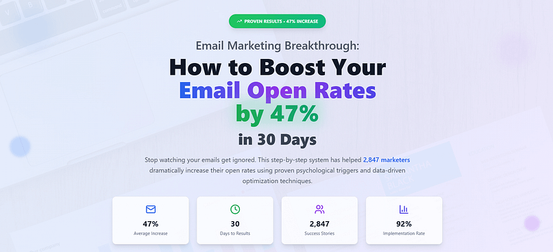
When I include numbers, I make sure they’re accurate and sourced from reliable data. It builds trust — and it helps the headline stand out in a crowded feed. If you’re curious how metrics like this influence behavior, see our conversion rate optimization stats.
5. Address Your Readers Directly
When I want a headline to feel personal, I write it as if I’m speaking to one person — the exact person I want to reach. Using “you” or “your” pulls the reader into the conversation and makes the message feel tailored to them.
This works especially well for sales pages, emails, and blog posts where you want the reader to imagine themselves getting the benefit you’re promising.
Here’s how I apply it:
- Use second-person pronouns (you, your) to create connection.
- Ask direct questions that get the reader thinking.
- Speak to their needs, desires, or frustrations in plain language.
Example:
- Do You Want to Double Your Email Open Rates This Month?
- Your 7-Step Plan to Run a Faster 5K
By writing to one person instead of a vague “audience,” the headline feels less like marketing and more like advice from someone who understands their goals.
6. Align Your Headline With User Intent
One of the biggest improvements I’ve seen in headline performance came from matching the headline type to what the reader was actually looking for. If the headline doesn’t align with their goal, they’ll either bounce or never click at all.
When I plan a headline, I start by asking: What’s the reader trying to do here? Are they looking for step-by-step instructions, quick ideas, or an intriguing angle that makes them want to learn more?
Here’s how I match headline type to intent:
- How-to headlines for readers who want clear, actionable steps.
- Listicles for readers looking for a quick set of ideas or options.
- Curiosity-driven headlines for readers who want something surprising or less obvious.
Example: Someone searching “how to train for a 5k” expects a structured training guide. If the headline says “10 Fun Facts About Running”, it’s the wrong match — and the reader will skip it.
You need to be clear.
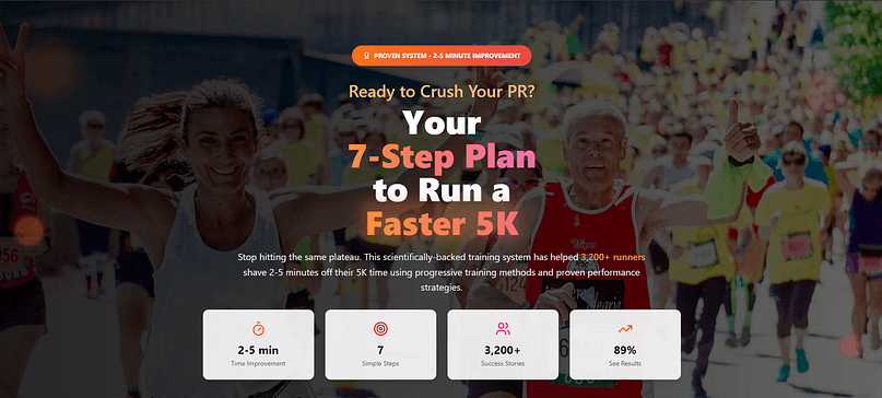
When the headline matches what the audience came for, they’re more likely to click, stay, and trust the content that follows.
If you’re not sure what your audience is looking for, start with keyword research tips to uncover real search intent.
7. Use a Headline Analyzer Tool
I never publish an important piece of content without testing at least a few headline variations through a headline analyzer. It’s a quick step that gives me data on how a headline might perform before it ever goes live.
Tools like AIOSEO’s Headline Analyzer, CoSchedule Headline Studio, and MonsterInsights’ Headline Analyzer score your headline on factors like word balance, emotional appeal, readability, and length.
Here’s my process:
Write 5–10 headline variations for the same piece of content.
Run each one through a headline analyzer.
Compare the scores and choose the headline that balances clarity, intrigue, and SEO-friendliness.
Even small improvements in headline quality can lead to significant increases in clicks and engagement — and the analyzer makes it easier to spot what to tweak.
Bonus: Proven Headline Formulas That Work
Over the years, I’ve found certain headline structures consistently pull higher clicks and engagement. These formulas are versatile — you can adapt them for blog posts, sales pages, emails, or ads.
Try these proven templates:
- Who Else Wants [X]? → Who Else Wants a 7-Minute Morning Routine That Boosts Focus All Day?
- How to [Achieve Goal] Without [Pain Point] → How to Double Your Leads Without Spending More on Ads
- [Number] Ways to [Desirable Outcome] → 9 Ways to Save Time on Weekly Meal Prep
- The Secret to [Achieving Goal] → The Secret to Writing Blog Posts People Can’t Stop Sharing
If you want to see how these fit into a complete conversion framework, visit our sales page strategy guide.
Why They Work: The Psychology Behind Them:
- Curiosity Gap: Leaves just enough out to make the reader want to know more.
- Urgency: Signals that the benefit is relevant right now, encouraging immediate action.
- Exclusivity: Implies the reader is getting insider information not everyone has.
- Benefit-Focused Framing: Keeps the spotlight on what the reader gains, not just the topic itself.
When you combine a proven structure with a strong psychological trigger, you’re stacking the odds in your favor for more clicks and higher engagement.
4 Design Tips to Make Your Headlines Stand Out (Must Read)
Writing strong headlines is just one part of making them stand out.
They also need to look good from a design perspective – and these 4 tips will help you achieve this:
1. Use Text Highlights
Nothing says “look here” like animated text highlights. And if you have Thrive Architect, the best WordPress page builder, you can add these to your headlines in seconds.
The Text Highlights feature lets you call out words in your headlines (or paragraphs) on your website.
Adding them in Thrive Architect is easy. Anytime you're using our visual editor, select a piece of text, and click the highlight color picker. That'll give you the basic highlight type.
But then, open the 'Highlight Options' dropdown and you can pick from 12 different highlight types.

Select your text, add highlight, and choose your preferred type!
Some highlight types are static, but others are animated.
Animated highlight types let you set their stroke width to thicken up those lines, choose to display it over or underneath your text, and choose to animate once, loop the animation, or have it replay every time the text re-enters your browser viewport.
You can enable or disable the highlight from different screen sizes, adjust the animation speed and even adjust the time-between when it's set to loop animation.
Check out the 12 different highlight types we've included!

2. Choose the Right Font
Your font choice plays an important role in how your headlines are perceived.
Fancy fonts look good on book covers and in invitation cards, but tend to read poorly on desktop and mobile screens.
Stick to clear fonts that your audience can read easily.
Some good fonts to use in your headlines and body copy are: Arial, Roboto, Oswald, Helvetica, Open Sans, Lato, and Montserrat.
3. Use ALL CAPS to Draw Attention
This is a neat way to make your headlines look interesting – and more direct.
“15% Off Black Friday Sale Discount Starts Now” vs. “15% Off Black Friday Sale Starts NOW”
Which headline is more likely to draw attention? Option B.
Use all caps to emphasize a specific word to get your audience to react. But don’t overdo it.
All caps can be perceived as “shouting”, and you don’t want your audience to think you’re yelling at them.
4. Play Around with Color – Carefully
Adding color to your headlines is another effective way to draw your audience’s attention to specific words. Colors are also powerful moodsetters.
For example, oranges and pink create a sense of playfulness, while red is known to evoke a sense of urgency or passion.
Understanding website color schemes can help you find the right colors for your headlines.
With the right page-building tools, you can implement these design tips in seconds. We recommend Thrive Architect.
Make Your Headlines Stand Out in Minutes with Thrive Architect
Strong headlines deserve strong design — and Thrive Architect gives you both, without the tech headaches.
With Thrive Architect, you can:
- Highlight specific words or phrases with animated effects that draw the eye.
- Instantly adjust fonts, sizes, and colors so your headlines match your brand and pop on the page.
- Choose from professionally designed landing page templates built to boost conversions.
- Apply changes visually — see exactly how your headline will look as you edit it.
Whether you’re refreshing a blog post or building a high-converting sales page, you can make your headlines look as good as they read — in minutes, not hours.
Ready to turn skimmers into readers and clicks into customers? Get Thrive Architect today and start building headlines that work as hard as you do.
Next Steps: Rewrite Your Sales Page Copy
If you’re not seeing the conversions you expected from your sales page, you’ll need to work on more than just your headlines.
A good exercise is to take one of your sales pages and rework your headlines and copy.
Use these free tutorials to help you create sales pages that lead to conversions:
- How to Create the Perfect Long-Form Sales Page (+ Templates)
- Nail that Launch: How to Smash a Sales Page Strategy
- Entrepreneur’s Guide: 7 Elements of a Successful Sales Page
Final Thoughts: Your Headline Is Your First Conversion
Every click, every read, and every sale starts with a headline. It’s the first moment your audience decides whether to give you their time — or move on.
By combining proven copywriting formulas, psychological triggers, and smart design, you can craft headlines that do more than grab attention — they start a conversation and guide readers toward taking action.
You now have the tools to:
Match your headline to your audience’s intent.
Use words and structure that trigger curiosity and trust.
Present headlines in a way that commands attention on the page.
And if you want those headlines — and the pages they live on — to look as good as they perform, Thrive Architect makes it easy. Even better, as part of Thrive Suite, you’ll get every tool you need to turn clicks into conversions: sales page builders, lead generation forms, quizzes, testimonials, and more — all built to work seamlessly together.
Your headline is your opening handshake. Make it unforgettable. Start with Thrive Architect, or unlock the full Thrive Suite to power your entire marketing funnel.


