We’ve been banging on about how great online quizzes are since we launched Thrive Quiz Builder, and with good reason: quizzes are incredible tools for supercharging your website.
Quizzes encourage visitors to interact with your brand, opt-in to your email list, follow calls-to-action, and share insightful information about themselves.
Today we’re pulling back the curtain to share the secrets of how – and why – we built a successful online quiz here at Thrive Themes, so you can do the same.
This is a unique opportunity to see behind-the-scenes, where we’ll share the planning, building, and results of our popular online quiz that reveals the best opt-in offer for your website!
More...
The Quiz Creation Struggle is Real
Back when we explored Kaye Putnam’s awesome online quiz funnel, we received an insightful comment from one of our readers…

Petra
Thrive Themes Blog Reader
If there’s one aspect that seems to be missing in every article that I’ve read about quizzes... it’s building the quiz, choosing the questions and connecting them to the results.
Even though I’m an expert in a certain subject doesn’t mean that I have the ability to design a quiz that delivers great results. The difficulty of planning the content, questions, their connections with the results and the results categories themselves is what has kept me from building a quiz.
… well today’s blog post is for Petra, and for everyone else who wants to build an engaging online quiz, but feels paralyzed putting it all together.
Are you ready to level up your quiz game? Let’s go!
Planning the Quiz Strategy
Any good quiz strategy starts with what you want to achieve.
Our very first step in planning our online quiz was to decide on the goals...
- To build awareness of Thrive Quiz Builder & demonstrate what it’s capable of
- To create some fun, interactive content that our audience would find valuable
- To grow our email list with new subscribers
- To collect information about our existing subscribers
- To promote our free list building masterclass
Don’t be put off by the number of goals here. Some of them overlap and your first quiz could focus on just a couple of objectives.
After choosing the goals, we were excited to fire up Thrive Quiz Builder and start writing questions and designing results pages. However, we resisted the temptation to sit down at the computer, and instead found some ancient relics of another time: pen and paper.
There was no right or wrong at this point. Our aim was to get our jumbled thoughts on paper so we could see the whole picture. Rather than try to get everything perfect the first time around, we went through 5 or 6 quiz iterations before everything started to come together.
Finally we had a sketch of the quiz flow, which acted as a blueprint during the build and design stages:
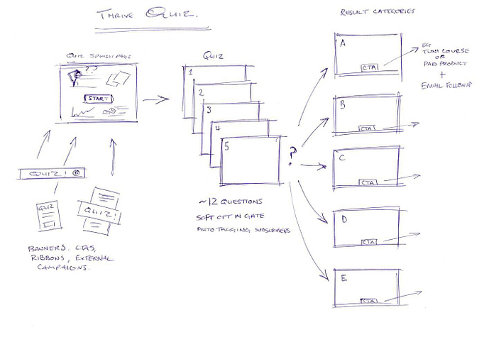
An initial sketch of the quiz developed during the brainstorming phase. This sketch acted as a blueprint during the quiz's build and design stages.
I strongly recommend using old school pen and paper to first plan your online quiz, but if you really don’t want to, here are some online tools that can help.
Mind-Mapping tools like XMind, FreeMind, or SimpleMind (my favorite).
Presentation Tools like Powerpoint or Google Slides.
Wireframe and sequence tools like LucidChart or Balsamiq.
Based on my sketch, here are the key elements of our quiz strategy:
Promotional Elements
How would people discover the quiz?
Through common CTAs like site banners and ribbons, as well as external marketing like sending an email to our fantastic subscribers.
Quiz Splash Page
A splash page is the central promotional page that communicates the benefits of your quiz and encourages visitors to take it. A quiz splash page is a critical part of your quiz funnel, so it’s worth spending some serious time making it look good.
You can find our quiz splash page here.

The final splash page design for our online quiz.
The Quiz Questions
At this early planning stage, I felt 13 quiz questions sounded about right. Any more and visitors would probably start abandoning the quiz.

This particular quiz used 13 questions, but that doesn't mean every quiz taker answered them all to arrive at the Results Page thanks to branching logic. More on that Thrive Quiz Builder feature below!
You’ll discover how this evolved later on with the addition of branching quiz logic.
A Decision on an Opt-in Gate
A quiz opt-in gate is a fancy way of saying you collect email addresses before letting people view their results.
Hard opt-in gates simply won’t let visitors view their quiz results until they subscribe.
Soft opt-in gates strongly encourage subscribers to submit their details, but provide a ‘Skip this step’ link or similar as well.
Both have their place, but we decided to go with a hard opt-in gate for this particular quiz:

For this quiz, we decided to use a hard opt-in gate.
Learn more about quiz opt-in gates here.
Result Pages
Quiz results come in many flavors, depending on your questions and strategy.
With Thrive Quiz Builder, you can provide a final score, a percentage, a category, or even highlight which questions were answered correctly or incorrectly.
We knew we needed categories for our quiz, automatically calculated based on combinations of answers. In other words, our quiz would have no right or wrong answers, just insightful questions that finally redirected to one of five result category pages.
Why did we choose five?
Rapid implementation.
We didn’t know how successful the quiz would be, so it didn’t make sense to invest too much time creating lots of result pages. It’s better to get something published, rather than keep it locked up in the pursuit of perfection.
As you might've guessed, we’re big fans of rapid implementation when it comes to building online businesses.
Final Calls-to-Action
Reaching the final results page is the visitor’s goal. But what is our goal as a business?
Sure the main call-to-action is growing our mailing list as part of the opt-in gate, but it doesn’t make sense for that to be our only CTA and leave visitors wondering what their next steps should be after they receive their results.
The category results pages were a great opportunity to promote other CTAs that grow our business:
- A free list-building video masterclass
- Awareness of Thrive Quiz Builder itself
Don’t get too hung up about your choice of result page CTA as you build your first quiz. You can always switch it out later as your business priorities change.
So with our strategy decided, it was time to build the quiz itself!
Let’s see how we did this...
Building the Quiz: The Back-to-Front Method
When building your first online quiz, it feels natural to begin by writing the questions, then the results, and then trying to tie the two together somehow.
After all, you can’t have results without questions… can you?
The problem with this approach is that it quickly becomes too complex to manage. Writing the questions without a clear outline of the results makes your job of quiz-master a hundred times more difficult.
Instead, we recommend the back-to-front method of quiz building.
Results first. Questions second.
Choosing the Quiz Results
In order to recommend the best opt-in offer for our quiz takers, we decided on 5 category result pages:
- A Video
- A Community Event
- An Ebook or Printable
- An Email Series
- A Resource Pack or Tool
We knew we wanted them to look good, and with Thrive Architect, we had all the tools necessary to make them look amazing:

The 5 Results Pages we built for our quiz using Thrive Architect.
Once we were happy with the design and content, it was time to tell Thrive Quiz Builder to redirect each quiz taker to the relevant results page based on their final quiz category.
This was easy to achieve using the ‘Redirect Settings’ options...

You can setup Results Page redirects for your online quiz using Thrive Quiz Builder's 'Redirect Settings' options.
Designing the Opt-in Gate
Working backwards in the back-to-front quiz building method, the next element to design was the opt-in gate.
This is a critical step in any quiz – all quiz traffic passes through this page, and getting it wrong can tank your conversion rate. Spend some time on your opt-in gate page as you build your own online quiz.
Here’s how ours looks...

1. The headline - We constantly drove home the benefits of the quiz from the visitor’s perspective, across the entire quiz sequence. Don’t forget that people can lose momentum after answering lots of questions, so sing your main benefit loud and proud.
2. The subheading - As with the headline, we used a consistent subheading to set visitor expectations and layer another tangible benefit: growing their email list.
3. The reassurance - Entirely optional. We chose to let visitors know they were super close to accessing their quiz results. You could use a simple sentence like us, or feature a gorgeous progress bar.
4. The lead generation form - This is where we collect email addresses and grow our own mailing list. Our original plan called for a soft opt-in form which allowed people to skip this page and access their quiz results without subscribing. However, we changed this to a hard (required) opt-in form as the quiz was valuable enough to warrant a fair exchange of value.
5. The disclaimer - You really shouldn’t add people to your email list without explicitly stating so. Not only is it dishonest and unethical, it’s also illegal in many countries. Europe’s GDPR laws state that citizens have the right to be told what will happen with their personal data before it is submitted. Many other territories have similar laws, such as Brazil’s LGPD and California’s CCPA.
Using the Smart Complete Feature for Existing Subscribers
Since we planned to send this quiz to our existing email list, we wanted to avoid any major barriers to conversion, such as forcing them to re-enter their name and email address.
Thankfully, Thrive Quiz Builder comes with an advanced feature called Smart Complete to hide the opt-in form entirely for existing subscribers who visited from an email link. All that’s left is the button to continue to the results page!
Now this is a super advanced feature, so we won’t go into too much detail here. I just want to show you the opt-in gate from the perspective of an existing subscriber:

With the Smart Complete feature deployed on your quiz opt-in page, here's what the opt-in page looks like for existing subscribers — no input fields necessary!
Writing the Quiz Questions
And finally we get to the quiz questions themselves.
If we’d started with the questions, it would have been much more difficult to tie them to relevant result pages. But by building the quiz back-to-front, we can now use our result pages to help write our questions.
Here’s an example…

Writing your quiz questions is much easier once you already have your result pages figured out.
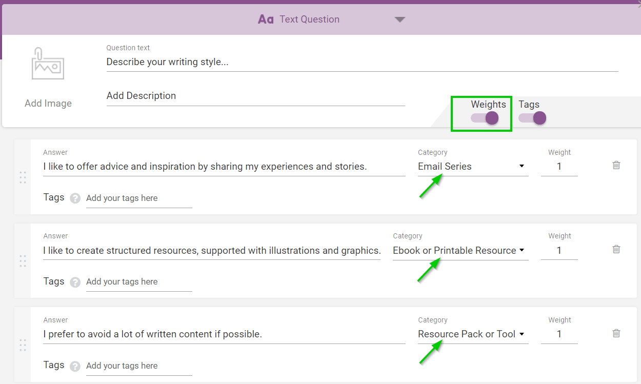
Depending on which answer is chosen, the results will be more weighted to recommending an Email Series opt-in offer, an Ebook or Printable, or a Resource Pack or Tool.
Let’s see how that looks in the Thrive Quiz Builder dashboard…

Thrive Quiz Builder gives you the power to weight your question answers for specific result categories.
We gave each question an equal weight score of 1, but if a particular question really strengthened a certain result above the rest, we could increase this weighting score accordingly.
Branching Questions
Now you could simply string all your quiz questions together sequentially, but we felt that 13 questions might negatively impact completion rates. Ain’t no-one got time for that.
So how could we add 13 questions without forcing everyone to complete 13 questions?
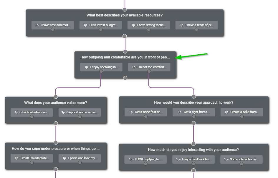
We decided to add a branching question whose sole purpose was to force visitors to choose a path: are you more introverted or extroverted? This allowed us to sidestep all irrelevant questions for each quiz taker and improve our conversion rates.
Take the left extrovert path, and you get questions about videos and community events.
Choose the right introvert path, and you get questions about email series, resource packs, and eBooks!

We added a branching logic question to our quiz to remove irrelevant questions for a given quiz taker and help improve our conversion rates.
Tagging Questions
OK, I’ll level with you…. We’re actually a for-profit business. Shocking, I know!
We like to sell products, and understanding our customers is a vital part of this. If you’re subscribed to our email list, we probably have a basic picture of who you are through tags we’ve applied to your subscription entry in our email marketing service.
Your country. What type of content you like to read. That kind of basic data. It’s useful to a degree, but it’s not going to make a huge impact in our conversion rate or product strategy.
If only there was a way to get our email subscribers to tell us more about their businesses…
Well, it turns out that we built functionality into Thrive Quiz Builder to achieve exactly this!
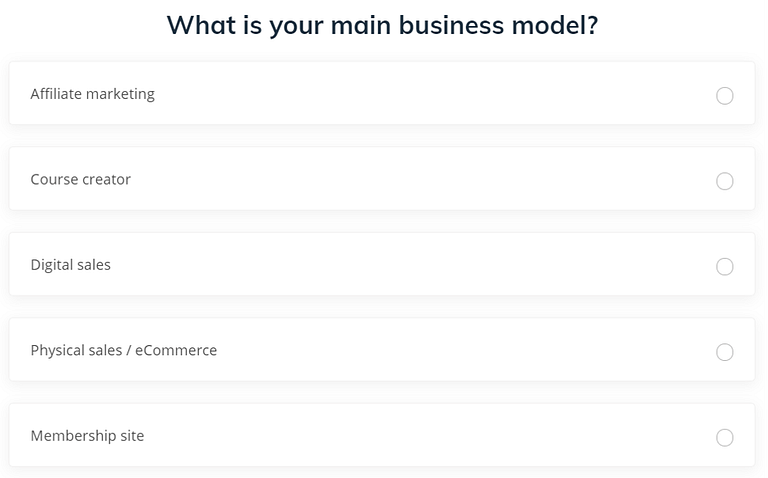
We built this question into our quiz so we could gain important insights about each of our quiz taker's online business. We capture these insights by having Thrive Quiz Builder pass a question answer tag along to our email marketing tool.
When visitors choose an answer, Thrive Quiz Builder automatically passes the answer tag we applied to it along to our email service provider.
Here’s how it looks in the Thrive Quiz Builder dashboard...

With Thrive Quiz Builder, you can assign tags to each of your question answers to gain more detailed insights about your quiz takers. When your quiz takers subscribe to get their quiz results, these tags will be passed along with the email to your email service provider.
Here’s another great example of how we use our opt-in offer quiz to learn more about our subscribers’ skillsets and business resources.
What type of customer information would help your business to grow?
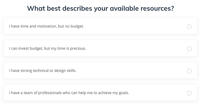
Another quiz question example aimed at gaining more detailed insights about the quiz taker's entrepreneurial resources.
Analyzing the Results
So far, we’ve given you an unprecedented look behind the curtain at our business. We encourage you to learn – steal – anything that you can to build your own conversion focused quiz.
But first, let’s explore the results we got from our own quiz, and highlight what we learned along the way.
Quiz Funnel Completions and Drop-Off
We sent an email to a selection of our email subscribers (we love you!) telling them we’d launched a new online quiz designed to help them choose an opt-in offer for their mailing list.
Of the 3,259 people who visited the quiz, about 57% made it all the way through to their results page.
But why not 100%?
Drop-off is a normal part of any online funnel, whether that’s a product, a lead magnet, a webinar registration, or an online quiz. Let’s use Thrive Quiz Builder’s amazing Flow Report to look at where this drop-off occurred.

With Thrive Quiz Builder's amazing Flow Report feature, you can see how well each step of your quiz funnel did to convert online visitors into subscribers.
We can see the opt-in gate worked superbly. With a drop-off of only 2.8%, it’s clear that our Smart Complete strategy really helped to maintain conversion momentum.
The biggest source of visitor drop-off were the quiz questions themselves, with 40% of people getting bored before completing it. That’s not a worrying high number, but I’m sure there are lots of opportunities for improving it.
Insights like this are what makes the Flow Report so useful.
Tagging
Remember how some of our quiz questions automatically tagged visitors according to their answers?
Want to see those results?
Here we go...

Based on the quiz answer tagging we set up, here's the breakdown of our quiz takers's type of online business... a very useful insight for our company!
It turns out that 30% of you offer a service of some kind… yoga, fitness, coaching, consultancy, etc. We always suspected this, hence our resources for service based businesses, but now we have the hard data to confirm.
Just behind that are the online course providers, although it’s possible this is spread across membership sites too, as there’s often some overlap between the two. Another suspicion confirmed!
What’s really interesting is the eCommerce percentage at 8%. We have to ask ourselves if this reflects the general market, or if our recent WooCommerce integrations would attract more eCommerce subscribers… these are the types of internal discussions this data really helps to inform.
What about our subscribers’ most available resource?...
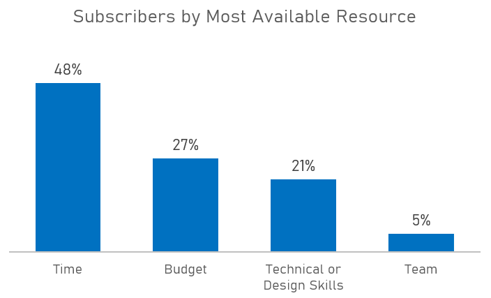
Here's the data we got from quiz takers about their most available entrepreneurial resource.
A whopping 48% of you feel your time is your most available resource to build your online business.
27% of you are able to allocate some level of budget to solve problems and grow, and only 5% of you are rocking a team of people to help your business.
My inner geek is very happy to finally verify our theories with hard data.
What insights would move your business forward?
What About YOUR Online Quiz?
Today’s post was very different from our usual content – we’ve shared a lot of strategy and analysis that most businesses wouldn’t feel comfortable publishing.
Why?
Because we want you to build a successful online business that earns you financial freedom away from the 9-5 drudge.
We want you to learn how we planned our online quiz, so you can do the same.
Was this post useful to help you finally build your first online quiz? Let us know in the comments below!




Wow really helpful thank you very much!
I’m glad it was helpful, Olivier.
Awesome breakdown. Thank you for sharing! I feel less intimidated to work on more quizzes now ????????
Can’t wait to see what quiz you come up with, Nicolette!
Great job. I only want to know how to set the splash page and the result page to cover the whole page.
Hi Johan.
Brilliant question… Try clicking on the splash element, going to the Layout & Settings options in the sidebar, setting the side margins to 0, and the width to max: 100%.
That should expand your splash element to the full width of the screen.
But remember that the splash page is really better thought of as a splash element, that can be added to any page using a short-code. This lets you feature your quiz in multiple places, and keep the entire quiz on one page, like the quiz you’ll find at the top of this post.
In my opt-in offer quiz, I manually created a splash/landing page, and linked the button to the quiz questions. I tested both ways, but this felt better for my needs. It’s good to have every option available so you can decide what’s best for your website.
Never release another post again about a Thrive feature without a detailed how to guide.
This would have saved me days !
Just joking ….no not really
Great work David ,
Hah 🙂 I’m so happy this was useful, even if it was a little late for your own quiz, Paul.
Please share what you learned when you get chance. I’m sure you’ve picked up some tips and tricks that everyone would find valuable too.
Unfortunately, this can not be called “survey builder”: we can not publish results and also we can not give a notation to 50 towns, for example.
Hi Rémy,
This post isn’t about surveys, so I don’t want to pull too much attention away from the value you’ll find if you’re building a standard results-based quiz funnel.
However, Thrive Quiz Builder certainly can be used to collect survey results, with the ‘Survey’ quiz type
It’s currently designed for collecting the survey data internally, not for automatically publishing the results. That’s a great suggestion and I’ll pass it along to our development team.
I agree with Olivier! This type of “internal example” post is extremely helpful! <3
For example, i would never have thought about implementing the plan “back-to-front!” :-O
Like Petra — in your article — I had no idea how to see relationships between the questions & meaningful answers… It’s so helpful to see how to create questions that serve both readers & business-related conversion goals!
Certainly hope you & the Thrive team do more posts like this!
Well done! 😀
Thanks Karen, I’m so pleased you find it useful.
I think it really highlights the value we can share by using our own tools.
Hope you guys do a video on this as I like to learn from video rather than reading 🙂
That’s a great idea, James. We do publish a lot of videos with our blog posts, but sometimes it’s useful to go into detail in a written post. We’ll definitely consider your preference however.
Thanks for this insightful post.
Very useful post. Thank You.
I’d like to offer coupons as a reward for taking my quizzes. Please can you offer some guidance on how to use the results page to offer coupons in WooCommerce ( with WooCommerce Smart Coupons plugin)
Hi Mark, I don’t know that plugin but if you can use a shortcode or something to show the coupon code this will work on your results pages too.
Can I also make a Quiz and sell it for a low price? Or do I have to build a small course in Thrive Apprentice to do so?
Hi Nicole, you’d want the quiz to be the product?
this is great I’m trying to build a quiz right now and this really helped so many just give the birds-eye view but your right it’s the creating it that is the bit most leave out. Much appreciated David
This quiz Splash page and questions page should be templates for thrive architect. Can you guys please do that?
Hi Emilio, They are 🙂
We used the Flat 2.0 landing page set you can find under legacy landing pages in Thrive Architect.
This is a great plugin, and functions perfectly as a product sizing guide embedded on my site, but my customers are getting frustrated when they can’t go back or change their selection having to refresh the page and start over. This has been requested just on my small site enough times that I am looking at alternatives and therefore I must assume it has been brought to your attention more than once. Any plans on addressing this or is it already solved and I am missing something?
Going back through the quiz isn’t something we’re consider at the moment. Quizes should maintain momentum, and encourage the user to move forwards to the result.
However, I’ll definitely share this idea with our developers! Thank you.
This is incredibly helpful! When you talk about the tags. Can you only see the tags of those who actually opt-in, or even for the ones that skip that step?
Thanks Emily. They would need to opt-in, as the tags are passed to the email service.
Very useful post. Thank You.