I’ve spent the last 7 years in marketing, and in that time I’ve analyzed well over 1,000 landing pages (no surprise — it’s my job). I’ve built hundreds myself, celebrated big wins with some, and watched a few flop spectacularly. That’s the reality of testing, tweaking, sweating… and yes, even crying over conversion rates.
The good news? You don’t have to repeat all that trial and error.
Here’s a reality check: the median landing page conversion rate across industries is 6.6% according to Unbounce. If your pages are sitting at 2–3%, you’re already below the benchmark — which means there’s huge upside just waiting to be unlocked.
In this guide, I’ll share the 17 landing page hacks I lean on most:
5 advanced, insider hacks that deliver quick wins and instant lifts.
12 proven fundamentals that make sure your landing pages never leave conversions on the table.
I’ve done the hard work so you can skip the guesswork and start applying what actually works.
🔑 Key Takeaways: The 5 Hacks That Give You an Instant Edge
If you’re short on time, here are the 5 advanced hacks I’ve seen make the biggest difference — fast:
- The 2-Step Opt-in → Uses the Zeigarnik Effect to boost form completions.
- Dynamic Text Personalization → Match your headline to the exact ad or keyword that brought someone in.
- Content Upgrades → Offer a hyper-specific lead magnet tied directly to that page.
- Exit-Intent Offers → Catch visitors right before they leave and win back up to 20% more conversions.
- Scarcity Triggers → Use authentic countdowns or limited spots to drive action without the sleaze.
These are the same tactics I’ve tested across hundreds of landing pages — and they’re consistently the hacks that move a page from “pretty good” to “high-converting.”
❓ Landing Page Optimization FAQ
A landing page is built for one job only — to drive a single call-to-action (like sign-ups, downloads, or purchases). It strips away distractions like navigation menus, sidebars, or unrelated links.
A homepage, by contrast, is a broad digital storefront: it welcomes exploration, serves multiple audiences, and links to different parts of your site. Sending campaign traffic to a cluttered homepage usually leaks conversions, while a dedicated landing page acts like a laser-focused salesperson guiding visitors to one clear action.
Start with the headline — it’s often the only thing most visitors will read. It needs to be clear, specific, and connected directly to the ad or promise that brought someone in.
The body copy should expand on your unique value proposition (UVP) by answering three visitor questions: What do you offer? How does it benefit me? Why are you better than the rest?
Keep the language simple and benefit-focused. Remember: people don’t buy features — they buy the results those features deliver.
Keep the layout clean, uncluttered, and easy to scan. Use whitespace to reduce overwhelm and guide the eye.
Build a strong visual hierarchy: the headline should dominate, and the CTA button should pop with a bold, contrasting color. Optimize everything for mobile first — small screens are now where most visitors land.
And don’t ignore speed: if your page takes more than 3 seconds to load on mobile, you’ll lose a big chunk of your traffic before they even see your offer.
Because people look to others when they’re unsure. That’s social proof in action — it reassures visitors that others have taken the same step and benefitted.
Testimonials, customer reviews, case studies, client logos, or even live user stats (“Join 10,000+ subscribers”) all build trust.
To work best, social proof should be sprinkled across the page — especially right next to forms or CTAs — so it addresses doubts at the exact moment someone is deciding whether to convert.
Urgency works because of loss aversion — people are more motivated to avoid missing out than to gain something new.
Countdown timers, limited spots, or time-bound discounts can lift conversions, but only if they’re real. Fake urgency (like a timer that resets on refresh) backfires badly, eroding trust and credibility.
The rule is simple: if you use urgency, make sure it’s authentic. Tie it to a real deadline, an actual stock limit, or a genuine event.
Your CTA should be bold, visually contrasting, and use action-driven, first-person language (e.g., “Get My Free Guide” instead of “Submit”).
Place it above the fold and repeat it at key points down the page. For forms, keep them short and simple — every extra field adds friction.
If you need more detail, use a multi-step form (the Breadcrumb Technique™) that starts with easy, low-threat questions. People are more likely to finish what they’ve started, which makes step-by-step forms incredibly effective.
Conversion rate is important, but it’s not the whole story. True success is measured by lead quality and business impact.
That means tracking downstream metrics like Sales Acceptance Rate, Customer Lifetime Value, or revenue per lead — not just raw sign-ups.
A/B testing helps you optimize individual elements, but the real question is whether your landing page is driving profitable customers, not just cheap clicks.
Tips to Increase Your Landing Page Conversion Rates
This list includes actionable tips you can implement today to achieve a higher conversion rate for your landing pages — whether you run a blog, eCommerce website, or service-oriented business site.
1. Design a Page That Directs Eyes Straight to Your CTA
The major key to getting conversions is the layout of your page. You want to create a clean, conversion-focused landing page design that guides visitors toward your goal and makes it easy for them to take action.

Landing page designs
From your home page to your lead-generation and sales pages, start by keeping things simple and streamlined.
Use plenty of white space to make your content easy to read and use clear, bold headlines to draw attention to your main points. Make sure your call-to-action stands out and is easy to find - you want people to know exactly what to do next.
Next, think about the flow of your page. Use visual cues like arrows or images to guide people's eyes towards your most important content. Break up long blocks of text with bullets or images to keep things easy to scan. And don't be afraid to use contrasting colors or bold fonts to make key elements pop.

Examples of well-designed landing pages
If you don’t have web design experience, trying to achieve this might feel like an unachievable task.
How do you pick the right colors?
How do you know, for sure, that you’ve placed your copy and visual elements the right way?
Do you even have the time to build all your landing pages from scratch?
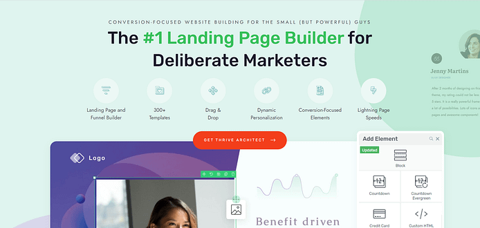
That’s why we recommend using a landing page builder like Thrive Architect.
If you want an easy way to create beautiful, conversion-focused landing pages, this is the solution for you.
Thrive Architect is the best landing page builder that comes with tons of SEO-friendly templates designed for a large variety of niches. You can easily drag and drop elements to create your perfect layout, and everything is optimized for conversions right out of the box.
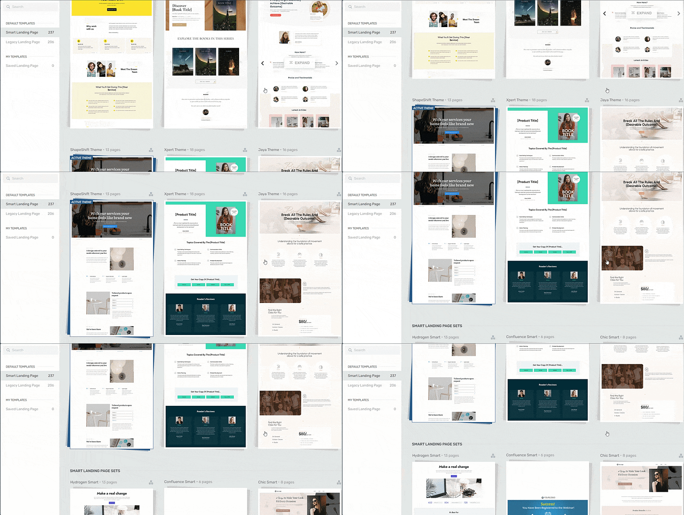
Landing page template sets in Thrive Architect
So if you want to create high-quality
landing pages that look great and convert like crazy, give Thrive Architect a try. With its clean, conversion-focused templates and easy-to-use builder, you'll be churning out high-performing pages in no time!
2. Write Headlines That Stop the Scroll
Headlines play a big part in grabbing your audience’s attention and drawing visitors in. It sets the tone for the rest of your landing page. A strong headline triggers the primacy effect — people remember (and act on) the very first thing they read more than anything else on the page.
With the right headline text and design, you can create a strong first impression and significantly increase the chances of visitors staying to explore your content.

Here are a few tips to create attention-grabbing headlines:
Keep them clear and concise: Make sure your headlines are easy to understand and quickly convey the main message.
Speak directly to your audience's needs: Address their desires, pain points, or interests to make the headline relevant.
Use action words and emotional triggers: Make your headlines compelling by appealing to emotions and encouraging action.
Incorporate numbers or questions: Numbers can make headlines more specific and questions can pique curiosity.
Create a sense of urgency: Use time-sensitive language to prompt immediate attention and action.
Use Text Highlights to Elevate Your Headlines
Want to create headlines that stop scrollers in their tracks? With Thrive Architect's text highlights feature, you can easily add eye-catching effects to your text that make your message impossible to ignore. From colorful backgrounds to bold outlines and more, you've got everything you need to craft headlines that demand attention and drive conversions.
3. Put Your Benefits Front and Center — Fast
Don't make your visitors hunt for the good stuff! Display your benefits early and often on your landing page. People want to know what's in it for them right away, so don't be shy about showing off what makes your offer so special.

Put your top benefits front and center, above the fold where they can't be missed. Use headlines, bullet points, or eye-catching visuals to make them pop. And don't just list features - focus on the real-world results and transformations your product or service can deliver.
Lead with your strongest benefit in your main headline
Use subheadings or callouts to draw attention to key advantages
Include benefit-focused bullet points or icons
Show before-and-after examples or case studies
Tie benefits back to your audience's specific needs and pain points
Remember, your visitors are always asking "what's in it for me?" so make sure your benefits are loud and clear from the moment they land on your page.
4. Build Instant Trust With Social Proof in the Right Spots
Social proof can be a powerful tool to build trust on your landing page. When visitors see testimonials, reviews, or case studies, they feel more confident in your offer. Here are some key places to add social proof:
- Near sign-up forms
- Next to purchase buttons
- Within product descriptions
- At the top of the landing page
- In pop-ups or banners
This works because of a simple psychological truth: we look to others when we’re unsure what to do. Social proof taps into herd behavior — if people see others choosing your product, they’re far more likely to assume it’s the right choice for them too.

Adding Testimonials in Thrive Architect
Another great way to incorporate social proof is by adding a Google reviews feed to your landing page. With the help of tools Smash Balloon’s Reviews Feed, you can easily display your positive reviews and ratings, giving visitors a real-time glimpse into what others think of your product or service.
Just remember to keep your social proof authentic and relevant to your target audience. Use real photos or names when possible, and choose examples that speak directly to the needs and concerns of your ideal customer.
Thrive Tip: Struggling to find a way to ask for testimonials without feeling awkward? Our handy guide can help.
5. Craft CTAs That Are Impossible to Miss (or Ignore)
Your call-to-action (CTA) is the most important part of your landing page. It's the big "do this now!" button that tells visitors exactly what you want them to do, whether it's signing up, making a purchase, or downloading a freebie.

Your CTA sections should look like this
To make your CTA irresistible, create clear, focused sections that draw the eye and make it easy for people to take action. Start by choosing a bold, contrasting color for your button that stands out from the rest of your page. Use action-oriented language that creates a sense of urgency, like "Get Started Now" or "Claim Your Discount."
Here are a few more tips for crafting compelling CTAs:
Keep it short and sweet - aim for 3-5 words max
Use first-person language, like "Sign me up!" or "I want this!"
Create a sense of scarcity or exclusivity, like "Limited spots available"
Offer a clear benefit or value proposition
Test different versions to see what works best
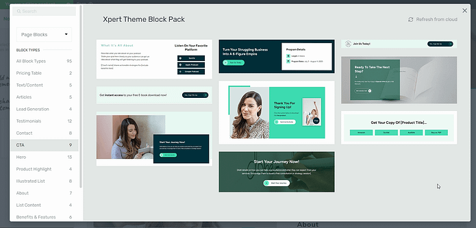
Example of CTA sections available in Thrive Architect
Your CTA is the gateway to your conversion goal, so don't be afraid to make it bold and prominent.
6. Double Your Sign-Ups by Slashing Form Friction
When it comes to opt-in forms, less is definitely more. Nobody wants to fill out a long, complicated form just to get your free eBook or discount code. The more form fields you ask for, the more likely people are to bounce.
So keep your opt-in forms simple and streamlined. Only ask for the bare minimum contact information you need, like name and email address. Don’t ask for their phone number if you don’t intend on contacting them via text.

Keep Your Forms Simple
If you really need more details, consider breaking your form into multiple steps or pages to make it feel less overwhelming.
💡That’s where psychology kicks in: the Zeigarnik Effect says people are more likely to finish a process once they’ve started. By asking for one or two easy fields first, you lower the barrier — and once someone begins, they’re far more motivated to complete the rest.
Use clear, concise labels for each field so people know exactly what you're asking for. Avoid jargon or confusing terms that might make people hesitate.
And make sure your form is easy to find and fill out on any device. Use a mobile-responsive form design that adapts to different screen sizes, and place your form in prominent locations like the top of your page or in a floating bar.
Pro tip
Here are a few more tips for creating user-friendly opt-in forms:
Use a contrasting color or design to make your form stand out
Include a clear, benefit-driven headline above your form
Add social proof near your form, like a testimonial or trust badge
Give people a way to opt out or adjust their preferences later
Test different form lengths and layouts to see what converts best
7. Make Your Landing Pages Effortless on Mobile
More people are browsing on their mobile devices than ever, so if your landing page isn't mobile-friendly, you could be missing out on a ton of potential customers.

But making your pages mobile-friendly doesn't have to be a huge headache. Just use a responsive design that automatically adjusts to different screen sizes, so your layout, images, and text look great on anything from a tiny phone to a big desktop.
Keep your content easy to read and scroll through on a small screen. Short paragraphs, bullet points, and lots of white space are your friends. Steer clear of giant images or complex layouts that take forever to load or make people play "thumb wrestling" just to navigate.
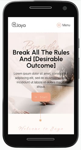
And make sure your buttons and links are big enough to tap easily, even on the smallest screens. No one wants to play "pin the tail on the CTA" just to click through to your offer.
Oh, and don't forget to test your page on different devices to make sure it all looks and works the way it should. You might be surprised how different your page can look on an iPhone versus an Android.
8. Use Conditional Display to Show the Right Offer to the Right Person
Want to create landing pages that feel like they're made just for each visitor? Then you've got to try using conditional display! This nifty trick lets you show different versions of your page to different people, all based on things like where they came from, what device they're using, or even what actions they've taken on your site before.

Think of it as having a whole bunch of landing pages rolled into one! You can use conditional display to show special offers to first-time visitors, highlight different benefits to people who came from specific ads or social media posts, or even create a more personalized experience for your loyal fans.
If you want an easy way to set up conditional display on your landing pages, Thrive Archive Architect is the way to go.
9. Add a Video That Sells Your Offer for You
Videos can quickly capture attention and explain complex ideas in a simple, visual way. And creating a video landing page is a great way to engage visitors, convey your message effectively, and drive more conversions.

Creating a video post or page in Thrive Architect
Keep the video short and focused on your main points. Use a clear and compelling script, and ensure the video quality is high. Place the video prominently on your page, such as at the top or next to your call-to-action. A well-placed video can engage visitors more effectively, increasing the chances they'll stay and convert.
Pro tip
Not sure what type of video to add to your page? Here are a few options to consider:
Explainer videos: Simplify complex concepts and explain your product or service.
Testimonials: Showcase satisfied customers sharing their positive experiences.
Product demos: Highlight features and benefits through a demonstration.
Brand stories: Share your company’s mission, values, and background.
How-to guides: Provide step-by-step instructions on using your product or service.
Webinars: Offer in-depth insights and expert knowledge on relevant topics.
10. A/B Test Everything Until the Data Speaks
A/B testing your landing pages involves creating two slightly different versions of your landing page and splitting your traffic between them to see which one performs better. You can test various elements like headlines, CTA buttons, or form length to find out what resonates most with your audience.

The beauty of A/B testing is that it allows you to make data-driven decisions based on actual user behavior, rather than relying on guesswork or subjective opinions. By continuously testing and optimizing your pages, you can incrementally improve your conversion rates over time.
The key to success with A/B testing is to test frequently and be open to trying new ideas. The more you test, the more insights you'll gain into what makes your audience convert.
11. Shorten Pages for Free or Low-Cost Offers
Don't overwhelm your audience with endless walls of text.
Instead, cut straight to the chase and showcase your irresistible offer front and center. Use clear, concise language that gets your message across in a flash.
Remember, when you're giving something away or selling at a low price point, your audience doesn't need much convincing. They're already primed to take action, so make it easy for them to say "yes" without any fuss.
Thrive Tip: Read this guide if you want to learn when to use a long-form landing page vs. a short-form landing page.
12. Use a Pricing Table That Makes the “Yes” Obvious
Don't leave your audience scratching their heads, wondering what's included and how much it costs.
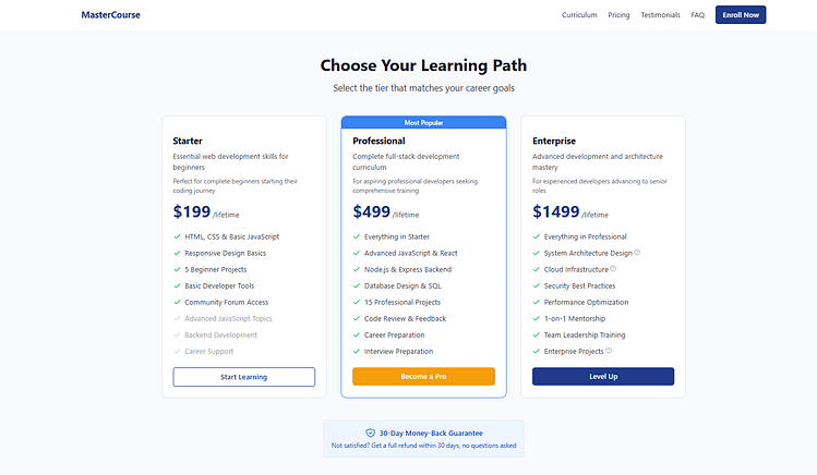
Make it a no-brainer for them by laying it all out in a super-simple format that highlights the awesomeness of each package or tier. Use easy-to-understand language to describe what they'll get and how it'll benefit them, and make sure those prices are front and center.
When you add a pricing table to your landing page that looks great and is easy to read, your audience can quickly compare their options and make a decision they feel good about.
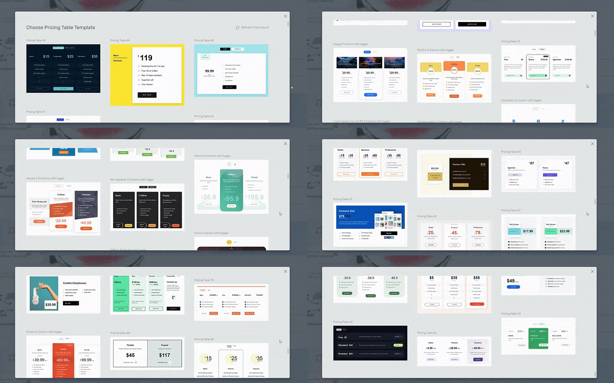
Pricing tables in Thrive Architect
Plus, a pricing table that's designed to impress can create a sense of "I need this now!" and get your audience clicking that "buy" button faster than you can say "cha-ching!"
13. Write Copy So Simple It Feels Like a Conversation
Keep your copy simple and straight to the point!
Use language that's easy to understand and gets your message across loud and clear. Write like you're talking to a friend, and let your personality shine through.
Keep your sentences short and snappy, and use bullet points or numbered lists to break up your text and make it easy to scan.
Cut to the chase and tell your audience exactly how your offer can help them, without any fluff or filler. When you keep your copy simple and direct, you'll create landing pages that engage your audience, build trust, and inspire them to take action.
Pro tip
Tips for keeping your copy simple and direct:
Use everyday language that your audience can easily understand
Write in a conversational tone, as if you're chatting with a friend
Highlight key points with bullet points or numbered lists
Focus on the benefits of your offer, not just the features
Edit ruthlessly and cut out any unnecessary words or phrases
And if you want to sharpen your copywriting skills, check out our free guide here.
14. Get More Opt-Ins With 2-Step Forms
Make signing up easy with a 2-step opt-in form on your landing page.
This can get more people to join your email list. Start with a button that says something simple like "Sign me up!" or "I want in!"

When someone clicks the button, show a short form where they can type in their info. Breaking it into two steps makes signing up feel quick and easy. This can get a lot more people to complete the process.
It also gets new subscribers more involved from the start, so they're more likely to keep opening your emails later.
15. Trigger FOMO With Live Sales Notifications
Want to add some excitement to your landing page and boost conversions? Try using live sales notifications!
These small but mighty pop-ups show real-time updates when someone takes an action on your site, like making a purchase or signing up for your email list. It's like a little nudge that says, "Hey, others are interested in this too!"
Live sales notifications can:
- Create a sense of FOMO (fear of missing out)
- Build trust and social proof
- Encourage visitors to take action
The easiest way to add live sales notifications to your site is with TrustPulse. It's a powerful tool that lets you customize your notifications, track conversions, and even show them on any page of your site.
Plus, it takes just a few minutes to set up - no coding needed! So if you want an instant boost in credibility and sales, give TrustPulse a try. Your visitors will love seeing those notifications pop up, and you'll love the extra sales that roll in.
16. Turn “Almost Lost” Visitors Into Last-Minute Conversions
Don't let your visitors slip away! Catch them before they leave with exit-intent popups. These handy little messages appear when someone is about to close your page or hit the back button. It's like a friendly tap on the shoulder that says, "Wait, don't go yet! Check this out first."

Exit-intent popups are your secret weapon for keeping people on your site longer and turning more of them into leads or customers. You can use them to offer a special discount, invite people to join your email list, or just remind them of what they'll miss out on if they leave.
The reason this works is simple: people hate losing something valuable more than they love gaining it. Psychologists call it loss aversion. When your popup offers a discount, bonus, or exclusive freebie, you’re reminding visitors of what they’re about to lose if they leave — and that fear of missing out is often the nudge they need to take action.
17. Personalize in Real-Time for Maximum Conversions
Most landing pages talk to everyone the same way — which means they connect deeply with no one. I’ve learned that the fastest way to boost conversions is to make a page feel like it was written just for the person reading it.
With dynamic content personalization, you can swap out headlines, testimonials, or even offers based on where someone came from. Example: if a visitor clicked a Google Ad for “email marketing tips,” your headline can say “Boost Your Email Marketing Results Today” instead of a generic “Grow Your Business Online.”
This works because of a simple psychological truth: relevance creates trust. When people feel like your page matches their intent, they’re far more likely to take action.
👉 Thrive Architect makes this easy with dynamic text replacement. You can pull in keywords, referral info, or even subscriber details automatically — no developer needed. (And you can learn more about creating dynamic landing pages right here).
Next Steps: Drive Traffic to Your New and Improved Landing Page
Now that you’ve got an impressive eCommerce homepage, it’s time to get it in front of the right eyes.
Here are 4 free website & marketing tutorials to help you grow your audience & get your business noticed:
Ready to Implement These Landing Page Hacks?
You now have 16 powerful landing page hacks at your fingertips, ready to optimize your pages for maximum conversions. From attention-grabbing headlines to social proof and simplified forms, these proven techniques are waiting for you to put them into action.
And when you're ready to take your landing pages to the next level, consider using Thrive Architect. This intuitive drag-and-drop builder with stunning templates and seamless integrations makes it easy to implement these hacks and create high-converting pages without coding skills.
So, what are you waiting for? Start implementing these hacks today and watch your conversion rates soar.
And when you're ready to supercharge your landing pages, give Thrive Architect a try.


