TL;DR – Quick Diagnosis of 7 Common Conversion Killers
If your landing page isn’t converting, chances are it’s showing one (or more) of these symptoms:
- Vague headline: Visitors can’t tell what you offer or why it matters within seconds.
- Multiple CTAs: Too many competing buttons and links create decision fatigue and dilute your main goal.
- No social proof: Without testimonials, reviews, or case studies, your page lacks the trust signals people need to take action.
- Slow page speed: Even a few extra seconds of loading time can cause visitors to abandon your page before they’ve seen your offer.
- Confusing layout: A cluttered or illogical design makes it hard for visitors to follow the path to conversion.
- Not mobile-optimized: If your page is hard to read or use on a phone, you’re losing the majority of your potential audience.
- Mismatched ad scent: The tone, promise, or visuals in your ad don’t match the landing page, creating a disconnect that breaks trust.
You know that moment when you crack open your analytics and your heart does a small flop?
You’ve got solid traffic—but conversions? Not so much.
It’s maddening. You’ve spent hours crafting what felt like knockout copy, picked visuals that would make Instagram pause, and refined every pixel. Yet the results just don’t align with the effort.
Here’s the hard truth: even seasoned marketers have launched landing pages that flop—what sets them apart is that they learned from those flops and turned them around.
That’s what this guide is: a conversion triage. We’ll diagnose the most common symptoms of underperforming landing pages and prescribe the fixes that actually work.
If you want the full strategy from start to finish, check out our complete landing page strategy guide or these quick landing page hacks for an immediate lift.”
Landing Page FAQ – Diagnosing and Fixing Common Conversion Killers
A landing page has one job: guide visitors toward a single conversion goal.
If your page feels like a brochure — packed with multiple offers, navigation links, and distractions — your focus is too diluted. Strip away anything that doesn’t move the visitor toward your main CTA, and make sure each campaign sends traffic to a page tailored to that audience and offer.
More in our landing page strategy guide.
Skip the jargon and feature lists — they put the burden on visitors to figure out “what’s in it for me.”
Instead, lead with a benefit-driven headline that addresses their problem or desire, then use your copy to tell a short transformation story: the pain they’re in now, the result they want, and how your offer bridges the gap.
Learn more in our conversion copywriting tips.
Slow load times are a conversion killer. If your page takes more than three seconds to appear, you could be losing over half your visitors before they see a single word. Optimize your images, clean up your code, and use performance tools like caching and a CDN to get your page loading fast.
Follow our optimize website speed guide.
Yes — with most web traffic now coming from mobile devices, a page that’s hard to read or navigate on a phone will drive visitors away instantly. Use a responsive design, make buttons easy to tap, and test your page on multiple devices to ensure a smooth mobile experience.
Check out our mobile landing page best practices.
Generic CTAs like “Sign Up” or “Join Now” don’t give visitors a reason to act. Make your CTA benefit-driven (“Start My Free Trial,” “Get My Custom Plan”) and make it stand out visually. Keep the page focused on one main action to avoid decision fatigue.
See how to boost your CTA click-through rates.
This usually comes down to “message match.” If your ad promises one thing but your landing page delivers something different — or uses a different tone, wording, or visual style — trust breaks instantly. Match your headline, visuals, and offer so the transition from ad to page feels seamless.
Read our PPC landing page optimization guide.
A Breakdown of the Most Common Landing Page Mistakes (+ Solutions)
Here's a hard truth: most landing pages are leaving money on the table. I've reviewed hundreds of them over the years, and the same conversion-killing mistakes keep popping up. These aren't just minor design flaws – they're serious roadblocks between you and your goals.
The good news? Most of these mistakes are surprisingly easy to fix once you know what to look for. I've compiled the most common pitfalls I see, along with proven solutions to help you turn more visitors into customers. Let's dive into what's likely holding your landing pages back.
Mistake #1: Vague Headline (The Promise Is Unclear)
Symptom:
I can’t tell you how many landing pages I’ve opened where the headline left me scratching my head.
It might sound impressive, even poetic, but if I can’t figure out in three seconds what you actually do, I’m already mentally halfway back to Google. Your headline is prime real estate — waste it, and you risk losing people before they’ve even started reading.
Cure:
Think of your headline as your handshake and first sentence rolled into one. It should:
- Say exactly what you offer
- Show who it’s for
- Hint at the benefit or result they can expect
Then use your subheadline to add a little extra — a qualifier, timeframe, or proof point. And make sure your primary CTA is visible without scrolling, so there’s no “now what?” moment.
Example:
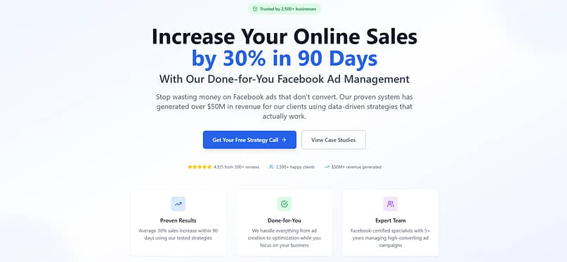
Vague: “Transform Your Business Today” (sounds nice, but says nothing specific)
Clear: “Increase Your Online Sales by 30% in 90 Days With Our Done-for-You Facebook Ad Management” (specific outcome, timeframe, and service)
Lead with a benefit-driven headline that addresses their problem or desire. If you’re not sure where to start, our conversion copywriting tips and Problem-Agitate-Solution copywriting formula walk you through proven structures that grab attention fast.”
Mistake #2: Multiple Calls-to-Action (The Goal Is Unfocused)
Symptom:
You’ve got buttons everywhere — “Sign Up,” “Download Now,” “Learn More,” “Book a Call,” “Subscribe Here.”
Instead of guiding visitors toward one clear action, you’re making them stop and decide which path to take. The result? Decision fatigue. And when people feel unsure, they take the easiest route: closing the tab.
Cure:
Choose one primary conversion goal for your landing page and build the page around it.
Make your main CTA the most prominent element, using contrasting colors and placement near the top and after key sections.
Repeat it at natural breakpoints (e.g., after addressing a major pain point or showing proof), but don’t overwhelm the page with competing buttons.
If you need secondary actions, keep them subtle — text links or smaller buttons that don’t pull focus from your main goal.
Example:
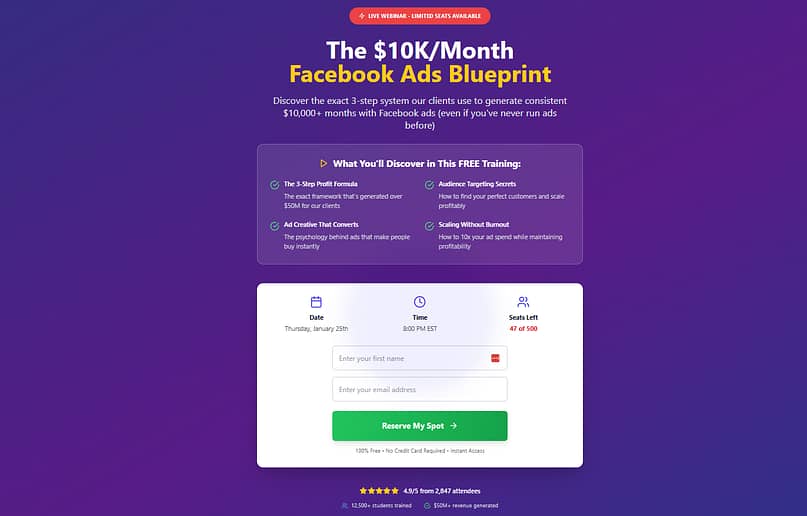
A webinar registration page with one CTA — “Reserve My Spot” — throughout will almost always outperform the same page cluttered with additional offers to “Download the Free Guide” or “Join Our Newsletter.” Focus makes the path to conversion frictionless.
Lead with a benefit-driven headline that addresses their problem or desire. If you’re not sure where to start, our conversion copywriting tips and Problem-Agitate-Solution copywriting formula walk you through proven structures that grab attention fast.”
Mistake #3: No Social Proof (The Trust Is Missing)
Symptom:
Your landing page might look great and read well, but if visitors have no reason to believe you can deliver on your promises, they’ll hesitate. In today’s online world, people are trained to be skeptical — and without proof, your offer feels like a risk they’re not ready to take.
Cure:
Add trust signals that show you’re credible, experienced, and worth their time. This can include:
Testimonials from real customers, with names, photos, and (if possible) specific results.
Case studies that walk through a before-and-after transformation.
Logos of companies you’ve worked with or been featured by.
Ratings or reviews from trusted third-party platforms.
The key is authenticity. Avoid generic stock photos or anonymous “John D.” quotes — they can do more harm than good.
Learn how to use testimonial marketing strategically, collect and display authentic testimonials, and even add Google reviews to your WordPress site for extra credibility.
If you’re just starting out, consider collecting short testimonials from beta users, peers, or industry connections who can vouch for your work or expertise.
Example:
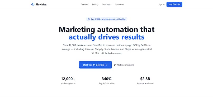
A SaaS landing page that simply says “Trusted by businesses worldwide” is forgettable. One that shows “Over 4,500 marketers use [Product Name] to increase their campaign ROI — including teams at HubSpot, Zapier, and Monday.com” immediately adds weight and credibility.
Mistake #4: Slow Page Speed (The Visitor Gets Impatient)
Symptom:
You’ve done everything right — great headline, persuasive copy, beautiful design — but your page drags when it loads. By the time it appears, your visitors are already frustrated or gone. Online, patience is short, and slow load times send a silent message: this might not be worth my time.
Cure:
Speed should be treated like part of your conversion strategy, not just a technical detail.
Compress and optimize images so they’re high-quality but lightweight.
Use a fast, reliable hosting provider with caching and CDN (Content Delivery Network) support.
Limit heavy scripts and unnecessary plugins that slow things down.
Test regularly with tools like Google PageSpeed Insights or GTmetrix so you know exactly where to improve.
Even small gains matter. Shaving a second off your load time can keep more people on your page long enough to read your offer — and click that CTA.
➡️Follow our guide on how to optimize your website speed and check your Core Web Vitals to meet modern performance standards.
💡Think of it this way: if your page loads in under two seconds, your visitor barely notices the wait — they’re straight into your headline and offer. But if it takes six seconds, they’re already tapping their phone screen, glancing at the clock, or deciding to check their email instead. By the time your page finally appears, their attention has moved on.
Mistake #5: Confusing Layout (The Path to Conversion Is Difficult)
Symptom:
Your landing page might have all the right elements — headline, copy, images, CTA — but if they’re scattered or competing for attention, visitors don’t know where to look or what to do next. A busy or disorganized layout forces people to work too hard to understand your offer, and most won’t bother.
Cure:
Design your page so it guides the eye naturally toward your goal.
Place your headline and main CTA where they can be seen immediately.
Group related information together so visitors can process it quickly.
Use white space to give the page breathing room and avoid visual overwhelm.
Follow a logical flow: introduce the problem, present your solution, prove it works, then invite action.
Example:
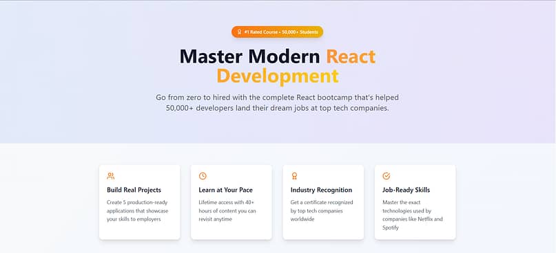
A course sales page that starts with the headline, follows with a short benefit list, then moves straight into testimonials and the purchase button will convert far better than one that opens with a long company history, buries the CTA in the middle, and scatters testimonials across multiple sections.
💡For more on creating a clear, conversion-focused layout, read our fundamental web design principles and optimal landing page structure recommendations.
Mistake #6: Not Mobile-Optimized (The Experience Is Broken for Most Users)
Symptom:
Your landing page looks great on a desktop monitor, but on a phone? Text runs off the screen, images are cut off, buttons are too small to tap, and visitors have to pinch and zoom just to read. Since the majority of web traffic now comes from mobile devices, a poor mobile experience means you’re instantly losing a big portion of your audience.
Cure:
Build your landing page with mobile in mind from the start, not as an afterthought.
Use a responsive design so your content adapts to any screen size.
Keep headlines short enough to fit cleanly on mobile without breaking awkwardly.
Make buttons large and spaced far enough apart for easy tapping.
Test your page on different devices and browsers to catch formatting issues before launch.
Example:
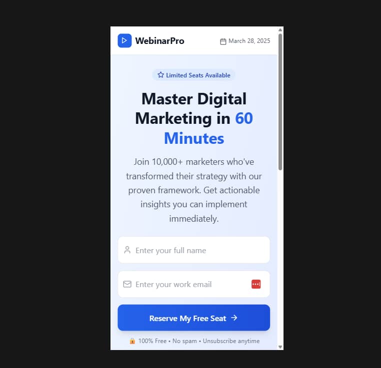
A mobile-optimized webinar signup page might use a single-column layout, bold headline, and one clear CTA button near the top, followed by short, scannable benefit bullets. A non-optimized version could squeeze in three columns, tiny text, and a buried signup button — almost guaranteeing fewer signups from mobile users.
💡For a deeper dive, follow our mobile landing page best practices and learn how to design mobile-friendly content that’s easy to read and tap on any device.
Mistake #7: Mismatched Ad Scent (The Promise Doesn’t Match the Page)
Symptom:
A visitor clicks your ad expecting one thing… and lands on a page that feels completely different. The headline doesn’t match the ad’s wording, the visuals are unrelated, or the offer has shifted. That disconnect breaks trust instantly — and most people will leave without taking action.
Cure:
Match the “scent” of your ad to your landing page so the transition feels seamless.
Keep your headline and core message consistent between the ad and page.
Use similar or identical visuals so visitors immediately recognize they’re in the right place.
Make sure the offer and CTA in your ad are the exact ones featured on the landing page.
Example:
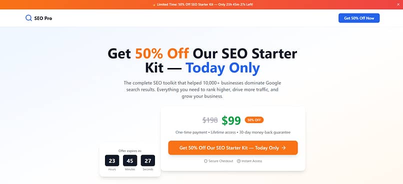
If your ad says “Get 50% Off Our SEO Starter Kit — Today Only,” your landing page should repeat that exact offer and urgency in the headline, show the same product image, and feature the same “Get 50% Off Now” button. Changing it to “Learn More About Our Services” will almost always tank your conversion rate.
💡To fix message match, see our PPC landing page optimization guide and consider using dynamic personalized landing pages so each visitor sees a perfectly aligned offer.”
Next Steps: Set Up Your Site Analytics the Right Way
You can’t truly know the effects of your landing page optimization without tracking your analytics.
Good analytics show you how visitors interact with your page. As I mentioned earlier, they reveal where people lose interest, which elements they engage with, and what leads to conversions. It’s a key part of any sales or lead gen strategy.
So, before you start making changes to your websites, get your Google Analytics setup.
If you read this guide, then you’ll know that MonsterInsights is my top recommendation. It makes your data easy to read and even easier to act on.
And if you’re not sure how to get started, check out this step-by-step tutorial.
Wrapping Up: Fix the Symptoms, Boost the Conversions
If you’ve spotted any of these mistakes on your own landing pages, don’t panic — even high-performing marketers and business owners run into them at some point. The difference is they treat these problems like a diagnosis: identify the symptom, apply the right cure, and track the results.
Now it’s your turn. Go through your pages with a critical eye. Remove the friction, match your message to your visitor’s expectations, and make sure the path to conversion is clear — on every device.
Next step: Use our Landing Page Checklist before you publish, and if you want to test your changes properly, here’s how to run A/B tests in WordPress for reliable results.


Great!
Thanks, Chipo!
You’re welcome, Chris 😀